
Hi, crafty friends. I have another Christening card to share today, featuring another one of Mo’s adorable images. For this one I used Baby and Bunny, which works well for either boy or girl. I’m trying to use colors other than the traditional blue, so I made this one teal, since my last one was green. These two cards were for the same boy.

I used the Nested Stitched Doily Set from Cottage Cutz to die cut the circular panel. I like the decorative border, it adds a little bit of interest to the card.
 I used flowers from different companies (I honestly don’t know where these are from, I’ve had them for 10+ years, but I’m thinking most of these are from Wild Orchid Crafts. The ruffled roses are really old ones from Kort & Godt, and I think the teal ones might be from I am roses, though I’m not entirely sure), removed the yellow centers from the teal ones and replaced them with white pearls from Papirdesign.
 Both insides share the same layout, and so does the back. I printed a sentiment to go on the back, as well as the date, and a few more flowers. These cards that I make with decorations on all four sides are thick, flowers add a ton of dimension. I used old patterned paper from Maja Design for this card. The Vintage Spring Basics collection and the Vintage Summer Basics collection are both collections that Maja Design released over 10 years ago. Back then, I used plenty of patterned paper, and especially Maja Design. Their paper is such good quality, and I love their use of pattern and color. My style has changed considerably, and I rarely use large pieces of patterned paper anymore, but I still have a lot, and Maja Design is still a favorite.
![]() Simple color palette that makes the teal pop!
Simple color palette that makes the teal pop!

 This
This  I used 3 different collections of patterned paper from Maja Design for this card. One of the benefits of using their papers is that their collections usually match pretty well. Vintage Basics Summer, Vintage Baby and Sofiero are the collections I used for this card, and they all match. I used older dies from Lifestyle Crafts, Cottage Cutz, Scrapmagasinet, Marianne Design and Spellbinders, as well as flowers from Wild Orchid Crafts and Papirdesign.
 The insides of the card have a very similar layout, and so does the back. Onto a white circular panel, I stamped a christening stamp from North Star Design using Soft Granite ink from Hero Arts.
 The card was too thick to fit inside a regular envelope, so I created a box envelope using a punch board from We R Memory Keepers. Onto a diecut eyelet circle I stamped a Norsk Stempelblad AS sentiment and adhered it to the box envelope.
 This image is so quick to color and doesn’t require a ton of markers. Easy peasy!
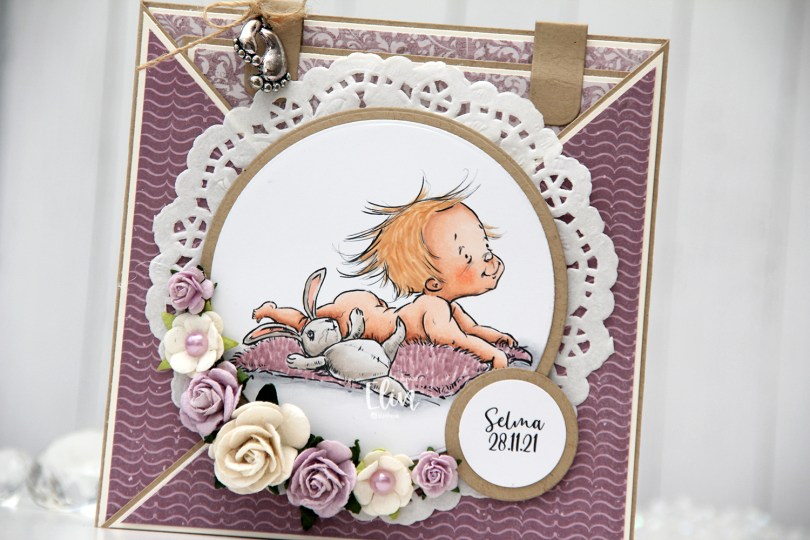
 This card was created for a little girl whose christening was this past Sunday. I think the
  I die cut the image using a circle die from Lifestyle Crafts and matted it with kraft cardstock. I also printed the name and date on a piece of white cardstock that I also matted with kraft. I put a doily from Helz Cuppelditch behind my image and added flowers using a hot glue gun. I took out the yellow centers of two of the flowers and replaced them with Lavender pearls from Kaisercraft.
 On the inside tag I added a circle diecut made from white cardstock for a space to write a personal message. I used the Labels Trio die set from Spellbinders to create two “handles” from kraft cardstock. I tied a bow and attached a charm to one of them for a little added interest.
 On the back of the card I stamped a sentiment from North Star Design using Amethyst ink from Altenew.
 The card isn’t very big, it only measures 5×5″, but it’s quite dimensional and doesn’t fit in a regular envelope, so I decided it was best to create a box envelope.
 I rummaged through my 12×12″ cardstock and found a color that matched pretty well, and used my Envelope Punch Board from We R Memory Keepers to create the box. I added another Helz Cuppelditch doily for cohesion, as well as more of the patterned paper that I die cut using the Impact alphabet die set from My Favorite Things.
 Cards like this come together very easily, it’s basically a bunch of diecutting and you’re done. I use two full 12×12 sheets of patterned paper for cards like this, and the beauty is that there are no scraps left when I’m done. For this one I used two sheets from Papirdesign, one is Roseduft, and the other is stemorsblomst, blå.
 I added flowers from Wild Orchid Crafts, Kort & Godt and Papirdesign along the edge of two opposite quadrants on my circle, used letter stickers from Papirdesign to spell her name and some diecut numbers for her age. I finished off the front of the card using diamonds from Kort & Godt.
 I kept the insides pretty simple, with plenty of room for a personal message for the birthday lady. I added some more diamonds to embellish a tiny bit.
 On the back of the card I used more flowers, more diamonds and stamped a Norsk Stempelblad AS sentiment using Autumn Rose ink from Papertrey Ink. “Happiness is the art of creating a bouquet of the flowers within reach.”
 I colored her up with my Copics, focusing on the RV90s that go so incredibly well with the patterned paper from Papirdesign that I used, it’s ridiculous!
 I made a shaped card using the third largest die in the XXL Square Frames Frilly #10 set from GoKreate, and did a whole bunch of diecutting elsewhere on the card too. To break up the monotony of a diecut on top of a slightly larger diecut on top of a slightly larger diecut on top of a slightly larger diecut, I cut some Kort & Godt lace and put it across the card. The diecut heart banner, the word banner and all those Wild Orchid Crafts flowers also help. The flower berries and pearls are from Kort & Godt.
 There’s a banner hidden behind that image, diecut with a Magnolia die. I tied a bow of seam binding ribbon with the help of a DIY bow easy, I can’t make nice bows for cards to save my life (true story!), so the Bow Easy helps. I stamped a Papirdesign stamp using Memento Sweet Plum ink, which also matches the patterned papers beautifully. On top of the bow I added an old button from Melissa Frances.
 Is that an adorable little fairy or what? Those flower berries from Kort & Godt are really old, I think they might actually be from their first production of flower berries. They made some later on that had more of a greenish yellowy tint, but these are more creme colored and perfect for this card. I still have a few left, I only use them on very special cards.
 I added another Papirdesign sentiment stamp on the back of the card, along with a few more flowers. I removed the centers of the sweetheart blossoms and added back in some purple pearls from Papirdesign that once again matched the colors of everything else.
 As you can see from the above photo, this is a very dimensional card and not at all mail friendly, it’s super thick.
 Not too many Copics used for this one. Probably because it’s mostly that one dominating color.
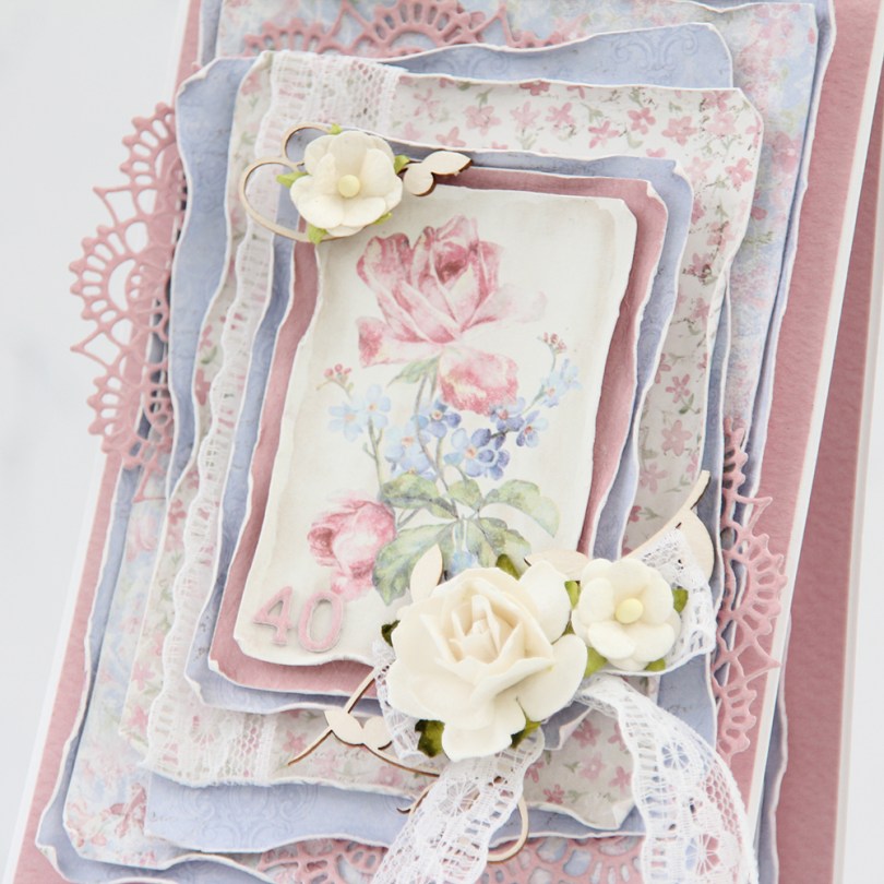
 There are two types of cards I love making more than any other: Christmas cards and birthday cards. I love making clean and simple cards, but also very layered ones with lots of patterned paper. Today’s card is one of those, made exclusively with papers from the Sofiero collection from Maja Design.
 One of the things I love the most about Maja Design paper is the quality of the paper they use. It’s almost as thick as cardstock, something I haven’t really found in other patterned papers. Their patterns are gorgous, too, making card making a breeze. The thick quality also means I can use a wet paint brush (with clean water) and run along the edges, before using my fingers to curl them slightly back. This is so much easier to do when the paper is wet, and so much easier to do with these good quality papers. Thinner paper won’t hold up as well to all that water. I love the look you achieve by doing this.
 I’m not an embellishment queen. I use a little bit on cards like this, but I rarely do a lot. This time, I used some pieces of chipboard from SnipArt and a few flowers to frame the image in the center of my card. I also used some lace to combat the rigid look you sometimes get when using just straight lines like square or rectangular panels.
 I also added a couple of diecut doilies to further break up the linear look, and added stacked diecut numbers to the bottom left of the focal point of the card. As you can tell from this photo, this is a card with lots of dimension, it’s not very mail friendly.
 I did a little bit of layering on the insides, as well. They are both the same, and those pink center panels provide plenty of room to write a personal message to the birthday girl.
 On the back of the card I stamped a sentiment from Norsk Stempelblad AS using Papertrey Ink Autumn Rose ink. The text is about butterflies, so I thought it fitting to add a few chipboard ones for a little bit of extra interest.
 Even though my card isn’t very mail friendly, I needed something to put it in, so I made a box envelope to go with it and added the recipient’s name on the front of it. The card was hand delivered, so this works perfectly.
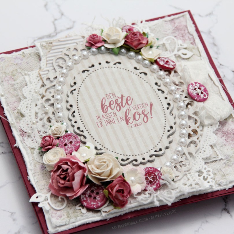
 Jeg var innom Hobbykunst i januar og fikk en utfordring om å bruke et
  Teksten er et stempel fra
  Kortet ble ikke veldig postgangvennlig, det er ganske tykt, selv om jeg kun har pyntet forsiden. Det var nemlig ikke nok igjen av arket til å bruke inni og bak. Sløyfen med knapp sitter fast i en tag som er under hovedpanelet. Teksten på tagen er også et Huldra-stempel. Hvilket kan du se i Hobbykunst-butikken, der er nemlig kortet.
 It’s Mo day (aka Wednesday). One of the last things I did in 2019 was to clear away all the jars of flowers from the desk in my craft room (I had about 50 of them). I figured I don’t really use flowers all that much on my cards anymore, so I didn’t need them to be easily accessible and take up space on my desk. I put them in a cabinet right below the ceiling, I was able to cram all of them into one single cabinet. The last card I made in 2019 had flowers on it. We’re barely two weeks into the new year, and I’ve made another one with flowers. For both cards I had to climb on a ladder and pull out a bunch of jars to get to the flowers I wanted. Maybe removing those jars wasn’t such a good idea after all?
 Good idea or not, this was the card I made. I colored up Mo’s
  I partially die cut my image with some of the bubble hanging out, and glued it to my card using lots of foam tape. I haven’t used my frame dies from GoKreate in a while, so I thought I’d break them out for this one. I usually make my card from the third largest die in the set (the XXL Square Frilly Frames #10 set), but I want to see how far into 2020 I can get with using just scraps, and the third largest die in the set requires a full sheet of paper to die cut two pieces (front and back of the card). The next size down was the perfect size for this scrap of Maja Design patterned paper, and it was also a good size for the green patterned paper from Papirdesign that I used behind my image and on the insides of the card.
 Speaking of insides – I diecut an eyelet circle with a Cottage Cutz die, stamped a Norsk Stempelblad AS sentiment using Memento Sweet Plum ink and again used lots of foam tape. I even diecut a scrap strip of another purple piece of Maja Design patterned paper to go across.
 The second inside has plenty of space for a personal message, and I diecut another eyelet circle from patterned paper and added a couple of diecut numbers from Scrapmagasinet to my circle. I thought this card would be the perfect birthday card for my niece, she turns 10 in June!!
 I used the same design on the back, but used a green strip instead of a purple one. Another NSB sentiment, once again stamped in Memento Sweet Plum ink, and once again glued on with lots of foam tape.
 There’s quite a bit of dimension in this card, and with that great image as the focal point, I think this will be perfect for my niece!
 Lots and lots of Copics used for this one, but there are 15 colors in the heart bubble alone.

 Jeg stanset ut motivet mitt med en die fra Spellbinders og satte på en perlebord fra Wild Orchid Crafts på innsiden av kanten. Pyntet med blomster fra WOC og Kort & Godt, i tillegg til knapper fra Papertrey Ink malt med bittelitt gesso. I midten av de hvite sweetheartblomstene har jeg satt blå diamanter fra Kort & Godt, og i midten av den blå har jeg limt på en liten hvit perle.
 Bak motivet har jeg gjemt en tag stanset ut med en die fra Magnolia. Jeg har satt en sløyfe med knapp i enden, og stemplet en tekst fra North Star Design på tagen med blekk fra Papertrey Ink. Bokstavene i navnet til dåpsbarnet er stanset ut i Maja Design papir med en Sizzix-die.
 Kantdieen jeg har brukt for å lage stjerneborden som går på tvers av kortet kommer også fra Magnolia, det samme gjør hjerteswirlen jeg har lagt under blomstene mine.
 På innsidene har jeg to identiske skrivefelt laget med den samme dieen som jeg brukte på forsiden til motivet mitt. Det gir en fin helhet til kortet. Den andre innsiden er lik denne. Veldig greit med ekstra god skriveplass på dåpskort, dåpsbarnet har jo hele livet foran seg.
 Baksiden har det samme oppsettet, en tekst fra NSD og enda flere blomster.
 Her syns relativt godt at det er en god del dimensjon på kortet. Spesielt postgangvennlig er det ikke, men dåpskort blir gjerne håndlevert, så jeg syns likevel det er innafor med såpass dimensjon.
 Siden kortet ikke fikk plass i en vanlig konvolutt lagde jeg en eske til å ha det i. En liten diecut med stemplet tekst får pryde utsiden av esken.
 Jeg stanset ut en die fra Papirdesign i fem lag av Berry Sorbet kartong fra Papertrey Ink og limte dem rett på lommen. Jeg pyntet enkelt med blomster og blader fra I am Roses og Wild Orchid Crafts, limte på noen perler fra Papirdesign og et par sommerfugler fra Snip Art.
 Kortet for øvrig er laget som et vanlig dobbelt kort, med paneler til skrivefelt inni. Kantene på selve bukselommen er ikke 100 % rette, så resten av målene måtte tilpasses deretter. Det var også en av grunnene til at jeg valgte å rufse kantene på papirene, da er det ikke så farlig at det ikke er helt perfekt. Av en bit mønsterark fra Summer Crush-kolleksjonen til Maja Design stanset jeg ut en sirkel med pyntekant med en die fra Cottage Cutz og stemplet en tekst fra Stempelglede med Espresso Truffle blekk fra Memento. Følte at jeg måtte ta igjen litt av pynten fra forsiden, så det ble en liten sommerfugl her også.