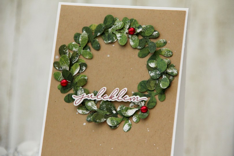
Hi, crafty friends. I’m back with another Christmas in July card. It’s still July – barely. I don’t want summer to end, and at the same time, I love creating Christmas cards, so I’m not entirely sure what to make of that. The card I shared two weeks ago featured felt snowflakes and a branch die that I used to create my arrangement. I wanted to revisit the idea of a wreath of snowflakes (which was my original plan for the last card), but once I’d die cut and decorated my branches, I wound up skipping the snowflakes on this one.
 I started by die cutting the branch four times from a piece of green patterned paper from the Key to my Heart Collection from Kaisercraft. I then painted unevenly with a VersaMarker and added White puff embossing powder from Wow! for a snowy effect on parts of the leaves. I then cut each of the branches up into little mini branches to create my wreath.
 I splattered white reinker onto a panel of Wheat cardstock from Concord & 9th and adhered it to a top fold white card base. I added my mini sprigs of leaves in a wreath formation, popped up a sticker sentiment near the base of the wreath and added three red pearls to embellish. I also put little pieces of foam squares behind some of the leaves to make it more dimensional.
Kort & Godt products used:

 I colored the image with Copics, added some simple ground and flowers next to her and die cut my panel using the largest die in the Additional A2 Layers die set from Waffle Flower, before adhering it to a card base I created from Lazy Day cardstock from My Favorite Things. It’s been a really long time since I’ve made one of my signature “cluster cards”, so I decided it was time for a new one. I keep little die cut scraps in storage pockets sorted by color, which makes it easy to find pieces that will fit any color combination I’ve chosen for my image. I play around with the composition, and when I’m happy, I adhere it all to my card. Some directly, some using foam tape. This gets very thick very fast, but I love this process.
 I stamped a sentiment from the Pristine Peonies stamp set from Altenew using Picked Raspberry Distress Oxide ink, then die cut it into a banner using one of the dies in the Essential Stitched Sentiment Strips die set from My Favorite Things. This goes really well with the other fishtail banners I already had going in my cluster, and the color matches nicely with the pink striped patterned paper from Sunny Studio that I used. I finished off with a few enamel dots from the Pocketful of Sunshine pack from Altenew.
 Very springy color palette. I’m here for it!!
 As usual, I colored the image with Copics, cut my panel down a little on the sides and added Glossy Accents to all the ornaments. This time, I decided to use the
  My signature clean and simple cluster cards have been few and far between this year, and I thought a mini cluster would work well for this card. I started with a scrap of a mini paper doily from Doodlebug Design that I adhered to my colored panel with liquid glue. I die cut a couple of additional pieces using the Happy Days Ticket Stubs die from XCut. This is one die that cuts nine different tickets, and it’s one I use a lot. I cut one from the light blue gingham patterned paper, and the other one from a scrap piece of patterned paper from Kaisercraft. I put them both on foam squares for dimension. The sentiment is from the Itty Bitty Holiday stamp set from My Favorite Things, stamped and white heat embossed on a piece of Autumn Rose cardstock from Papertrey Ink, which I then die cut into a strip with flag ends using a die from the Itty Bitty Strips die set from My Favorite Things. I finished off with a few sequins from the Ice Water mix from Little Things from Lucy’s Cards.
 A very simple color palette for this card. I started out with blue ornaments, but once I printed the patterned paper, I realized they needed to have a green tinge and went over the blue with BG32 and G00.
 I die cut a tree nine times from three different shades of green patterned paper. The two lighter ones are both from Maja Design, while the dark one’s from Kaisercraft. This die is pretty small and perfect for scraps. There’s also a die in the sets that cuts the trunk, but I decided not to use that for this card.
 I sprinkled on Chunky white embossing enamel from Stampendous to each of the trees and melted the granules from the back to make snowy trees. I then used three different thicknesses of foam tape behind the trees for varying dimension.
 I stamped and white heat embossed the sentiment onto a black cardstock strip (True Black cardstock from Papertrey Ink), added a couple of more layers of cardstock behind it for dimension and glued it on top of two of my trees.
 I added a bunny to the top of the teacup stack and colored the image with Copics, before fussy cutting, leaving a thin white border around the edge. I used a black glaze pen from Sakura to add shine and a tiny bit of dimension to the bunny’s eyes, then a white dot of Gelly Roll 05 on top of the black, once the black was dry. The glaze pen dries fairly quickly once applied, so I didn’t have to wait long.
 I adhered a panel of Blueberry cardstock from My Favorite Things to my white card base. Using a die in the A2 Double Stitched Rectangle STAX die set, also from My Favorite Things, I die cut a piece of patterned paper from Sunny Studio to adhere on top of the blue. This patterned paper is from the Subtle Grey Tones pack, and it really is subtle.
 I realized I hadn’t made any of my signature clusters in a while, and decided to pull out my die cut scraps of patterned paper and have a play. These patterned papers are from Sunny Studio (more from the subtle grey pack), Kaisercraft (light blue with dots), Papirdesign (dark blue with smaller dots) and Maja Design (pink floral), all die cut using a combination of the Happy Days Ticket Stubs die from XCut and the Fishtail Flag Frames dies from My Favorite Things. I used a mini paper doily from Doodlebug to mat my little clusters, and embellished with sequins from Pretty Pink Posh and Simon Says Stamp.
 The sentiment is from the Coffee and Chocolate stamp set from hÄnglar & Wings, white heat embossed on a strip of the same color cardstock I used for the card front. I then die cut it using one of the dies in the Itty Bitty Banners die set from My Favorite Things.
 The interactive element that I mentioned at the beginning of the post is actually the image. As you can see in this photo, it sits pretty high off the base. The reason for that is that it’s on an action wobble, so it’ll shake and move once you help it along a tiny bit.
 Fairly simple color palette for this one.
 I printed the dragon on a piece of X-Press It blending card and colored him with my Copics, before using the largest die in the A2 Stitched Rectangles STAX 1 die set from My Favorite Things. I covered my card base with a 4 1/4 x 5 1/2″ piece of patterned paper from Kaisercraft (Charmed from the Key to my Heart collection) to match the green. I cut the panel with the dragon at funky angles at the top and left side to create a convex quadrilateral that I mounted on foam tape in the top left corner of the card.
 Using a scrap of patterned paper from the Fremtidsdrømmer collection from Papirdesign, I die cut Gratulerer using the Gratulerer med dagen 3 die set, also from Papirdesign. I die cut an additional 3 layers of white cardstock to glue behind it, but decided that even that wasn’t enough dimension, so I cut tiny slivers of clear foam tape from Rabbit Hole Designs to add to the back of the letters. That did the trick, and it looks like the die cut is floating. I stamped a sub sentiment from the A06 stamp set from Norsk Stempelblad AS onto another piece of the same patterned paper using Jalapeño Popper ink from My Favorite Things, cut it down to a strip, added a couple of white cardstock strips behind it and more of the clear foam tape to make it float, before finishing off the card with a few enamel dots from the Pocketful of Sunshine pack from Altenew.
 Fairly simple color palette, but I went through too many teal colors before I decided on the right one for the straws and the sprinkles.
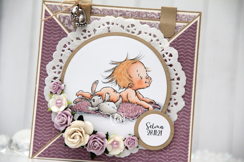
 This card was created for a little girl whose christening was this past Sunday. I think the
  I die cut the image using a circle die from Lifestyle Crafts and matted it with kraft cardstock. I also printed the name and date on a piece of white cardstock that I also matted with kraft. I put a doily from Helz Cuppelditch behind my image and added flowers using a hot glue gun. I took out the yellow centers of two of the flowers and replaced them with Lavender pearls from Kaisercraft.
 On the inside tag I added a circle diecut made from white cardstock for a space to write a personal message. I used the Labels Trio die set from Spellbinders to create two “handles” from kraft cardstock. I tied a bow and attached a charm to one of them for a little added interest.
 On the back of the card I stamped a sentiment from North Star Design using Amethyst ink from Altenew.
 The card isn’t very big, it only measures 5×5″, but it’s quite dimensional and doesn’t fit in a regular envelope, so I decided it was best to create a box envelope.
 I rummaged through my 12×12″ cardstock and found a color that matched pretty well, and used my Envelope Punch Board from We R Memory Keepers to create the box. I added another Helz Cuppelditch doily for cohesion, as well as more of the patterned paper that I die cut using the Impact alphabet die set from My Favorite Things.
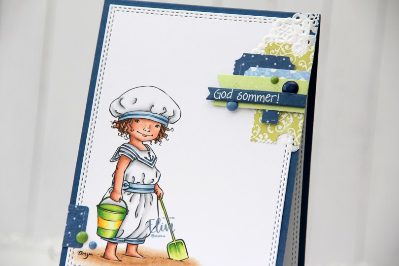
 Technically, I should have made this card at the beginning of the summer, but it’s a recent image from Mo and I couldn’t NOT make a summer card using it. The air is definitely getting cooler here, and I’m very well aware of the fact that summer officially ends in two weeks. I kind of want to go back to June and warmer temps, I don’t like the cold.
 Onto the card. I colored the image with Copics and used a double stitch rectangle die from My Favorite Things to turn it into a nice panel, before adhering it to a top fold card base I made out of Enchanted Evening cardstock from Papertrey Ink. I love their cardstocks.
 When I don’t have a clear idea for a card, I turn to embellishment clusters of patterned paper scraps. These are so easy to put together and a great way to add SOMETHING when I’m out of ideas and my mojo’s low.
 I’ve sorted my die cut patterned paper scraps by color, so I pull out colors that will match my card and just start playing. I used patterned paper from 3ndypapir, Papirdesign, Kaisercraft and Imaginisce for this card, and the dies I used to cut them out are from XCut and My Favorite Things.
 I white heat embossed a sentiment from Norsk Stempelblad AS onto a scrap piece of Enchanted Evening cardstock and used one of the Itty Bitty Strips dies from My Favorite Things to diecut it, before using 1 mm foam squares to mount it onto my cluster. I added a few enamel dots from Papirdesign to finish my card.
 Fairly limited color palette for this one.
 You can actually get the image I used for FREE if you spend $20 or more during Mo’s summer sale, which ends today, so you’d better be quick.
 I colored the image using my Copics, die cutting it with a faux stitch rectangle die from My Favorite Things for a nice finished loo, before stamping the definition of friend (stamp from Norsk Stempelblad AS) using VersaFine Onyx Black ink.
 I added shimmer to the bird and bee using my clear Wink of Stella brush. The sparkle is hard to catch in photos, but in real life it’s very shimmery. I found a scrap piece of patterned paper from Kaisercraft that was already cut down to the perfect size and adhered it to my card base, before adhering the colored panel on top of that. The color of the patterned paper matches the bird nicely. It’s a closer match in real life than I’ve managed to capture in this photo.
 I added a couple of sparkling clear sequins from Pretty Pink Posh and left it at that, this is a very simple card. In this photo you can see a little bit of the sparkle in the bird and the bee.
 Super limited color choices for this one. I also used BG71, which is a color I’ve made myself using refill of BG72 and blender solution.
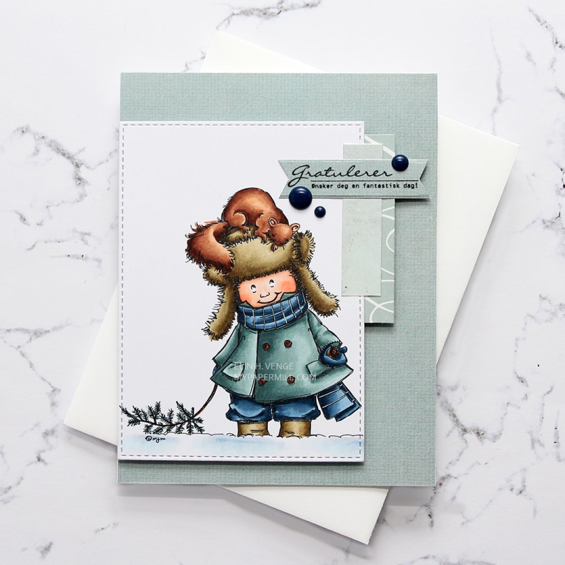
 I went with a combo of cool Copic colors and even used the E80s, which I hardly ever use. I cut my colored piece down using a faux stitch rectangle die from My Favorite Things.
 I used some old scraps of patterned paper to create this card. On my desk I have a container of scraps of patterned paper that I’ve cut down to 4 1/4 x 5 1/2″, making them very convenient to use. The paper I used to cover the entire front of the white card base is from My Mind’s Eye (it’s the same sheet as the one I used for the sentiment banner), the one with the white lines running through it is from Autumn Leaves, from their Manhattan line, which happens to be from 2007. I definitely have some old papers in my stash. The lightest piece is from Kaisercraft. I decided to add dark blue enamel dots from Papirdesign to break a little from the monochromatic patterned paper I had going, and also to reintroduce the blue from the image, even though I really like the grayish teal of the jacket and the patterned paper scraps.
 I stamped the sentiment from Norsk Stempelblad AS using VersaFine Onyx Black ink and die cut it using one of the fishtail flag frames dies from My Favorite Things.
 Quick and easy coloring of this one without too many colors. As usual when I color snow, quite a few of the colors were used for the snow alone. I also used BG71 on the jacket, which is a color I’ve made myself.