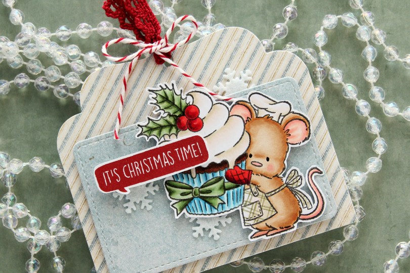
Hi, crafty friends! It’s the first Sunday of Advent, and I have a fun gift tag to share today featuring the adorable Baking Fun image from Purple Onion Designs, illustrated by Pei – I’m such a big fan of her illustrations!! I did a lot of baking last year for Christmas – SO many different types of Christmas cookies and sweets. This year, I haven’t even started yet. I have a few favorites I might end up making, I haven’t decided yet. Anyway, back to the gift tag.
 I colored up the cute little mouse with Copics, adding a plaid pattern to the apron using a Zig watercolor brush marker (No. 98 Pale Dawn Gray), before fussy cutting the image leaving a white border. I used the Gift Pocket Tag die set from Mama Elephant to die cut from patterned paper from the Christmas Nostalgia collection from Maja Design to create my tag. I mounted the smaller piece with foam squares and did the same with the cute little mouse.
 I stamped a sentiment from the Holiday Blurbs I stamp set from Purple Onion Designs using Amarena Cherry ink from My Favorite Things, fussy cut leaving a white border and mounted it on top of my image, doubling up on the foam squares on the left half. I tucked a few felt snowflakes from Kort & Godt under my element, added a bit of black glaze pen to the eyes and tied ribbon and twine at the top of the tag to finish.
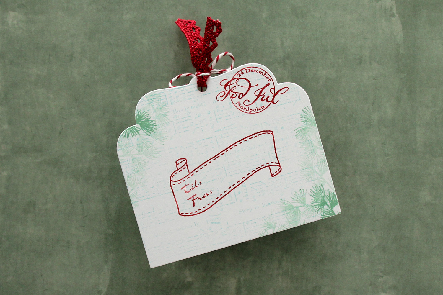 I die cut the tag a second time from white cardstock and did quite a bit of stamping on it. I used second generation stamping of an old sheet music stamp from Magnolia using Powder ink from Concord & 9th – I wanted it to be very soft. The sheet music is actually for Silent Night, making it extra Christmas-y – not that you can really tell. I used first and second generation stamping of a branch from a Mathia Design stamp set using Eucalyptus ink from Concord & 9th to add a little something to the corners. I stamped a postmark stamp from Ladybug & Friends, as well as a to/from stamp from Norsk Stempelblad AS using Amarena Cherry ink from My Favorite Things. I don’t think Ladybug & Friends is in business anymore. Neither is Norsk Stempelblad, but I love their stamps and can’t bring myself to stop using them.
![]() I didn’t use too many colors on this one.
I didn’t use too many colors on this one.
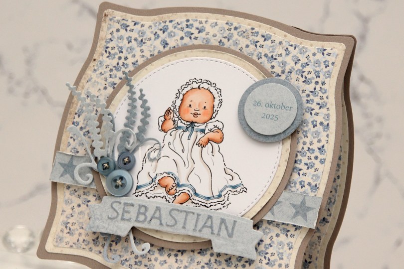
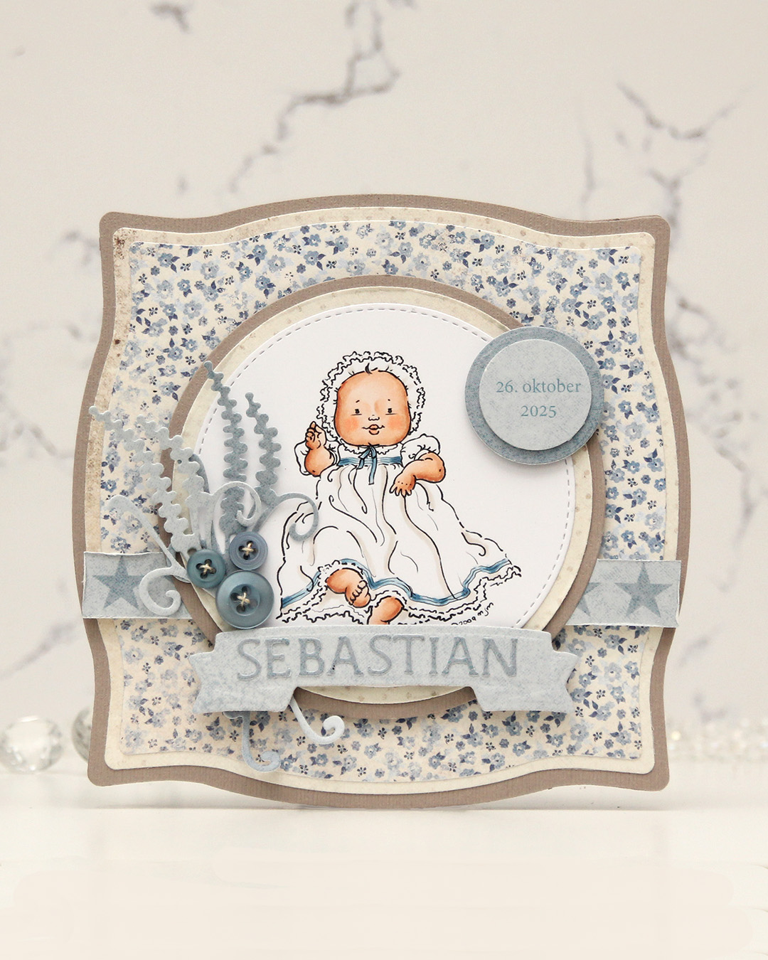 I colored the image and die cut it using one of the circle dies in the Stitched Circle STAX die set from My Favorite Things. I also die cut circles from grey cardstock and patterned paper from the Denim & Friends collection from Maja Design using the Nesting Circles die set from Lifestyle Crafts. The shape of the card is created with the Nesting Frames #8 die set from Lifestyle Crafts.
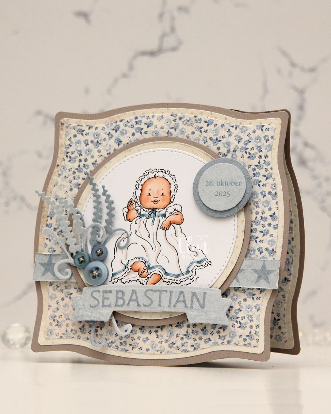 I popped some pieces up using foam tape, die cut the letters for the name using an alphabet die set from Scrapmagasinet and adhered the letters to a banner I die cut with an old die from Spellbinders. I used an old die from Marianne Design for the spriggy things on the left, and used some old Blueberry Sky buttons from Papertrey Ink to embellish.
 Very limited color palette for this one.
 This all started with patterned paper from Maja Design and the Sleigh full of cheer dies from Concord & 9th. Die cutting presents like this is a great way to use scraps. I used the Christmas Nostalgia collection for this. I’m a sucker for anything blue, so I wanted a dark-ish blue at the bottom, a lighter blue at the top and a contrast in the center. You could do this with any color, even plain cardstock. There are actually some images in the coordinating stamp set that will allow you to add patterns to your die cuts using just ink, but I opted for the patterned paper version here. I die cut the bow, the ribbon for the presents and the sleigh using champagne foil cardstock from Concord & 9th and added those for a touch of shine. The sleigh itself is a few layers thick to make it stand out against the background, and I did some ink blending on the seat using Wheat ink to make it stand out even more, as I have the same cardstock color for the seat as my background.
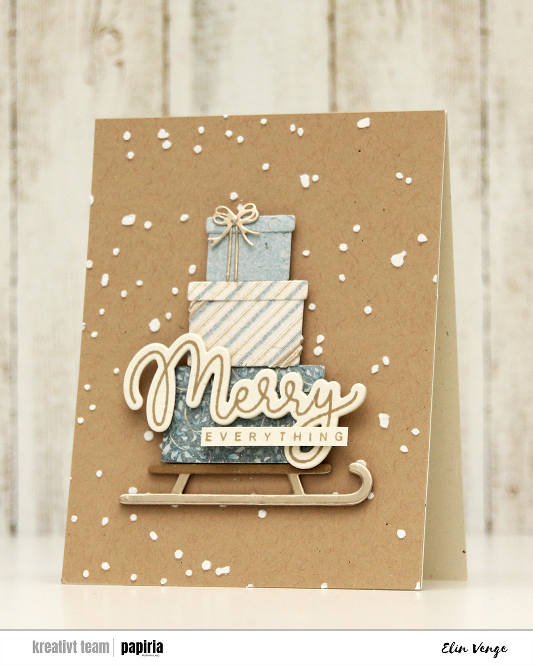 Speaking of backgrounds – I used one of the stencils in the Splatter Textures stencil set from Kristina Werner on a panel of Wheat cardstock from Concord & 9th. I added Altenew embossing paste through the openings and sprinkled on rock candy distress glitter while the paste was still wet. It’s important to clean your stencils quickly when using paste, or you’ll have a really hard time making it come off. Nobody wants to clean, but when dealing with pastes, you need to. I stamped my sentiment from the Joyful and merry stamp set from Kristina Werner using Wheat ink on Rustic Cream cardstock from Papertrey Ink. I used the coordinating die set to cut out my merry, and added another three die cuts on the back for dimension. I cut down everything to a nice strip, added another strip on the back for strength and adhered the sentiment to the largest present to finish the card.
 I made a
  I created a shaped card using the Nesting Frames 8 die set from Lifestyle Crafts, and used a few sizes of this die for the patterned paper panels on my card, which are all created from the Vintage Spring Basics collection from Maja Design. I die cut a white doily using the English Tea Party die from Cheery Lynn, mounted it in the center of the card and added my circles on top. I die cut the letters to spell the boy’s name using Die 304 from Kort & Godt and adhered them to a strip I die cut with the Essential Stitched Sentiment Strips die set from My Favorite Things. I added some Studio Calico veneer stars to embellish and a button from Kort & Godt that I put on top of a bow I created from Chalk White seam binding which I’d colored with Copic B95 and B91. This took me back – I used to color seam binding with Copics to match my card sooo often back in the day, and it honestly made me a little nostalgic doing this.
 The insides of the card have the same basic layout as the front, just different patterns, and I left the stitched circles plain white for the personal message. On the back of the card, I die cut a pre printed image from Kort & Godt, found another button and added a star on each side of it to finish.
 Very limited color palette for this one, there wasn’t much to color.
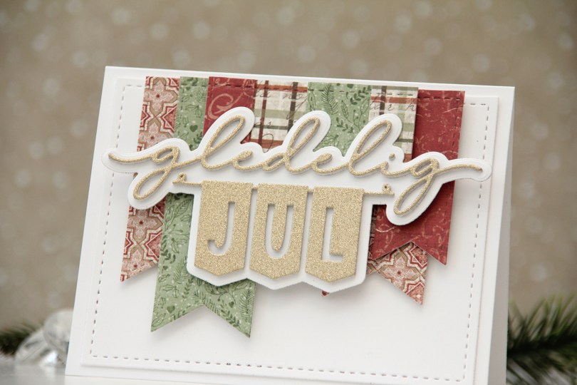
 I rummaged through my scraps of patterned paper and found these from Maja Design. Their patterned papers coordinate really well, even across collections years apart. In fact, I’ve used three different collections on this card. The Happy Christmas collection from 2021, the Vintage Winter collection from 2011 and the Gammaldags Jul collection, which is even older, but I’m not sure what year it’s from (it was before they started printing the year on the strips at the bottom of their patterned papers). I used Die 240 from Kort & Godt to cut the patterned paper. This ia a die set with these fish tail banners of different sizes. I then arranged them how I wanted them and die cut them all at once using a stitched rectangle die (Die 182 from Kort & Godt) to give them all that faux stitch line at the top. I used the same rectangle die to cut a piece of white cardstock which I adhered to my card base with another layer behind it for a tiny bit of dimension.
 I mounted the banners in layers using foam tape, and die cut the sentiment from gold glitter cardstock. I stacked a few white ones behind it for dimension (I think I used four layers in addition to the gold glitter cardstock) and also die cut the shadow from white. I added dimension behind it and adhered it on top of the banners to finish the card.
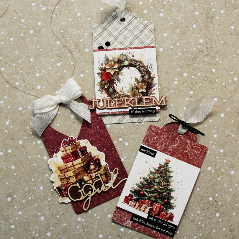
 Kort & Godt just released image sheet with a Christmas theme. There are 11 different image sheets to choose from, and somehow, I started with one of the red ones. I don’t know how that happened when there are gorgeous blue and green ones to choose from, but I don’t always do things that make sense.
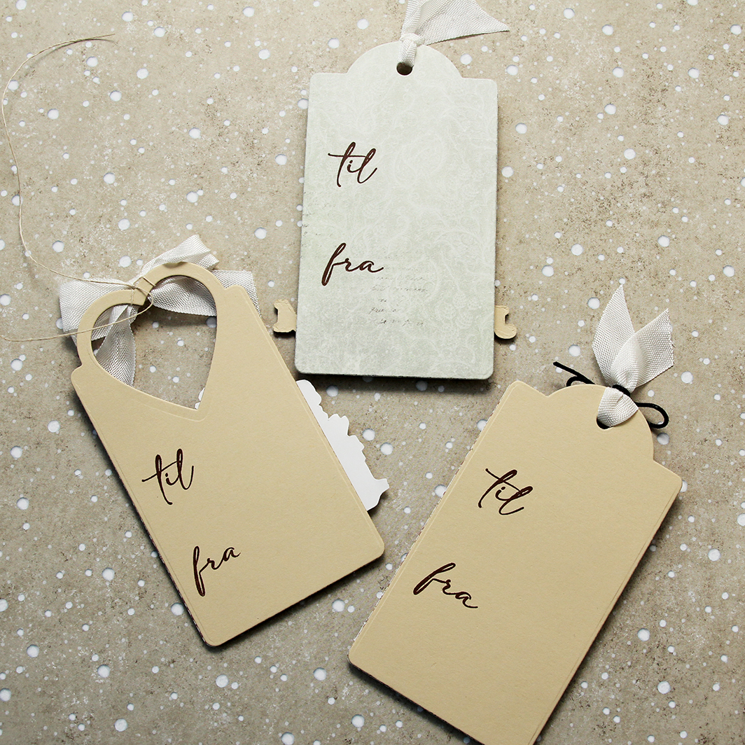 I stamped til/fra on the back of each of the tags using Dark Chocolate ink from Papertrey Ink. The stamps are from M-466.
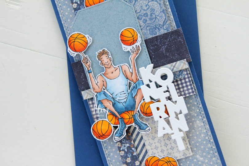
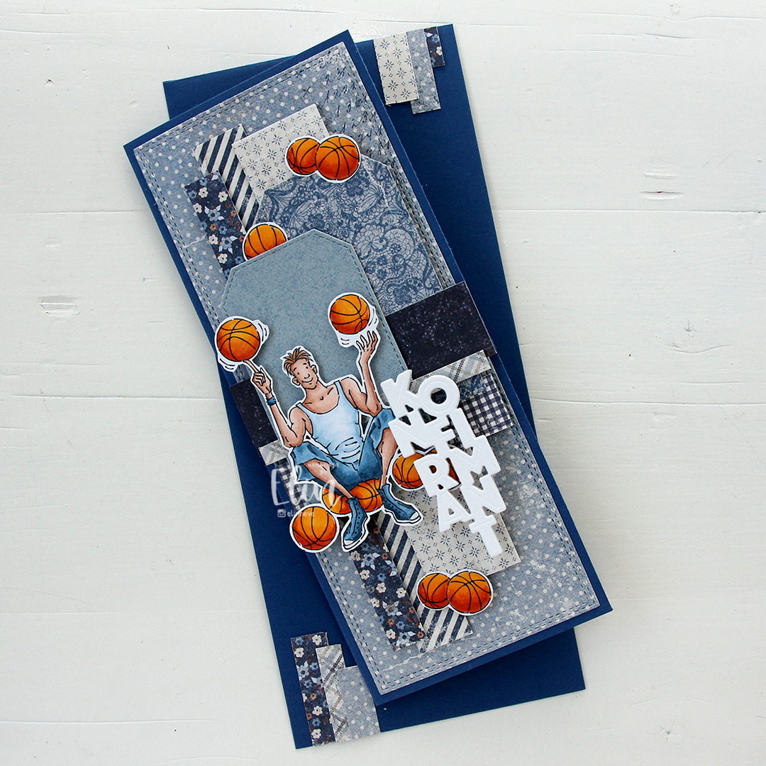 I made a slimline card this time. I created a background from blue scraps from several collections from Maja Design – Denim & Friends, Denim & Girls, Fika and Vintage Autumn Basics are all represented. One of the things I like about the Maja Design patterned paper is that papers match across collections. They’re also made from really good heavyweight paper, which is another tick in the pro column for me. I used the Slimline Double Stitched Rectangle STAX die set from My Favorite Things to create the panel in the back and also the Stitched Traditional Tag STAX die set, also from MFT, to create the tags.
 I added the image on top of one of the tags and scattered a few more basketballs around to work as embellishments. The orange really stands out against the blue background. To finish off I die cut the Konfirmant 5 die from Papirdesign six times from white cardstock and stacked them for a dimensional look. I adhered it on top of the image, and it floats above the card further down.
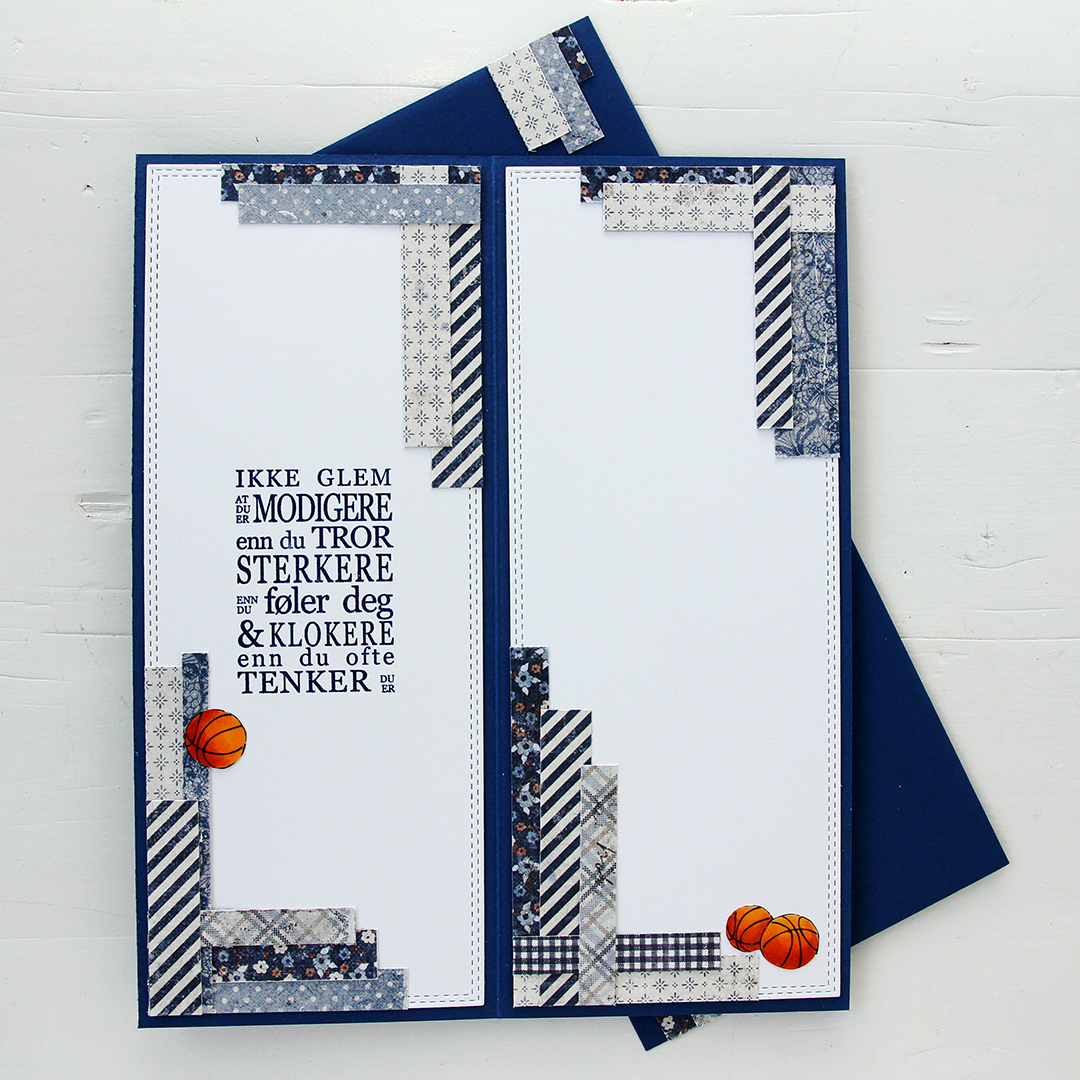 Whenever I make cards to order, I always decorate the inside too. I used the largest slimline double stitched rectangle die to create the white panels on the inside, adding more strips of patterned paper to continue the look from the front of the card and also fill the pages a little. Slimline cards are large, and the added elements make it less daunting to have to come up with a message for the recipient. On one side, I stamped a sentiment from the Konf. 01 stamp set from Norsk Stempelblad using Blue Beyond ink from My Favorite Things, the right side still has plenty of room for a personal message. I also included more basketballs.
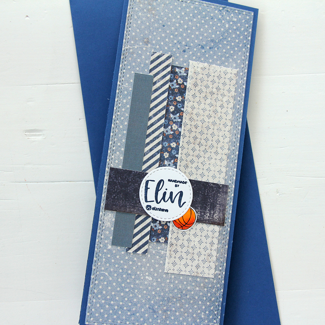 For the back of the card, I used a few strips of patterned paper I had left, die cut a white cardstock circle using the Stitched Circle STAX die set from My Favorite Things and stamped my personal stamp in the center of it using Blue Beyond ink from MFT. The card base is also from My Favorite Things, it’s made from Blueberry cardstock, and the envelope is also in that same Blueberry color.
 Limited color palette for this one.
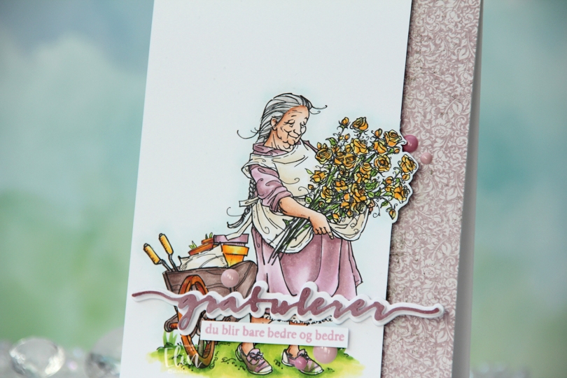
 I printed the image on X-Press It blending card and colored it with my Copics. I pulled out my RV90 series, which I used to use a lot ages ago, but haven’t really used much in recent years.
 Once my coloring was complete, I decided to cut off quite a bit on the right hand side of the panel, which meant doing some fussy cutting around the flowers. I don’t mind fussy cutting, and cutting on the border like this makes for a more dynamic design. Along the right hand side of a top fold card base, I adhered a scrap strip of patterned paper from the Vintage Romance collection from Maja Design, then popped my colored panel on the left.
 I die cut the Gratulerer 6 die from Papirdesign a few times. I die cut the shadow layer in white, then a few stacked of the word, before finishing off with a colored one. I actually colored this one with Copics on the scrap I cut off the panel. This is a neat trick if you want your colors to match, but don’t have the right cardstock color. I stamped a sentiment from the A06 stamp set from Norsk Stempelblad AS using Briar Rose ink from Concord & 9th, cut it down to a strip and adhered it below the die cut, adding a few strips of cardstock behind it for dimension. I finished off the card with a few enamel does from the Shades of Purple pack from Altenew.
 Using patterned paper from Craft Consortium along with a stamp, die and a few sentiment sticker strips from Kort & Godt, I created an envelope to match.
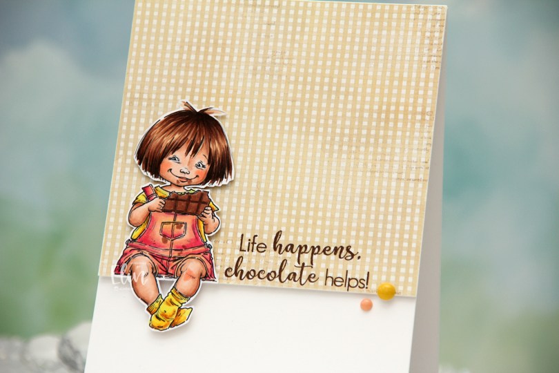
 I colored the image with Copics, fussy cut leaving a white border and created a very simple card for her to sit on. I pulled out a piece of patterned paper from the Coffee in the Arbour 6×6″ paper stack from Maja Design and cut it down to fill about 2/3 of the front of an A2 card.
 I stamped a sentiment from the Coffee and Chocolate stamp set from hÄnglar & Wings onto the bottom of the pattern using Dark Chocolate ink from Papertrey Ink. I added a few layers of cardstock behind the patterned paper for a bit of dimension, and did the same with the little girl, making sure to add a couple of extra layers behind her legs so they wouldn’t sag. I adhered her so she’s sitting right on the edge of the patterned paper and finished off the card with a couple of enamel dots from My Mind’s Eye. The yellow one is from the “Oxford Lane” pack, the peach from the “Sky’s the Limit” pack.
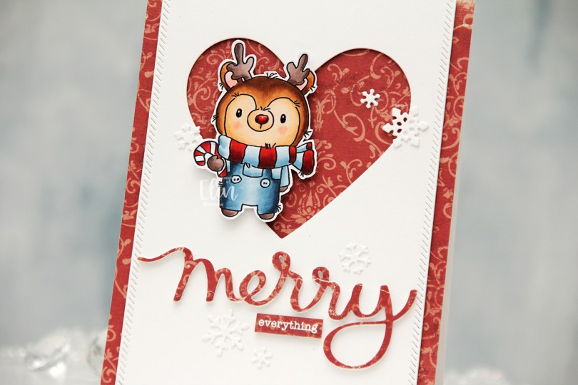
 I colored my reindeer with Copics, added black Glaze to his eyes for shine, a white dot on top with a Gelly Roll 05 once the black was dry and also a thick layer of Glossy Accents to his nose for dimension as well as shine. I fussy cut him leaving a white border and proceeded to work on the rest of my card.
 I covered a card base with the Julhälsningar sheet from the Vintage Winter collection from Maja Design. This has a little bit of pattern to it, but not so much that it’s too distracting. I created a window in a white panel using a heart die from Papirdesign, then used one of the dies in the Stitched Borders die set from Lawn Fawn to create a little bit of interest to the sides, before adhering the panel with foam tape to the center of the card front.
 Using the Merry Script die from Mama Elephant, I die cut three layers from white cardstock and one from the patterned paper to adhere on top. I stacked the four together and adhered my die cut to the card. I white heat embossed a sub sentiment from the Holiday messages stamp set from Mama Elephant onto a scrap piece of patterned paper and trimmed it down to a strip, before I added a few layers of cardstock behind it for dimension and adhered it below my die cut word.
 I mounted the reindeer on foam tape offset in the heart opening and added die cut snow flakes here and there. Some I created with the Snowflake Confetti Fancy die from Hero Arts, some are made with the Stitched Let It Snow Circle Frame die set from Memory Box, which includes a die that cuts three individual snowflakes (which is what I used).
 This card has a lot of texture and dimension, and the shine on Rudolph’s nose is the perfect detail to draw attention to him!