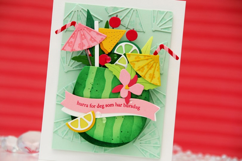
Hi, crafty friends! Two weeks ago, I was a camper in Concord & 9th’s summer camp, which is a virtual event they hold every year. If you’ve never participated, I highly recommend it, it’s so much fun! There are six awesome instructors teaching one class each, and the products the C9 design team comes up with are equally amazing, you get a lot of bang for your buck. It’s hard to pick a favorite bundle from the camp kit, but the Summer Sips bundle is the one I’ve had time to play with after camp, and I have a fun card to share today featuring that entire bundle (die set, stamp set and stencil set for this particular one).
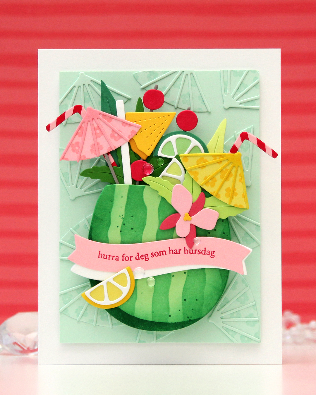 I needed a birthday card for my niece’s 16th birthday. She’s a lover of tropical fruits, and this was the perfect set to use for her birthday card. I die cut the watermelon from Vintage Jadeite cardstock from Papertrey Ink and used the stencil set to in blend the stripes on the watermelon rind using Clover ink from Concord & 9th. I stamped the spots in the coordinating stamp set using the same color. I die cut a few extra watermelons from Vintage Jadeite. I knew I was going to pop up my watermelon on an action wobble (I actually ended up using two wobbles), so it needed to be sturdy.
All the dies and stamps (except for the sentiment stamp I used) are in the Summer Sips bundle from camp. For the background umbrellas, I stamped the flowers from the stamp set in VersaMark ink onto the die cuts, which are die cut from Mint cardstock from Spellbinders. I wanted a tone on tone look in the background, and this worked perfectly. For the yellow umbrella, I stamped with Memento Dandelion ink onto a Starfruit die cut, and for the pink, I used Pink Lemonade ink on a Pink Lemonade die cut. I also used Dandelion ink directly on the caning on the yellow umbrella, as well as for the rind on the lemon at the bottom left. The stripes on the straws are stamped in Berry Kiss ink on Pink Lemonade cardstock.
I used colored cardstock from various companies for my die cuts. The greens are Altenew Limeade, Altenew Lime, Altenew Grass Field, Papertrey Ink Vintage Jadeite, Concord & 9th Clover. The grey (there’s only a little bit visible) is Concord & 9th Cobblestone, the light pink is Concord & 9th Pink Lemonade, the darker pink on the orchid is Concord & 9th Honeysuckle, the darkest pink is Concord & 9th Berry Kiss. The yellows are Concord & 9th Starfruit (umbrella and lemon wedgde), Papertrey Ink Bright Buttercup (pineapple and flower center on the orchid) and Spellbinders Tuscan (pineapple rind). I stamped the sentiment from the A06 stamp set from Norsk Stempelblad AS using Berry Kiss ink from Concord & 9th. The stamp itself is a straight line, but I manipulated it in my Misti to curve along the banner die cut. I put a few layers of cardstock behind the yellow umbrella and the orchid for a little bit of lift, and also used three white banner die cuts to give a little lift to the pink banner. To finish off I used a few Concord & 9th dew drops. This card is super dimensional, even when you push down the action wobble springs, it’s about 1/2″ thick.
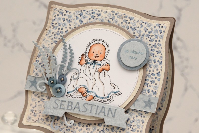
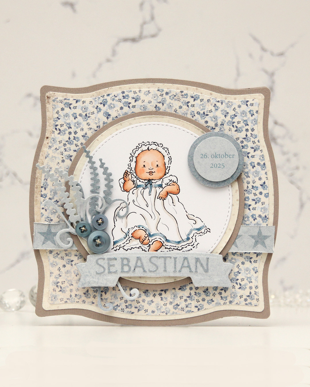 I colored the image and die cut it using one of the circle dies in the Stitched Circle STAX die set from My Favorite Things. I also die cut circles from grey cardstock and patterned paper from the Denim & Friends collection from Maja Design using the Nesting Circles die set from Lifestyle Crafts. The shape of the card is created with the Nesting Frames #8 die set from Lifestyle Crafts.
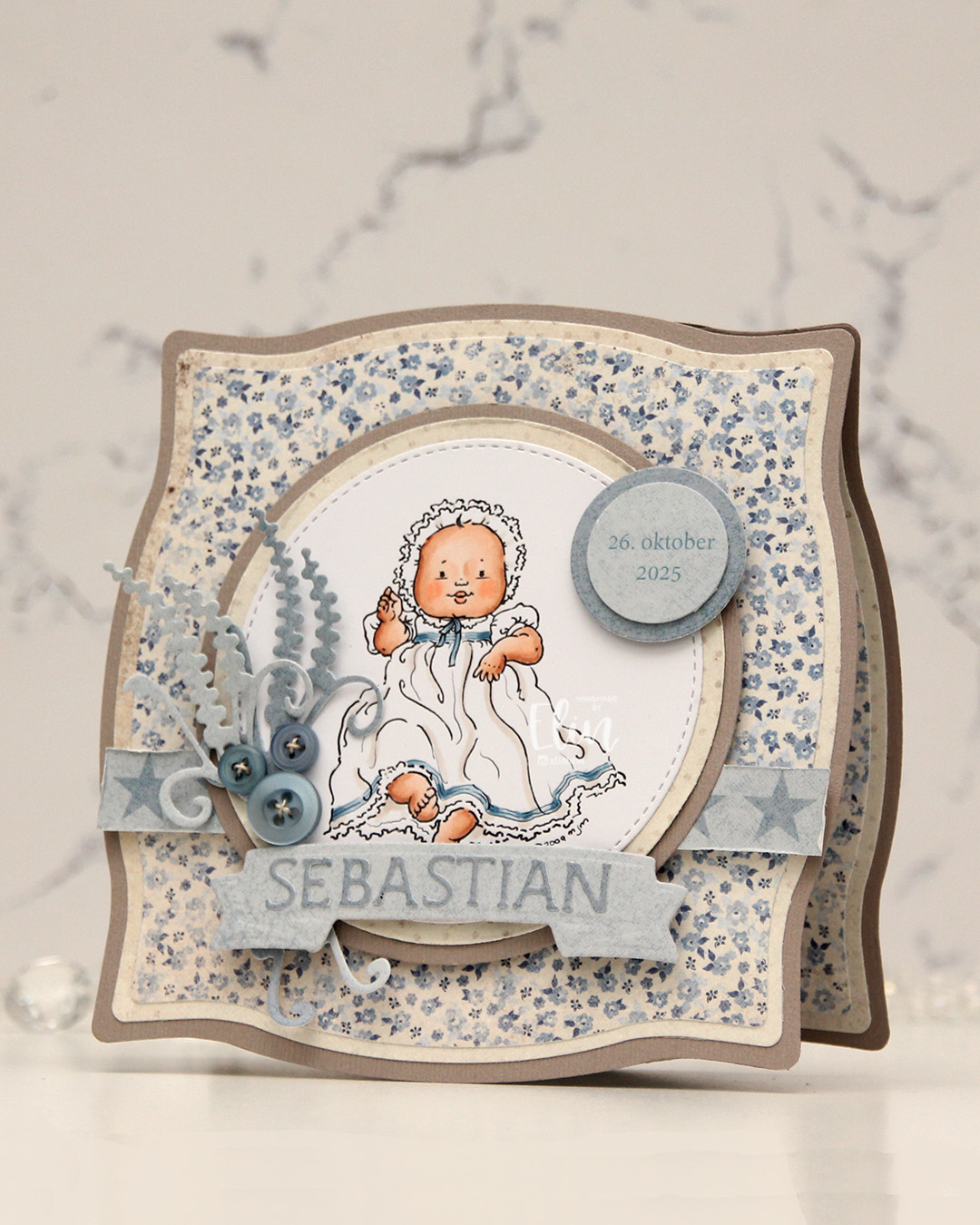 I popped some pieces up using foam tape, die cut the letters for the name using an alphabet die set from Scrapmagasinet and adhered the letters to a banner I die cut with an old die from Spellbinders. I used an old die from Marianne Design for the spriggy things on the left, and used some old Blueberry Sky buttons from Papertrey Ink to embellish.
 Very limited color palette for this one.
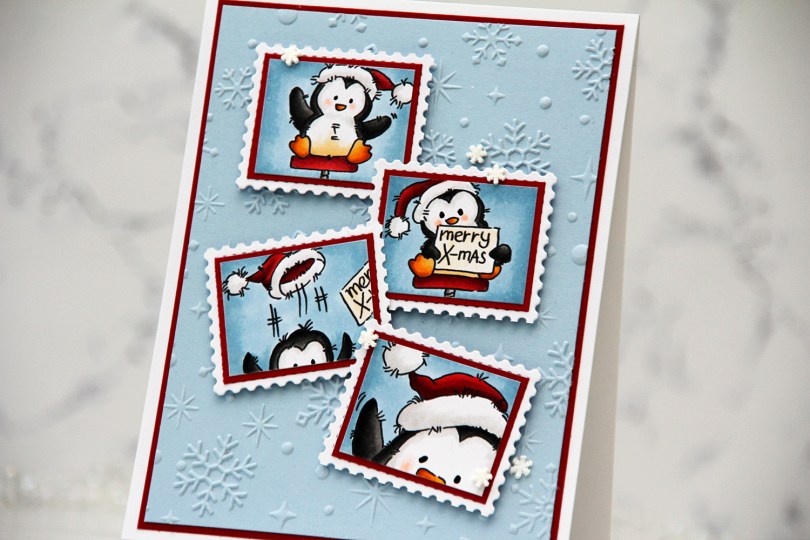
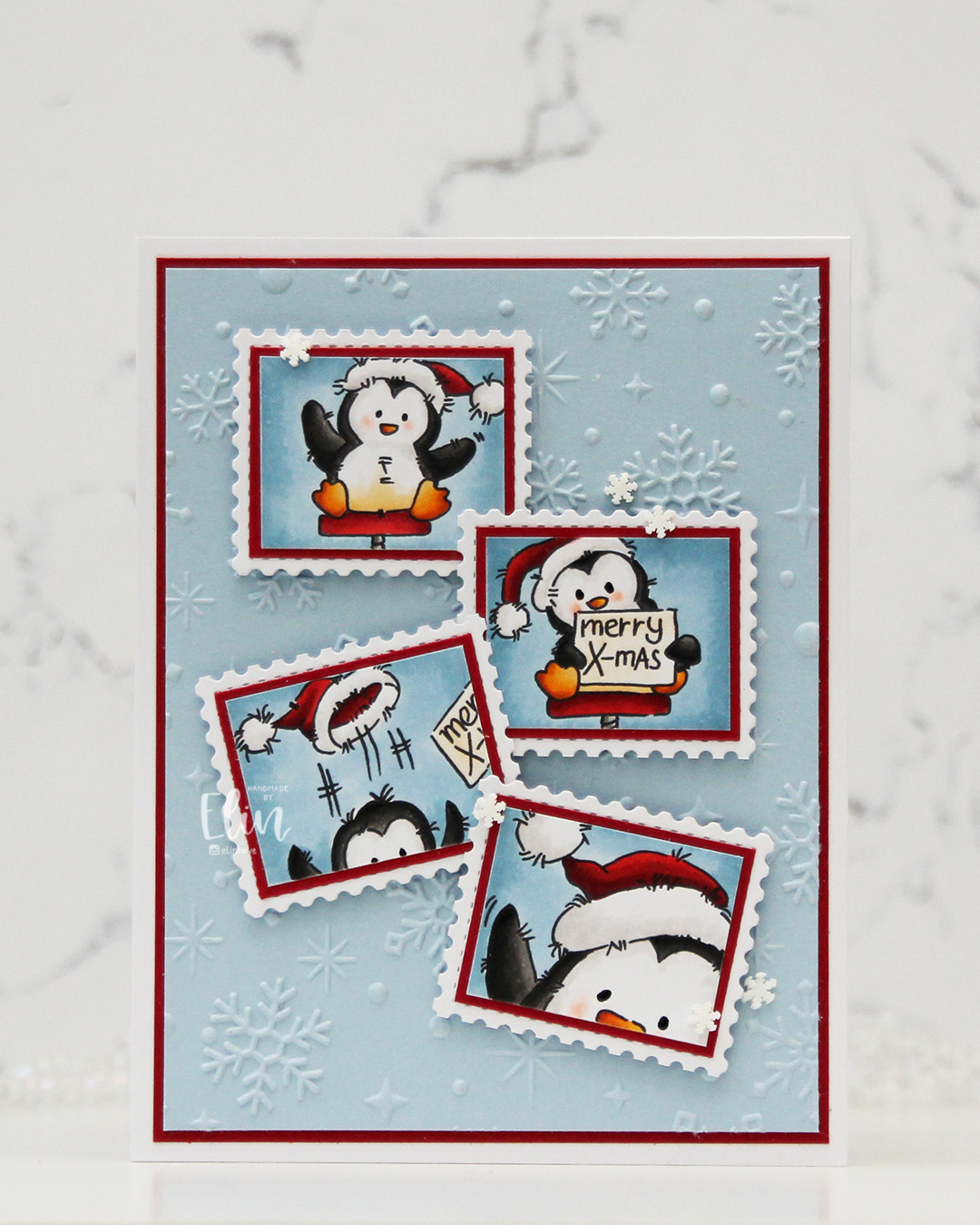 I started by coloring the images with Copics. They each come with a frame, but I wanted this postage stamp look, so I cut my images on the inside of the frames.
 I wanted some interest in the background, and the Sparkling Snow embossing folder from Simon Hurley/Spellbinders is amazing! It creates proper six pointed snowflakes and gives such a cool texture, I want to use it on everything. I used it with a panel of Blue Breeze cardstock from My Favorite Things. It’s one of my favorite light blue colors, I may need to hoard it since MFT went out of business. I trimmed my panel down, matted it with a panel of Cranberry cardstock from Concord & 9th and adhered both to a top fold white card base I covered with an A2 panel of X-Press It blending card, just so that my whites would match.
 I adhered each of my colored images onto Cranberry cardstock for a nice framed look, then adhered my matted images to postage stamps I die cut with the Postage Collage die from Waffle Flower.
 I mounted each of my postage stamps using foam squares, adding the first two straight before making sure the last two were wonky. I like that both the images and their placement tell a story about what happened in that photo booth, everything going perfectly at the start, followed by slight chaos. To finish off the card, I added black glaze to the eyes for some shine and a tiny bit of dimension, as well as snowdrift sprinkles from Little Things from Lucy’s Cards.
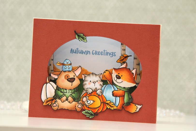
 I stamped my images (both the critters and birch tree background) on separate panels of X-Press It blending card with Copic friendly ink, colored them in and fussy cut them. Before fussy cutting the critters, I actually stamped over my initial stamping with Obsidian ink from Altenew, which gives super black lines that are extra crisp. It’s a pigment ink, though, so it needs to be stamped after the coloring. I also colored a sky and some bushes on a separate panel, where I stamped my sentiment in Blueberry Sky ink from Papertrey Ink. I cut an oval into a panel of Americana cardstock from Papertrey Ink using an old oval die from Spellbinders (Petite Ovals Large) and then created two pieces of accordion folds in the same color cardstock. I glued my background with bushes and sky to the back of the accordion pieces, the birch trees in the center, and the panel with the oval window in front. I mounted my critters using foam tape and used black glaze pen for the eyes. I then adhered my accordion to a top fold card base I created from Rustic Cream cardstock from Papertrey Ink.
 I used a lot of Copics for this one. I even used B20, which is a color I’ve created myself using an empty marker, B21 reinker and blender reinker.
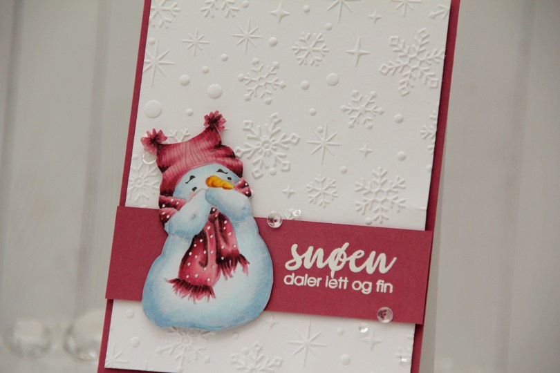
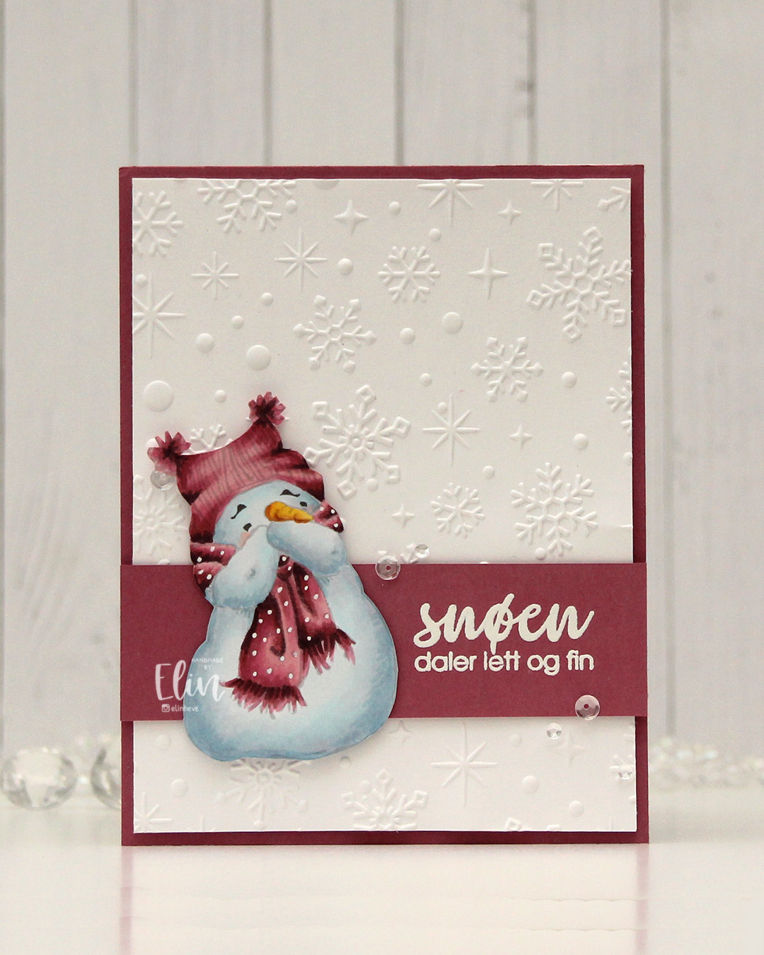 I went for a no line version this time. This is probably my most used image from Mo, and I love how easy he is to color. I chose a pink color combo that I really like, and I think this could work both as a holiday card and as a general winter card. I added the dots back into his scarf using an extra fine white Sharpie, and then fussy cut him. He’s pretty easy to fussy cut, too. I used the Sparkling snow embossing folder from Simon Hurley (Spellbinders) on the background for some texture. I love the detail this embossing folder gives, and they’re proper six pointed snowflakes and not the weird 8 pointed ones that some companies make. Real snowflakes never have eight points, they always come in multiples of six. It has to do with the way water molecules are formed and then bind together. Anyway, it’s a great embossing folder and it adds interest to an otherwise plain background.
 I trimmed my embossed panel slightly, added a couple of layers behind it and adhered it to a card base covered with a panel of Autumn Rose cardstock from Papertrey Ink. On a separate piece of Autumn Rose cardstock, I stamped a sentiment from the Snøstorm stamp set from byCino using VersaMark ink, before sprinkling on super fine detail embossing powder from Ranger and melting it until it was smooth. I cut my sentiment down to a wide strip, added a layer to the back of it for a little bit of dimension, then put a couple of additional layers behind the snowman before gluing him down and finishing the card with a few sequins from the Assorted Moonshine mix from Simon Says Stamp.
 Simple color palette for this one.
 I started with a panel of white cardstock (Stamper’s Select White from Papertrey Ink) that I cut down slightly from a quarter sheet. I used a couple of dies from Papirdesign to do a dry emboss on my cardstock. I covered a white top fold card base with a quarter sheet of Harbor cardstock from Concord & 9th and layered my white dry embossed panel on top.
 I die cut the banner pieces in the Joyful Season die set from Concord & 9th from Harbor and Powder cardstock, before stamping a sentiment from the Merry Greetings builder stamp set from Kristina Werner onto the banner pieces using Harbor ink. I assembled the banner and added a few layers of cardstock behind it for dimension. I die cut a tree and a snowflake from the same dies that I used for my dry emboss background, both from Powder cardstock. I stacked two of each and glued them on top of its actual position in the embossed background, before finishing off with Opal gems from Spellbinders. Very simple.
 I printed my image on X-Press It blending card and colored it with Copics. I chose a soft blue green for the balloon itself, and vibrant colors for the florals to make them pop. Using the largest die in the Blueprints 27 die set from My Favorite Things, I turned my image into a panel with a nice scalloped border with faux stitching, put lots of foam tape on the back and mounted it to a card base I covered with a quarter sheet of Wildberry cardstock from Concord & 9th.
 I die cut hello from the Blooming Delight die set from Altenew four times from white cardstock and once from Wildberry cardstock, stacked all the layers together and adhered my sentiment, before finishing with a few opal gems from Spellbinders.
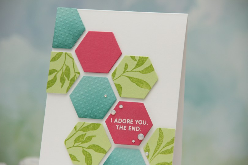


 After adhering everything to my card base, I cropped the card down slightly. It matched my design better, so this card is 4 x 5 3/8″. I added
  The dimension makes it look like these hexagons are floating on the front of the card, and the pink one with the sentiment is floating a bit more than the rest.
 I colored my emu and koala with Copics, and fussy cut the image leaving a white trim. Cutting around that string of lights was tricky, but worth it.
 Onto a piece of white cardstock, I stamped the Christmas Lights Bold Prints stamp from Hero Arts using VersaMark ink, and poured on Iridescent Sparkle embossing powder from Judikins, which I then heat embossed. It adds a sparkly, but subtle shine to the background and I love that the lights are just like the colored lights on the emu.
 I cut off a strip of the panel on each side and die cut a star in the top center using the Stars Five die set from Spellbinders. I mounted the panel on foam tape and added it to a card base I’d covered with the
  I mounted the emu in the star opening, making sure to adhere the delicate lights directly to the white panel, while the emu itself is backed with foam tape. I stamped an white heat embossed a sentiment from the Christmas Wishes stamp set from My Favorite Things onto a scrap piece of my gum leaves paper, before using the coordinating die to cut it out. I backed it with four white die cuts and adhered it underneath the emu’s feet and dangling lights, before finishing off with sequins and star confetti from the Starry Night mix from Little Things from Lucy’s Cards.
 You can see a little more of the sparkle in this photo.
 The emu and the koala are very muted, so I chose bright colors for the lights.

 This image was so quick and easy to color up. It’s a digital stamp from Lili of the Valley, entitled
  I colored the image with Copics, trimmed a little bit off the edges of my panel and adhered it to a card base I created from Berry Sorbet cardstock from Papertrey Ink. I used the same color cardstock to die cut the words for you using a die in the Sweet Sentiments die set from Altenew. I stacked two on top of each other to give a little bit of dimension, without it being too much, before finishing the card with a gems from a pack of Color Essentials gems (in opal) from Spellbinders. I also added a dot of black Glaze pen to the eye of the little bee for a little bit of shine.