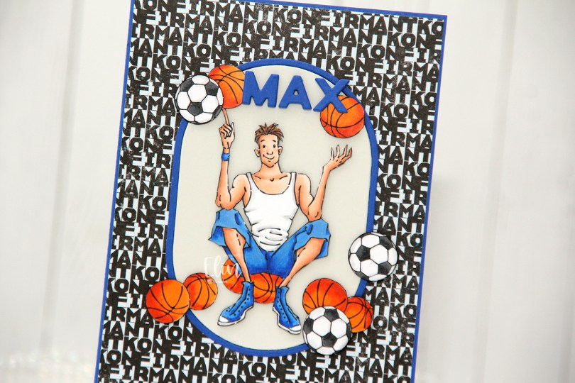
Hi, crafty friends! A few weeks ago, I received an order for a confirmation card for a boy who loves basketball. He also likes football, but basketball was more important. I dug through my digital stamps and decided to use Basketball Teen from Mo Manning, as well as the actual football from Soccer Boy, also from Mo Manning. I also printed a few extras of the basketball and the football to use as embellishments for the card.
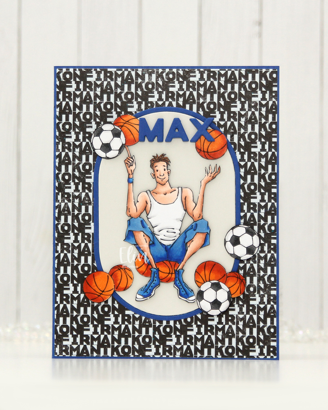 I colored the basketball teen, the extra basketballs and the footballs with Copics and fussy cut them all. I made an A2 card base using Capri cardstock from Concord & 9th and covered most of it with the Lovende patterned paper from the Ungdommelig collection from Papirdesign. Putting the teen directly on the patterned paper wouldn’t work as it was a very busy pattern, but by using the A2 Oval Basics die set from Kristina Werner, I was able to create a grounding element for my focal point. The die cuts out the oval and a frame in one go, so I die cut it once from Capri cardstock, and once from Soft Stone cardstock from Papertrey Ink. I used the Connected Alphabet die set from My Favorite Things to die cut the letters for the kid’s name in Capri cardstock, stacking a few for dimension.
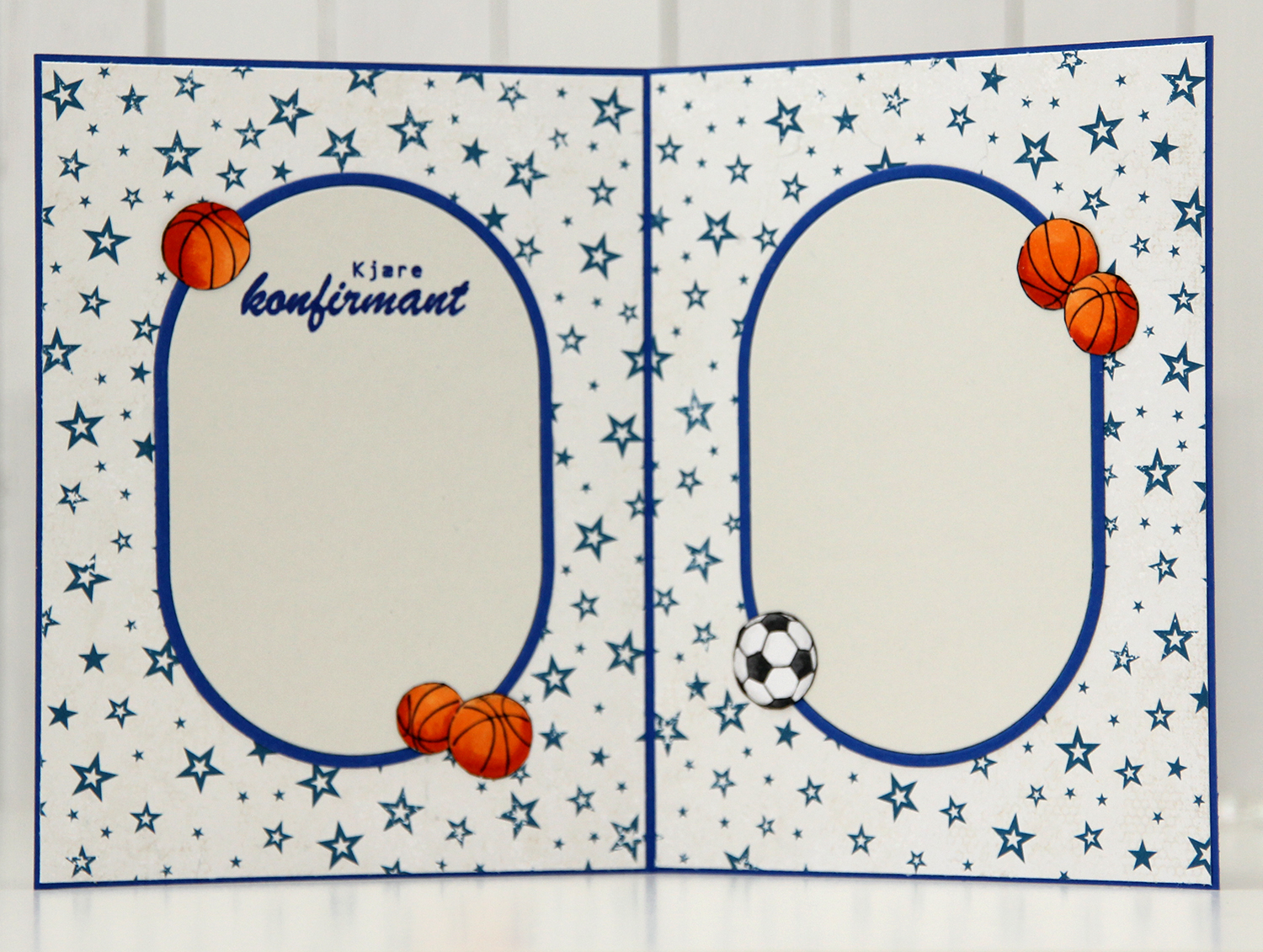 For the insides, I die cut more of the ovals, and actually used the back of that same patterned paper that I used for the front. Double sided patterned paper is awesome. I rarely use patterned paper anymore, so it was fun to bring it back for this card. I stamped a sentiment from the Konf. 02 stamp set from Norsk Stempelblad AS on the panel on the left using Capri ink from Concord & 9th and embellished the insides with a few basketballs and a football. (I know the photo is a bit blurry, but it was the only one I took of the inside and I didn’t realize until I’d given the card to the lady who ordered it).
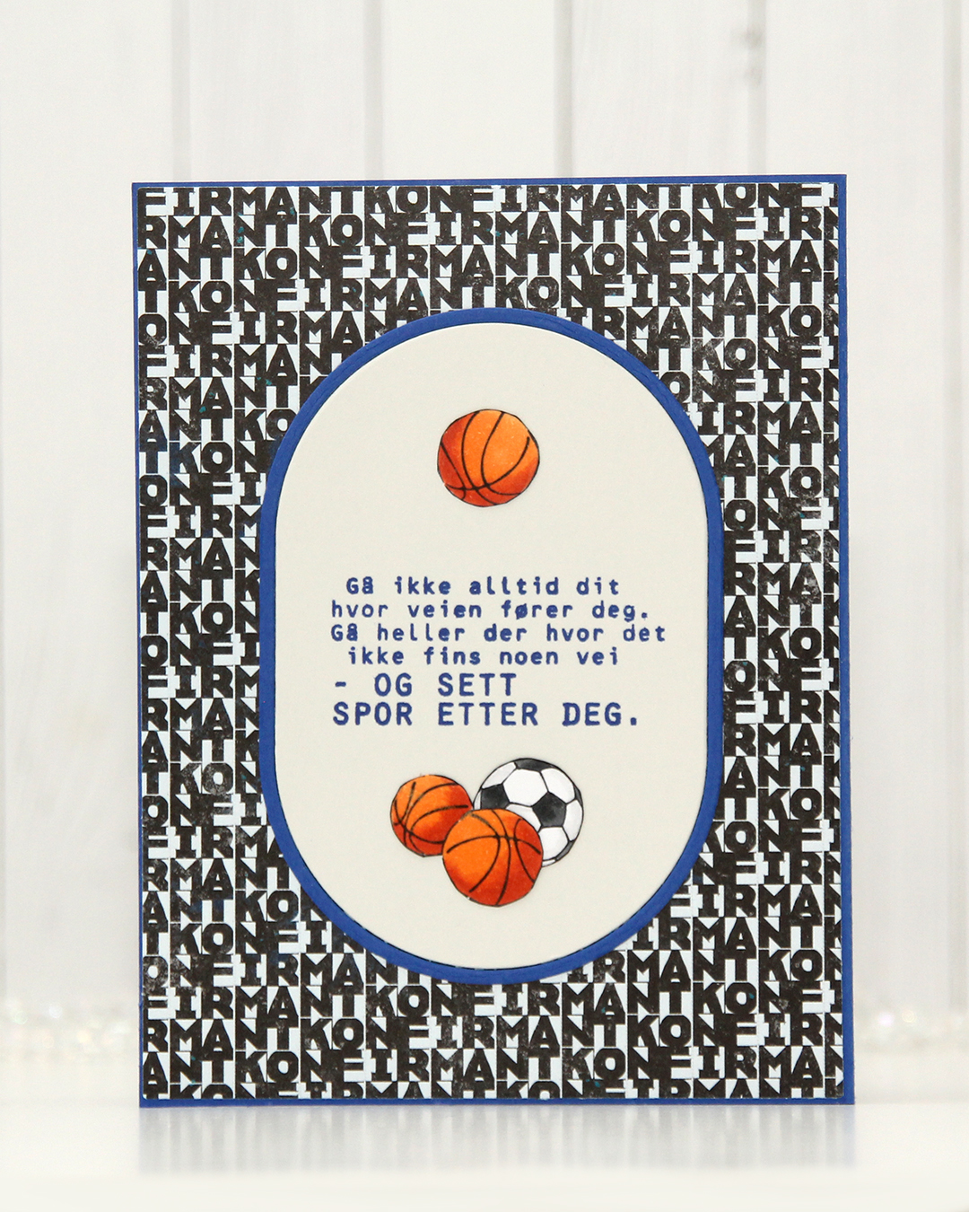 Same setup on the back of the card. Another sentiment stamped in Capri ink, also from the Konf. 02 stamp set.
 With such a simple image, there weren’t a lot of colors used.
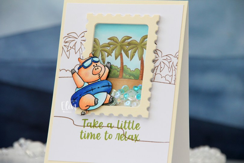
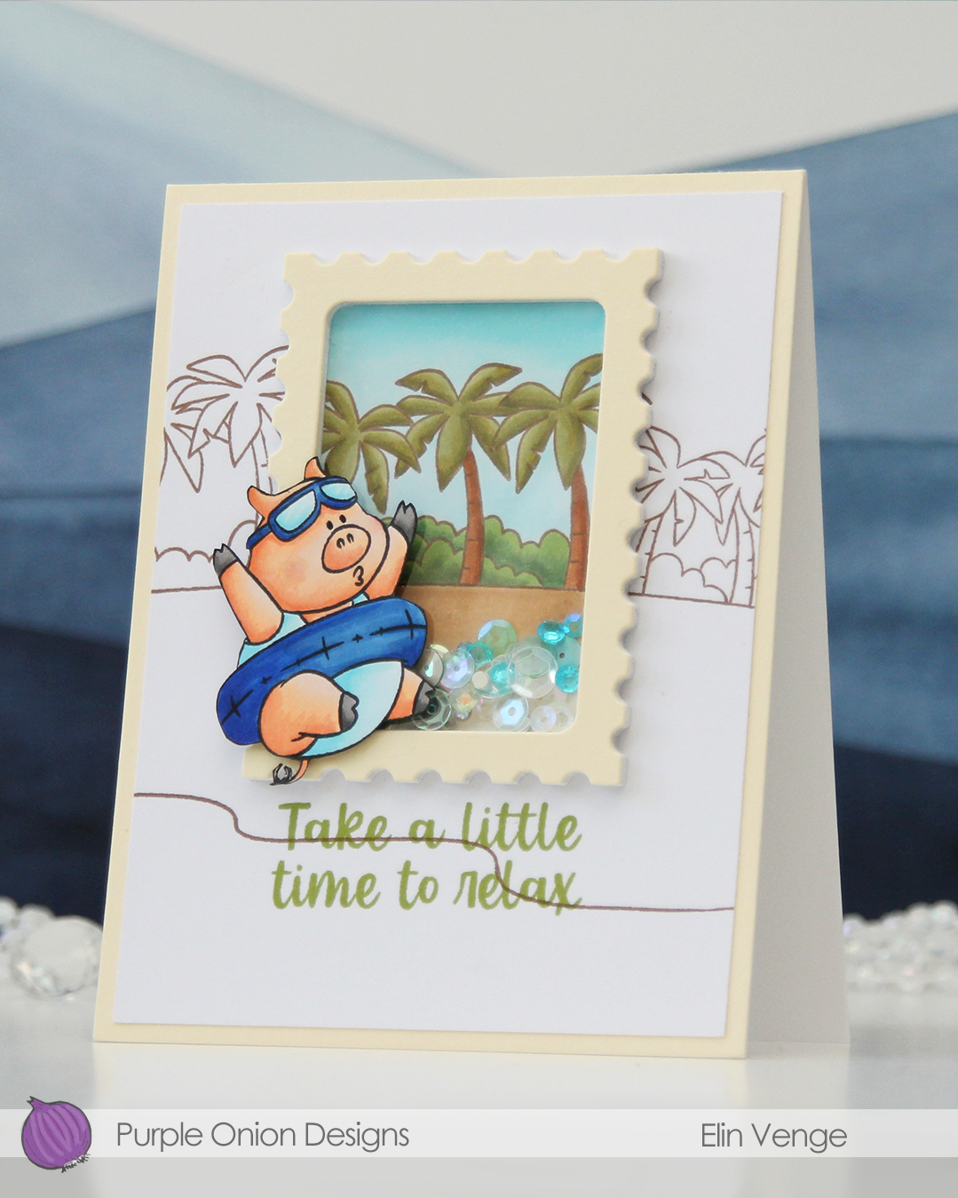
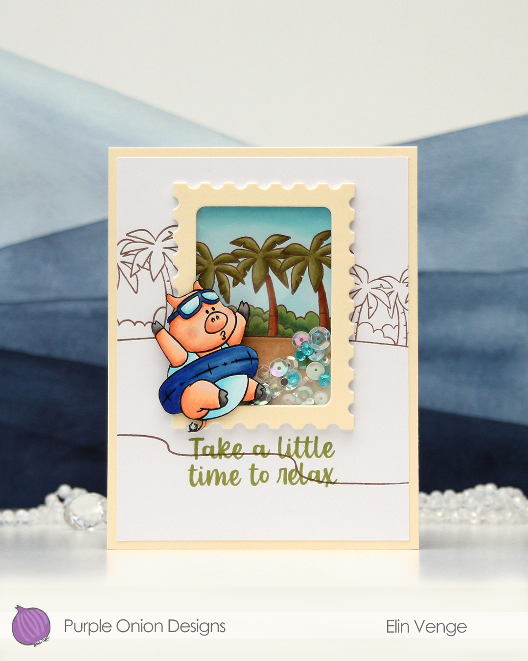 This little guy (gal, maybe?) is part of the Sunshine and Daydreams collection that released this summer from Purple Onion Designs. (S)he is half of the
  I stamped the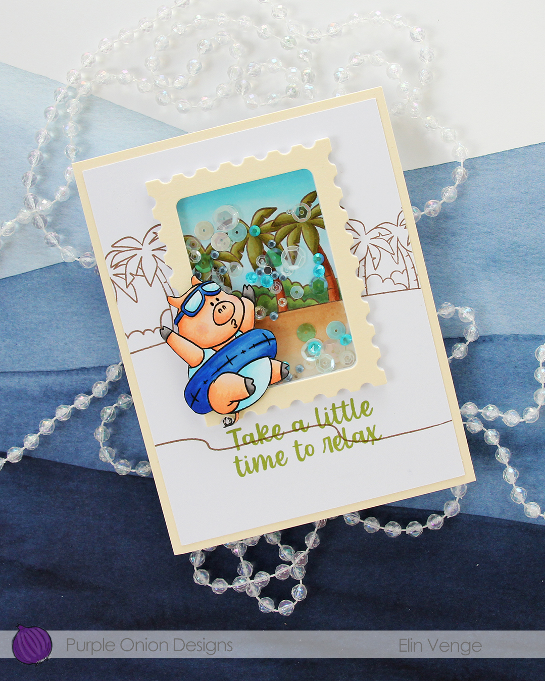
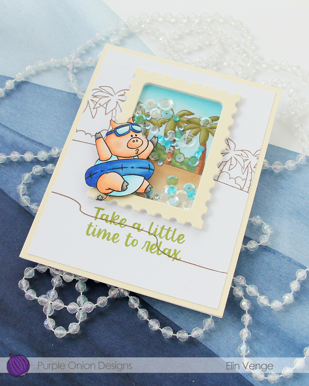 I used Avocado ink from Concord & 9th to stamp my sentiment, which is from the
 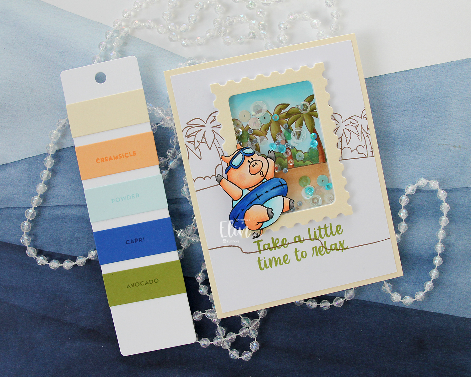 The Farmhouse color combination from Concord & 9th was my inspiration for the colors I used on this card. It’s a combo I probably wouldn’t have thought of on my own, but I quite like the end result. Give me anything blue, and I’m here for it, that Capri color definitely is a show stopper!
 I used quite a few Copics for this one, in spite of the coloring being on a somewhat smaller portion of the card front.
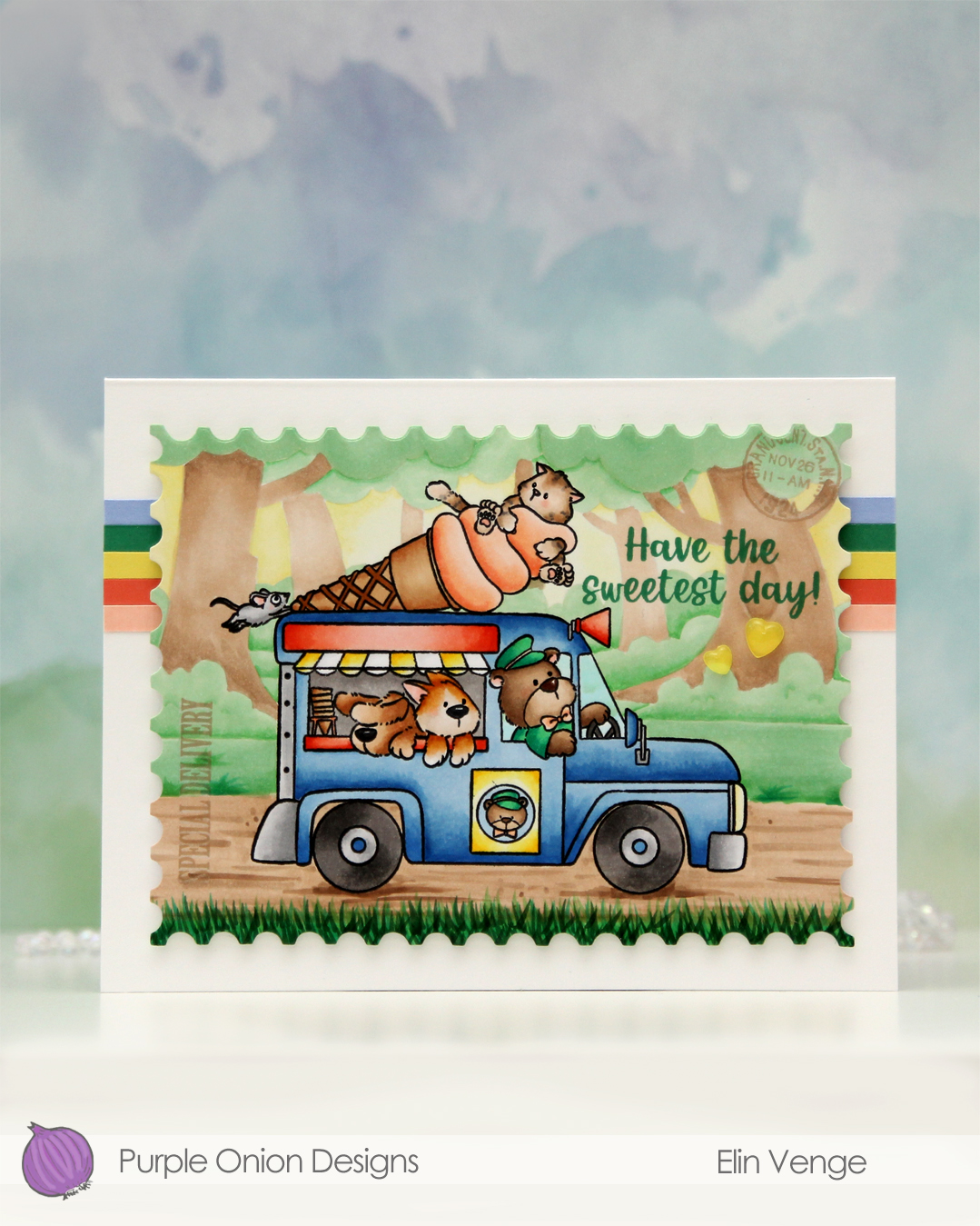 I wanted a storybook look to this, and the ice cream truck is a fairly busy image, so I decided to stamp the background in fadeout ink from Inkon3 for a no line look.
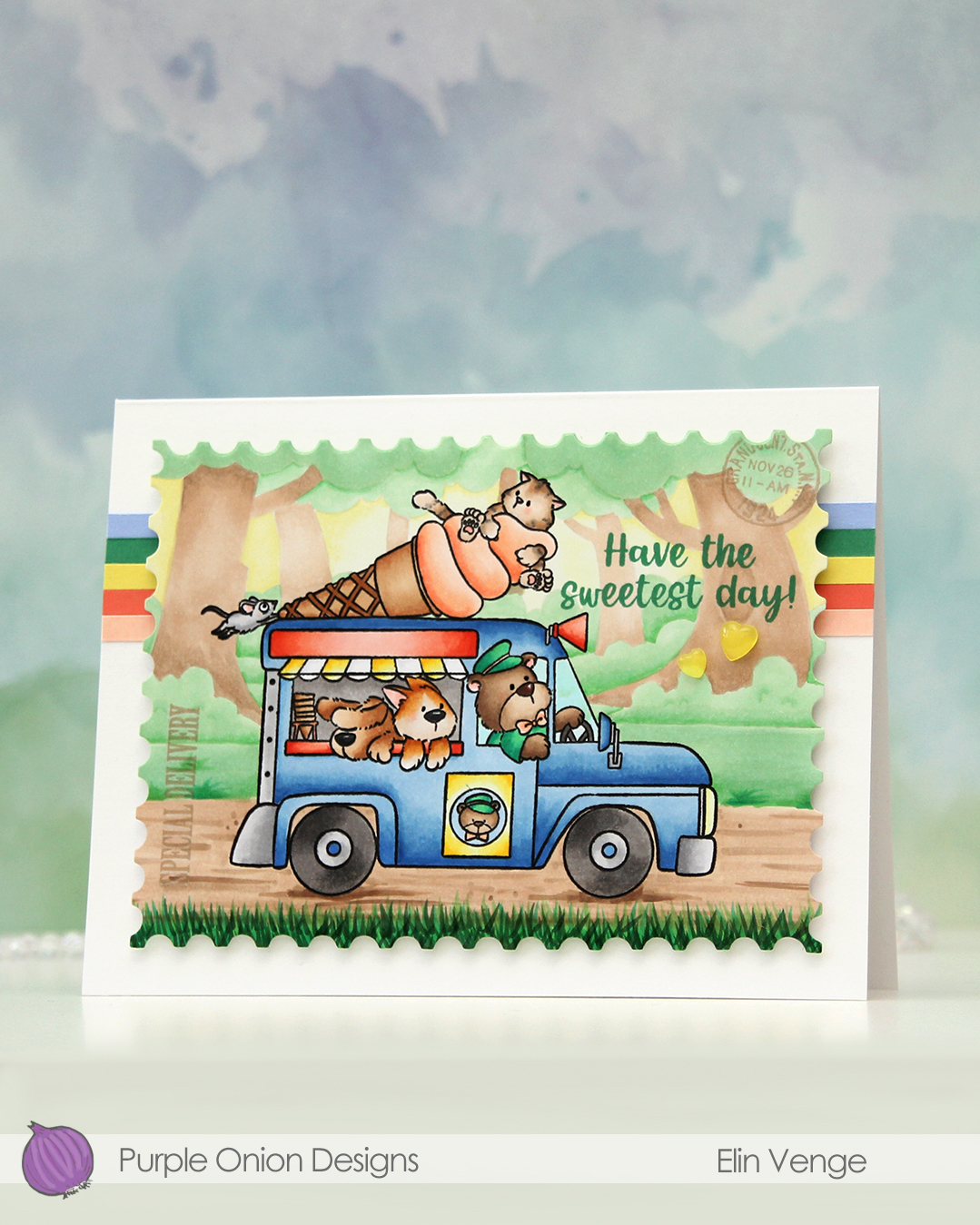 I colored my scene with Copics, and when the coloring was complete, I put the panel back in my Misti and stamped the truck again, this time in Obsidian ink from Altenew. It gives such crisp, dark black lines, but it’s not Copic friendly, so I need to do this step once the coloring is complete. I tend to hold my breath hoping I don’t offset the stamping, as I don’t want to have to start all over again. This time it worked. I stamped SPECIAL DELIVERY and the postmark stamp using Classic Kraft ink from Papertrey Ink. The stamps are from the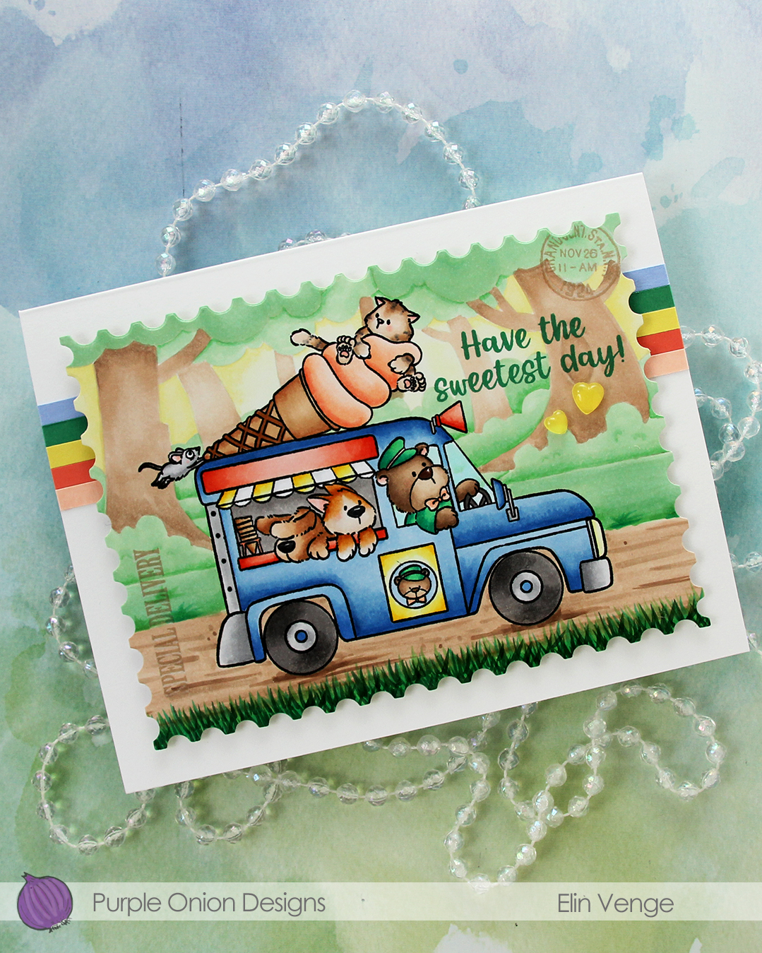
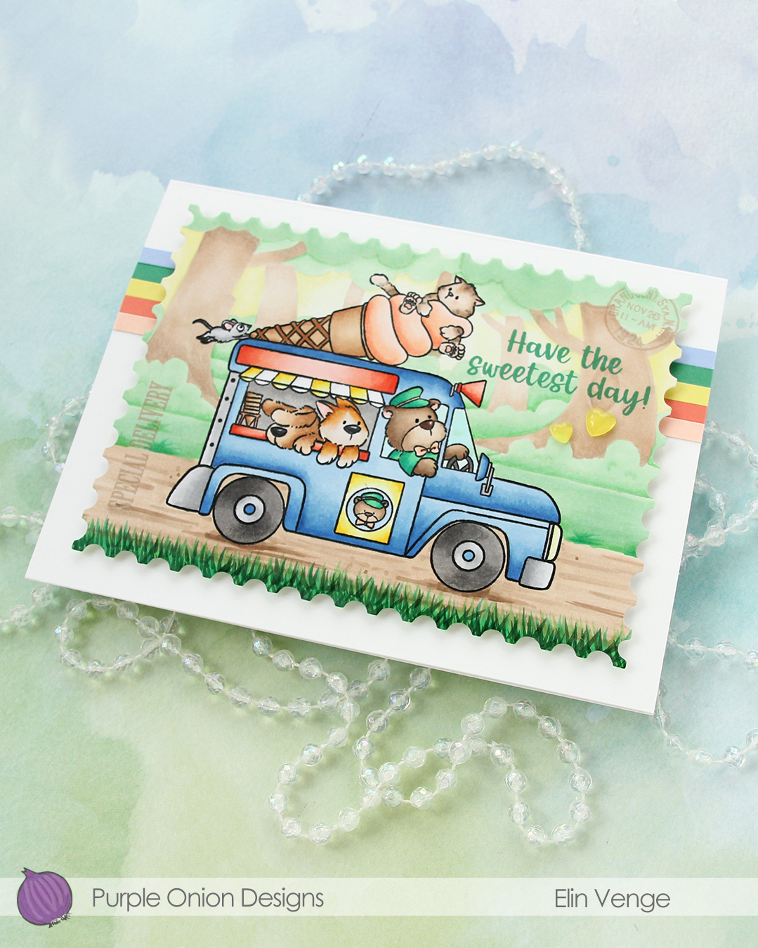 I adhered strips of solid color cardstock towards the top of my 6 1/2 x 5″ card base, before mounting my huge postage stamp scene in the center with foam tape. The colors I used are Nectar, Sorbet, Starfruit, Clover and Bluebell, all from Concord & 9th.
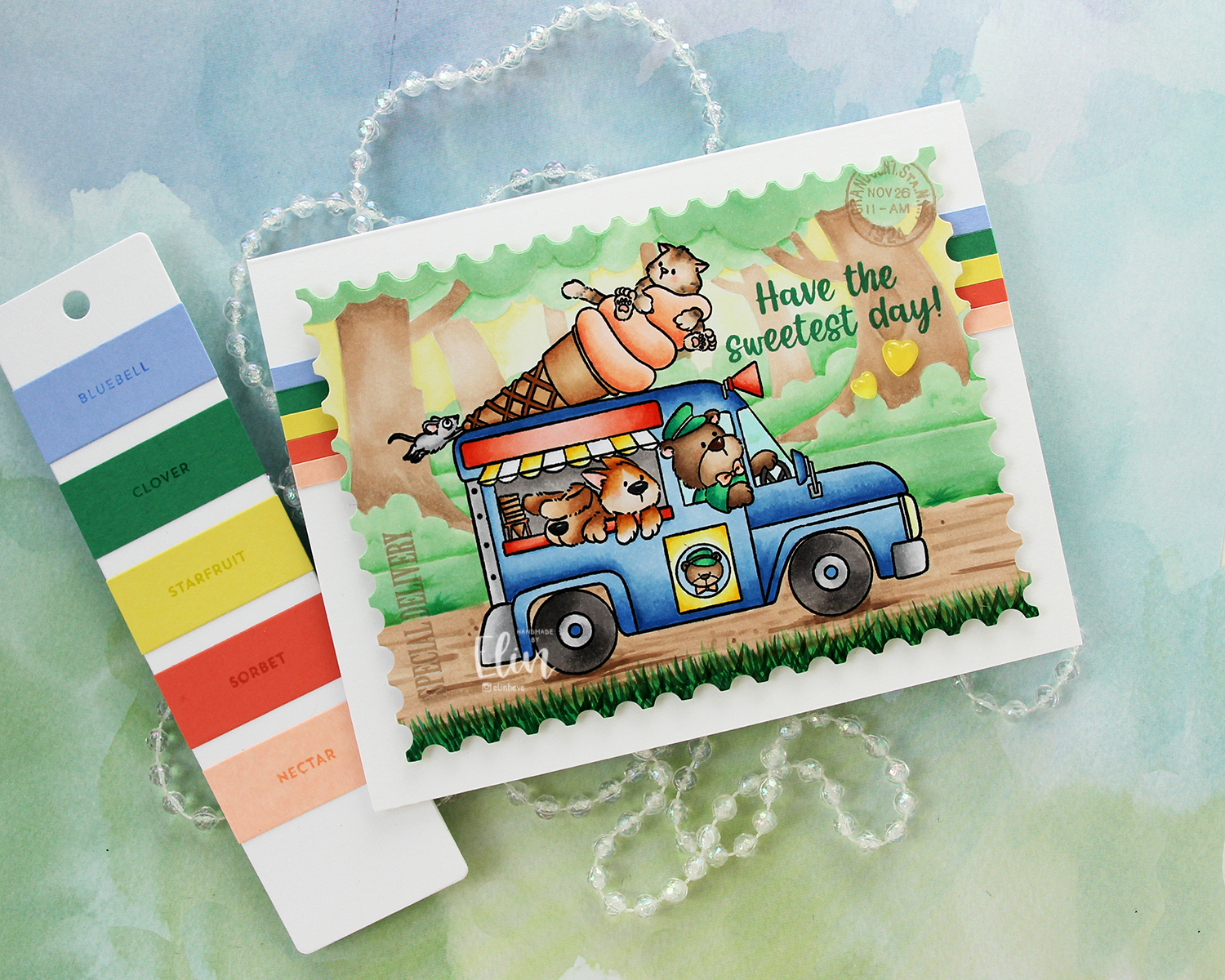 To finish off the card I added a couple of yellow hearts from the Beach Dreams Crystal collection from Little Things from Lucy’s Cards.
 I used a LOT of colors for this one. Very few colors for the background, but a lot for the truck and these cute friends!!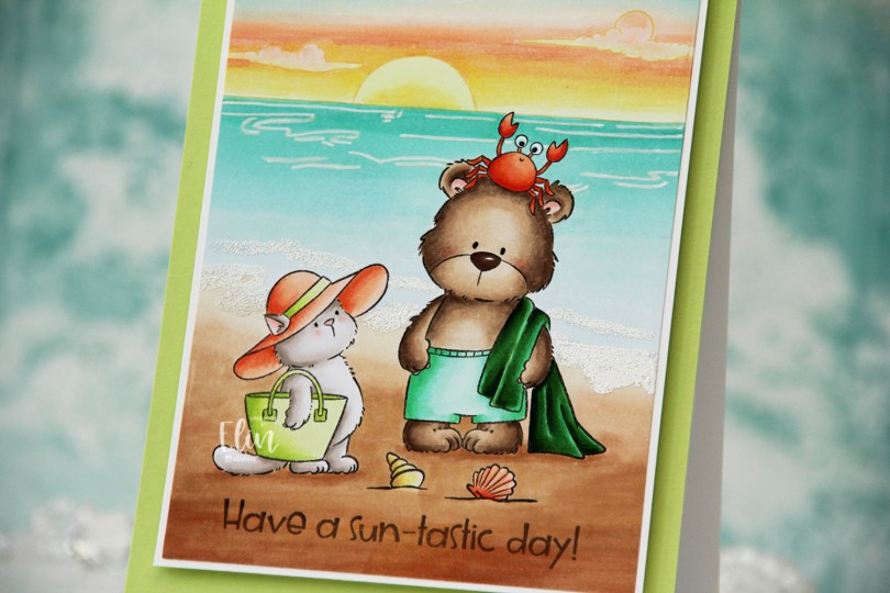
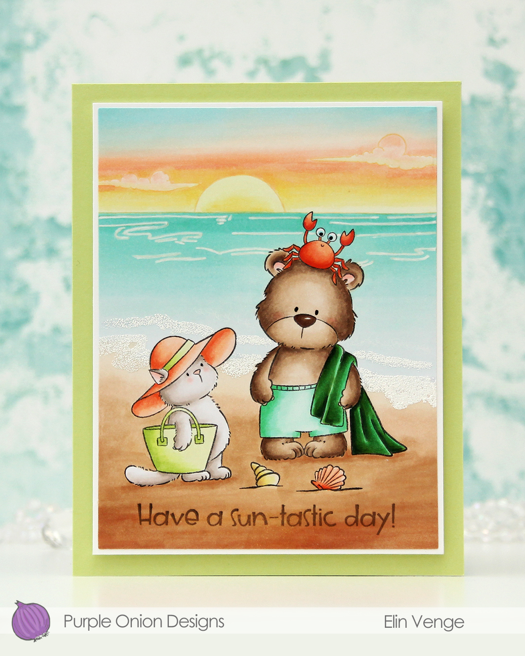 I stamped Tofu and Brownie in Extreme Black ink from My Favorite Things, placed a mask over top and stamped the Sunrise Sunset with Altenew Golden Honeycomb ink. I colored in my scene and decided to try a new twist for the sky. I don’t think I’ve ever used these particular color for a sky before, but I think it worked out well.
 I imagine they’re in a tropical location where the ocean has this very peaceful aqua color that fades into nothing as it reaches the shore. I tried to give the whole panel a dreamy vibe, and there’s not a whole lot of dark markers used. I did include a dark green towel and used more of the YR09 on the crab than I did on Tofu’s hat (believe it or not, it was used on Tofu’s hat, albeit in a very small amount). The greens play well together and work with the ocean, while the more corally color for the hat, seashell and crab play off the peach in the sunset.
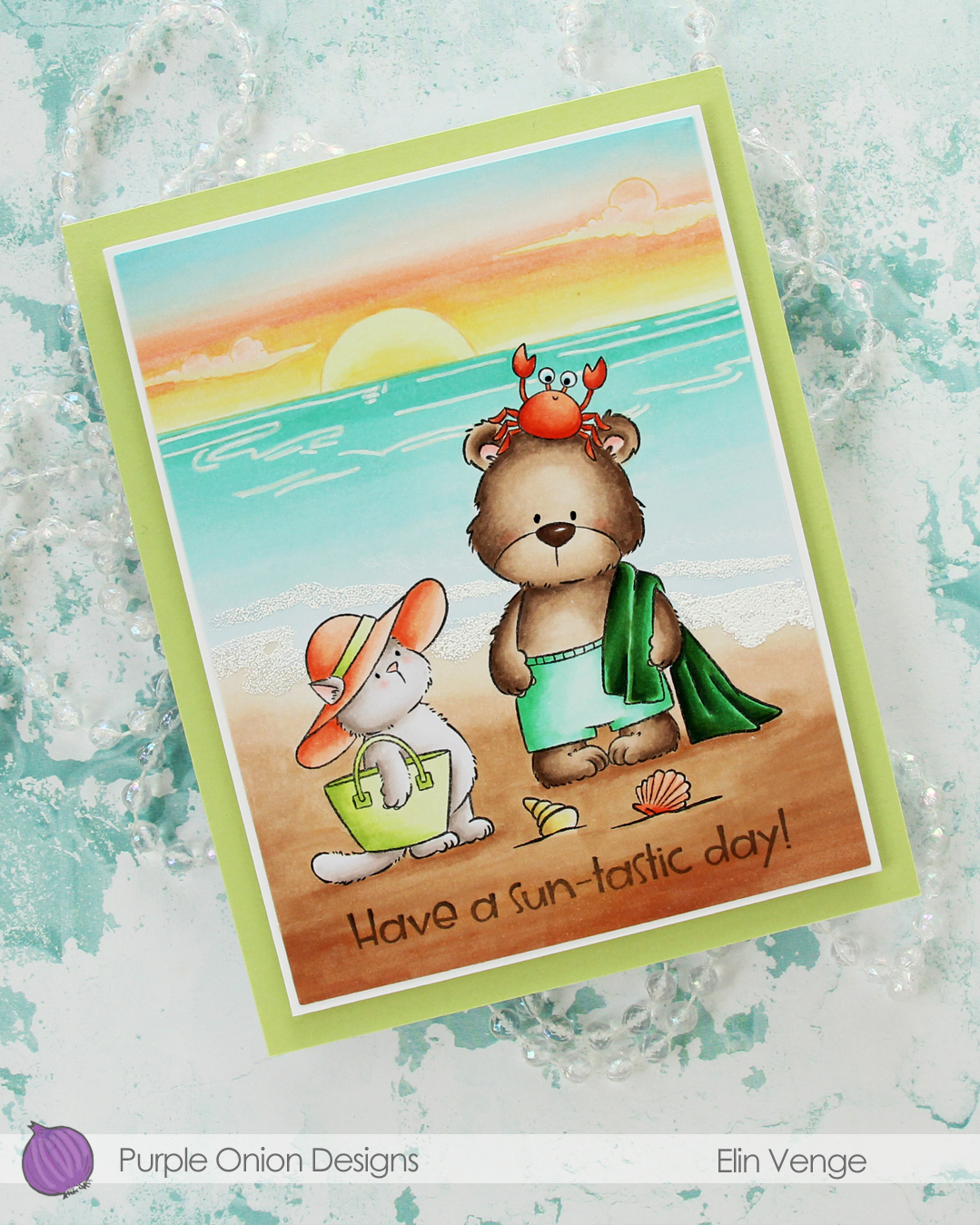 Once my image was colored, I cut my panel down using the larges die in the Additional A2 Layers die set from Waffle Flower. I stamped a
 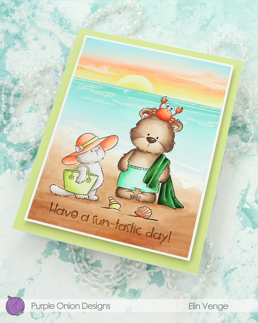 I used an extra fine point white Sharpie to add the ripples in the ocean, and used White puff embossing powder from Wow! to create the seafoam on the beach. I added a bit of black glaze pen to their eyes, and the glaze made the crab’s eyes bigger, which made him even funnier than he was originally. I adhered my colored piece to a panel of white cardstock cut to 4 1/4 x 5 1/2″, then mounted the whole thing onto a 4 3/4 x 6″ white card base covered with a panel of Sprout cardstock from Concord & 9th.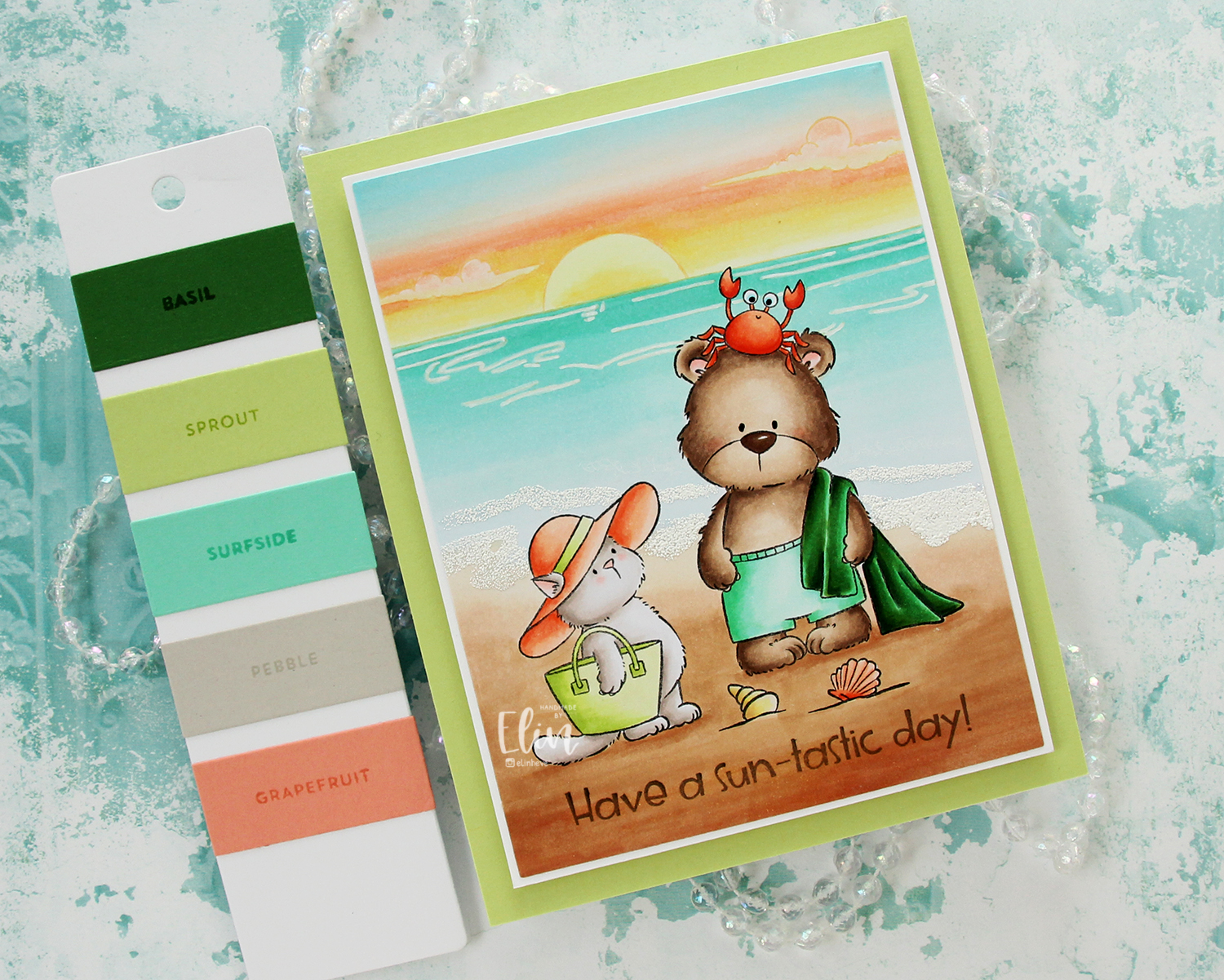
 Speaking of colors, I used a ton of Copic colors for this card. By the time I had colored the sky, I’d already used 11 colors; they add up fast!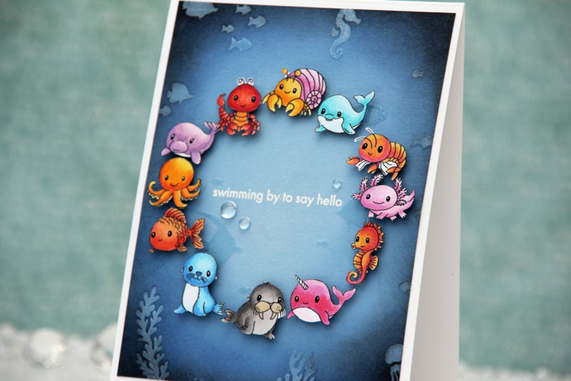
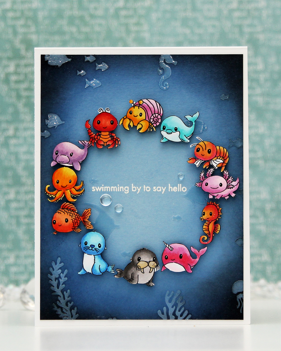 For this one, I started with a panel of Lazy Day cardstock from My Favorite Things. I used one of the stencils in the Undersea Jamboree stencil set from Altenew to emboss a texture onto my panel. It was very subtle, so I put the stencil back in place and added Crystal 3D gel from Altenew over the top. This gives a fun texture, shine and a very tactile feel to the panel. Once the gel was dry, I cropped down the panel slightly, before inking up the edges with Midnight and Black ink from Concord and 9th to darken my undersea panel. The gel resists the ink I put on, making it easy to buff off the excess.
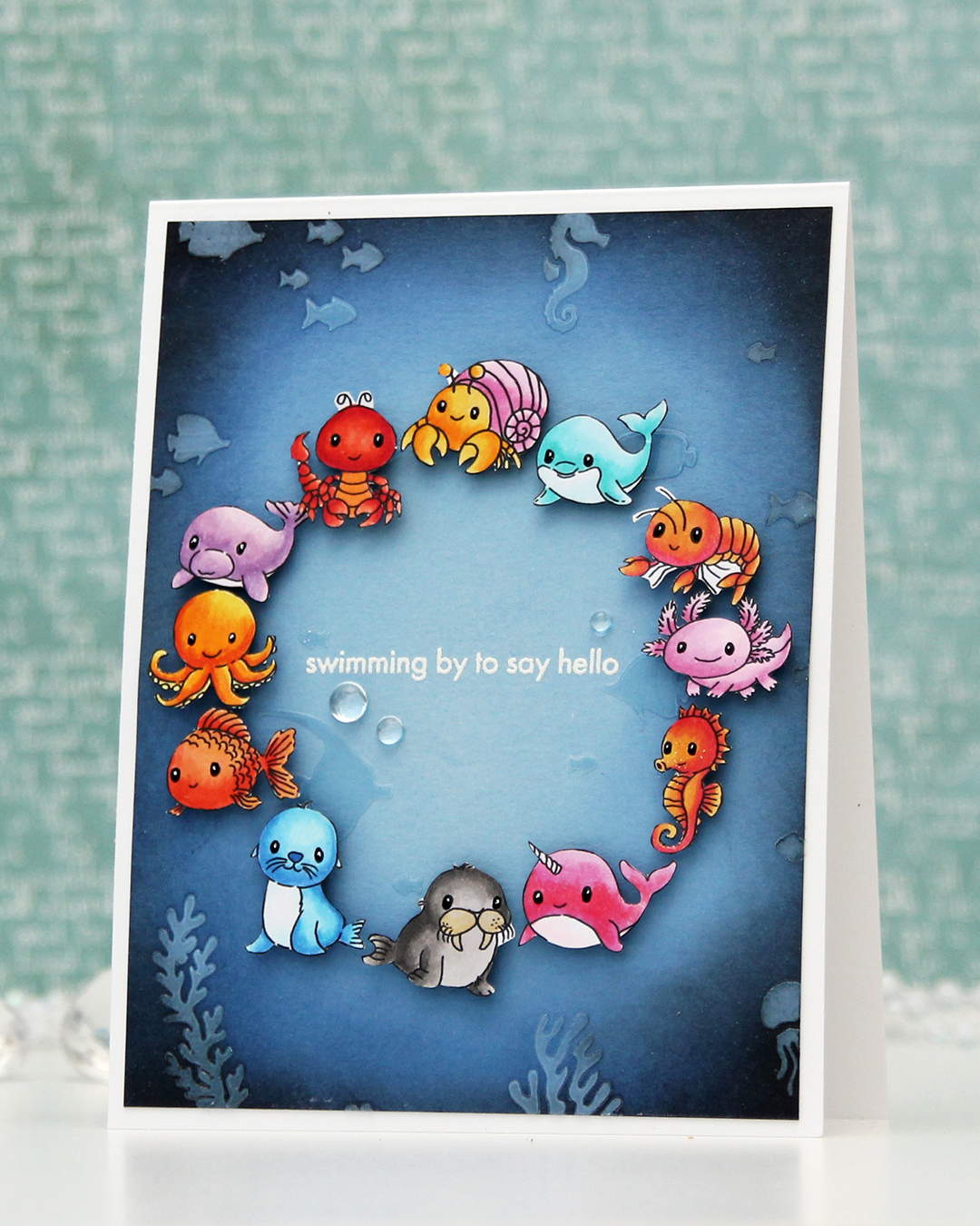 I adhered my panel to a top fold white card base I created from Stamper’s Select White cardstock from Papertrey Ink. I arranged my animals in a circle and mounted each on foam tape. I realized after I took the photos that I’ve left a bit of white on a few of the animals, particularly on the shrimp and the lobster, but I colored and fussy cut the images a month before I put the card together and didn’t remember that I’d left the white bits to deal with later. Once they were mounted with foam tape, it was too late to do anything about it, though. Live and learn, I guess.
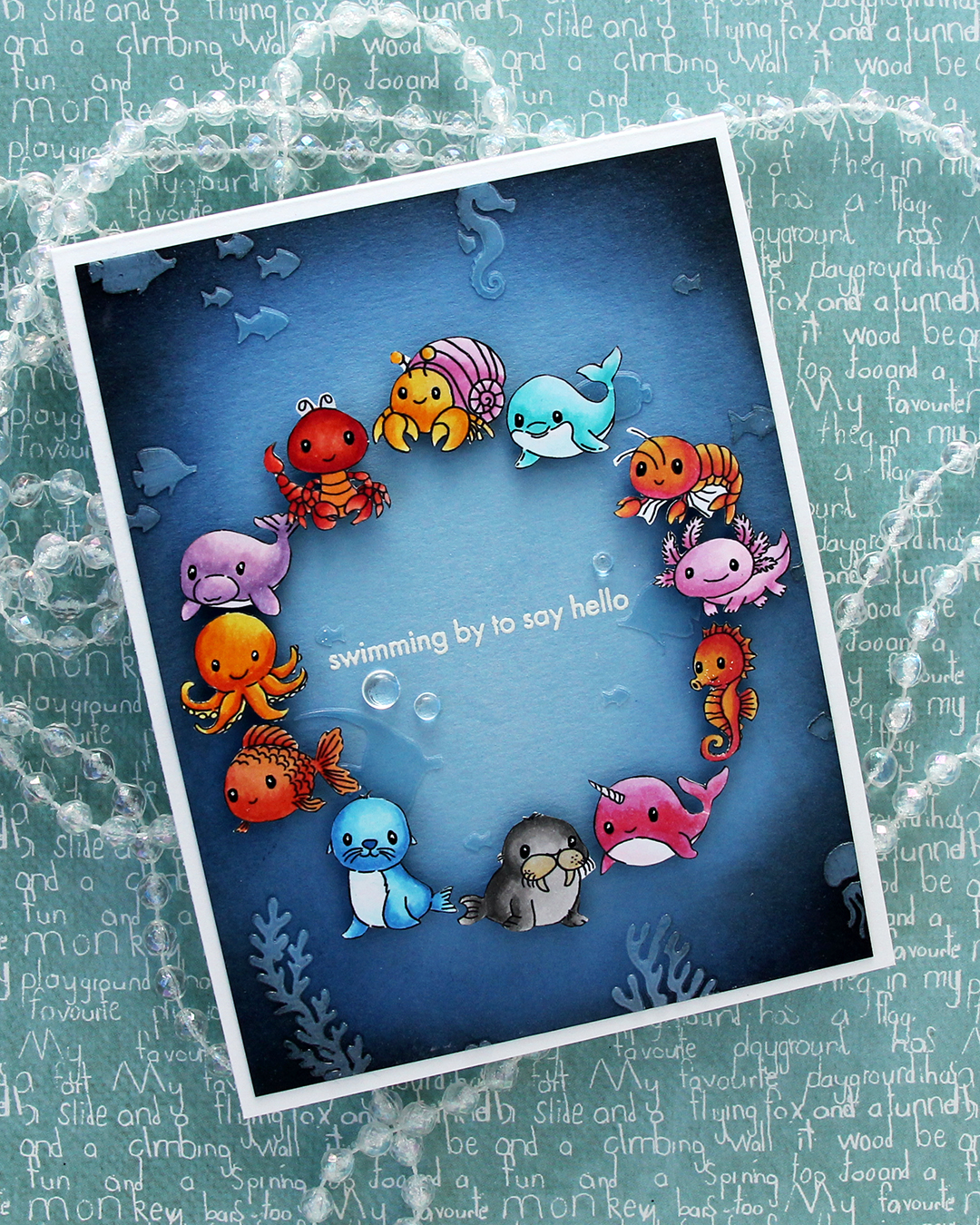 I was originally planning on adding a black strip with a white heat embossed sentiment in the center, but I thought it would look just as good, if not better with the heat embossed sentiment directly on the background. I could use the black strip if the white didn’t work out, right? I only had one chance at this, as the critters were already glued down. I put the panel in my Misti, used lots of antistatic powder and stamped the sentiment from the Coral Reef Wonders stamp set from Altenew using VersaMark ink, before sprinkling on super detailed white embossing powder from Ranger and heat set from the back. I always do my heat embossing from the back, it gives a much smoother result than heat embossing from the front. It turned out perfect, and I didn’t have to resort to plan B with the black sentiment strip.
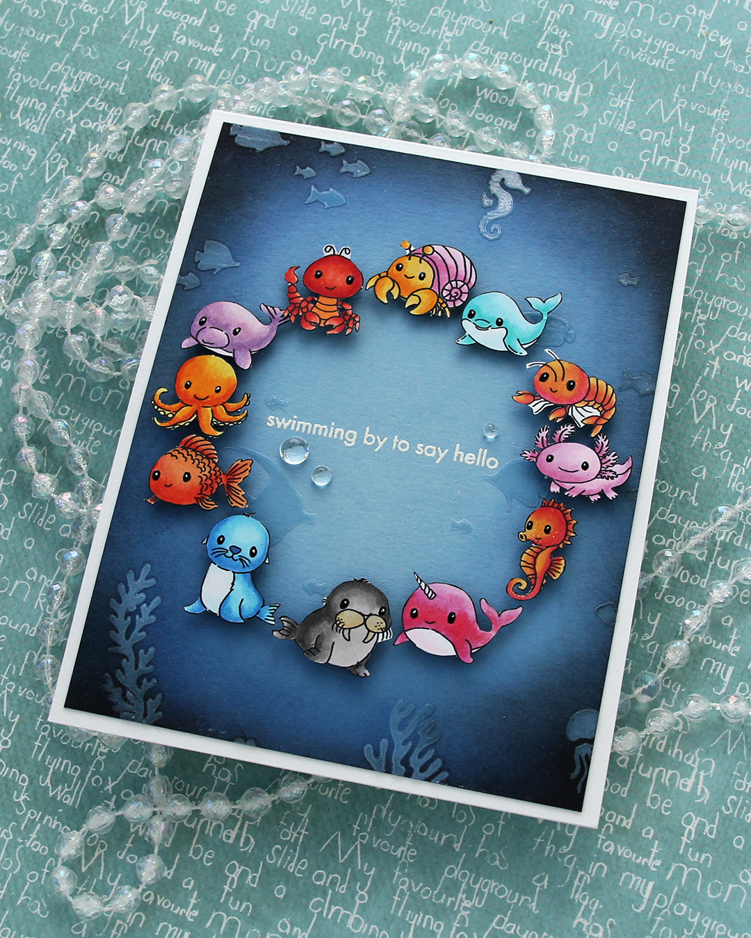 I added a few dew drops from Concord & 9th near the sentiment. They work well as bubbles and they add more shine. I also added black glaze and a white dot with a 05 Gelly Roll to their eyes once the black glaze pen was dry.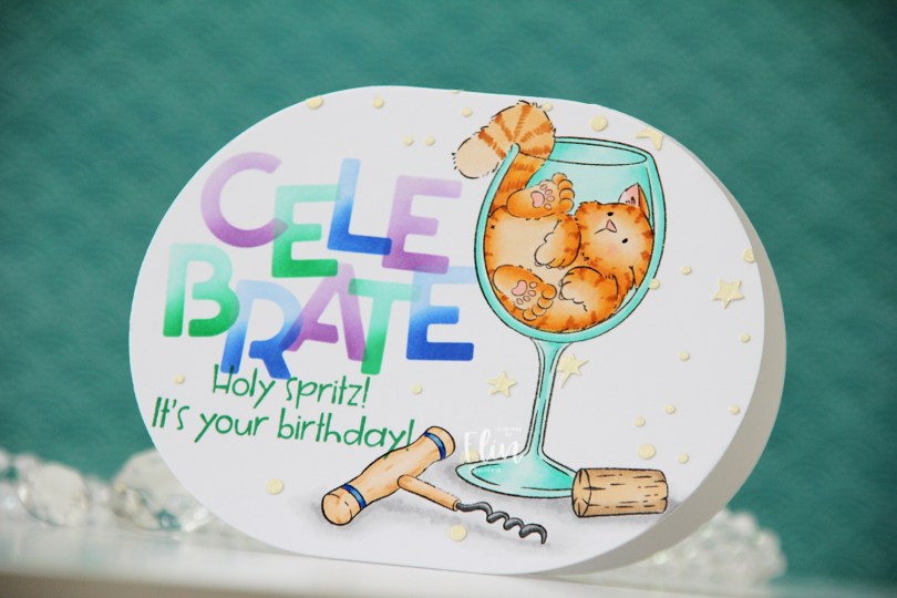
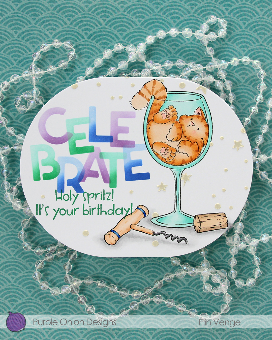
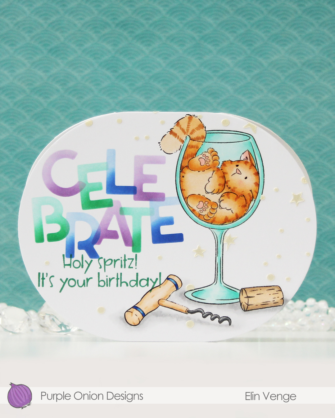 Isn’t this image fun? I love that Tofu somehow fits in this wine glass. There was an image in last year’s summer collection with a similar vibe. That one had a corgi hanging on to a margarita glass. So fun!
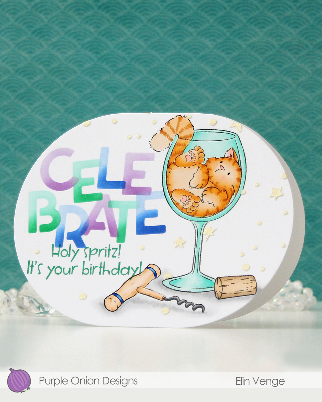 For this card, I simply colored my image with Copics, placed a mask on top of my mage and did some ink blending with C9 inks and the Celebrate stencil set from Kristina Werner. I used purple voluntarily, can you believe it? The purple is Fig faded into Aster, the green is Clover faded into Surfside, and the blue is Capri blended into Bluebell. I can’t take credit for the color palette, though, it was one Jennifer McGuire shared in the C9 Winter Retreat back in January, when they revealed the new colors to the retreat attendees. I’ll take my color inspiration wherever I can get it, and this was a fun one to try. Capri has stolen my heart!
 Back to the card. I removed the mask on the corkscrew before stamping the
 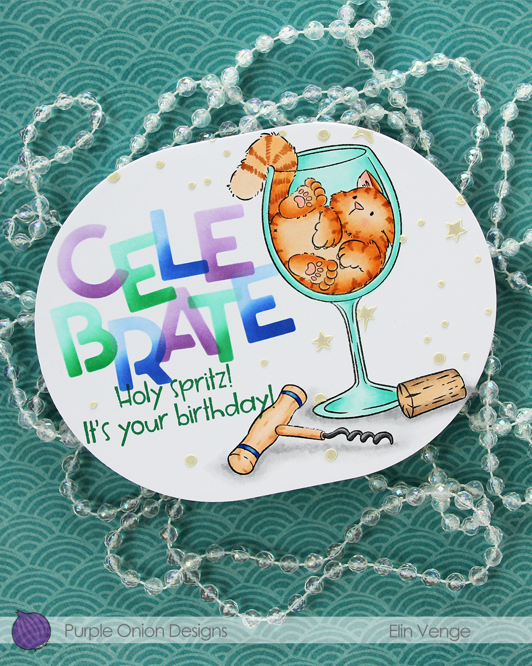 I wanted a little bit more interest in the background and decided to use paste, but before I put the paste on, I die cut my panel using the largest die in the A2 Oval Basics die set from Kristina Werner.
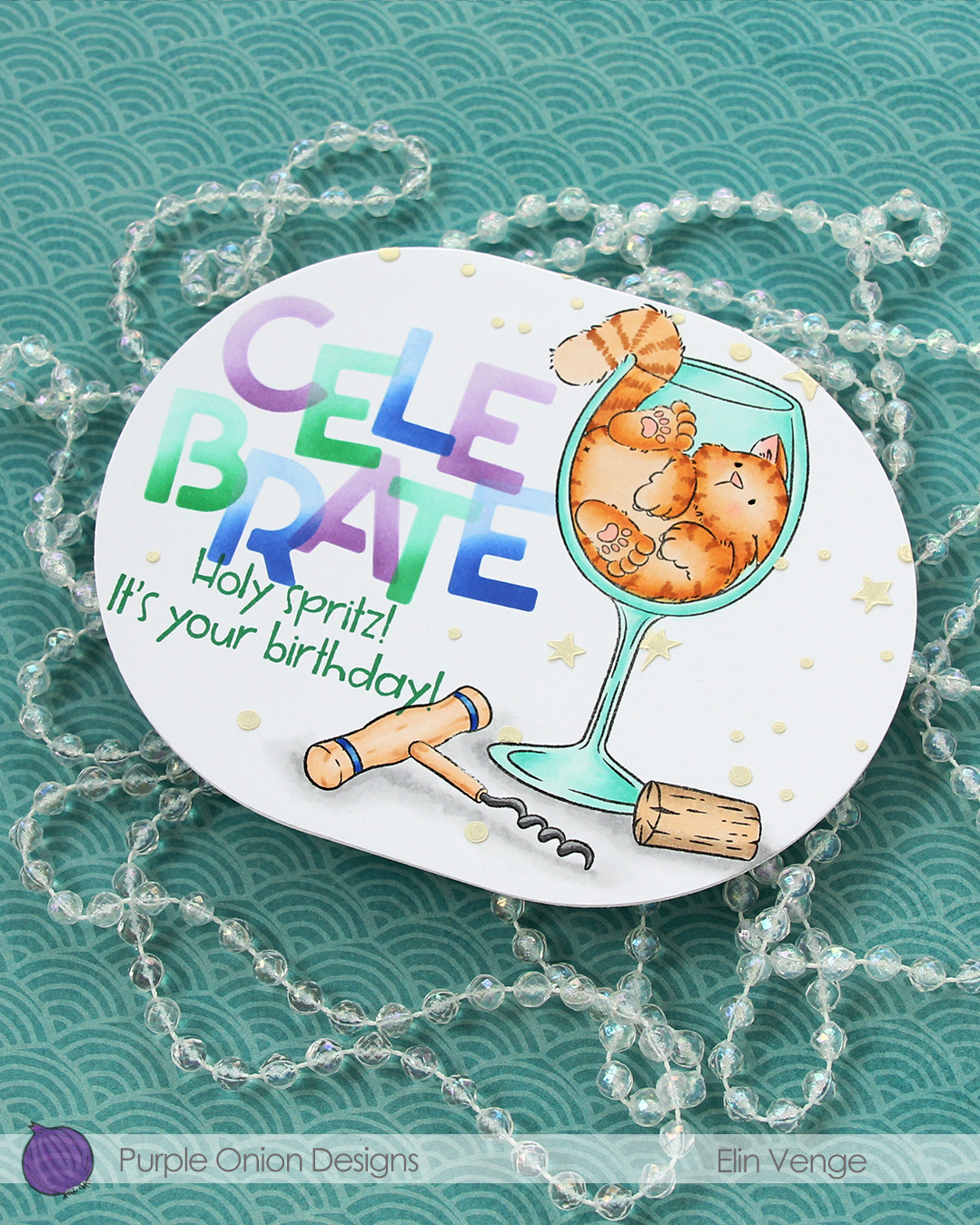 Once my panel was the finished size of the card, I placed the corkscrew mask back on, then used another stencil in the Celebrate stencil set from Kristina using Golden Hour Solar Paste from Simon Hurley. I made sure to cover the sentiment before adding the paste, so it wouldn’t end up where I didn’t want it. The paste adds texture and a little bit of shine in addition to breaking up all the white space in the background.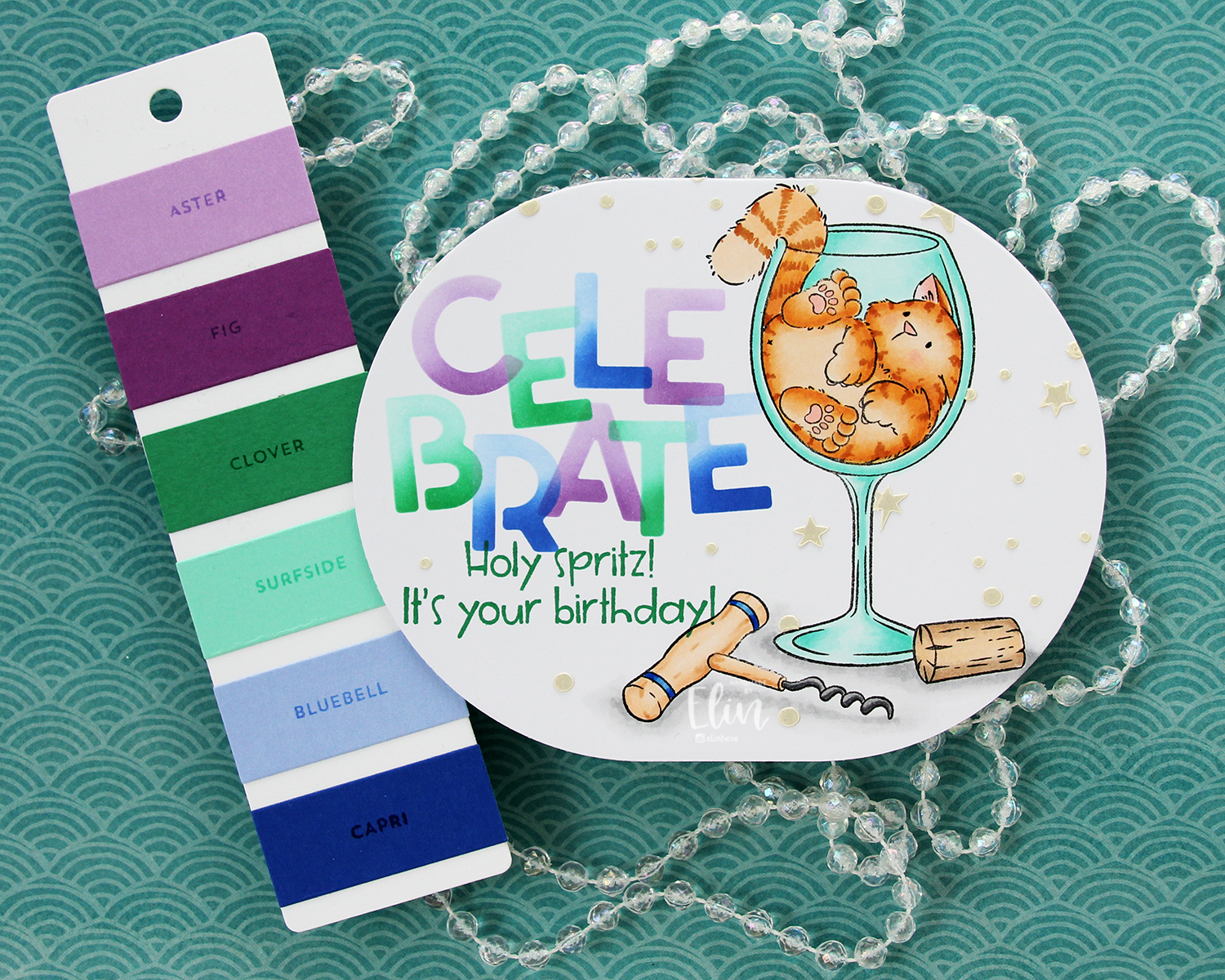
 Last, but not least: the Copics I used. Fairly neutral palette for this one.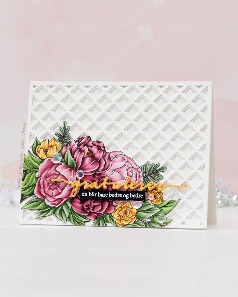
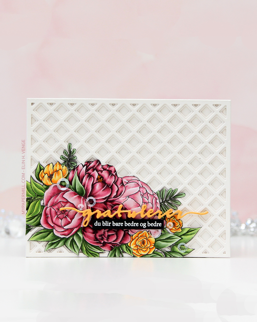 The floral stamp’s an old Stamptember collaboration stamp with Studio Katia called Flower Bunch. Studio Katia is no longer in business, I believe, but that doesn’t mean this image is any less gorgeous. I stamped it with Extreme Black ink from My Favorite Things onto X-Press It blending card, colored it with Copics and fussy cut the whole thing.
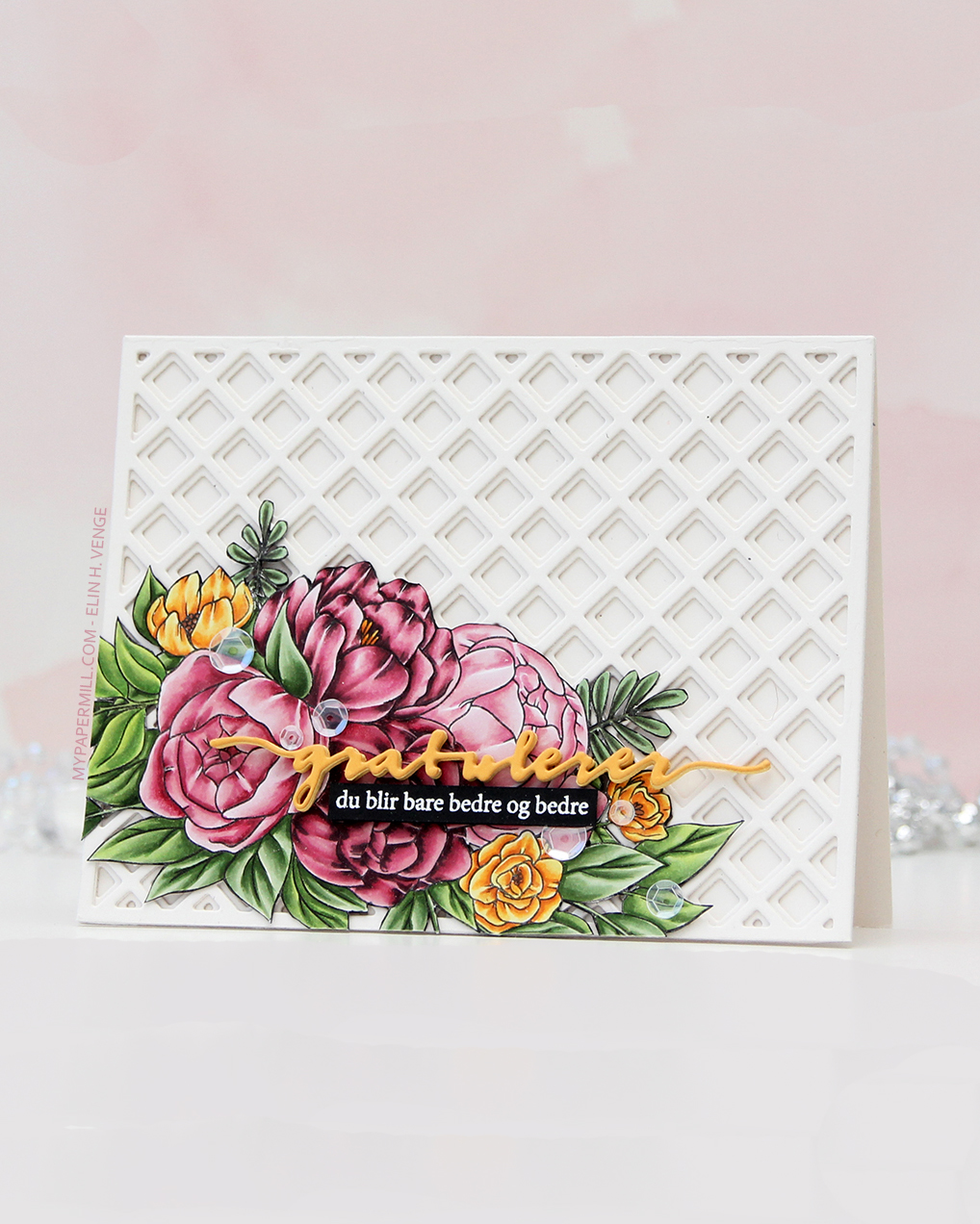 I created a card base from Rustic White cardstock from Papertrey Ink and added some interest to the background with the Garden Lattice Base and Garden Lattice Top dies, both from Honey Bee. I cut two of each, stacked them and adhered them to my card base, gluing the fussy cut image down in the bottom left corner.
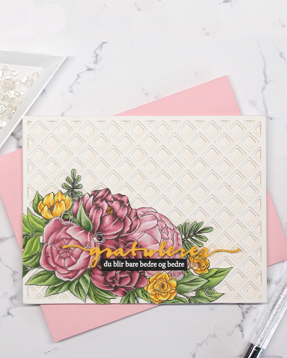 I die cut the Gratulerer 6 die (PD17240) from Papirdesign from Summer Sunrise cardstock from Papertrey Ink and backed it with a couple of additional ones die cut from Harvest Gold cardstock, also from PTI. I stamped and white heat embossed a sub sentiment from the A06 stamp set from Norsk Stempelblad AS onto a scrap of True Black cardstock from Papertrey Ink, trimmed it down to a strip and backed it with additional strips for dimension. I’m pretty sure I used some glitter spray at the end of my coloring, because the image on this card really sparkles. It’s not in my notes, though. To finish off I scattered a few sequins from the White Orchid sequin mix from Little Things from Lucy’s Cards.
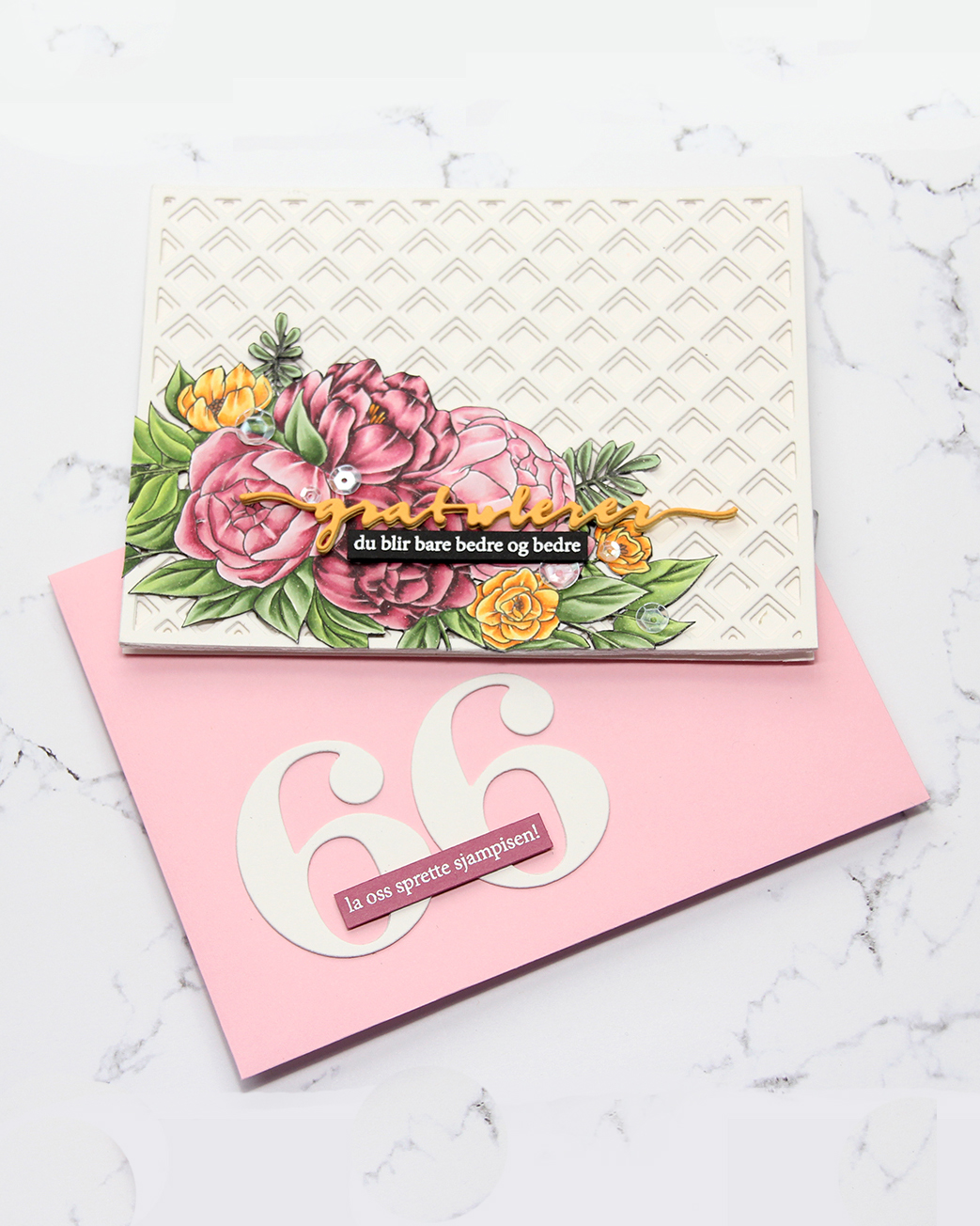 I even embellished my envelope. I used the By the numbers die set from Papertrey Ink for the big numbers, then white heat embossed another sentiment from the A06 stamp set from Norsk Stempelblad AS, this time onto Autumn Rose cardstock from Papertrey Ink.
 I love how you can get so many variations of pink with just five markers.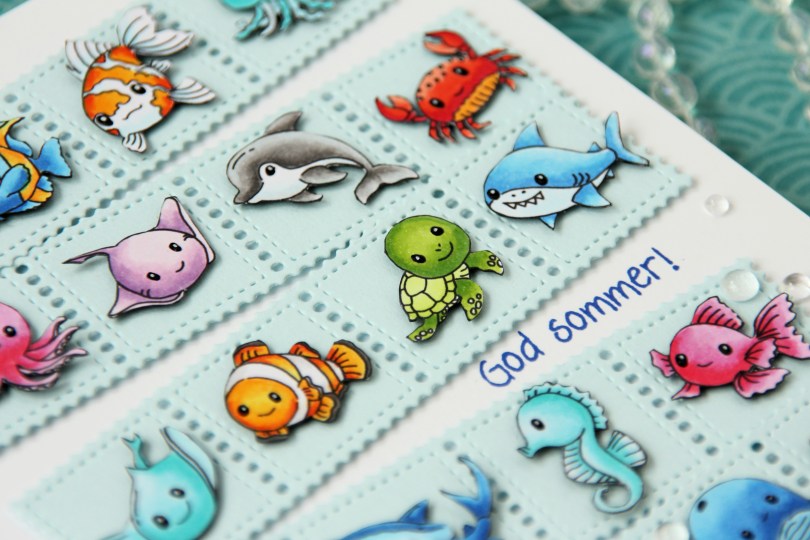
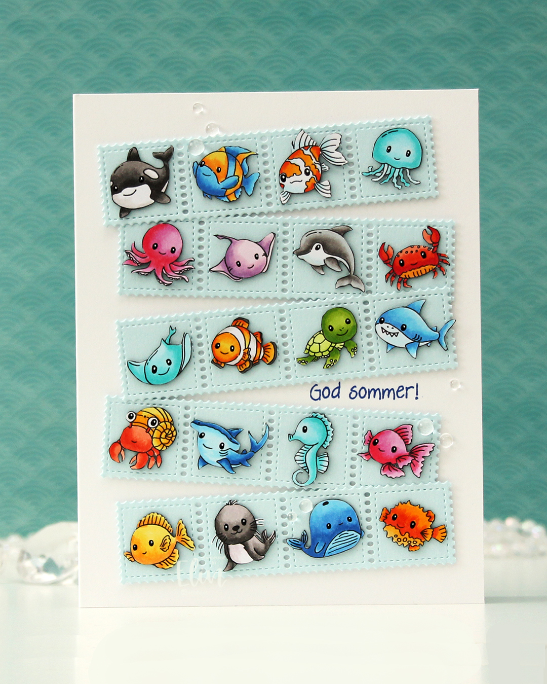 As I mentioned, I created this card using two collections:
 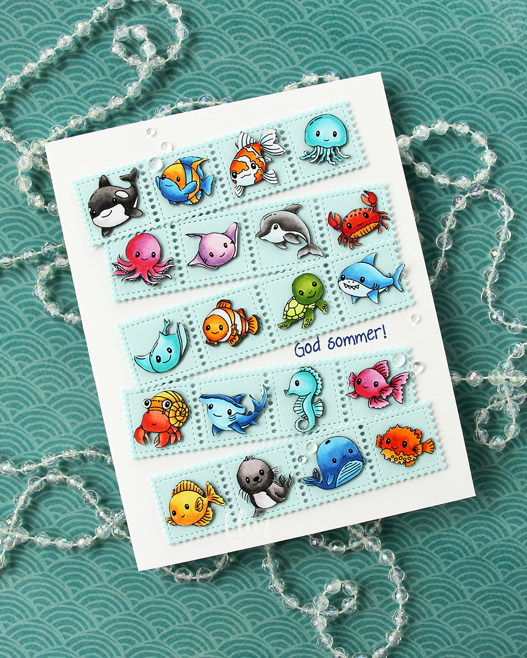 Once I had all my sea creatures colored and fussy cut, I put them aside and worked on the rest of the card. I die cut the Stamp Border from Gummiapan five times from Powder cardstock from Concord & 9th. The die cuts five postage stamps in a border, but I cut off one, making it a strip of four. I put two layers of white scraps behind each of the individual postage to give it a floating look. I also cut down small cardstock squares two layers thick to put behind my critters, also giving them a bit of dimension, but not as much as foam tape would add.
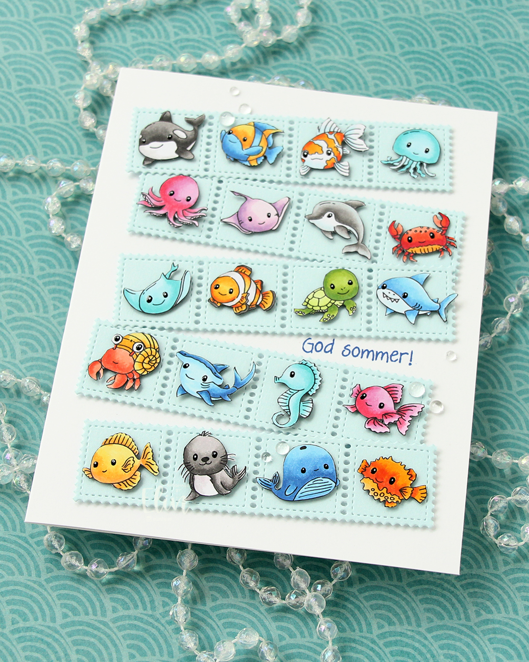 Once I knew how I wanted my strips of sea postage arranged, I stamped a sentiment from the Småtekster stamp set from Norsk Stempelblad AS using Capri ink from Concord & 9th directly on my card base, which I created from Stamper’s Select White cardstock from Papertrey Ink. I made a side fold card this time that is 1/2″ larger in both directions than the standard A2 card. I adhered my postage stamps, added some dew drops from Concord & 9th that kind of look like bubbles and decided to make their eyes shine. I used a black glaze pen, then went over with one small dot of an extra fine white Sharpie once the black was dry. I don’t think I’ve ever used 20 images on one card before, but this was SO. MUCH. FUN!!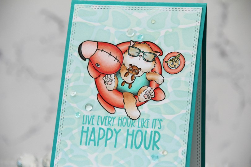
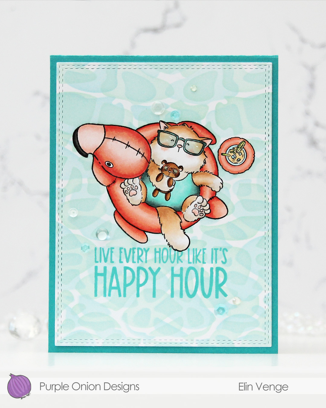 I stamped and colored my image with Copics on X-Press It blending card, before using a die in the A2 Double Stitched Rectangle STAX die set from My Favorite Things to create faux stitching around the perimeter of my panel.
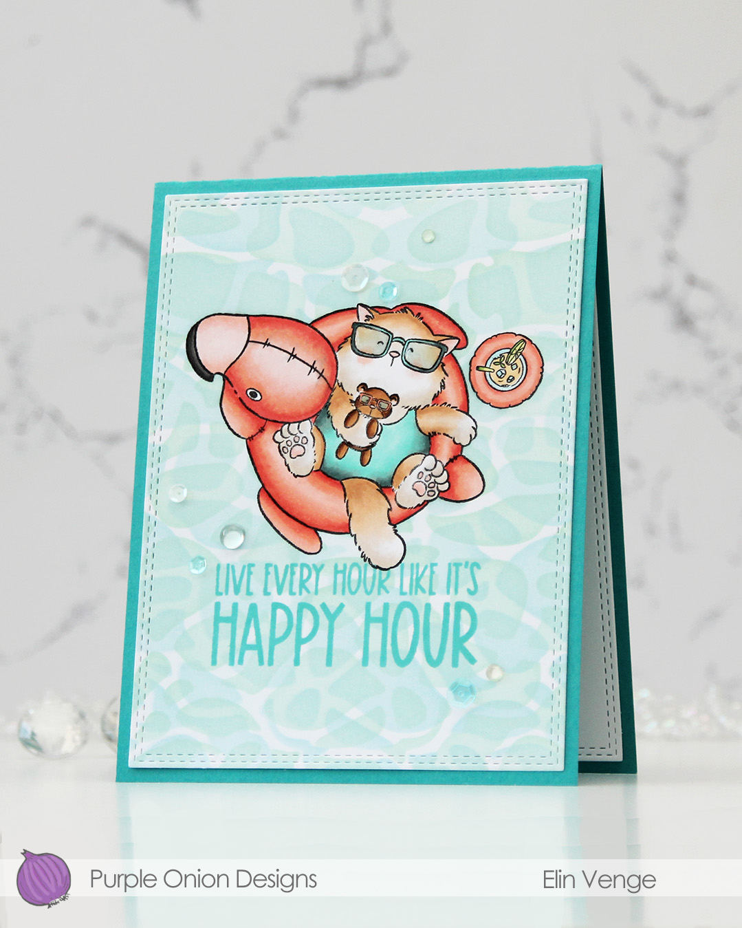 I masked off my image, before using Powder, Harbor and Sea Glass inks from Concord & 9th to ink blend the background through the Perfect Pool Water stencil from My Favorite Things. I flipped and rotated the stencil to create my pool water.
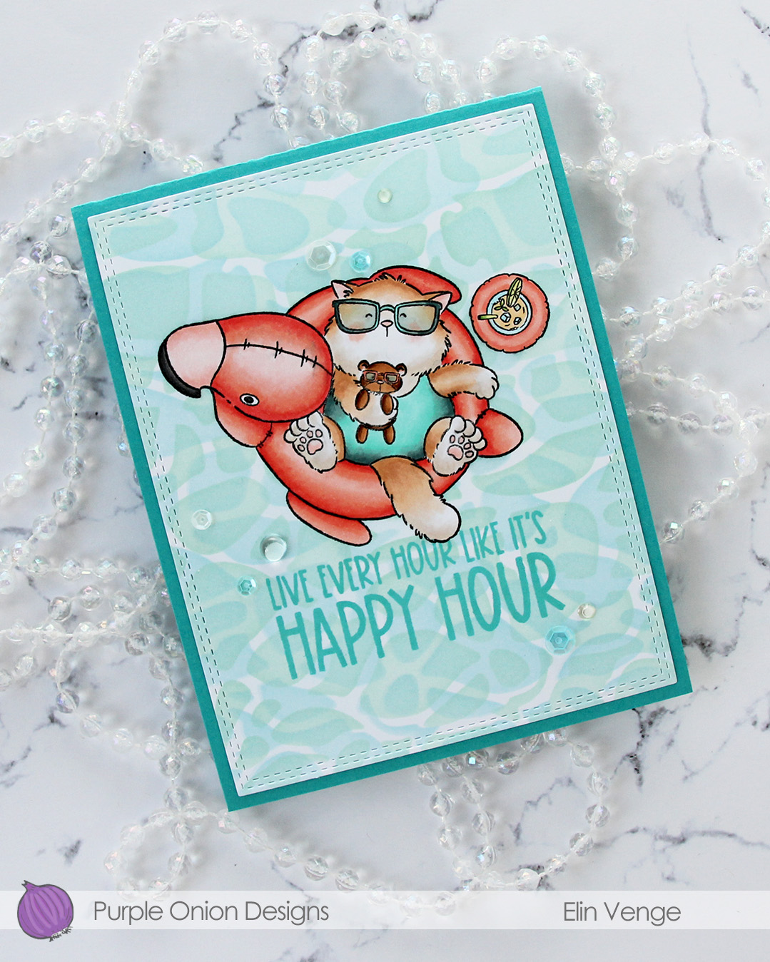 While I still had my mask in place, I stamped a sentiment from the
 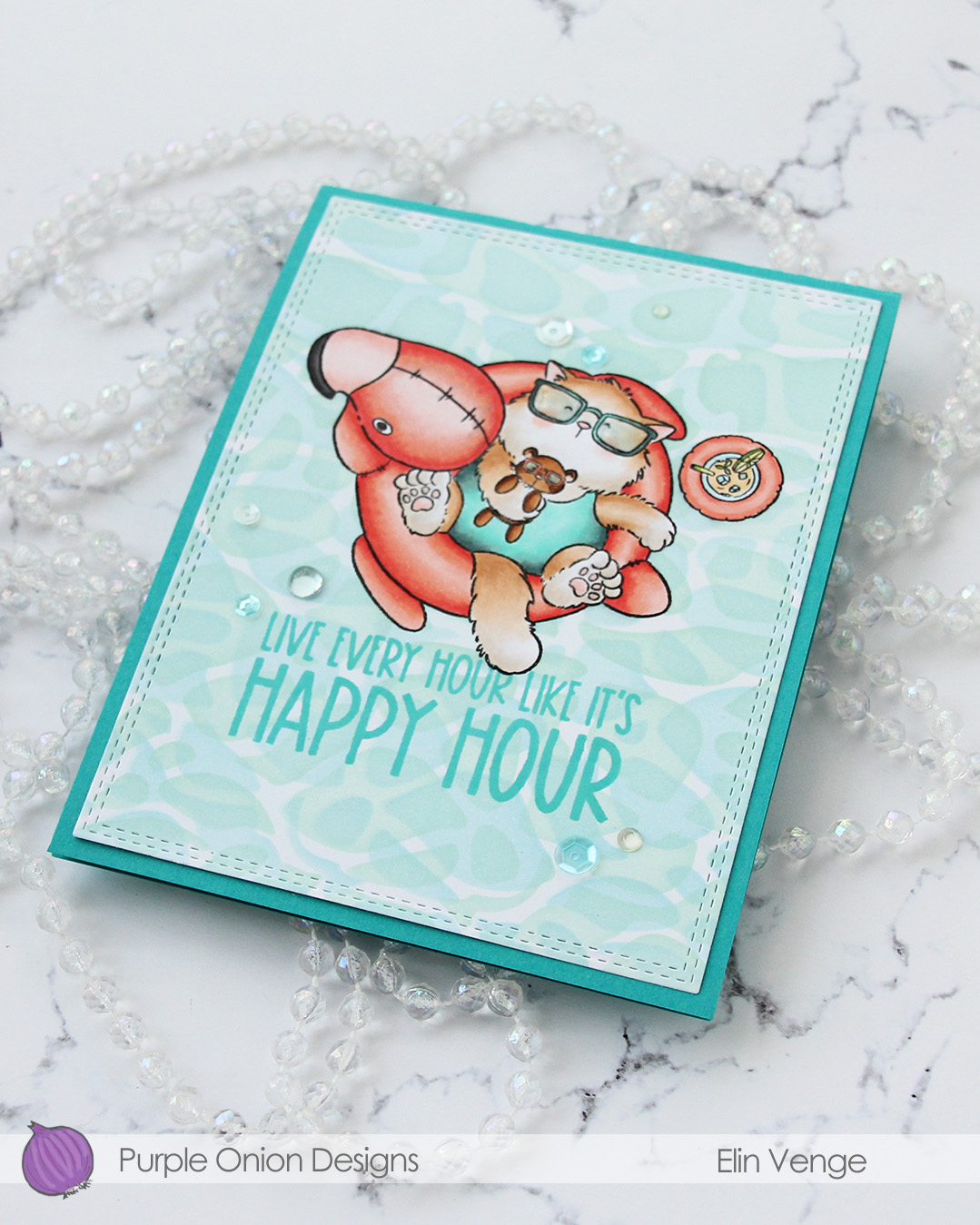 I adhered my panel to a card base I created from Oceanside cardstock from Concord & 9th, added a layer of Glossy Accents to Tofu’s glasses and finished off with a mix of sequins and gems from the Ice Water embellishment mix from Little Things from Lucy’s Cards.
 Very limited color palette for this one.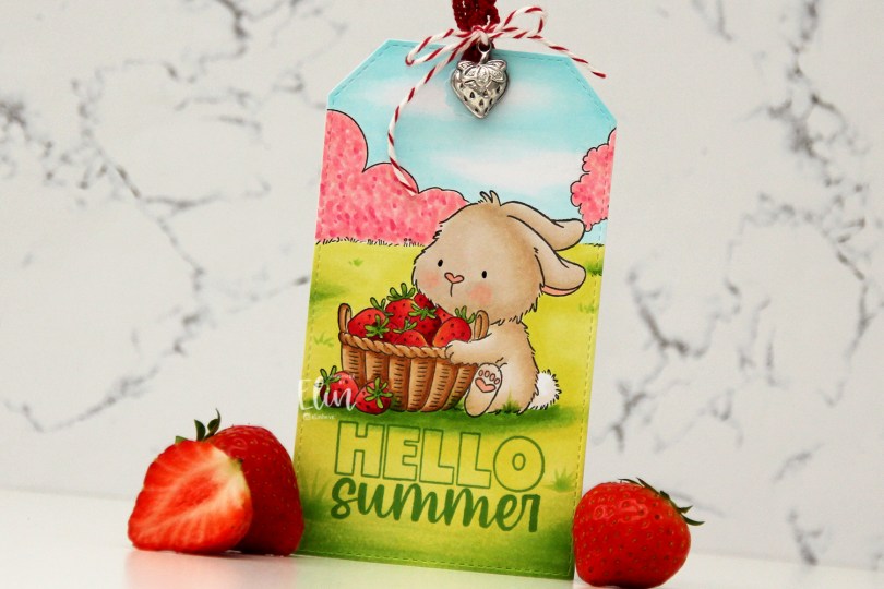
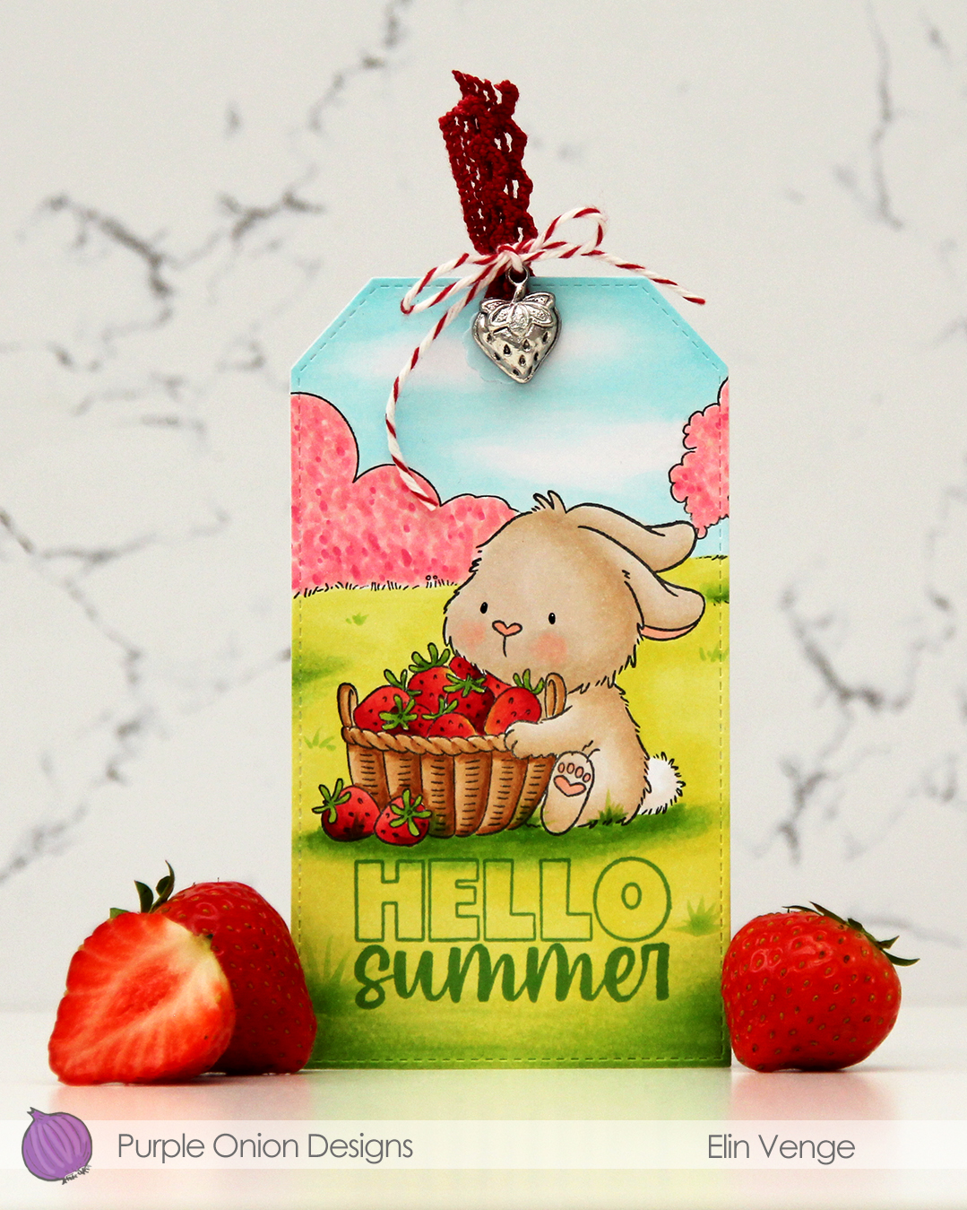 I stamped and masked my bunny, stamped the field background, then colored in my scene with Copics. I didn’t want an “all green” background, so I colored the bush and the tree with pink markers, I’m pretending they’re blooming. The fruit trees are in full bloom at the moment, so it was an easy decision. Once my coloring was complete, I used the largest die in the Stitched Traditional Tag STAX die set from My Favorite Things. This tag set doesn’t create holes in the tags, so I made my own and used a reinforcer from the Fold-up Tags die set, also from My Favorite Things, to give the hole a finished look. I stamped Hello from the
  Very soft color palette for this one.
