
Hi, crafty friends! My blogging has been sporadic lately. Madness (the good kind) at work and the world cup are the reasons behind my absence, but now that we’ve been kicked out of the world cup because FIFA didn’t want us advancing to the semi finals, I can focus on other things. Vacation time is also right around the corner, so I’m hoping to share lots of cards! I’m starting with this cute ice cream truck from Purple Onion Designs, brilliantly illustrated by Pei. This is Happy Cone Mobile, and it’s from the Sunshine & Daydreams collection that was released a few weeks back. The Woodsy Background is from the same collection.
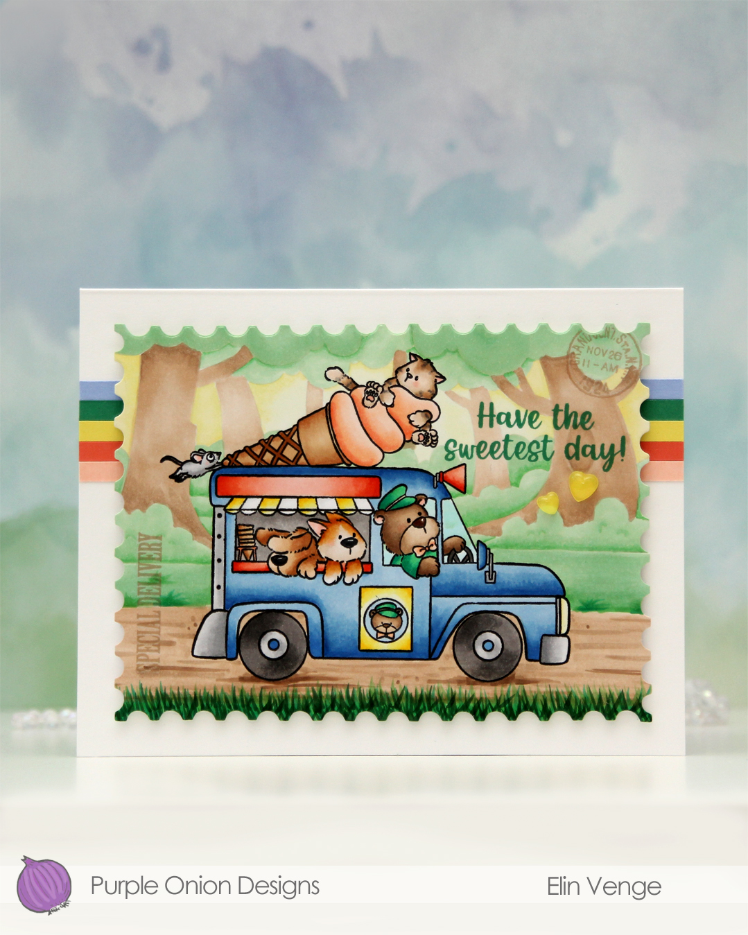 I wanted a storybook look to this, and the ice cream truck is a fairly busy image, so I decided to stamp the background in fadeout ink from Inkon3 for a no line look.
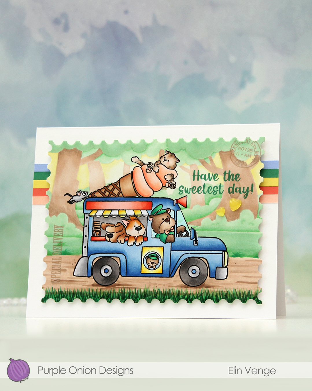 I colored my scene with Copics, and when the coloring was complete, I put the panel back in my Misti and stamped the truck again, this time in Obsidian ink from Altenew. It gives such crisp, dark black lines, but it’s not Copic friendly, so I need to do this step once the coloring is complete. I tend to hold my breath hoping I don’t offset the stamping, as I don’t want to have to start all over again. This time it worked. I stamped SPECIAL DELIVERY and the postmark stamp using Classic Kraft ink from Papertrey Ink. The stamps are from the Vintage PostCARD and the Vintage PostCARD Add-On stamp sets, which are both older sets from Purple Onion. I also stamped a sentiment from the Sunshine & Rainbows sentiment set using Clover ink from Concord & 9th.
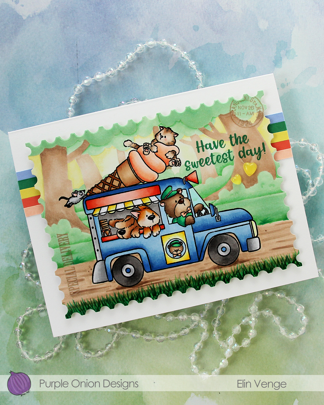
I used the largest die in the Nesting Postage Stamps die set from Hero Arts to turn my panel into a large postage stamp.
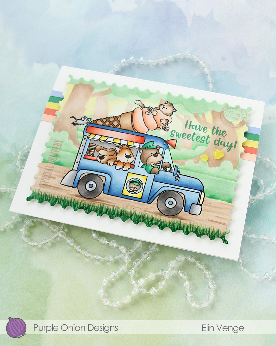 I adhered strips of solid color cardstock towards the top of my 6 1/2 x 5″ card base, before mounting my huge postage stamp scene in the center with foam tape. The colors I used are Nectar, Sorbet, Starfruit, Clover and Bluebell, all from Concord & 9th.
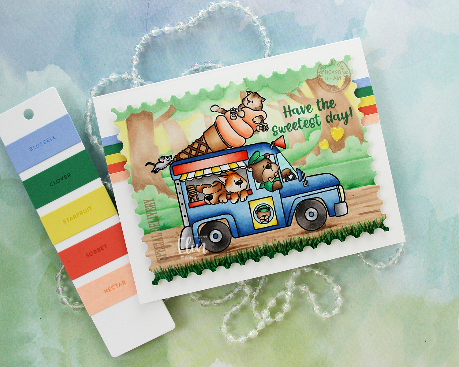 To finish off the card I added a couple of yellow hearts from the Beach Dreams Crystal collection from Little Things from Lucy’s Cards.
 I used a LOT of colors for this one. Very few colors for the background, but a lot for the truck and these cute friends!!
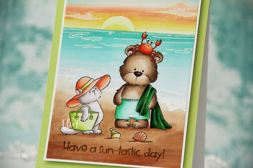
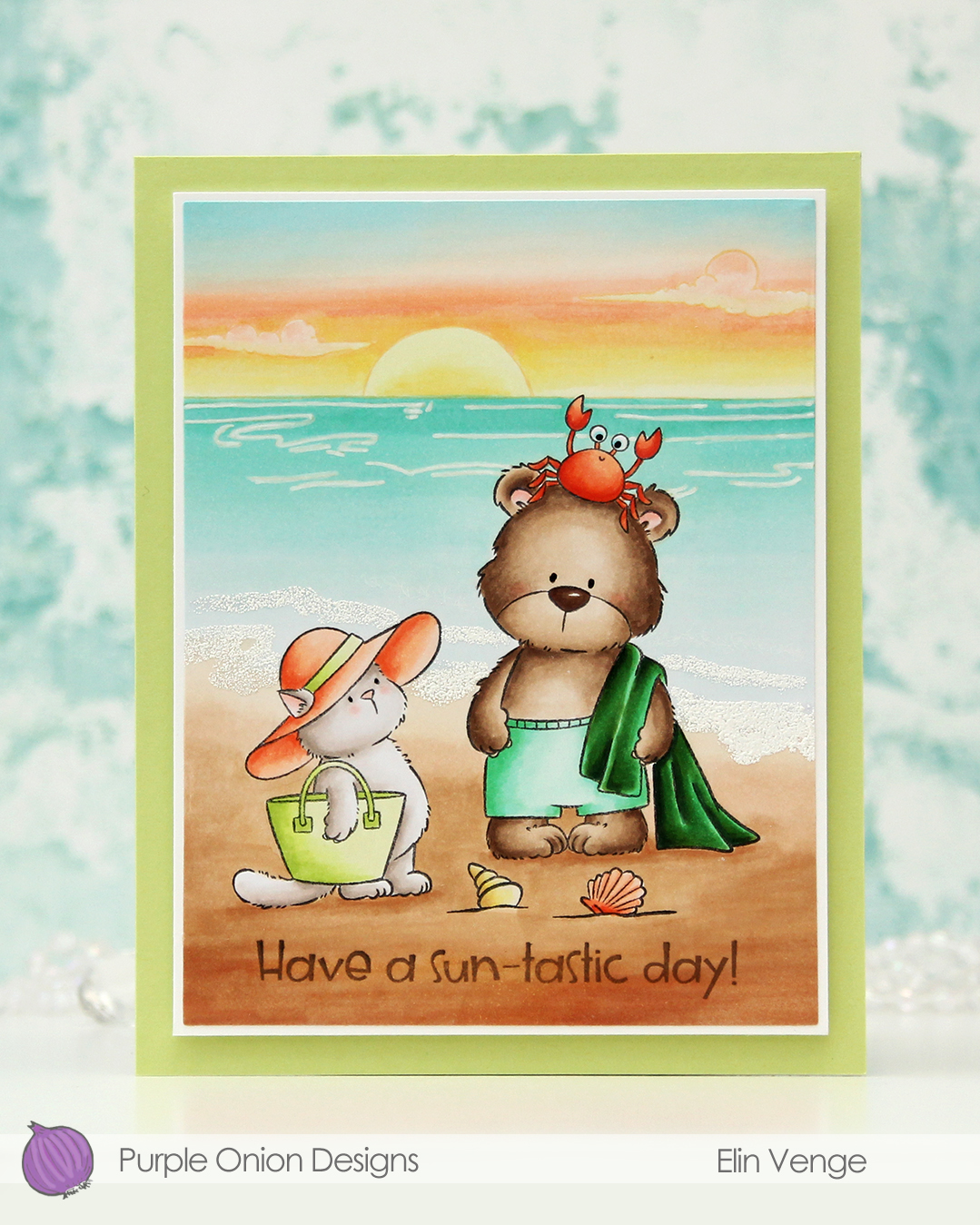 I stamped Tofu and Brownie in Extreme Black ink from My Favorite Things, placed a mask over top and stamped the Sunrise Sunset with Altenew Golden Honeycomb ink. I colored in my scene and decided to try a new twist for the sky. I don’t think I’ve ever used these particular color for a sky before, but I think it worked out well.
 I imagine they’re in a tropical location where the ocean has this very peaceful aqua color that fades into nothing as it reaches the shore. I tried to give the whole panel a dreamy vibe, and there’s not a whole lot of dark markers used. I did include a dark green towel and used more of the YR09 on the crab than I did on Tofu’s hat (believe it or not, it was used on Tofu’s hat, albeit in a very small amount). The greens play well together and work with the ocean, while the more corally color for the hat, seashell and crab play off the peach in the sunset.
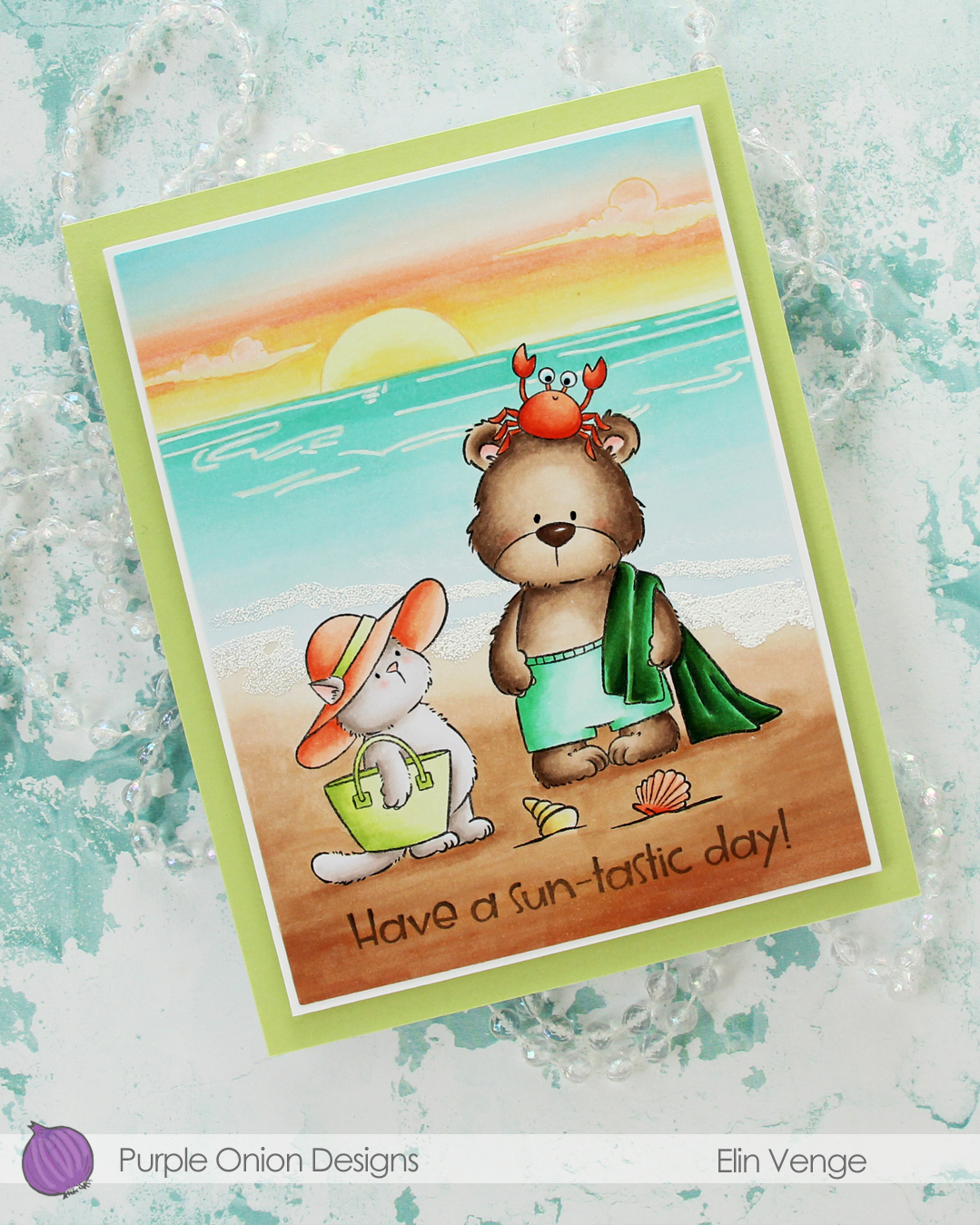 Once my image was colored, I cut my panel down using the larges die in the Additional A2 Layers die set from Waffle Flower. I stamped a
 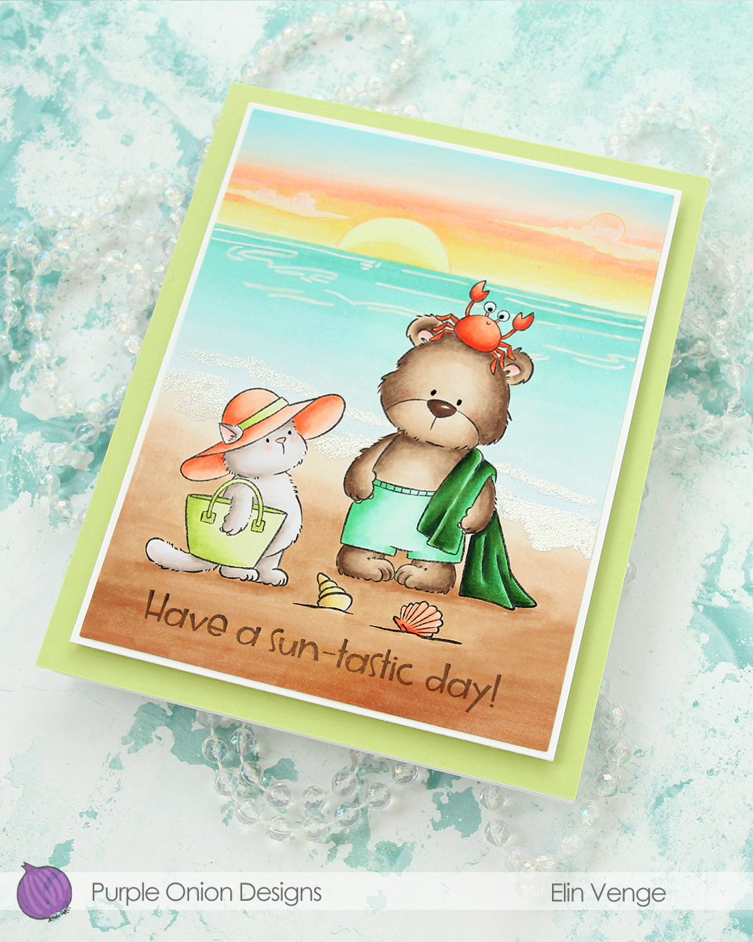 I used an extra fine point white Sharpie to add the ripples in the ocean, and used White puff embossing powder from Wow! to create the seafoam on the beach. I added a bit of black glaze pen to their eyes, and the glaze made the crab’s eyes bigger, which made him even funnier than he was originally. I adhered my colored piece to a panel of white cardstock cut to 4 1/4 x 5 1/2″, then mounted the whole thing onto a 4 3/4 x 6″ white card base covered with a panel of Sprout cardstock from Concord & 9th.
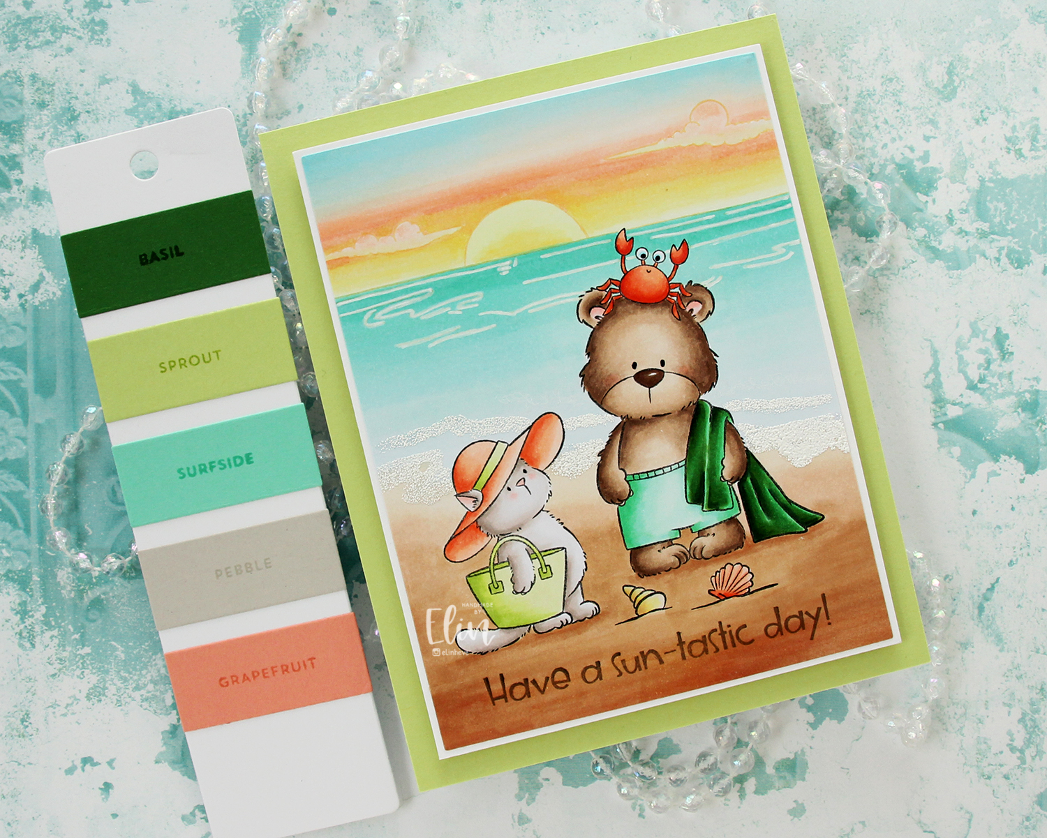
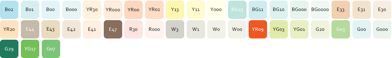 Speaking of colors, I used a ton of Copic colors for this card. By the time I had colored the sky, I’d already used 11 colors; they add up fast!
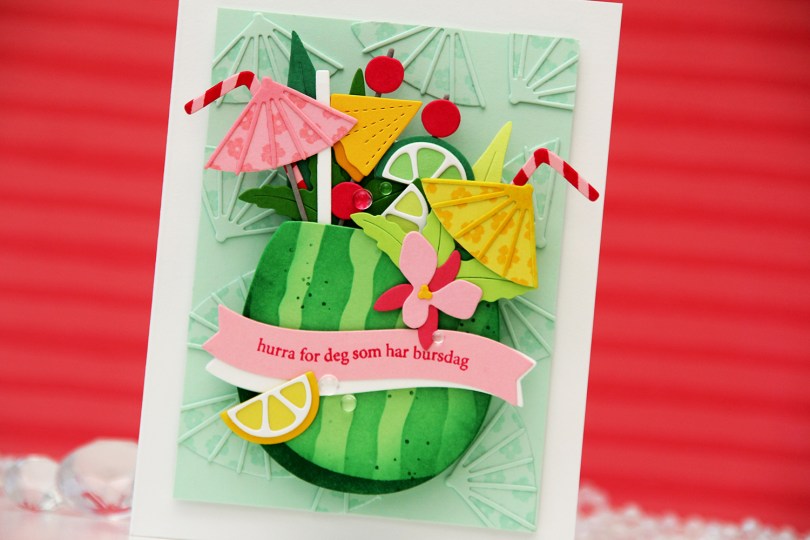
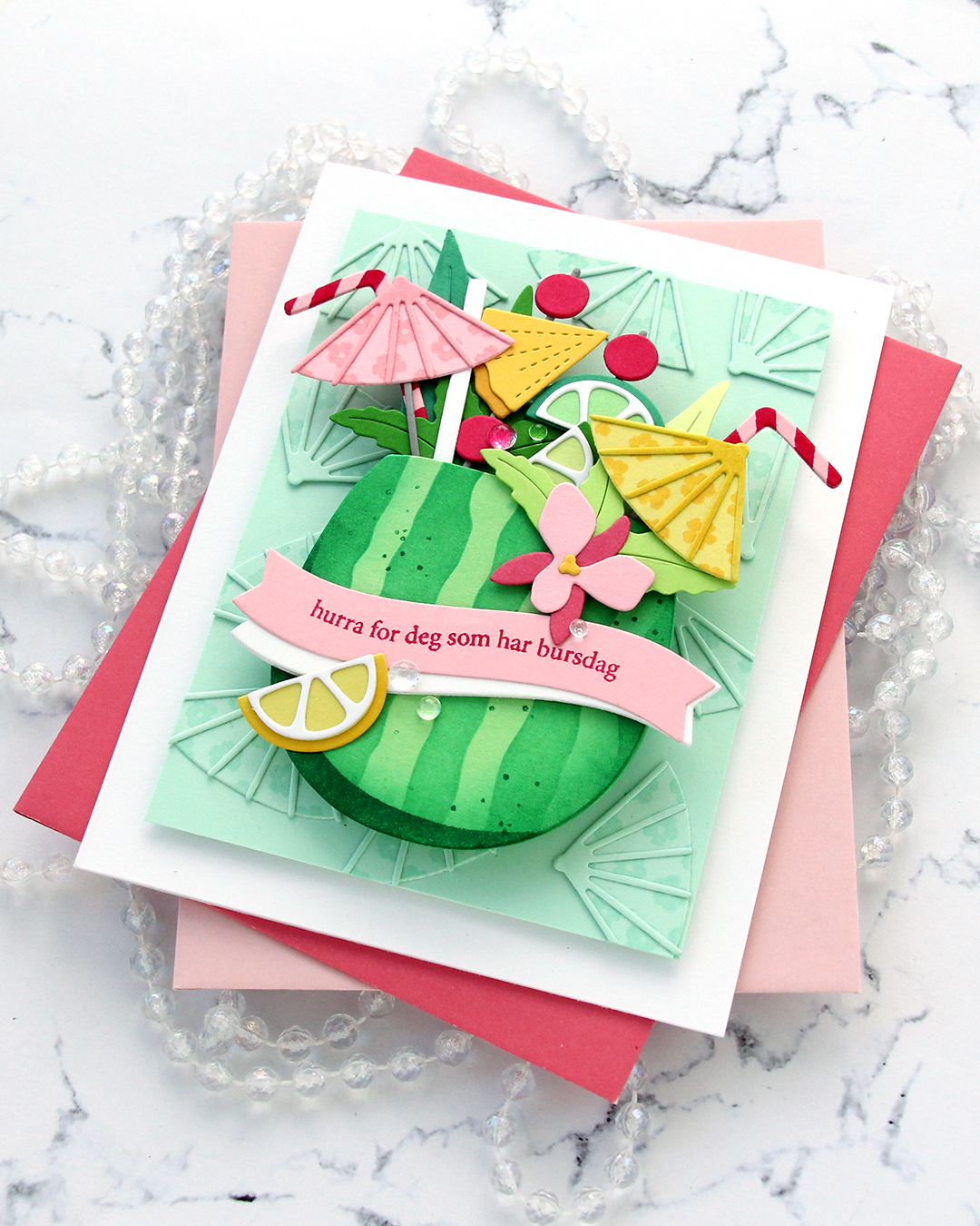
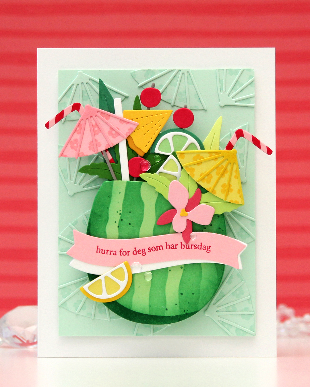 I needed a birthday card for my niece’s 16th birthday. She’s a lover of tropical fruits, and this was the perfect set to use for her birthday card. I die cut the watermelon from Vintage Jadeite cardstock from Papertrey Ink and used the stencil set to in blend the stripes on the watermelon rind using Clover ink from Concord & 9th. I stamped the spots in the coordinating stamp set using the same color. I die cut a few extra watermelons from Vintage Jadeite. I knew I was going to pop up my watermelon on an action wobble (I actually ended up using two wobbles), so it needed to be sturdy.
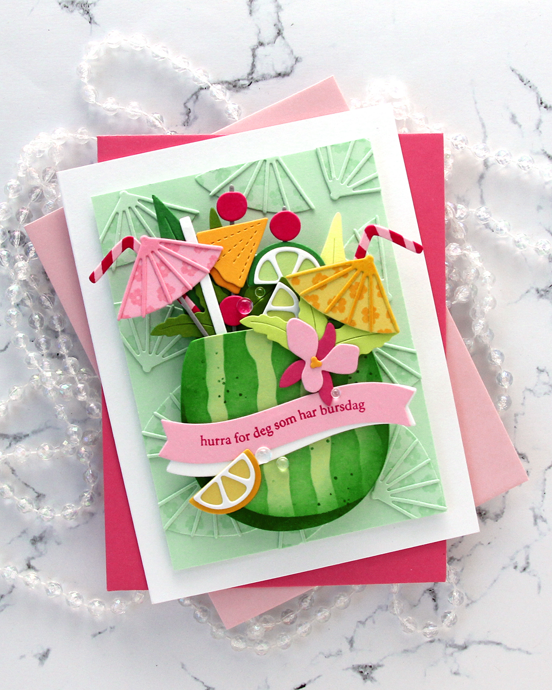
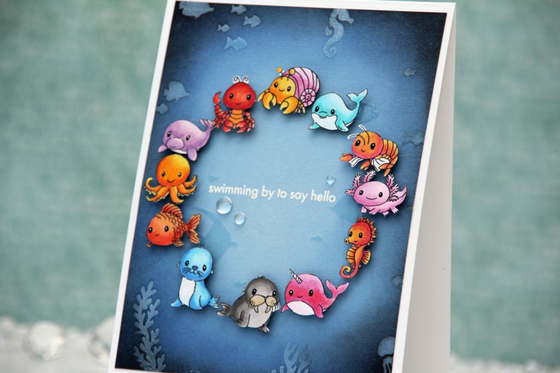
 For this one, I started with a panel of Lazy Day cardstock from My Favorite Things. I used one of the stencils in the Undersea Jamboree stencil set from Altenew to emboss a texture onto my panel. It was very subtle, so I put the stencil back in place and added Crystal 3D gel from Altenew over the top. This gives a fun texture, shine and a very tactile feel to the panel. Once the gel was dry, I cropped down the panel slightly, before inking up the edges with Midnight and Black ink from Concord and 9th to darken my undersea panel. The gel resists the ink I put on, making it easy to buff off the excess.
 I adhered my panel to a top fold white card base I created from Stamper’s Select White cardstock from Papertrey Ink. I arranged my animals in a circle and mounted each on foam tape. I realized after I took the photos that I’ve left a bit of white on a few of the animals, particularly on the shrimp and the lobster, but I colored and fussy cut the images a month before I put the card together and didn’t remember that I’d left the white bits to deal with later. Once they were mounted with foam tape, it was too late to do anything about it, though. Live and learn, I guess.
 I was originally planning on adding a black strip with a white heat embossed sentiment in the center, but I thought it would look just as good, if not better with the heat embossed sentiment directly on the background. I could use the black strip if the white didn’t work out, right? I only had one chance at this, as the critters were already glued down. I put the panel in my Misti, used lots of antistatic powder and stamped the sentiment from the Coral Reef Wonders stamp set from Altenew using VersaMark ink, before sprinkling on super detailed white embossing powder from Ranger and heat set from the back. I always do my heat embossing from the back, it gives a much smoother result than heat embossing from the front. It turned out perfect, and I didn’t have to resort to plan B with the black sentiment strip.
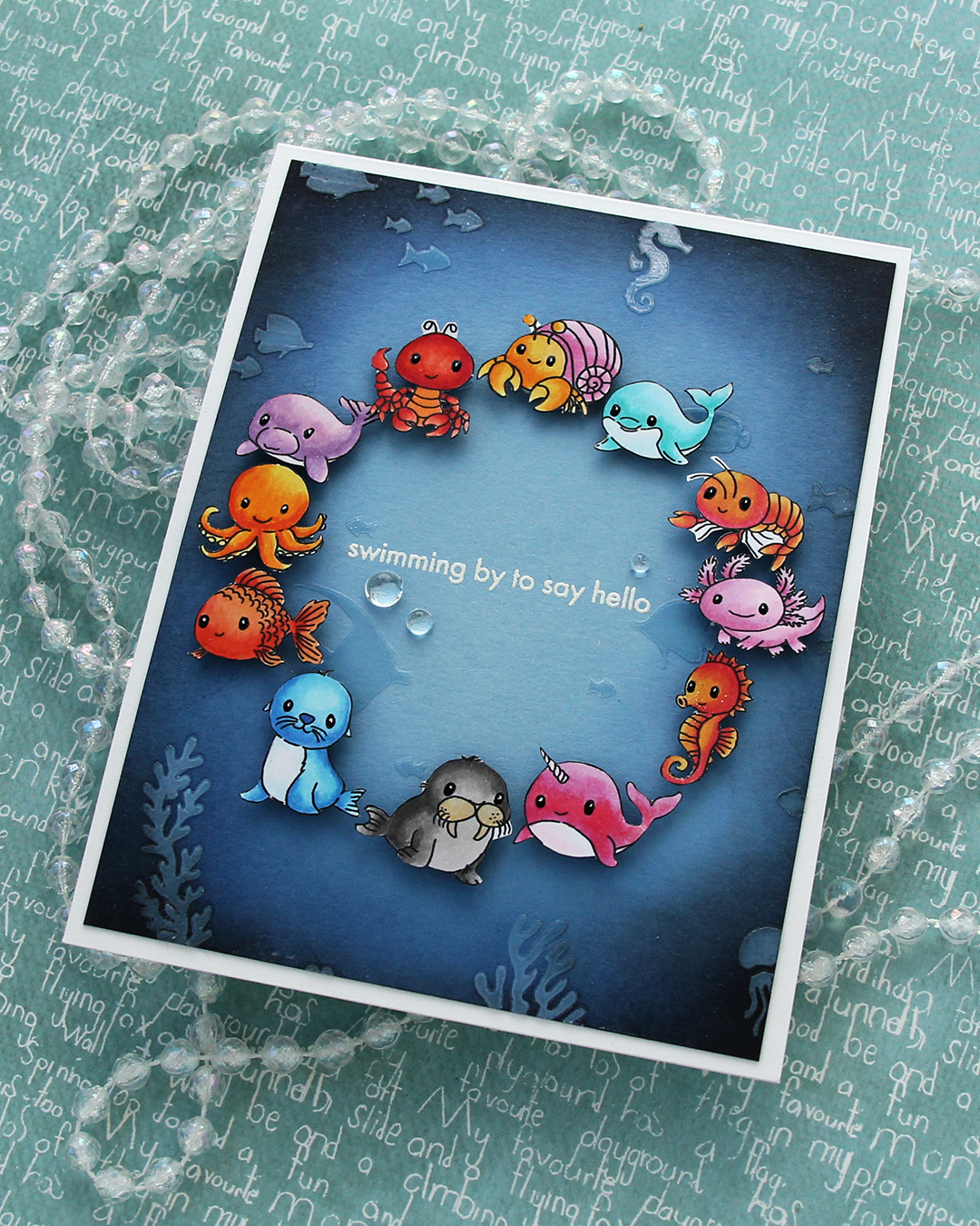 I added a few dew drops from Concord & 9th near the sentiment. They work well as bubbles and they add more shine. I also added black glaze and a white dot with a 05 Gelly Roll to their eyes once the black glaze pen was dry.
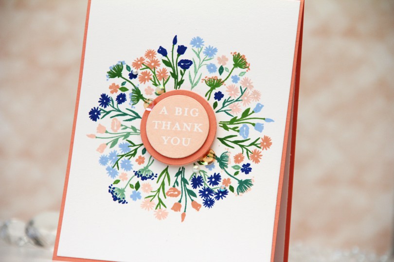
 I’ve been made aware that this beautiful peach is my signature color. I kind of thought it would be blue, it’s my favorite color, after all, but I don’t make as many blue cards as I used to. Anyway, peach works with just about everything. It’s great with blue, it works really well with green and it’s also dynamite with pinks and yellows. It’s just a really good color. For this card I teamed it up with blue. More specifically, Capri and Bluebell from Concord & 9th, which were both in the new color release this spring. Capri is the most amazing color!!
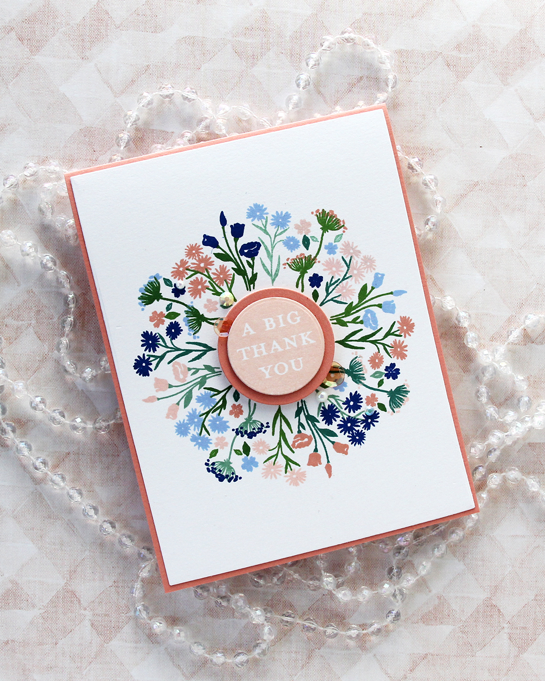 I cut my panel down using the largest die in the Additional A2 Layers die set from Waffle Flower and adhered it to an A2 card base I created from Grapefruit cardstock from Concord & 9th. I stamped one of the sentiments in the Bouquet turnabout stamp set using Nectar ink, die cut it with a circle die, then mounted it on a die cut circle from Grapefruit cardstock, which I then mounted in the center of the card.
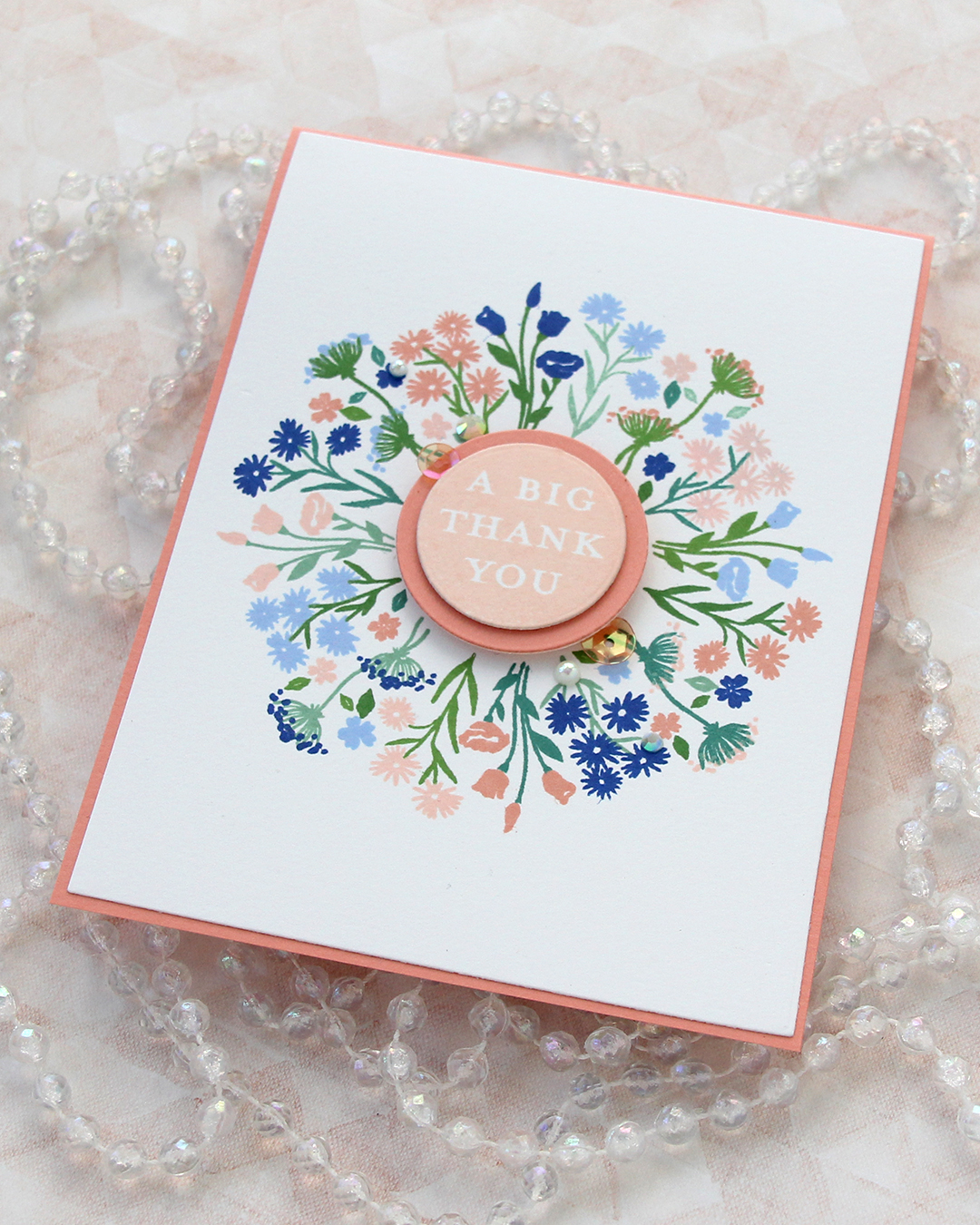 I finished off the card with a few pearls, gems and sequins from the Melon mix from Little Things from Lucy’s Cards.
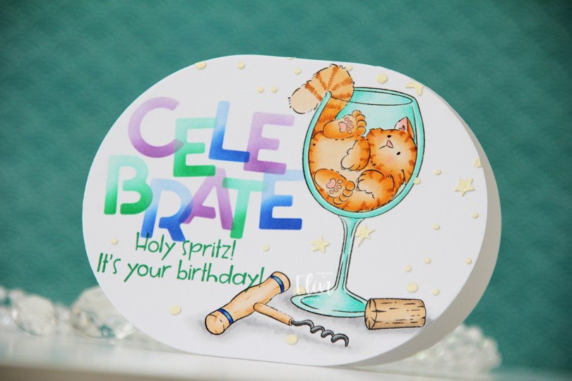
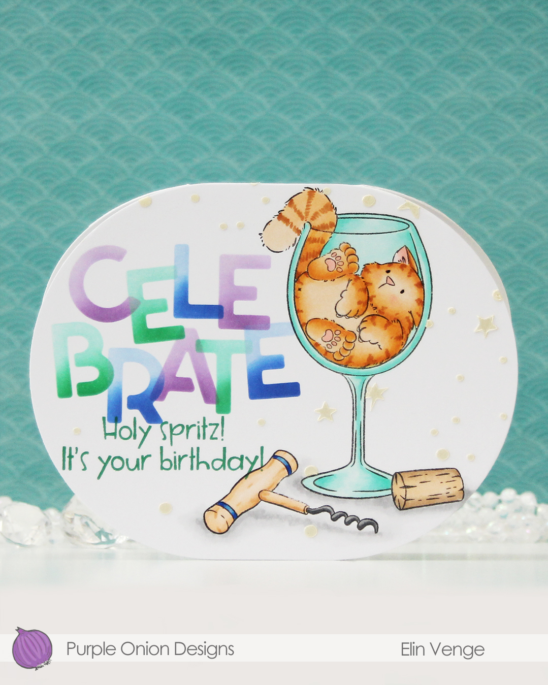 Isn’t this image fun? I love that Tofu somehow fits in this wine glass. There was an image in last year’s summer collection with a similar vibe. That one had a corgi hanging on to a margarita glass. So fun!
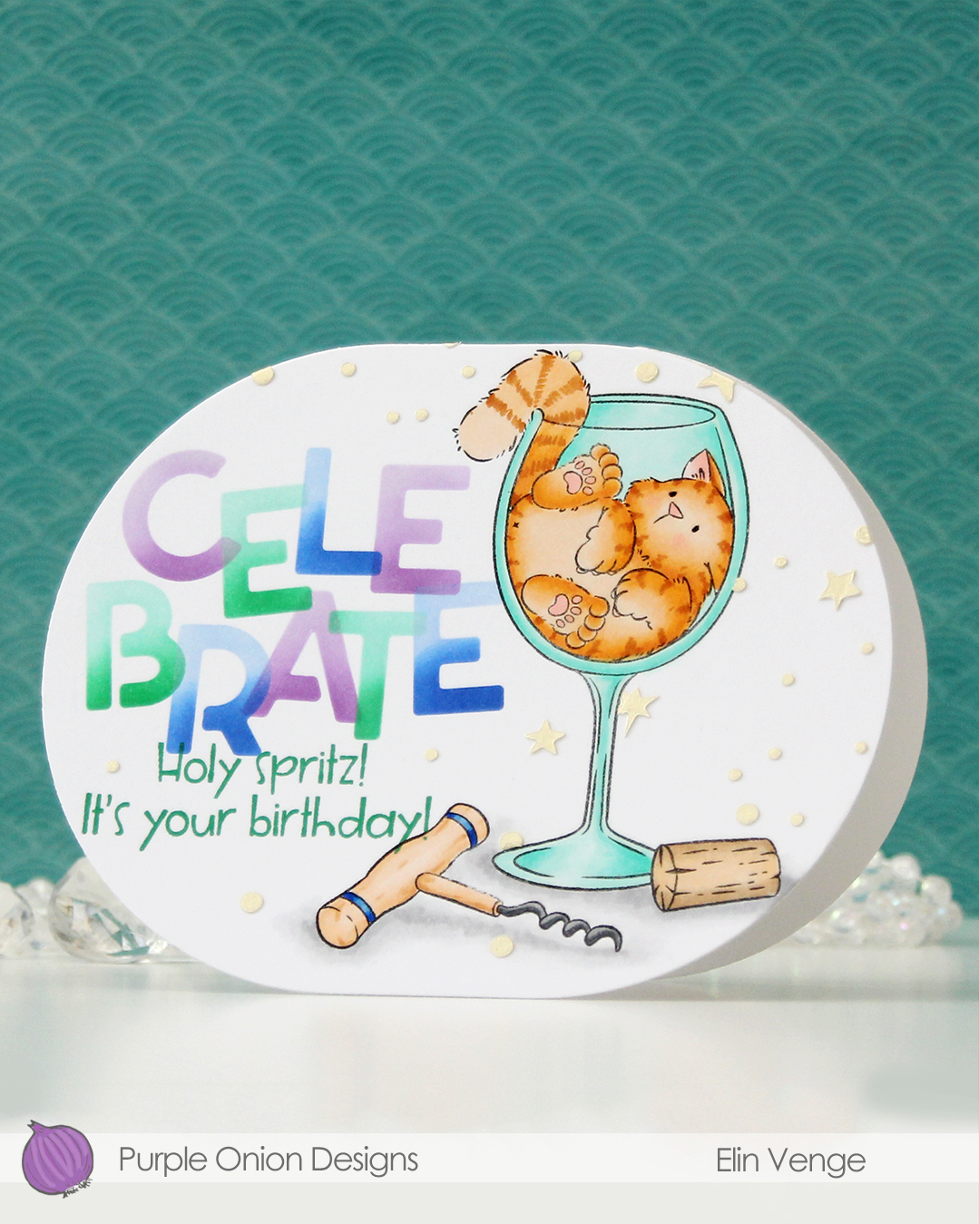 For this card, I simply colored my image with Copics, placed a mask on top of my mage and did some ink blending with C9 inks and the Celebrate stencil set from Kristina Werner. I used purple voluntarily, can you believe it? The purple is Fig faded into Aster, the green is Clover faded into Surfside, and the blue is Capri blended into Bluebell. I can’t take credit for the color palette, though, it was one Jennifer McGuire shared in the C9 Winter Retreat back in January, when they revealed the new colors to the retreat attendees. I’ll take my color inspiration wherever I can get it, and this was a fun one to try. Capri has stolen my heart!
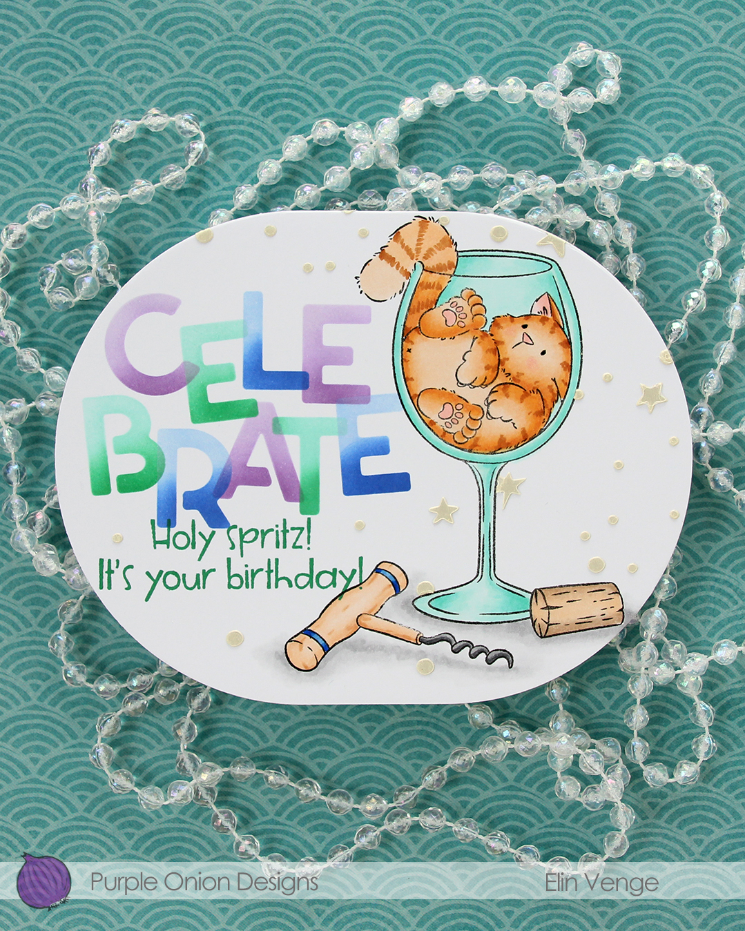 Back to the card. I removed the mask on the corkscrew before stamping the
  I wanted a little bit more interest in the background and decided to use paste, but before I put the paste on, I die cut my panel using the largest die in the A2 Oval Basics die set from Kristina Werner.
 Once my panel was the finished size of the card, I placed the corkscrew mask back on, then used another stencil in the Celebrate stencil set from Kristina using Golden Hour Solar Paste from Simon Hurley. I made sure to cover the sentiment before adding the paste, so it wouldn’t end up where I didn’t want it. The paste adds texture and a little bit of shine in addition to breaking up all the white space in the background.
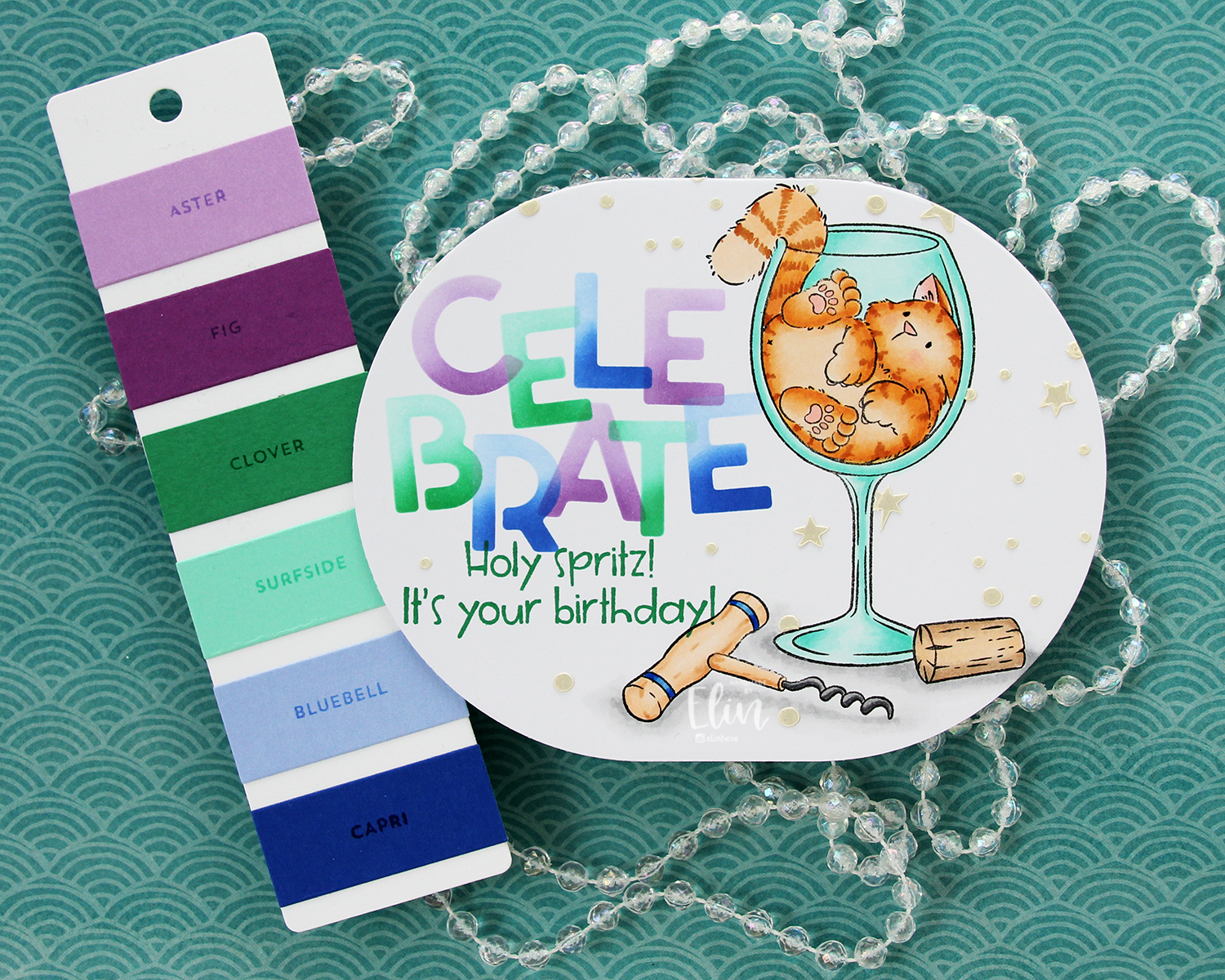
 Last, but not least: the Copics I used. Fairly neutral palette for this one.
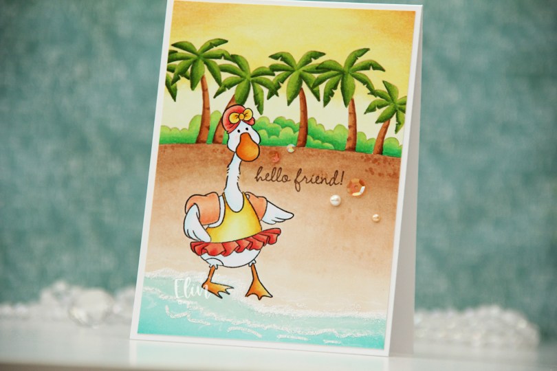
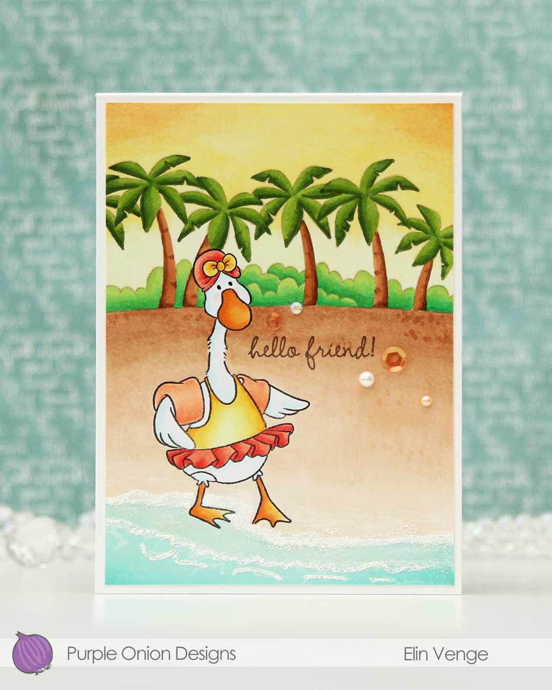
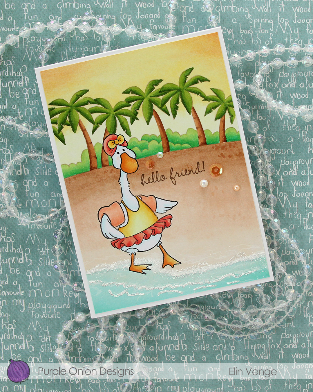 I added White puff embossing powder from Wow! for a seafoam look near the bottom of my panel and stamped a sentiment from the much older
 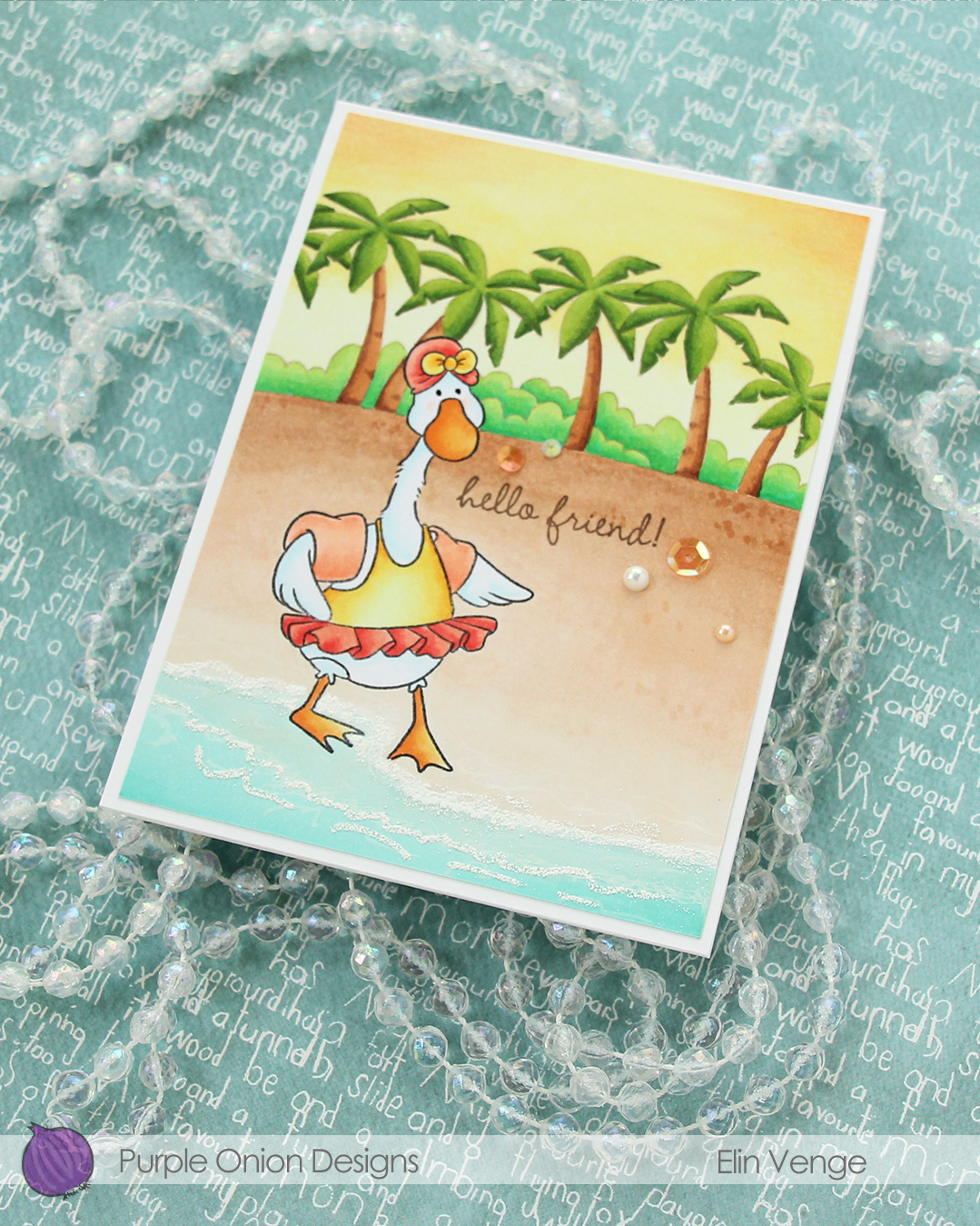 To finish off the card, I added a few sequins, gems and pearls from the Melon embellishment mix from Little Things from Lucy’s Cards.
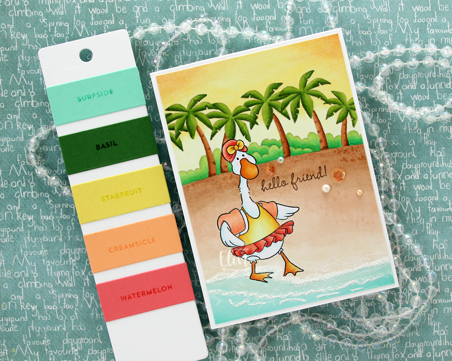 This Tropic color combination from Concord & 9th was my inspiration for this card.
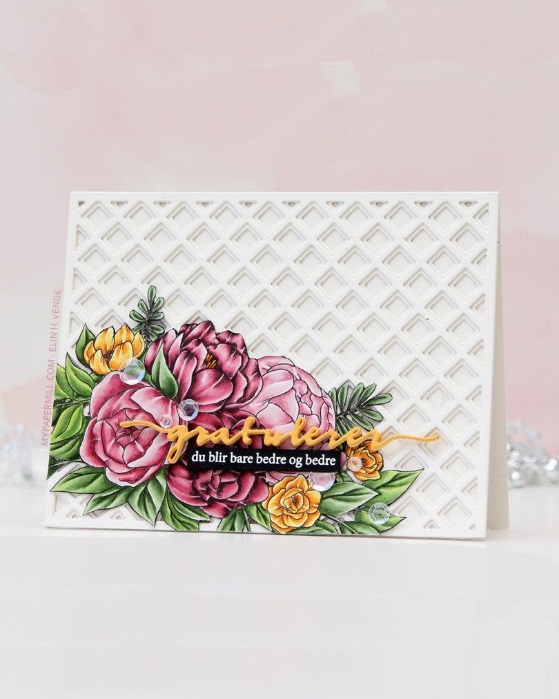
 The floral stamp’s an old Stamptember collaboration stamp with Studio Katia called Flower Bunch. Studio Katia is no longer in business, I believe, but that doesn’t mean this image is any less gorgeous. I stamped it with Extreme Black ink from My Favorite Things onto X-Press It blending card, colored it with Copics and fussy cut the whole thing.
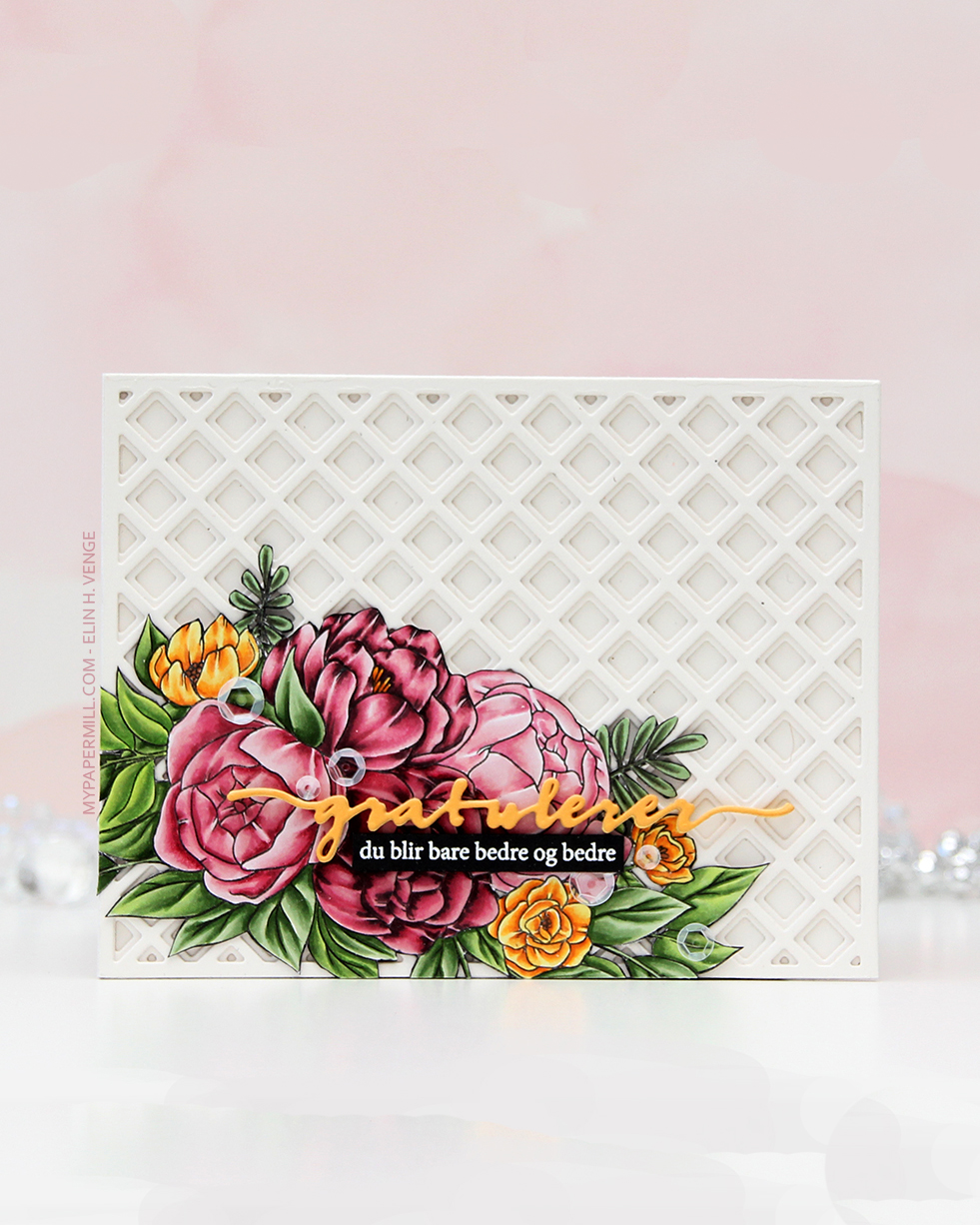
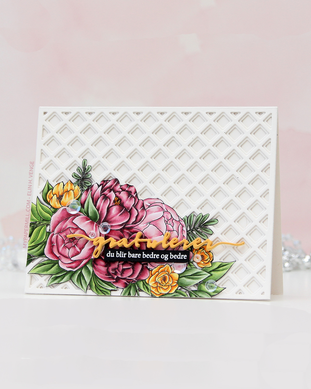 I created a card base from Rustic White cardstock from Papertrey Ink and added some interest to the background with the Garden Lattice Base and Garden Lattice Top dies, both from Honey Bee. I cut two of each, stacked them and adhered them to my card base, gluing the fussy cut image down in the bottom left corner.
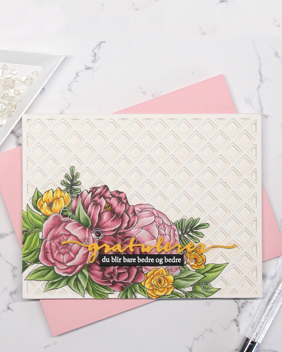 I die cut the Gratulerer 6 die (PD17240) from Papirdesign from Summer Sunrise cardstock from Papertrey Ink and backed it with a couple of additional ones die cut from Harvest Gold cardstock, also from PTI. I stamped and white heat embossed a sub sentiment from the A06 stamp set from Norsk Stempelblad AS onto a scrap of True Black cardstock from Papertrey Ink, trimmed it down to a strip and backed it with additional strips for dimension. I’m pretty sure I used some glitter spray at the end of my coloring, because the image on this card really sparkles. It’s not in my notes, though. To finish off I scattered a few sequins from the White Orchid sequin mix from Little Things from Lucy’s Cards.
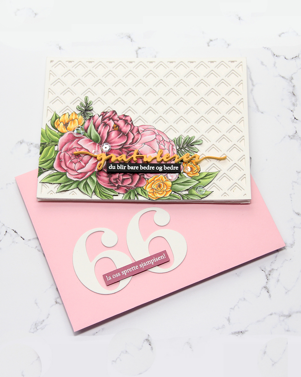 I even embellished my envelope. I used the By the numbers die set from Papertrey Ink for the big numbers, then white heat embossed another sentiment from the A06 stamp set from Norsk Stempelblad AS, this time onto Autumn Rose cardstock from Papertrey Ink.
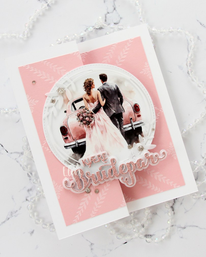
 This is a super simple fun fold, you basically fold the front of a regular sidefold card at the halfway point, so it doubles up on itself, which then becomes the front. For this one I started with three panels of Pale Peony cardstock from Papertrey Ink. I inked up the Leafy Lattice press plate from Pinkfresh Studio with white pigment ink from Concord & 9th to impress and ink up a very subtle pattern on all panels. I created a card base from Stamper’s Select White cardstock from Papertrey Ink that measures 5 x 6 1/4″ when it’s folded. I scored and folded the front at 2 1/2″. I put one of my panels on the inside of the card, put one on the back of the card and cut the last one in two to put on the front, making sure the pattern lined up with the inside.
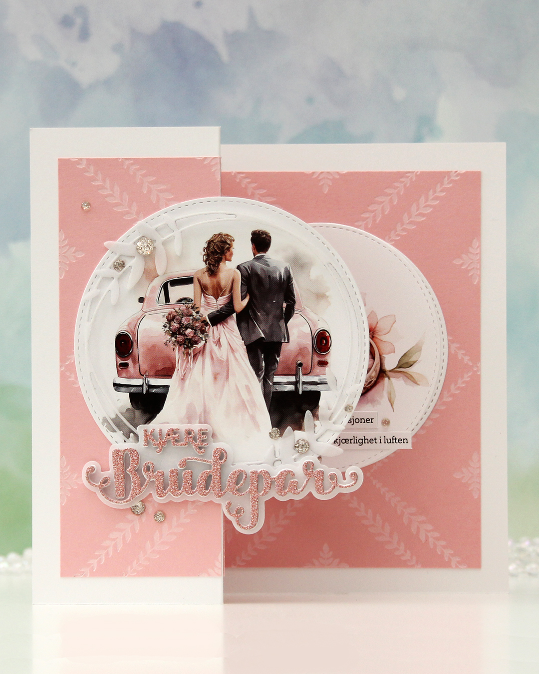 This is what the card looks like on display. I die cut a couple of images from a sheet from Kort & Godt (MA1001) using a die in the Stitched Circle STAX die set from My Favorite Things. This paper is kind of thin, so I backed it with a plain white cardstock circle behind. I glued one circle to the front, making sure to put glue on the left side only. I die cut the leafy circle die from Kort & Godt (die 345) from Heavyweight Translucent vellum from MFT and added that on top of my circle image, adhering it only in a few spots. I used the Kjære brudepar die set (PD18406) from Papirdesign for the word, stacking a few white ones, adding the shadow die cut from vellum, then another few white die cuts topped with a glitter one, die cut from pink glitter cardstock from Kort & Godt, before finishing off with a few champagne glitter drops from Pinkfresh Studio.
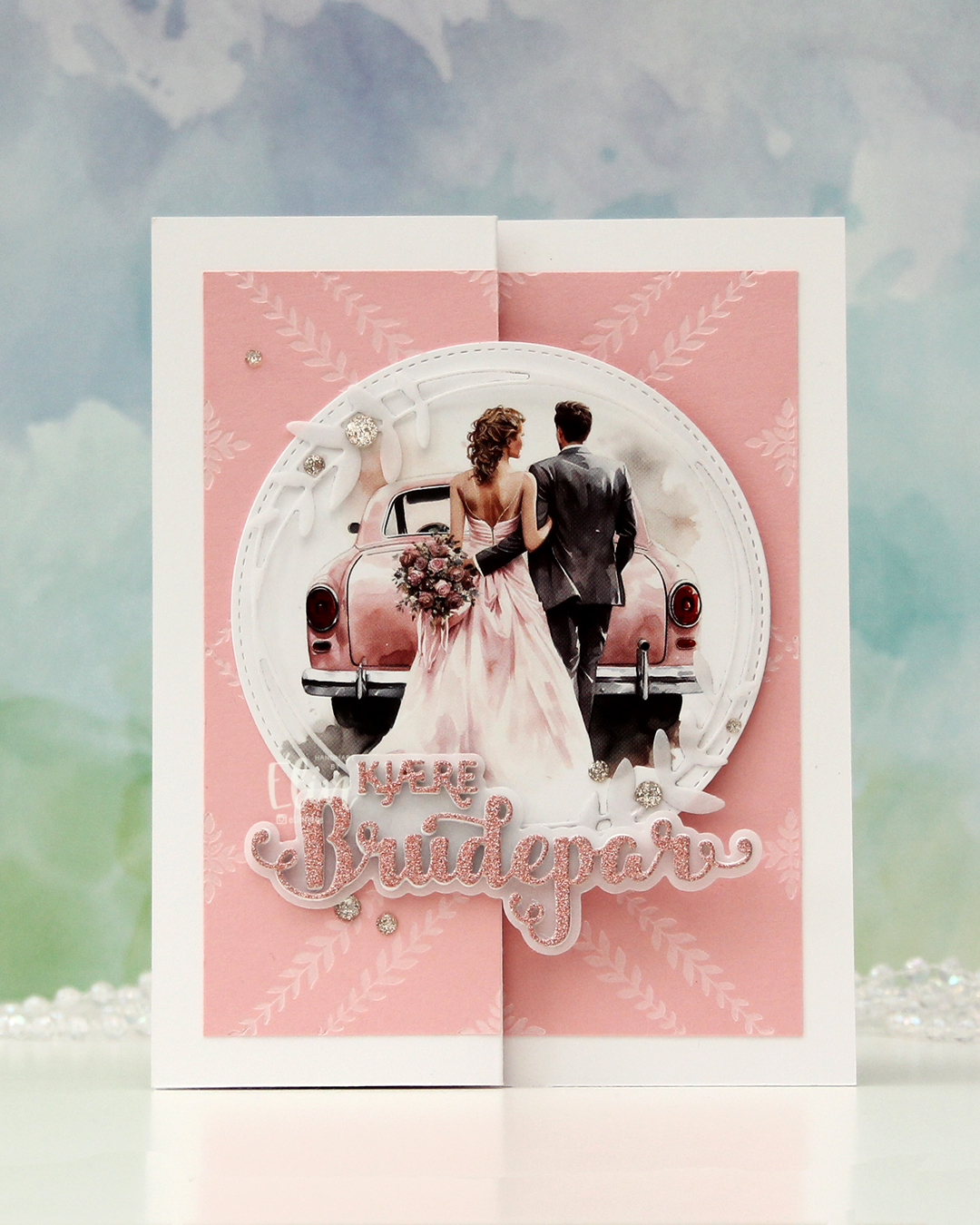
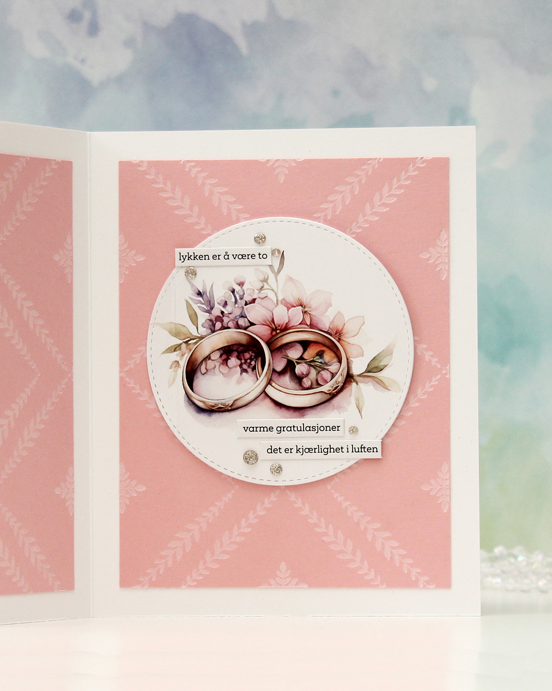 The circle image on the inside is a little bit smaller than the one on the front, and is hidden when the card is closed. . I added some wedding themed sentiment sticker strips from Kort & Godt (ST1018) and a few more glitter drops to embellish. This circle actually opens to reveal a place to write a sentiment, there’s a score line you can see on the left here.
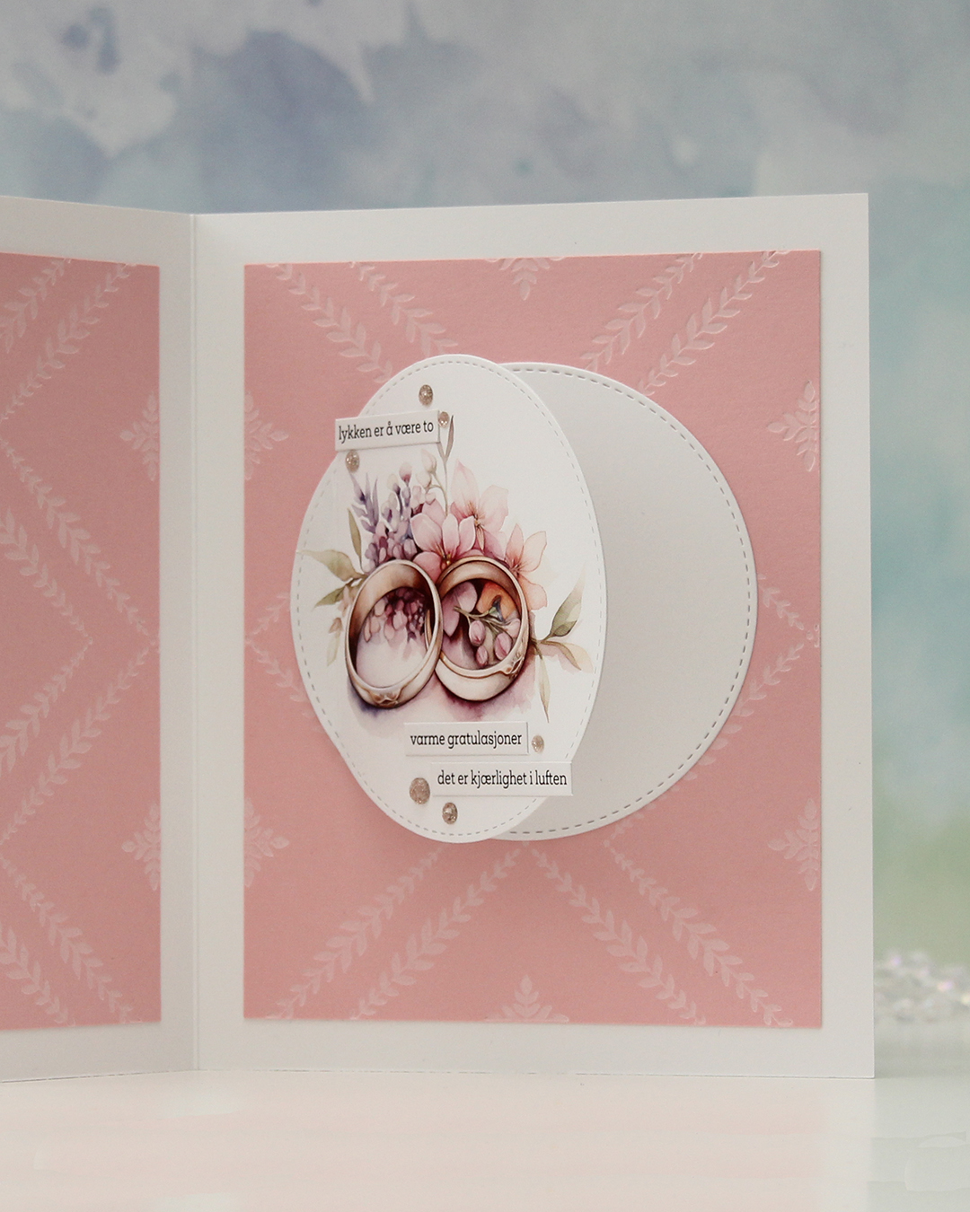 Another circle hides behind, and there’s enough room for a personal message without it showing too well when the card is open on display.
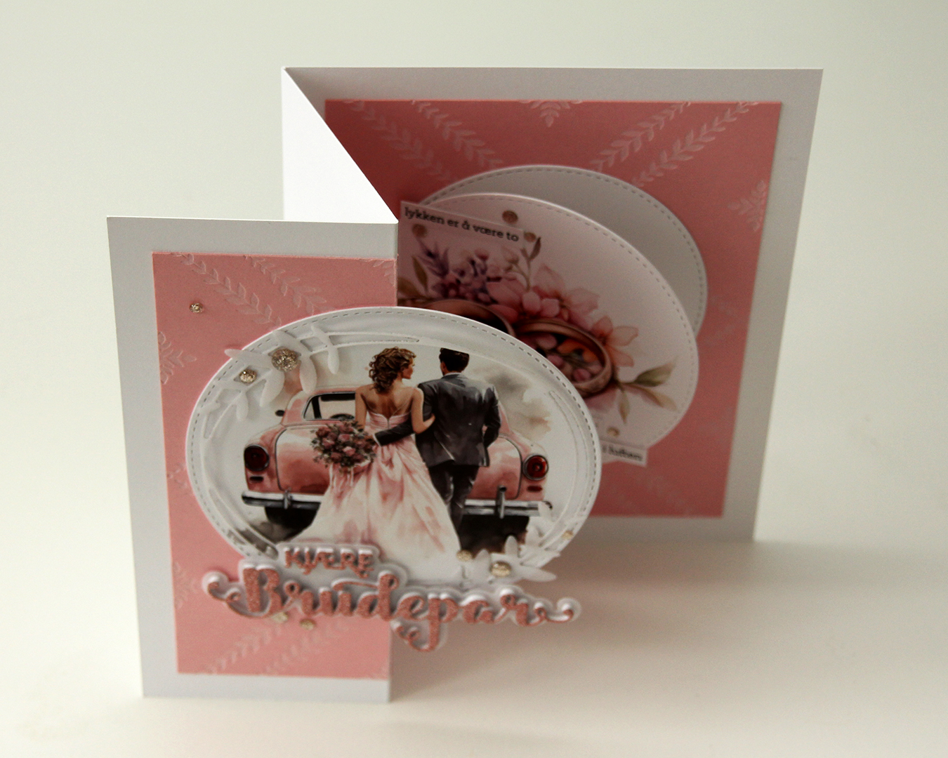 Here you can see the card open from a different angle.
 This wound up being a very soft looking card, between all the pink, white and vellum.
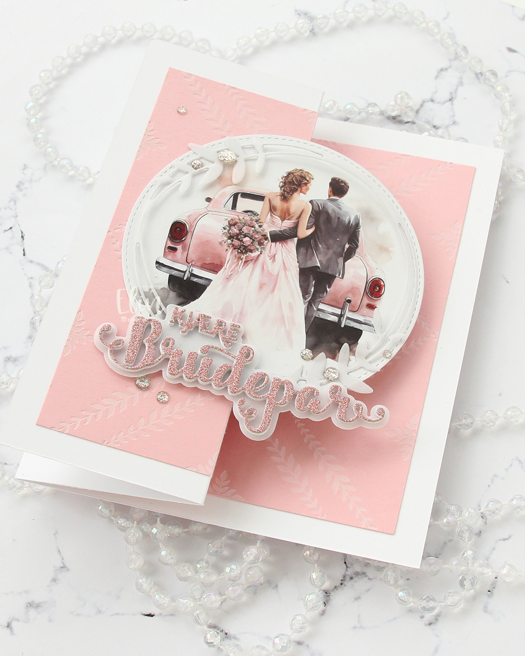 I love love love the added texture and crisp inking you get with a press plate. It’s the best thing ever.
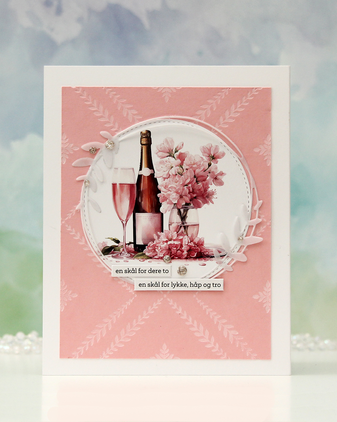 The back of the card. Another die cut circle, another vellum circle with the leaves and a couple more of the sentiment sticker strips. I hope you try this fun fold if you haven’t already. It’s easy, but still something different than store bought.
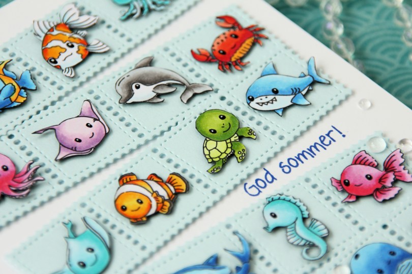
 As I mentioned, I created this card using two collections:
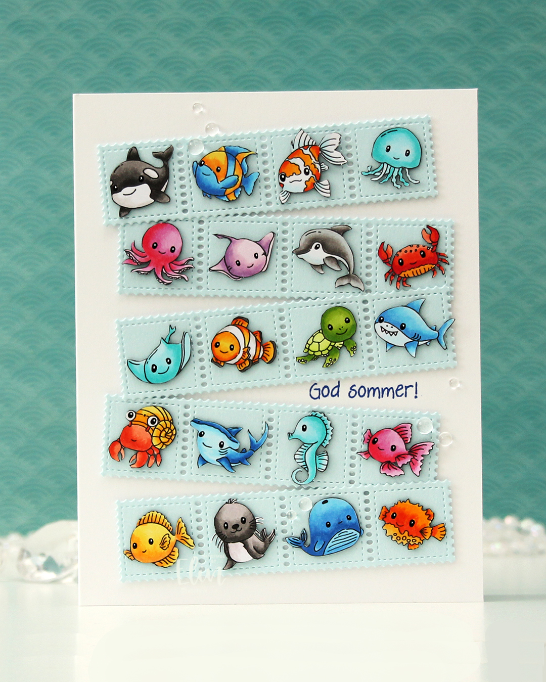
 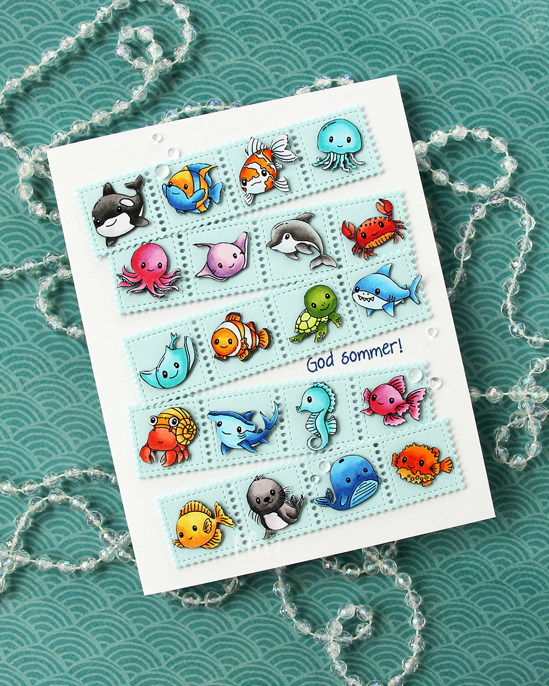 Once I had all my sea creatures colored and fussy cut, I put them aside and worked on the rest of the card. I die cut the Stamp Border from Gummiapan five times from Powder cardstock from Concord & 9th. The die cuts five postage stamps in a border, but I cut off one, making it a strip of four. I put two layers of white scraps behind each of the individual postage to give it a floating look. I also cut down small cardstock squares two layers thick to put behind my critters, also giving them a bit of dimension, but not as much as foam tape would add.
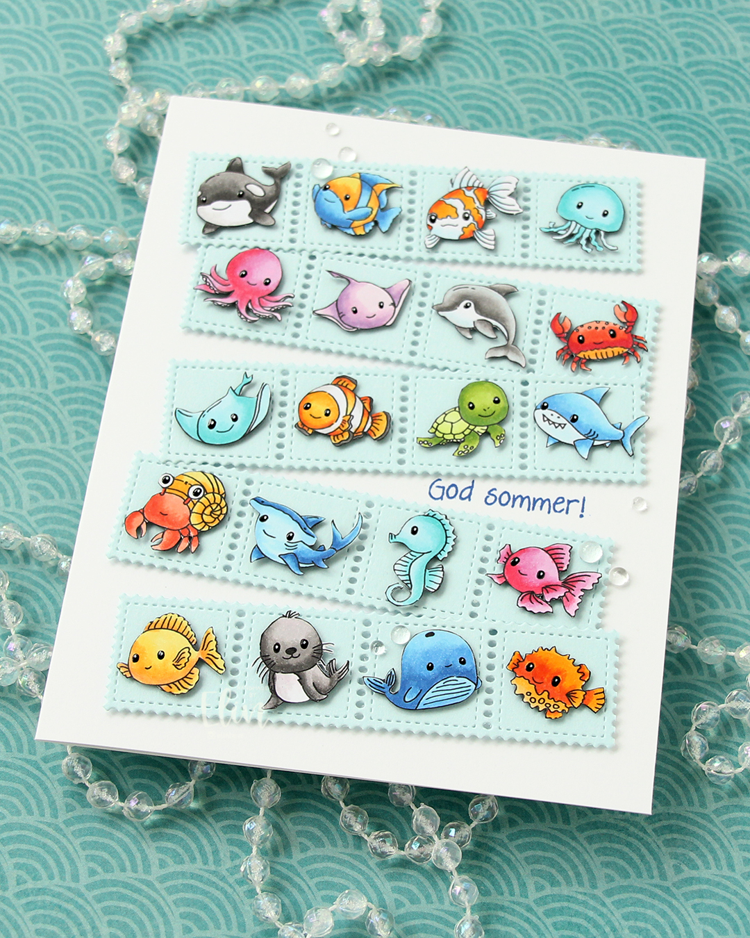 Once I knew how I wanted my strips of sea postage arranged, I stamped a sentiment from the Småtekster stamp set from Norsk Stempelblad AS using Capri ink from Concord & 9th directly on my card base, which I created from Stamper’s Select White cardstock from Papertrey Ink. I made a side fold card this time that is 1/2″ larger in both directions than the standard A2 card. I adhered my postage stamps, added some dew drops from Concord & 9th that kind of look like bubbles and decided to make their eyes shine. I used a black glaze pen, then went over with one small dot of an extra fine white Sharpie once the black was dry. I don’t think I’ve ever used 20 images on one card before, but this was SO. MUCH. FUN!!