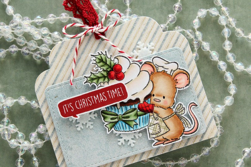
Hi, crafty friends! It’s the first Sunday of Advent, and I have a fun gift tag to share today featuring the adorable Baking Fun image from Purple Onion Designs, illustrated by Pei – I’m such a big fan of her illustrations!! I did a lot of baking last year for Christmas – SO many different types of Christmas cookies and sweets. This year, I haven’t even started yet. I have a few favorites I might end up making, I haven’t decided yet. Anyway, back to the gift tag.
 I colored up the cute little mouse with Copics, adding a plaid pattern to the apron using a Zig watercolor brush marker (No. 98 Pale Dawn Gray), before fussy cutting the image leaving a white border. I used the Gift Pocket Tag die set from Mama Elephant to die cut from patterned paper from the Christmas Nostalgia collection from Maja Design to create my tag. I mounted the smaller piece with foam squares and did the same with the cute little mouse.
 I stamped a sentiment from the Holiday Blurbs I stamp set from Purple Onion Designs using Amarena Cherry ink from My Favorite Things, fussy cut leaving a white border and mounted it on top of my image, doubling up on the foam squares on the left half. I tucked a few felt snowflakes from Kort & Godt under my element, added a bit of black glaze pen to the eyes and tied ribbon and twine at the top of the tag to finish.
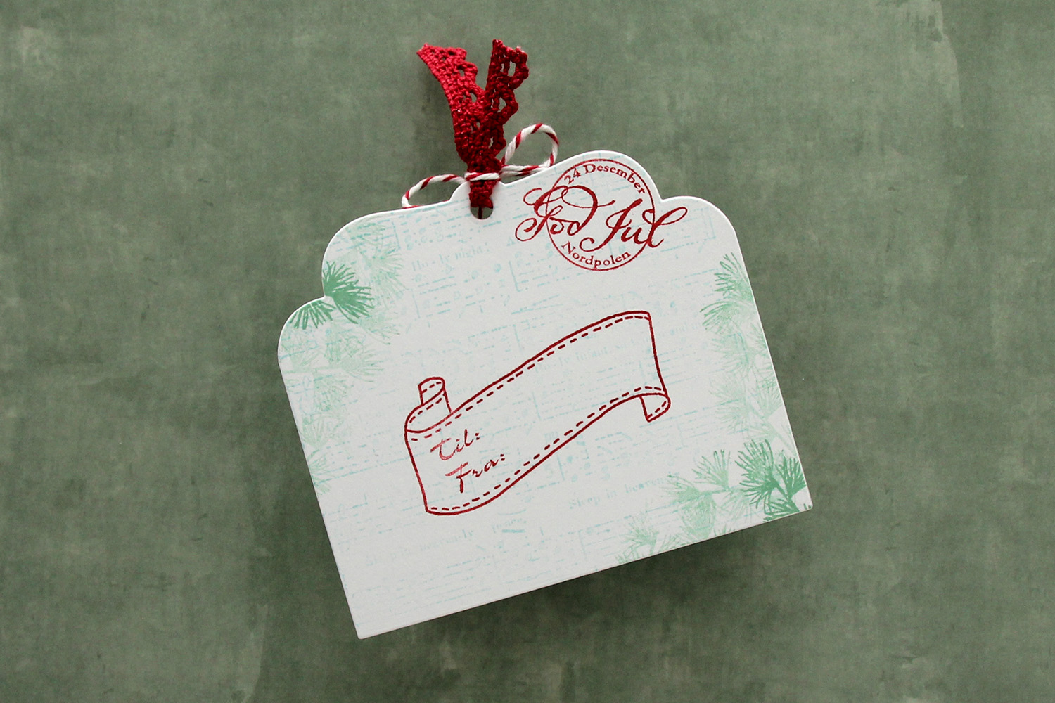 I die cut the tag a second time from white cardstock and did quite a bit of stamping on it. I used second generation stamping of an old sheet music stamp from Magnolia using Powder ink from Concord & 9th – I wanted it to be very soft. The sheet music is actually for Silent Night, making it extra Christmas-y – not that you can really tell. I used first and second generation stamping of a branch from a Mathia Design stamp set using Eucalyptus ink from Concord & 9th to add a little something to the corners. I stamped a postmark stamp from Ladybug & Friends, as well as a to/from stamp from Norsk Stempelblad AS using Amarena Cherry ink from My Favorite Things. I don’t think Ladybug & Friends is in business anymore. Neither is Norsk Stempelblad, but I love their stamps and can’t bring myself to stop using them.
![]() I didn’t use too many colors on this one.
I didn’t use too many colors on this one.

 The card was made on order for a superintendent turning 60. I was told he likes wine, good food, sunny, warm weather and enjoying life and was given free reign to do as I pleased.
  I rarely use patterned papers on my cards anymore, and certainly not pieces this big, but I love the XXL Square Frames Frilly #10 die set from GoKreate, the dies in the set are perfect for creating shaped cards. I use two 12×12″ sheets of patterned paper to make one of these cards, and this time I used the Drivers License patterned paper from the Denim & Friends collection as well as the Tough but sweet sheet from the Denim & Girls collection, both from Maja Design. I can cut two of the larger shapes and two of the smaller shapes from one sheet, so the insides of the card are reverse.
 I colored the image in colors that went with the patterned paper, adding a bit of red to catch the eye and writing the words on his t shirt with a black Copic friendly pen. I thought the pun would tick the “loves wine” box.
 I used foam tape to add the smaller shape to the larger one, and also to add the die cut circle to the smaller shape. I stamped postmarks from various cities in the world using Memento Rich Cocoa ink to add a little bit of interest to the circle and the panel behind it. I figure if the guy loves warm, sunny weather, he probably also loves to travel, there’s not a whole lot of warm days in Oslo over the course of a year.
 I added some metal embellishments from Tim Holtz in a bit of a cluster near the bottom left “corner”, as well as his age, die cut and put on a 1″ circle with an epoxy sticker on top for a bit of added dimension.
 I hid a die cut tag behind my image. I used to do this all the time, and it’s a fun way to add a sentiment without having to find space for it on the front of the card. The sentiment is from the Til mannen stamp set from Norsk Stempelblad AS. The dies I used for the tag and reinforcer are old ones from Magnolia. I tied a bow from twill onto the tag, and some cutlery charms to the twill bow using natural twine from May Arts. I thought the cutlery was perfect for a food lover, I have so many treasures in my stash that I forget about until I go looking for something to use.
 The inside of the card are pretty simple. The same patterned paper as the front, only with the reverse size. I used more of the postmark stamps from Marianne Design, as well as a sentiment from the Gratulerer stamp set from Norsk Stempelblad AS. There’s plenty of space for a personal message on the second circle, which only has the postmark stamps on the edges.
 The back of the card is also simple. Another sentiment from Norsk Stempelblad AS, this time it’s the B03 stamp set. I love their stamp sets and use them more than any other of my Norwegian sentiment stamps. They’re hard to get your hands on because the company is no longer in business, but they’re the best sentiments out there.
 Simple color palette.
 I colored the image with Copics and die cut the panel using the largest die in the A2 Stitched Rectangles STAX 1 die set from My Favorite Things, before adhering it to a card base I created from Sour Apple cardstock, also from My Favorite Things.
 On my cluster cards, I usually choose two to three colors from the image to create scraps from. This time I chose green and yellow with a little bit of gray. Neutrals are always a good thing to add. I keep die cut scraps in stamp storage pockets on my desk, sorted by color. Whenever I want to create a cluster, I choose the storage pockets with the colors I want, dump the contents on my desk and start PLAYING.
 For this card I wound up using scraps from 3ndypapir, Karen Foster, Sunny Studio, P13, Magnolia and Papirdesign. By limiting the size and colors of my clusters, the design stays harmonious and you can’t tell that I’ve used patterned paper from 6 different companies. I adhere some directly to the layer below, some using foam squares. As a base, I used half a doily from Doodlebug Design that I had in a drawer. I love these tiny paper doilies, they’re perfect for this.
 Using VersaFine Onyx Black ink, I stamped a sentiment from the
  These cluster cards are so fun to make. They make my piles of scraps shrink EVER so slightly, but anything’s better than nothing, and I love the dimension they add to the card.
 I used quite a few colors for this one.
 I colored up
  These clusters are pretty easy to put together. On my desk I keep a bin with die cut scraps of patterned paper. I organize these scraps by color, and put each color in a stamp storage bag. Whenever I want to create a cluster, I choose the colors that go with my card, dump the contents of the storage pockets on my desk and play. This time I used three bags; the blue, the green and the gray – it’s nice to throw a neutral into the mix. The scraps I used for this card are from a few different companies. The blue ones are from Papirdesign (the grey with the blue stars is the back of that blue with the lighter dots), the green ones are from 3ndypapir and Karen Foster, with a little bit of New Leaf cardstock from Papertrey Ink thrown in for a darker green to make the dark blue a little less dominant. The top grey one is actually from Magnolia, whereas the one with the sentiment is from DCWV. The sentiment itself is from Norsk Stempelblad, stamped in Cornflower ink from My Favorite Things. To finish off the card I added a few green enamel dots from Papirdesign.
 This color palette makes me happy.
 I colored the penguin with my Copics, fussy cut him and added 1 mm foam squares to the back. I created a fold over tag using the second largest die in the fold over tags nesting die set from We R Memory Keepers and some really old pink patterned paper from Magnolia.
 I created a tag to go inside the folded over tag using scraps of patterned paper from Papirdesign. Using one of the dies in the Tag Builder Blueprints 6 die set from My Favorite Things, I created the to/from circle using that pink patterned paper, and matted it with a white die cut circle. I probably didn’t need the white circle, I’m thinking the letters would have stood out more against the grey patterned paper, but what’s done is done. I still like the white.
 Fairly quick coloring on such a small image means I didn’t use a lot of markers. I originally colored his feet and beak orange/yellow, but didn’t like the look and covered it with grey. You can still see the orange shining through in the finished coloring. That, I don’t mind, for some reason, I just didn’t like the look of the orange alone. Some species of penguins have black feet anyway 😉
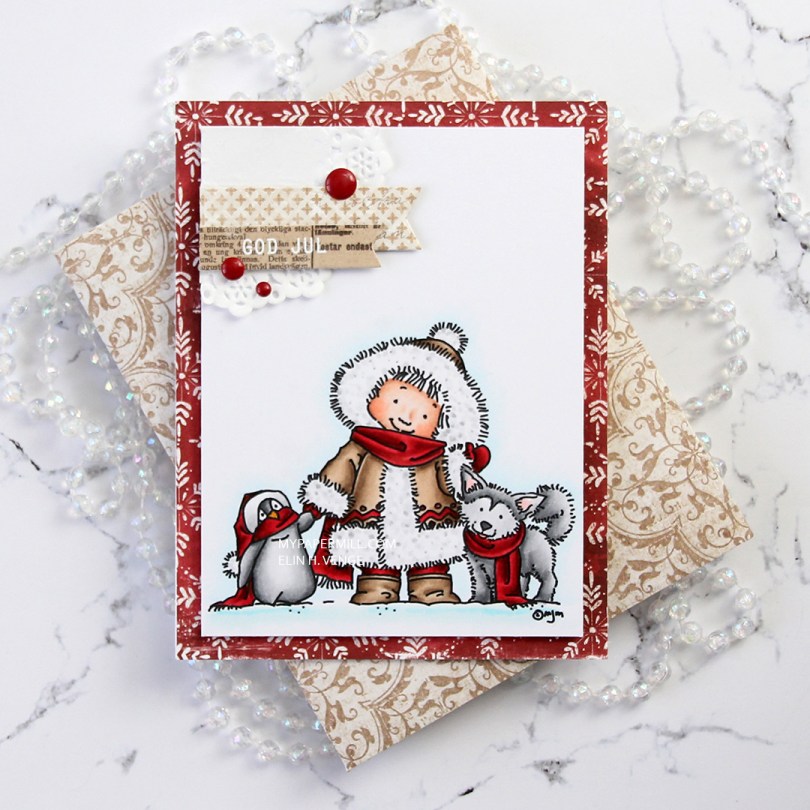
 I don’t know what’s going on with me, but I’ve made another red Christmas card. I love creating Christmas cards, but I’m not a fan of red, not even for Christmas. The best thing about creating cards is that they get sent to someone else, so even if I personally don’t like certain colors, I’m getting rid of them eventually anyway, so it doesn’t matter. 😉
 Once I’d colored the image with my Copics, I trimmed 1/4″ off each of the four sides and covered the back with foam tape. I found an old scrap of patterned paper from Magnolia that was already cut down to 4 1/4 x 5 1/2″, probably a reject from a previous project, but perfect for this one, the red matches my coloring! It has white “snowflakes” on it. These have 8 points, so they’re not actually snowflakes. There’s no such thing as an eight pointed snowflake (or a five pointed, for that matter), it has to do with how water molecules are formed.
 I die cut a couple of scraps of Maja Design patterned paper using two of the Fishtail Flag Frames dies from My Favorite Things. I stamped and white heat embossed a sentiment from Norsk Stempelblad AS onto one of the die cut banners, adhering it to the larger one using 1 mm foam squares for a little bit of dimension. I used the same foam squares on the back of the bigger one and glued both banners to part of a mini doily from Doodlebug adhered to the top left corner of my colored panel. I added a few enamel dots from Papirdesign, and my card was done.
 I found an old scrap of patterned paper from 3ndypapir that was just large enough to create an envelope from using the A2 V flap envelope dies from Simon Says Stamp. I thought the color matched the brown in my card nicely.
 Not a lot of colors used for this one.
 I colored her up with my Copics, focusing on the RV90s that go so incredibly well with the patterned paper from Papirdesign that I used, it’s ridiculous!
 I made a shaped card using the third largest die in the XXL Square Frames Frilly #10 set from GoKreate, and did a whole bunch of diecutting elsewhere on the card too. To break up the monotony of a diecut on top of a slightly larger diecut on top of a slightly larger diecut on top of a slightly larger diecut, I cut some Kort & Godt lace and put it across the card. The diecut heart banner, the word banner and all those Wild Orchid Crafts flowers also help. The flower berries and pearls are from Kort & Godt.
 There’s a banner hidden behind that image, diecut with a Magnolia die. I tied a bow of seam binding ribbon with the help of a DIY bow easy, I can’t make nice bows for cards to save my life (true story!), so the Bow Easy helps. I stamped a Papirdesign stamp using Memento Sweet Plum ink, which also matches the patterned papers beautifully. On top of the bow I added an old button from Melissa Frances.
 Is that an adorable little fairy or what? Those flower berries from Kort & Godt are really old, I think they might actually be from their first production of flower berries. They made some later on that had more of a greenish yellowy tint, but these are more creme colored and perfect for this card. I still have a few left, I only use them on very special cards.
 I added another Papirdesign sentiment stamp on the back of the card, along with a few more flowers. I removed the centers of the sweetheart blossoms and added back in some purple pearls from Papirdesign that once again matched the colors of everything else.
 As you can see from the above photo, this is a very dimensional card and not at all mail friendly, it’s super thick.
 Not too many Copics used for this one. Probably because it’s mostly that one dominating color.
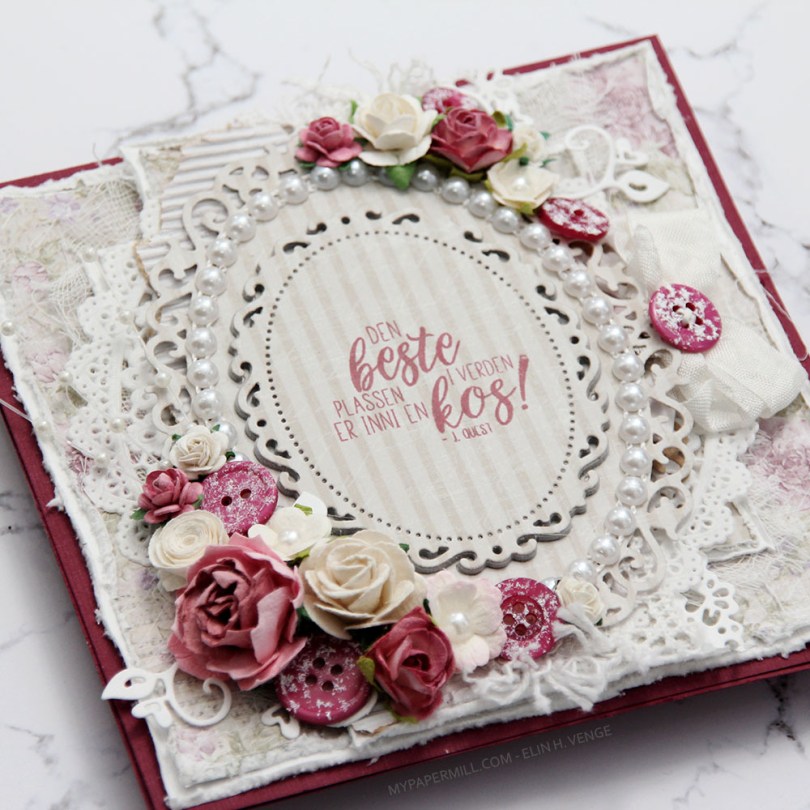
 Jeg var innom Hobbykunst i januar og fikk en utfordring om å bruke et
  Teksten er et stempel fra
  Kortet ble ikke veldig postgangvennlig, det er ganske tykt, selv om jeg kun har pyntet forsiden. Det var nemlig ikke nok igjen av arket til å bruke inni og bak. Sløyfen med knapp sitter fast i en tag som er under hovedpanelet. Teksten på tagen er også et Huldra-stempel. Hvilket kan du se i Hobbykunst-butikken, der er nemlig kortet.

 Jeg stanset ut motivet mitt med en die fra Spellbinders og satte på en perlebord fra Wild Orchid Crafts på innsiden av kanten. Pyntet med blomster fra WOC og Kort & Godt, i tillegg til knapper fra Papertrey Ink malt med bittelitt gesso. I midten av de hvite sweetheartblomstene har jeg satt blå diamanter fra Kort & Godt, og i midten av den blå har jeg limt på en liten hvit perle.
 Bak motivet har jeg gjemt en tag stanset ut med en die fra Magnolia. Jeg har satt en sløyfe med knapp i enden, og stemplet en tekst fra North Star Design på tagen med blekk fra Papertrey Ink. Bokstavene i navnet til dåpsbarnet er stanset ut i Maja Design papir med en Sizzix-die.
 Kantdieen jeg har brukt for å lage stjerneborden som går på tvers av kortet kommer også fra Magnolia, det samme gjør hjerteswirlen jeg har lagt under blomstene mine.
 På innsidene har jeg to identiske skrivefelt laget med den samme dieen som jeg brukte på forsiden til motivet mitt. Det gir en fin helhet til kortet. Den andre innsiden er lik denne. Veldig greit med ekstra god skriveplass på dåpskort, dåpsbarnet har jo hele livet foran seg.
 Baksiden har det samme oppsettet, en tekst fra NSD og enda flere blomster.
 Her syns relativt godt at det er en god del dimensjon på kortet. Spesielt postgangvennlig er det ikke, men dåpskort blir gjerne håndlevert, så jeg syns likevel det er innafor med såpass dimensjon.
 Siden kortet ikke fikk plass i en vanlig konvolutt lagde jeg en eske til å ha det i. En liten diecut med stemplet tekst får pryde utsiden av esken.
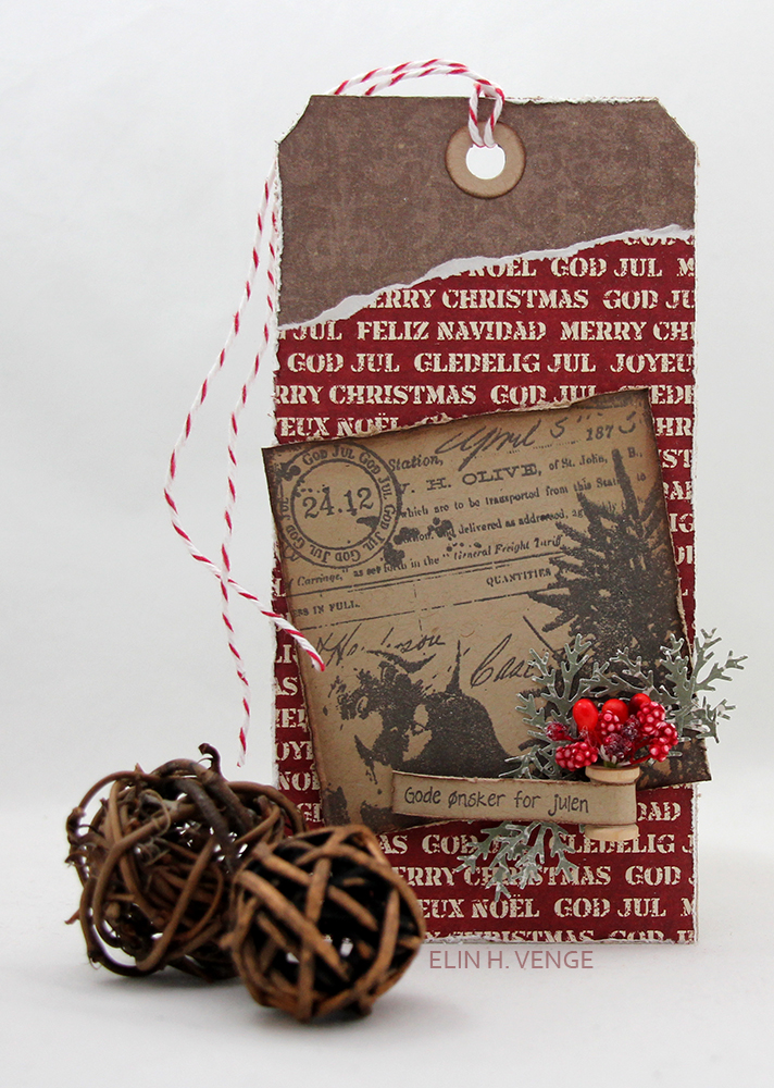 Denne første pakkelappen er stanset ut med en tagdie fra Sizzix. Jeg har brukt mønsterark fra Pion Design og Inkido, og stempelmotivet kommer også fra Inkido. Teksten er fra Norsk Stempelblad AS, og jeg har pyntet veldig enkelt med utstansede kvister og noen pyntebær fra Magnolia. Den lille snellen kommer fra Maya Road.
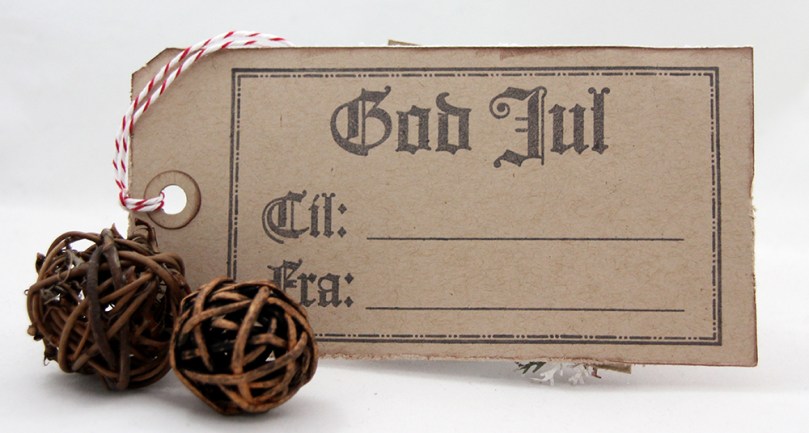 På baksiden stemplet jeg et digert Til/Fra-stempel fra North Star Design med Papertrey Ink Dark Chocolate blekk, som er samme blekkfarge som jeg brukte på stemplene foran på tagen. Den lille røde biten med twine kommer fra Whisker Graphics.
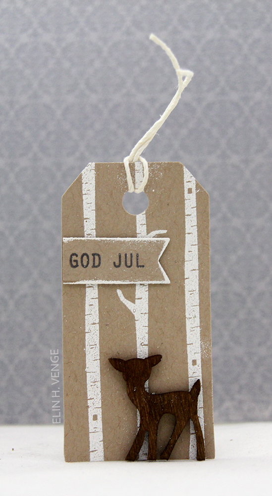 Pakkelapp nummer to er mye mindre. Her har jeg stemplet og embosset trær fra Mama Elephant på kraftfarget kartong og limt på et lite rådyr fra Nille. God jul-stempelet kommer fra Norsk Stempelblad AS og er stemplet med Papertrey Ink Dark Chocolate.
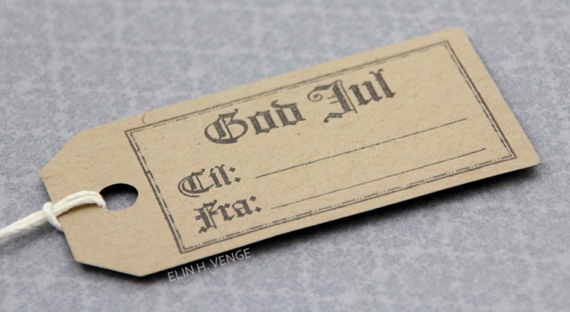 Også her har jeg brukt et stempel fra NSD på baksiden stemplet med Dark Chocolate, men dette stempelet er ganske mye mindre enn det på den første tagen. I enden har jeg festet hvit hamp fra Hemptique.
 Denne pakkelappen er av det veldig enkle slaget. Jeg brukte to vimpeldies fra Papertrey Ink, den ene litt større enn den andre, og stanset de ut i henholdsvis kartong og mønsterark fra Pion Design. Jeg pyntet enkelt med seam binding og to bjeller som lager herlig julelyd.
 Baksiden denne gangen har et stempel fra Inkido, stemplet med Blueberry Sky blekk fra Papertrey Ink.
 Enda en pakkelapp av det enkle slaget. Jeg stemplet et stempel fra Poppydesign rett på et mønsterark fra Maja Design med Coffee Archival Ink fra Ranger og klippet ut formen på pakkelappen rundt kanten på stempelet. Jeg limte på løs bling fra Kort & Godt i midten av hvert store snøfnugg på stempelet.
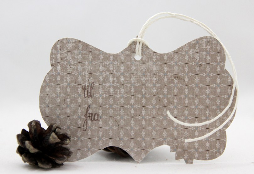 Enkel bakside med stempler fra North Star Design. Her har jeg også brukt hvit hemp fra Hemptique.
 Pakkelapp nummer fire. Her har jeg stemplet tekst fra Papertrey Ink rett på mønsterark fra Pion Design med Memento Rich Cocoa blekk. Formen på pakkelappen er stanset ut med en die fra Magnolia, og jeg har brukt en liten bit blonde og litt naturlig twine fra May Arts i enden.
 Stemplene på baksiden kommer fra Norsk Stempelblad AS.
 Den siste pakkelappen er den som egentlig er mest omfattende. Her har jeg brukt en liten bit av et stempel fra Penny Black som jeg har stemplet og embosset på akvarellark før jeg har fargelagt med Copic-refiller og vannpensel fylt med blenderrefill. Motivet er skjært ut og limt på en sirkel av Rustic White kartong fra Papertrey Ink med en stemplet tekst fra Norsk Stempelblad AS stemplet med Papertrey Ink Scarlet Jewel blekk.
 På baksiden har jeg brukt et Til/Fra-stempel fra Papirdesign. Jeg oppdaget litt sent at bildet mitt av baksiden er litt uklart, men pakkelappen er jo gitt bort, så jeg kan ikke akkurat ta nye bilder. Også her har jeg brukt rød twine fra Whisker Graphics.