Hi, crafty friends! I’m back today with a confirmation card I made on commission. I was told that the recipient does kickboxing, likes car races, swimming (lake or beach doesn’t matter as long as it’s water) and is a bit of a prankster. Lots of interests that I tried to incorporate into my card. They’re all very different interests, so I had a tough time figuring out what to do, but the card was a huge hit with the recipient, and that’s never a bad thing.
 I looked for a kickboixng image I could color up, as I wanted that to be the main focus on the card – it was his main hobby. I didn’t have one, nor could I find one, but I found this greyscale sketched image with boxing gloves that was perfect.
 The gloves cover the entire front of the card. I still needed something to color, because a black and white image isn’t very interesting on its own. I settled on Blast from Mo Manning, which was the perfect image for a prankster who loves water. I colored it up in very vibrant colors, making sure to include some red, which I thought would work great with the boxing theme AND the car racing theme. I fussy cut him and placed him on top of one of the gloves. He blended in with the background a little too much, so I decided to print the gloves again, this time with a very low opacity. I fussy cut the glove, scored it on one side and made it into a flap that opens. Put the colored image on top of this one, and now it didn’t get lost in the background. I also added a bit of Glossy Accents to the goggles for a bit of shine.
 I mounted the colored image on pieces of foam tape, making sure to add a magnet in a strategic spot to keep the flap from opening on its own. I put another magnet behind the image of the gloves to keep both magnets hidden. They’re still plenty strong enough to work through a couple of layers of cardstock.
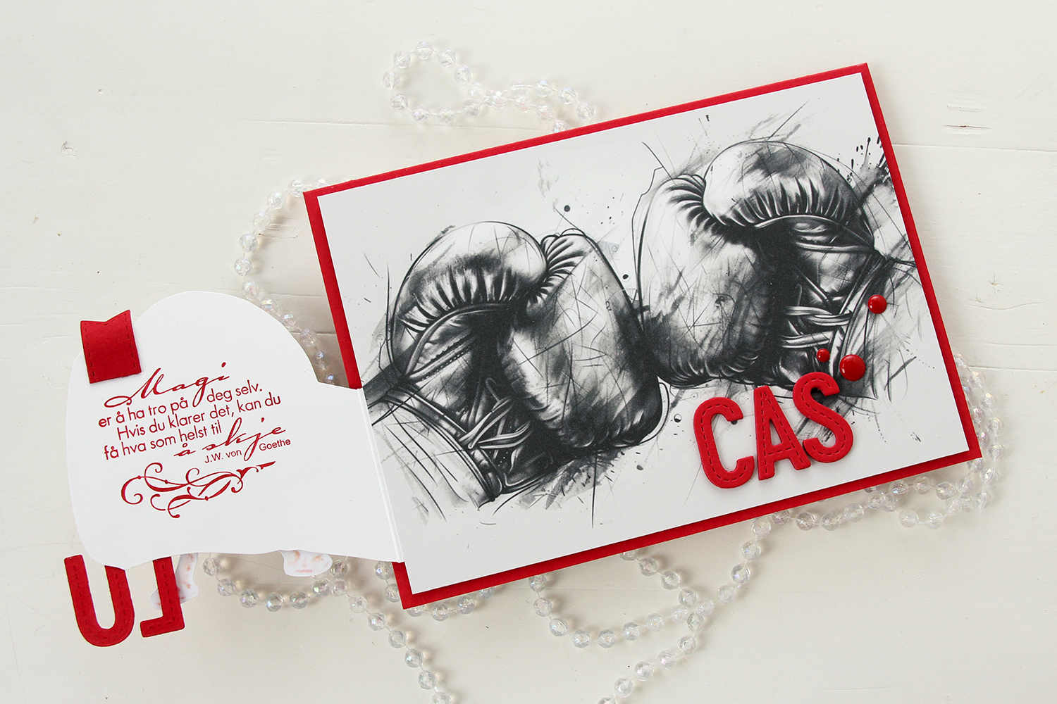 Once you open the glove fully, there’s a sentiment from an old confirmation stamp set from Stempelglede, stamped in Wild Cherry ink from My Favorite Things. I used one of the dies in the Essential Stitched Sentiment Strips die set from My Favorite Things to create a flag end to pull the glove open when the card is closed. The magnets are so strong, it won’t open on its own, and by adding the little flag end, it gives the recipient a little clue to look behind the glove.
 Back to the front of the card when it’s closed. I stamped an white heat embossed the word KONFIRMANT from the A05 stamp set from Norsk Stempelblad AS onto a piece of Red Hot cardstock from My Favorite Things, and then die cut it using a banner die from MFT – they have lots! I popped it up and made sure the end crossed into the image, to tie the two together. I did the same thing with my letters, die cut using the In Stitches Alphabet die set from My Favorite Things, also from Red Hot cardstock. I stacked a few layers for dimension and stability, the L and the U are only barely attached to the glove and the back of his left leg, so they needed a little bit of strength.
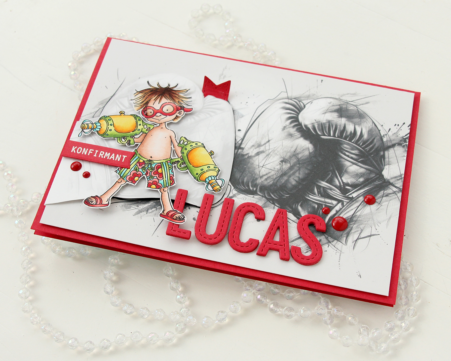 I finished off the front with a few red enamel dots from Papirdesign.
 On the inside, I printed and cut out a checkerboard pattern, which I thought worked well with the car racing theme. There’s still plenty of room to write a personal message. I also used the Wax Seals die set from Waffle Flower to create a rosette badge with a Norsk Stempelblad AS confirmation sentiment heat embossed in the center. I used the Itty Bitty Strips dies from My Favorite Things to create the ribbon ends hanging down from the actual rosette.
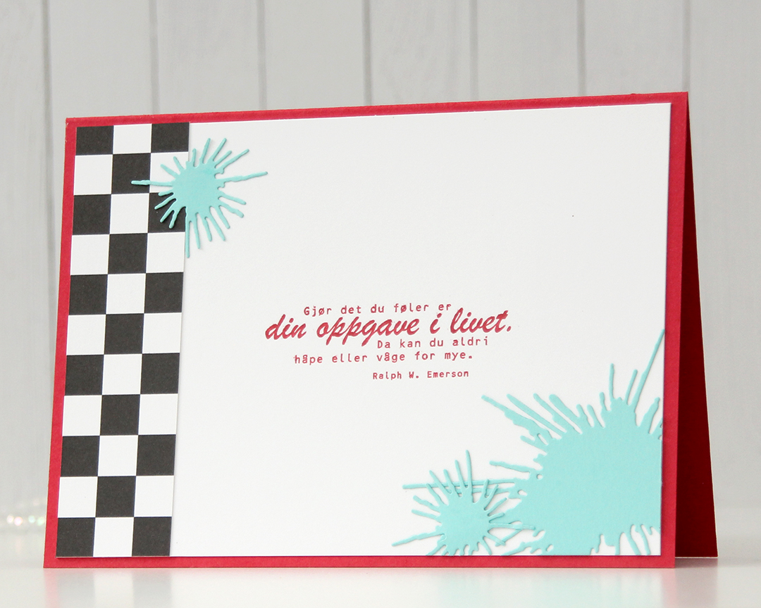 On the back of the card, I used more of that checkerboard pattern, stamped another confirmation sentiment (it’s actually an Emerson quote) and used the Splash die set from Papirdesign to create some water splashes from Summer Splash cardstock from My Favorite Things. I thought they tied in well with the super soakers in the colored image on the front of the card.
 A simple color palette to finish off. This card was a hard nut to crack, but once I got going I had a blast (no pun intended) creating it.
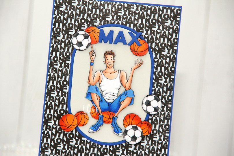
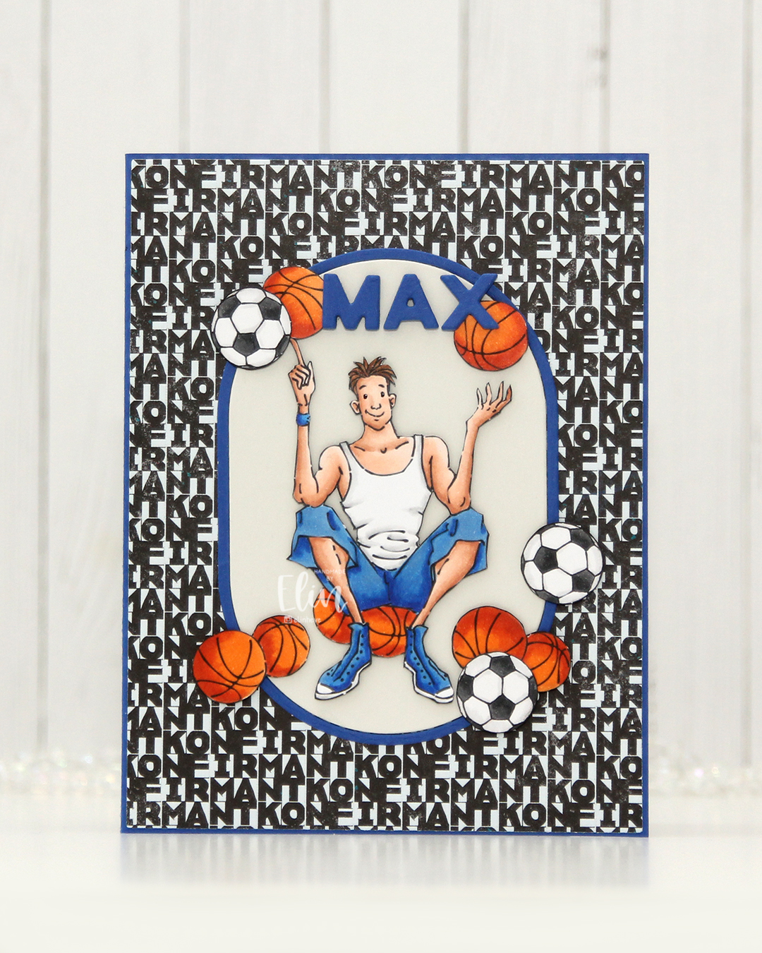 I colored the basketball teen, the extra basketballs and the footballs with Copics and fussy cut them all. I made an A2 card base using Capri cardstock from Concord & 9th and covered most of it with the Lovende patterned paper from the Ungdommelig collection from Papirdesign. Putting the teen directly on the patterned paper wouldn’t work as it was a very busy pattern, but by using the A2 Oval Basics die set from Kristina Werner, I was able to create a grounding element for my focal point. The die cuts out the oval and a frame in one go, so I die cut it once from Capri cardstock, and once from Soft Stone cardstock from Papertrey Ink. I used the Connected Alphabet die set from My Favorite Things to die cut the letters for the kid’s name in Capri cardstock, stacking a few for dimension.
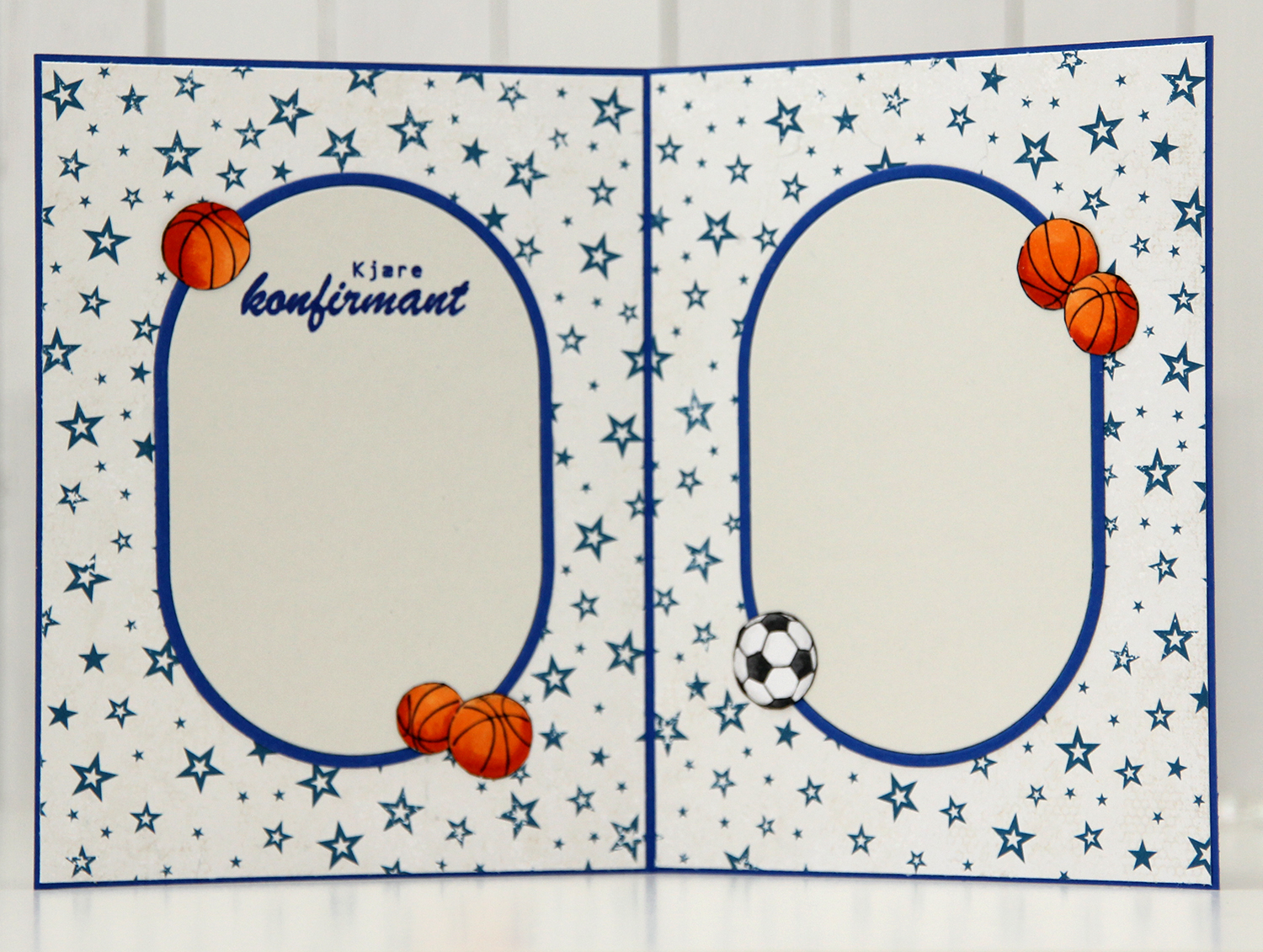 For the insides, I die cut more of the ovals, and actually used the back of that same patterned paper that I used for the front. Double sided patterned paper is awesome. I rarely use patterned paper anymore, so it was fun to bring it back for this card. I stamped a sentiment from the Konf. 02 stamp set from Norsk Stempelblad AS on the panel on the left using Capri ink from Concord & 9th and embellished the insides with a few basketballs and a football. (I know the photo is a bit blurry, but it was the only one I took of the inside and I didn’t realize until I’d given the card to the lady who ordered it).
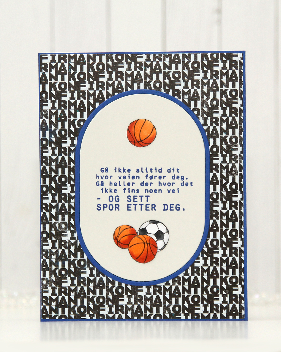 Same setup on the back of the card. Another sentiment stamped in Capri ink, also from the Konf. 02 stamp set.
 With such a simple image, there weren’t a lot of colors used.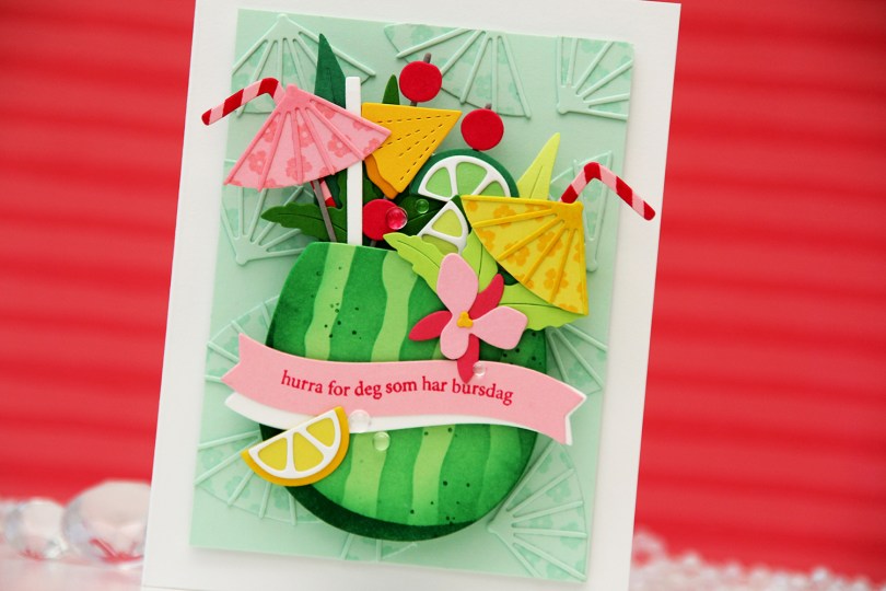
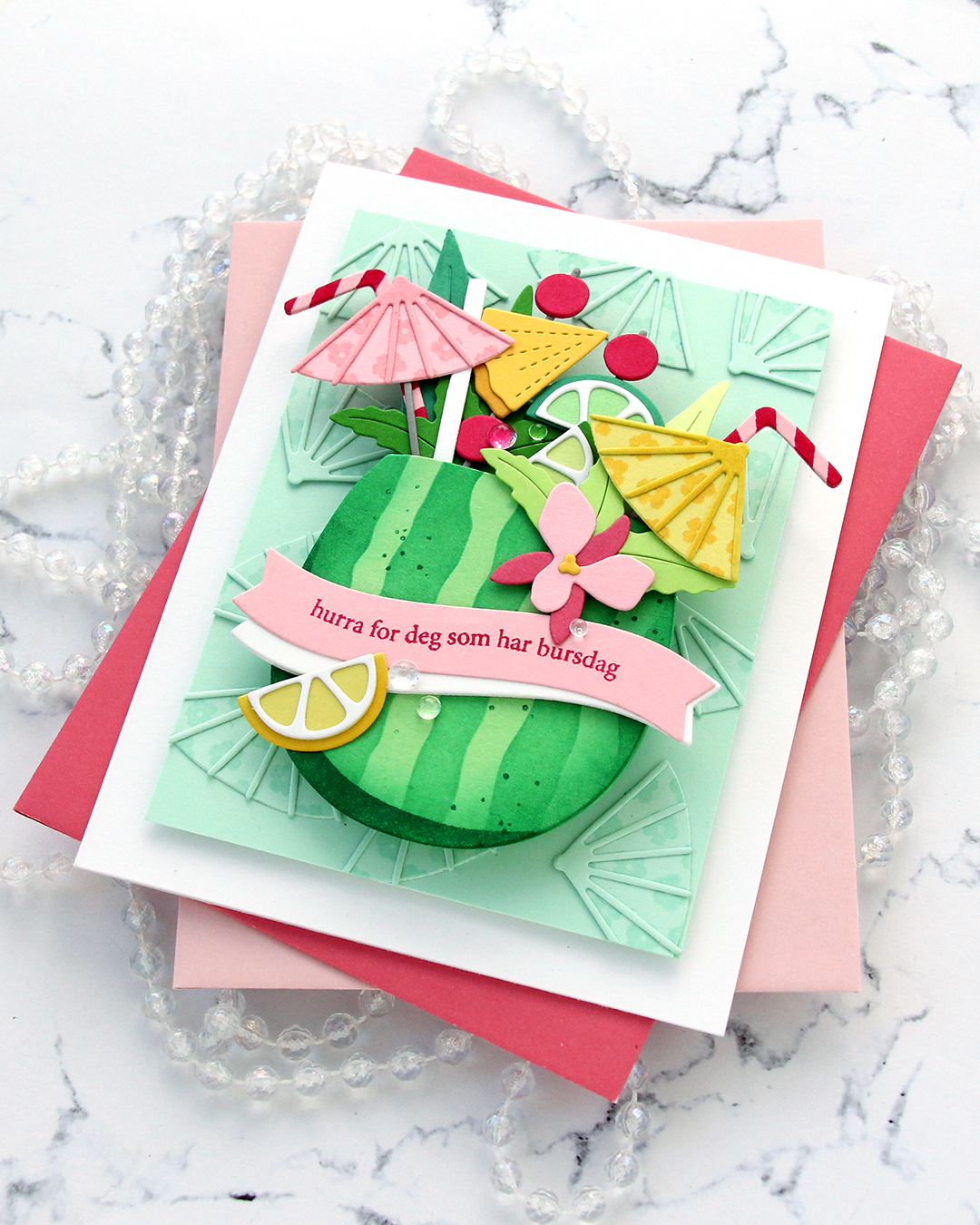
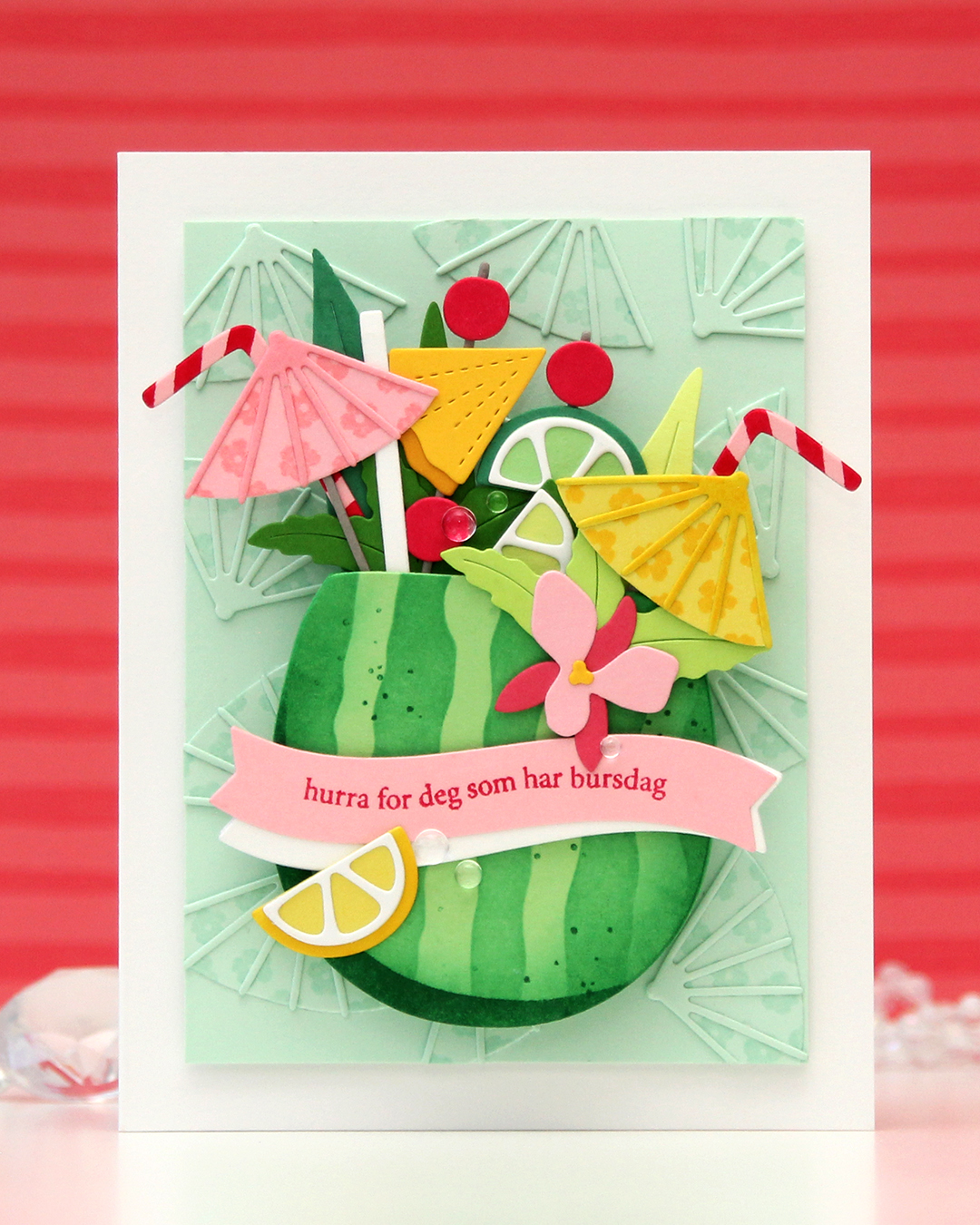 I needed a birthday card for my niece’s 16th birthday. She’s a lover of tropical fruits, and this was the perfect set to use for her birthday card. I die cut the watermelon from Vintage Jadeite cardstock from Papertrey Ink and used the stencil set to in blend the stripes on the watermelon rind using Clover ink from Concord & 9th. I stamped the spots in the coordinating stamp set using the same color. I die cut a few extra watermelons from Vintage Jadeite. I knew I was going to pop up my watermelon on an action wobble (I actually ended up using two wobbles), so it needed to be sturdy.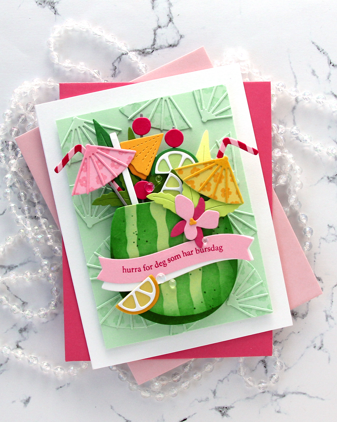
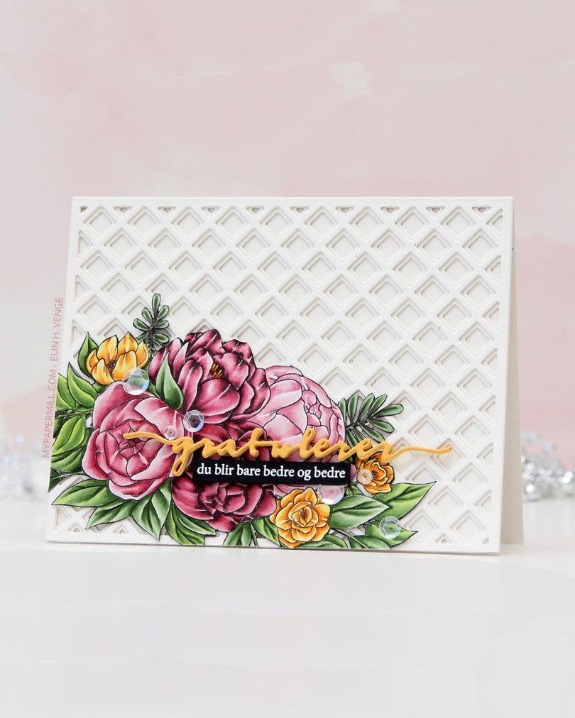
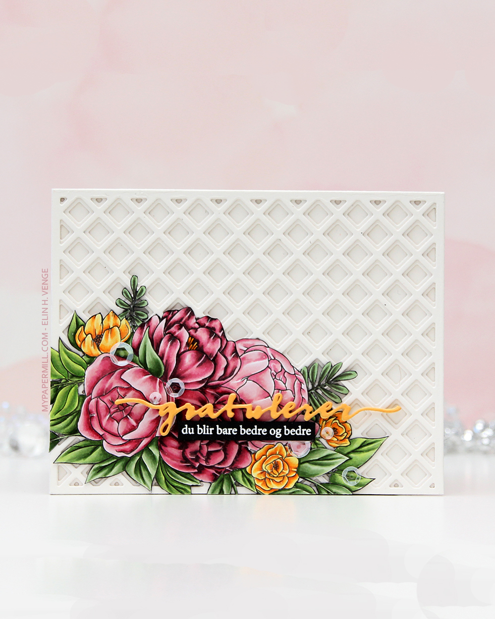 The floral stamp’s an old Stamptember collaboration stamp with Studio Katia called Flower Bunch. Studio Katia is no longer in business, I believe, but that doesn’t mean this image is any less gorgeous. I stamped it with Extreme Black ink from My Favorite Things onto X-Press It blending card, colored it with Copics and fussy cut the whole thing.
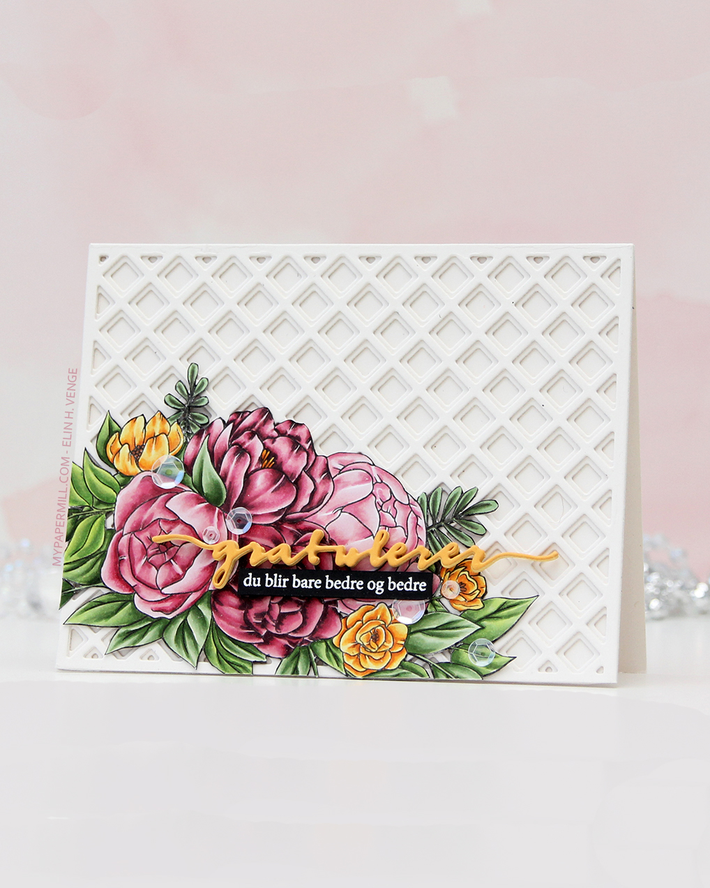 I created a card base from Rustic White cardstock from Papertrey Ink and added some interest to the background with the Garden Lattice Base and Garden Lattice Top dies, both from Honey Bee. I cut two of each, stacked them and adhered them to my card base, gluing the fussy cut image down in the bottom left corner.
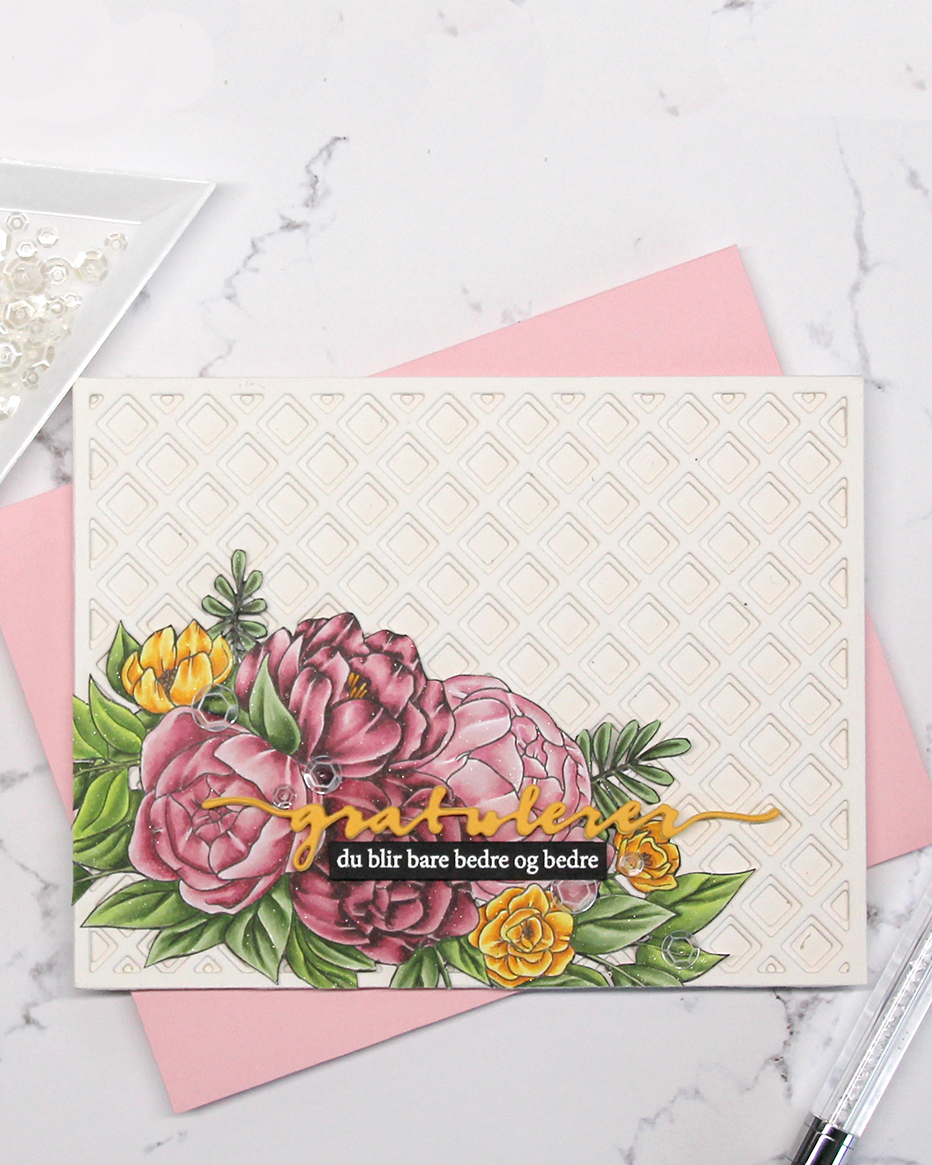 I die cut the Gratulerer 6 die (PD17240) from Papirdesign from Summer Sunrise cardstock from Papertrey Ink and backed it with a couple of additional ones die cut from Harvest Gold cardstock, also from PTI. I stamped and white heat embossed a sub sentiment from the A06 stamp set from Norsk Stempelblad AS onto a scrap of True Black cardstock from Papertrey Ink, trimmed it down to a strip and backed it with additional strips for dimension. I’m pretty sure I used some glitter spray at the end of my coloring, because the image on this card really sparkles. It’s not in my notes, though. To finish off I scattered a few sequins from the White Orchid sequin mix from Little Things from Lucy’s Cards.
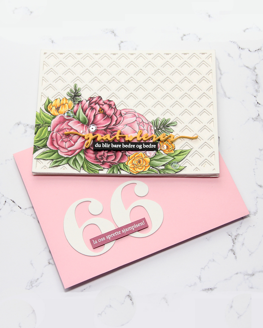 I even embellished my envelope. I used the By the numbers die set from Papertrey Ink for the big numbers, then white heat embossed another sentiment from the A06 stamp set from Norsk Stempelblad AS, this time onto Autumn Rose cardstock from Papertrey Ink.
 I love how you can get so many variations of pink with just five markers.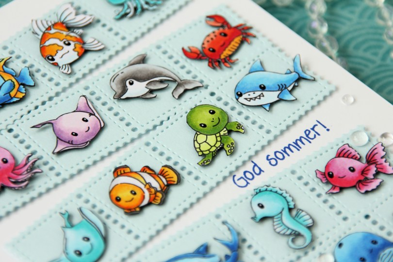
 As I mentioned, I created this card using two collections:
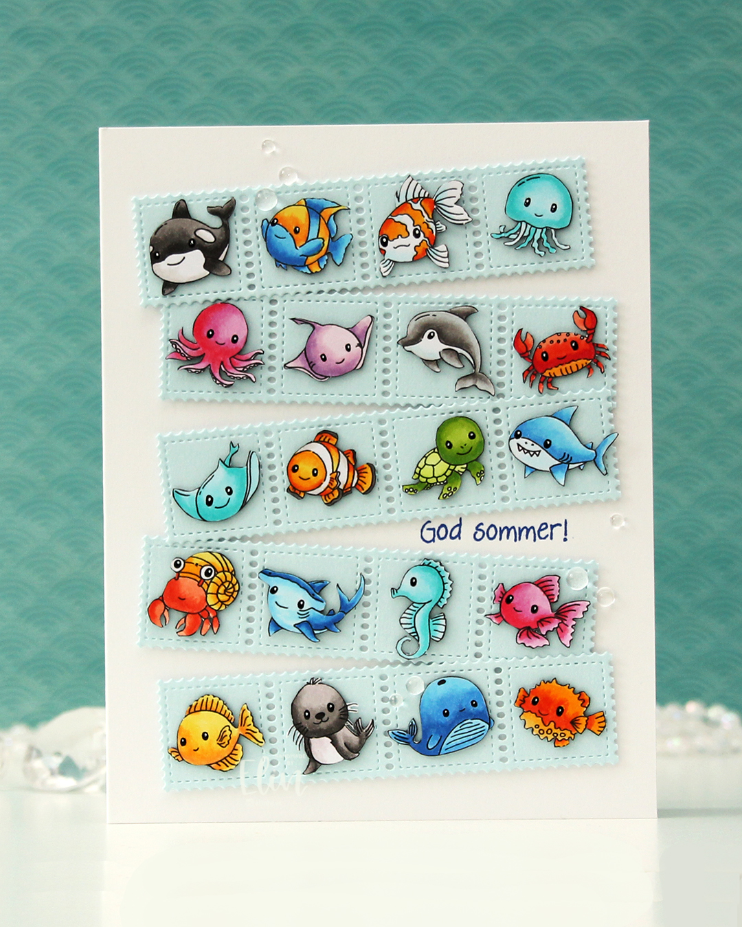
 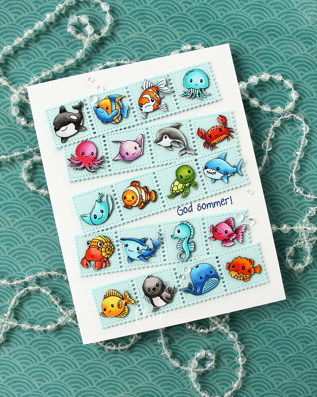 Once I had all my sea creatures colored and fussy cut, I put them aside and worked on the rest of the card. I die cut the Stamp Border from Gummiapan five times from Powder cardstock from Concord & 9th. The die cuts five postage stamps in a border, but I cut off one, making it a strip of four. I put two layers of white scraps behind each of the individual postage to give it a floating look. I also cut down small cardstock squares two layers thick to put behind my critters, also giving them a bit of dimension, but not as much as foam tape would add.
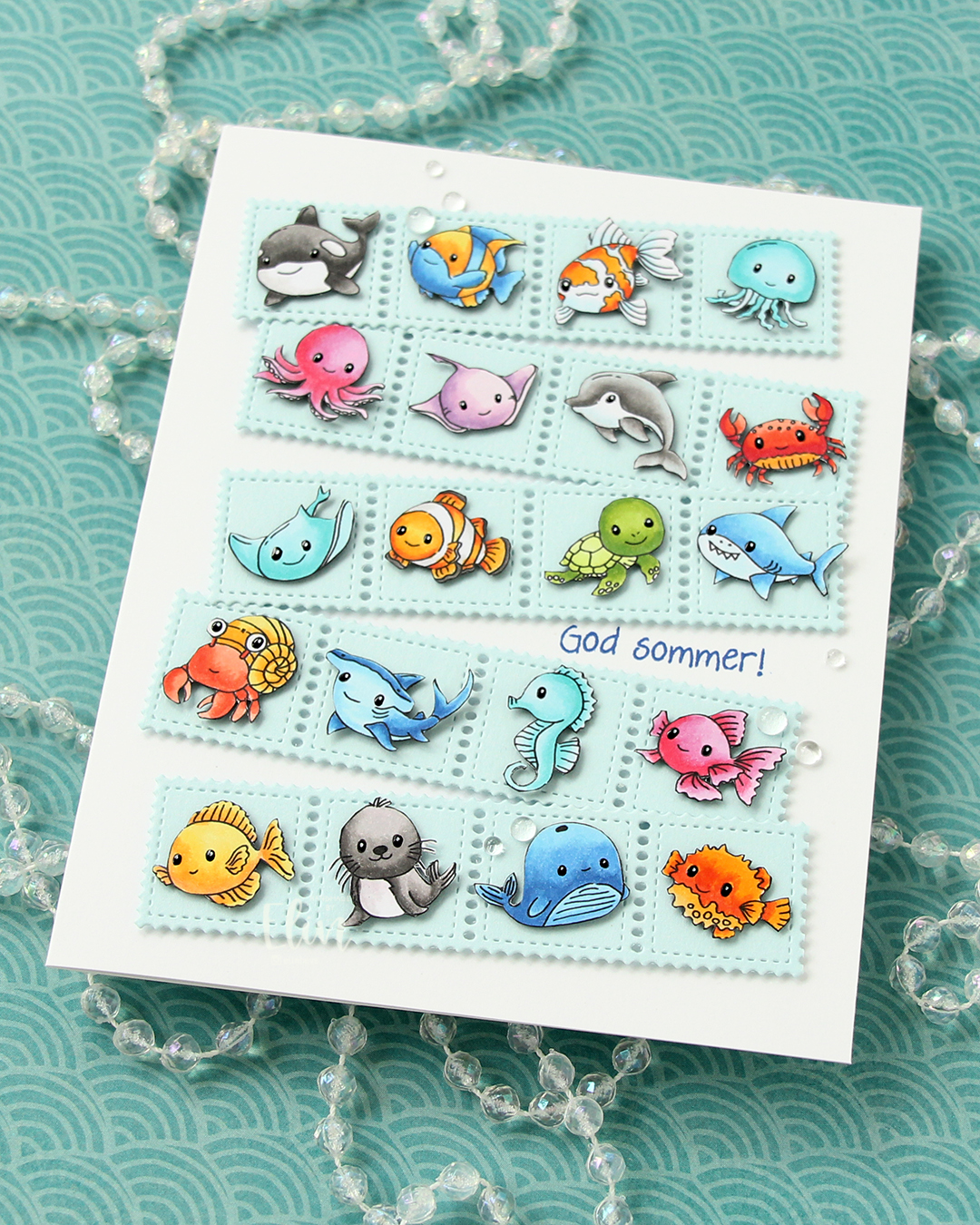 Once I knew how I wanted my strips of sea postage arranged, I stamped a sentiment from the Småtekster stamp set from Norsk Stempelblad AS using Capri ink from Concord & 9th directly on my card base, which I created from Stamper’s Select White cardstock from Papertrey Ink. I made a side fold card this time that is 1/2″ larger in both directions than the standard A2 card. I adhered my postage stamps, added some dew drops from Concord & 9th that kind of look like bubbles and decided to make their eyes shine. I used a black glaze pen, then went over with one small dot of an extra fine white Sharpie once the black was dry. I don’t think I’ve ever used 20 images on one card before, but this was SO. MUCH. FUN!!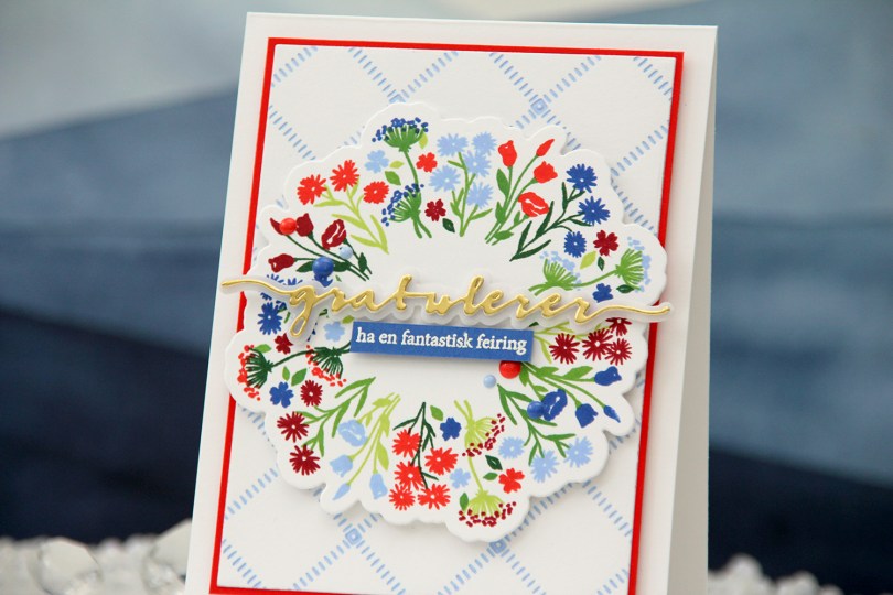
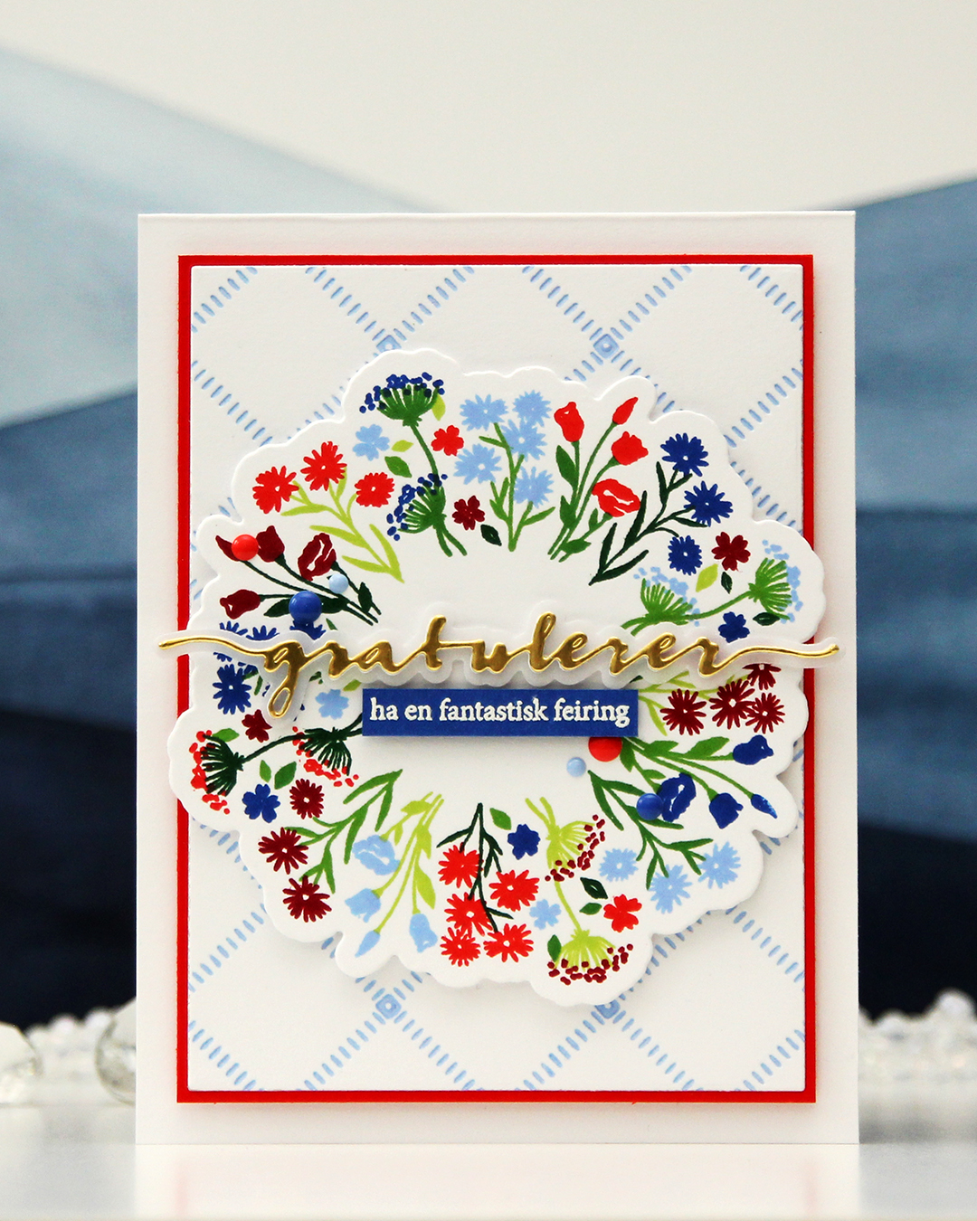 I used the Bouquet turnabout stamp set from Concord & 9th to create my focal point. This turnabout set has two separate images that you turn. The greenery is one stamp, the florals another. I used Sprout, Parsley, Basil and Evergreen inks for the greenery, and Bluebell, Capri, Poppy and Cranberry for the florals, all C9 colors. I’m loving the new 2026 colors from Concord & 9th, Capri is dynamite, it’s so awesome!! I cut my bouquet out using the coordinating die set and put the piece aside while I worked on the rest of the card.
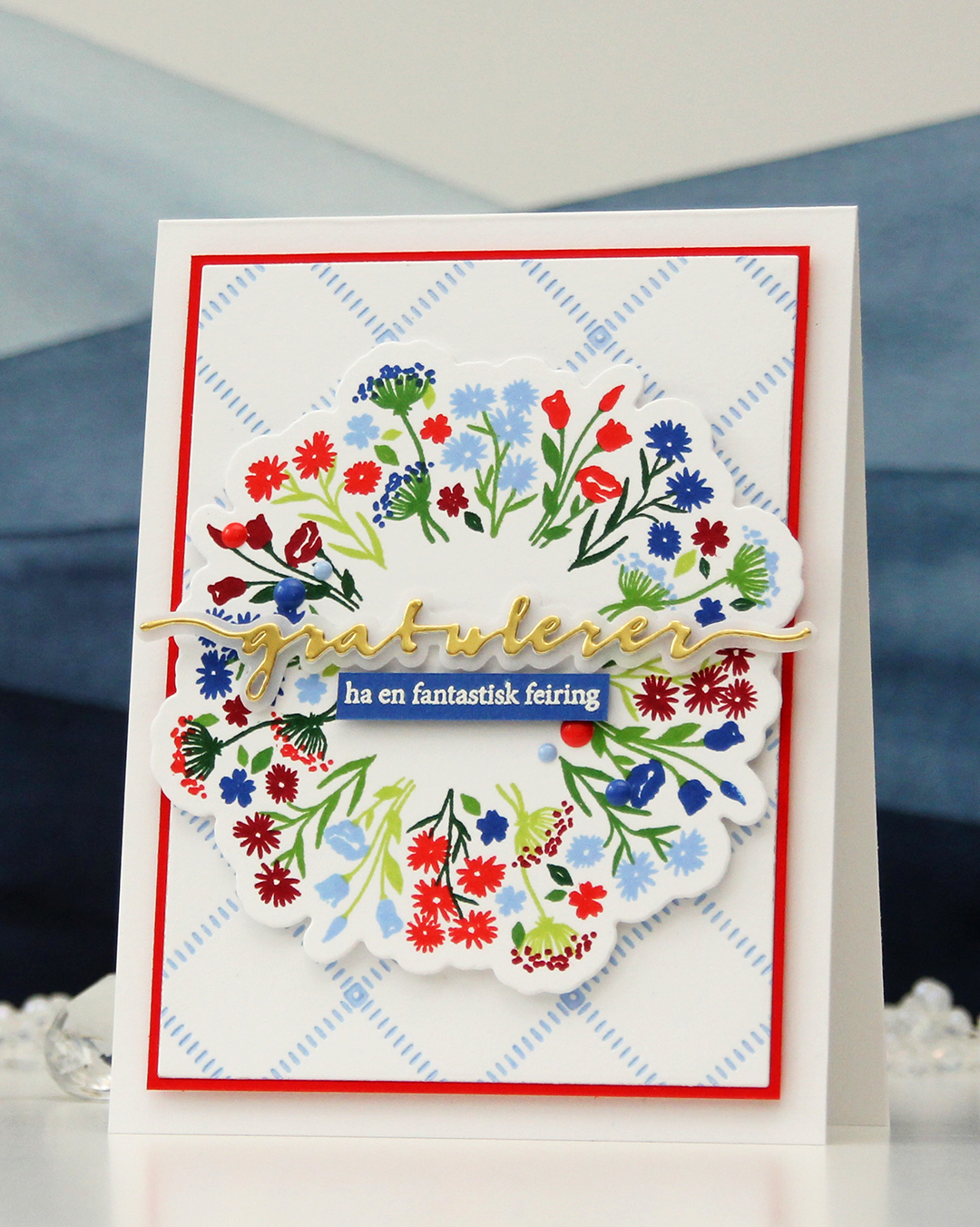 I wanted a subtle background, and opted for the Stippled Plaid press plate from Pinkfresh Studio. I love this press plate, it’s probably the one press plate I use the most. I inked it up very carefully with Bluebell ink and ran it through my system with plain white cardstock to match the white cardstock I used for my floral bouquet stamping. I then cut the panel down significantly, added a mat from Poppy cardstock and mounted it on a top fold card base I created from Stamper’s Select White cardstock from Papertrey Ink, which is the white cardstock I’ve used for everything on this card.
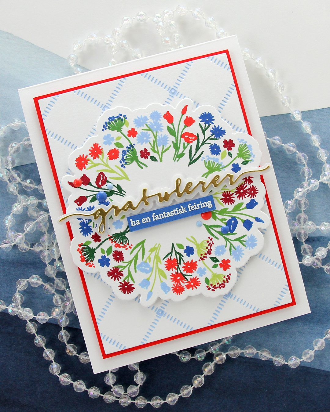 I popped up my bouquet using more foam tape and knew I wanted a die cut sentiment. Gratulerer med dagen is what you say when greeting someone on May 17th, it literally translates to “Congratulations on the day”. It’s the exact same sentiment we use to wish someone a happy birthday. I used the Gratulerer 6 die set from Papirdesign for the main part of my sentiment. I die cut four layers from white cardstock, one layer from Gold Shine cardstock from My Favorite Things and the shadow layer from Heavyweight vellum, also from MFT. I backed the gold one with one white, adhered it to the vellum and put the three remaining white ones behind the vellum, to give it a bit of dimension.
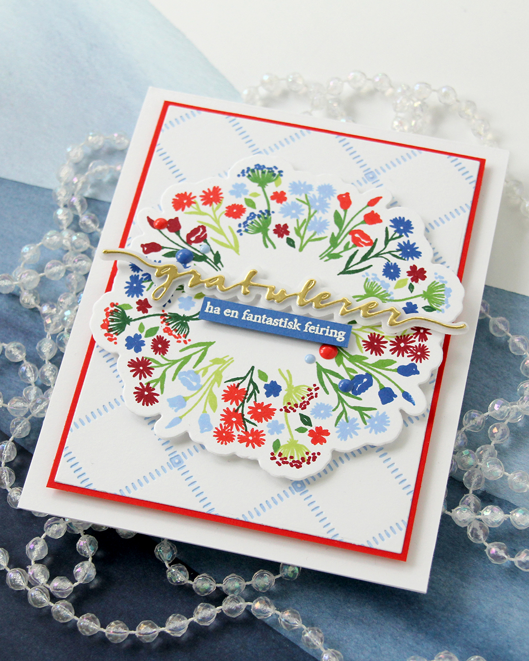 On a piece of Capri cardstock, I stamped a sentiment (have a fantastic celebration) from the A06 stamp set from Norsk Stempelblad AS with VersaMark ink, sprinkled on Super fine detail embossing powder from Ranger and heat set it from the back. I always do my heat embossing from the back, it gives a much smoother result than working from the front. I finished off the card with a few enamel dots from Concord & 9th in Capri, Bluebell and Poppy.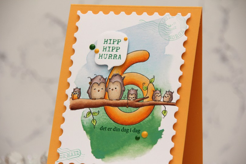
 I printed the image onto a piece of X-Press It blending card, adding a digital watercolor background behind the image before printing. I colored the image with Copics and opted for a warm yellow for the actual number and the book, an analogous color palette always works well.
 I die cut the panel using the Postage Stamps infinity die set from Hero Arts, then stamped the sentiments from the Bursdagsbillett stamp set from by.cino (hipp hipp hurra) and the A06 stamp set from Norsk Stempelblad AS (det er din dag i dag) using Clover ink from Concord & 9th. I also used second generation stamping of a couple of the images from the CS0879 stamp set from Marianne Design in the corners of my large postage stamp. I mounted my postage panel onto a card base I created from Summer Sunrise cardstock from Papertrey Ink, then die cut and mounted the Hipp hipp hurra sentiment using the MSTN Say Anything die set from My Favorite Things, before finishing off the card with Clover and Honeycomb enamel dots from Concord & 9th, as well as a dot of a black Sakura Glaze pen to each eye for a little bit of shine and dimension.
 Simple color palette for this one.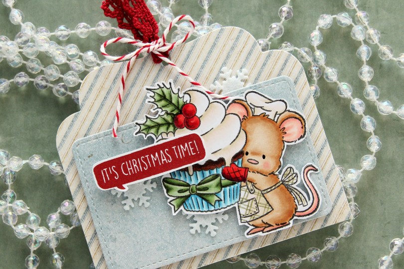
 I colored up the cute little mouse with Copics, adding a plaid pattern to the apron using a Zig watercolor brush marker (No. 98 Pale Dawn Gray), before fussy cutting the image leaving a white border. I used the Gift Pocket Tag die set from Mama Elephant to die cut from patterned paper from the Christmas Nostalgia collection from Maja Design to create my tag. I mounted the smaller piece with foam squares and did the same with the cute little mouse.
 I stamped a sentiment from the
 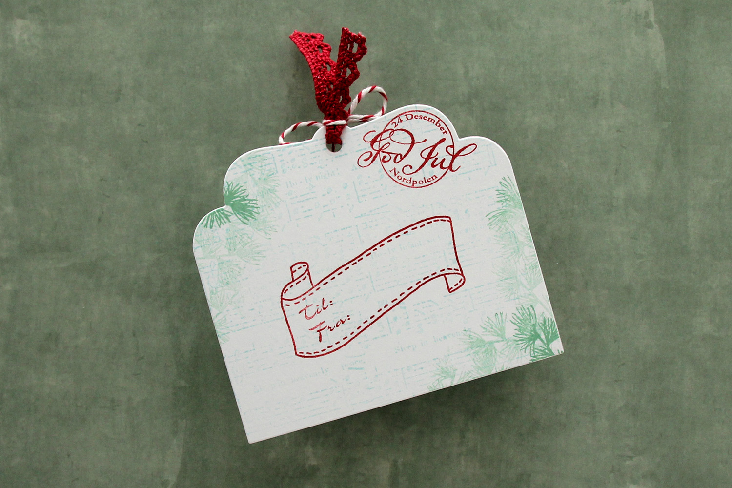 I die cut the tag a second time from white cardstock and did quite a bit of stamping on it. I used second generation stamping of an old sheet music stamp from Magnolia using Powder ink from Concord & 9th – I wanted it to be very soft. The sheet music is actually for Silent Night, making it extra Christmas-y – not that you can really tell. I used first and second generation stamping of a branch from a Mathia Design stamp set using Eucalyptus ink from Concord & 9th to add a little something to the corners. I stamped a postmark stamp from Ladybug & Friends, as well as a to/from stamp from Norsk Stempelblad AS using Amarena Cherry ink from My Favorite Things. I don’t think Ladybug & Friends is in business anymore. Neither is Norsk Stempelblad, but I love their stamps and can’t bring myself to stop using them.
 I didn’t use too many colors on this one.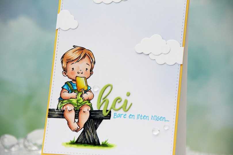
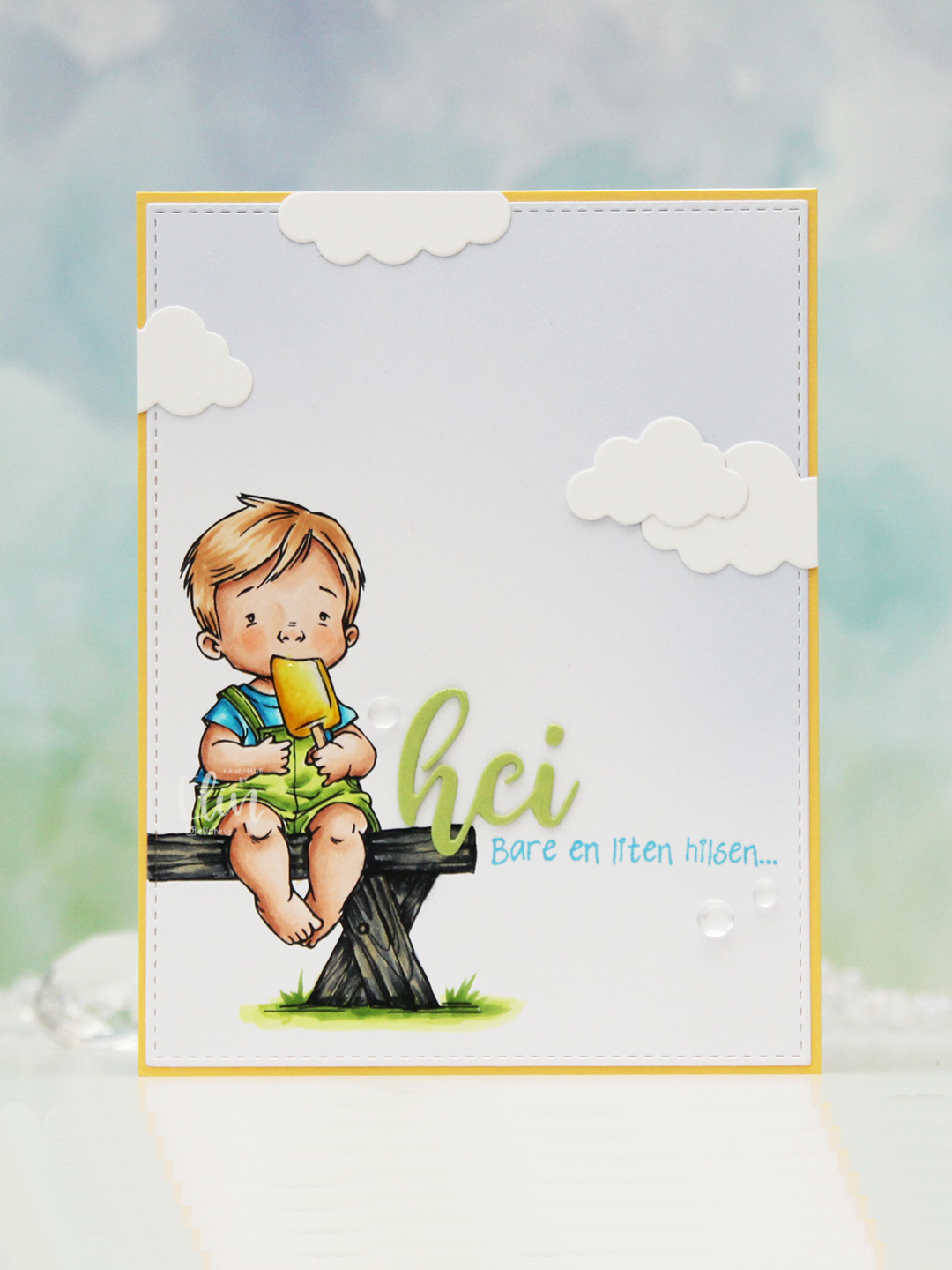 I colored the image with Copics, opting for the cool grays for the bench. I wasn’t planning on making it this dark originally, but when my C9 made a blob, dark was the only way to go. It still works, and I don’t think you can really see where the blob was. I used the largest die in the A2 Stitched Rectangles STAX 1 set from My Favorite Things to trim the panel down a little, then a large blending brush to add some soft blue to the background. I didn’t add any ink to the brush, I simply used whatever was left from a previous project.
 I stamped a sentiment from the Småtekster stamp set from Norsk Stempelblad AS next to the bench using Tide Blue ink from Altenew. I added my colored piece to a panel of Buttercup cardstock from Concord & 9th, which I then adhered to a top fold white card base. I die cut the word hei twice from Green Parakeet cardstock from Papertrey Ink, stacked them and adhered my double die cut next to the boy on the bench before adding a few die cut clouds and some dew drops. Both the cloud dies and dew drops are from Concord & 9th.
 I used quite a few colors for this very simple image.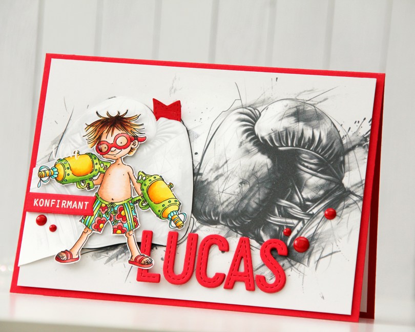

 I’ve had this duck colored for quite a while, but sometimes, life just gets busy. I fussy cut him, leaving a white border around the edge and did the same with the butterflies and the balloon from the same stamp set. I ink blended clouds on a piece of Stamper’s Select White cardstock from Papertrey Ink using Harbor ink from Concord & 9th and the Rolling Clouds stencil from My Favorite Things. I die cut my panel using the largest die in the Blueprints 27 die set, also from MFT.
 I covered my white card base with a piece of light pink glitter cardstock from Kort & Godt. I added a few layers of cardstock behind my die cut panel to give it a little lift and adhered it in the center, before placing stacked die cut words on top. I used the Hipp hurra die set from Kort & Godt to create these, cutting four of each words from white cardstock and the top from the same pink glitter cardstock I used to cover the front of the card. I threaded black sewing thread through the balloon and the wing of the duck. I added a bow to the balloon using the same thread and mounted both the duck and the balloon onto the card using foam tape. I adhered the butterflies above the balloon, before heat embossing a sentiment from the A06 stamp set from Norsk Stempelblad AS. I cut it down to a strip, put a few additional layers of cardstock on the back of it and adhered it below my die cut sentiment, before finishing off with a few gems from the
  Yellows and pink and nothing else for this one.
