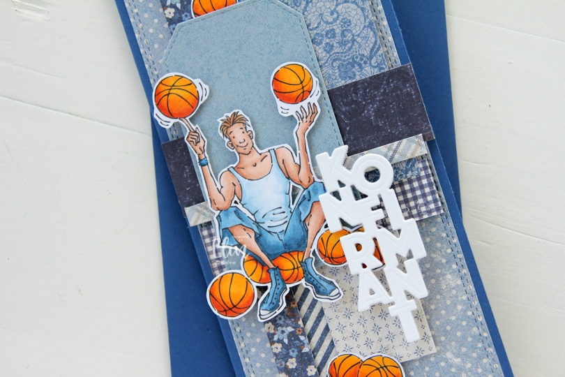
Hi, crafty friends. It’s confirmation season in Norway (May to early June and also September), and I have a basketball themed one to share today, made for a guy whose confirmation was a couple of weeks ago. The majority of the population in Norway isn’t particularly religious, and I try to tailor my cards to fit the recipient. This particular recipient loves basketball, and Basketball Teen from Mo Manning was the perfect image to use. I even printed a few extra balls to scatter around on the card.
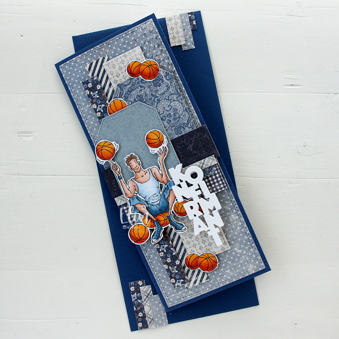 I made a slimline card this time. I created a background from blue scraps from several collections from Maja Design – Denim & Friends, Denim & Girls, Fika and Vintage Autumn Basics are all represented. One of the things I like about the Maja Design patterned paper is that papers match across collections. They’re also made from really good heavyweight paper, which is another tick in the pro column for me. I used the Slimline Double Stitched Rectangle STAX die set from My Favorite Things to create the panel in the back and also the Stitched Traditional Tag STAX die set, also from MFT, to create the tags.
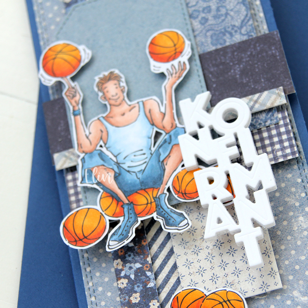 I added the image on top of one of the tags and scattered a few more basketballs around to work as embellishments. The orange really stands out against the blue background. To finish off I die cut the Konfirmant 5 die from Papirdesign six times from white cardstock and stacked them for a dimensional look. I adhered it on top of the image, and it floats above the card further down.
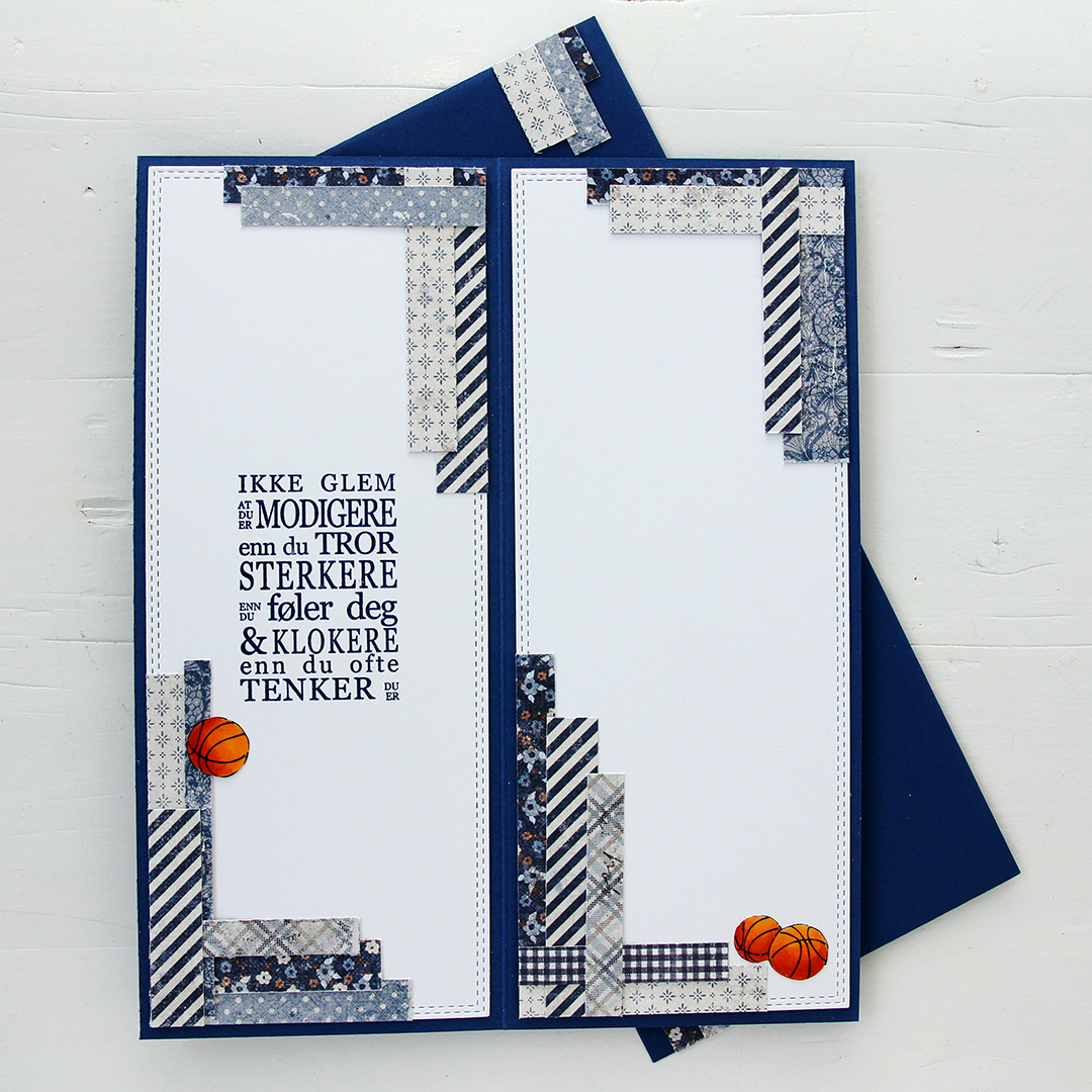 Whenever I make cards to order, I always decorate the inside too. I used the largest slimline double stitched rectangle die to create the white panels on the inside, adding more strips of patterned paper to continue the look from the front of the card and also fill the pages a little. Slimline cards are large, and the added elements make it less daunting to have to come up with a message for the recipient. On one side, I stamped a sentiment from the Konf. 01 stamp set from Norsk Stempelblad using Blue Beyond ink from My Favorite Things, the right side still has plenty of room for a personal message. I also included more basketballs.
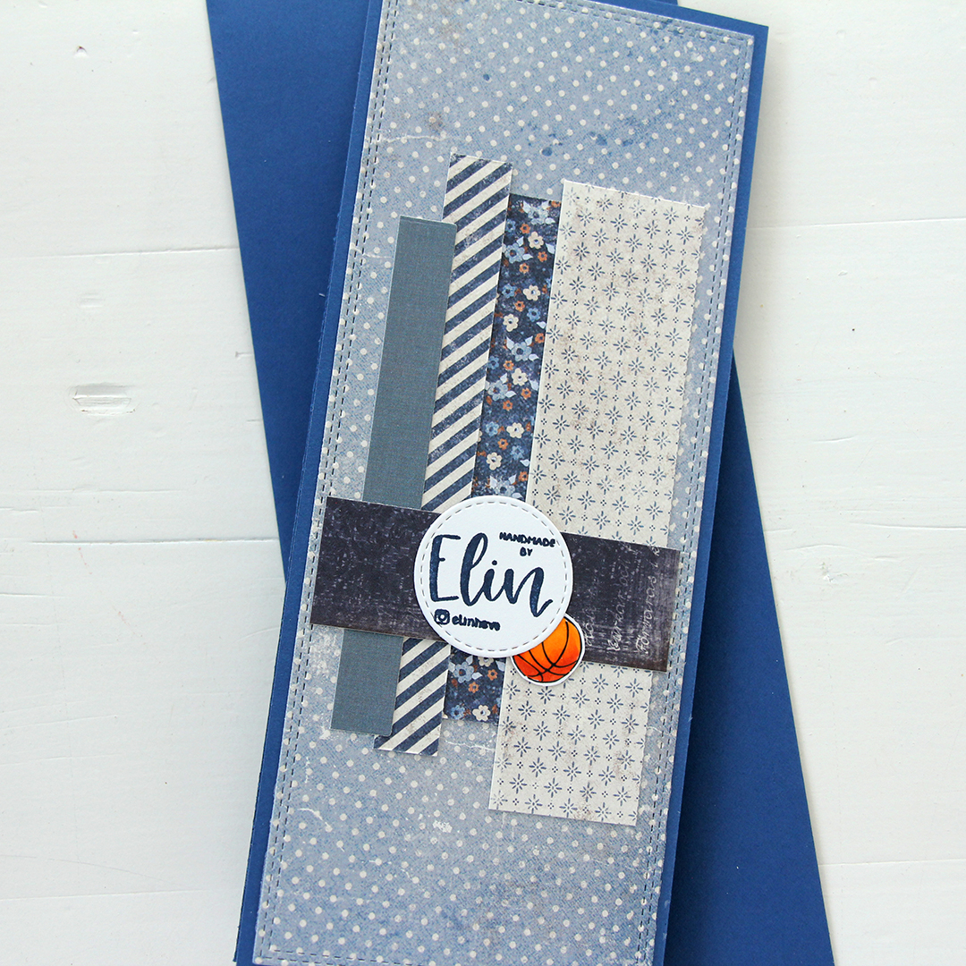 For the back of the card, I used a few strips of patterned paper I had left, die cut a white cardstock circle using the Stitched Circle STAX die set from My Favorite Things and stamped my personal stamp in the center of it using Blue Beyond ink from MFT. The card base is also from My Favorite Things, it’s made from Blueberry cardstock, and the envelope is also in that same Blueberry color.
 Limited color palette for this one.
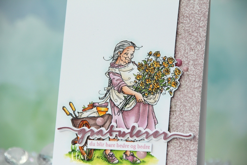
 I printed the image on X-Press It blending card and colored it with my Copics. I pulled out my RV90 series, which I used to use a lot ages ago, but haven’t really used much in recent years.
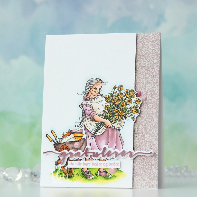 Once my coloring was complete, I decided to cut off quite a bit on the right hand side of the panel, which meant doing some fussy cutting around the flowers. I don’t mind fussy cutting, and cutting on the border like this makes for a more dynamic design. Along the right hand side of a top fold card base, I adhered a scrap strip of patterned paper from the Vintage Romance collection from Maja Design, then popped my colored panel on the left.
 I die cut the Gratulerer 6 die from Papirdesign a few times. I die cut the shadow layer in white, then a few stacked of the word, before finishing off with a colored one. I actually colored this one with Copics on the scrap I cut off the panel. This is a neat trick if you want your colors to match, but don’t have the right cardstock color. I stamped a sentiment from the A06 stamp set from Norsk Stempelblad AS using Briar Rose ink from Concord & 9th, cut it down to a strip and adhered it below the die cut, adding a few strips of cardstock behind it for dimension. I finished off the card with a few enamel does from the Shades of Purple pack from Altenew.
 Using patterned paper from Craft Consortium along with a stamp, die and a few sentiment sticker strips from Kort & Godt, I created an envelope to match.
 I actually didn’t use too many Copics for this one. I see I’ve left out the colors I used for the sky, but I’m betting I chose B0000, BG90 and the blender for that.
 I did a lot of coloring the day I colored these monkeys. As you can probably tell by their fur, my markers needed to be reinked at this point. I could have chosen a different brown combo. I could have taken the time to refill my markers, but I had colored so much the day I colored this that I just wanted to keep coloring. I probably should have stopped and taken the time to refill or chosen a different combo that didn’t need reinking. This is a good reminder to reink your markers. You can be an amazing colorist, but if you don’t take care of your markers, your coloring will look uneven. I went with it anyway. The 5 year old getting this card is not going to notice that my coloring’s not perfect, and it doesn’t always have to be. I’m trying to let go of my perfectionist tendencies, and this was a good exercise. I will refill these markers before I use them again, though, don’t you worry.
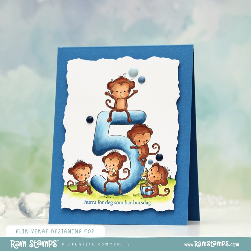 The card itself is very simple. I stamped a sentiment from the A06 stamp set from Norsk Stempelblad AS below the image, using Cornflower ink from My Favorite Things. I then used the second largest die in the Watercolor Rectangle STAX die set from My Favorite Things to turn it into a panel with a fun edge, before I added dimension behind it and adhered it to a top fold card base I created from Cornflower cardstock from My Favorite Things. I finished off the card with some enamel dots from Papirdesign.
 Simple color palette. And I really do need to refill those browns. Even E23 was giving me trouble.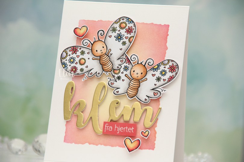
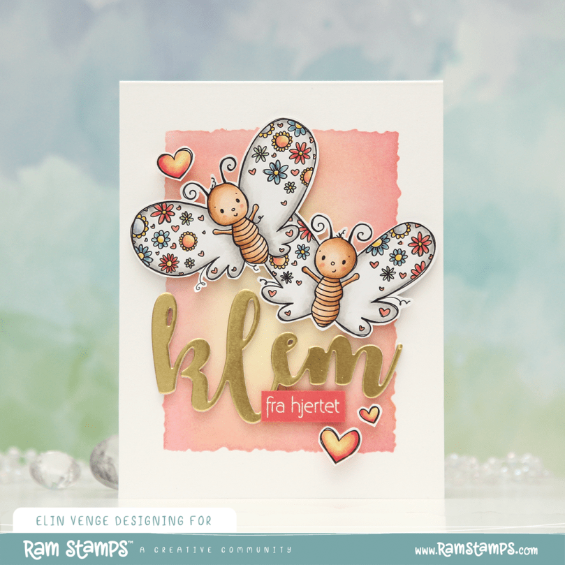 I colored the butterflies (and the three hearts that are part of the image) with Copics and fussy cut them, leaving a thin white trim around the edge. Onto a top fold card base I created from Stamper’s Select White cardstock from Papertrey Ink, I ink blended the center of the card, using the Watercolor Rectangle stencil from My Favorite Things and various inks (Distress Ink Picked Raspberry, Distress Ink Worn Lipstick, Altenew Pink Pearl, Distress Ink Scattered Straw). I went with pink on the edge and yellow in the center to mimic the colors in the hearts.
 I die cut the word klem (hug) four times from white cardstock and once from Gold Shine cardstock from My Favorite Things, and stacked them for a layered look. I added foam tape to the back of my butterflies, adhered them top center on the card and put the stacked klem below them. I also added a sub sentiment from Norsk Stempelblad AS that I white heat embossed on a piece of Berry Sorbet cardstock from Papertrey Ink. I put a few layers of cardstock behind it for dimension and added it to the card, partly on top of the die cut, before embellishing with the colored hearts to finish.
 Bright and happy color palette for this one.
 I printed the image onto X-Press It blending card and colored it with Copics. I went with a grayish green/muted pink combo, which is one I often use for holiday cards. I’m not a fan of bright red and green together, but this works for me. Once colored, I used a die from the Wonky Stitched Rectangle STAX set from My Favorite Things for a fun faux stitch look on the edges. I adhered my panel to a top fold card base I created from Autumn Rose cardstock from Papertrey Ink, which is a nice match with my pink coloring.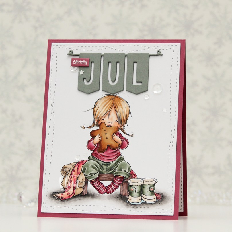
 I used a fairly simple color combo, but it’s still a lot of Copics, I never can seem to rein it in.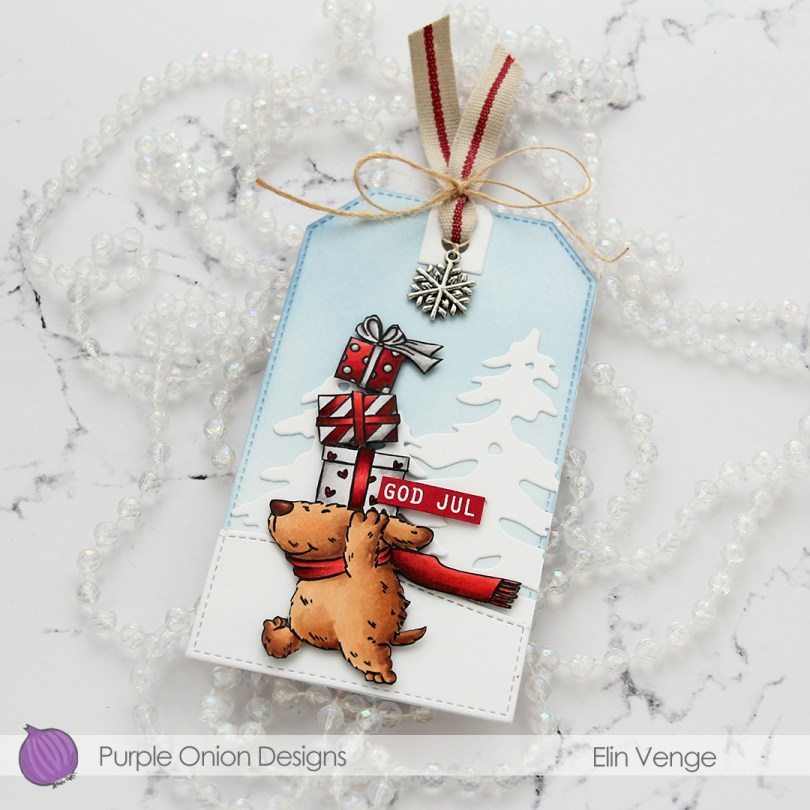
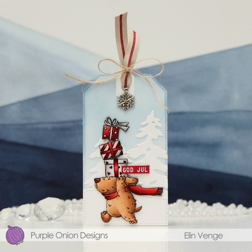 I stamped the image with Extreme Black ink from My Favorite Things, colored it with Copics, then stamped again, this time using Obsidian ink from Altenew for crips, dark lines. I decided to fussy cut right against the stamped lines, and put this cute dog to the side while I worked on the rest of the tag.
 I die cut a tag from white cardstock using the Stitched Trad. Tag STAX die set from My Favorite Things, before using Polar Bear, Icy Water and Winter Lake inks from Altenew to ink blend a soft blue sky. I die cut a couple of trees using the silhouette snow trees from Mama Elephant and adhered them on top of my ink blending. I used a die in the Stitched Hillside Borders die set from Lawn Fawn to create the faux stitch hill, then used the tag die again to die cut the bottom part and adhered it to the tag also.
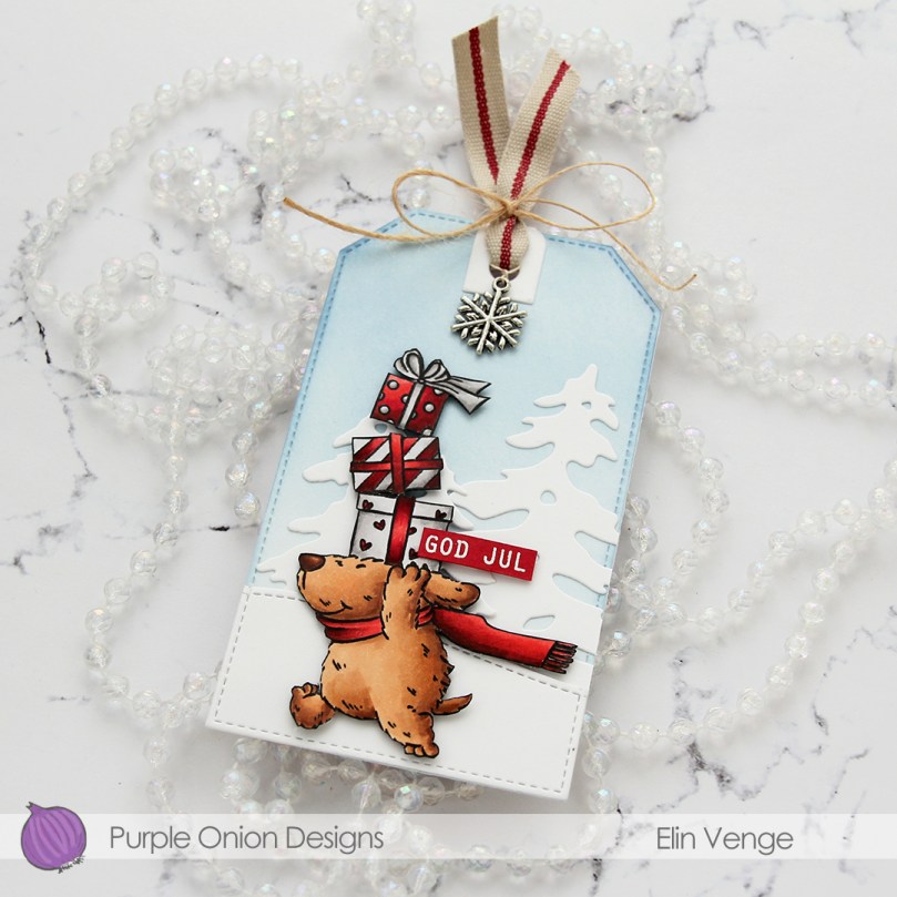 I added my dog using foam squares. stamped and white heat embossed a sentiment from the Julehilsen stamp set from Norsk Stempelblad AS onto Wild Cherry cardstock from My Favorite Things, before trimming it down and adding it with foam squares to the tag. I die cut a reinforcement piece from white cardstock using a die in the Fold-up Tags die set from My Favorite Things and adhered it to the top, before threading some ribbon through and adding a charm. I used some May Arts Natural Twine to tie a bow to secure everything.
 On the back of the tag, I stamped the Til/Fra frame from Norsk Stempelblad AS using Obsidian ink from Altenew. I used Dark Chocolate and Classic Kraft inks from Papertrey Ink to stamp the images that make up the background. The stamps are from North Star Design, Inkido and Ladybug and Friends. I believe none of these companies are still in business, but I love these particular stamps and use them regardless.
 Simple color palette for this one. No wonder, as it’s essentially just brown, gray and red.
 I colored my image with Copics and used a fancy border die from Papirdesign (Snøkrystall ramme 2) to create trees and snowflakes along the edge. I wanted to do something different, and actually created a card base from vellum. I have heavyweight translucent vellum from My Favorite Things, and it’s a very thick, sturdy vellum that can handle being a card base.
 I sprinkled on chunky white embossing enamel from Stampendous both on my colored piece and on the vellum base, before adhering the two together. I decided to create a white panel with the same die cut border for the inside of the card, as the vellum is very slick and not well suited for writing a personal message.
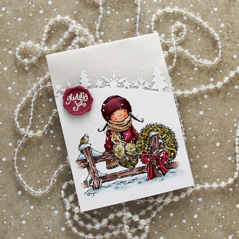 I stamped and white heat embossed a sentiment from the B05 stamp set from Norsk Stempelblad onto Autumn Rose cardstock from Papertrey Ink. I used the Wax Seals die set from Waffle Flower to turn it into a faux seal and mounted it onto my card using foam tape.
 The vellum and die cut border create unexpected elements, the embossing enamel creates texture and you get a little bit of dimension with the sentiment seal. They all contribute and make this simple card a special one.
 Not a whole lot of Copics for this, and a fairly muted color palette.
 I knew one of the elves at the bottom would get his head cut off (the one wearing blue), so I created a copy with just his head, rotated it and put it in the top right corner to include another kid peeking in.
 I colored in the scene with Copics, choosing very bright colors. I then took my white Gelly Roll 05 to create patterns on most of the kids’ clothes. I used the largest die in the Watercolor Rectangle STAX die set from My Favorite Things to create a fun edge to my panel, before using the Connected alphabet die set, also from MFT, to spell out the name of the recipient. At first, I thought of cutting them straight, but realized that a wonky look would work well with the card and also be less time consuming.
 I wanted to include her age too, but didn’t have any number dies that matched the letters. There was just enough room on her apron for me to sketch in a couple of stick figures holding signs. I used my 0.03 Copic multiliner, and I think it’s running out of ink, which only enhanced the sketchy look I was going for. I die cut six more of each of the letters from True Black cardstock from Papertrey Ink, stacked them and added the colored pieces on top for a stacked inlay look. I mounted the panel on foam tape and adhered it to a card base I created from True Black cardstock from Papertrey Ink. I decided not to add any embellishments, I figured this card is colorful and really doesn’t need it.
 For the inside, I stamped a fun sentiment (You’re not thaaaat old – you were just born too soon) from the Til mannen stamp set from Norsk Stempelblad AS using Summer Splash ink from My Favorite Things.
 I stamped a sentiment from the Go’klem stamp set from Norsk Stempelblad AS onto a Summer Splash envelope from My Favorite Things using Summer Splash ink. I thought the envelope and ink matched the dress nicely.
 Here you can see those popped up letters a bit better.
 I used a lot of Copics for this one. Skin tones (and hair) make up that entire top row. I wanted different skin tones for the kids, and even though they don’t look that different in my photos, the difference is more pronounced in real life.
 Shari Bresciani’s cast of characters is so fun and quirky. Michele at Purple Onion Designs is very good at finding illustrators with a distinct style. The left tag features
  For both of my tags, I used the Wintry Forest stencil set from Pinkfresh Studio to create my background of blue trees. I used Polar Bear, Icy Water and Winter Lake inks from Altenew to create my trees, die cut my panel into tags using the Stitched Trad. Tag STAX die set from My Favorite Things, then sprinkled on Chunky White embossing enamel from Stampendous which I melted from the back for a snowy look.
 I love the expression on Scruffy’s face! This tree originally has a star on top, but I wanted Starla to add the star to the tree, so I cut off the star from the top and colored the cone shaped part of the star in green, so it looks like it’s the actual tree, even though the even curved line is a telltale sign that it’s not. I don’t think many people will notice, and even less will care.
 I stamped the sentiment using two ink colors from My Favorite Things: Jalapeño Popper and Sour Apple. I would have preferred a green tone with more blue in it, but I don’t have that in the ink formulation that’s best for this kind of mostly solid stamping. I find that the squishy ink pads that have become popular in recent years do better with this kind of stamping than the old firm felt pad type ink pads.
 Close to the sentiment, I added pearls from the Party Girl mix from Little Things from Lucy’s Cards. I was tempted to add lots of pearls in different colors to the tree too, to act as baubles, but opted not to.
 I threaded some satin ribbon through the tag hole and tied it with a piece of Natural twine from May Arts. I also added a couple of gold bells from my stash, I love tags that make that jingle sound.
 Lots of colors for this, even though I felt like I didn’t use too many.
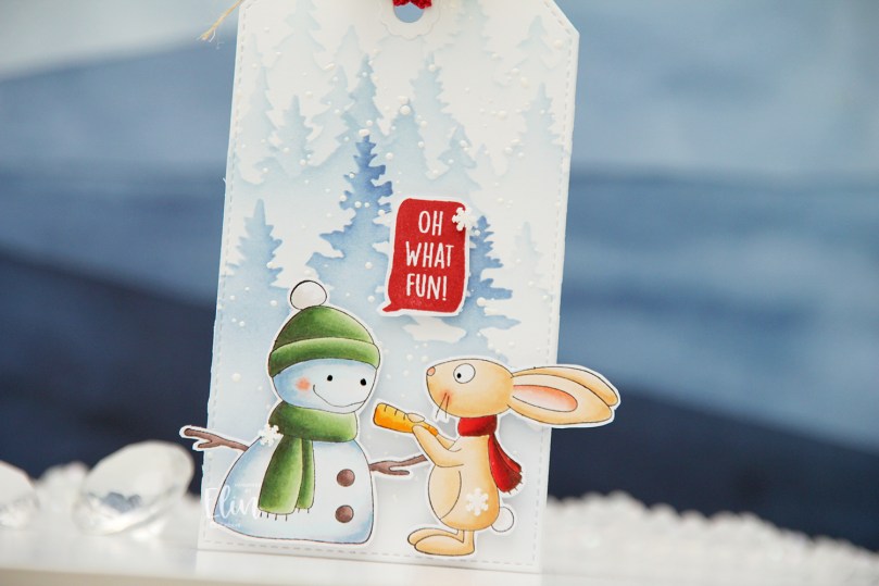 It’s Carrie’s turn. She goes so well with this snowman, you could almost think they’re one stamp and not two. I don’t mind when things hang off the edge of my cards or, in this case, tags. Will the ears and the branch get bent once this tag is on a present under the tree? Possibly. But I don’t mind, because I feel it adds to the design. If I had cut off the ears and branch to make everything fit inside the dimensions of the tag, this tag wouldn’t be as fun.
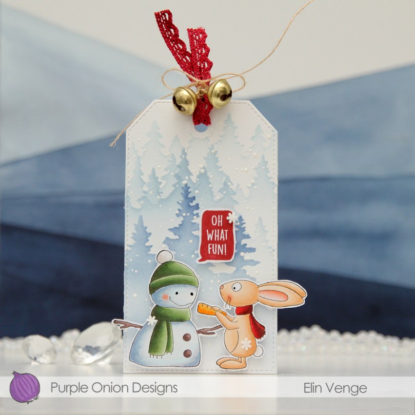 For this one, I stamped the sentiment in Amarena Cherry ink from My Favorite Things. It matches her scarf nicely.
 I managed to get something sticky in the middle of Carrie. There was no way to remove it, so I was very strategic about the placement of the clay snowflakes I added. They’re Snowdrift sprinkles from Little Things from Lucy’s Cards, and I love them.
 I threaded ribbon through the hole at the top of the tag, tied a bow around it using more of that Natural Twine from May Arts and added a couple of gold bells to the top. Different kind of bell than on the green tag, but they still make that wonderful sound.
 Lots of Copics for this one too. I just can’t help myself.
 For the back of the tags, I stamped To/From from the B06 stamp set from Norsk Stempelblad AS using Obsidian ink from Altenew. The remaining stamps are stamped in Classic Kraft and Dark Chocolate inks from Papertrey Ink. For some of it, I used second generation stamping. The circle stamp with 24.12 in the center and the tree stamp are both from Inkido. The little snowflakes are from North Star Design, the smaller circle stamp with God jul in the center is from Ladybug & Friends. Unless I’m mistaken, none of these companies are still in business. It’s kind of sad, but I’m very glad I have these stamps!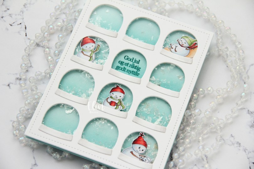
 I chose four of the snowmen in the set and scaled them to fit inside the windows on this Globies Grid Cover die from Mama Elephant. I colored them with Copics and fussy cut them leaving a thin white border.
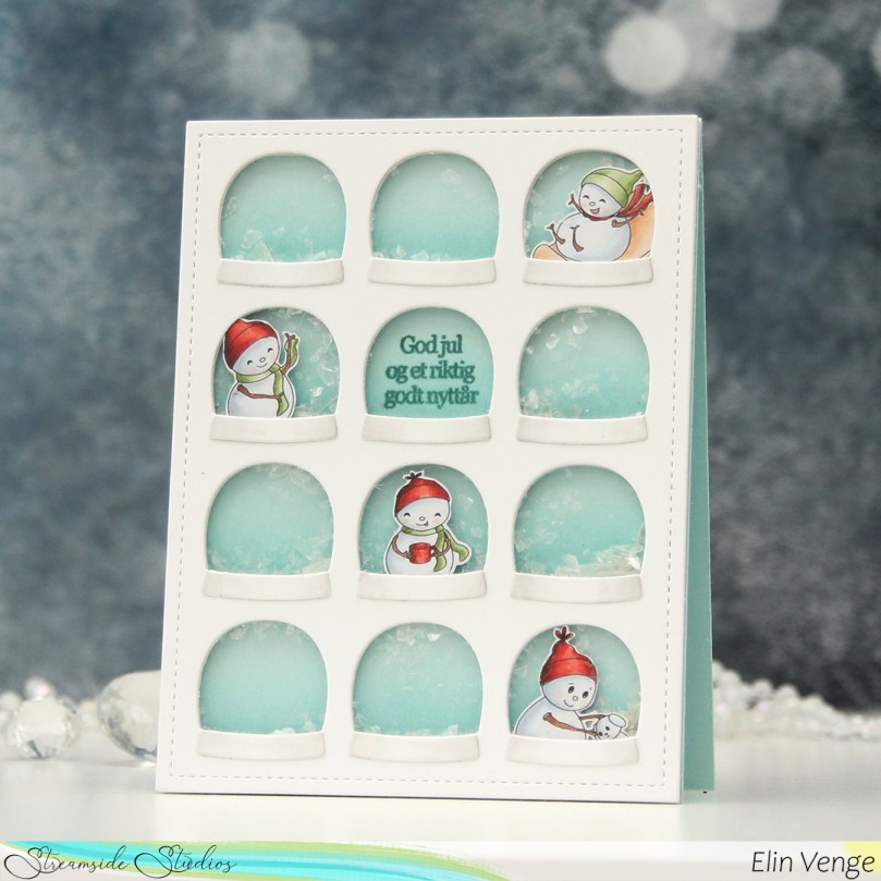 I die cut the cover die from Stamper’s Select White cardstock from Papertrey Ink, added acetate to the back and adhered my snowmen to the back of the acetate in a few of the windows. Onto a panel of Sno Cone cardstock from My Favorite Things, I did some very subtle ink blending at the bottom of each row of snowglobes, using Sno Cone ink, also from My Favorite Things. The ink blending adds a little gradient to each of the snowglobes. I stamped a sentiment from the Julehilsen stamp set from Norsk Stempelblad AS using Caribbean Sea ink from My Favorite Things.
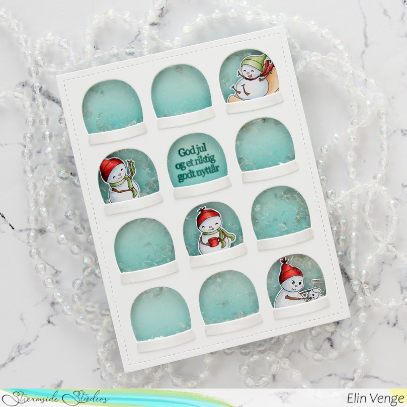 I flipped the front over, added foam tape to the back of my windows and sealed the globe with the sentiment shut so no shaker bits would be in that particular window. I added a sprinkling of Distress Mica Flakes to each of the remaining 11 windows and carefully placed my ink stamped and ink blended panel onto the exposed adhesive to close my shaker wells.
 I adhered my front to a top fold card base I created from Sno Cone cardstock from My Favorite Things. To finish the card, I die cut the bases for the snow globes from white cardstock and added a little bit of subtle shading on the edges with a T0 Copic marker, as well as the colorless blender.
 These snowmen are super tiny, it’s a miracle I used so many colors. I may have gotten carried away with the red in particular. Five colors for these tiny areas is probably way too many, but there you go.
