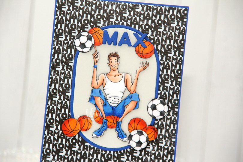
Hi, crafty friends! A few weeks ago, I received an order for a confirmation card for a boy who loves basketball. He also likes football, but basketball was more important. I dug through my digital stamps and decided to use Basketball Teen from Mo Manning, as well as the actual football from Soccer Boy, also from Mo Manning. I also printed a few extras of the basketball and the football to use as embellishments for the card.
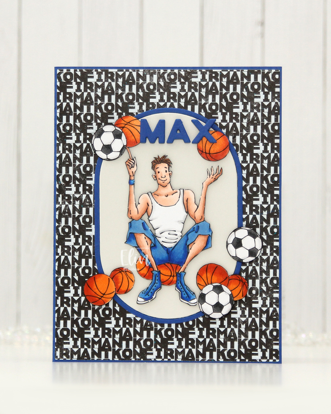 I colored the basketball teen, the extra basketballs and the footballs with Copics and fussy cut them all. I made an A2 card base using Capri cardstock from Concord & 9th and covered most of it with the Lovende patterned paper from the Ungdommelig collection from Papirdesign. Putting the teen directly on the patterned paper wouldn’t work as it was a very busy pattern, but by using the A2 Oval Basics die set from Kristina Werner, I was able to create a grounding element for my focal point. The die cuts out the oval and a frame in one go, so I die cut it once from Capri cardstock, and once from Soft Stone cardstock from Papertrey Ink. I used the Connected Alphabet die set from My Favorite Things to die cut the letters for the kid’s name in Capri cardstock, stacking a few for dimension.
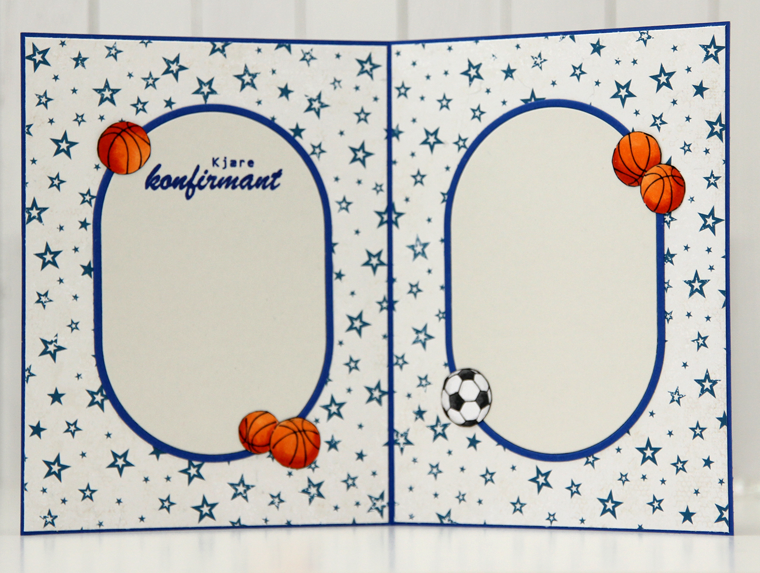 For the insides, I die cut more of the ovals, and actually used the back of that same patterned paper that I used for the front. Double sided patterned paper is awesome. I rarely use patterned paper anymore, so it was fun to bring it back for this card. I stamped a sentiment from the Konf. 02 stamp set from Norsk Stempelblad AS on the panel on the left using Capri ink from Concord & 9th and embellished the insides with a few basketballs and a football. (I know the photo is a bit blurry, but it was the only one I took of the inside and I didn’t realize until I’d given the card to the lady who ordered it).
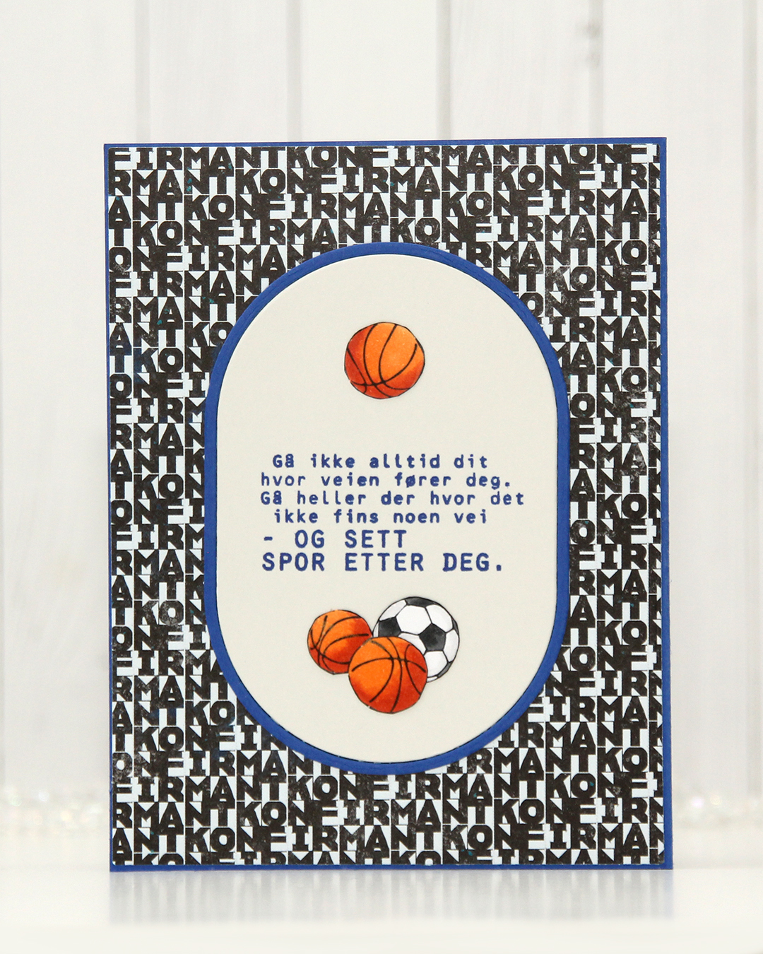 Same setup on the back of the card. Another sentiment stamped in Capri ink, also from the Konf. 02 stamp set.
 With such a simple image, there weren’t a lot of colors used.
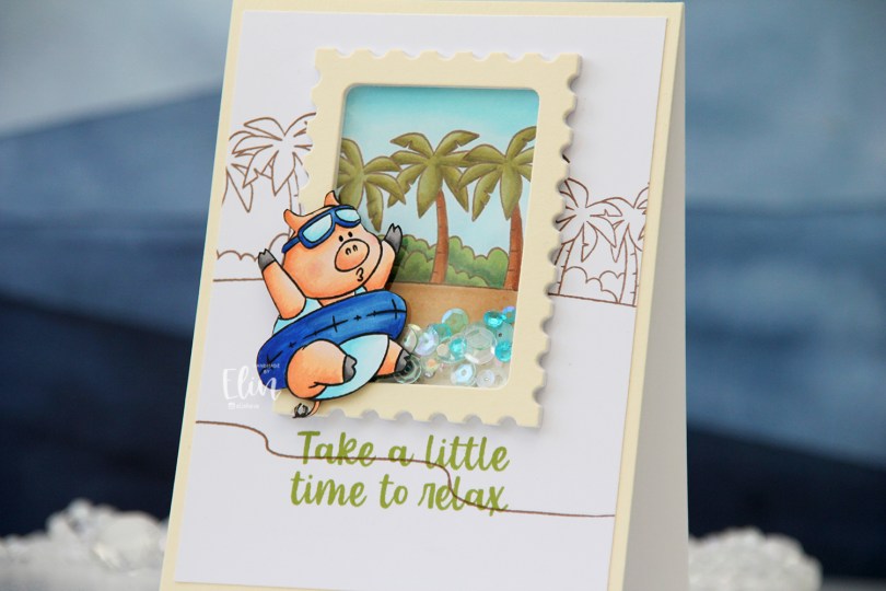
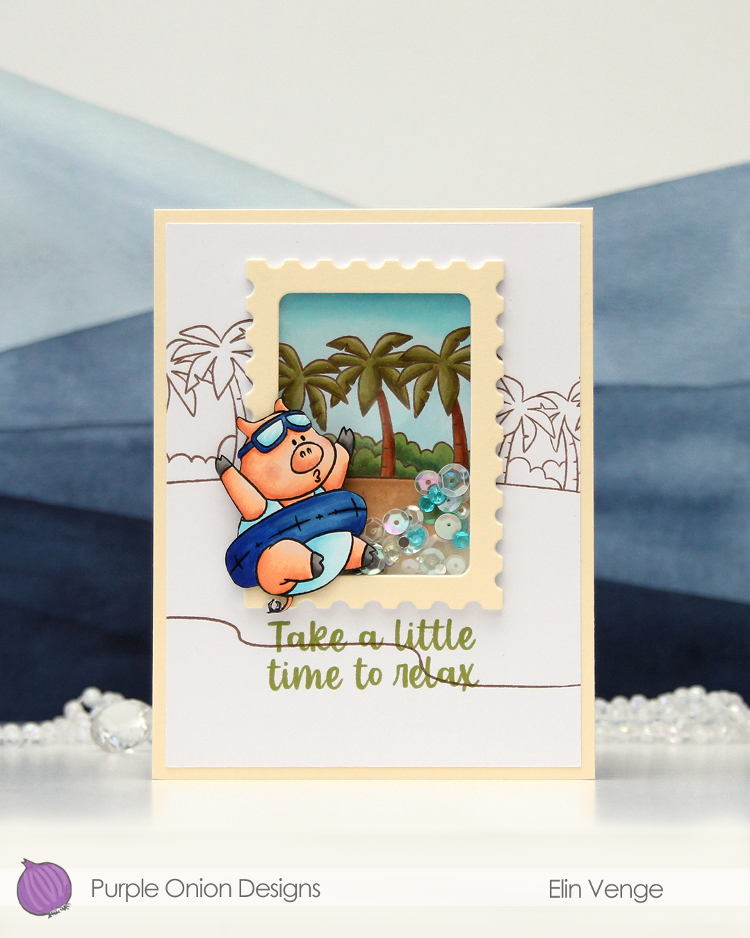 This little guy (gal, maybe?) is part of the Sunshine and Daydreams collection that released this summer from Purple Onion Designs. (S)he is half of the
 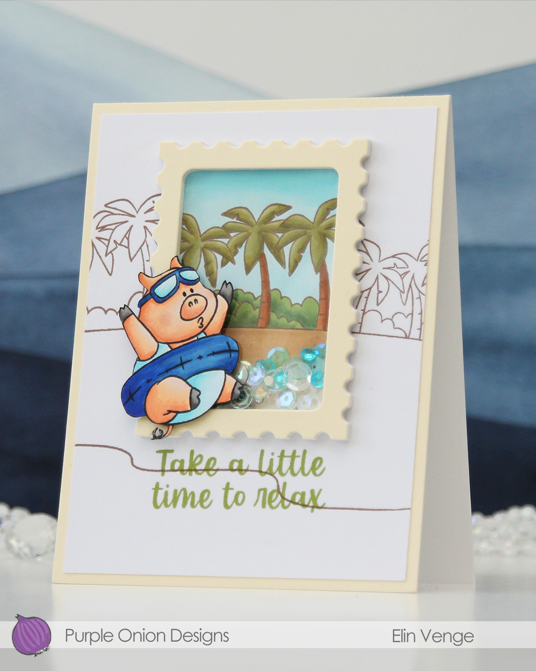 I stamped the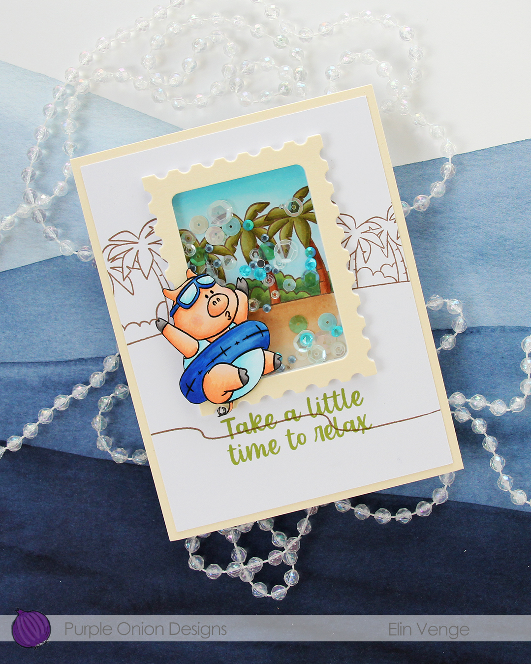
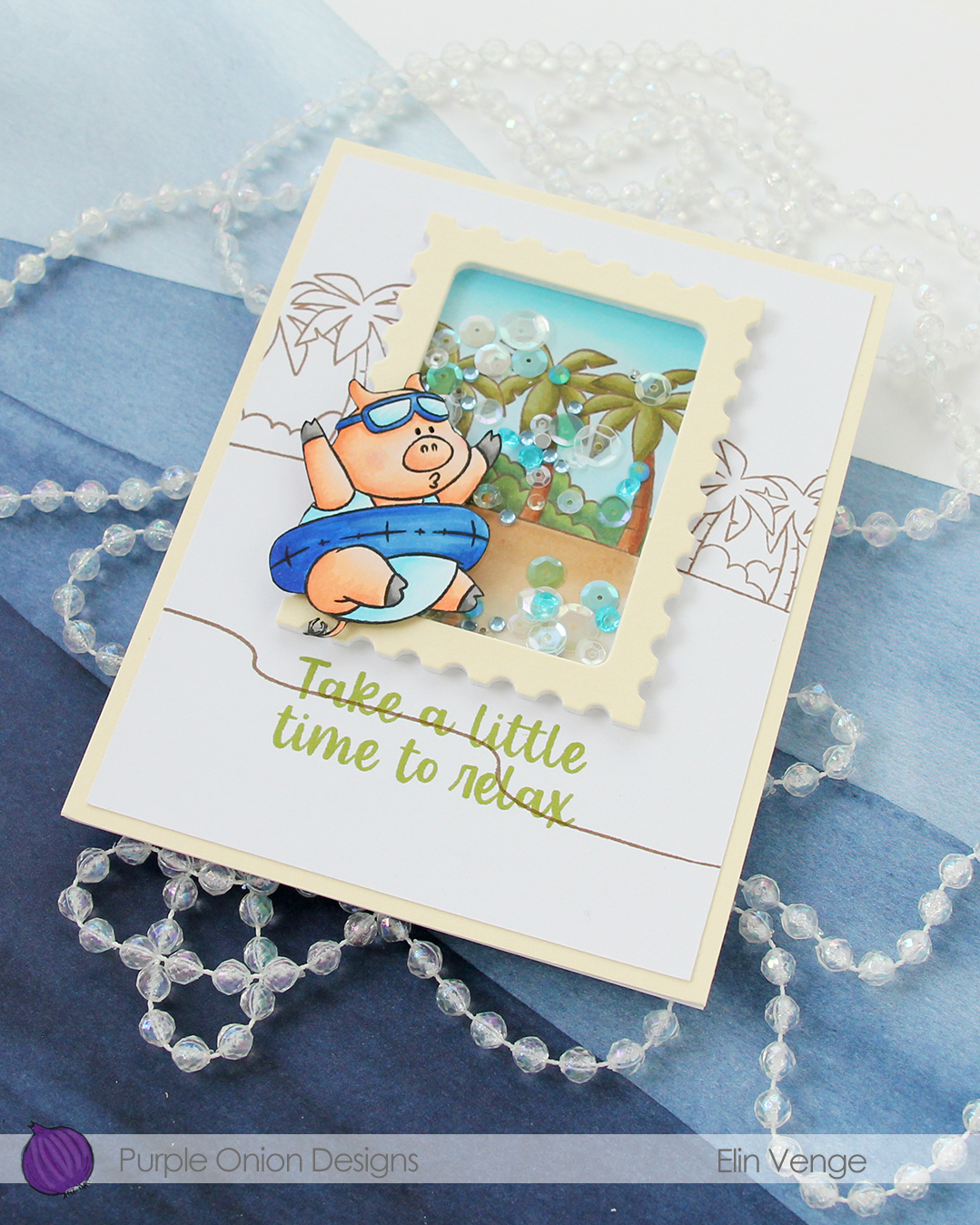 I used Avocado ink from Concord & 9th to stamp my sentiment, which is from the
 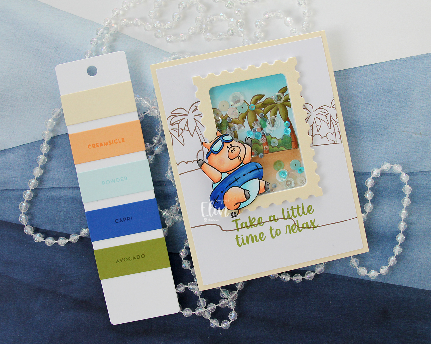 The Farmhouse color combination from Concord & 9th was my inspiration for the colors I used on this card. It’s a combo I probably wouldn’t have thought of on my own, but I quite like the end result. Give me anything blue, and I’m here for it, that Capri color definitely is a show stopper!
 I used quite a few Copics for this one, in spite of the coloring being on a somewhat smaller portion of the card front.
