
Hi, crafty friends. Today’s release day over at Rachelle Anne Miller. This month’s theme is Year of the Dragon. I’m a big fan of dragons, and I couldn’t resist this cutie with his little chick friend. This is the Earth stamp, there’s also wood, metal, water and fire, as well as a new pack of digital patterned paper, which I also incorporated into my design.
 I colored the image with my Copics, then used the second largest die in the A2 Stitched Rectangles STAX 2 set from My Favorite Things to turn it into a nice panel with a faux stitch edge. I put a few additional layers of cardstock behind my colored piece for dimension and adhered it to a card base that I had covered in the patterned paper in this release. I used the blossoms, I thought the pattern went well with the blooms in the image and colored my dragon to be a good color match.
 Using the Waterbrush Hello Die from Altenew, I die cut three layers from white cardstock and one from the patterned paper, adhered them together for a stacked look and placed the die cut so it nestles in with the image, before finishing off with a few pearls. These Panduro pearls are very pale pink and they’re at least ten years old, but they worked really well for this card. I also used a black Glaze pen from Sakura to add shine to the eyes, and on the dragon, I added a white dot to each eye once the black was dry.
 Simple color palette this time, one that really makes me think of (and long for) spring. Even though spring technically starts today in the Northern Hemisphere, it doesn’t feel like it yet. I’m getting impatient, I’m 100 % over the cold weather.


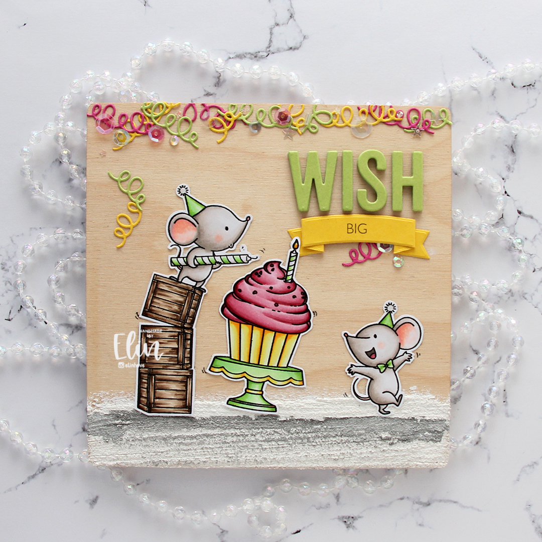


 I diecut a panel of Spring Rain cardstock from Papertrey Ink using the Snowfall Backdrop die from Lawn Fawn and ink blended over the top. I used Chipped Sapphire Distress ink, Faded Jeans Distress ink, Stormy Sky distress ink and Spring Rain dye ink working my way from top to bottom, dark to light. I glued the piece straight onto my white cardbase.
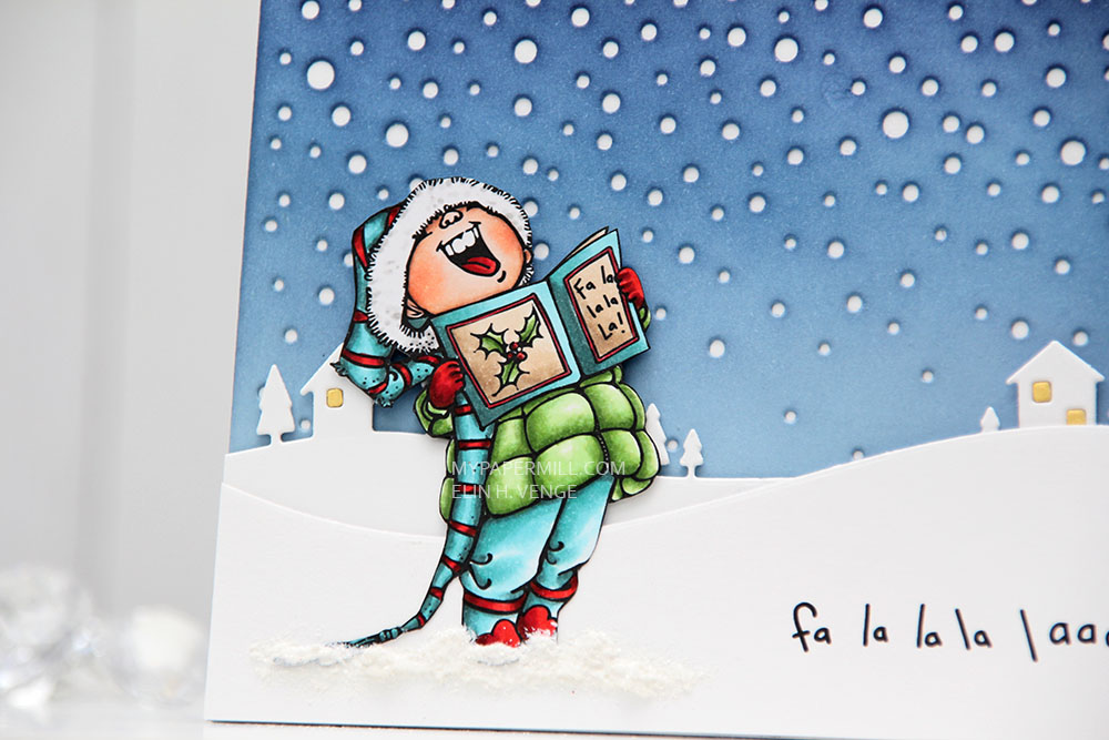 I used the Country Landscape die from Memory Box to diecut the background hills from Stamper’s Select White cardstock from Papertrey Ink. I used the same die to diecut the windows using Harvest Gold cardstock, also from PTI, and inlaid them. I popped the entire panel on low foam tape for a little bit of dimension. I then diecut my panel with the sentiment already printed using a die from the Stitched Hillside Borders die set from Lawn Fawn. I’m a huge fan of faux stitch dies, but since the Memory Box die doesn’t have the faux stitching, I didn’t want it on my top panel either, so I used the die upside down and glued this snow bank on with low foam tape. To ground my image I used snow paint just below it as snow, and sprinkled rock candy distress glitter on top while the snow paint was still wet.
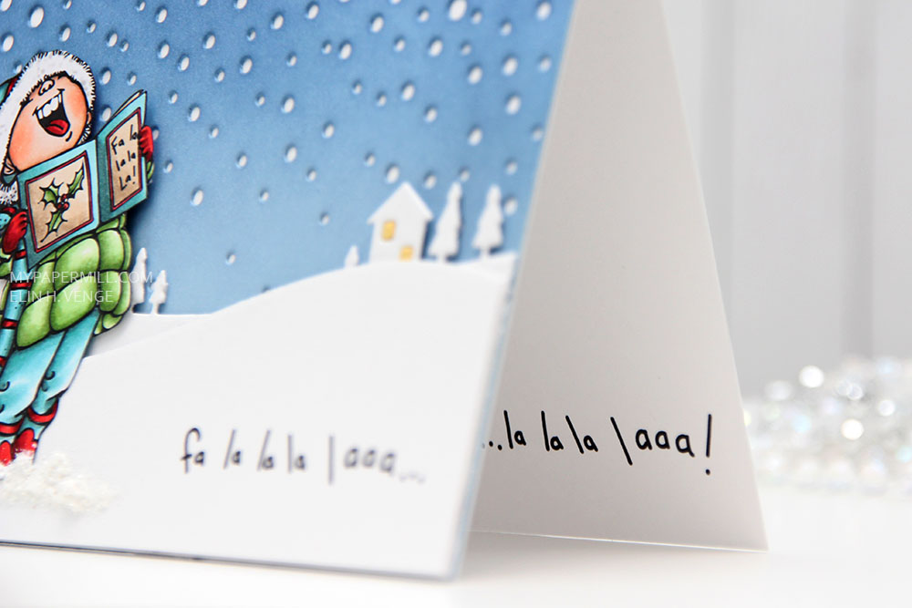 I changed up the sentiment a little. There’s an exclamation mark at the end, but I wanted that to be on the inside, so I added three dots instead and printed the same sentiment on the inside with the three dots in the beginning and the exclamation mark at the end.
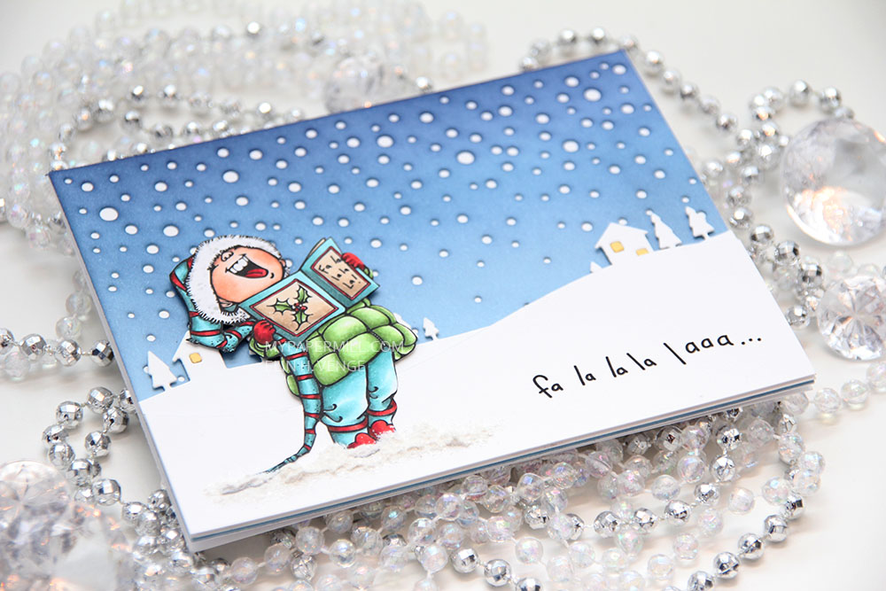 I was a little hesitant about using my blue background at first, because I didn’t think the image stood out enough against the blue. When I created the snow banks, the whole thing transformed, and I’m glad I stuck with the blue.
 Not a lot of markers for this one.
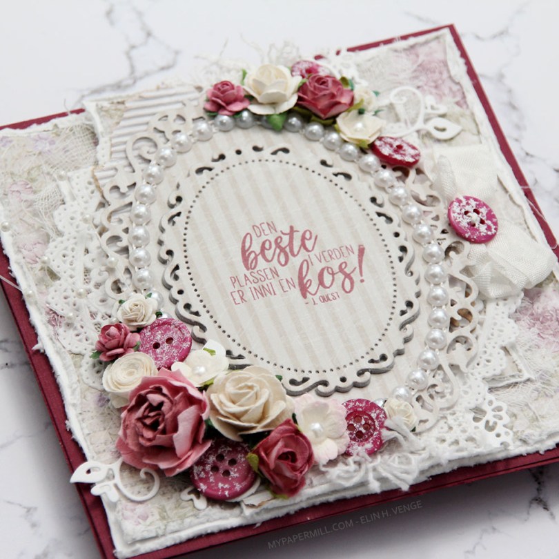
 Jeg var innom Hobbykunst i januar og fikk en utfordring om å bruke et
 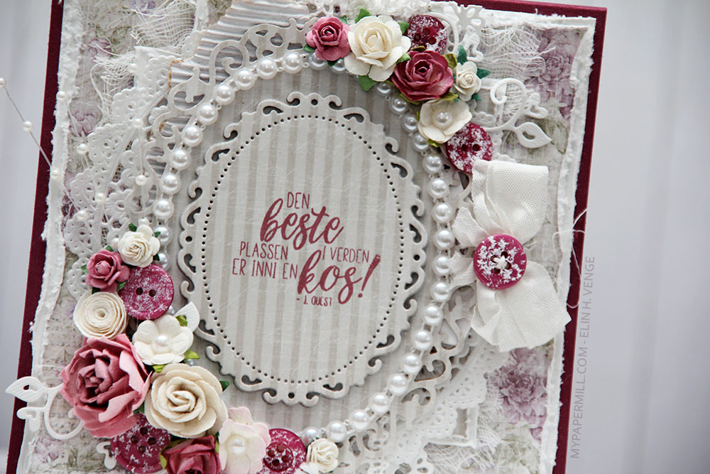 Teksten er et stempel fra
 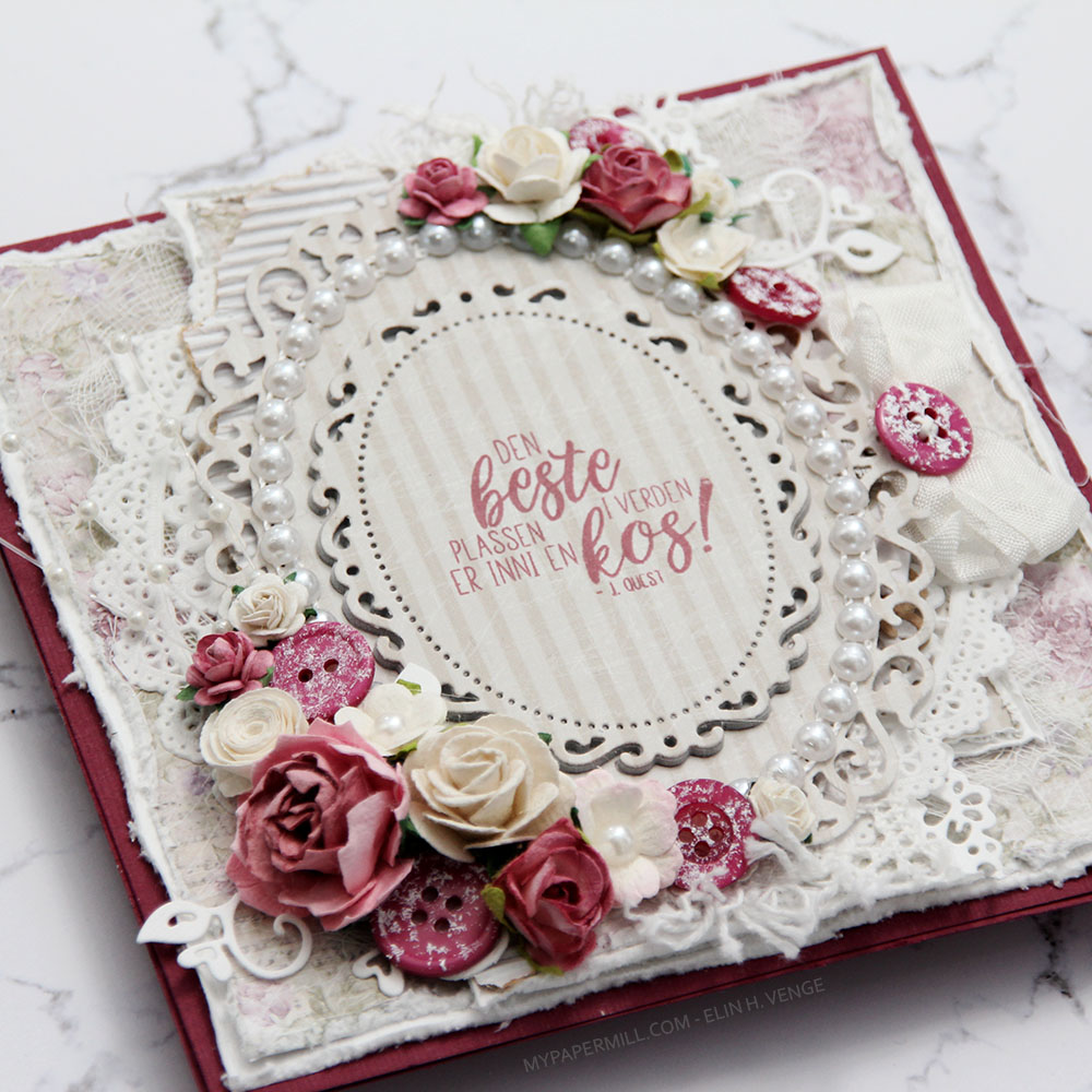 Kortet ble ikke veldig postgangvennlig, det er ganske tykt, selv om jeg kun har pyntet forsiden. Det var nemlig ikke nok igjen av arket til å bruke inni og bak. Sløyfen med knapp sitter fast i en tag som er under hovedpanelet. Teksten på tagen er også et Huldra-stempel. Hvilket kan du se i Hobbykunst-butikken, der er nemlig kortet.
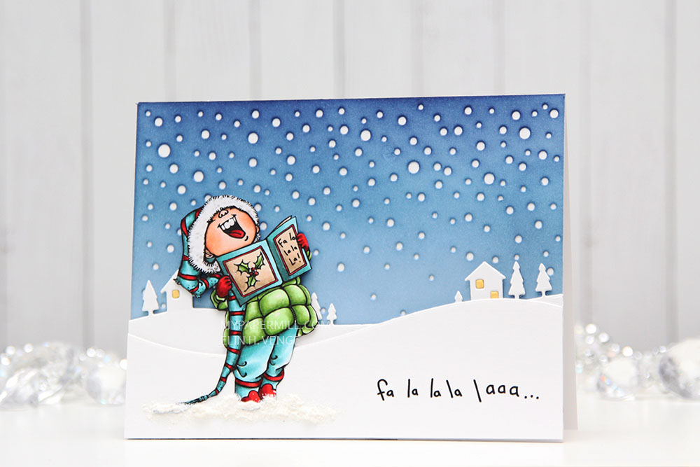
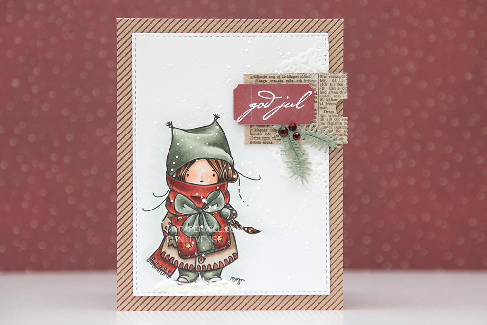 I chose muted colors with lots of grays in them, diecut my colored panel with a stitched rectangle die from My Favorite Things and sprinkled on chunky white embossing enamel from Stampendous which I heat embossed. It gives the look of falling snow, which I really love for Christmas cards. No pattern, completely random, which really is how snow falls in real life.
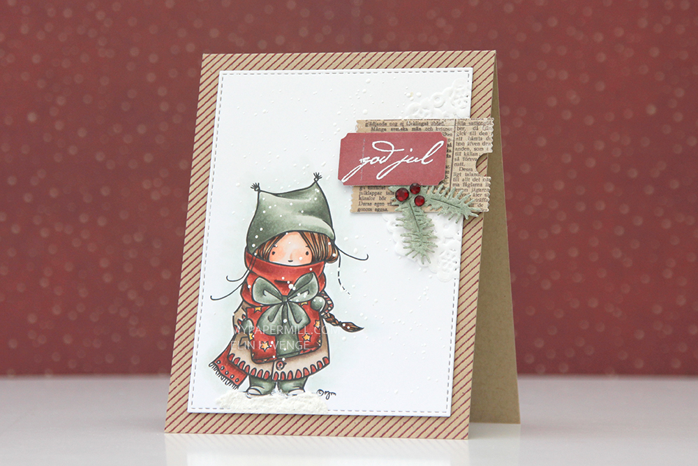 I added my panel to my card base using dimensional adhesive without too much dimension. The card base is Classic Kraft cardstock from Papertrey Ink. I stamped a pinstripe stamp from Altenew across it in Scarlet Jewel ink, also from Papertrey Ink.
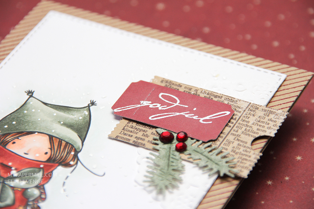 I tend to add little embellishment clusters on my simple cards, and this one is no different. Part of a mini doily from Doodlebug, some patterned paper diecut with a Docrafts die, a ticket with a white heat embossed sentiment from Papirdesign, and diecut pine branches from patterned paper. I added three Papirdesign crystals as a finishing touch.
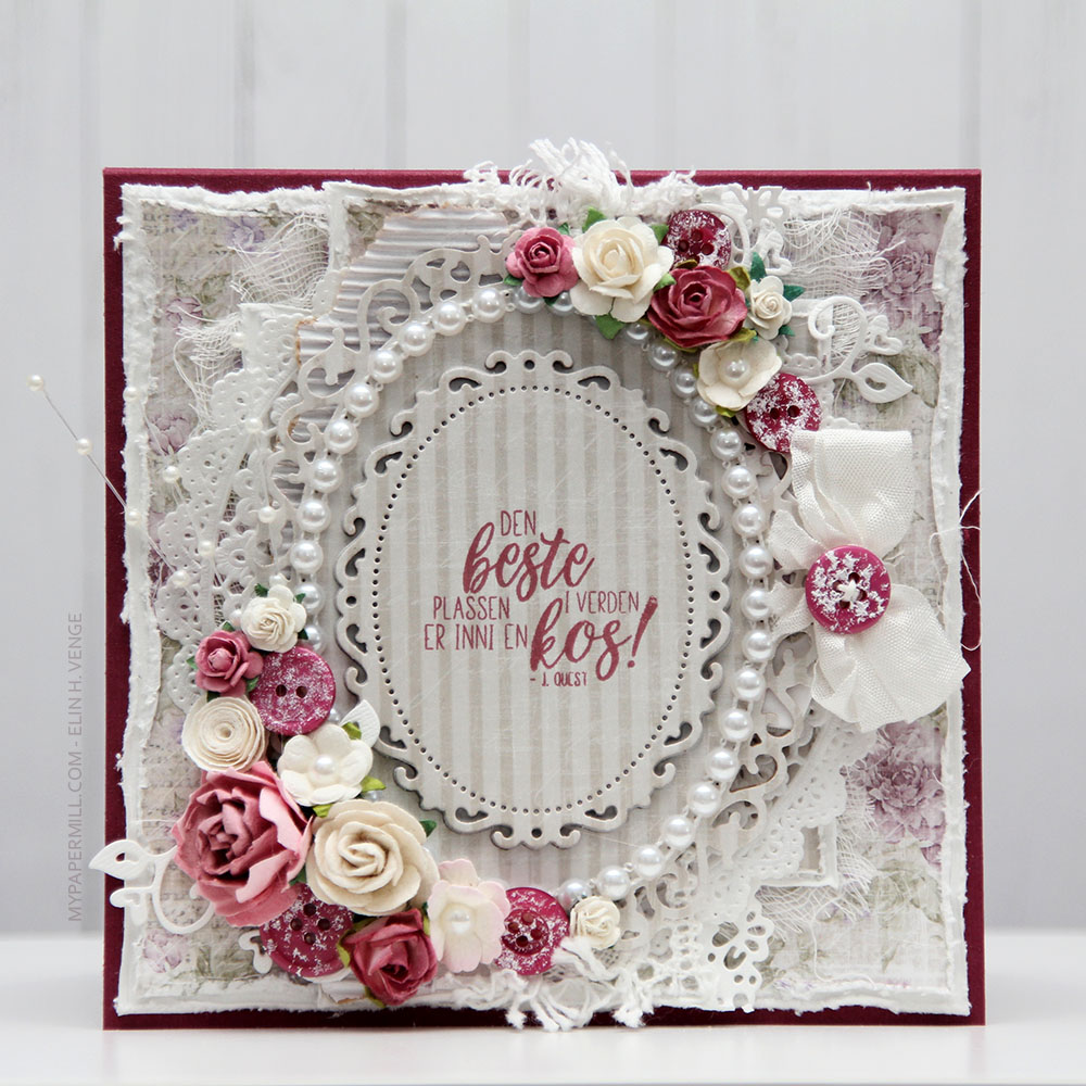
 Jeg bestemte meg for at jeg skulle lage disse som et sett, så de matcher. Jeg har brukt mønsterark fra Vintage Summer Basics-serien til Maja Design på begge to, samme stempelpute og også en del av pynten er lik. I hver spiss på vinskjuleren har jeg satt en malje fra Making Memories for å forsterke hullene som tråden skal gjennom. På rammen har jeg limt 2mm perler fra Kort & Godt tett i tett rundt hele ringen for å pynte opp litt ekstra.
 Kortet har jeg laget litt lag på lag. Jeg har brukt den samme rammen her som på vinskjuleren, og stemplet en tekst fra Norsk Stempelblad AS med Papertrey Ink Autumn Rose blekk rett på det ene mønsterarket. Jeg har pyntet enkelt med blomster og en perlestreng og lagt en tynn blonde bak som en slags ekstra ramme.
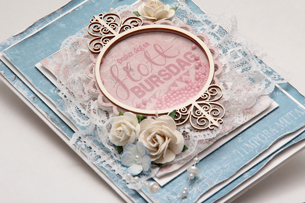 Jeg har laget hovedfokuset på kortet som en shakerboks, med glassperler inni. Disse perlene er kjempegamle, min bestemor kjøpte dem på bokhandelen på Åndalsnes en gang på åttitallet, men de matcher jo mønsterarket HELT perfekt.
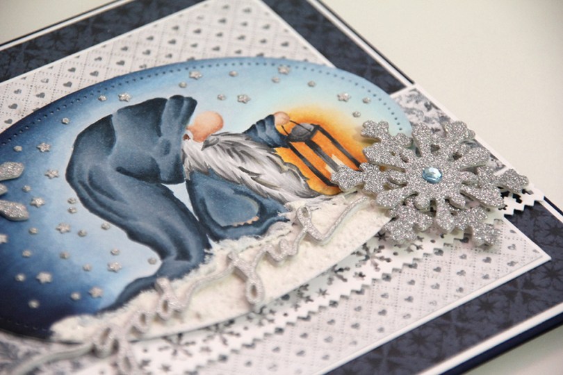
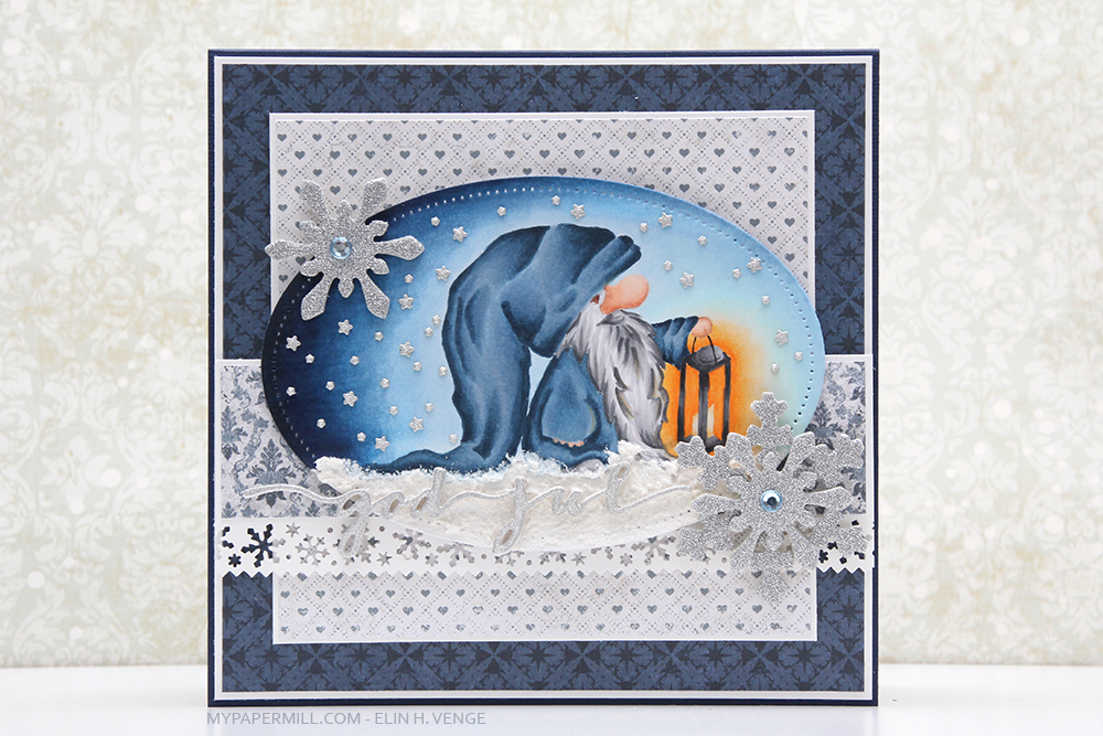 Jeg har brukt nissestempelet fra Nisse med lykt-platen som hovedfokus på forsiden av kortet mitt. Jeg annengangsstemplet stempelet med Memento Summer Sky og fargela med nolinesteknikk med Copics. Jeg vet ikke helt om jeg vil anbefale annengangsstempling med akkurat det blekket, det ble nesten usynlig. Det er en veldig lys blåfarge i utgangspunktet, så førstegangsstempling hadde sikkert vært bra nok.
 Jeg brukte den største dieen i Hipp hurra, oval-settet til å stanse ut motivet, og jeg har også stanset ut ordene god jul og limt på snøen min. For å få litt tykkelse på det hele stanset jeg ordene ut fire ganger i vanlig hvit kartong og limte oppå hverandre, før jeg limte en versjon i glitterkartong på toppen. Sølvfargen på glitterkartongen matcher faktisk sølvfargen på snøfnuggchipboardene ganske bra.
 Innsidene lagde jeg veldig enkle. Tekstpanelene er stanset ut med den samme dieen som jeg brukte på nissen, og jeg har stemplet noen snøfnugg i blått for å pynte opp litt.
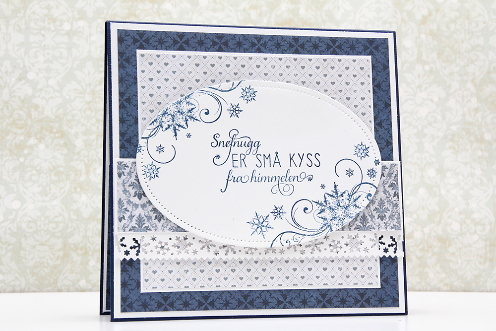 Flere snøfnugg stemplet i den samme blåfargen på baksiden, og også en tekst som passer bra til snøfnuggtemaet.
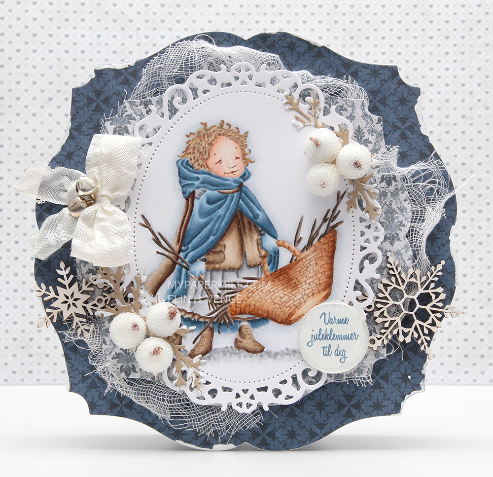 I printed my image with a very low opacity percentage and colored her with Copics. She’s diecut with a Spellbinders die, and the shape of the card itself is made using a Go Kreate die. I’m a huge fan of blue for Christmas cards, so the new papers from Papirdesign are perfect for me.
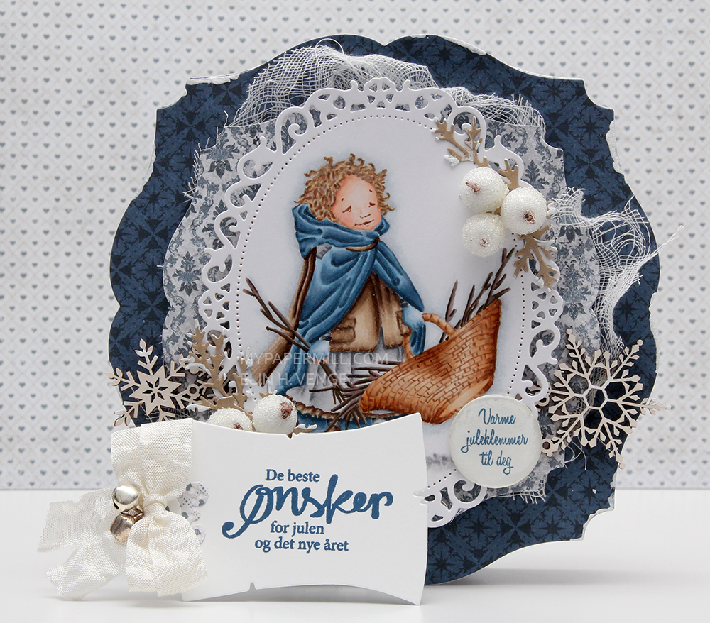 I’ve hidden a tag behind my image, diecut with an old Magnolia die. The sentiment is from Norsk Stempelblad AS, as are the rest of the sentiments on the card, all stamped using Papertrey Ink Enchanted Evening ink.
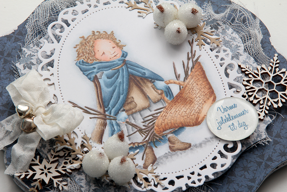 I’ve embellished with frosted berries from Kort & Godt, a SnipArt snowflake chipboard border, some cheesecloth and diecut branches with some gesso painted as snow.
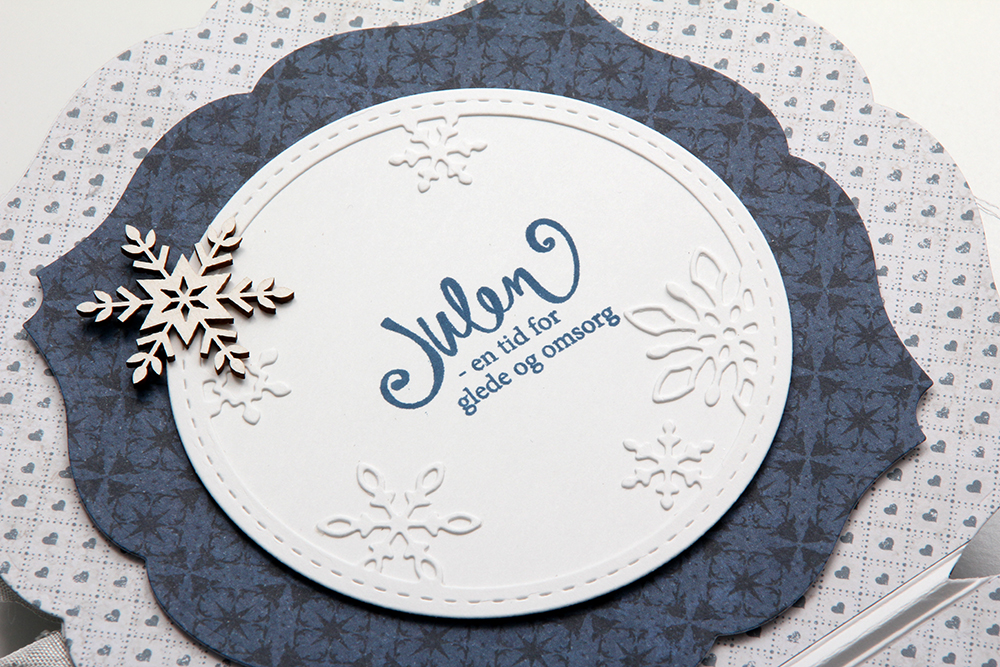 I made the insides really simple. A stitched snowflake circle frame from Memory Box and another SnipArt snowflake, in addition to the sentiment. The other inside is pretty similar, but without a stamped sentiment – perfect for writing a personal message to the recipient.
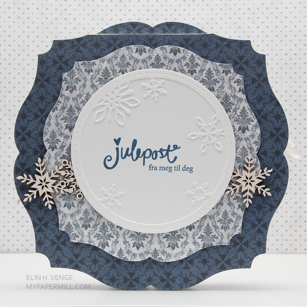 The back is also pretty simple. The rest of the snowflakes from that long border strip on the front, another stitched snowflake circle frame and one last sentiment.
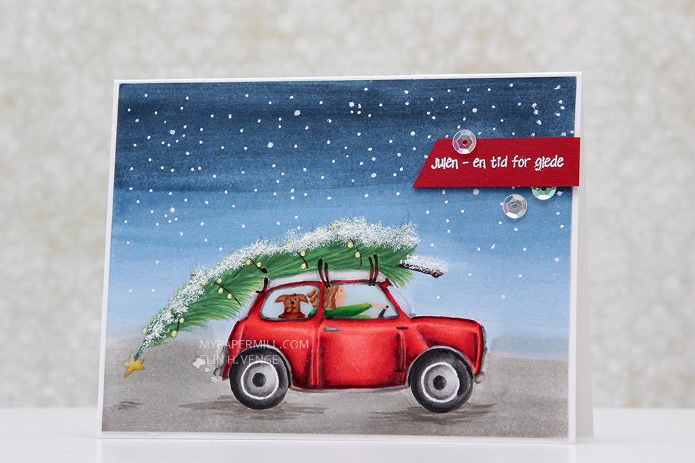
 Jeg avslutter som vanlig med fargene jeg har brukt på motivet mitt. For å lage bakgrunnen med himmelen og bakken brukte jeg faktisk refiller til fargene mine og en pensel istedenfor tusjene.
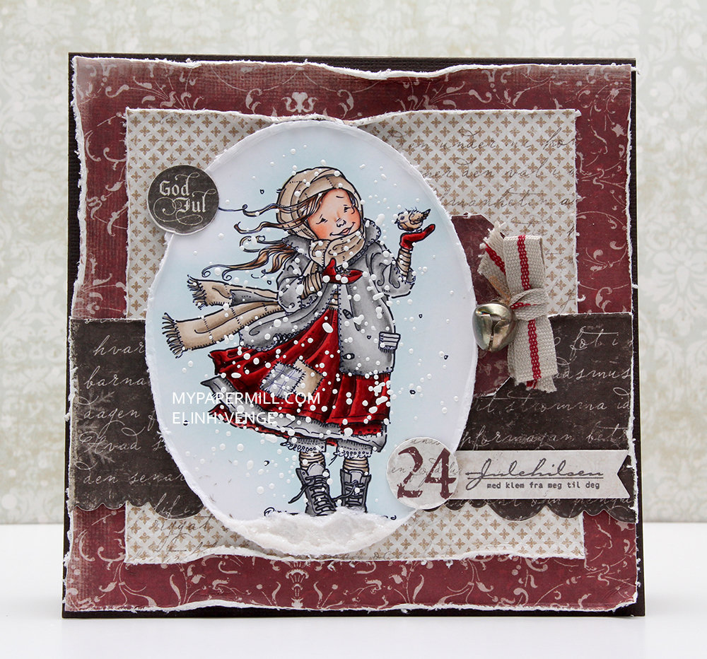 Det er onsdag, og det betyr at det er min tur til å inspirere på
 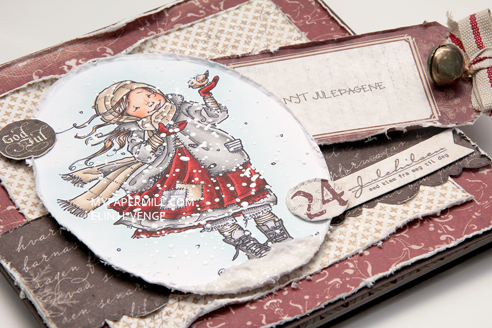 Bak motivet på forsiden har jeg gjemt en tag som jeg har stemplet en tekst fra Julehilsen-platen til Norsk Stempelblad på. I tagen har jeg festet et bånd og en bjelle som lager herlig julelyd.
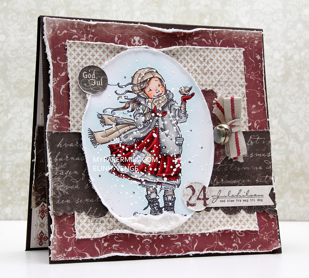 Når kortet er oppreist kan man se litt av innsiden. Jeg hadde to ferdige paneler i full størrelse som jeg hadde planlagt til et kort for lenge siden, men ikke brukt, og nå bød sjansen seg, så da var det bare å kjøre på.
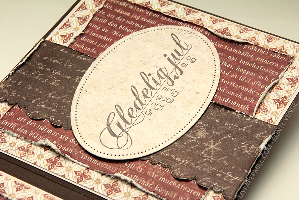 Jeg har brukt mer eller mindre det samme oppsettet på innsidene mine, her har jeg stemplet et gammelt NSB-stempel på et panel jeg har stanset ut med en ny die fra Papirdesign.
 Jeg har gjort det enkelt på baksiden og bare satt på en tag på de andre lagene mine med mønsterark.