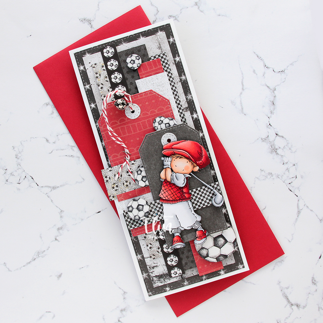
Hi, crafty friends. I’m back with one of those cards I make once in a blue moon, which happens to be a type of card I used to make all the time back in the day (I realize I’m making myself sound really old by saying that). It’s a 6×6″ card, but still not square.
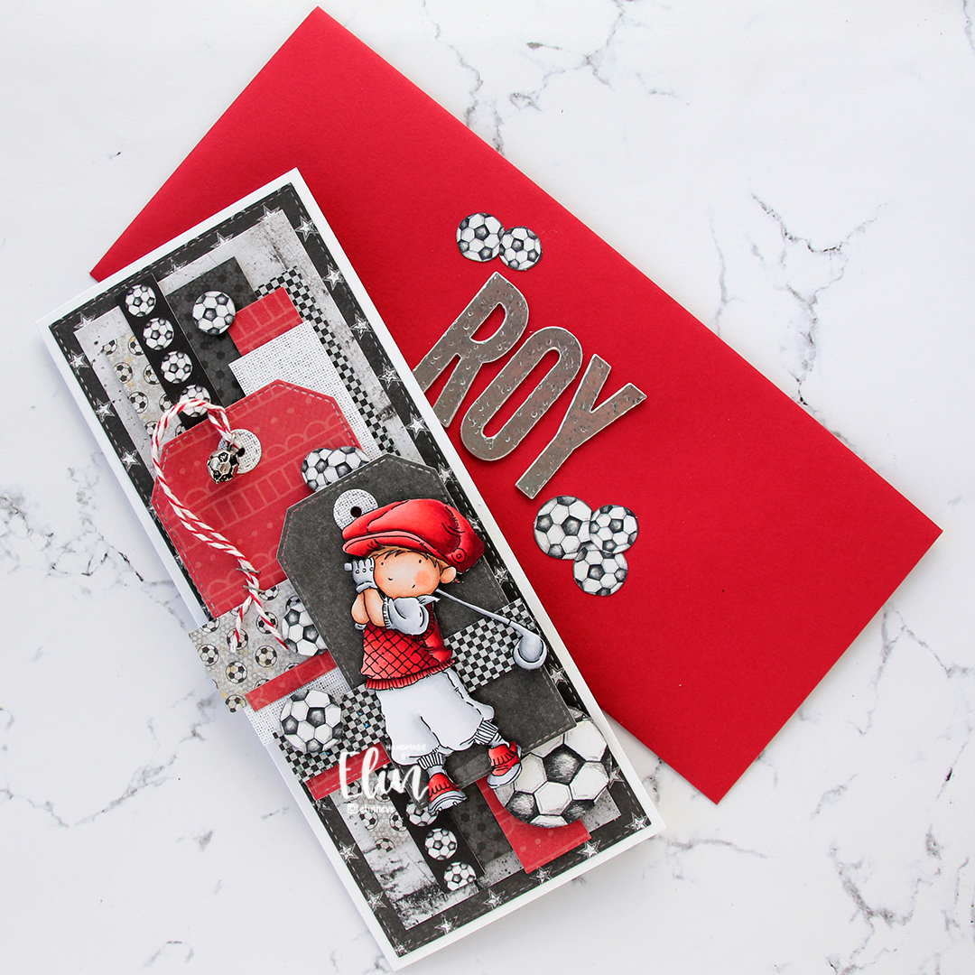
 The card was made on order for a superintendent turning 60. I was told he likes wine, good food, sunny, warm weather and enjoying life and was given free reign to do as I pleased. Mr. Fixit from Mo Manning seemed like the perfect choice for an image to color.
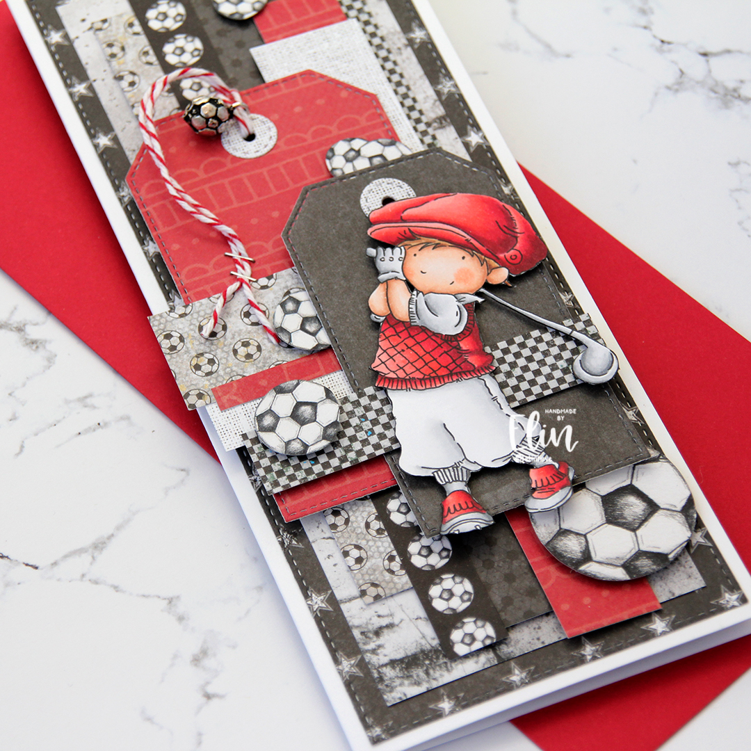
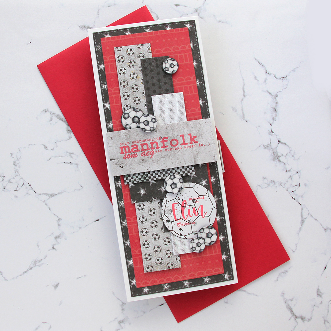
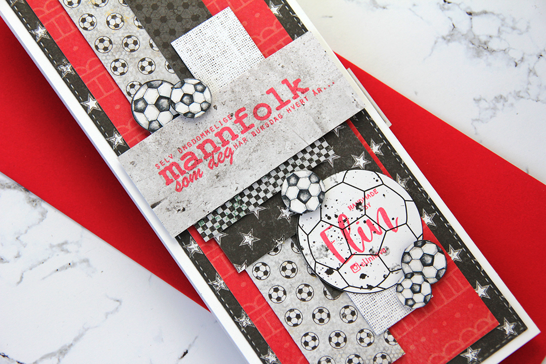
 I rarely use patterned papers on my cards anymore, and certainly not pieces this big, but I love the XXL Square Frames Frilly #10 die set from GoKreate, the dies in the set are perfect for creating shaped cards. I use two 12×12″ sheets of patterned paper to make one of these cards, and this time I used the Drivers License patterned paper from the Denim & Friends collection as well as the Tough but sweet sheet from the Denim & Girls collection, both from Maja Design. I can cut two of the larger shapes and two of the smaller shapes from one sheet, so the insides of the card are reverse.
 I colored the image in colors that went with the patterned paper, adding a bit of red to catch the eye and writing the words on his t shirt with a black Copic friendly pen. I thought the pun would tick the “loves wine” box.
 I used foam tape to add the smaller shape to the larger one, and also to add the die cut circle to the smaller shape. I stamped postmarks from various cities in the world using Memento Rich Cocoa ink to add a little bit of interest to the circle and the panel behind it. I figure if the guy loves warm, sunny weather, he probably also loves to travel, there’s not a whole lot of warm days in Oslo over the course of a year.
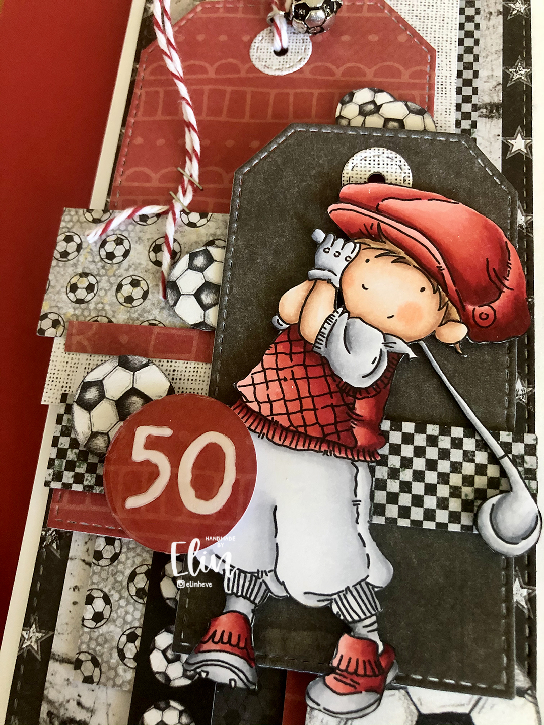
 I added some metal embellishments from Tim Holtz in a bit of a cluster near the bottom left “corner”, as well as his age, die cut and put on a 1″ circle with an epoxy sticker on top for a bit of added dimension.
 I hid a die cut tag behind my image. I used to do this all the time, and it’s a fun way to add a sentiment without having to find space for it on the front of the card. The sentiment is from the Til mannen stamp set from Norsk Stempelblad AS. The dies I used for the tag and reinforcer are old ones from Magnolia. I tied a bow from twill onto the tag, and some cutlery charms to the twill bow using natural twine from May Arts. I thought the cutlery was perfect for a food lover, I have so many treasures in my stash that I forget about until I go looking for something to use.
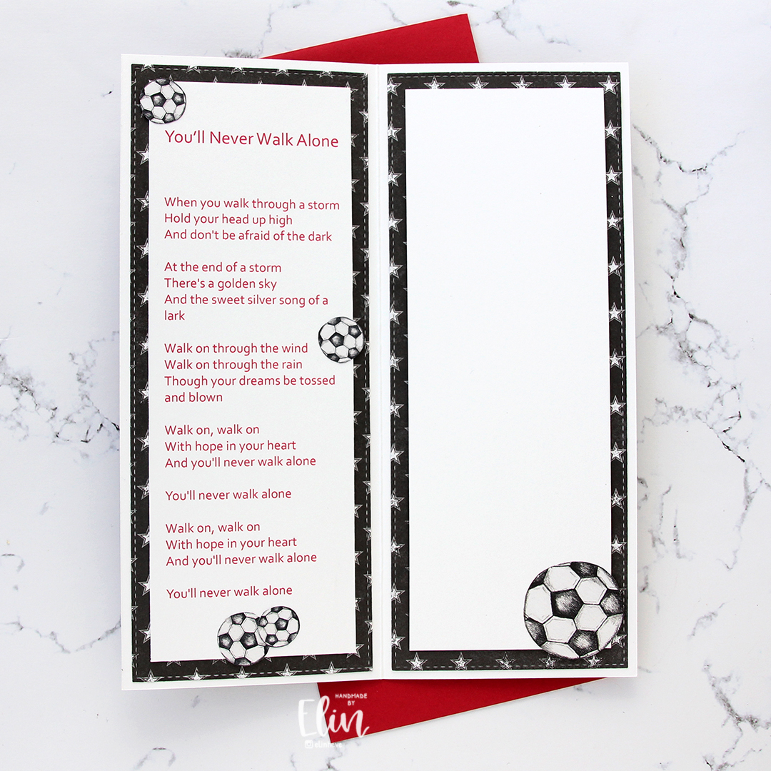
 The inside of the card are pretty simple. The same patterned paper as the front, only with the reverse size. I used more of the postmark stamps from Marianne Design, as well as a sentiment from the Gratulerer stamp set from Norsk Stempelblad AS. There’s plenty of space for a personal message on the second circle, which only has the postmark stamps on the edges.
 The back of the card is also simple. Another sentiment from Norsk Stempelblad AS, this time it’s the B03 stamp set. I love their stamp sets and use them more than any other of my Norwegian sentiment stamps. They’re hard to get your hands on because the company is no longer in business, but they’re the best sentiments out there.
 Simple color palette.
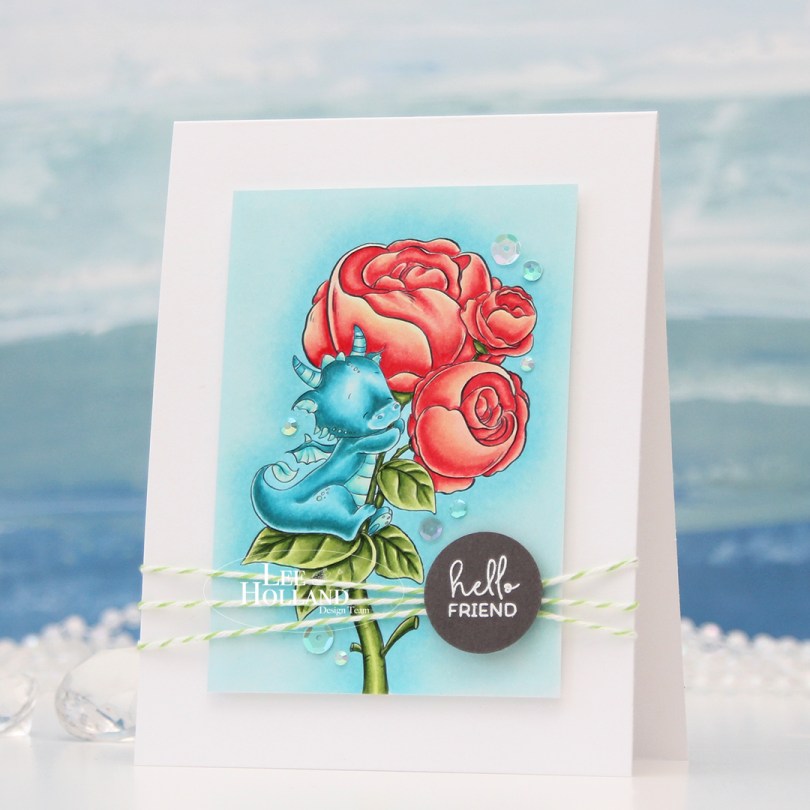
 I printed the image onto X-Press It blending card and colored it with my Copics, before trimming it down. I mounted it on foam tape to a top fold white card base I created from Stamper’s Select White cardstock from Papertrey Ink.
 I felt the need to add a design element that would break the rigidity of the rectangular panels, and decided to add some twine going across. I wrapped Green Apple Divine Twine around the card front three times and tied a knot. The green goes well with the green in the image.
 Onto a piece of Eiffel Tower cardstock from My Favorite Things, I stamped and white heat embossed a sentiment from the Mini messages stamp set from Mama Elephant, before using a 1″ circle punch from EK Success to create a quick circle from it. I added strategically placed pieces of foam tape on the back of it and adhered it directly onto the knot I had tied on the front of the card.
 To finish off the card, I added sequins and gems from the Urban Chic mix from Little Things from Lucy’s Cards. They’re kind of scattered in a trail going from the bottom left to the top right of the image.
 The card is simple, but has lots of dimension, and that dragon hugging his peonies will always steal the show.


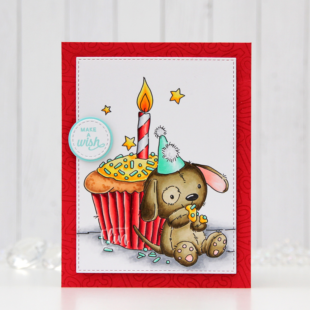 I colored the image with my Copics and used a die from the A2 Stitched Rectangles STAX 2 set from My Favorite Things to turn my colored piece into a panel with the nice faux stitching I love so much.
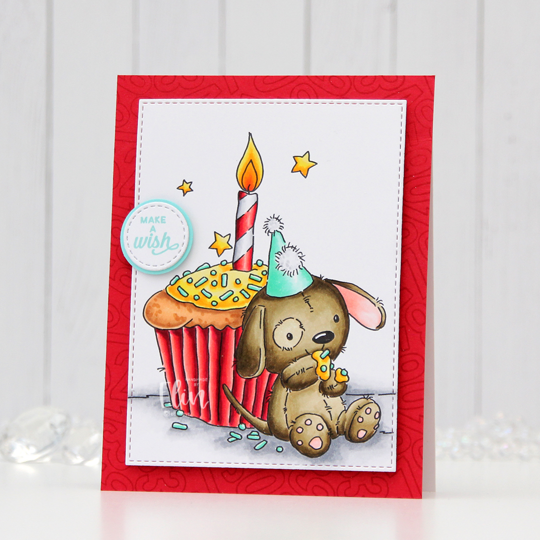 Onto a piece of Pure Poppy cardstock from Papertrey Ink, I stamped the Number Jumble background stamp from MFT with Pure Poppy ink from Papertrey Ink for a tone on tone look. It just adds a little interest to the background without being too distracting. I mounted my colored piece on top using foam tape.
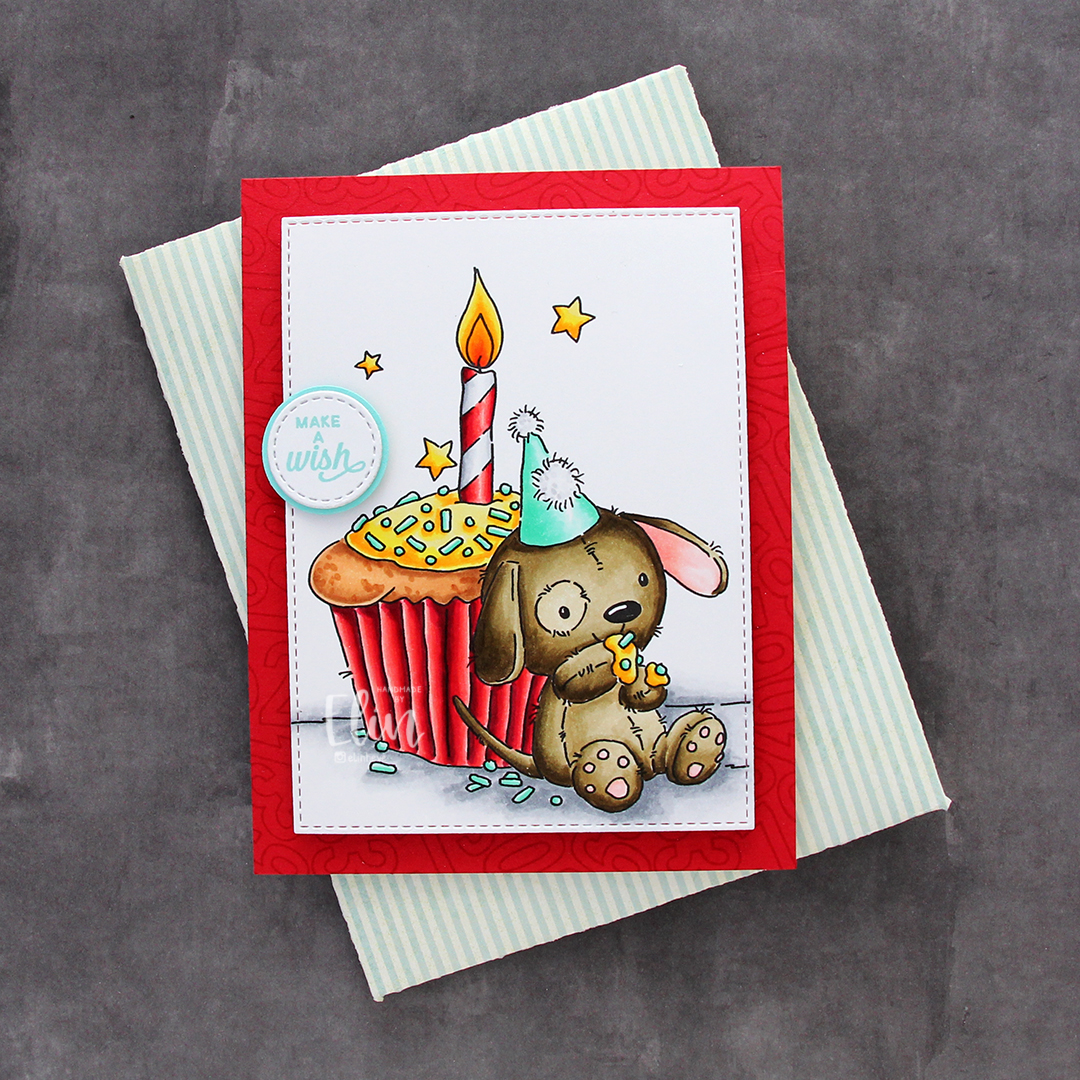 I stamped a sentiment from the Mini Messages stamp set from Mama Elephant using Summer Splash ink from MFT and diecut that using a circle die with faux stitching, also from MFT. I adhered it to a 1″ circle I created from Summer Splash cardstock from My Favorite Things and adhered the circle to the card using a thin foam tape to finish my card.
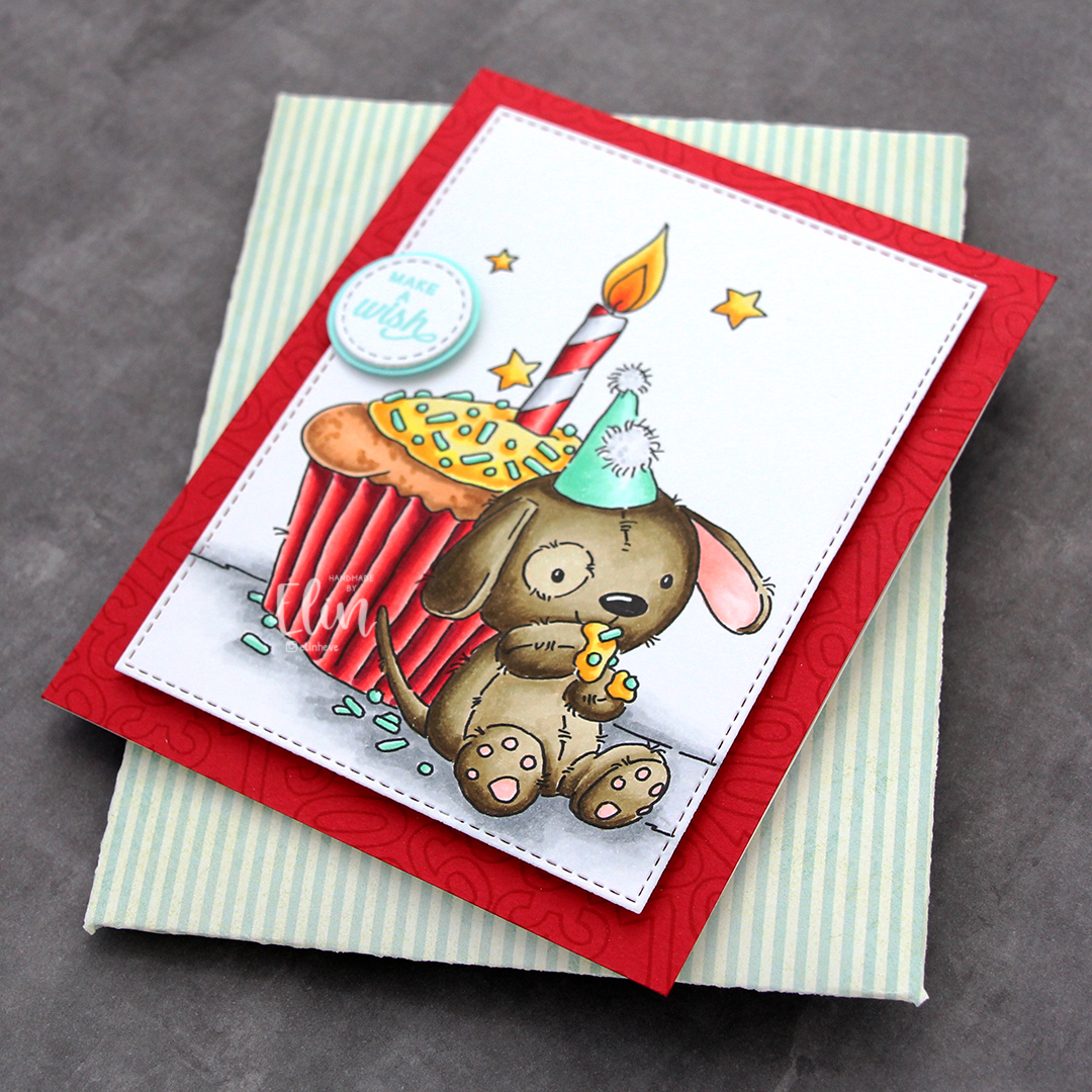 I created an envelope to match from some really old patterned paper from My Mind’s Eye that I had in my stash.


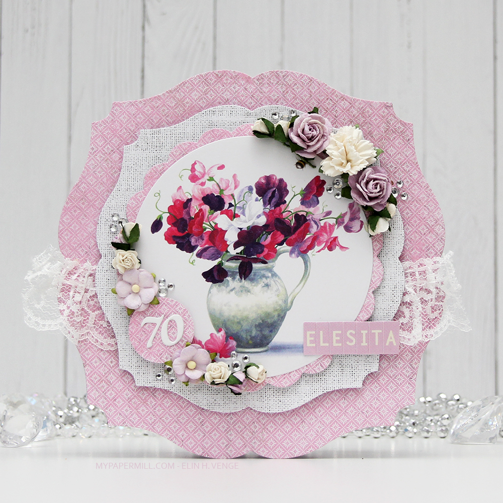 Cards like this come together very easily, it’s basically a bunch of diecutting and you’re done. I use two full 12×12 sheets of patterned paper for cards like this, and the beauty is that there are no scraps left when I’m done. For this one I used two sheets from Papirdesign, one is Roseduft, and the other is stemorsblomst, blå.
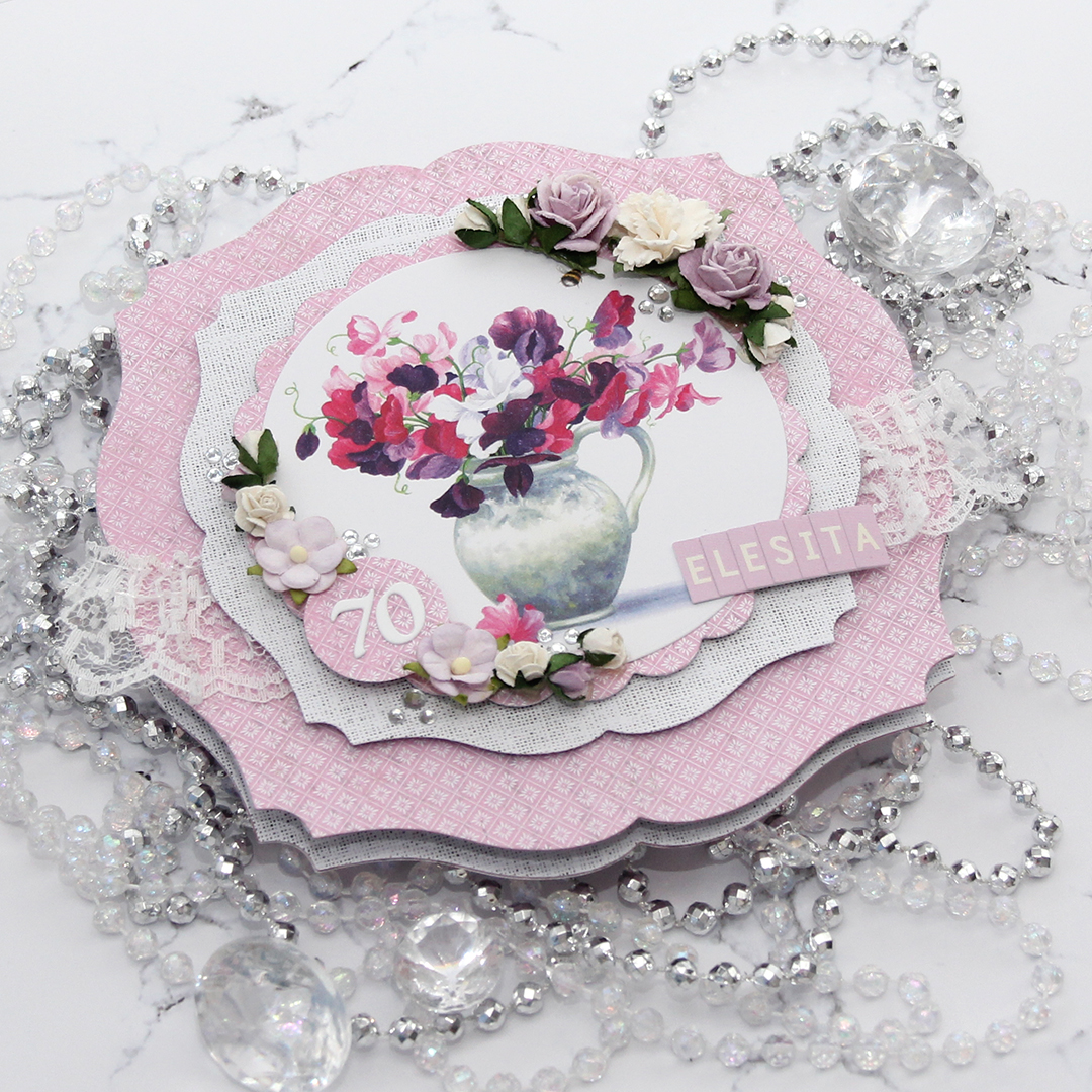 I added flowers from Wild Orchid Crafts, Kort & Godt and Papirdesign along the edge of two opposite quadrants on my circle, used letter stickers from Papirdesign to spell her name and some diecut numbers for her age. I finished off the front of the card using diamonds from Kort & Godt.
 I kept the insides pretty simple, with plenty of room for a personal message for the birthday lady. I added some more diamonds to embellish a tiny bit.
 On the back of the card I used more flowers, more diamonds and stamped a Norsk Stempelblad AS sentiment using Autumn Rose ink from Papertrey Ink. “Happiness is the art of creating a bouquet of the flowers within reach.”
 I printed
 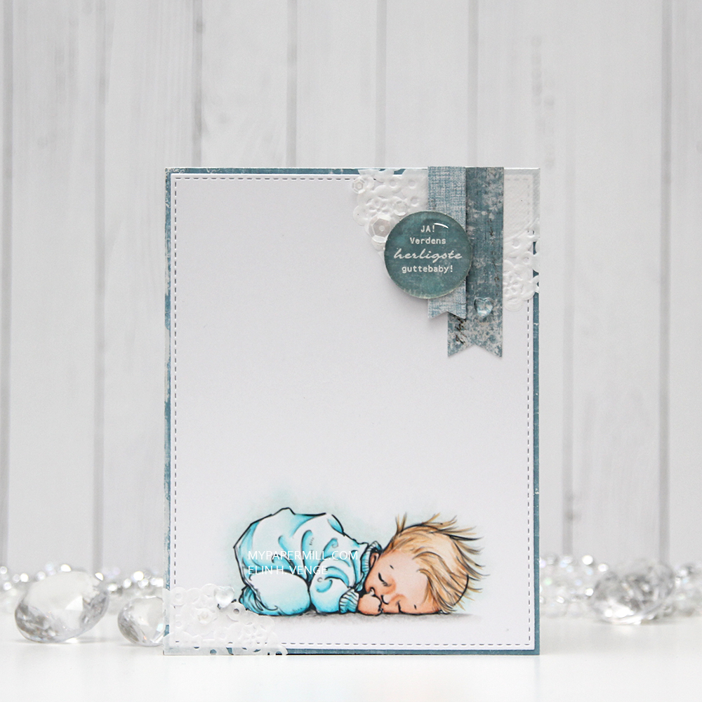 I’m no stranger to adding clusters on my cards, so I pulled out half a paper doily from Doodlebug Design, more scraps of Maja Design patterned paper (the Vintage Summer Basics and Vintage Autumn Basics collections) and diecut a couple of banners using the Fishtail Flag Frames die set from My Favorite Things. I also stamped and white heat embossed a Norsk Stempelblad AS sentiment, before punching it out using my 1″ circle punch from EK Success. I added a pebble on top for an extra bit of dimension.
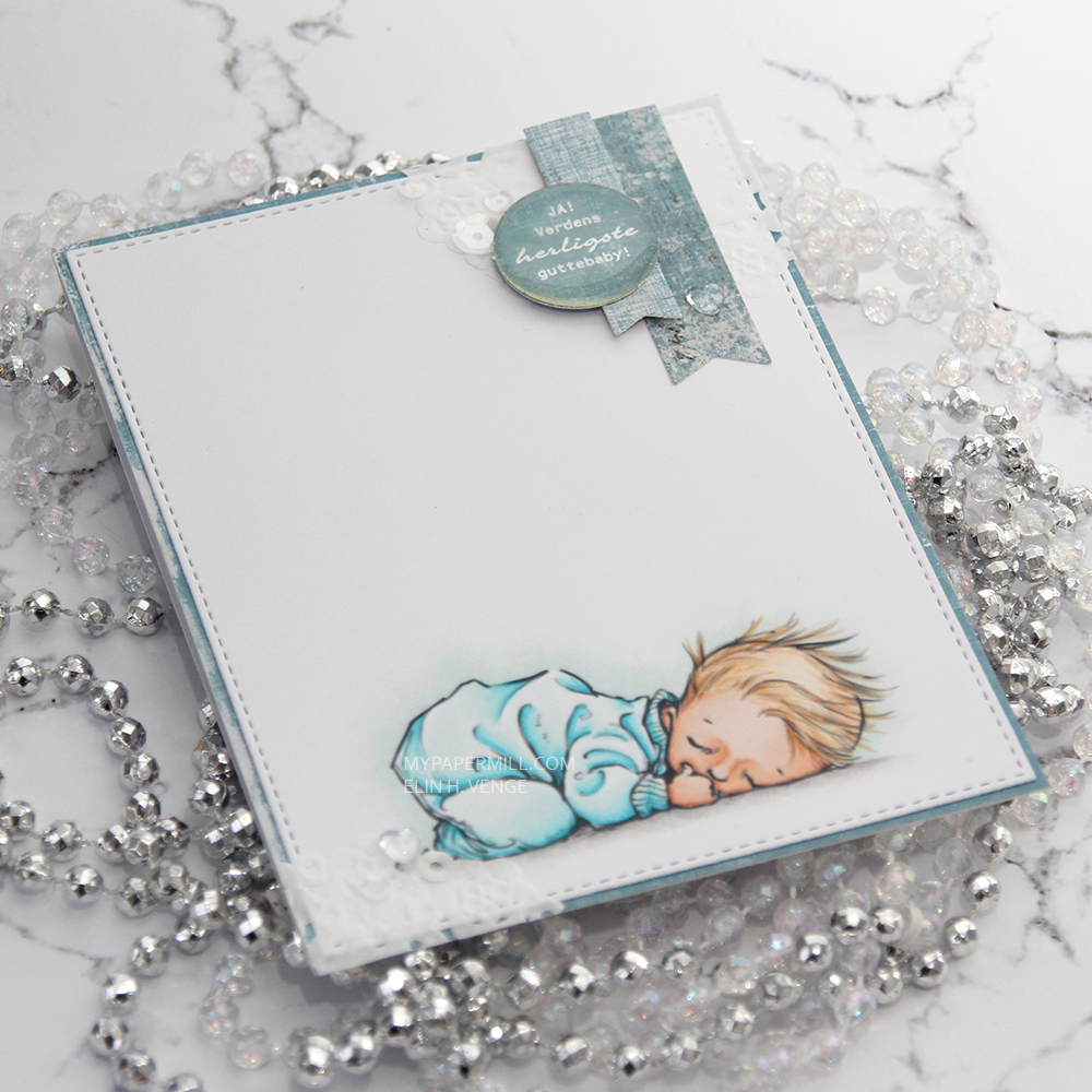 I also added some sequins (from the Ice Water mix) and a couple of heart shaped drops (from the Crystal Collection – Glass mix) from Little Things from Lucy’s Cards, and my card was done.
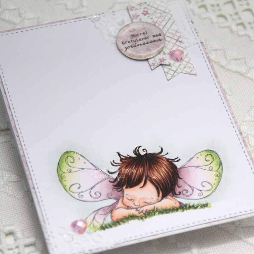
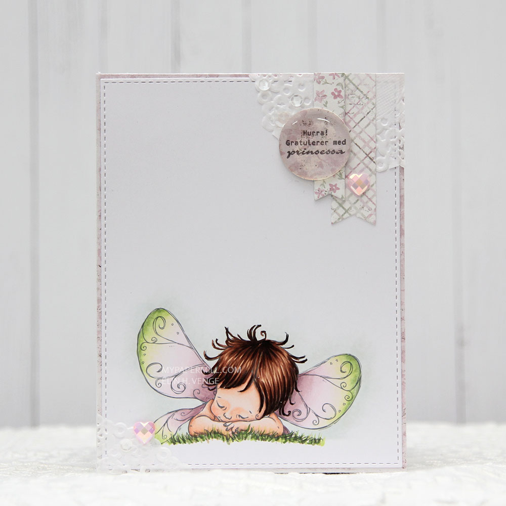 I printed my image on a piece of X-Press It cut down to 4 1/4 x 5 1/2″. I colored my image with my Copics and used the largest of the stitched rectangle dies from My Favorite Things to cut it slightly smaller.
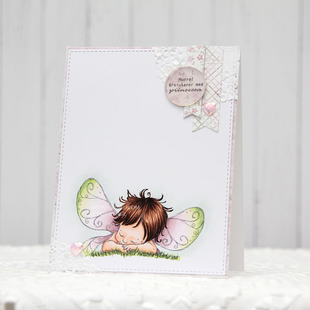 I’m also doing my best this year to use scraps of patterned paper. I have a basket of scraps that I’ve cut down to card front sizes, and I realized pink is the color I have the most of, which was the reason for my color choice today. I found a pink scrap in the basket that I wanted to use, colored my image in matching colors and took a bit of a dive into my smaller scraps to find pieces to use for my cluster. The circle with the sentiment is actually cut from the center of the patterned paper I used on the front of this card, which is a scrap from the Vintage Summer Basics collection from Maja Design. The diecut banners are from the Sofiero collection, the colors were perfect for this card.
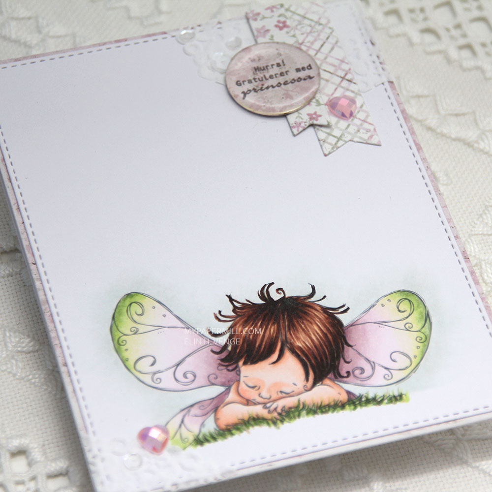 I used part of a Doodlebug mini paper doily in the top right corner as a base for my small cluster. I had a tiny bit left over and glued in the opposite corner. I embellished very simply with a couple of hearts from the Rosy Glow mix from Little Things from Lucy’s Cards and sequins from the White Orchid Sequin mix, also from Little Things from Lucy’s Cards. I added an epoxy pebble to the sentiment circle for a little bit of extra dimension and interest.

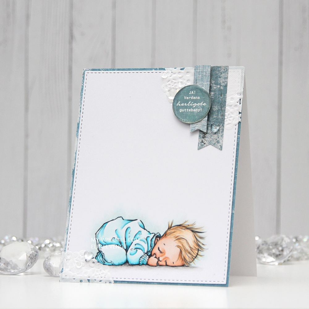
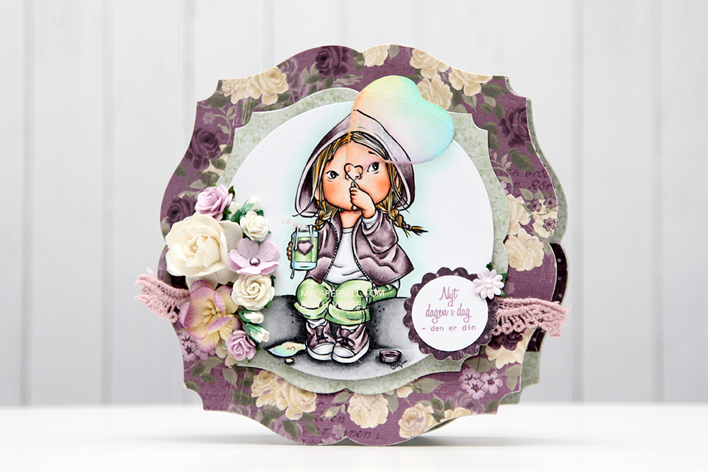 It’s Mo day (aka Wednesday). One of the last things I did in 2019 was to clear away all the jars of flowers from the desk in my craft room (I had about 50 of them). I figured I don’t really use flowers all that much on my cards anymore, so I didn’t need them to be easily accessible and take up space on my desk. I put them in a cabinet right below the ceiling, I was able to cram all of them into one single cabinet. The last card I made in 2019 had flowers on it. We’re barely two weeks into the new year, and I’ve made another one with flowers. For both cards I had to climb on a ladder and pull out a bunch of jars to get to the flowers I wanted. Maybe removing those jars wasn’t such a good idea after all?
 Good idea or not, this was the card I made. I colored up Mo’s
  I partially die cut my image with some of the bubble hanging out, and glued it to my card using lots of foam tape. I haven’t used my frame dies from GoKreate in a while, so I thought I’d break them out for this one. I usually make my card from the third largest die in the set (the XXL Square Frilly Frames #10 set), but I want to see how far into 2020 I can get with using just scraps, and the third largest die in the set requires a full sheet of paper to die cut two pieces (front and back of the card). The next size down was the perfect size for this scrap of Maja Design patterned paper, and it was also a good size for the green patterned paper from Papirdesign that I used behind my image and on the insides of the card.
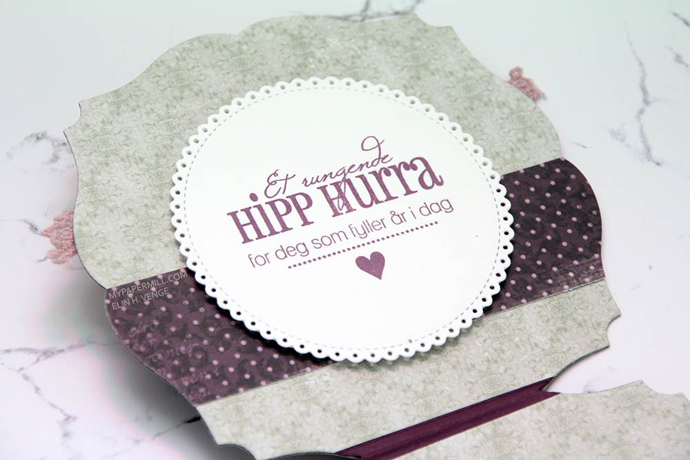 Speaking of insides – I diecut an eyelet circle with a Cottage Cutz die, stamped a Norsk Stempelblad AS sentiment using Memento Sweet Plum ink and again used lots of foam tape. I even diecut a scrap strip of another purple piece of Maja Design patterned paper to go across.
 The second inside has plenty of space for a personal message, and I diecut another eyelet circle from patterned paper and added a couple of diecut numbers from Scrapmagasinet to my circle. I thought this card would be the perfect birthday card for my niece, she turns 10 in June!!
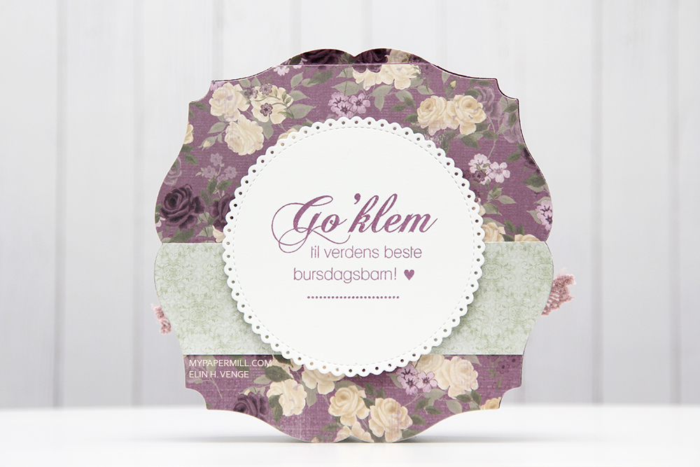 I used the same design on the back, but used a green strip instead of a purple one. Another NSB sentiment, once again stamped in Memento Sweet Plum ink, and once again glued on with lots of foam tape.
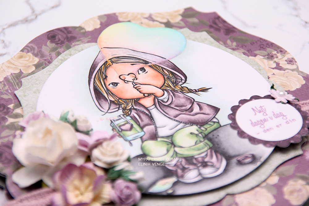 There’s quite a bit of dimension in this card, and with that great image as the focal point, I think this will be perfect for my niece!
 Lots and lots of Copics used for this one, but there are 15 colors in the heart bubble alone.
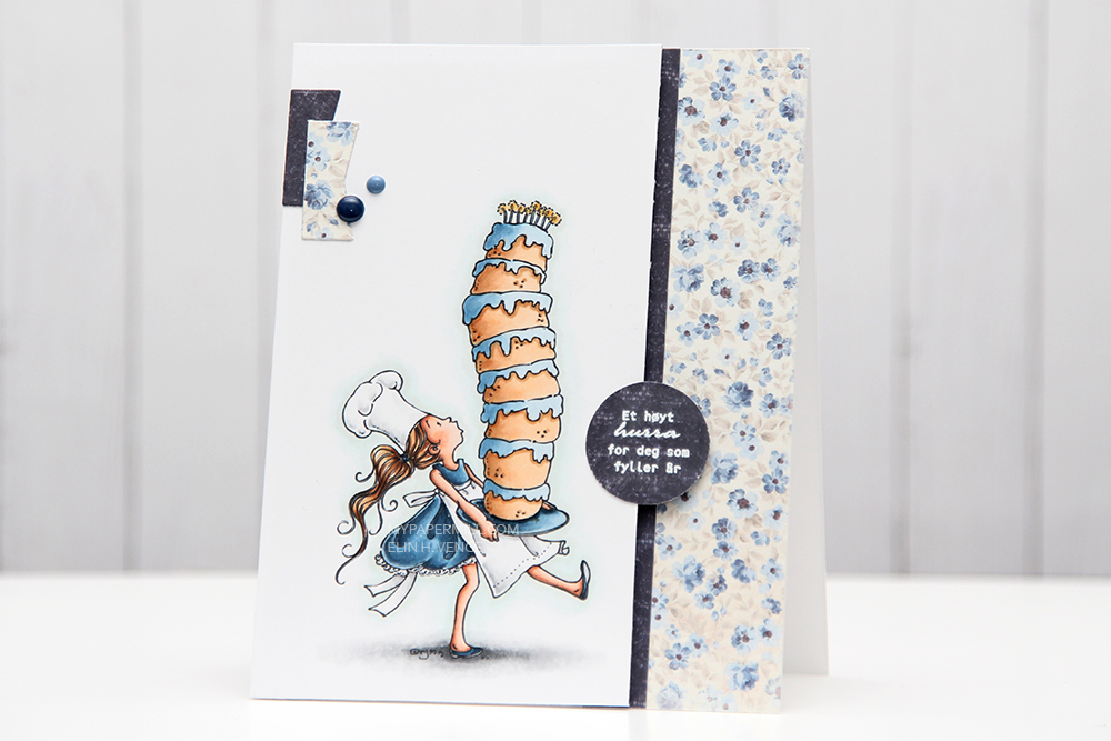 I’ve got
 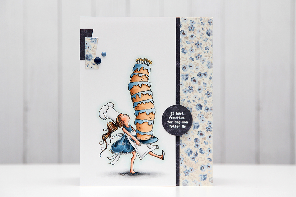 I quickly found out that the closest Copic color to that specific Pantone color is B99. How perfect is that, the B90s are my favorite blues in all the land. I colored my image and glued it to my card base with lots of foam tape. All I did embellishment wise was add a couple of those little diecut banners (they’re so wide you can hardly see the V shape) and enamel dots from Papirdesign. The white heat embossed sentiment is from Norsk Stempelblad AS.
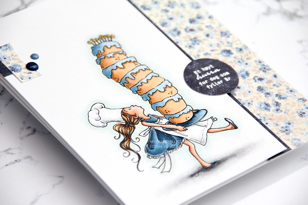 I love anything and everything blue – expect to be bombarded with lots of blue this year!