 Det er onsdag, og min tur til å inspirere på DT-bloggen til Mo Manning. Denne gangen er det et julekort jeg viser frem. Jeg er ikke overbegeistret for rød jul, MEN når jeg kan kombinere med en slags lys Rauma-grønn (Rauma er en elv i Romsdalen med en veldig fin blågrønn farge) er jeg happy, og når jeg klarte å finne papirer med begge deler fra Home for the Holidays-kolleksjonen til Maja Design var jeg solgt.
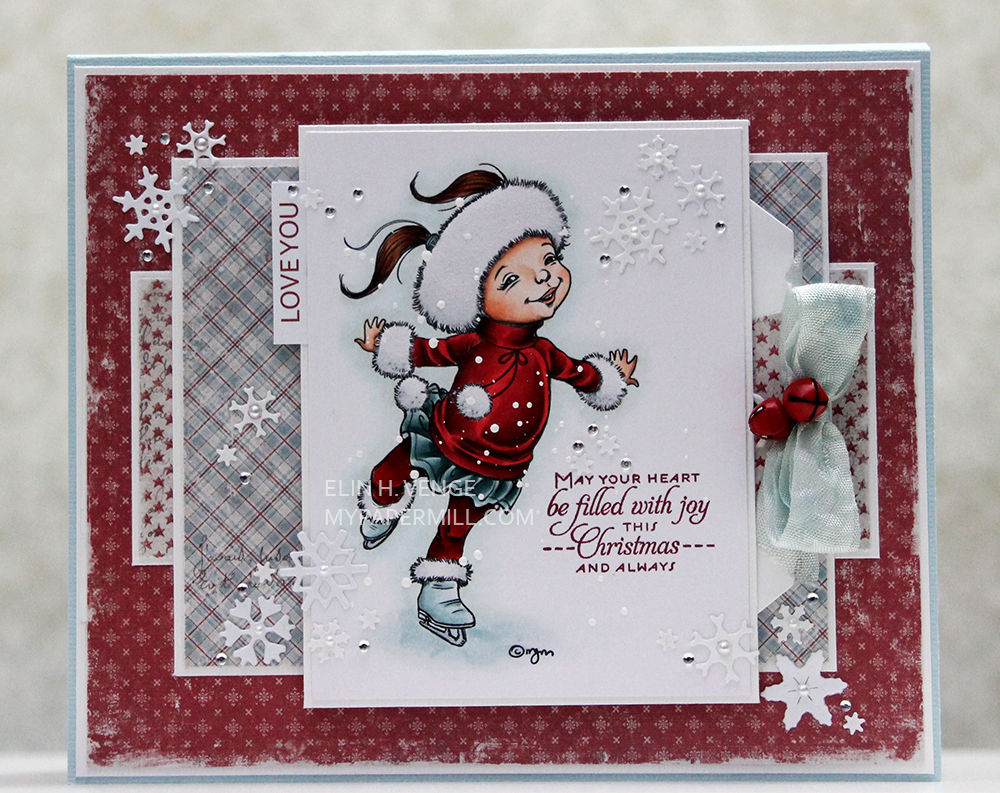
It’s Wednesday and my turn to inspire on Mo Manning’s DT blog. This time I’ve got a Christmas card to show you. I’m not crazy about red for Christmas, BUT when I can combine it with a kind of pale blueish green I’m happy, and when I was able to find papers with both colors in the Home for the Holidays collection by Maja Design, I was sold.
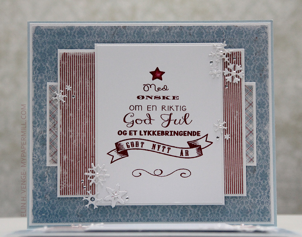
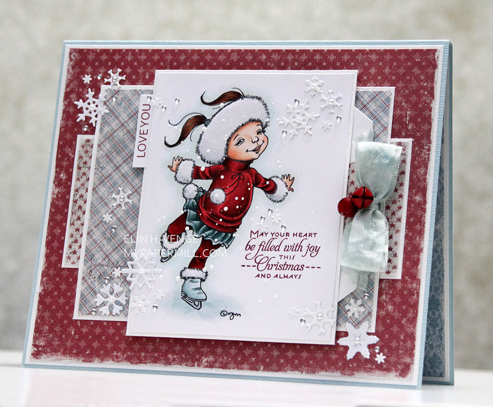 Jeg har bygd opp kortet lag for lag, pyntet med utstansede snøfnugg fra Marianne Design som Cathrine fant til meg sist vi var på scrappeshopping. Tenk så fantastisk hun er, at hun tenkte på meg når hun så dem og tipset meg. Gjennomsyret gode Cathrine!!! Snøfnuggene har fått noen perler og litt diamanter fra Kort & Godt, og jeg har stemplet en tekst fra Papertrey Ink med rødt blekk rett på arket med motivet.
I built the card layer for layer and embellished with diecut Marianne Design snowflakes that Cathrine found for me the last time we went shopping for craft supplies. How amazing is she – thinking about me when she saw them and told me. She’s just good down to her core!!! I added some pearls and Kort & Godt diamonds to the snowflakes and stamped a Papertrey Ink sentiment using red ink straight on the paper with the image.
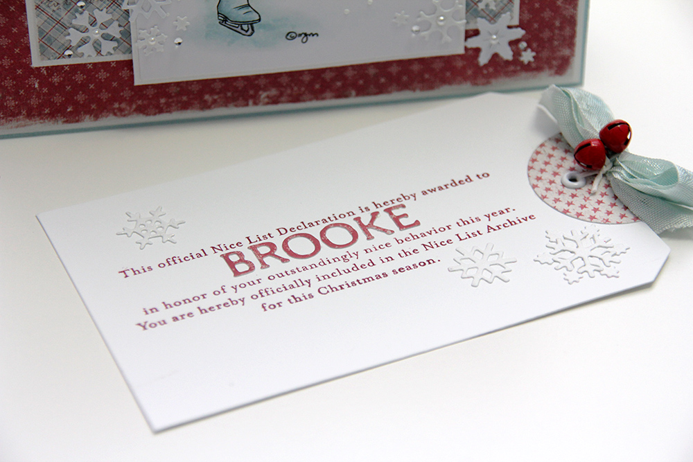 Tagen som skjuler seg bak motivet er stanset ut med en stor tag-die fra Sizzix. Jeg stanset ut en sirkel fra et av mønsterarkene som jeg limte rundt den ene enden, lagde et hull og satte inn en malje fra Making Memories, før jeg farget en bit seam binding med Copics og satte den fast med litt hvit papirtråd med et par røde bjeller. Teksten har jeg stemplet fra en stempelplate fra Papertrey Ink og navnet på mottaker er stanset ut med bokstavdies fra Scrapmagasinet i det samme røde mønsterarket som jeg har brukt på forsiden av kortet.
I diecut the tag hidden behind the image with a large Sizzix tag die. I diecut a circle from one of the patterned papers that I glued to the tag on one end, made a hole and added a Making Memories eyelet before coloring a bit of seam binding with Copics. I attached it with a piece of white paper thread with a couple of red bells. I stamped a Papertrey Ink stamp with red ink and added letters diecut from patterned paper for the name of the recipient.
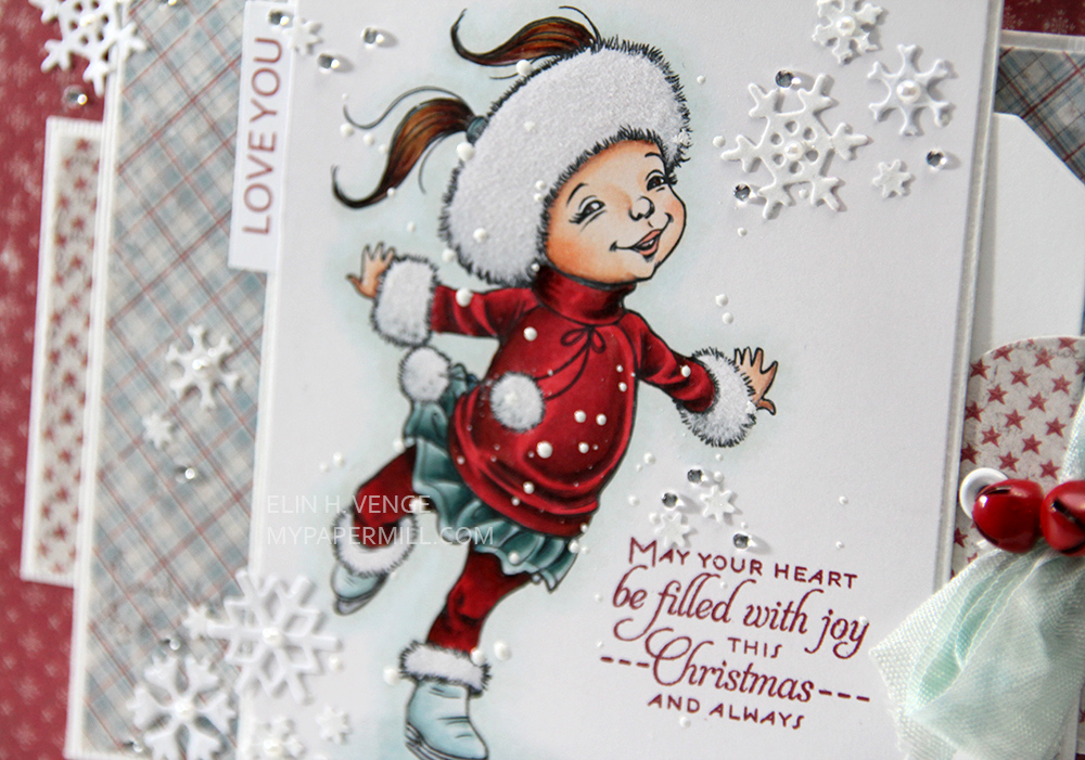 Motivet Skater S er farget med Copics, og jeg har strødd chunky white embossingpulver fra Stampendous over og embosset. På pelskantene har jeg limt hvit flock fra Doodlebug, så de ser ekstra fluffy ut.
Skater S is colored with Copics, and I added chunky white embossing powder for snow, as well as white flock from Doodlebug for the fur trimmings, making them extra fluffy.
 Alle de andre tekstene mine er på engelsk, og den halvt norske jenta som skal få kortet skjønner ikke lenger så mye norsk, men pappaen hennes kan oversette teksten fra Norsk Stempelblad AS inni for henne.
All my other text stamps on this card are in English, and the half Norwegian girl getting the card doesn’t really understand that much Norwegian anymore, but her dad can translate the Norsk Stempelblad AS text that I added to the inside of the card.
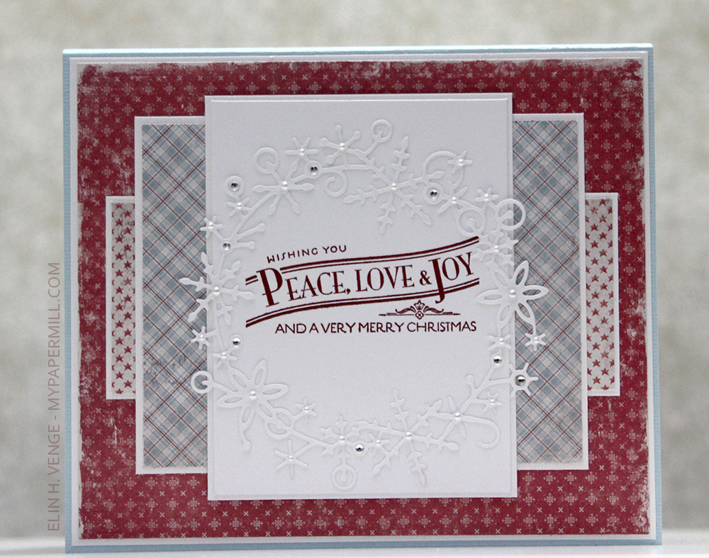 På baksiden har jeg brukt enda en stempelplate fra Papertrey Ink. Frostyville Wreath fra Memory Box passet akkurat rundt teksten, så da måtte jeg bare bruke den. Noen flere perler og diamanter fra Kort & Godt, og kortet er ferdig.
On the back I’ve used another Papertrey Ink stamp. Frostyville Wreath from Memory Box fit perfectly around the text, so I just HAD to use it. A few more Kort & Godt pearls and diamonds, and the card is done.
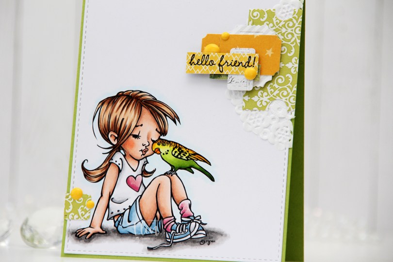
 I colored the image with Copics and die cut the panel using the largest die in the A2 Stitched Rectangles STAX 1 die set from My Favorite Things, before adhering it to a card base I created from Sour Apple cardstock, also from My Favorite Things.
 On my cluster cards, I usually choose two to three colors from the image to create scraps from. This time I chose green and yellow with a little bit of gray. Neutrals are always a good thing to add. I keep die cut scraps in stamp storage pockets on my desk, sorted by color. Whenever I want to create a cluster, I choose the storage pockets with the colors I want, dump the contents on my desk and start PLAYING.
 For this card I wound up using scraps from 3ndypapir, Karen Foster, Sunny Studio, P13, Magnolia and Papirdesign. By limiting the size and colors of my clusters, the design stays harmonious and you can’t tell that I’ve used patterned paper from 6 different companies. I adhere some directly to the layer below, some using foam squares. As a base, I used half a doily from Doodlebug Design that I had in a drawer. I love these tiny paper doilies, they’re perfect for this.
 Using VersaFine Onyx Black ink, I stamped a sentiment from the Sweet Summer Sentiment Set from Purple Onion Designs onto a strip of patterned paper from Papirdesign. I finished off the card by adding a few enamel dots from the Pocketful of Sunshine pack of enamel dots from Altenew.
 These cluster cards are so fun to make. They make my piles of scraps shrink EVER so slightly, but anything’s better than nothing, and I love the dimension they add to the card.
 I used quite a few colors for this one.
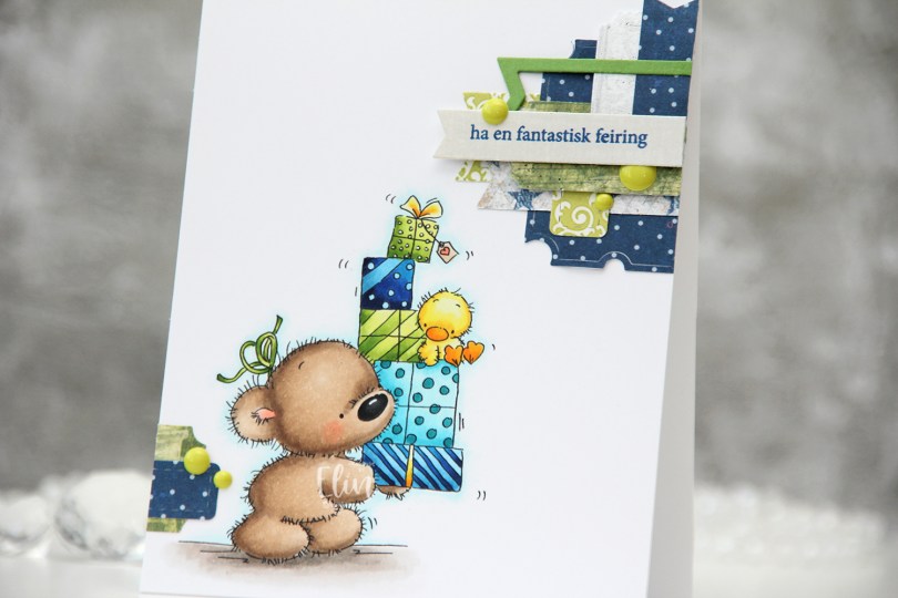
 I colored up
  These clusters are pretty easy to put together. On my desk I keep a bin with die cut scraps of patterned paper. I organize these scraps by color, and put each color in a stamp storage bag. Whenever I want to create a cluster, I choose the colors that go with my card, dump the contents of the storage pockets on my desk and play. This time I used three bags; the blue, the green and the gray – it’s nice to throw a neutral into the mix. The scraps I used for this card are from a few different companies. The blue ones are from Papirdesign (the grey with the blue stars is the back of that blue with the lighter dots), the green ones are from 3ndypapir and Karen Foster, with a little bit of New Leaf cardstock from Papertrey Ink thrown in for a darker green to make the dark blue a little less dominant. The top grey one is actually from Magnolia, whereas the one with the sentiment is from DCWV. The sentiment itself is from Norsk Stempelblad, stamped in Cornflower ink from My Favorite Things. To finish off the card I added a few green enamel dots from Papirdesign.
 This color palette makes me happy.
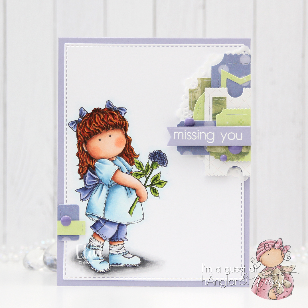
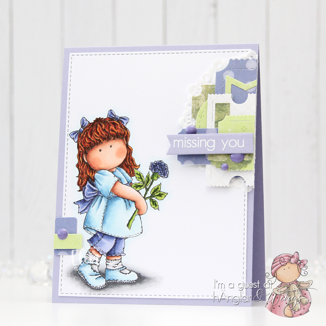
 I printed the image near the bottom left corner of a panel of X-Press It blending card, before coloring it with Copics and using the largest die in the A2 Double Stitched Rectangle STAX die set from My Favorite Things to create a finished look with the nice faux stitching details that I love to add to my cards. I adhered it to a cardbase I created from Jalapeño Popper cardstock, also from MFT, and I had my base ready for some play with scraps.
 I love creating these clusters of die cut scraps on my cards, and I have stamp storage pockets with little die cut patterned paper scraps sorted by color. That way I can rummage through these when I create my cards instead of having to find lots of patterned paper to match my card, then die cut it. It usually takes several different patterned papers of one color to create the dynamic look I want for my cards, but for this one, I actually kept it simple with one yellow (P13), one white and gray (Sunny Studio) and only two green ones (Basic Grey and Karen Foster Design). They’re all different shapes, which still keeps it interesting. Some are glued directly to the card, some with foam tape for a little bit of dimension. Using VersaMark ink, I stamped a sentiment from the Mini Messages stamp set from Mama Elephant onto one of these die cut pieces (it happened to be a tag) and heat embossed it using Super Fine Detail embossing powder from Ranger. I used part of a mini paper doily from Doodlebug Design behind my main cluster, and added a few enamel dots (green from Papirdesign, yellow from Altenew) to embellish.
 Lots of green for this color palette.
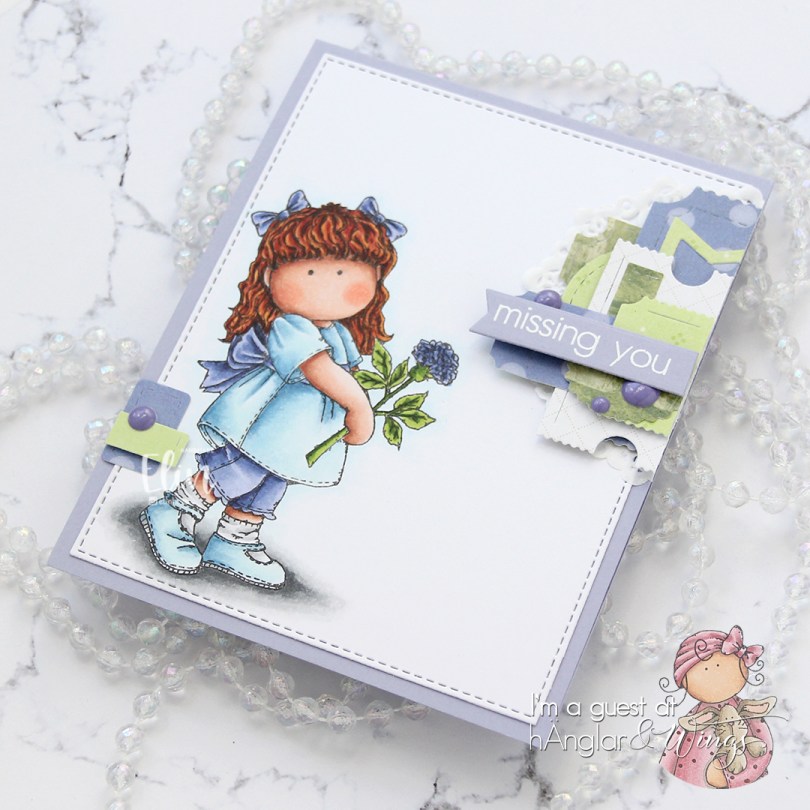


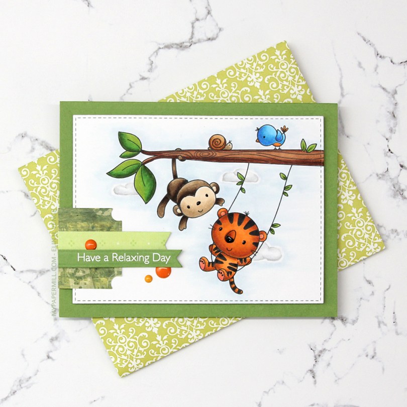
 I colored the image with Copics and die cut it using the second largest die in the A2 Stitched Rectangles STAX 2 set from My Favorite Things, before adding it to a card base made from Gumdrop Green Heavyweight card stock, also from MFT, using lots and lots of foam tape. I used a black Glaze pen to add some dimension and shine to their eyes and noses.
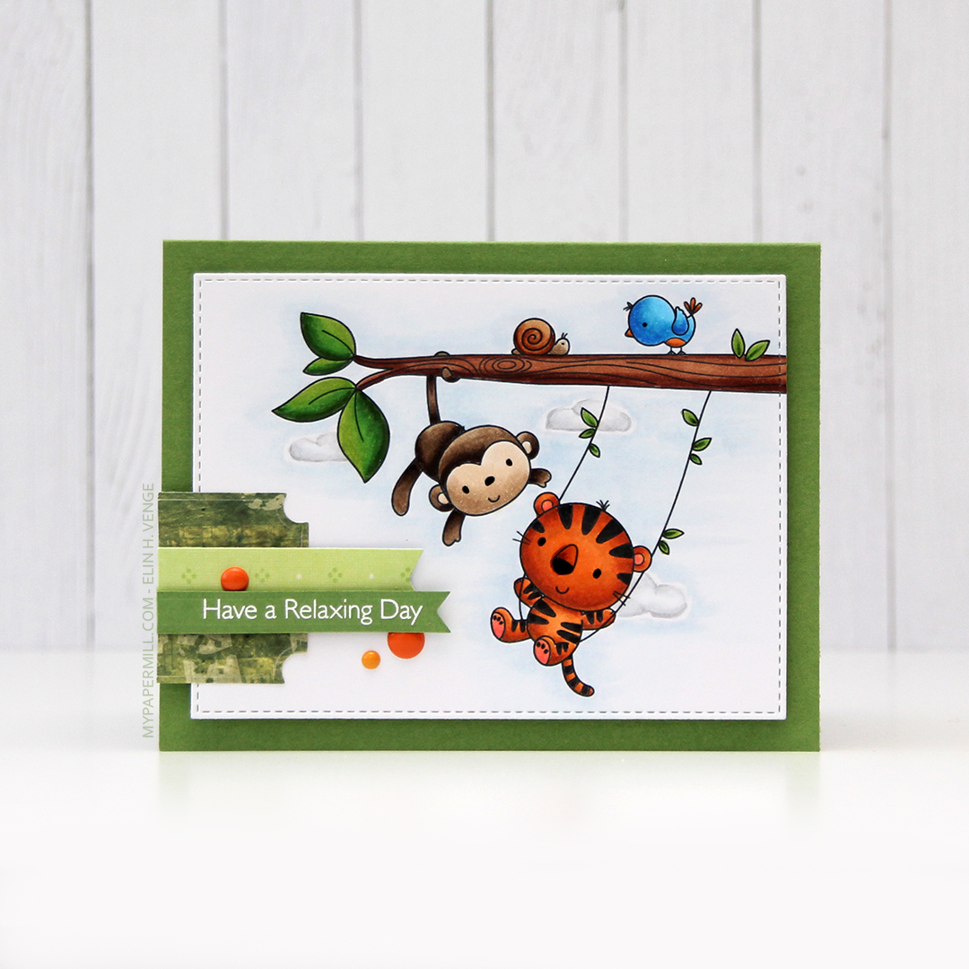 I’m one of those people that use patterned paper on my cards. I don’t use lots, and I pretty much always use them for small clusters, but my ancient stash of patterned paper is shrinking ever so slightly with each card. I have a tub of die cut patterned paper scraps on my desk, and rummage through it to find the perfect pieces for my clusters. The dark green patterned paper I used here is actually from 2005, which was years before I started making cards. I stamped one of the sentiments from the Always Bring a Smile stamp set from My Favorite Things onto a separate piece of Gumdrop Green card stock and die cut it using one of the dies in the Slimline Starter die set. I finished off my card with a few enamel dots from Papirdesign to match the tiger and the details on the bird.
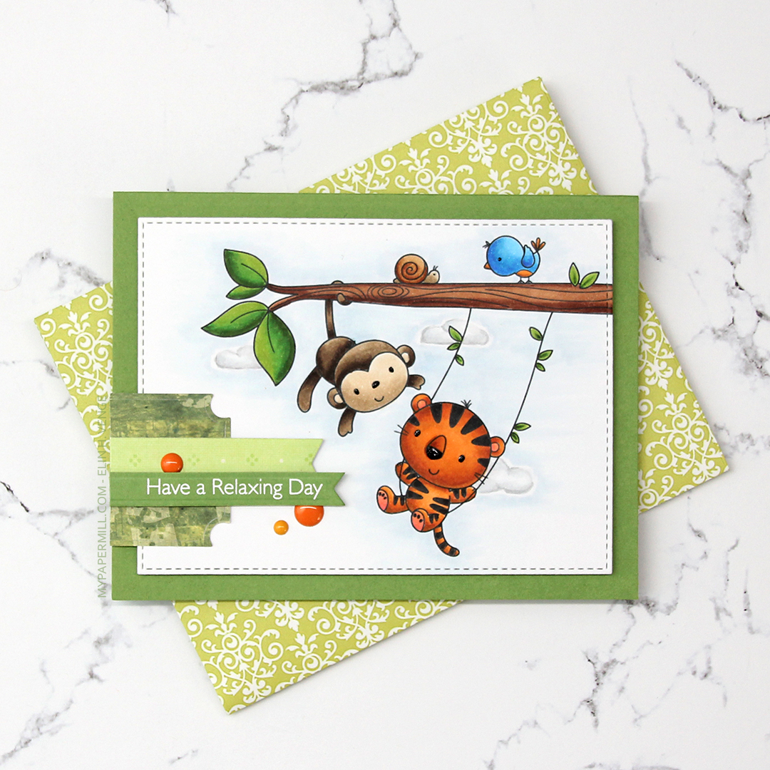 Another great use of patterned paper is envelopes. I’ve nearly run out of colored envelopes for A2 cards, and I’m definitely out of white ones, but larger scraps of patterned paper are perfect for creating one of a kind envelopes. I used the A2 V flap envelope dies from Simon Says Stamp on this piece of patterned paper from 3ndypapir. Another old one, this paper’s from 2010.
 Lots of bright colors used for this one. I also used B40, which is a color I’ve created myself.
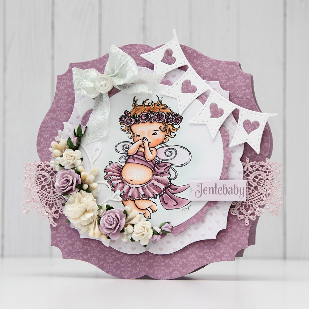 I colored her up with my Copics, focusing on the RV90s that go so incredibly well with the patterned paper from Papirdesign that I used, it’s ridiculous!
 I made a shaped card using the third largest die in the XXL Square Frames Frilly #10 set from GoKreate, and did a whole bunch of diecutting elsewhere on the card too. To break up the monotony of a diecut on top of a slightly larger diecut on top of a slightly larger diecut on top of a slightly larger diecut, I cut some Kort & Godt lace and put it across the card. The diecut heart banner, the word banner and all those Wild Orchid Crafts flowers also help. The flower berries and pearls are from Kort & Godt.
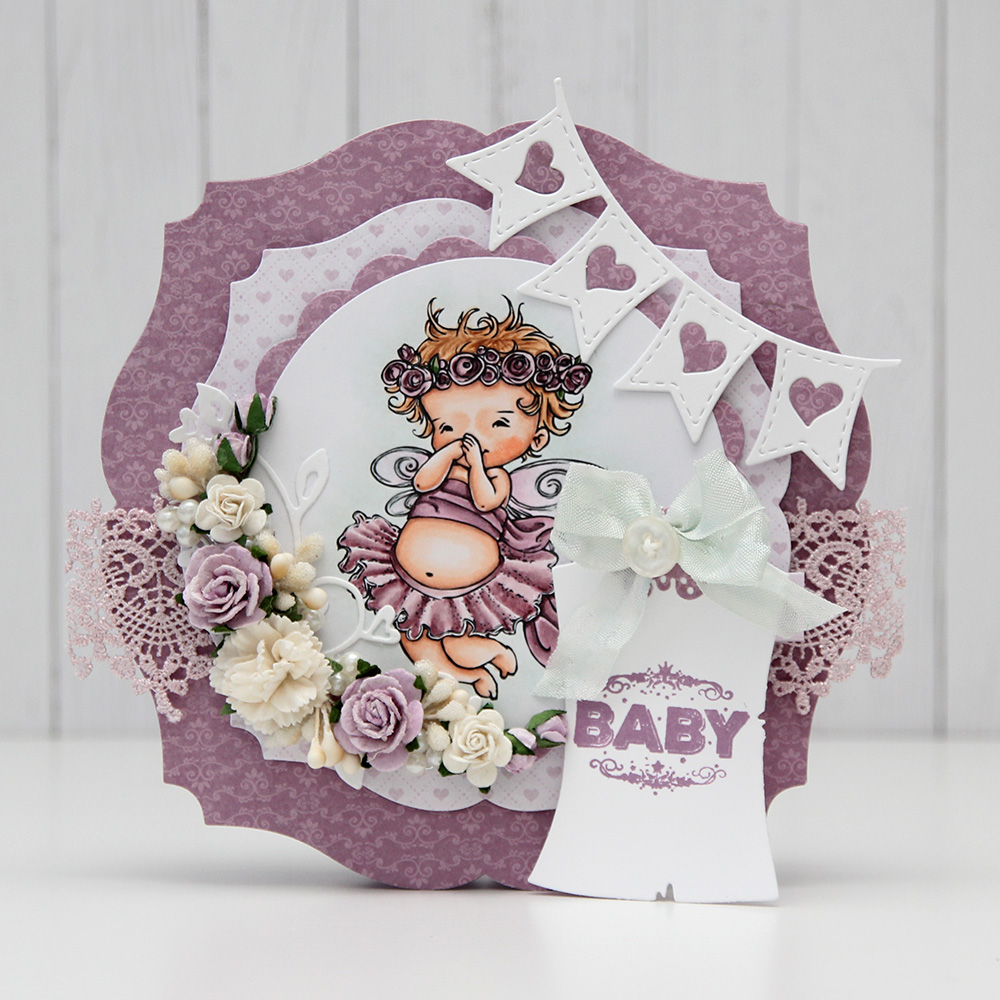 There’s a banner hidden behind that image, diecut with a Magnolia die. I tied a bow of seam binding ribbon with the help of a DIY bow easy, I can’t make nice bows for cards to save my life (true story!), so the Bow Easy helps. I stamped a Papirdesign stamp using Memento Sweet Plum ink, which also matches the patterned papers beautifully. On top of the bow I added an old button from Melissa Frances.
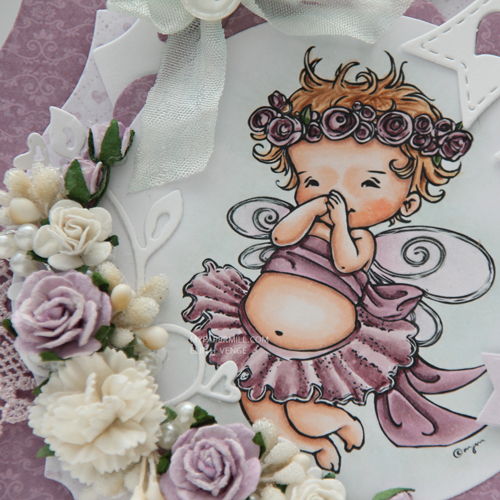 Is that an adorable little fairy or what? Those flower berries from Kort & Godt are really old, I think they might actually be from their first production of flower berries. They made some later on that had more of a greenish yellowy tint, but these are more creme colored and perfect for this card. I still have a few left, I only use them on very special cards.
 I added another Papirdesign sentiment stamp on the back of the card, along with a few more flowers. I removed the centers of the sweetheart blossoms and added back in some purple pearls from Papirdesign that once again matched the colors of everything else.
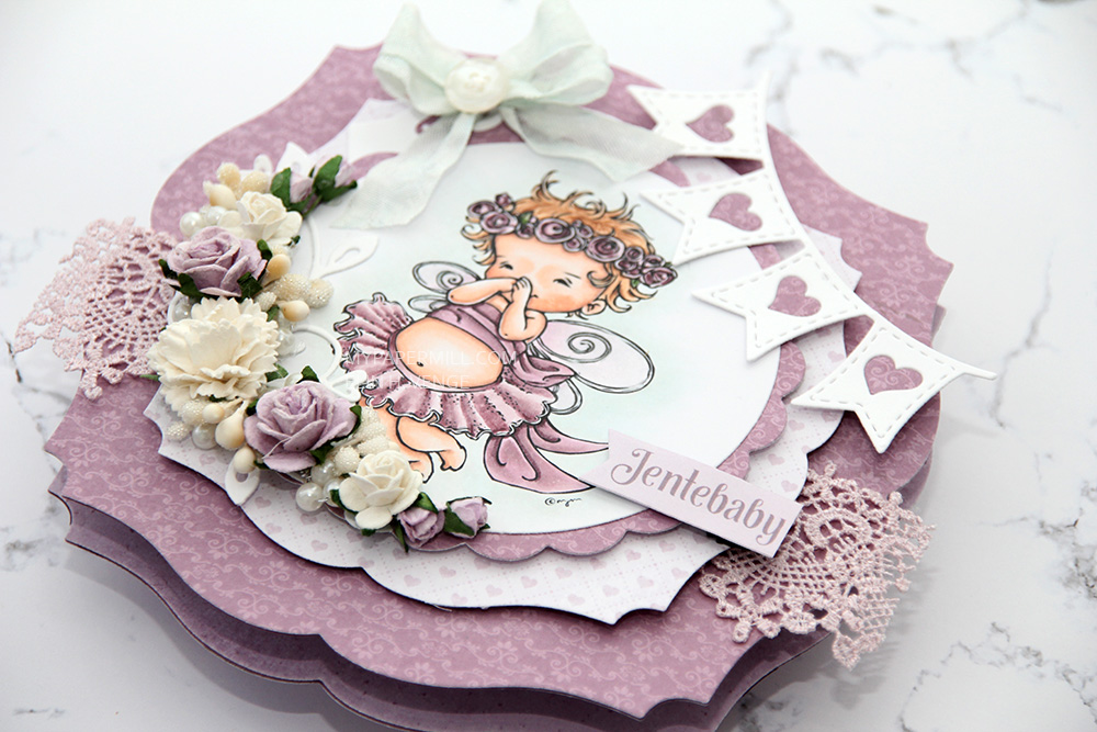 As you can see from the above photo, this is a very dimensional card and not at all mail friendly, it’s super thick.
 Not too many Copics used for this one. Probably because it’s mostly that one dominating color.
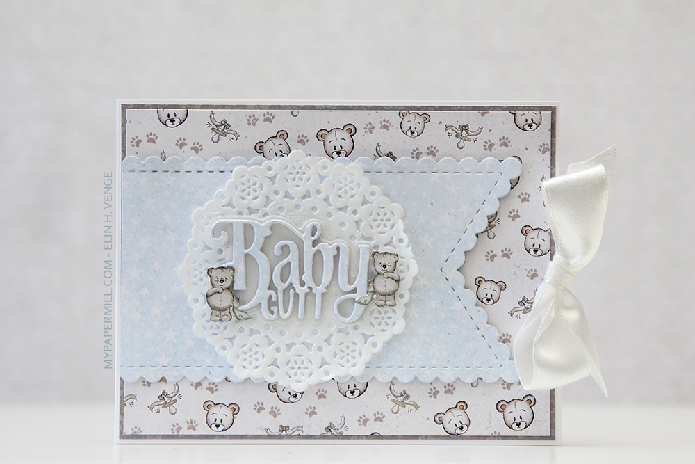 Jeg har i hovedsak brukt ark fra Velkommen lille venn-serien til Papirdesign på kortet mitt. Dieen jeg har brukt kommer også derfra. Jeg har stanset ut ordet flere ganger i hvit kartong og limt oppå hverandre, med et lag med mønsterark til slutt. Skyggedieen har jeg stanset ut i vellum.
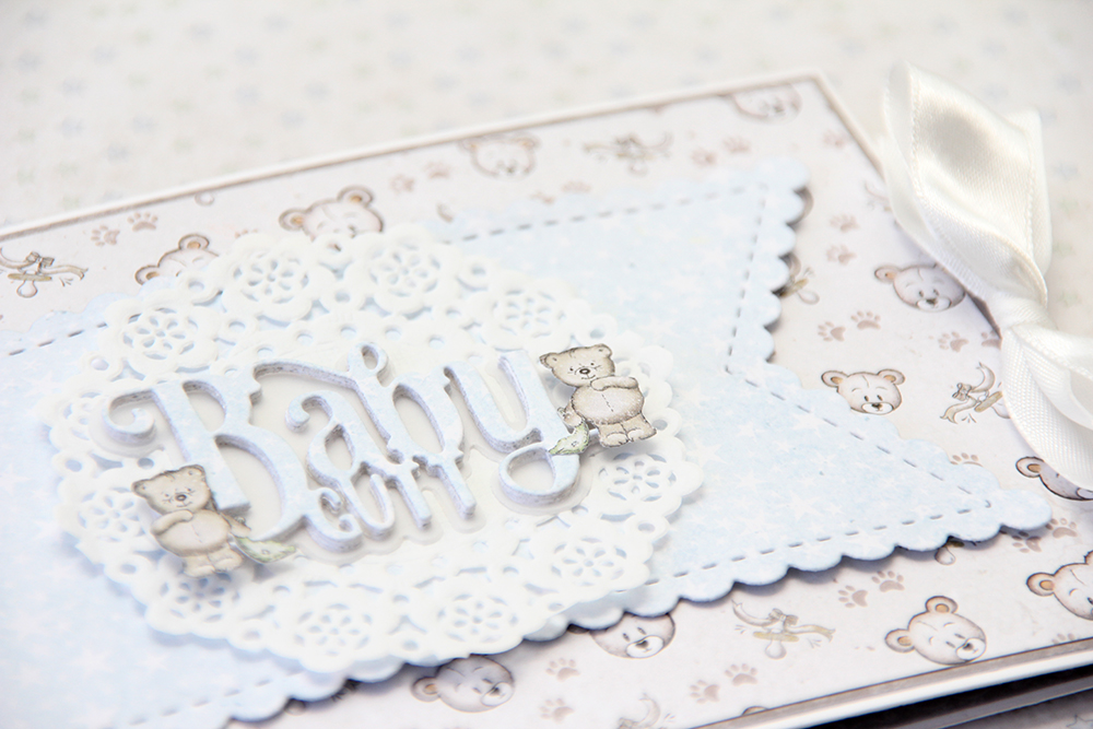 Jeg klippet ut et par småbamser fra et av mønsterarkene og limte dem på rundt teksten.
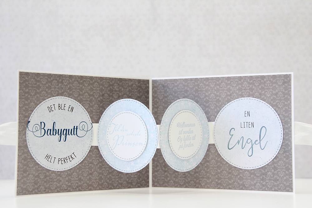 Det er først når kortet åpnes at man ser det er litt annerledes. Sirkelene i kantene er limt rett på mønsterarket på innsiden, mens de andre to henger i løse luften, kun festet med litt kartong i endene. Jeg har stemplet to tekststempler, også fra Papirdesign, på to sirkler med Papertrey Ink Spring Rain blekk. Sirklene er stanset ut med dies fra My Favorite Things, og sirklene stanset ut med den minste dieen er satt på 3D-puter for litt dimensjon.
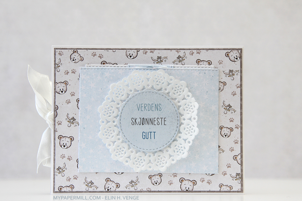 Baksiden av kortet ser heller ikke spesielt ut ved første øyekast, men det skjuler en liten hemmelighet.
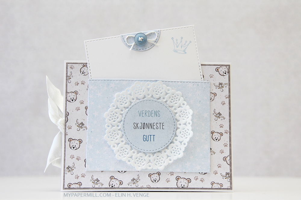 Siden det ikke er plass til å skrive en hilsen på innsiden av kortet er nemlig det blå panelet på baksiden av kortet en lomme med tag nedi. Selve tagen er også stanset ut med en die fra My Favorite Things, og jeg har stemplet en liten krone øverst på panelet, og også pyntet enkelt med litt scrapper’s floss og en knapp fra Papertrey Ink.
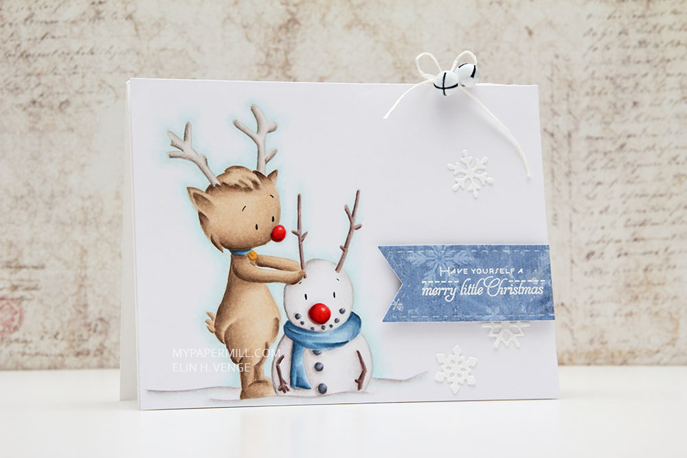 Motivet Reindeer and Snowman kommer fra Kinda Cute by Patricia, er printet ut veldig svakt og fargelagt med Copics med nolinesteknikk. Jeg har valgt å la motivet dekke mesteparten av fronten av kortet.
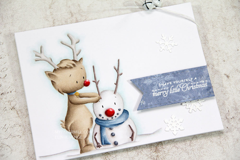 Kortet ellers er ganske så enkelt. Jeg har stanset ut en rest av et mønsterark fra en gammel Maja Design kolleksjon (Vintage Winter) med en vimpeldie fra Rayher og embosset en tekst fra Papertrey Ink (fra settet Christmas Poinsettia) med hvitt embossingpulver. Vimpelen er satt på 3D-puter, og jeg har ellers pyntet meget enkelt med noen utstansede snøfnugg og et par bjeller fra Darice.
 Det ble mange farger på dette kortet. Jeg har også brukt B90, som jeg har laget selv.
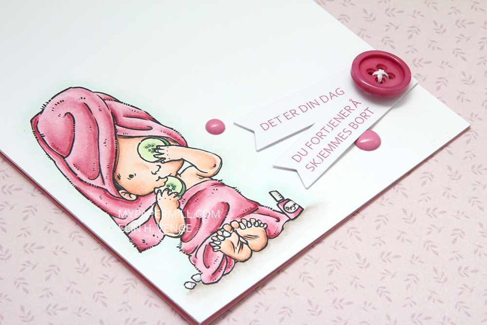 Vi er halvveis i vår monokromutfordring på CopicMarkerNorge, og her er mitt lille bidrag.
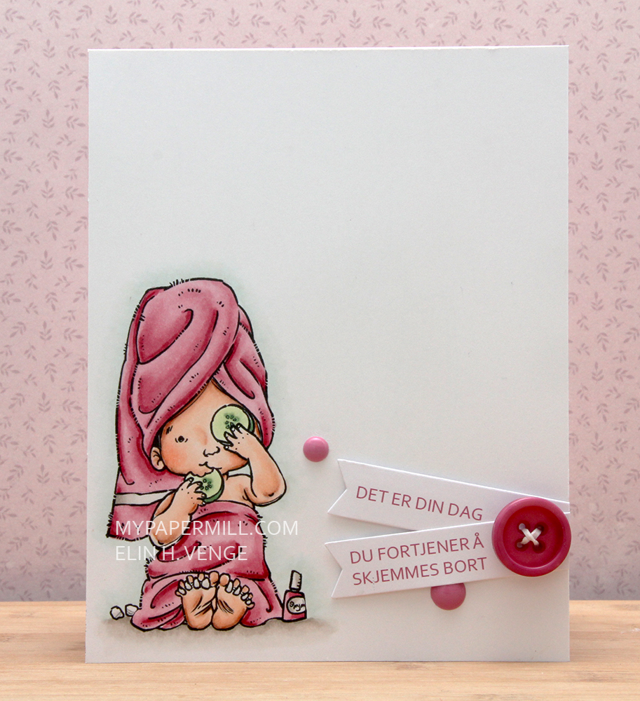 Jeg har fargelagt et søtt lite motiv fra Mo Manning som heter Pampered. Hun er så søt der hun sitter med tåskillere og spiser agurken sin.
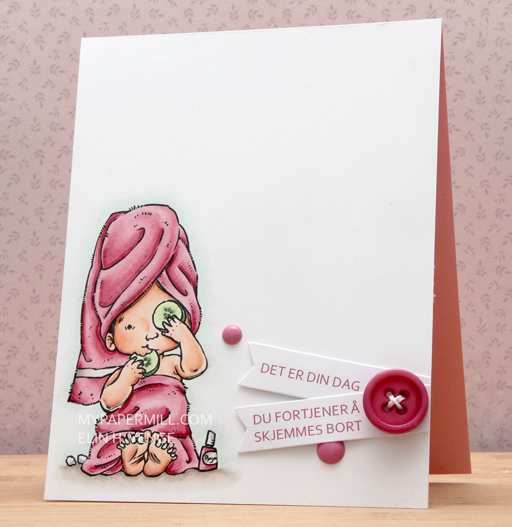 Tekstene har jeg skrevet ut fra Photoshop i Copicfarge R85 for å matche det rosa i motivet. De er stanset ut med en die fra Project Life og proppet opp på lave 3D-puter fra Clas Ohlsson. Jeg har pyntet enkelt med en knapp fra Papertrey Ink og et par dotter fra Papirdesign.