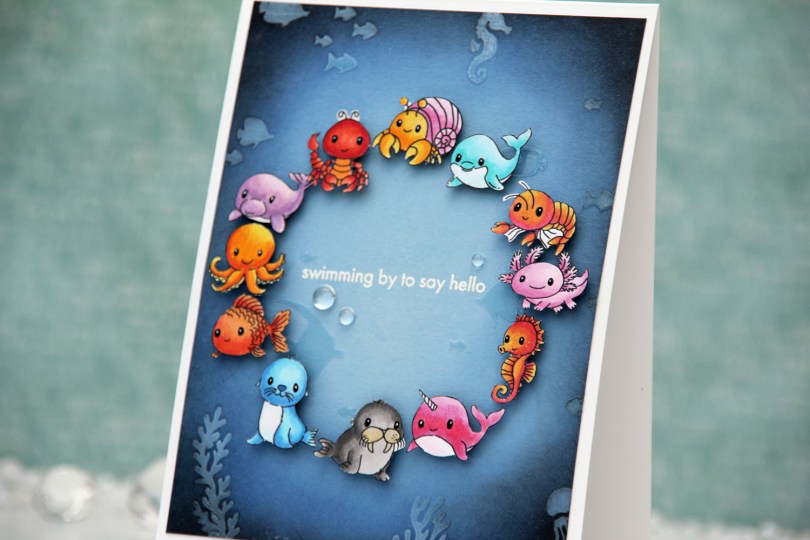
Hi, crafty friends. A month ago, I shared a fun card featuring the Cute Creatures 1 and Cute Creatures 2 digi stamp sets from Lili of the Valley. Across the two sets, there are 186 animals, which means you have lots of options. I picked out nearly all the sea creatures to drop into a Photoshop file, shrunk them down to about 40 % size, printed and colored them all. I wanted them tiny, and even though I used 20 of my sea creatures for that card, I still had 12 left over. I didn’t want them going to waste.
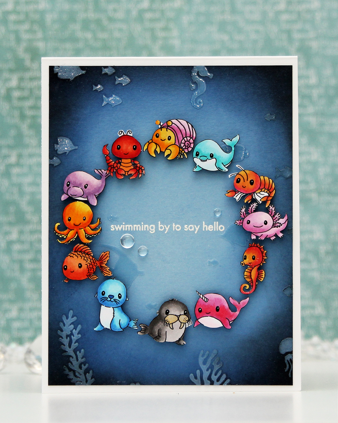 For this one, I started with a panel of Lazy Day cardstock from My Favorite Things. I used one of the stencils in the Undersea Jamboree stencil set from Altenew to emboss a texture onto my panel. It was very subtle, so I put the stencil back in place and added Crystal 3D gel from Altenew over the top. This gives a fun texture, shine and a very tactile feel to the panel. Once the gel was dry, I cropped down the panel slightly, before inking up the edges with Midnight and Black ink from Concord and 9th to darken my undersea panel. The gel resists the ink I put on, making it easy to buff off the excess.
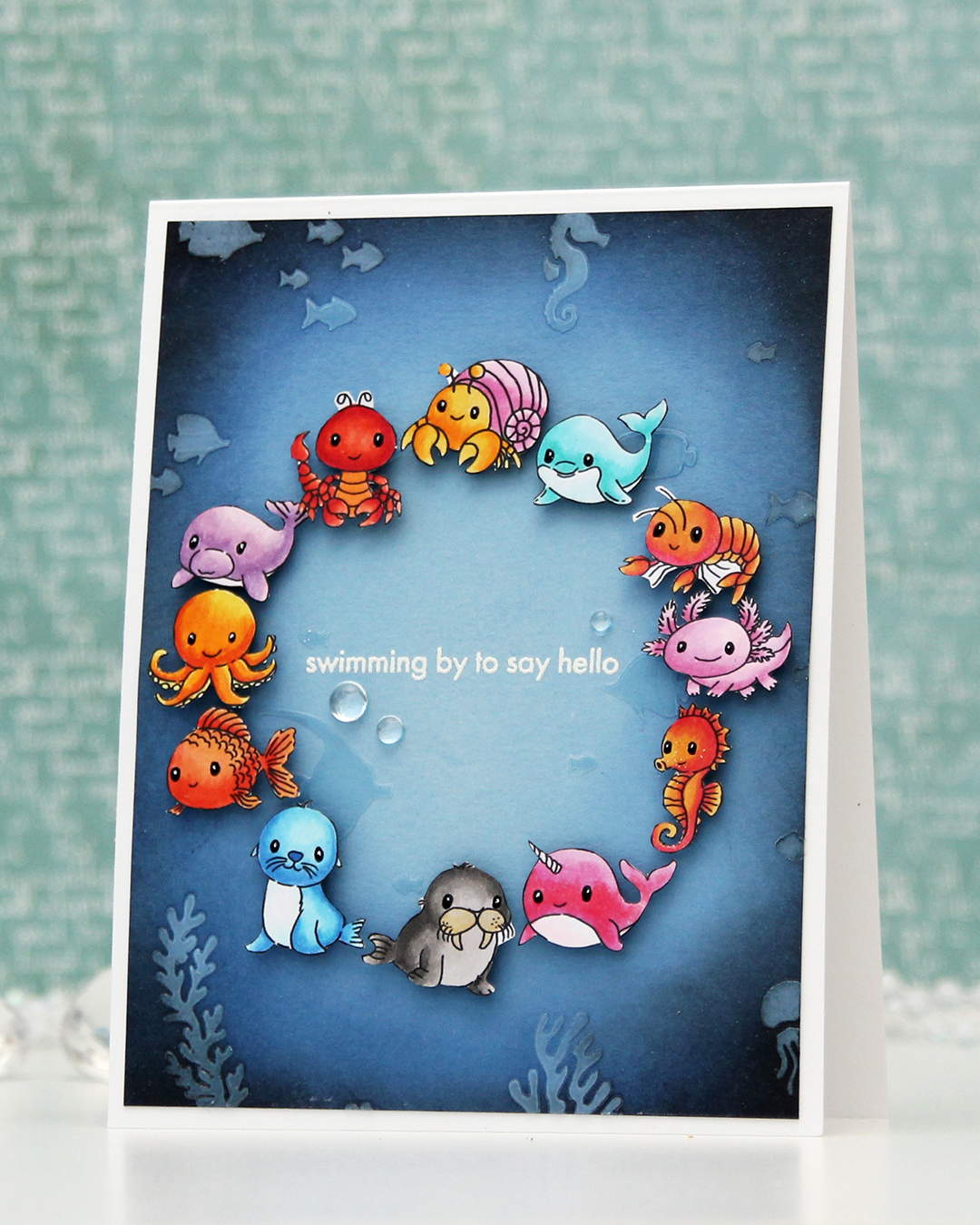 I adhered my panel to a top fold white card base I created from Stamper’s Select White cardstock from Papertrey Ink. I arranged my animals in a circle and mounted each on foam tape. I realized after I took the photos that I’ve left a bit of white on a few of the animals, particularly on the shrimp and the lobster, but I colored and fussy cut the images a month before I put the card together and didn’t remember that I’d left the white bits to deal with later. Once they were mounted with foam tape, it was too late to do anything about it, though. Live and learn, I guess.
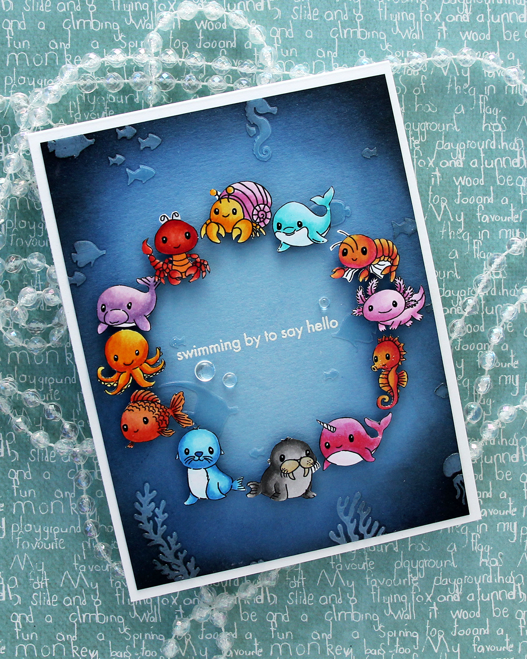 I was originally planning on adding a black strip with a white heat embossed sentiment in the center, but I thought it would look just as good, if not better with the heat embossed sentiment directly on the background. I could use the black strip if the white didn’t work out, right? I only had one chance at this, as the critters were already glued down. I put the panel in my Misti, used lots of antistatic powder and stamped the sentiment from the Coral Reef Wonders stamp set from Altenew using VersaMark ink, before sprinkling on super detailed white embossing powder from Ranger and heat set from the back. I always do my heat embossing from the back, it gives a much smoother result than heat embossing from the front. It turned out perfect, and I didn’t have to resort to plan B with the black sentiment strip.
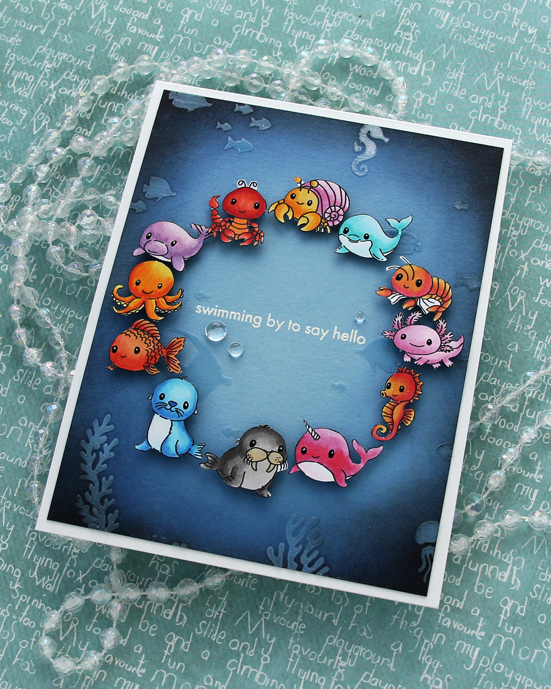 I added a few dew drops from Concord & 9th near the sentiment. They work well as bubbles and they add more shine. I also added black glaze and a white dot with a 05 Gelly Roll to their eyes once the black glaze pen was dry.
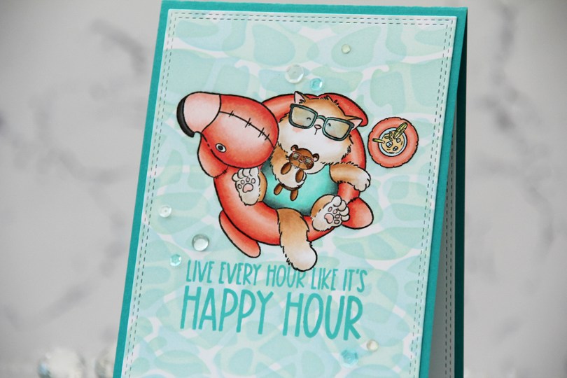
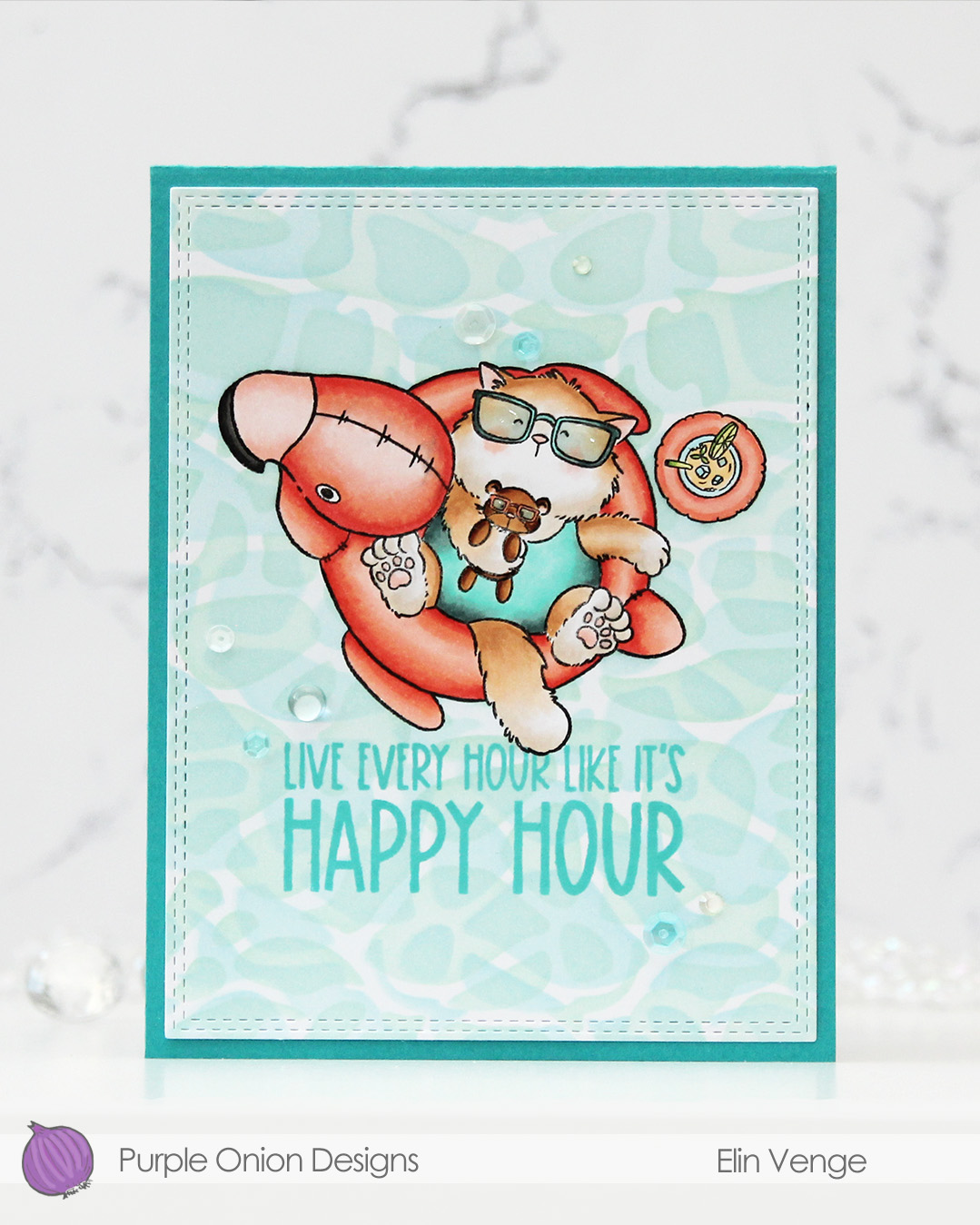 I stamped and colored my image with Copics on X-Press It blending card, before using a die in the A2 Double Stitched Rectangle STAX die set from My Favorite Things to create faux stitching around the perimeter of my panel.
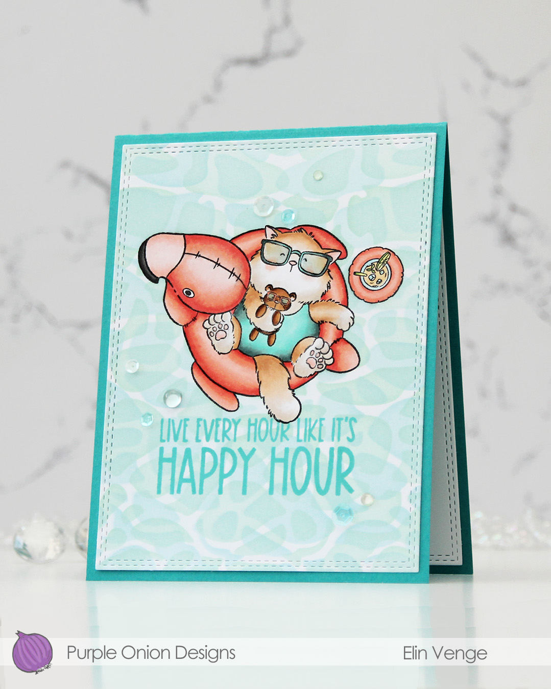 I masked off my image, before using Powder, Harbor and Sea Glass inks from Concord & 9th to ink blend the background through the Perfect Pool Water stencil from My Favorite Things. I flipped and rotated the stencil to create my pool water.
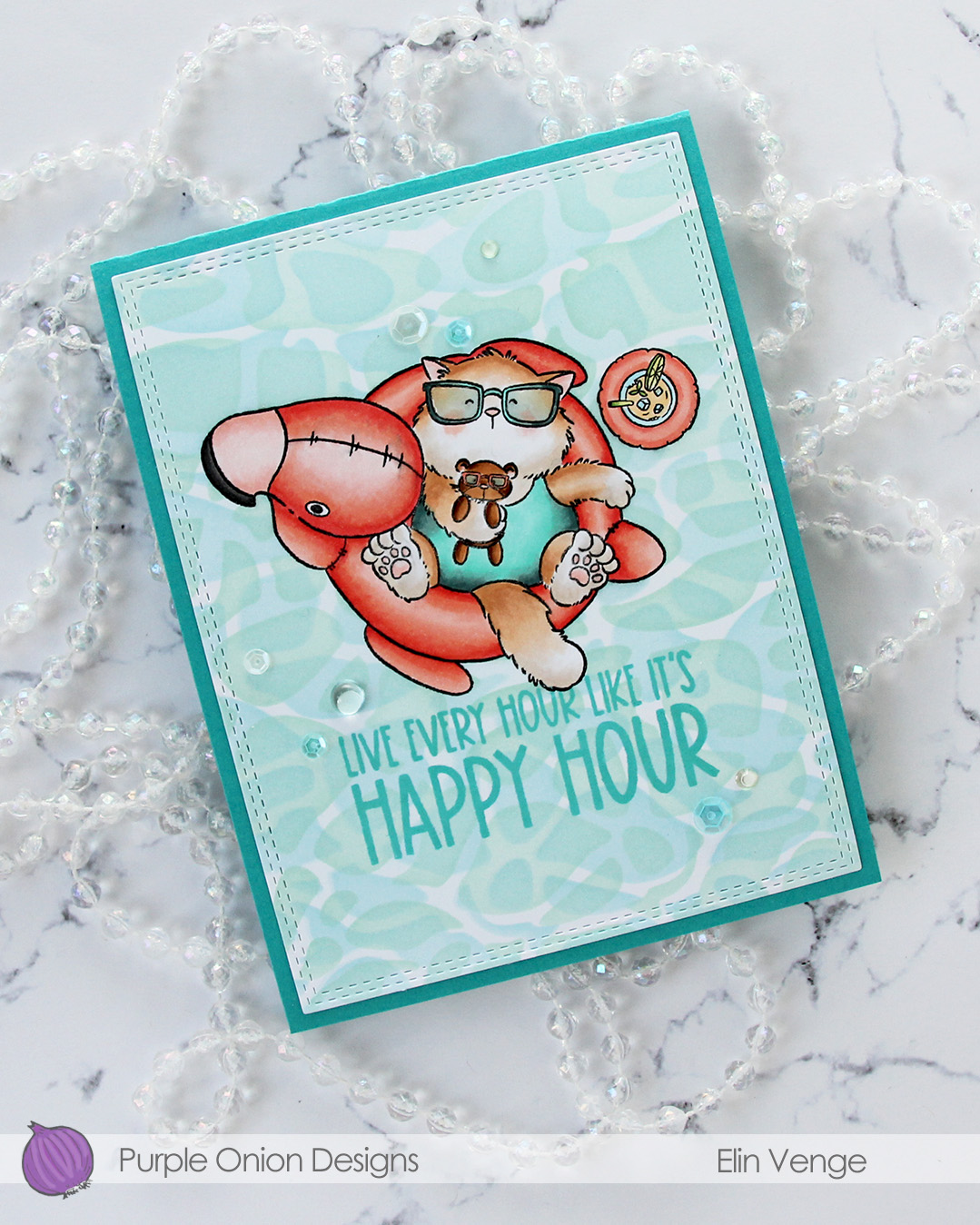 While I still had my mask in place, I stamped a sentiment from the
 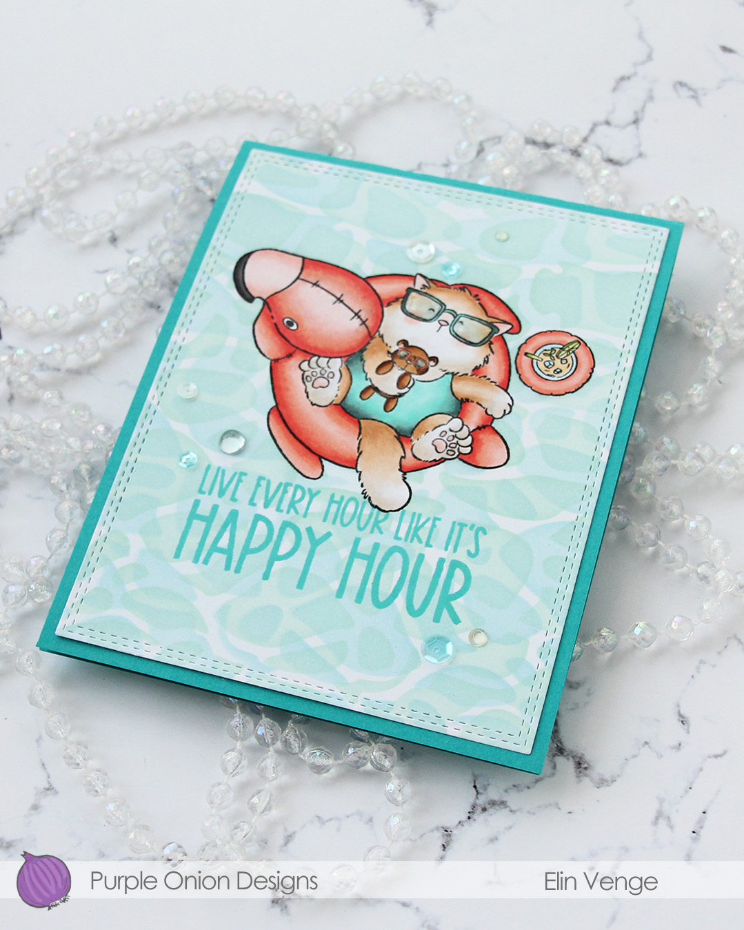 I adhered my panel to a card base I created from Oceanside cardstock from Concord & 9th, added a layer of Glossy Accents to Tofu’s glasses and finished off with a mix of sequins and gems from the Ice Water embellishment mix from Little Things from Lucy’s Cards.
 Very limited color palette for this one.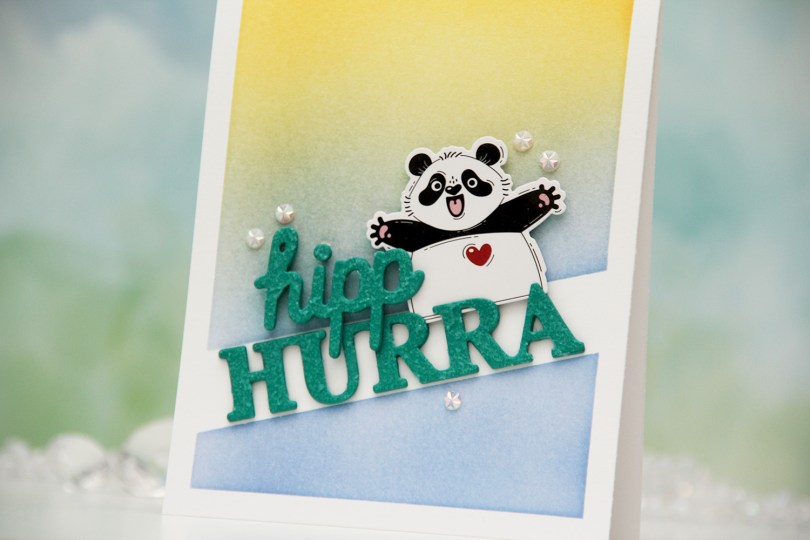
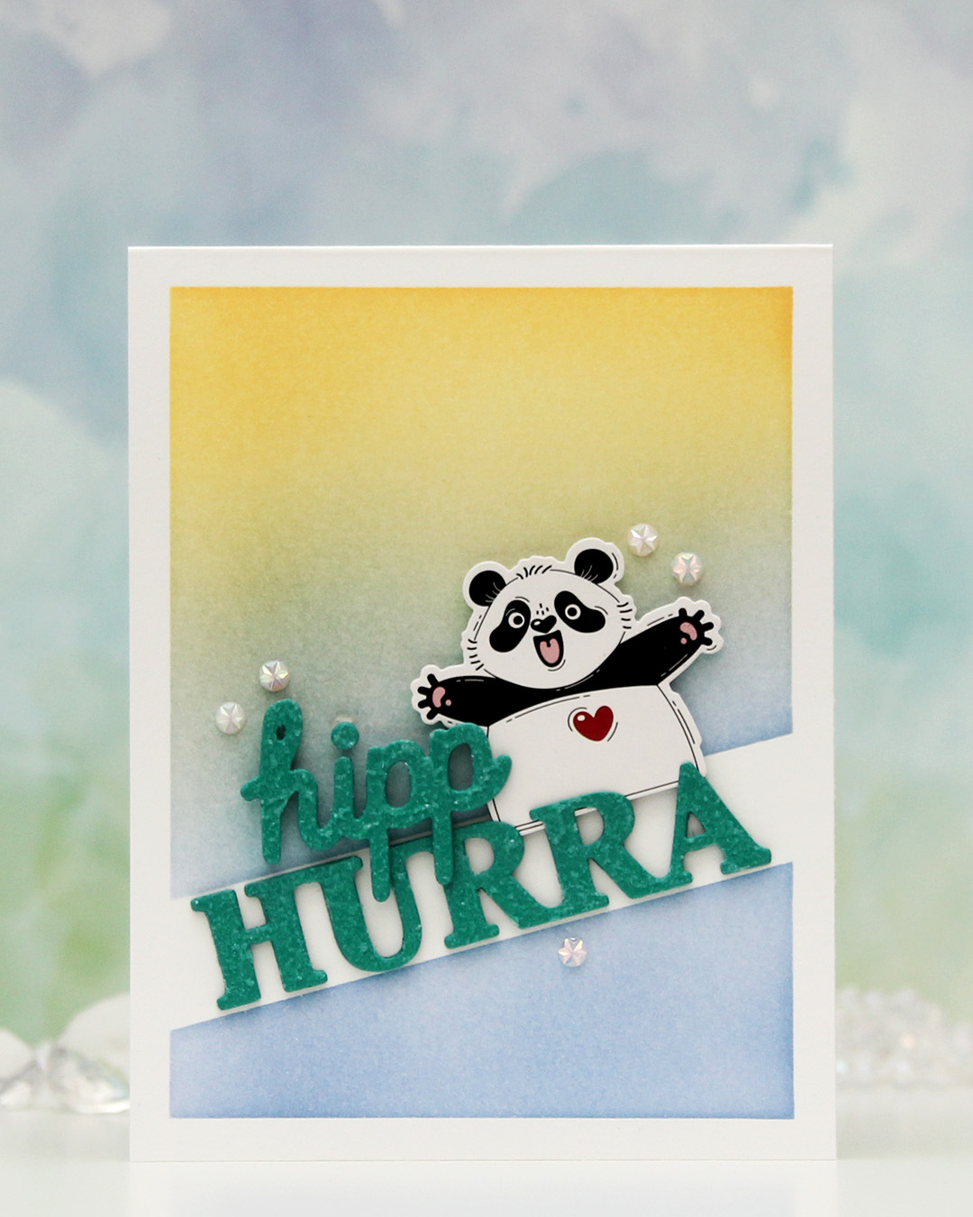 This one is sooo simple. Directly on the card base, I ink blended Blueberry Sky and Harvest Gold inks from Papertrey Ink over the Smart Mask Diagonal High Low stencil from My Favorite Things. This created the perfect spot for a sentiment, and the hurra part of the Hipp hurra die from Kort & Godt was the perfect size for the opening.
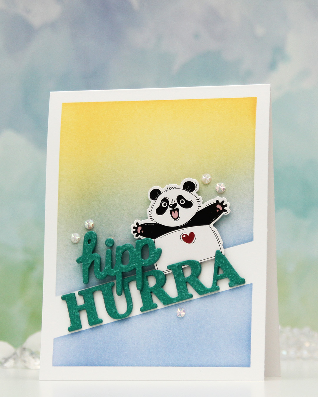 I die cut four layers from Tropical Teal cardstock from Papertrey Ink for both words, stacked them and added Frostbite Astro Paste from Simon Hurley on top for a fun, textured effect.
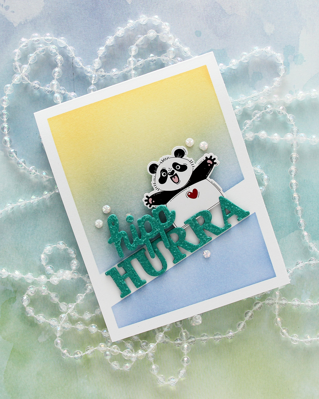 I mounted the panda from Kort & Godt with foam tape, adhered the hurra word in the opening and the hipp on top of both the panda and the other word.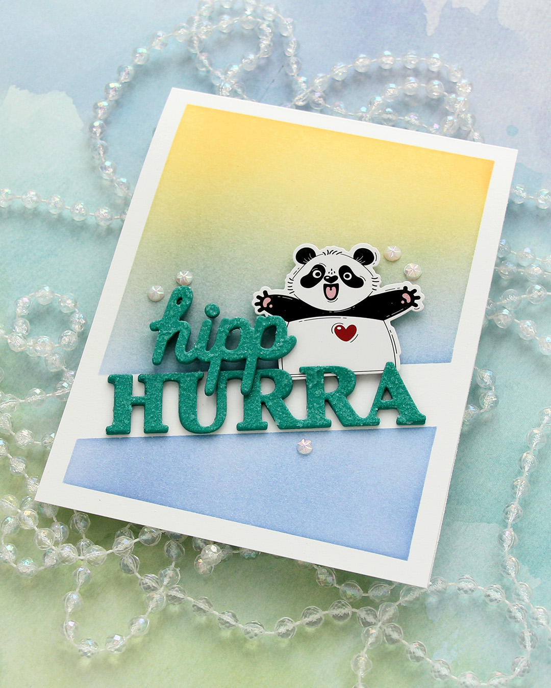
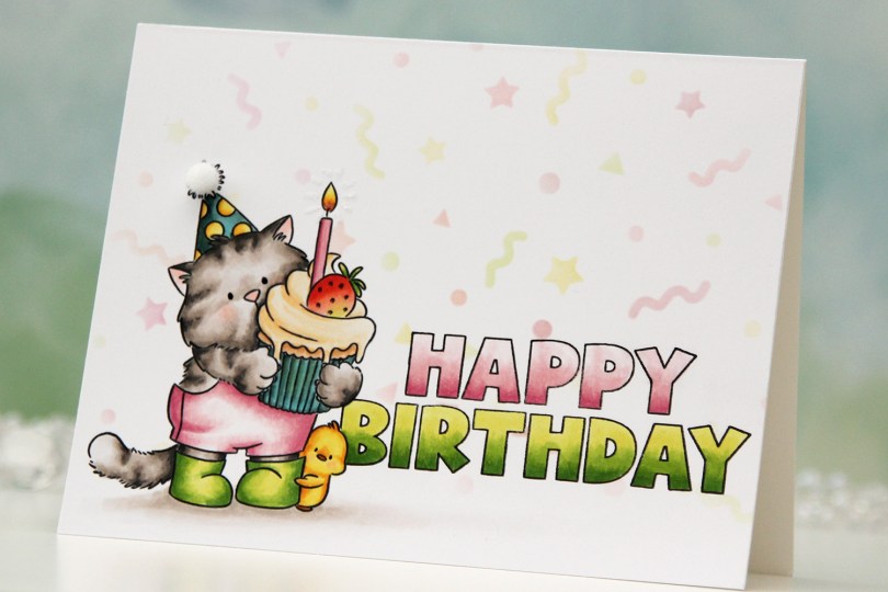
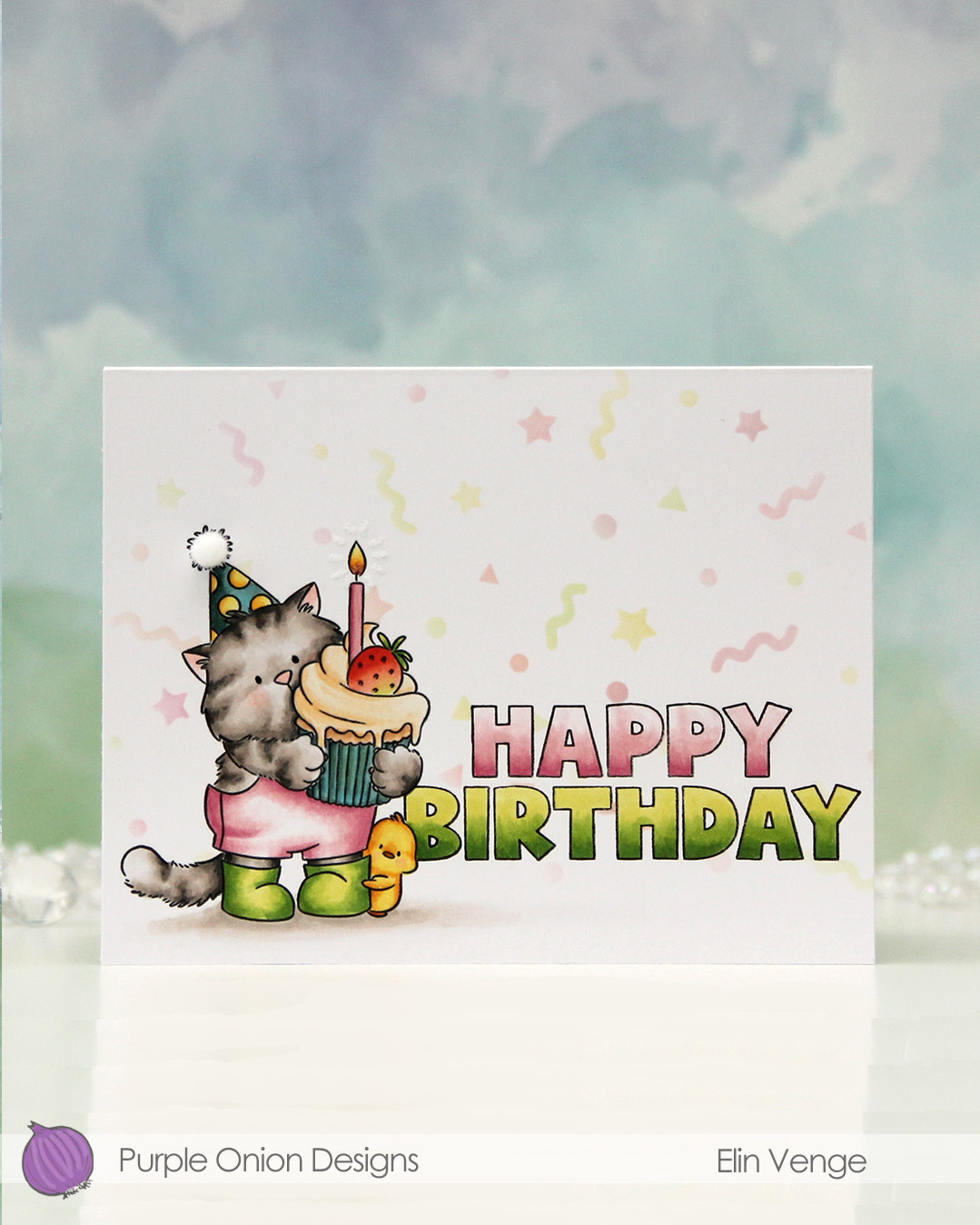 I stamped
 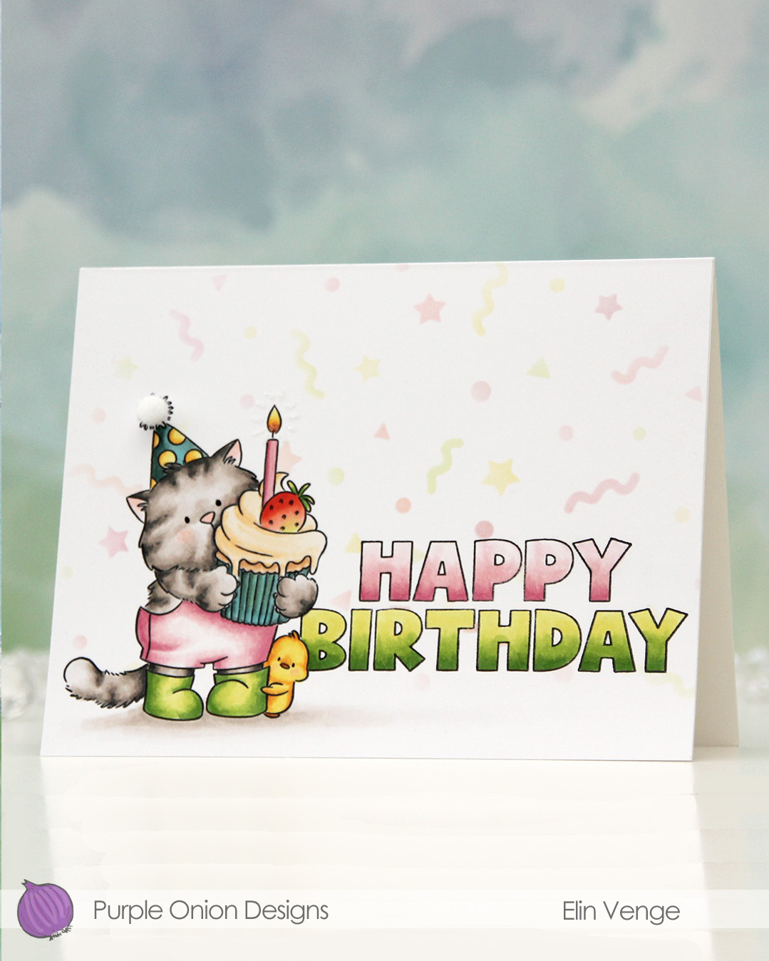 I colored Tofu and the sentiment with Copics, adding a black dot of Sakura Glaze pen to the eyes once the coloring was complete. This creates a tiny bit of dimension, as well as a bit of shine.
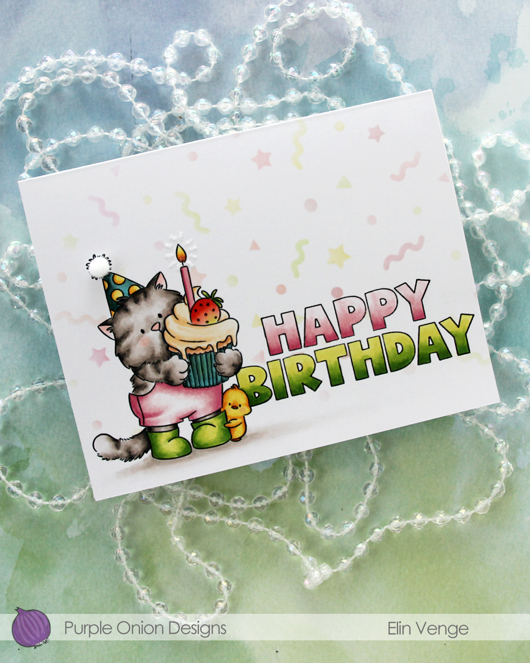 I used a Quickie glue pen to create a burst from the flame, then sprinkled on Rock Candy distress glitter. This adds a tiny bit of sparkle and some subtle texture.
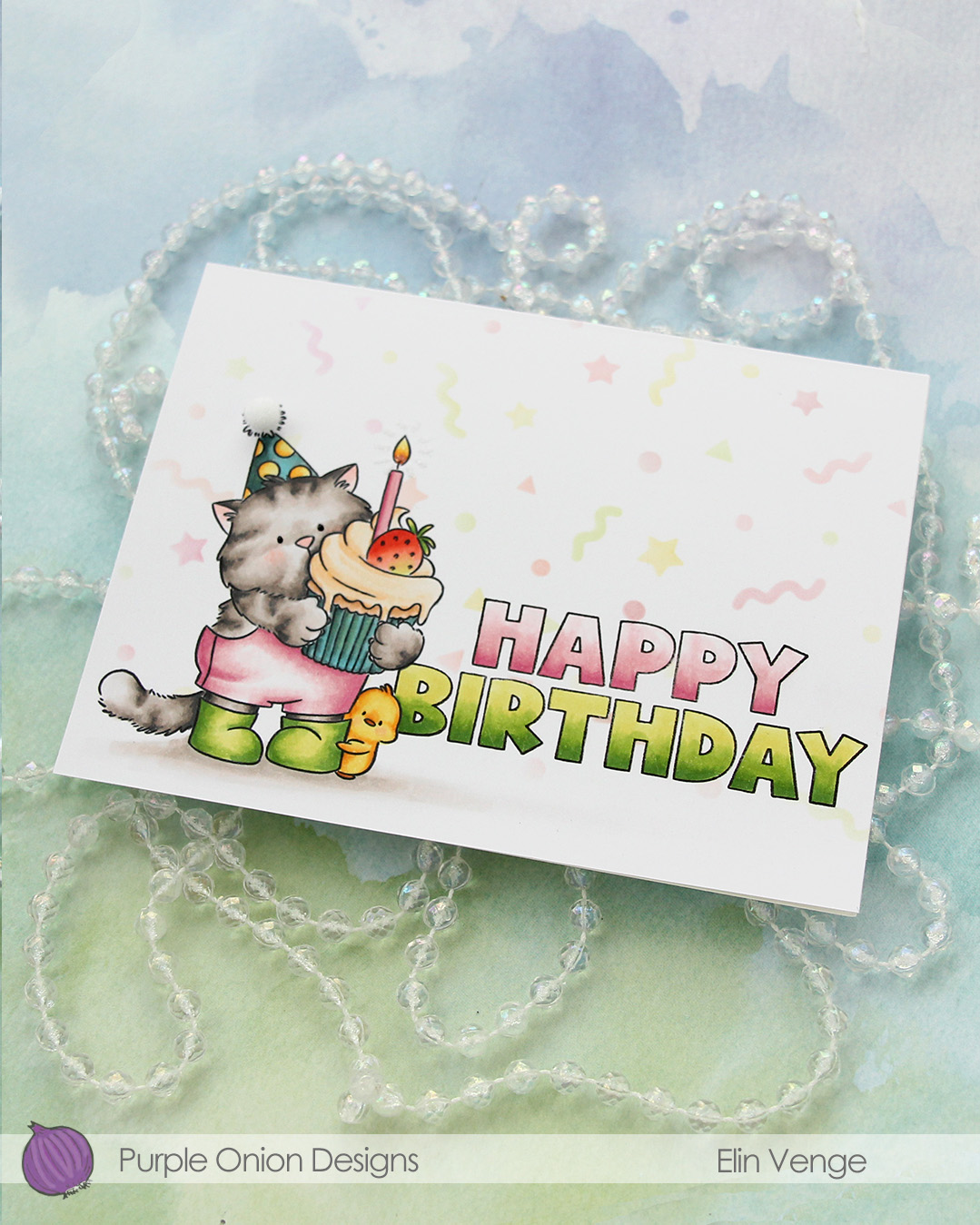 To finish off, I added a 5 mm pom pom from Cousin DIY to the top of the party hat.
 I used lots of Copics for this one. I wasn’t quite happy with the color of the cupcake liner or the party hat, but it is what it is. The card is still cute!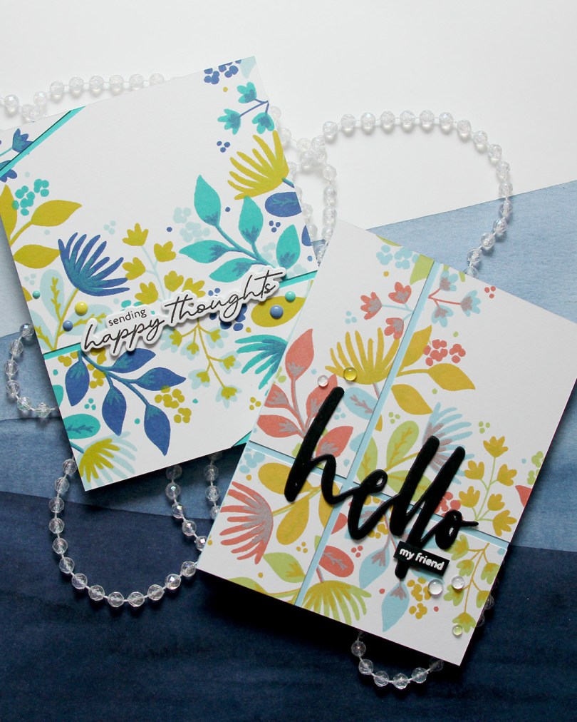
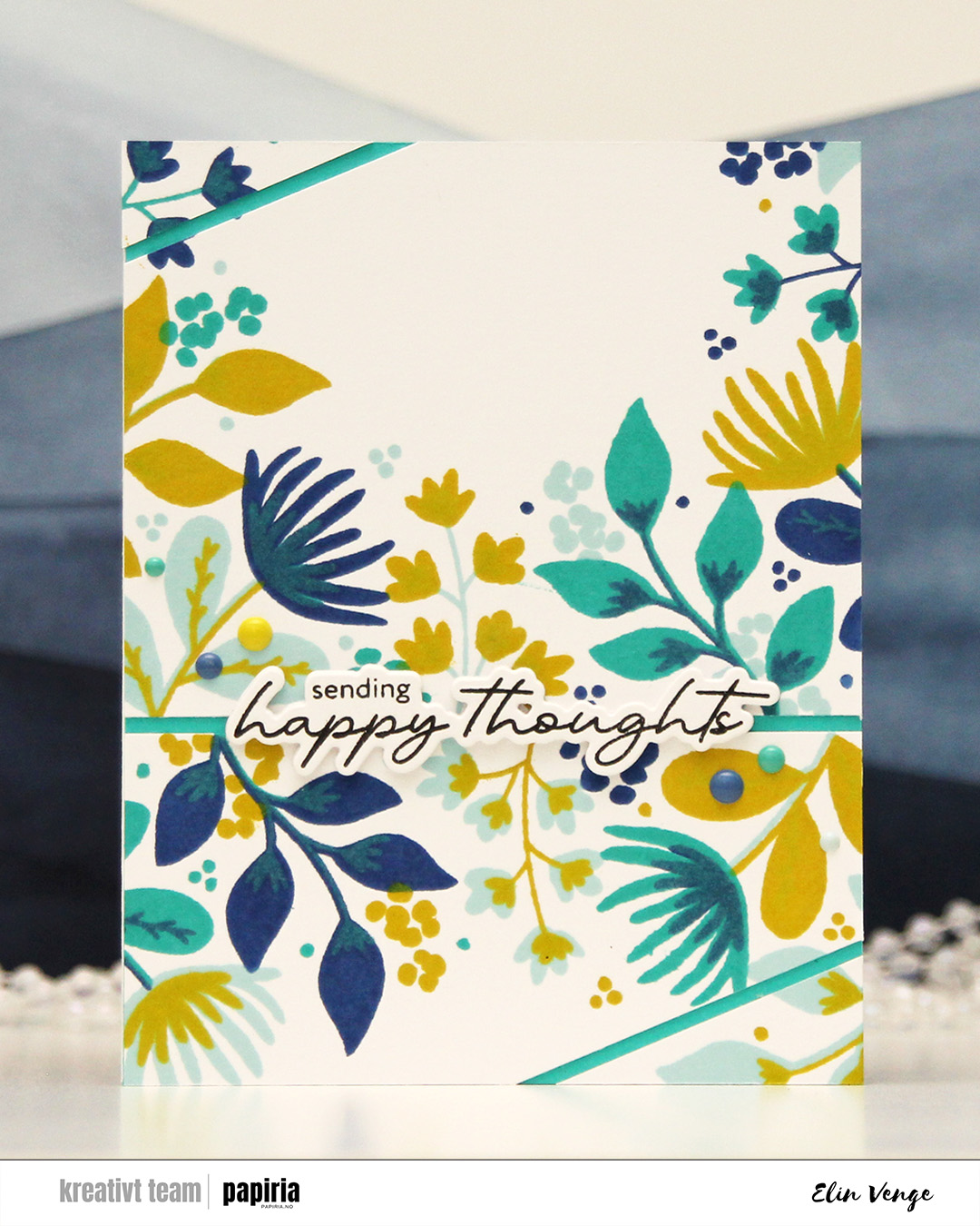 First up is this one. I chose an analogous color combo of Powder, Blueberry and Oceanside inks from C9, and a pop of Lemongrass for a somewhat contrasting color as my fourth. I cut the stamped panel in two, and then cut diagonal lines on each of my two pieces.
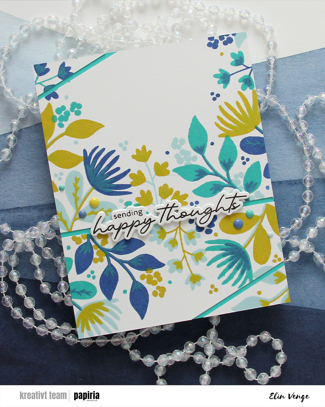 I covered a card base with Oceanside cardstock and adhered my panel pieces on top, leaving a gap between them so the Oceanside cardstock would show through.
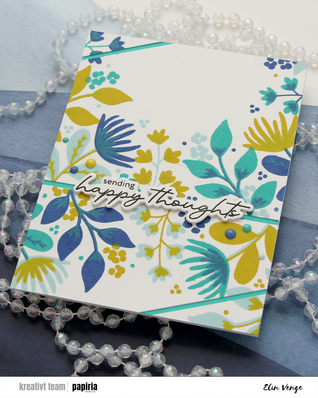 I stamped a sentiment from the Serene Blooms stamp set from Altenew using Obsidian ink from Altenew, and die cut it using the coordinating die. I stacked another three die cuts behind the sentiment for some dimension, and adhered my stack on top of the opening between the two largest pieces of the stamped background, before finishing off with enamel dots from C9 in the same colors that I used for the stamping.
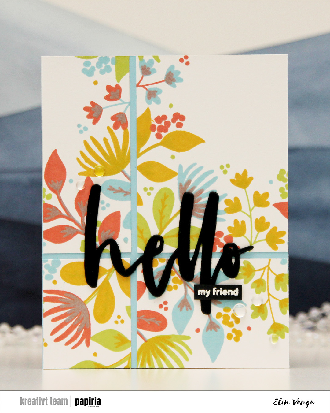 My second card features the same technique of cutting up the finished piece into smaller bits. Here, I used Sprout, Sunflower, Sorbet and Harbor inks, which makes for a way more colorful background (it’s basically a green, a yellow, a red and a blue).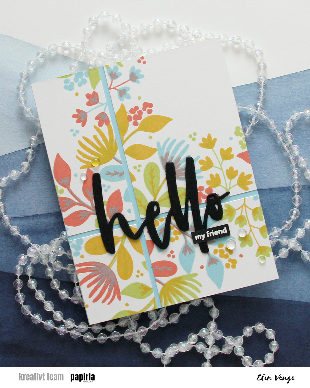
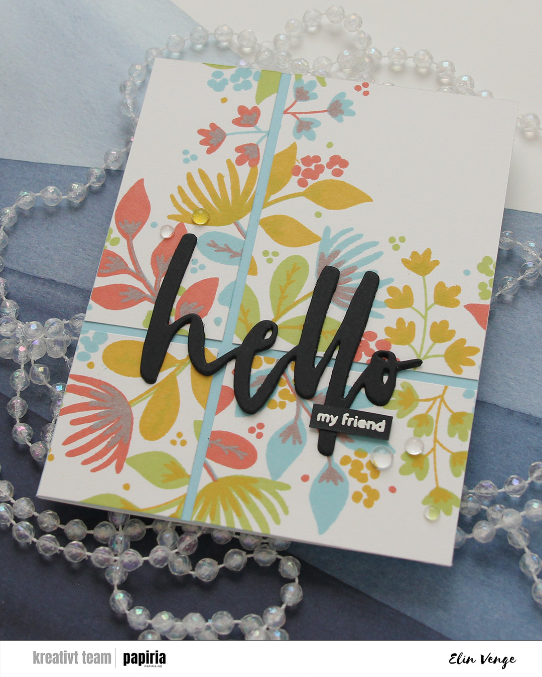 I used the Waterbrush Hello die from Altenew to create my sentiment for this card. I stacked three black die cuts for a bit of dimension and stamped and white heat embossed the sub sentiment from the Serene Blooms stamp set from Altenew. I’ve just replaced my VersaMark pad, so the letters are a bit thicker than I’d like, but i really did need a new pad. I finished off with a few dew drops from C9. There was a lot going on with the background already, and the dew drops are a bit more subtle.
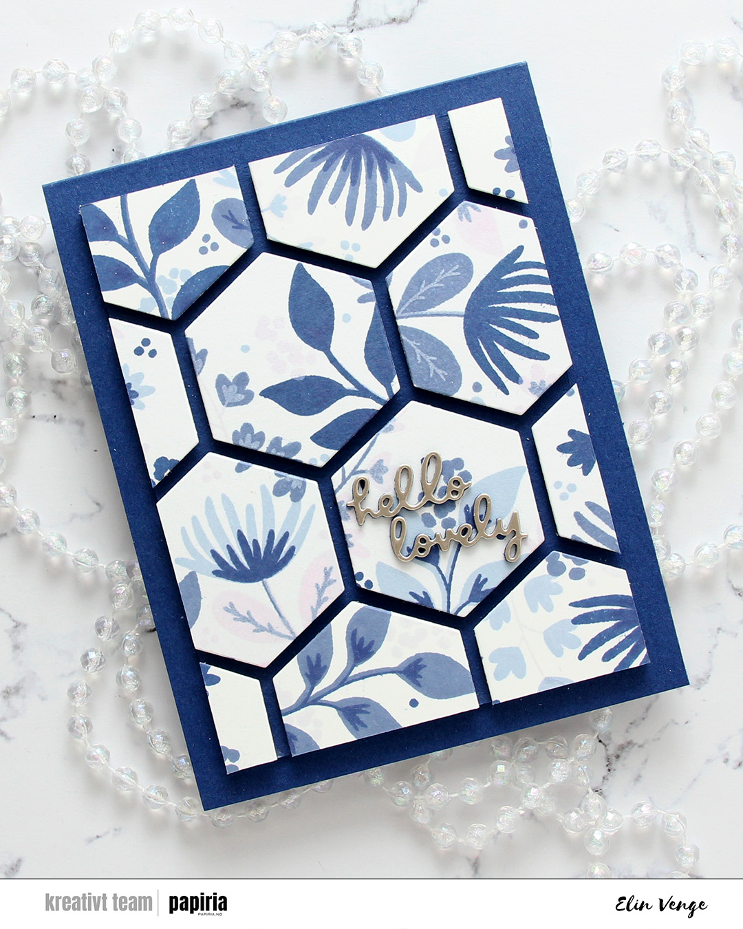 The final card is very different. For this one I had two full panels that I’d stamped with the Northern Shore bundle of fresh dye inks from Altenew (Polar Bear, Icy Water, Winter Lake and Arctic Mountain). I used the hexagon die in the Wild Meadow die set from C9 to cut as many hexagons as I could from the two panels and mounted them on foam tape to a piece of Blue Beyond cardstock from My Favorite Things. I then chopped off a bunch on all four sides for a nice border and adhered it to a card base I created from the same color.
 The die cut sentiment is from the Just picked die set from C9. I die cut two layers from blue cardstock and the top layer from Champagne cardstock from C9, adhered my sentiment in the center of one of the hexagons and decided to skip embellishments for this card. There’s a lot going on already with all the hexagons and dimension, I felt like the card really didn’t need more.
 This all started with patterned paper from Maja Design and the Sleigh full of cheer dies from Concord & 9th. Die cutting presents like this is a great way to use scraps. I used the Christmas Nostalgia collection for this. I’m a sucker for anything blue, so I wanted a dark-ish blue at the bottom, a lighter blue at the top and a contrast in the center. You could do this with any color, even plain cardstock. There are actually some images in the coordinating stamp set that will allow you to add patterns to your die cuts using just ink, but I opted for the patterned paper version here. I die cut the bow, the ribbon for the presents and the sleigh using champagne foil cardstock from Concord & 9th and added those for a touch of shine. The sleigh itself is a few layers thick to make it stand out against the background, and I did some ink blending on the seat using Wheat ink to make it stand out even more, as I have the same cardstock color for the seat as my background.
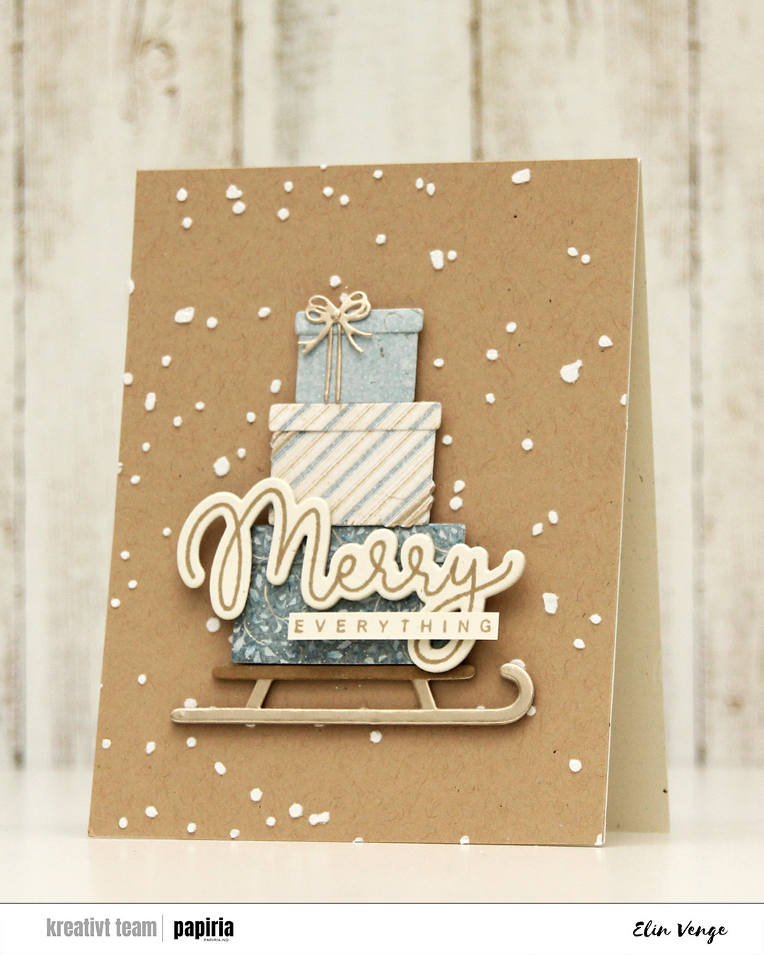 Speaking of backgrounds – I used one of the stencils in the Splatter Textures stencil set from Kristina Werner on a panel of Wheat cardstock from Concord & 9th. I added Altenew embossing paste through the openings and sprinkled on rock candy distress glitter while the paste was still wet. It’s important to clean your stencils quickly when using paste, or you’ll have a really hard time making it come off. Nobody wants to clean, but when dealing with pastes, you need to. I stamped my sentiment from the Joyful and merry stamp set from Kristina Werner using Wheat ink on Rustic Cream cardstock from Papertrey Ink. I used the coordinating die set to cut out my merry, and added another three die cuts on the back for dimension. I cut down everything to a nice strip, added another strip on the back for strength and adhered the sentiment to the largest present to finish the card.
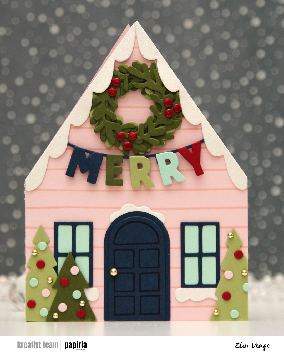 The Yuletide Lane bundle caught my eyes as soon as I saw it. It’s easy to create a big row of houses with the die set, but I opted for a simple shaped card for this one. If you love putting together die cuts, this is the set for you. I cut two houses from Ballet Slipper cardstock. Onto one of them, I stamped one of the stamps in the coordinating stamp set using Ballet Slipper ink for a tone on tone look. this particular stamp is very forgiving. It’s just two lines spaced about half an inch apart, but they’re not completely parallel or straight, which means you don’t need to be too precise when stamping. I glued the two houses together on one flap and cut the other flap off, leaving a standard side fold card base.
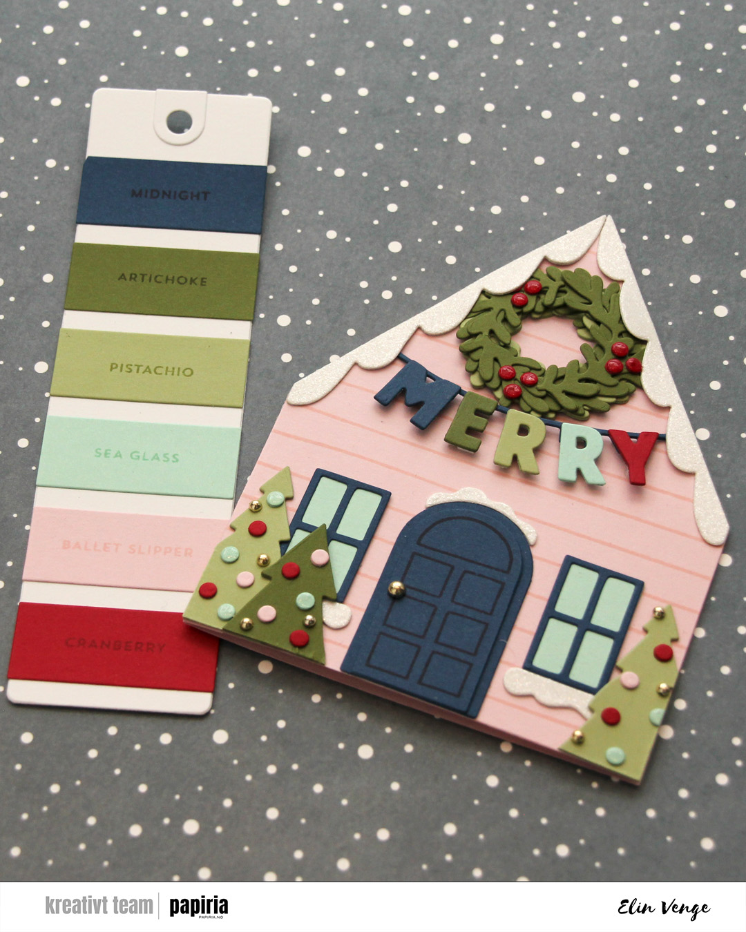 Time for the bells and whistles. This die set is packed full of so much stuff you can add, there’s really no limit to what you can do. I chose a fun color combo of Cranberry, Midnight, Artichoke, Pistachio and Sea Glass to match the Ballet Slipper nicely. I doubled up the die cuts on nearly everything, even adding white glitter cardstock from Kort & Godt for the snow. On the door, I stamped the coordinating door stamp in Midnight ink, I popped up the letters, added a thick layer of Glossy Accents to the berries on the wreath, a somewhat thinner layer on the Sea Glass ornaments and some gold enamel dots to finish. I even used a gold enamel dot for the doorknob.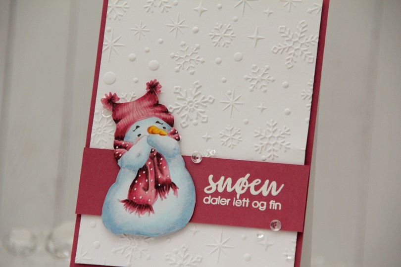
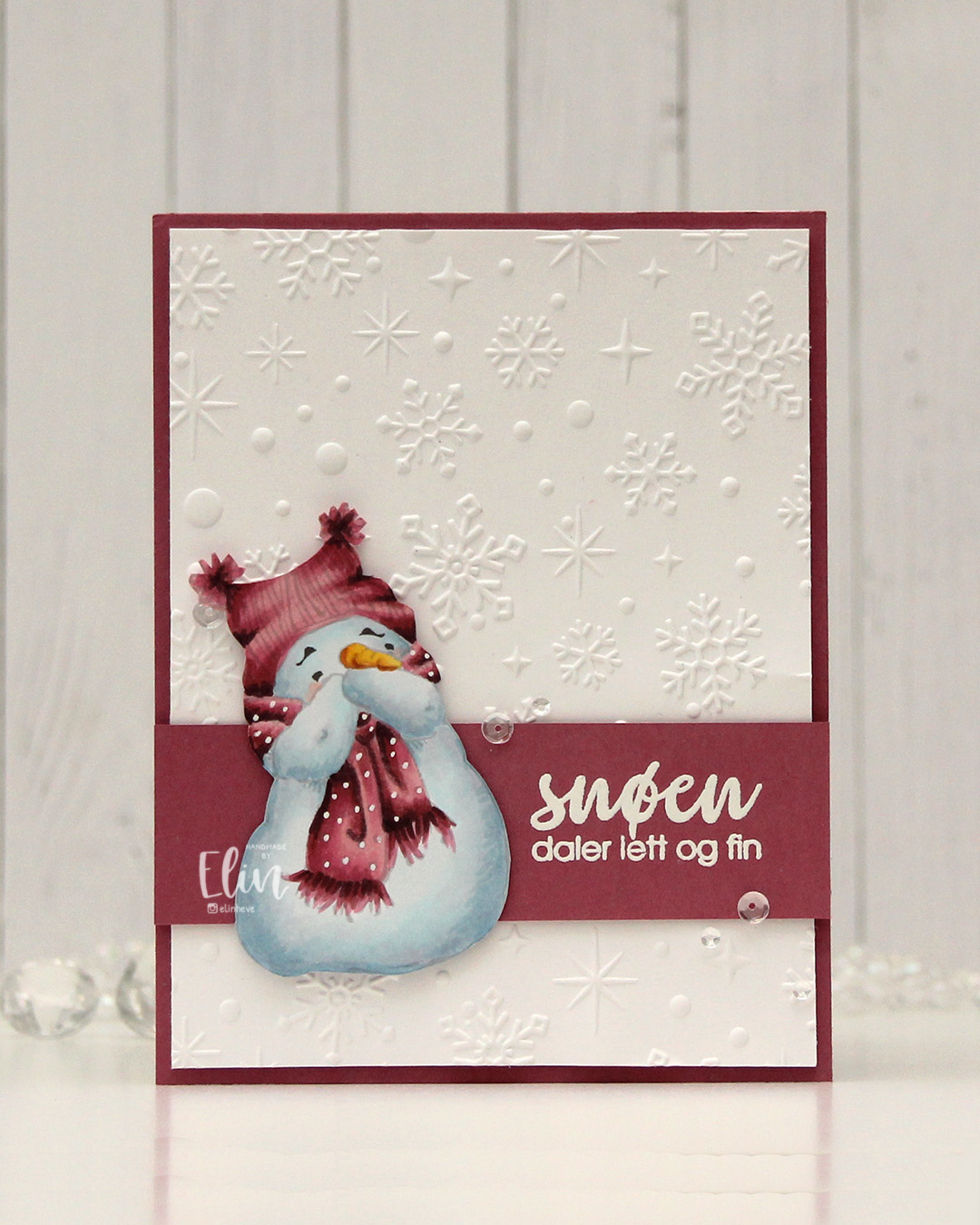 I went for a no line version this time. This is probably my most used image from Mo, and I love how easy he is to color. I chose a pink color combo that I really like, and I think this could work both as a holiday card and as a general winter card. I added the dots back into his scarf using an extra fine white Sharpie, and then fussy cut him. He’s pretty easy to fussy cut, too. I used the Sparkling snow embossing folder from Simon Hurley (Spellbinders) on the background for some texture. I love the detail this embossing folder gives, and they’re proper six pointed snowflakes and not the weird 8 pointed ones that some companies make. Real snowflakes never have eight points, they always come in multiples of six. It has to do with the way water molecules are formed and then bind together. Anyway, it’s a great embossing folder and it adds interest to an otherwise plain background.
 I trimmed my embossed panel slightly, added a couple of layers behind it and adhered it to a card base covered with a panel of Autumn Rose cardstock from Papertrey Ink. On a separate piece of Autumn Rose cardstock, I stamped a sentiment from the Snøstorm stamp set from byCino using VersaMark ink, before sprinkling on super fine detail embossing powder from Ranger and melting it until it was smooth. I cut my sentiment down to a wide strip, added a layer to the back of it for a little bit of dimension, then put a couple of additional layers behind the snowman before gluing him down and finishing the card with a few sequins from the Assorted Moonshine mix from Simon Says Stamp.
 Simple color palette for this one.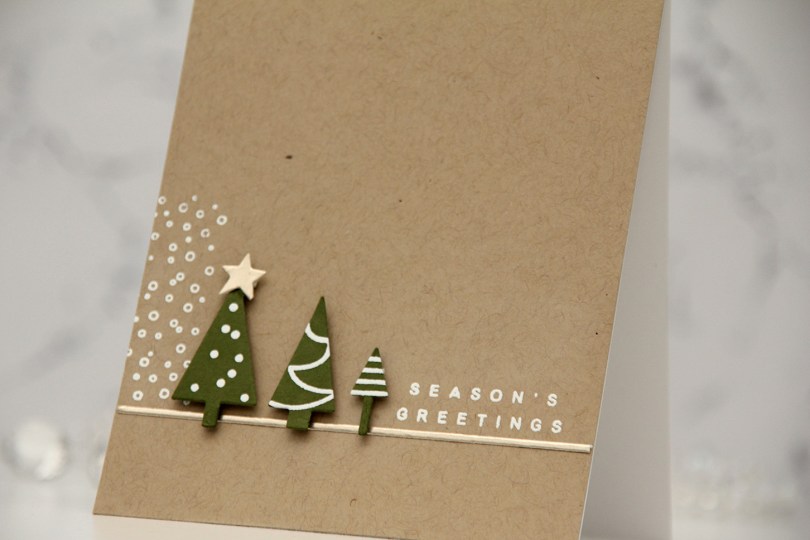
 I started by stamping the little decorations on the trees with VersaMark ink onto Artichoke cardstock from Concord & 9th, before heat embossing with white embossing powder from Ranger. I then used the coordinating tree die to cut out my trees. I added foam tape to the back and put the trees aside while I worked on the rest of the card.
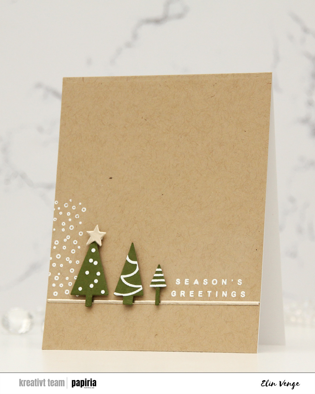 Onto a panel of Wheat cardstock from C9, I stamped and white heat embossed the snow flurries from the Sleigh full of cheer stamp set from C9, as well as a sentiment from the Joyful and merry stamp set from Kristina Werner. I used one of the dies in her Gift bows die set to cut a thin strip of Champagne cardstock from C9, which I adhered below the snow flurries and sentiment. I also die cut a star from the same cardstock using a die in the Yuletide Lane die set from Concord & 9th. I mounted my trees to the card and added the champagne star on top of the tallest tree to finish.
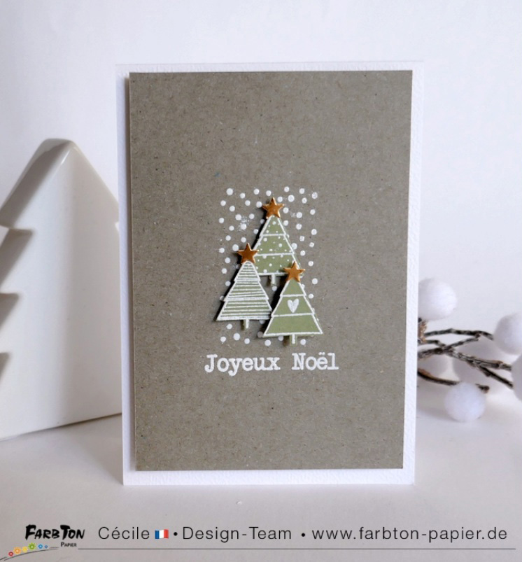 This was my inspiration for my card. Very clean and simple with lots of white space and the snow flurries in the background to ground the trees. It’s an awesome card!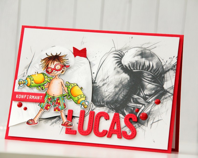
 I looked for a kickboixng image I could color up, as I wanted that to be the main focus on the card – it was his main hobby. I didn’t have one, nor could I find one, but I found this greyscale sketched image with boxing gloves that was perfect.
 The gloves cover the entire front of the card. I still needed something to color, because a black and white image isn’t very interesting on its own. I settled on
  I mounted the colored image on pieces of foam tape, making sure to add a magnet in a strategic spot to keep the flap from opening on its own. I put another magnet behind the image of the gloves to keep both magnets hidden. They’re still plenty strong enough to work through a couple of layers of cardstock.
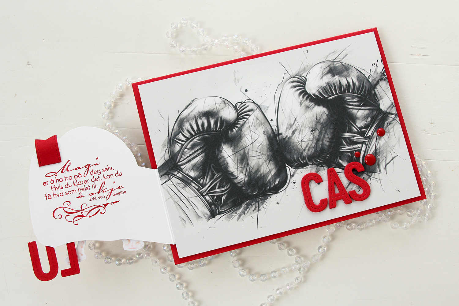 Once you open the glove fully, there’s a sentiment from an old confirmation stamp set from Stempelglede, stamped in Wild Cherry ink from My Favorite Things. I used one of the dies in the Essential Stitched Sentiment Strips die set from My Favorite Things to create a flag end to pull the glove open when the card is closed. The magnets are so strong, it won’t open on its own, and by adding the little flag end, it gives the recipient a little clue to look behind the glove.
 Back to the front of the card when it’s closed. I stamped an white heat embossed the word KONFIRMANT from the A05 stamp set from Norsk Stempelblad AS onto a piece of Red Hot cardstock from My Favorite Things, and then die cut it using a banner die from MFT – they have lots! I popped it up and made sure the end crossed into the image, to tie the two together. I did the same thing with my letters, die cut using the In Stitches Alphabet die set from My Favorite Things, also from Red Hot cardstock. I stacked a few layers for dimension and stability, the L and the U are only barely attached to the glove and the back of his left leg, so they needed a little bit of strength.
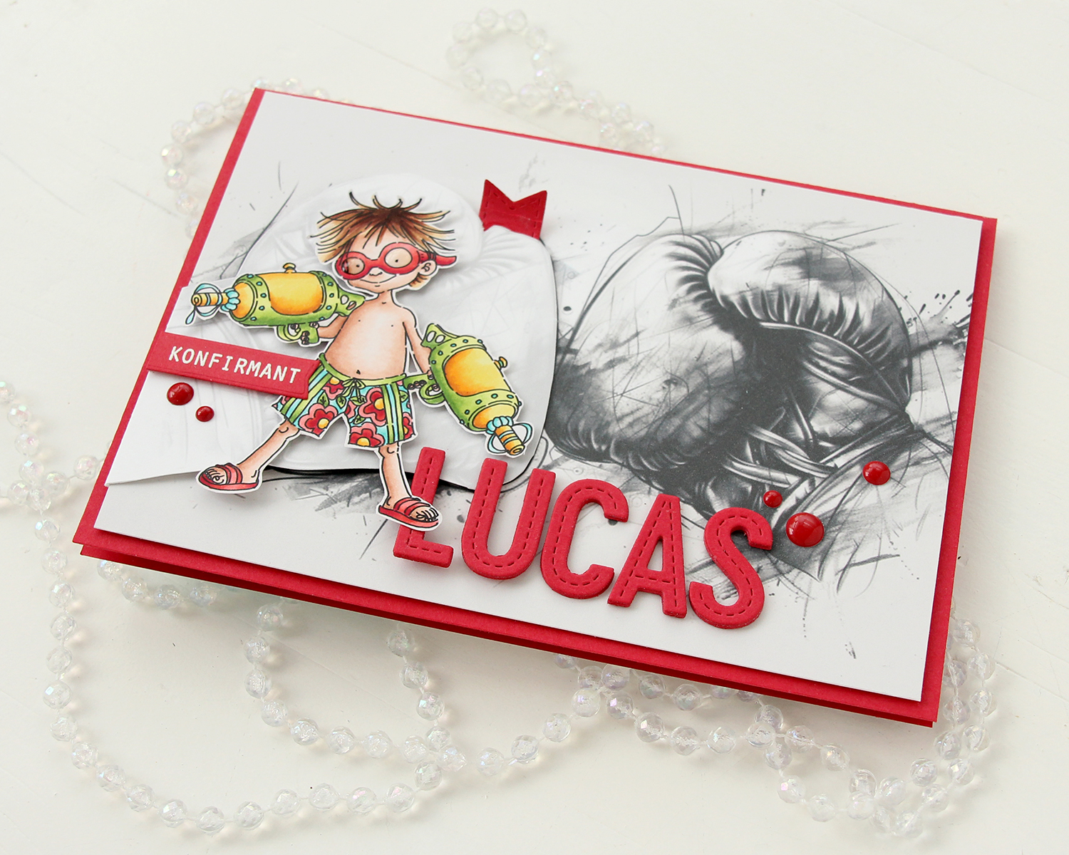 I finished off the front with a few red enamel dots from Papirdesign.
 On the inside, I printed and cut out a checkerboard pattern, which I thought worked well with the car racing theme. There’s still plenty of room to write a personal message. I also used the Wax Seals die set from Waffle Flower to create a rosette badge with a Norsk Stempelblad AS confirmation sentiment heat embossed in the center. I used the Itty Bitty Strips dies from My Favorite Things to create the ribbon ends hanging down from the actual rosette.
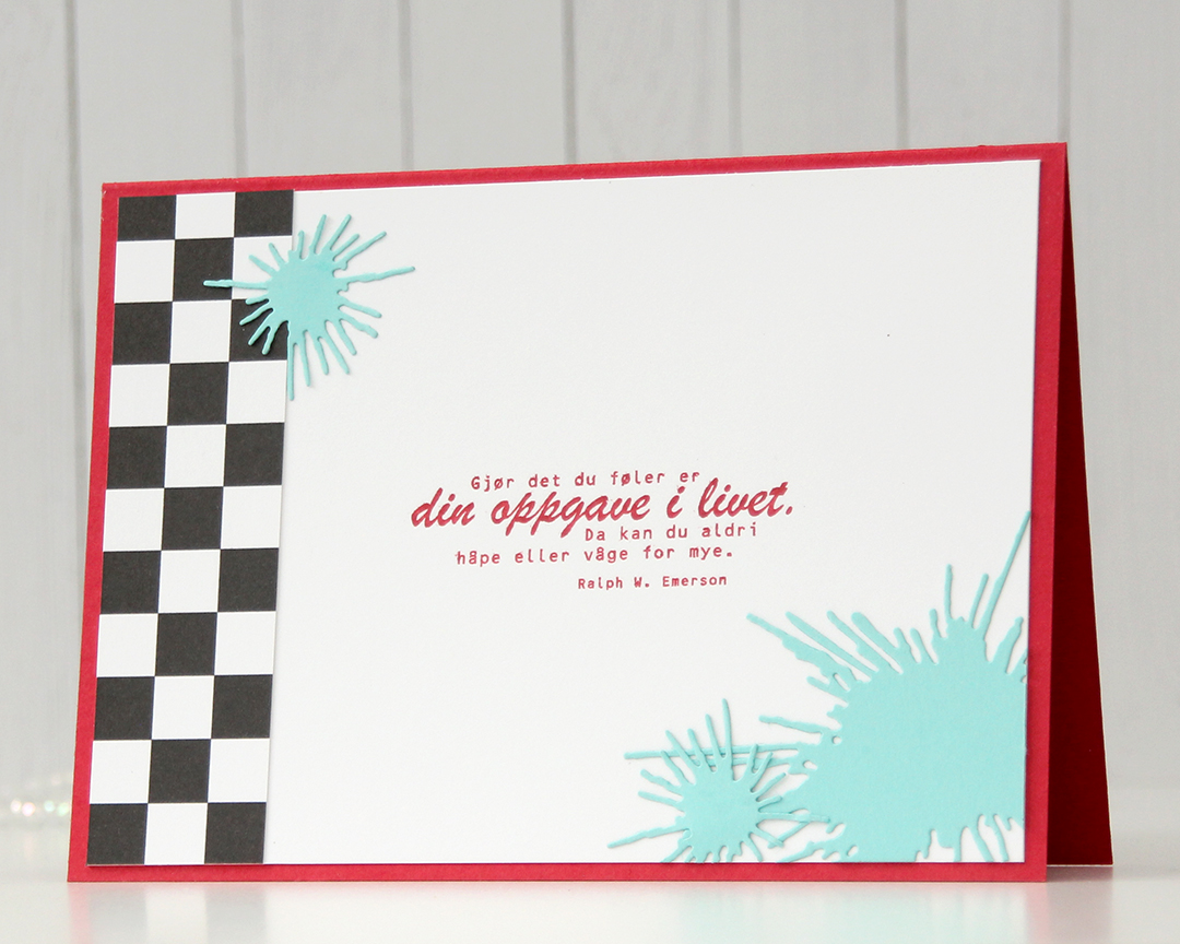 On the back of the card, I used more of that checkerboard pattern, stamped another confirmation sentiment (it’s actually an Emerson quote) and used the Splash die set from Papirdesign to create some water splashes from Summer Splash cardstock from My Favorite Things. I thought they tied in well with the super soakers in the colored image on the front of the card.
 A simple color palette to finish off. This card was a hard nut to crack, but once I got going I had a blast (no pun intended) creating it.
