
Hi, crafty friends! I know I usually state that “today’s card is a simple one”, but this one really is. I used a floral image, but cheated and didn’t color it at all.
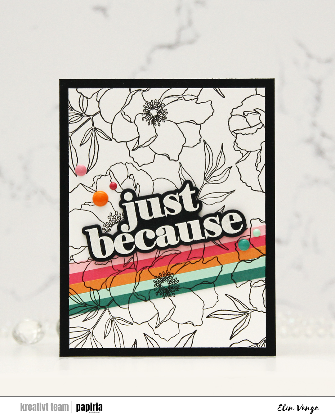 It’s no secret that I’m a fan of anything and everything Concord & 9th comes up with. This Blended petals set is an older one, a quick google search revealed a July 2022 release, but I hadn’t seen it before and picked it up just a few weeks ago. There’s a stamp set, a die set and a stencil set that all coordinate. I didn’t use the stencils today, but I definitely will in the future!
 I started by stamping the big floral image on a panel of white cardstock using Altenew Obsidian ink. This ink is very dark black and very crisp, and it’s perfect for outlines like this. I then “stripped it up” (thank you, Laura Bassen, for this term) with cardstock colors from C9. I cut 3/16″ strips from Juniper, Sea Glass, Clementine, Honeysuckle and Pink Lemonade cardstock. I butted the strips together and glued them to Post-it tape, which I then adhered temporarily to the white panel, so I could stamp in the exact same spot on my stripped piece.
 Once I’d completed my stamping, I adhered the Post-it tape with my strips properly with liquid glue and trimmed the panel down slightly, before adhering it to a black panel that covers the front of an A2 white card base. I stamped and heat embossed the large sentiment in the stamp set and cut it out with the die from the coordinating die set. I stacked another four black die cuts behind it for dimension, and adhered it to the top of my cardstock strips.
 To finish off the card, I rummaged through my enamel dots in search of colors to match. I have all the colors of the C9 enamel dots on their way to me. They would match perfectly, but the last time I tracked the shipment, they were in the UK. I used the Sea Shore enamel dots from Altenew for the ones that matched Juniper and Sea Glass, the Tea Party set from Altenew to sort of match the pinks and the orange one is from the Boy Crazy pack from My Mind’s Eye from 2013. I’ve loved enamel dots for a loooong time!

 When I printed my image, I printed
  Once my coloring was complete, I used the Notebook Edge die from My Favorite Things to cut from the edge of the panel for a little bit of interest. I mounted my little scene using foam tape onto a card base I created from Cornflower cardstock from My Favorite Things.
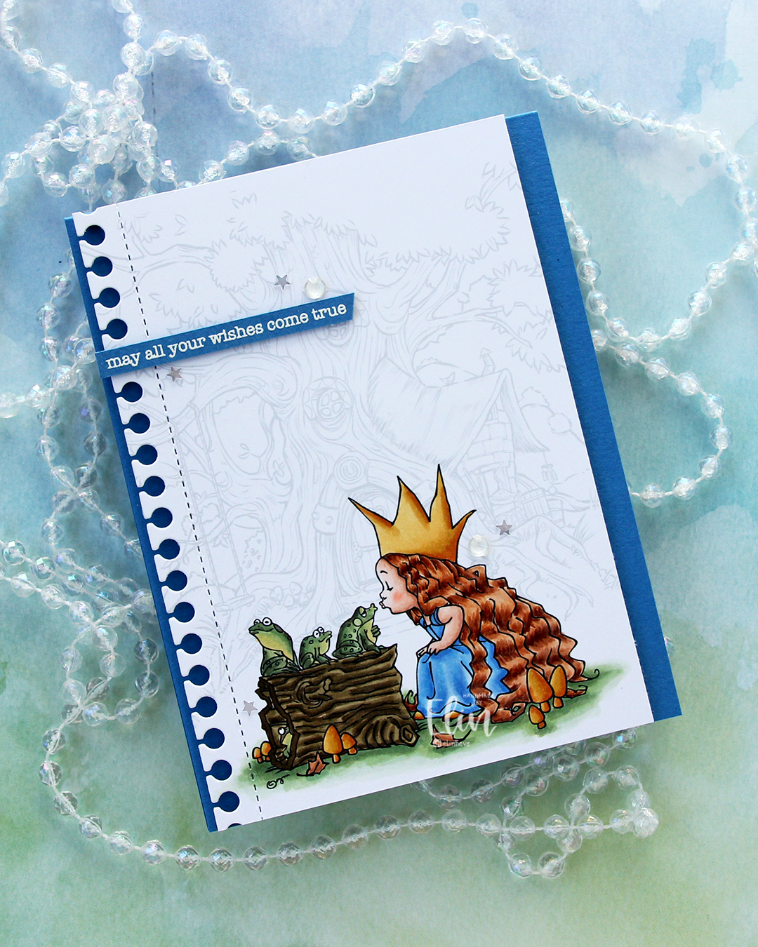 I stamped a sentiment from the Birthday messages stamp set from Mama Elephant using VersaMark ink onto a scrap of Cornflower cardstock, added super fine detail embossing powder from Ranger and heat embossed. I always heat emboss from the back of the back of the cardstock only, it gives a much better result than heat embossing from the front.
 I cut my sentiment down to a strip, added a couple of layers of cardstock behind it for dimension and adhered it near the top left of the card, before finishing off with a few gems and confetti stars from the Starry Night mix from Little Things from Lucy’s Cards. The stars made me think of “When you wish upon a star”, which goes perfectly with the sentiment and the “Once upon a time” theme for the Coloring Club Challenge.
 I used a fairly limited color palette for this one, I feel.
 I combined
  I didn’t want color on the entire piece and decided on coloring a strip that includes the largest part of the waterfall, the beaver and part of the mama swan. I used Zig clean color real brush markers to color, using the blender for some of it, but a size 4 round watercolor brush from Princeton, along with water, for most of it. The Zig colors I used are the following: 068 Deep Brown, 816 Soft Violet, 028 Pale Pink, 705 Peach Orange, 505 Yellow Ochre, 407 Grass Green, 406 Sage Green, 411 Cactus Green, 307 Aqua Blue, 315 Ultramarine and 910 Warm Gray 6.
 Once my coloring was complete, I cut the colored section apart from the rest. I adhered the uncolored sections onto a black mat I created from Black cardstock from Concord & 9th. Behind the colored panel, I stacked a few layers of cardstock for dimension and adhered it in between the other two pieces. I adhered my finished piece onto a card base that I created from Blue Beyond cardstock from My Favorite Things.
 I stamped and white heat embossed a sentiment from the
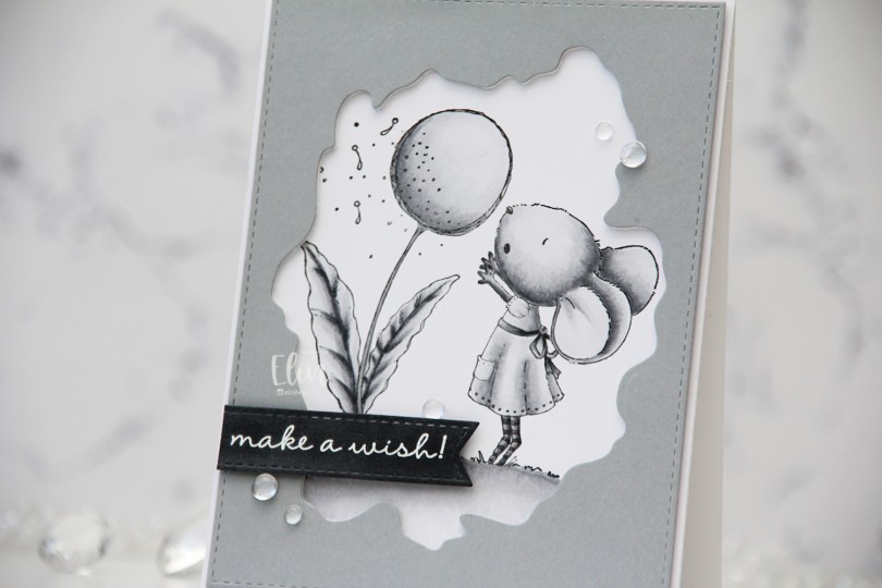
 I used grays for my coloring of this
 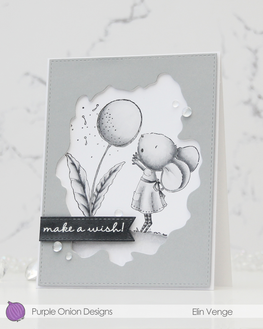 I used the Watercolor Wash Free Form die and the largest die in the A2 Stitched Rectangles STAX 1 set from My Favorite Things to cut a window opening and create the faux stitching on the edges of a piece of Dove cardstock from Concord & 9th. I used the Watercolor die to cut a few more layers from white cardstock to glue behind the grey for dimension.
 I scribbled a bit of N5 Copic marker on a scrap of Dove cardstock to make it a little darker, let it dry, then stamped and white heat embossed a sentiment from the A Beautiful Day Sentiment Set from Purple Onion Designs (unfortunately, I think the set’s discontinued, I couldn’t find it when searching the POD store). I then used one of the dies in the Essential Stitched Sentiment Strips die set from MFT to carry on the faux stitching look that I already had going. I added a few strips of cardstock behind it for even more dimension and adhered it in the bottom left of the card.
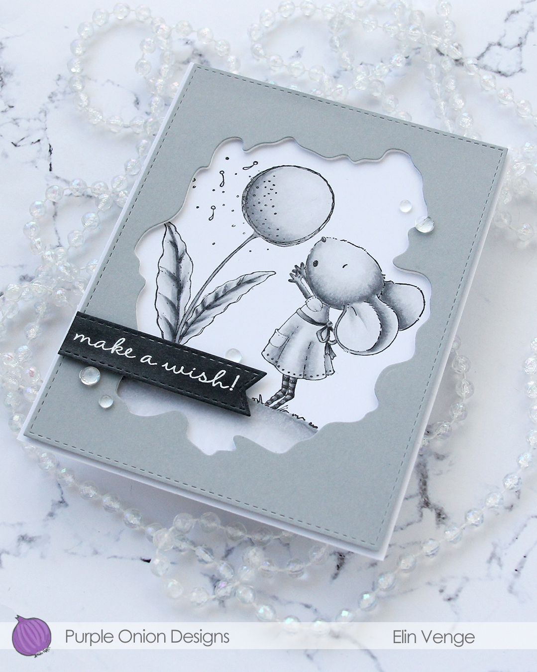 To finish off the card. I adhered a few Dew Drops from Concord & 9th. With greyscale coloring, grey cardstock, white heat embossing and clear dew drops, it looks like I took black and white photos of this card, but I promise I didn’t.
 I don’t think I’ve ever colored an image with less markers.
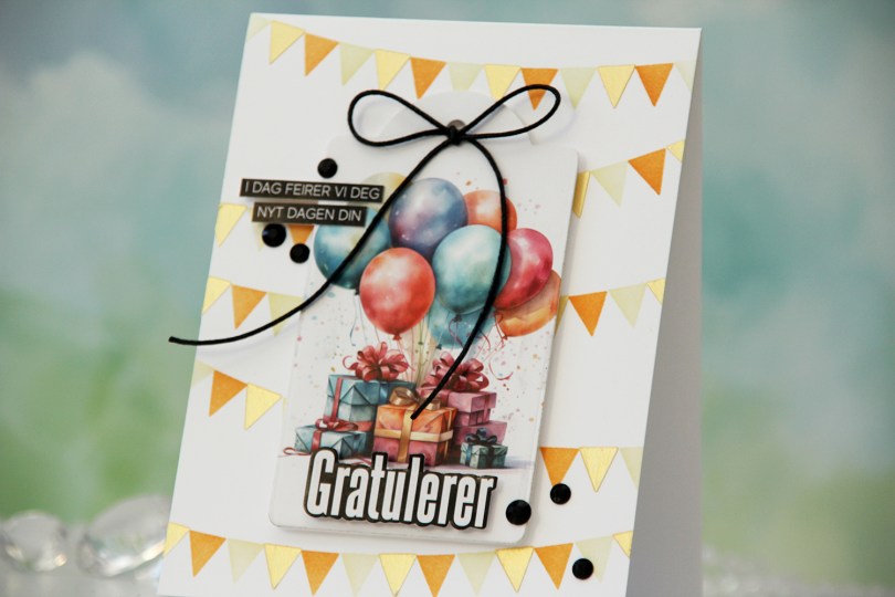
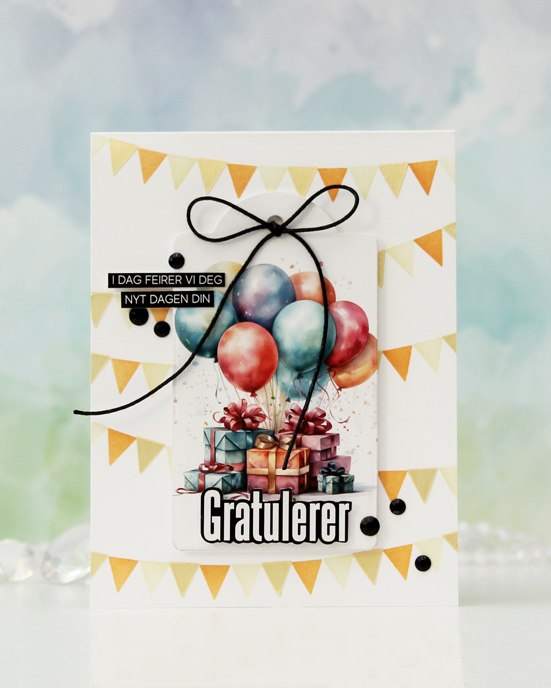 To start, I die cut this focal image with a tag die. I die cut another in white to put on the back for a little strength and put my tag aside while I worked on my card base.
 I used the Wimpelkette stencil set from Create a smile to create the pennants in the background. The set consists of 3 stencils that layer and create an easy pennant background. I used Peachy Glow and Amber Blaze inks from Altenew with two of the stencils, and through the third one, I added a layer of Solar Paste in the Golden Hour color. It creates a little bit of shine and some texture.
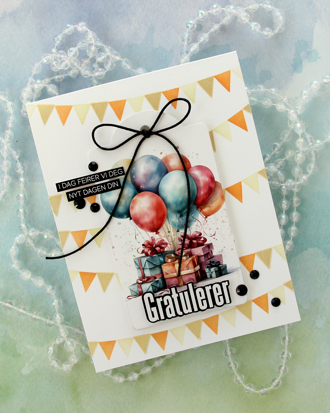 I mounted the tag with foam tape in the center of the card, used 1/16″ foam squares on the back of the Gratulerer word sticker to make it stand out a little, then trimmed down the sentiment strips slightly and adhered them to the tag.
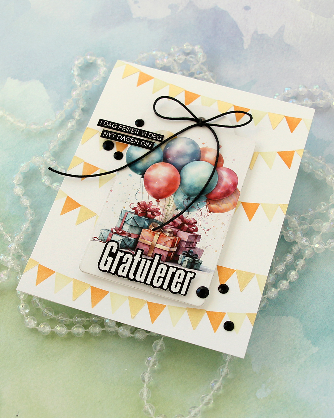 To finish off the card I added a few black gems and tied a bow using black cotton thread from Kort & Godt.
 I haven’t done any coloring since December, so I felt rusty. Thankfully, these images from Lili of the Valley are easy ones for jumping back in! Once my coloring was complete, I fussy cut him, leaving a thin white border around the edge. I didn’t want to cut away the “fuzzies” that are so typical of LOTV images, so by leaving a white border, I could preserve the look. I used an embossing folder (Quilted embossing folder from Concord & 9th) to create some interest in the background without being too distracting.
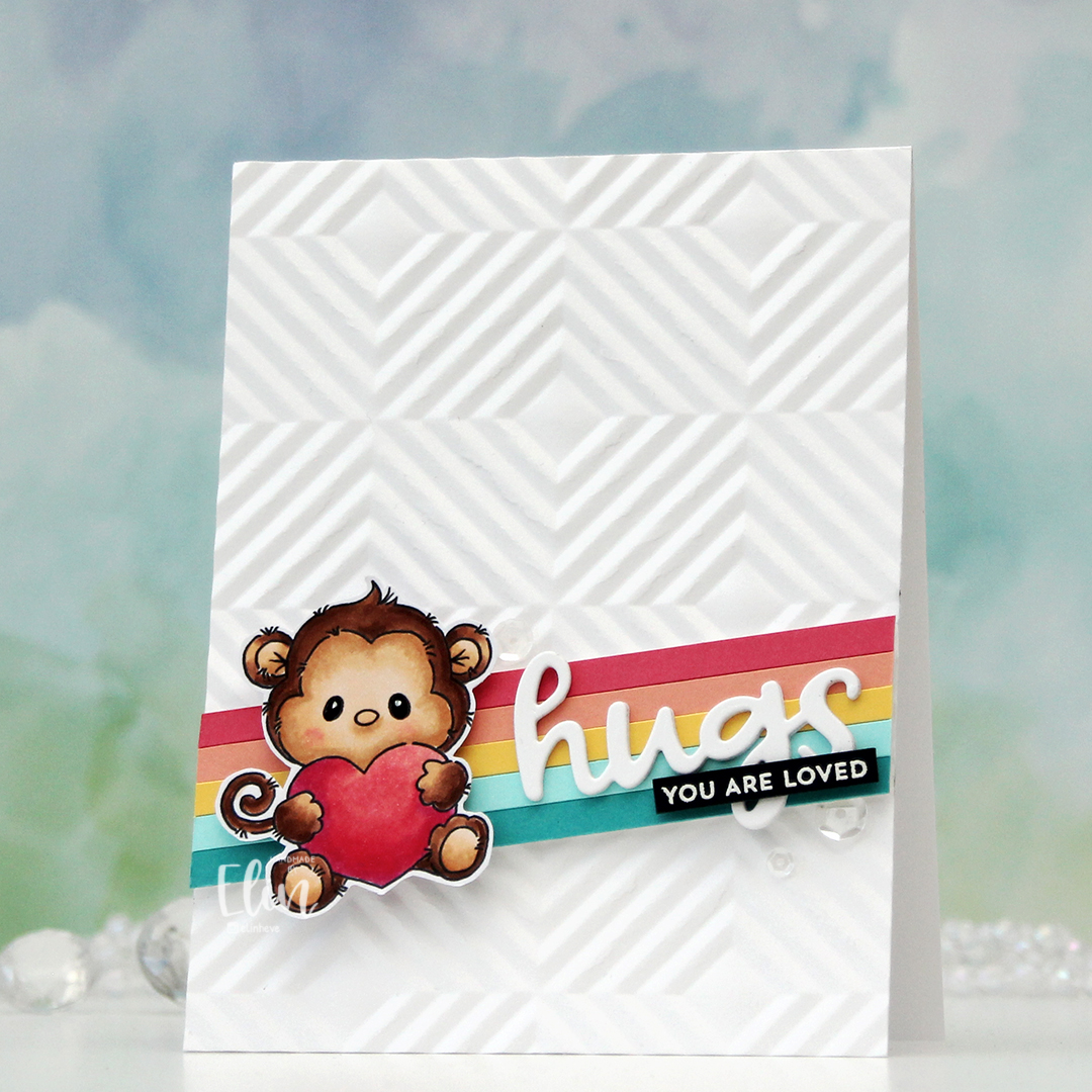 I cut down a few colors of cardstock from Concord & 9th to 3/16″ wide strips and glued them together on a scrap piece of white cardstock. The colors I used are Oceanside, Aqua Sky, Buttercup, Grapefruit and Honeysuckle. I mounted my stripped up panel at an angle, put a few foam squares behind the monkey and added him on top. I die cut hugs (Quilted die set from C9) three times from white cardstock, stacked them and adhered them on top of my strips next to the monkey. I then stamped and white heat embossed a sentiment from the Itty Bitty Gifting stamp set from My Favorite Things onto a black piece of cardstock from Concord & 9th. I added a couple of layers of black cardstock behind for strength and dimension and adhered it on top of the die cut word, before finishing off with a few sequins from the Starry Night mix from Little Things from Lucy’s Cards.
 Simple color combo this time.
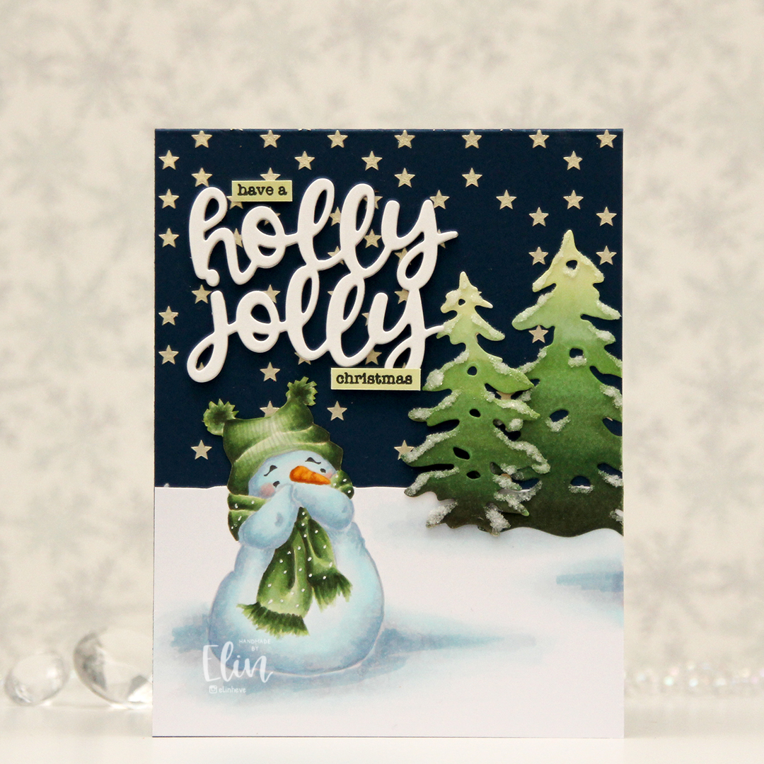 I love coloring this image in noline versions. I usually print with his eyes and eyebrows in a dark brown and the rest of him in a super light grey. I kept the snow on the ground around him this time, and cut away the part of the panel that above my imagined horizon line. I created stars in the sky by using solar paste from Simon Hurley (in the golden hour color) through the Falling stars stencil from Simon Says Stamp onto the front of an A2 card base I created from After midnight cardstock from My Favorite Things.
 Once the stars were dry, I adhered my panel with my snowman, adding die cut trees a little bit below the horizon line. I created the trees by coloring a scrap piece of X-Press It using the same green markers I used for the image, before die cutting them using the Silhouette Snow Trees die set from Mama Elephant. I finished off the trees with some liquid glue and Rock Candy distress glitter for a sparkly, snowy look. For a sentiment I die cut the words holly jolly from the Jolly Holiday greeting die set from Concord & 9th five times from white cardstock and adhered them all together for a stacked, dimensional look and completed the greetings with some small words from the Holiday messages stamp set from Mama Elephant that I stamped in Obsidian ink from Altenew onto pieces of cardstock I colored with the lightest of the green markers I used for the snowman and the trees.
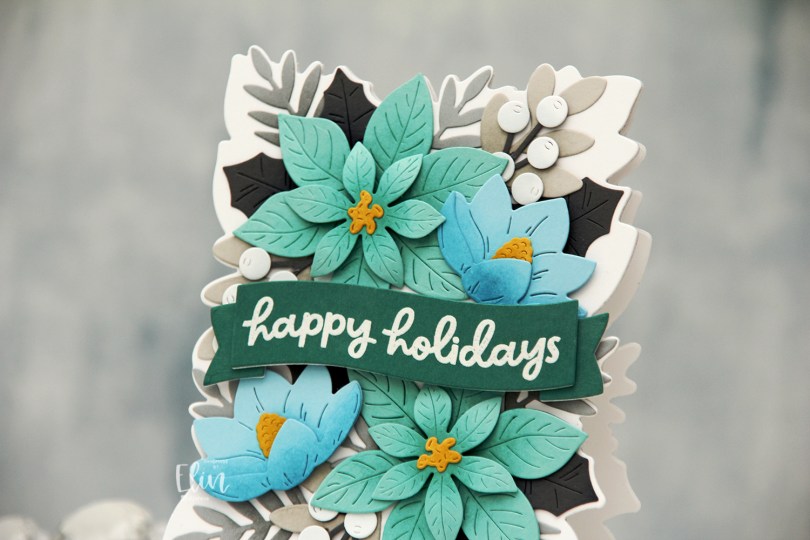
 This die set is massive, there are 18 dies to cut out everything I’ve used on this card. Included in the die set is also a large die that leaves a faux stitch outline of this arrangement. I didn’t use that for this card, but I’ve used all the other dies in the set.
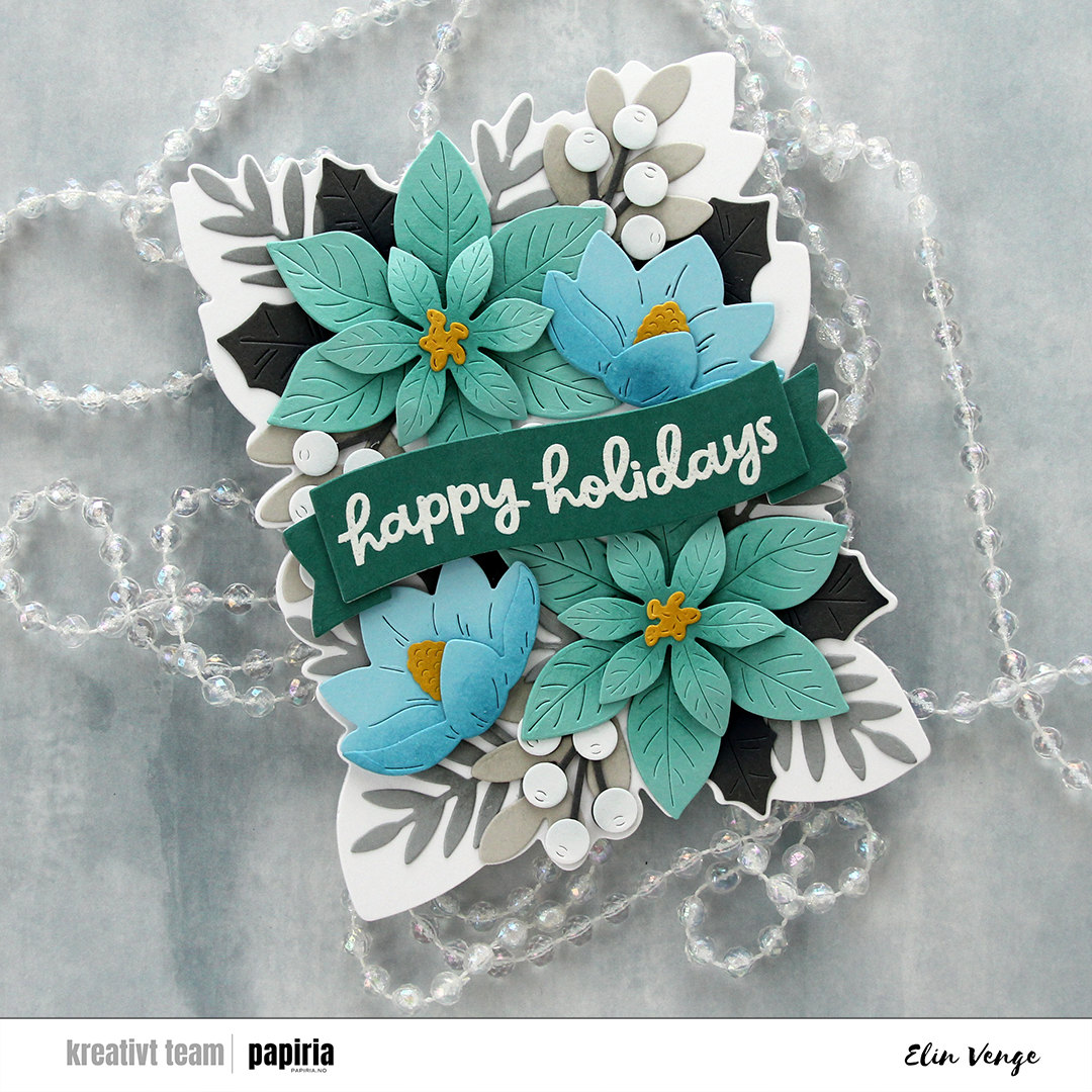 I used the outline die in the die set to cut my card base from Stamper’s Select White cardstock from Papertrey Ink. I folded half a sheet (4 1/4 x 11″) and did partial die cutting, so the top of the die wouldn’t cut. I then adhered a white panel I cut with the same die and then arranged my florals on top. I glued some pieces flat down and added others with diemension behind them.
 I stamped and white heat embossed a sentiment from the Festive Blooms stamp set onto Juniper cardstock, die cut it into a banner and added a couple of white die cuts behind it for strength and dimension, before popping it up on foam tape in the center of the card.
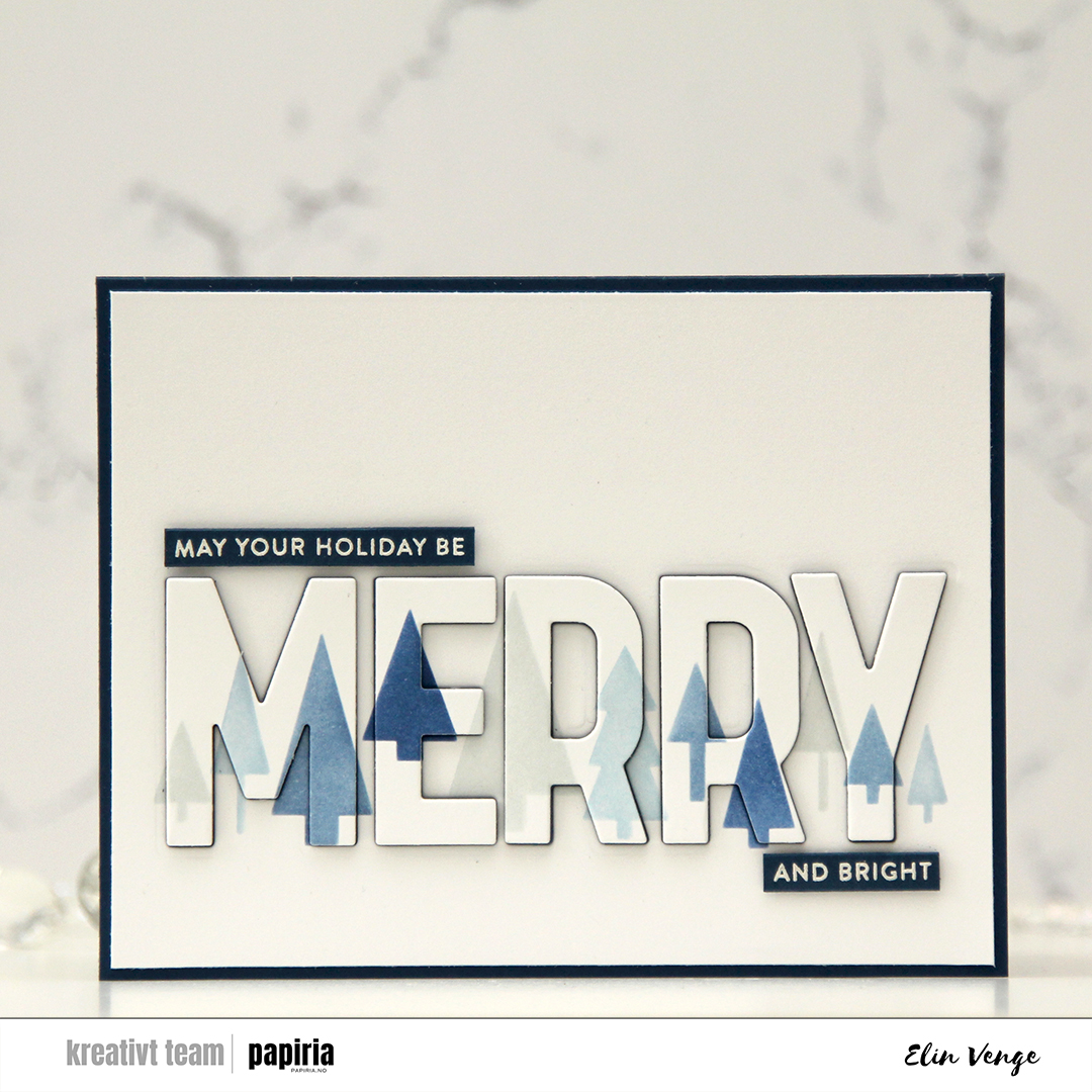 I wanted to create a blue Christmas card. Blue’s my jam, and I had this idea as soon as I saw the release. I started with the Merry Trees stencil set, which is a set of two stencils that creates a line of trees. Each of the stencils has two “layers”, and if you layer all four you have the full line of trees in up to four colors. I used the Northern Shore family of Fresh dye inks from Altenew for my stenciling, it’s a great blue family of inks.
 Using the Merry Trees die set, I took the big MERRY die and die cut it straight out of my ink blended trees. I also die cut an additional four layers of using After Midnight cardstock from My Favorite Things. I cut off a little on each side of the white panel, adhered it to a card base in that same dark blue color and puzzle pieced the letters back in. The fact that they’re stacked with a dark color makes the word easier to read than if I’d used white to stack.
 I white heat embossed a couple of sentiments from the Merry Greetings builder stamp set onto After midnight cardstock and cut them down to sentiment strips using the Merry Greetings builder die set. I usually use a steel ruler and craft knife to create my sentiment strips, but there’s something about the roundness of the edge that you get by using a die. I added a few more strips of cardstock behind each of the sentiment strips for dimension and placed them above and below the die cut MERRY to complete the sentiment.
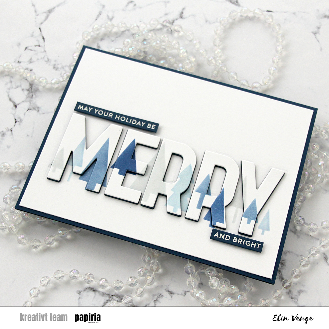 I decided not to use any embellishments on this card. Sometimes I feel like the colors and cardstock do all the work for me, and I love how this one turned out.
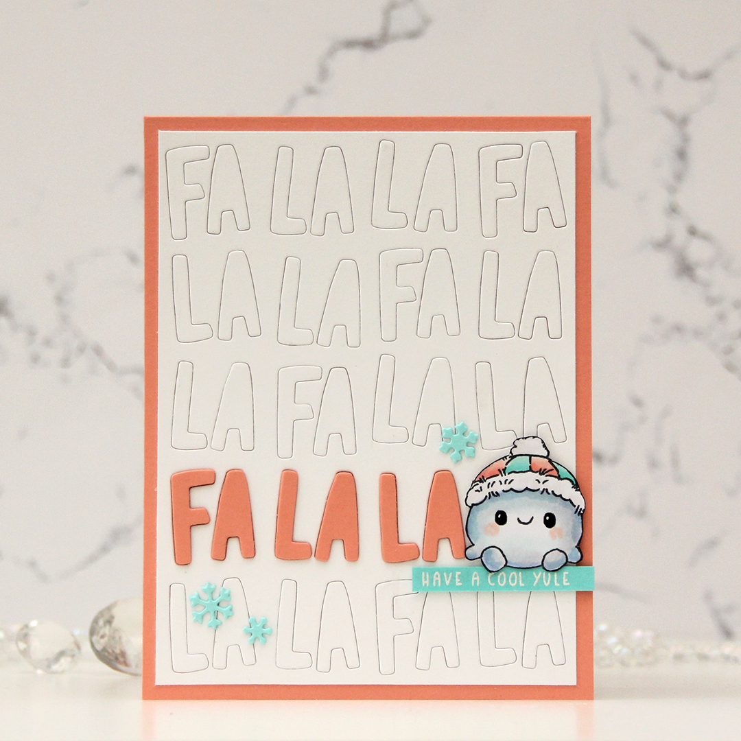 I colored the little snowball with Copics and fussy cut him, adding a touch of black glaze pen to his eyes to make them shiny, and then a tiny white dot of Gelly Roll 05 once the black was dry. I used the Fa la la inlay die from Concord & 9th and die cut a white panel. I trimmed off a little on each side and glued it to a card base I created from Grapefruit cardstock from Concord & 9th, inlaying the white letters back into place. I cut a few in the grapefruit color, stacked them and emphasized one line in the background using this color, which left just enough room on the right for the snowman to sit on some foam tape.
 I stamped and white heat embossed a sentiment from the older Christmas Greetings stamp set from Lili of the Valley onto a piece of Aqua Sky cardstock from Concord & 9th. The cardstock color was a little bit light for the white letters, so I ink blended on top using Aqua Sky ink to make the sentiment more visible. The exposure in the photo makes it lighter than it is in real life, it’s actually very easy to read it in person. I used the Snowflake Confetti Fancy die from Hero Arts to die cut small snowflakes from Aqua Sky cardstock. I stacked two of each for a tiny bit of dimension and used them as embellishments on the card.
 Very limited color palette for this one.