
Hi, crafty friends! Sometimes you need a big hug, and this Hugs image featuring Elliot & Marcel from Purple Onion Designs is the perfect one to use.
 I actually decided to watercolor this one with my Zig Clean Color Real Brush markers. I prefer using a paintbrush with water with these, but there’s also a blender that you can use. Marcel is small, but I still used three different browns and a pink for him (064 Oatmeal, 607 Milk Tea, 068 Deep Brown and 200 S. Almond Pink). For Elliot and the die cut letters I used 312 Overcast Sky only. I did use a little pink for the bow on his tail, but for the actual elephant, it was just the one blue. I love the movement you get with watercolor, it’s something you can’t really achieve with Copics.
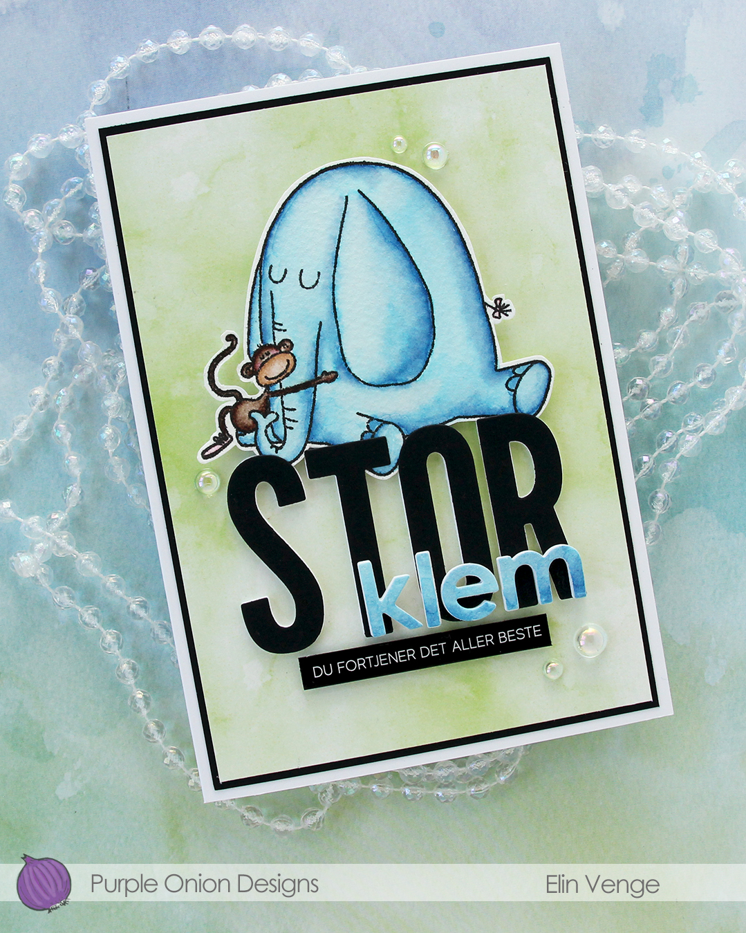 I fussy cut my image, leaving a thin white border. Using the Impact Alphabet die set from My Favorite Things, I die cut the letters to spell out STOR (big) four times from white cardstock and once from Black cardstock from Concord & 9th. I used the Parker lowercase alphabet die set from Memory Box to die cut the letters for klem (hug), again four layers of white, this time topped by a layer of the watercolor paper.
 I stacked my layers, and sandwiched the image between the white and black letters for the large word. I created a black mat on the card front, covered that with a piece of green patterned paper from the Watercolor Wash 6×6″ paper pad from My Favorite Things and mounted the letters and image in the center. I adhered the klem letters directly on top of the larger letters and added a sub sentiment sticker strip from Kort & Godt below it. I popped it up a bit to level it with the black letters, before finishing off with a few dew drops from the Spring Leaves embellishment mix from Little Things from Lucy’s Cards.
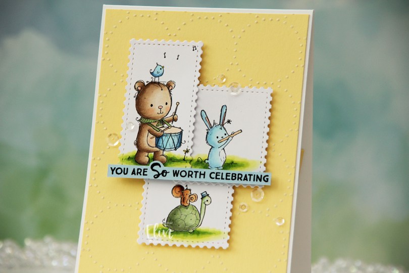
 I colored the images with Copics, then used the Postage Collage die from Waffle Flower to create stamps.
 I added Solar Paste in the Golden Hour color onto Lemon Tart cardstock from Papertrey Ink using the Merry Go Round stencil from Memory Box. I wanted a little bit of interest in the background, but nothing too distracting, and this worked really well. I added the panel to a top fold white card base I created from Stamper’s Select White cardstock from Papertrey Ink.
 I added scraps of cardstock behind my die cuts to give them a little lift off my card and adhered them pretty much in the center of the card.
 I stamped a sentiment from the Anything-but Basic Birthday Wishes stamp set from My Favorite Things onto Spring Rain cardstock from Papertrey Ink using Obsidian ink from Altenew. I cut the sentiment down to a strip and added a few layers of cardstock behind it before adhering it to the card.
 I finished off with a few sequins from the White Orchid Sequin mix from Little Things from Lucy’s Cards.
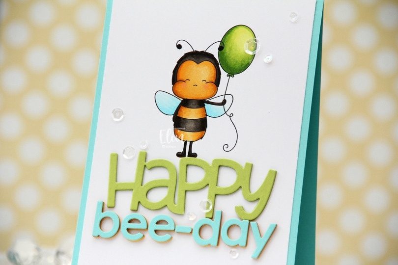
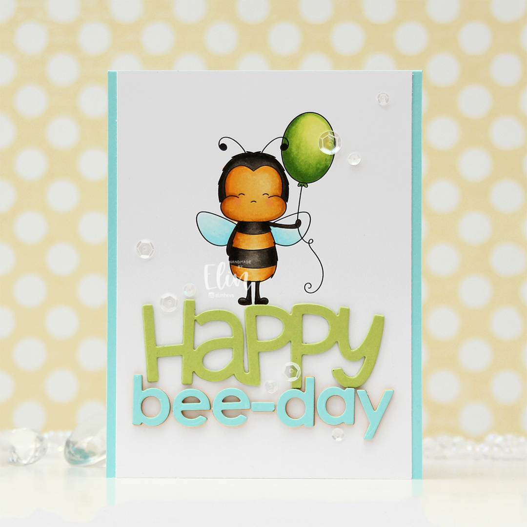 I knew I wanted a large sentiment for this card, so I printed the bee pretty much top center of a quarter sheet of X-Press It blending card, which is my preferred cardstock for Copic coloring. I’ve been using it since 2012, and in my mind, there’s no better cardstock for Copics, so it’s pretty much all I use. I colored the image with my Copics and cut off a little bit on each side of the panel before adhering it to a top fold card base I created from Summer Splash cardstock from My Favorite Things.
 I die cut HAPPY from the Big Happy Holidays die from Mama Elephant three times from Sour Apple cardstock from My Favorite Things, stacked them for a dimensional look and adhered the stacked die cut right beneath the bee’s feet. Using the Parker alphabet die set from Memory Box, I die cut the letters to spell bee-day, using an exclamation point that I trimmed down a little to create a hyphen. This word is actually multi-colored. That was not my intention, but I wasn’t happy with the color I chose initially, which was Bright Buttercup from Papertrey Ink. It’s a great color, but it wasn’t the right yellow to match my colored bee. On top of three die cuts of that, I added a layer of Honey Nut cardstock, also from Papertrey Ink. It matched my bee, but it was a little too brown for my taste, and my card felt sad. I didn’t want a sad birthday card, so I topped it with a layer of Summer Splash cardstock from My Favorite Things, which is what I used for the card base. I was much happier with this, and it matches the wings nicely.
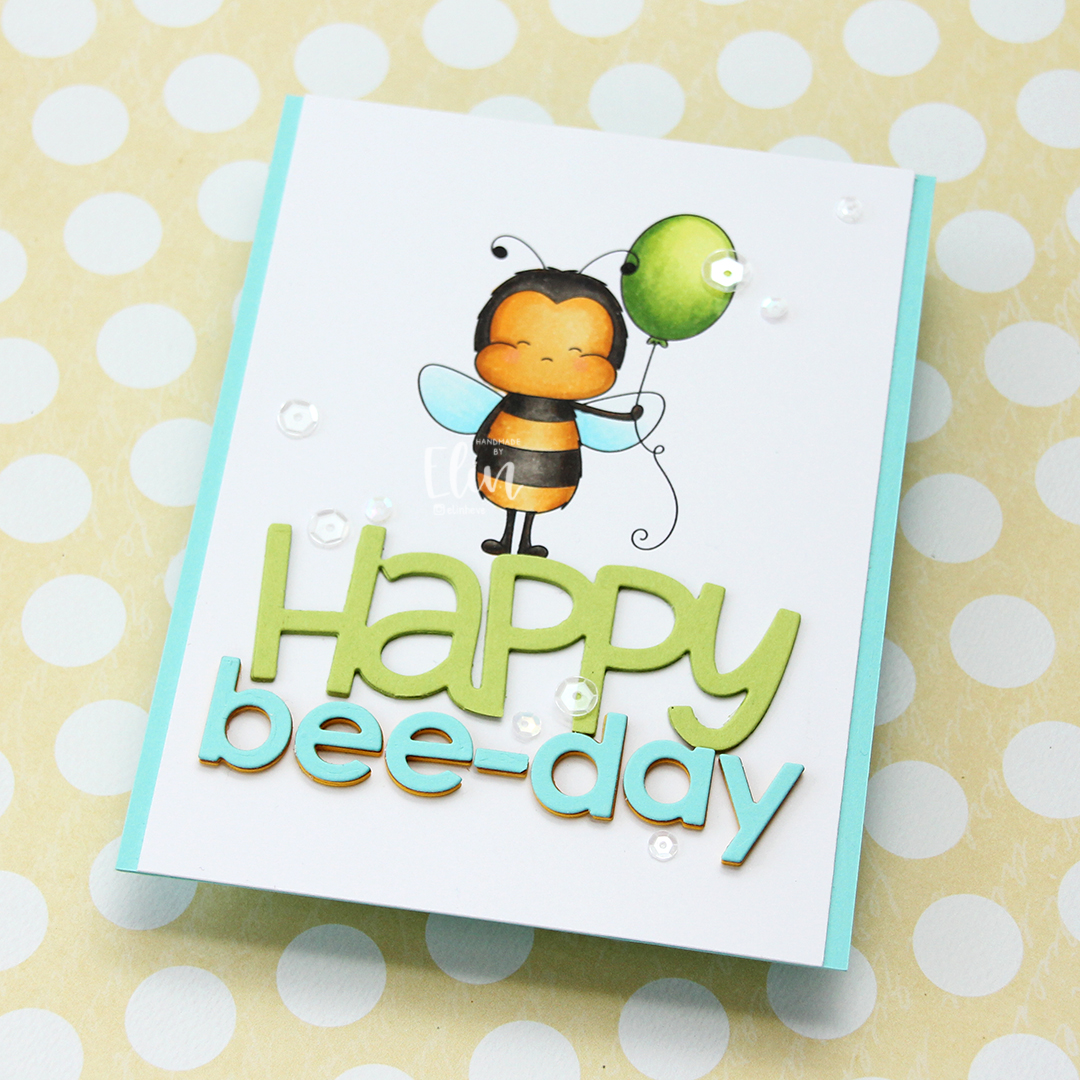 To finish off the card I added a few sequins from the Starry Night mix from Little Things from Lucy’s Cards. Here you can also see the multi-colored letters in the word bee-day, which adds another layer of interest to this fairly simple card.
 Simple color palette for this one.
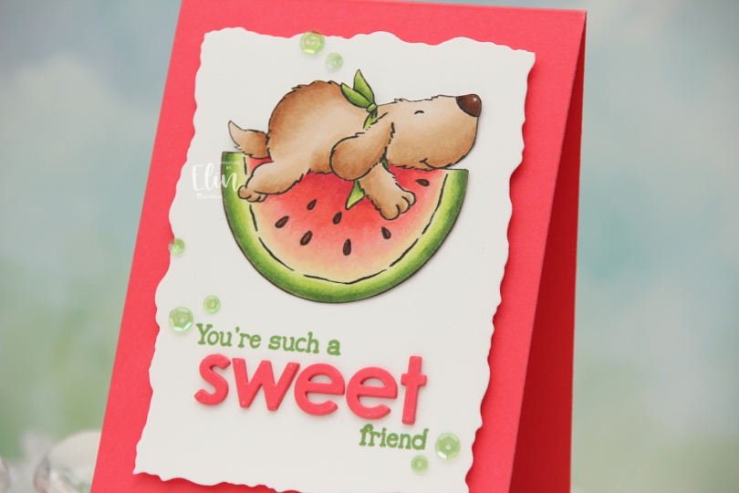
 I colored the image with Copics, fussy cut right up against the black lines and put the image aside while I worked on the rest of my card. I used the second largest die in the Watercolor Rectangle STAX die set from My Favorite Things to cut my white panel down with a fun border. I also used a small circle die to cut a hole behind where I wanted the image to go, as this is a pendulum card. The watermelon rocks back and forth when you tilt the card, which adds a fun element to an otherwise simple design. I stamped part of the sentiment from the
 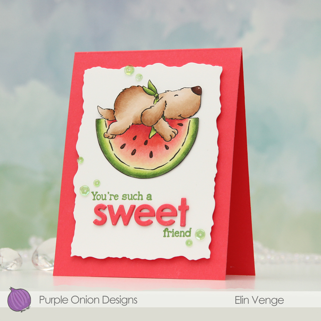 I used a strip of acetate with a washer at one end to create my pendulum mechanism. On the other end of the acetate strip, I added a button. I lined up my acetate piece on the back of my white die cut panel so the button would go through the hole and adhered the image to the button using liquid glue. I put foam tape on the back of the panel, making sure to leave enough open space for the pendulum to swing freely, then adhered everything to a top fold note card I created from Fire Coral cardstock from My Favorite Things, which is the same color cardstock that I used for the die cut letters. To finish off the card, I added sequins from the Waterfall mix from Little Things from Lucy’s Cards, making sure to place the top ones so Flappy wouldn’t catch when he rocks. Of course, you can’t see him rock in still photos, but if you head to my post on
  Simple color palette for this one.


 Very simple color palette for this one.
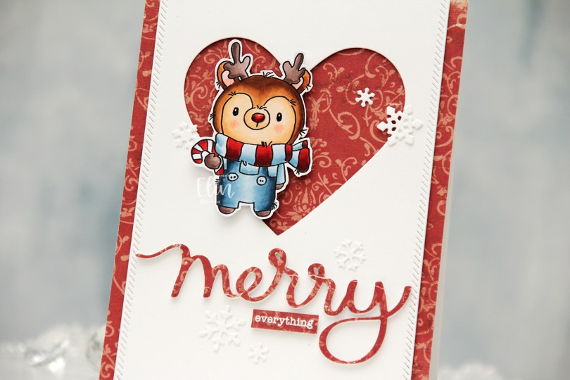
 I colored my reindeer with Copics, added black Glaze to his eyes for shine, a white dot on top with a Gelly Roll 05 once the black was dry and also a thick layer of Glossy Accents to his nose for dimension as well as shine. I fussy cut him leaving a white border and proceeded to work on the rest of my card.
 I covered a card base with the Julhälsningar sheet from the Vintage Winter collection from Maja Design. This has a little bit of pattern to it, but not so much that it’s too distracting. I created a window in a white panel using a heart die from Papirdesign, then used one of the dies in the Stitched Borders die set from Lawn Fawn to create a little bit of interest to the sides, before adhering the panel with foam tape to the center of the card front.
 Using the Merry Script die from Mama Elephant, I die cut three layers from white cardstock and one from the patterned paper to adhere on top. I stacked the four together and adhered my die cut to the card. I white heat embossed a sub sentiment from the Holiday messages stamp set from Mama Elephant onto a scrap piece of patterned paper and trimmed it down to a strip, before I added a few layers of cardstock behind it for dimension and adhered it below my die cut word.
 I mounted the reindeer on foam tape offset in the heart opening and added die cut snow flakes here and there. Some I created with the Snowflake Confetti Fancy die from Hero Arts, some are made with the Stitched Let It Snow Circle Frame die set from Memory Box, which includes a die that cuts three individual snowflakes (which is what I used).
 This card has a lot of texture and dimension, and the shine on Rudolph’s nose is the perfect detail to draw attention to him!
 I colored my penguin mug with Copics and fussy cut the image right up against the black stamped lines. This image doesn’t have a whole lot of the whispy, perpendicular lines that are so characteristic of Lili of the Valley images, which was the reason I opted not to include a white trim around the edges. There are 3 or 4 lines at the top of his head that I had to cut off, but I was okay with that. I stamped some snowflakes onto a card base using Spring Rain ink from Papertrey Ink. The snowflakes are from an old Tim Holtz stamp set. I mounted the mug on foam tape near the bottom right of the card.
 I die cut a few snowflakes using a couple of die sets from Memory Box. The one at the top, that is partially hidden behind the penguin and speech bubble is from the Stitched Let It Snow Circle Frame die set. The die set comes with a stitched snowflake circle frame and three individual snowflake dies. The snowflakes with the stitching detail are from the Twilight Snowflakes die set. I added some blue diamonds from Kort & Godt to the mug, as well as a heart from the Festivities mix from Little Things from Lucy’s Cards. I stamped a couple of sentiments from the Holiday messages stamp set from Mama Elephant using Lazy Days ink from My Favorite Things and die cut them into speech bubbles using the Say Anything die set from My Favorite Things. I stacked a couple of additional white die cuts behind the speech bubbles for dimension.
 Simple color palette for this one, and I realize now that I forgot to jot down the blue Copics I used for this, but I believe they are B93, B91 and B90, which is a color I’ve made myself.
 This week is Designer Week at Lili of the Valley! This means you can save 20% on any item on
 For this card I paired
 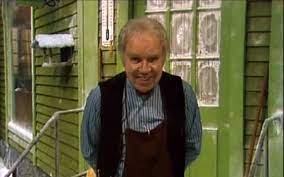 This is why! This image, taken from a TV advent calendar, is of the fictional character Skomaker Jens Petrus Andersen. He was the protagonist in this advent calendar and he lived (and had his shoe repair business) in this green house. If you’ve grown up in Norway after the ’70s (but before 2010), you undoubtedly know this character and this very green house. I get nostalgic just looking at the photo.
 Back to the card. Once my coloring was done, I added my panel to a card base I created from Cornflower cardstock from My Favorite Things. I used the Stitched Happy Birthday rectangle die from Memory Box to die cut the word happy. The die cuts a rectangle with the words happy birthday inside, but I wanted the word happy for my card and cut it away from the rest. I stacked a few for strength and dimension and adhered it to the roof of the train station, adding a white heat embossed sub sentiment from the
  Lots of Copics for this one.
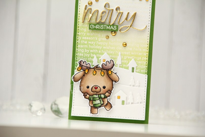
 I colored my reindeer with Copics and fussy cut him leaving a thin white border. I added Glossy Accents to the string of lights and his nose for shine, and used a black Glaze pen and a white Gelly Roll 05 for his eyes.
 I stamped and white heat embossed the Christmas Background stamp from My Favorite Things on a piece of white cardstock, before using Hunter Green, Forest Glades and Frayed Leaf inks from Altenew, as well as Squeezed Lemonade Distress ink, to ink blend on top. I ten used a die in the Stitched Mini Slimline STAX die set from My Favorite Things to turn it into a nice panel that would fit my card. I used the Country Landscape die from Memory Box to die cut the landscape in the background, and used the same stitching die on the hilly die cuts for a continuous stitching border across the card. I die cut the windows from Buttercup cardstock from Concord & 9th and the doors from white cardstock from Papertrey Ink that I ink blended with the same colors I used for the ink blending in the background.
 I used the Snow Globe Accessories die set from My Favorite Things to die cut the string of lights from a dark gray cardstock and the individual bulbs from Buttercup cardstock once again. I added Glossy Accents on top of the bulbs for extra shine and dimension.
 I die cut the word merry from the Merry Christmas die set from My Favorite Things five times from white cardstock, and once from Gold shine cardstock from My Favorite Things. I stacked them, adding the gold on top, and adhered my chunky die cut to the card. I stamped and white heat embossed a sentiment from the
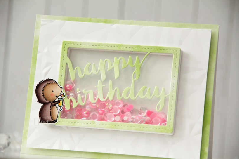
 I stamped Mimi using Extreme Black ink from My Favorite Things, colored her with Copics and stamped on top using Obsidian ink from Altenew, which is a super crisp pigment ink that doesn’t play well with alcohol markers, but is perfect for stamping at the end after the coloring’s done. I fussy cut her leaving a white trim, and put her to the side while I worked on the rest of the card.
 I chose one of the green papers in the Watercolor Wash 6×6″ paper pad from My Favorite Things to cover the front of a landscape oriented top fold A2 card base I created from Stamper’s Select White cardstock from Papertrey Ink. I cut down a white piece of cardstock and created texture using the Crystal Distortion embossing folder from Simon Says Stamp, before mounting the panel in the center of the card front using lots of foam tape.
 I then used the Stitched Happy Birthday Rectangle die from Memory Box to die cut once from the green patterned paper I’d already used and 10 or 11 times (I lost count) from white cardstock to create a shaker well. I cut the words out of the white frames, stacked them, added acetate to the back of my layered frame and adhered it in the center of the card. I then filled the shaker well with the Candy mix from Little Things from Lucy’s Cards. This mix has pearls, little flower shapes, sequins without holes, some hearts and raindrops. I topped it with another piece of acetate, then adhered the patterned paper die cut on top.
 By creating the well from so many layers of cardstock, my little embellishment mix has a lot of room to shake around. A few of the pieces in there are quite large, and I didn’t want any of them getting stuck.
 I added Mimi to the side of the frame. I put three layers of foam tape behind her for dimension, so she’d be level with the frame. This card has a lot of dimension, it’s almost 1/2″ at its thickest.
 Simple color palette for Mimi, she’s pretty quick to color.