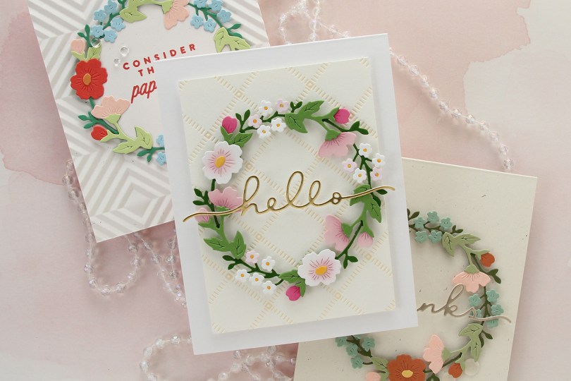
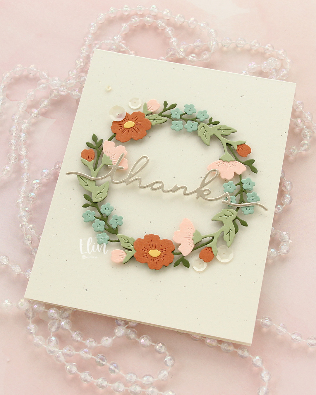
Hi, crafty friends! It’s a well known fact that I love to color. However, after having been on a couple of design team where coloring has not been my focus (thank you Kort & Godt and Papiria), I’ve grown very fond of cards with loads of die cutting. Today I’m sharing three same, but different cards featuring lots of die cut pieces. I have a stamped sentiment on one of the cards and have done a tiny bit of ink blending on another, but it’s mostly die cutting, and I’m here for it.
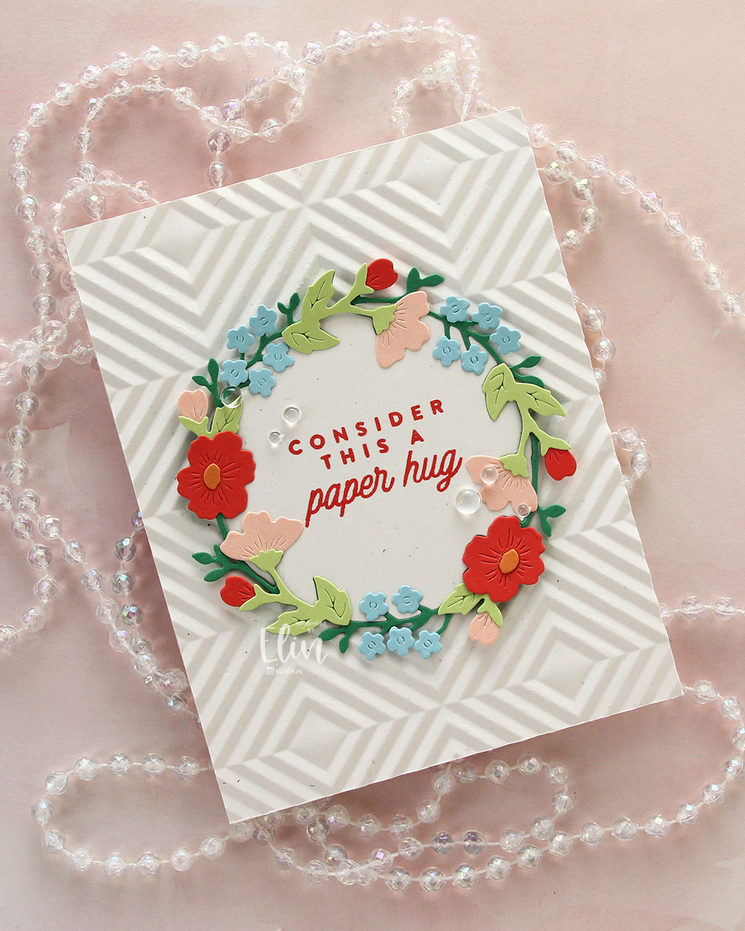 I’m also here for the Briar & Blooms die set from Concord & 9th, which honestly did most of the work on these cards. For this first card, I took my inspiration for the colors from the Summer Breeze color palette on the Concord & 9th website. They’ve got some great color resources, and this particular palette consists of Nectar, Pimento, Clementine, Clover and Harbor. I also threw in Sprout for a second green. I die cut the base of the wreath from Clover, and the remaining pieces from the other colors. I also die cut one base wreath from Rustic White cardstock from Papertrey Ink, but I only needed the inside negative part of that to stamp my sentiment on.
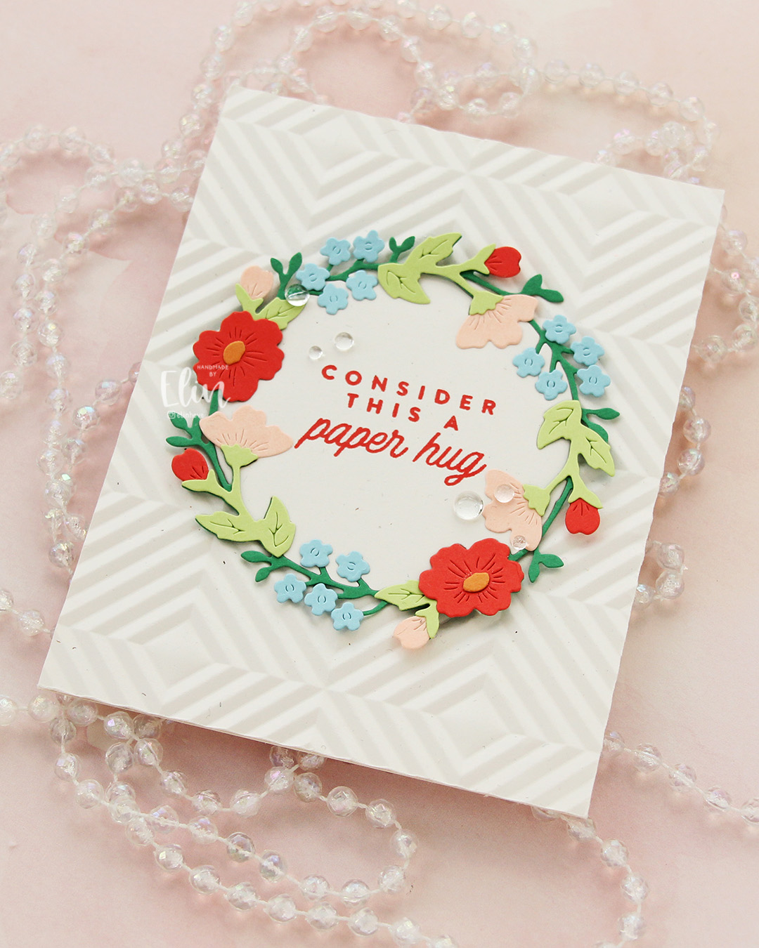 I used the Quilted embossing folder from Concord & 9th to create some texture behind the wreath. This embossing folder is a great one, but it was part of the 2025 Winter Retreat and is not available for purchase. Thankfully, there are other embossing folders out there which will work just as well to create some interest in the background. I adhered the embossed panel to a card base I created from the same Rustic White cardstock. I stamped a sentiment from the Flower Field stamp set from Kristina Werner using Pimento ink on that negative inside piece I’d already die cut. I adhered it in the center of the card and puzzle pieced the actual wreath around it, adding small pieces of foam tape to the outside edges of the wreath only. I finished off the card with a few Concord & 9th dew drops flanking the sentiment.
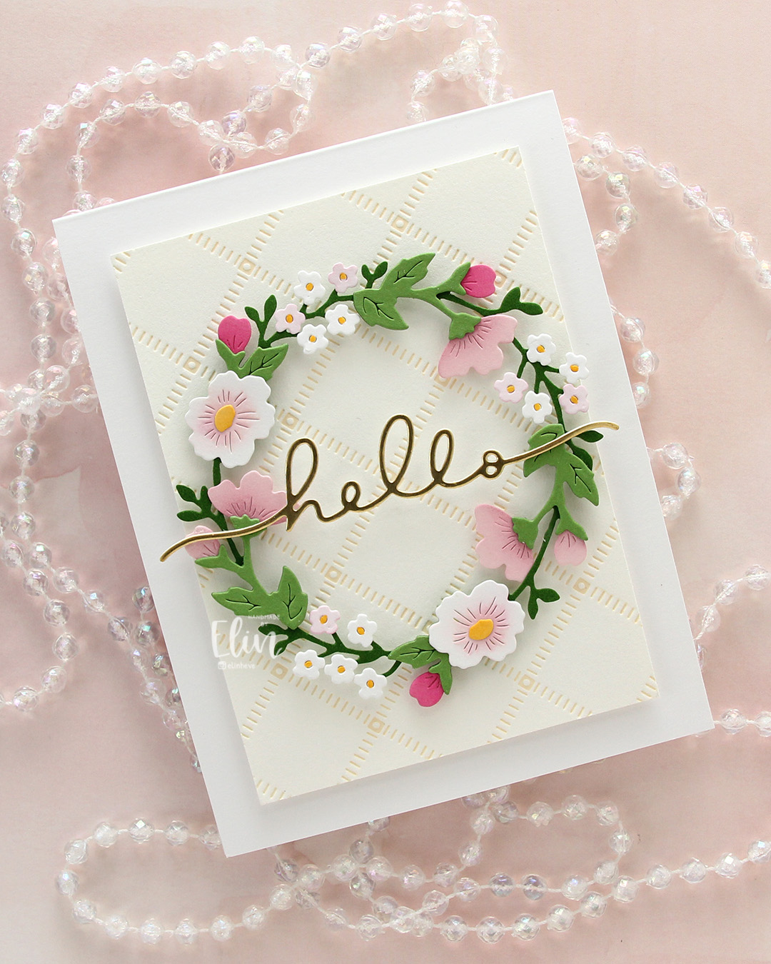
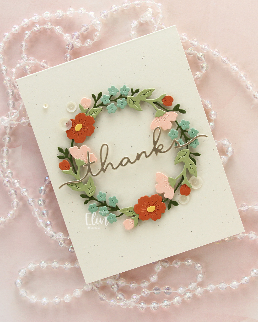 The first card was so much fun to create, I decided to make another. The example picture on the packaging for the die set is beautiful in soft, very muted tones, and I tried to pick colors that were close. Here, I used Artichoke for the base wreath, Pistachio for the remaining greenery, Spiced Cider for the large flowers and a few of the buds, Nectar for the remaining buds and the side facing flowers and finally Eucalyptus for the small flowers. Oh, I also used Buttercup for the flower centers. This is definitely a more muted palette than the first, it has a bit of a fall vibe to me.
 I leaned into the fall vibe and chose to mount my wreath on a card base I created from Rustic Cream cardstock from Papertrey Ink. This is also very muted, and I love the little specks that are in the paper, creating a bit of interest. I die cut the word thanks in the Briar & Blooms die set from Champagne cardstock (also Concord & 9th), backed it with a layer of Rustic Cream and adhered it across the center of the wreath, before finishing off the card with some Satin White sequins from Altenew.
 While I was working on card number two, I came up with the idea to create one more wreath in a “blossoming fruit tree” color combination. The fruit trees have just started blooming, and it’s the best thing ever. We have a blood cherry tree outside our front door that started blooming over the weekend. The apple trees (which my color combo is based on) have not started blooming quite yet, but they’re not far behind – I love this time of year! Anyway, back to the card. I don’t have the new Basil green yet from Concord & 9th (other than a small sample that was in this year’s Winter Retreat kit, which I turned into a swatch tag), but when you ink blend Parsley ink on Parsley cardstock, you get a darker color that works well. I did that, then die cut the base wreath from the dark version and die cut the rest of the greenery from plain Parsley. Once again, I used Buttercup for the centers, but I switched out the Nectar I used on the previous two cards for Ballet Slipper, which I thought worked better here. I also slipped in Sweet Pea for a few of the buds for a little more pop of color.
On the base of the Sweet Pea buds, I ink blended with Sweet Pea ink. On the large open white flowers, I ink blended with Ballet Slipper, adding a touch of Carnation (RIP – I’m sad to see this color leave the C9 color spectrum) in the very center. I also used Carnation for the Ballet Slipper buds and side facing flowers, and I used whatever pink ink was left on my brush on a few of the tiny white die cut flowers. For those I used a Y19 Copic marker in the center. It’s a good match for the Buttercup cardstock, and those centers are too small to ink blend. I used the very tip of the marker, no more was needed.
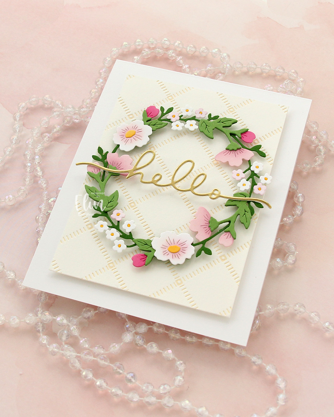 I loved the soft color palette so much that I wanted a soft look in the background, too. I opted for the Stippled Plaid press plate from Pinkfresh Studio and inked that up on a piece of Betterpress Bisque cardstock using Peachy Glow ink from Altenew. The soft yellow ink acts as a neutral on the cream cardstock, which in turn is a neutral on the Stamper’s Select White cardstock from Papertrey Ink that I used for my card base. I popped everything up on foam tape, then die cut the word hello once from white cardstock and once from Gold Shine cardstock from My Favorite Things. I stacked the two and stretched my hello across the center of the wreath. I tried to add a few different embellishments, but in the end, I decided not to use any – and honestly, I think this card looks great without it!
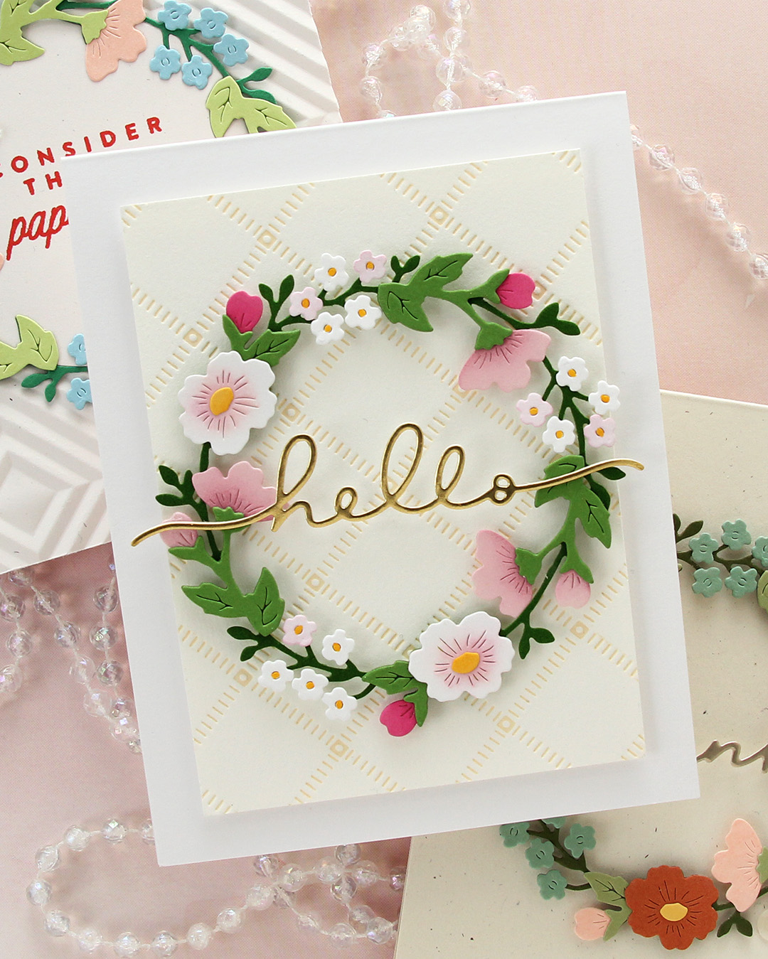
In the end, the apple tree color combo version wound up being my favorite of the three. What do you think? Maybe you have another favorite?
