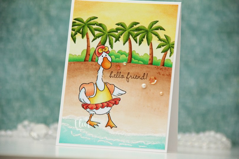
Hi, crafty friends! There’s a new release out today from Purple Onion Designs. The Sunshine & Daydreams collection is a beautiful summer collection illustrated by Pei. It consists of 12 images, and there’s also a sentiment set and a few individual sentiments available. These images are so awesome and as always, the images from Pei are a blast to work with.
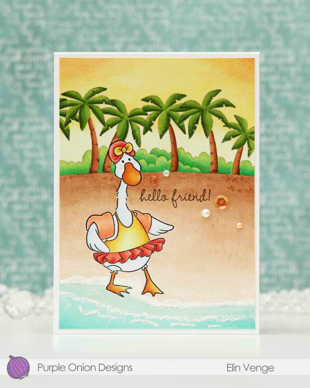
For this card, I started by stamping the goose from the Swim buddies set (there’s also a pig in the same set) in Extreme Black ink from My Favorite Things. I masked the goose before stamping the Beachscape background stamp using Classic Kraft ink from Papertrey Ink for a soft look.
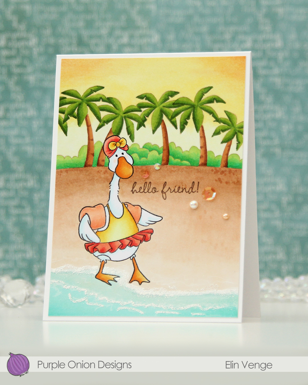
I colored the panel with Copics, and I made sure to have the feet barely touch the water, making it look like the goose is testing the temperature of the water. Quite a timid one, this one, the exact opposite of the pig in the same set, which is so much fun!
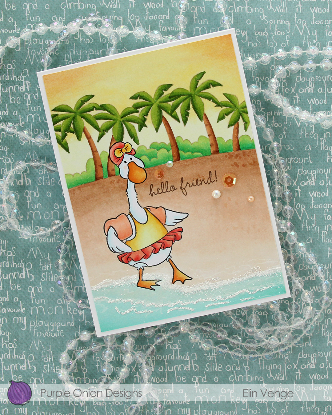 I added White puff embossing powder from Wow! for a seafoam look near the bottom of my panel and stamped a sentiment from the much older Sweet Summer sentiment set using Memento Rich Cocoa ink. I wanted to add a sentiment from the new sentiment set, but my panel was too small for all of them. This older one was the perfect size for this smaller 4 Bar card size.
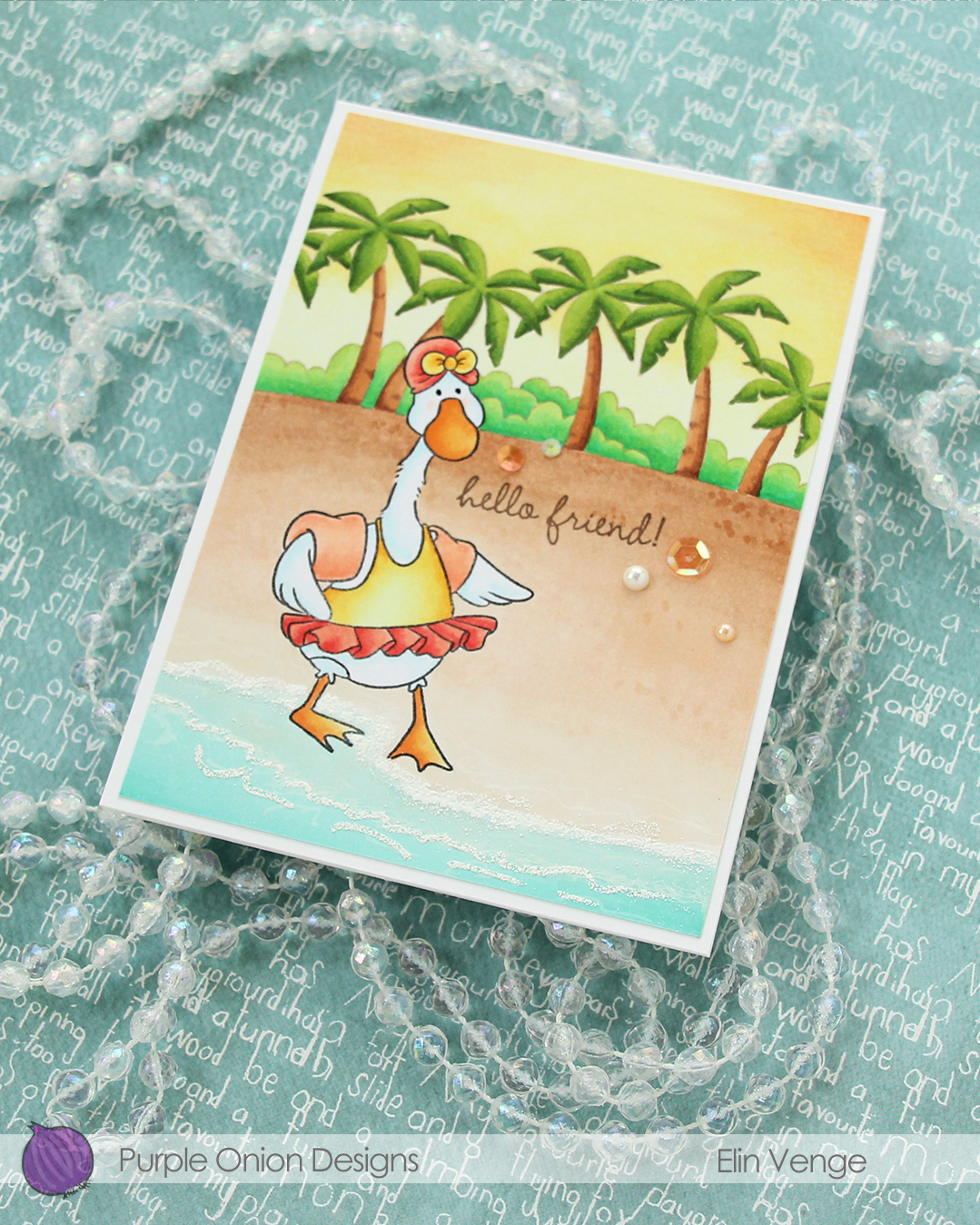 To finish off the card, I added a few sequins, gems and pearls from the Melon embellishment mix from Little Things from Lucy’s Cards.
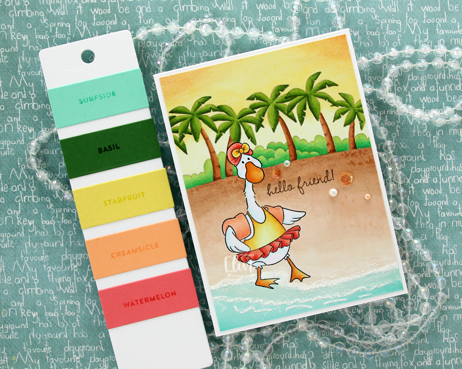 This Tropic color combination from Concord & 9th was my inspiration for this card.
For a limited time, the entire Sunshine & Daydreams collection is available as a discounted bundle. The discount for the bundle is over 30 %, so if you love Pei’s work as much I do, it’s available until June 24th 2026.
