Hi, crafty friends! Two weeks ago, I was a camper in Concord & 9th’s summer camp, which is a virtual event they hold every year. If you’ve never participated, I highly recommend it, it’s so much fun! There are six awesome instructors teaching one class each, and the products the C9 design team comes up with are equally amazing, you get a lot of bang for your buck. It’s hard to pick a favorite bundle from the camp kit, but the Summer Sips bundle is the one I’ve had time to play with after camp, and I have a fun card to share today featuring that entire bundle (die set, stamp set and stencil set for this particular one).
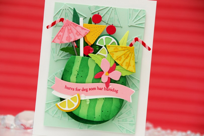
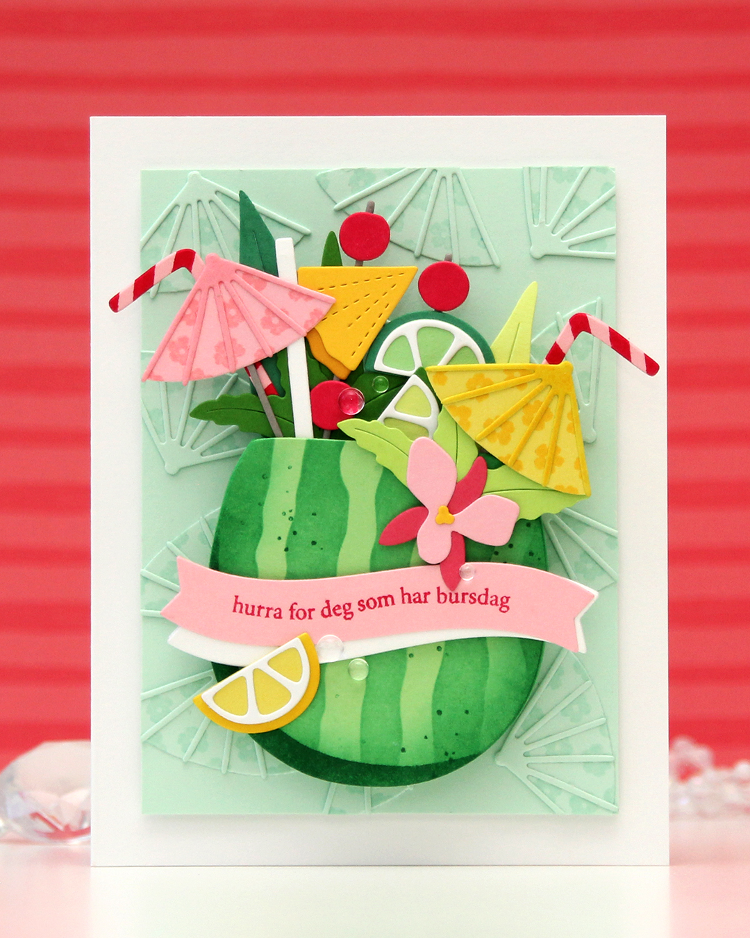 I needed a birthday card for my niece’s 16th birthday. She’s a lover of tropical fruits, and this was the perfect set to use for her birthday card. I die cut the watermelon from Vintage Jadeite cardstock from Papertrey Ink and used the stencil set to in blend the stripes on the watermelon rind using Clover ink from Concord & 9th. I stamped the spots in the coordinating stamp set using the same color. I die cut a few extra watermelons from Vintage Jadeite. I knew I was going to pop up my watermelon on an action wobble (I actually ended up using two wobbles), so it needed to be sturdy.
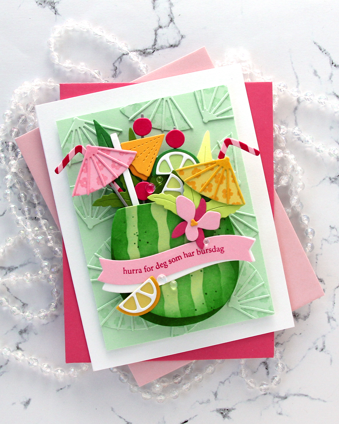
All the dies and stamps (except for the sentiment stamp I used) are in the Summer Sips bundle from camp. For the background umbrellas, I stamped the flowers from the stamp set in VersaMark ink onto the die cuts, which are die cut from Mint cardstock from Spellbinders. I wanted a tone on tone look in the background, and this worked perfectly. For the yellow umbrella, I stamped with Memento Dandelion ink onto a Starfruit die cut, and for the pink, I used Pink Lemonade ink on a Pink Lemonade die cut. I also used Dandelion ink directly on the caning on the yellow umbrella, as well as for the rind on the lemon at the bottom left. The stripes on the straws are stamped in Berry Kiss ink on Pink Lemonade cardstock.
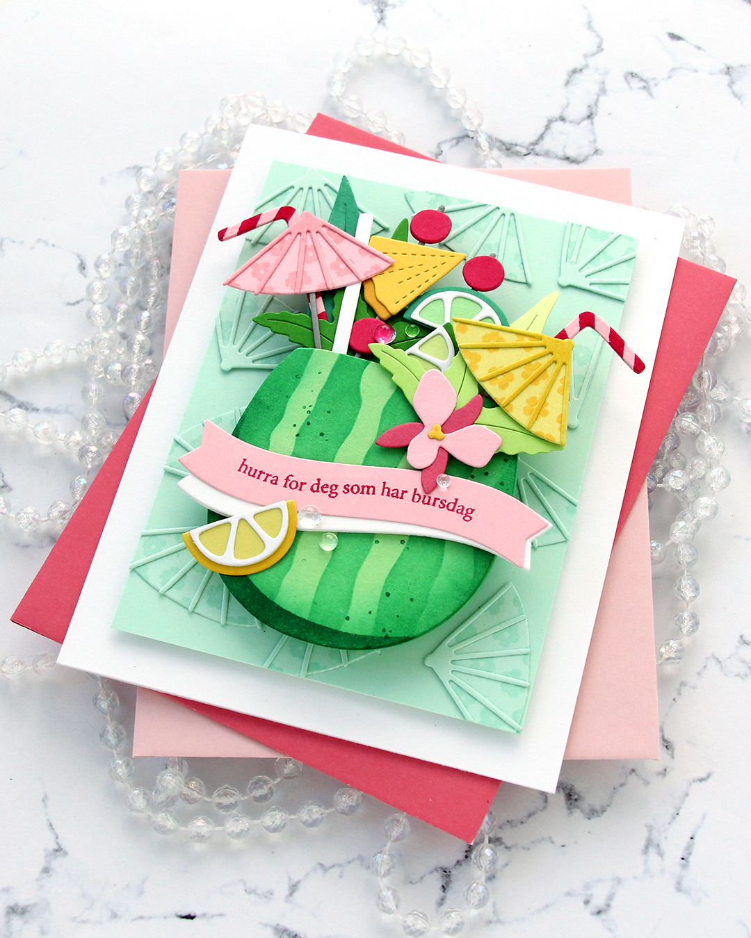
I used colored cardstock from various companies for my die cuts. The greens are Altenew Limeade, Altenew Lime, Altenew Grass Field, Papertrey Ink Vintage Jadeite, Concord & 9th Clover. The grey (there’s only a little bit visible) is Concord & 9th Cobblestone, the light pink is Concord & 9th Pink Lemonade, the darker pink on the orchid is Concord & 9th Honeysuckle, the darkest pink is Concord & 9th Berry Kiss. The yellows are Concord & 9th Starfruit (umbrella and lemon wedgde), Papertrey Ink Bright Buttercup (pineapple and flower center on the orchid) and Spellbinders Tuscan (pineapple rind). I stamped the sentiment from the A06 stamp set from Norsk Stempelblad AS using Berry Kiss ink from Concord & 9th. The stamp itself is a straight line, but I manipulated it in my Misti to curve along the banner die cut. I put a few layers of cardstock behind the yellow umbrella and the orchid for a little bit of lift, and also used three white banner die cuts to give a little lift to the pink banner. To finish off I used a few Concord & 9th dew drops. This card is super dimensional, even when you push down the action wobble springs, it’s about 1/2″ thick.
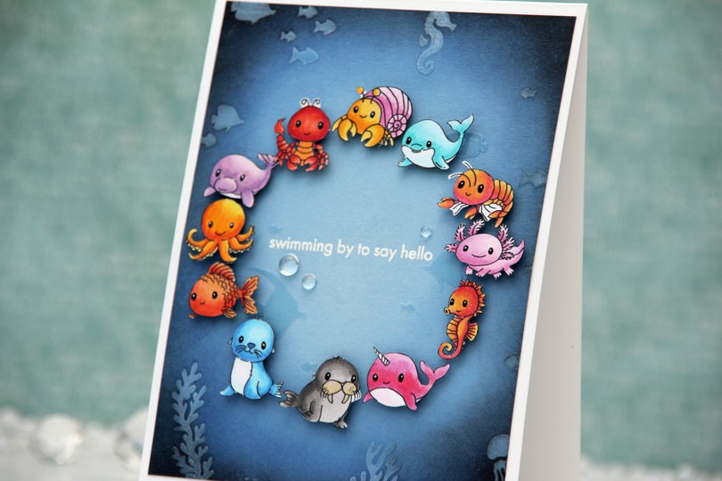
 For this one, I started with a panel of Lazy Day cardstock from My Favorite Things. I used one of the stencils in the Undersea Jamboree stencil set from Altenew to emboss a texture onto my panel. It was very subtle, so I put the stencil back in place and added Crystal 3D gel from Altenew over the top. This gives a fun texture, shine and a very tactile feel to the panel. Once the gel was dry, I cropped down the panel slightly, before inking up the edges with Midnight and Black ink from Concord and 9th to darken my undersea panel. The gel resists the ink I put on, making it easy to buff off the excess.
 I adhered my panel to a top fold white card base I created from Stamper’s Select White cardstock from Papertrey Ink. I arranged my animals in a circle and mounted each on foam tape. I realized after I took the photos that I’ve left a bit of white on a few of the animals, particularly on the shrimp and the lobster, but I colored and fussy cut the images a month before I put the card together and didn’t remember that I’d left the white bits to deal with later. Once they were mounted with foam tape, it was too late to do anything about it, though. Live and learn, I guess.
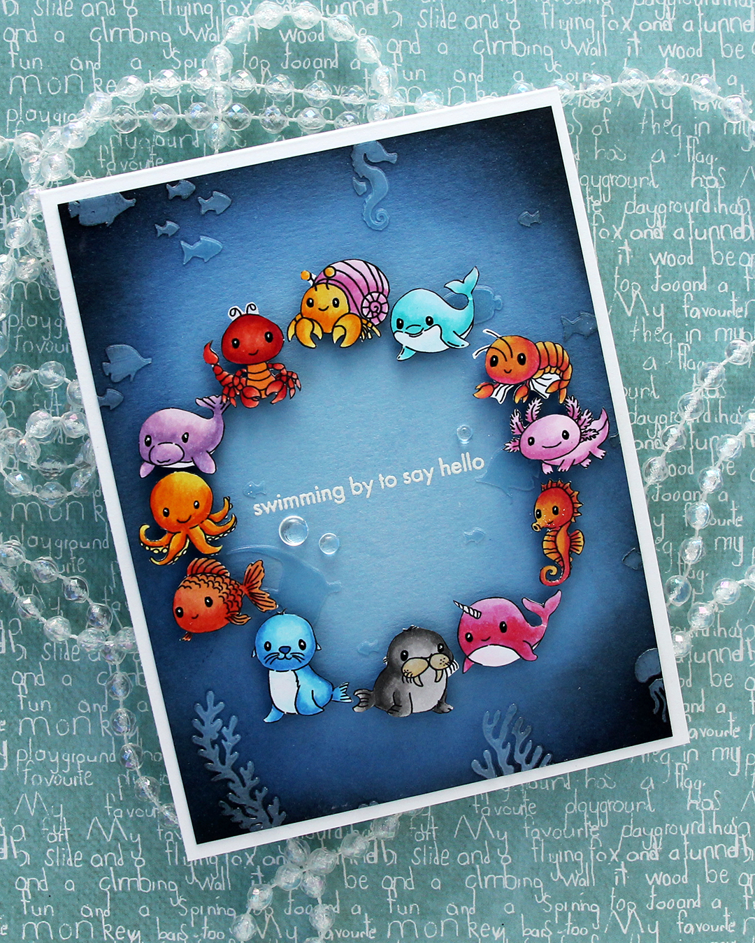 I was originally planning on adding a black strip with a white heat embossed sentiment in the center, but I thought it would look just as good, if not better with the heat embossed sentiment directly on the background. I could use the black strip if the white didn’t work out, right? I only had one chance at this, as the critters were already glued down. I put the panel in my Misti, used lots of antistatic powder and stamped the sentiment from the Coral Reef Wonders stamp set from Altenew using VersaMark ink, before sprinkling on super detailed white embossing powder from Ranger and heat set from the back. I always do my heat embossing from the back, it gives a much smoother result than heat embossing from the front. It turned out perfect, and I didn’t have to resort to plan B with the black sentiment strip.
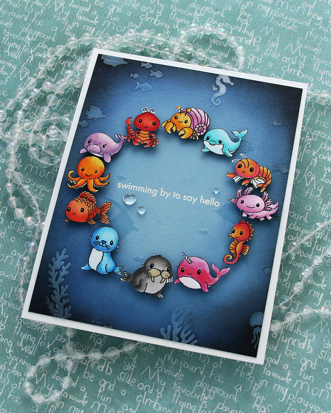 I added a few dew drops from Concord & 9th near the sentiment. They work well as bubbles and they add more shine. I also added black glaze and a white dot with a 05 Gelly Roll to their eyes once the black glaze pen was dry.
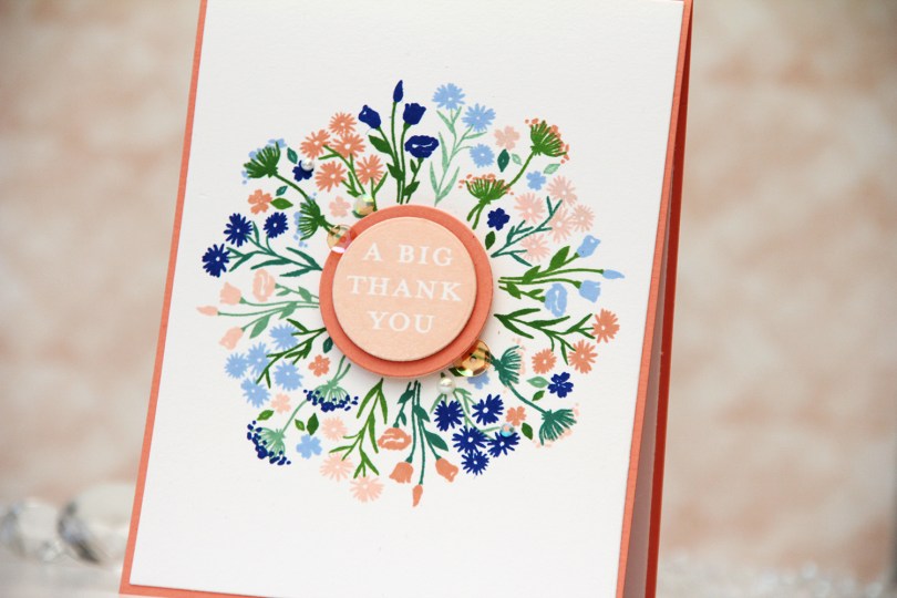
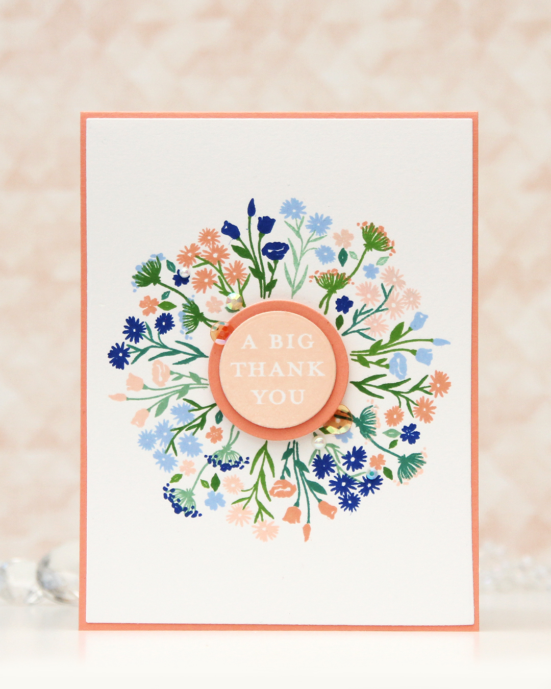 I’ve been made aware that this beautiful peach is my signature color. I kind of thought it would be blue, it’s my favorite color, after all, but I don’t make as many blue cards as I used to. Anyway, peach works with just about everything. It’s great with blue, it works really well with green and it’s also dynamite with pinks and yellows. It’s just a really good color. For this card I teamed it up with blue. More specifically, Capri and Bluebell from Concord & 9th, which were both in the new color release this spring. Capri is the most amazing color!!
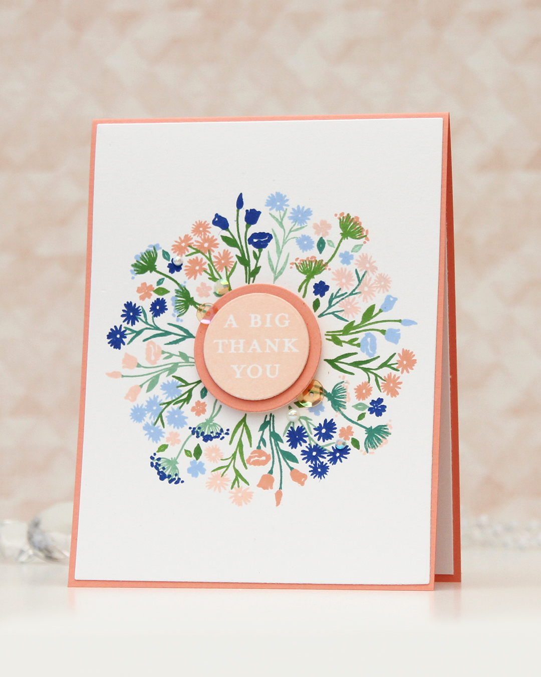
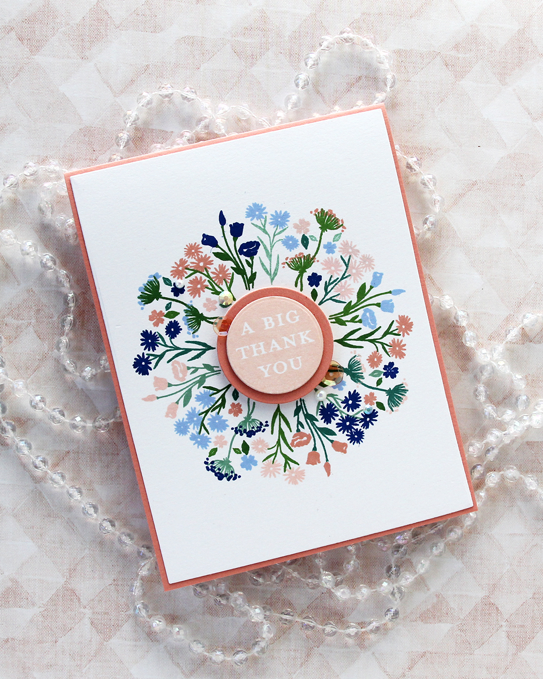 I cut my panel down using the largest die in the Additional A2 Layers die set from Waffle Flower and adhered it to an A2 card base I created from Grapefruit cardstock from Concord & 9th. I stamped one of the sentiments in the Bouquet turnabout stamp set using Nectar ink, die cut it with a circle die, then mounted it on a die cut circle from Grapefruit cardstock, which I then mounted in the center of the card.
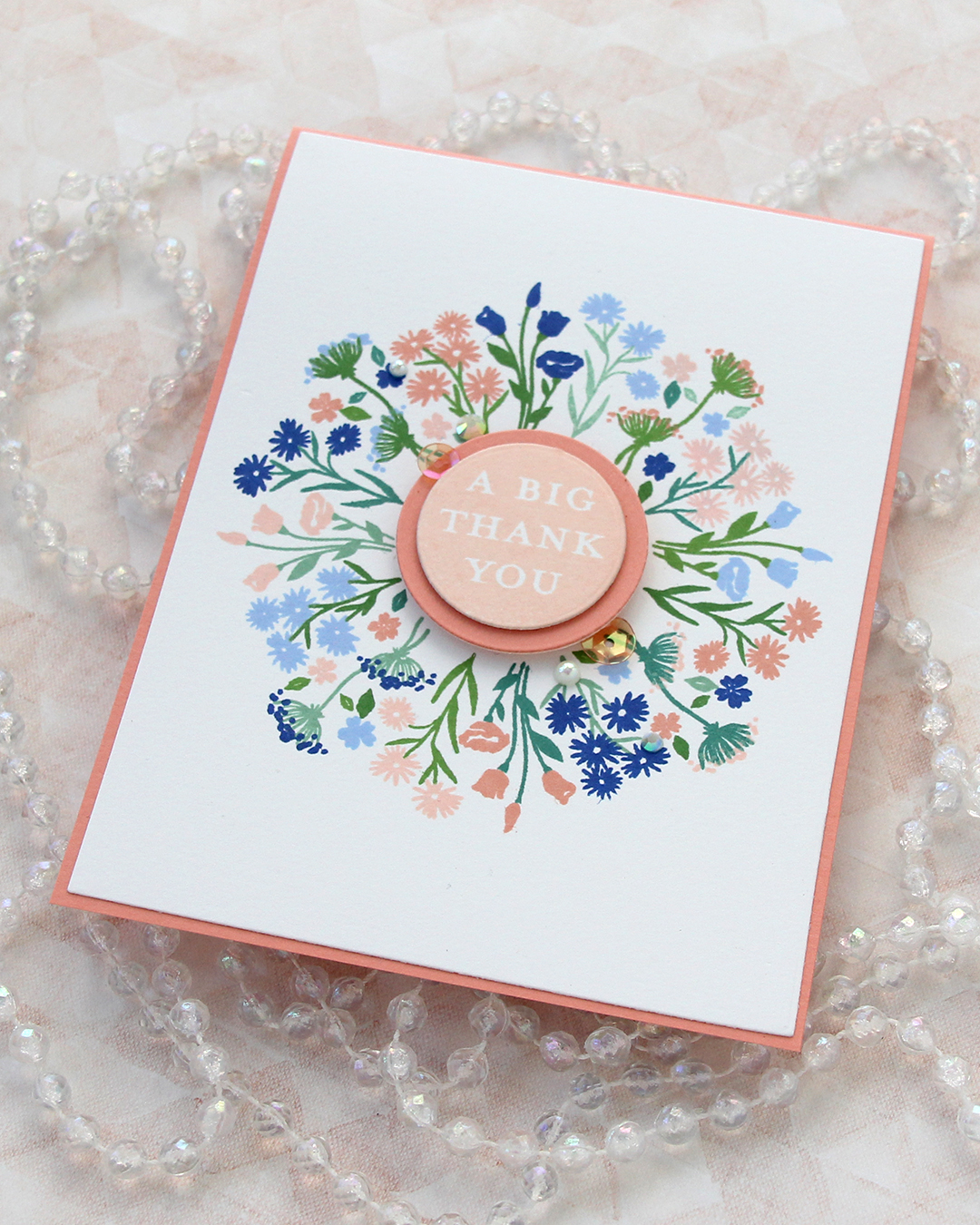 I finished off the card with a few pearls, gems and sequins from the Melon mix from Little Things from Lucy’s Cards.
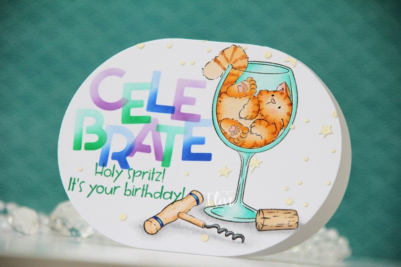
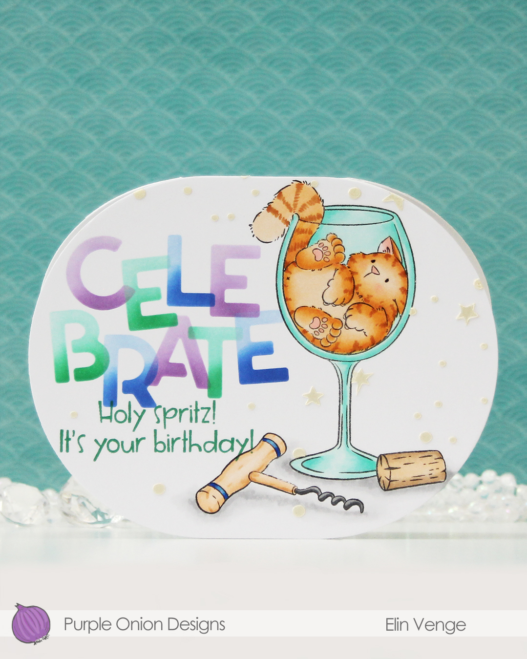 Isn’t this image fun? I love that Tofu somehow fits in this wine glass. There was an image in last year’s summer collection with a similar vibe. That one had a corgi hanging on to a margarita glass. So fun!
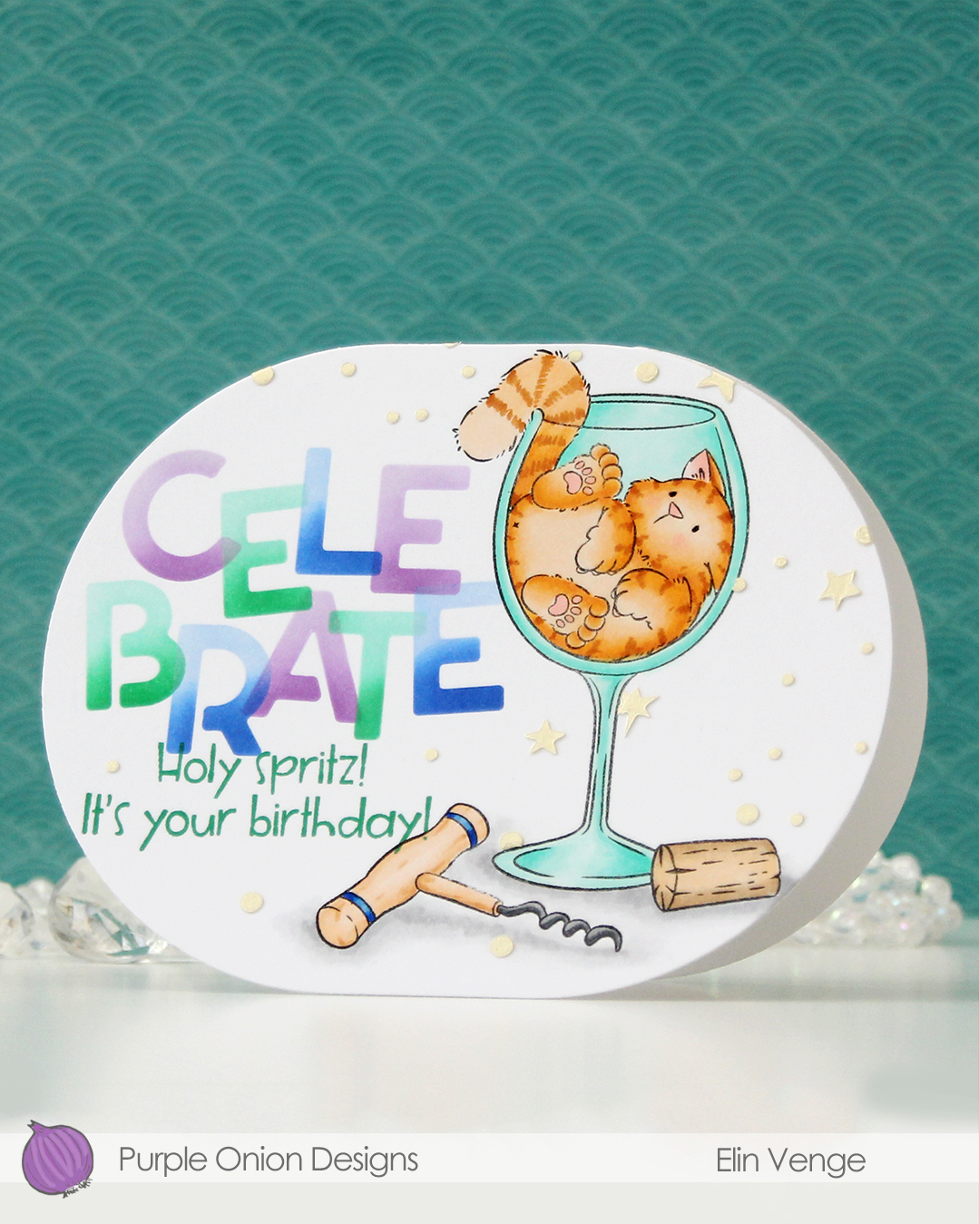 For this card, I simply colored my image with Copics, placed a mask on top of my mage and did some ink blending with C9 inks and the Celebrate stencil set from Kristina Werner. I used purple voluntarily, can you believe it? The purple is Fig faded into Aster, the green is Clover faded into Surfside, and the blue is Capri blended into Bluebell. I can’t take credit for the color palette, though, it was one Jennifer McGuire shared in the C9 Winter Retreat back in January, when they revealed the new colors to the retreat attendees. I’ll take my color inspiration wherever I can get it, and this was a fun one to try. Capri has stolen my heart!
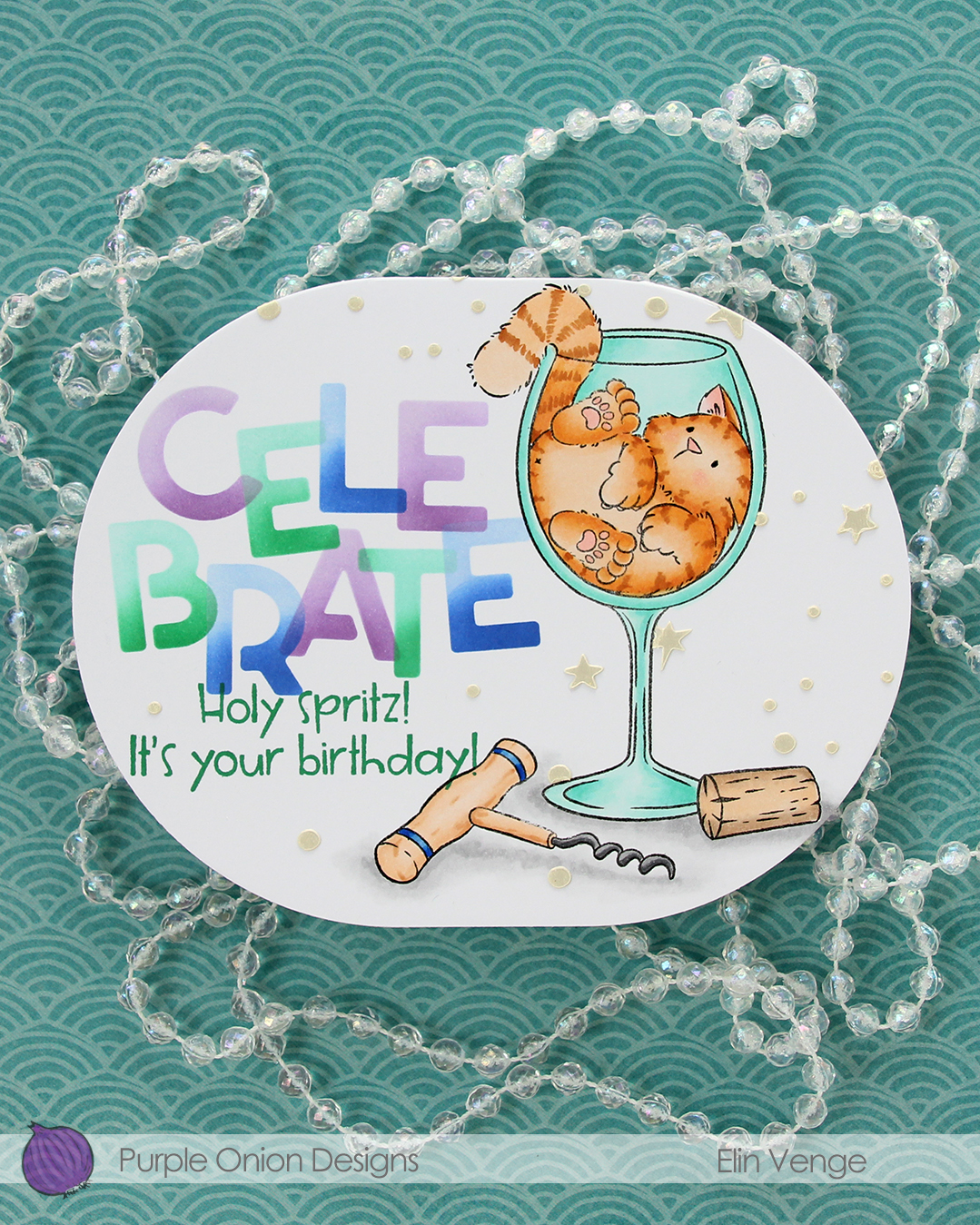 Back to the card. I removed the mask on the corkscrew before stamping the
 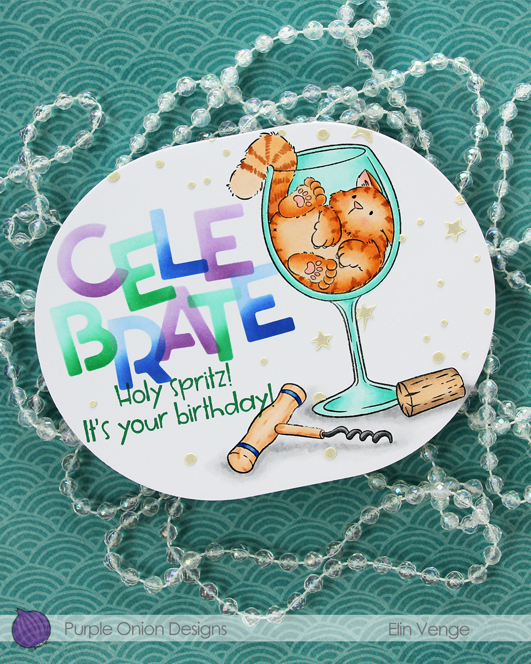 I wanted a little bit more interest in the background and decided to use paste, but before I put the paste on, I die cut my panel using the largest die in the A2 Oval Basics die set from Kristina Werner.
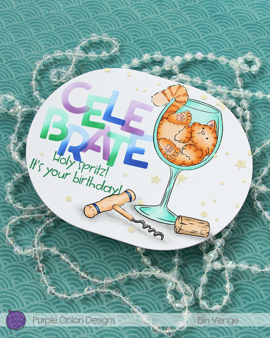 Once my panel was the finished size of the card, I placed the corkscrew mask back on, then used another stencil in the Celebrate stencil set from Kristina using Golden Hour Solar Paste from Simon Hurley. I made sure to cover the sentiment before adding the paste, so it wouldn’t end up where I didn’t want it. The paste adds texture and a little bit of shine in addition to breaking up all the white space in the background.
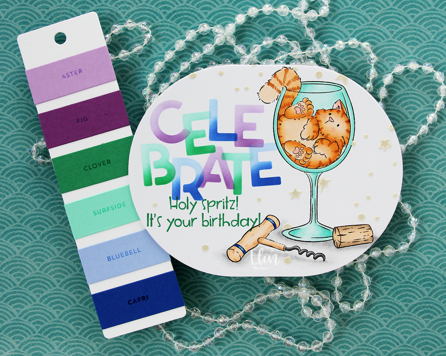
 Last, but not least: the Copics I used. Fairly neutral palette for this one.
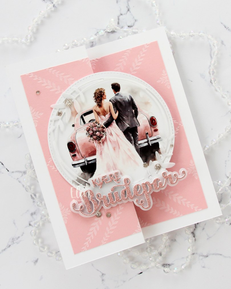
 This is a super simple fun fold, you basically fold the front of a regular sidefold card at the halfway point, so it doubles up on itself, which then becomes the front. For this one I started with three panels of Pale Peony cardstock from Papertrey Ink. I inked up the Leafy Lattice press plate from Pinkfresh Studio with white pigment ink from Concord & 9th to impress and ink up a very subtle pattern on all panels. I created a card base from Stamper’s Select White cardstock from Papertrey Ink that measures 5 x 6 1/4″ when it’s folded. I scored and folded the front at 2 1/2″. I put one of my panels on the inside of the card, put one on the back of the card and cut the last one in two to put on the front, making sure the pattern lined up with the inside.
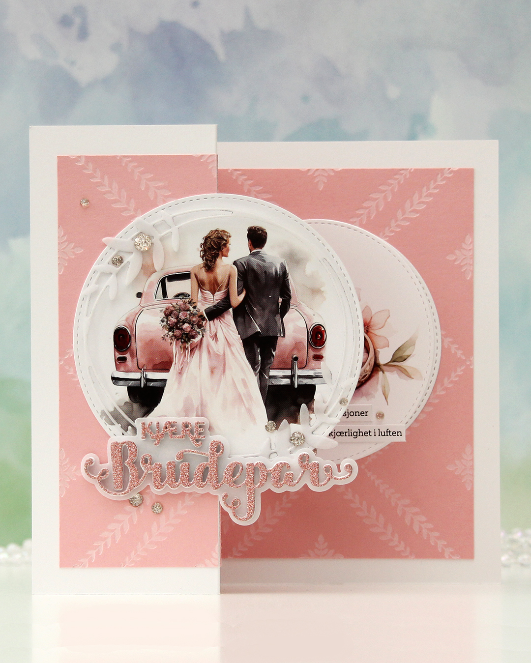 This is what the card looks like on display. I die cut a couple of images from a sheet from Kort & Godt (MA1001) using a die in the Stitched Circle STAX die set from My Favorite Things. This paper is kind of thin, so I backed it with a plain white cardstock circle behind. I glued one circle to the front, making sure to put glue on the left side only. I die cut the leafy circle die from Kort & Godt (die 345) from Heavyweight Translucent vellum from MFT and added that on top of my circle image, adhering it only in a few spots. I used the Kjære brudepar die set (PD18406) from Papirdesign for the word, stacking a few white ones, adding the shadow die cut from vellum, then another few white die cuts topped with a glitter one, die cut from pink glitter cardstock from Kort & Godt, before finishing off with a few champagne glitter drops from Pinkfresh Studio.
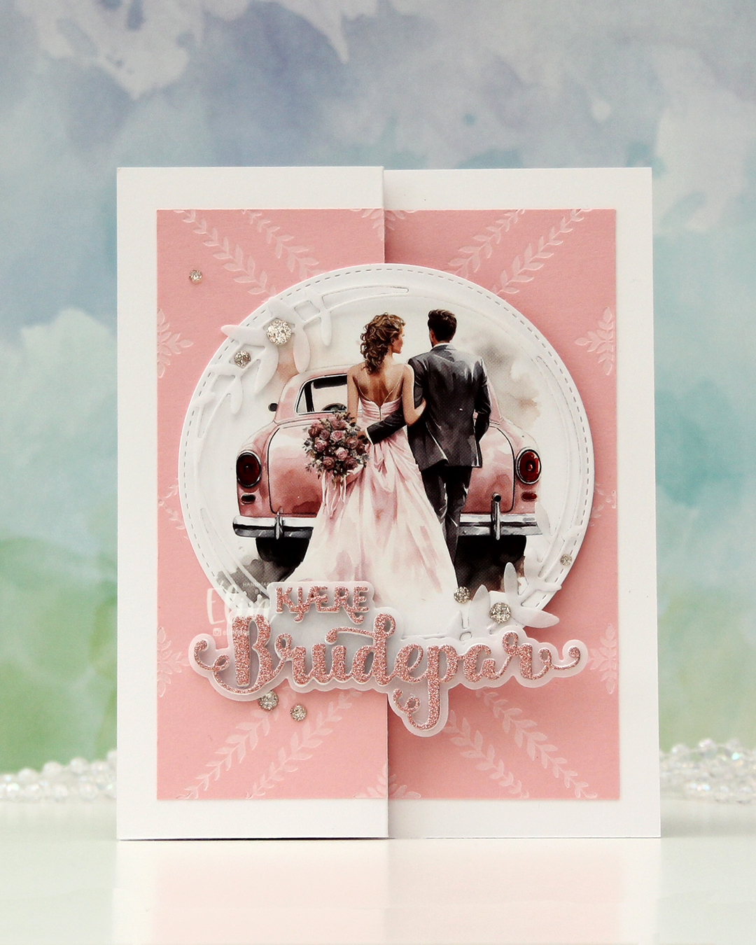
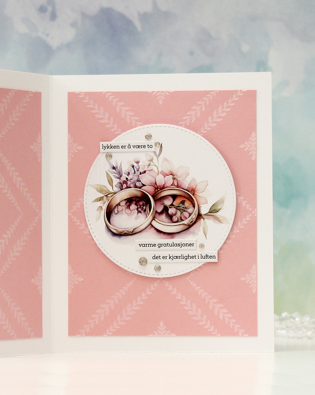 The circle image on the inside is a little bit smaller than the one on the front, and is hidden when the card is closed. . I added some wedding themed sentiment sticker strips from Kort & Godt (ST1018) and a few more glitter drops to embellish. This circle actually opens to reveal a place to write a sentiment, there’s a score line you can see on the left here.
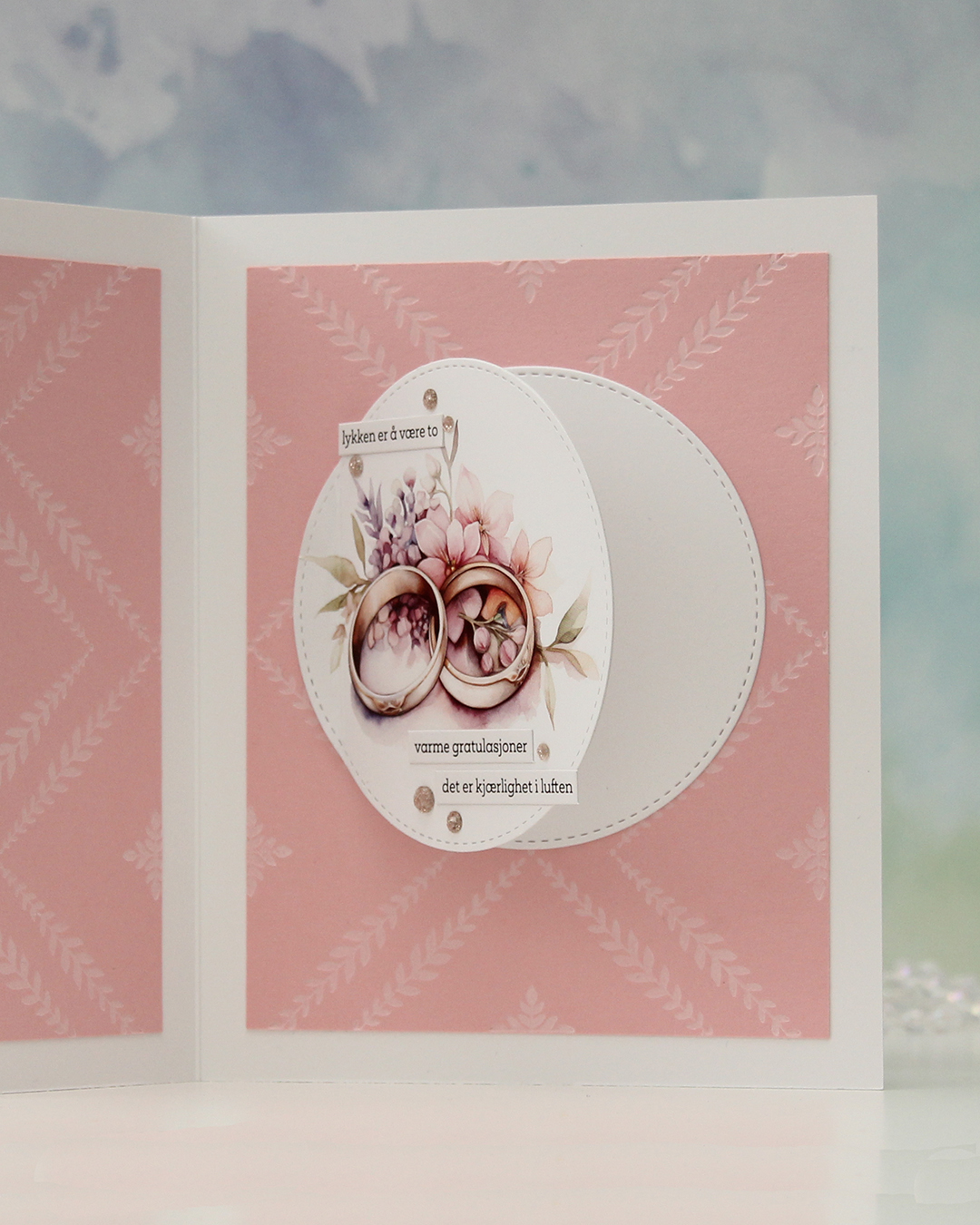 Another circle hides behind, and there’s enough room for a personal message without it showing too well when the card is open on display.
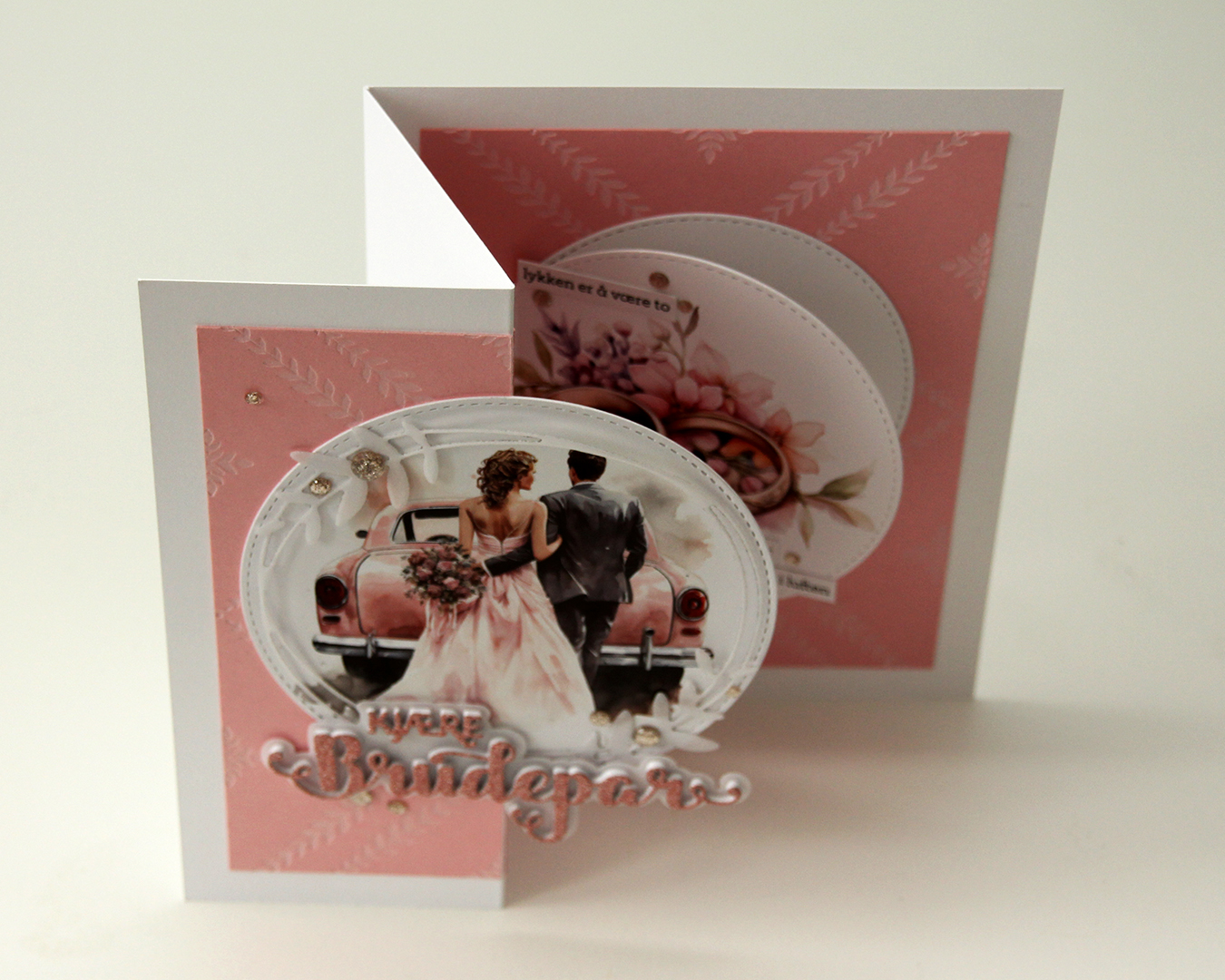 Here you can see the card open from a different angle.
 This wound up being a very soft looking card, between all the pink, white and vellum.
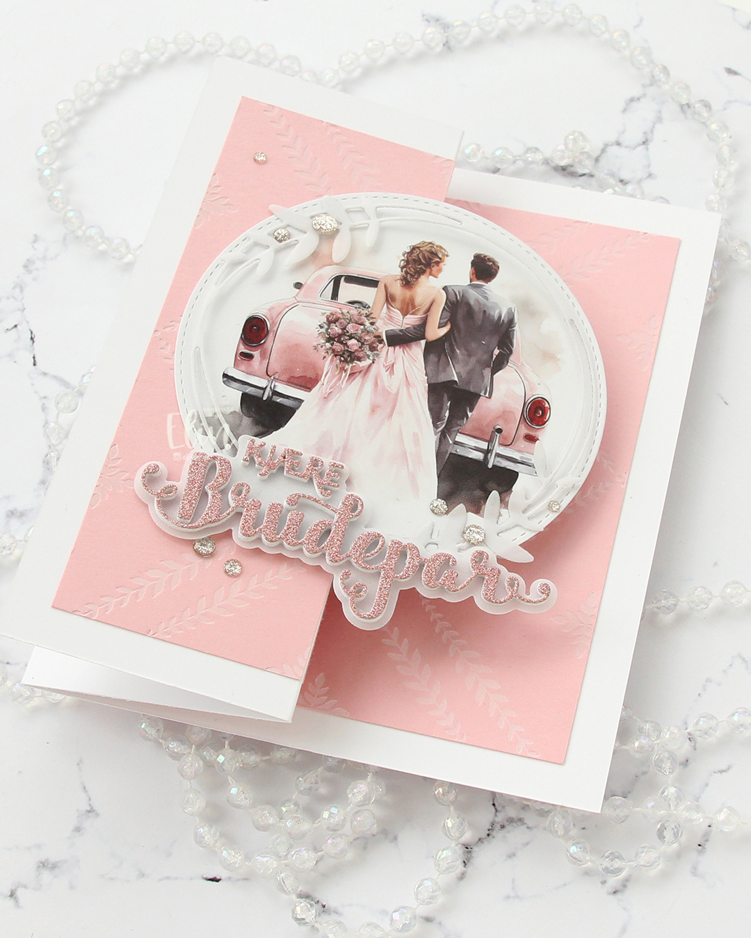 I love love love the added texture and crisp inking you get with a press plate. It’s the best thing ever.
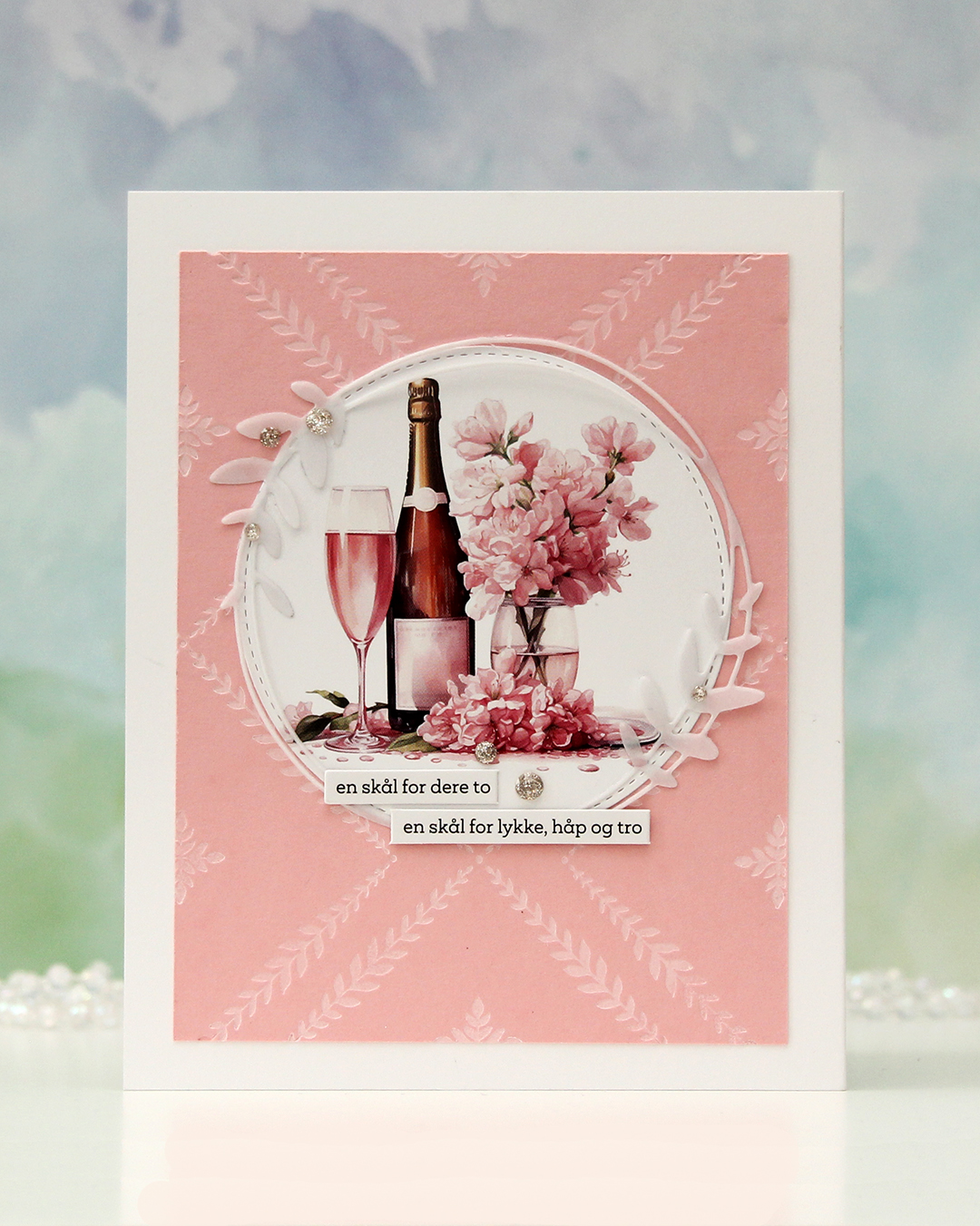 The back of the card. Another die cut circle, another vellum circle with the leaves and a couple more of the sentiment sticker strips. I hope you try this fun fold if you haven’t already. It’s easy, but still something different than store bought.
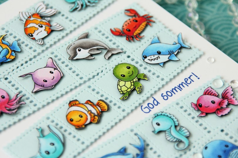
 As I mentioned, I created this card using two collections:
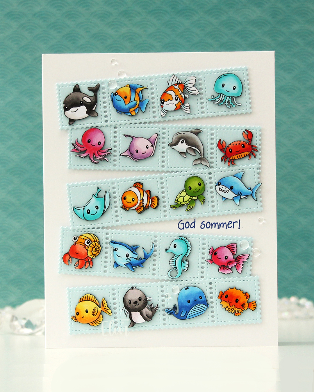
 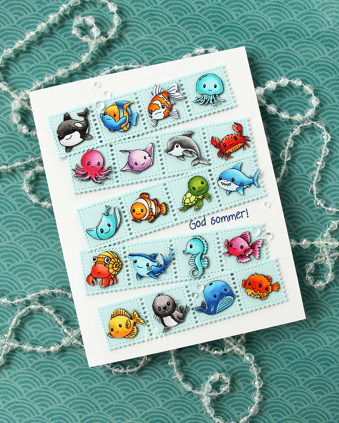 Once I had all my sea creatures colored and fussy cut, I put them aside and worked on the rest of the card. I die cut the Stamp Border from Gummiapan five times from Powder cardstock from Concord & 9th. The die cuts five postage stamps in a border, but I cut off one, making it a strip of four. I put two layers of white scraps behind each of the individual postage to give it a floating look. I also cut down small cardstock squares two layers thick to put behind my critters, also giving them a bit of dimension, but not as much as foam tape would add.
 Once I knew how I wanted my strips of sea postage arranged, I stamped a sentiment from the Småtekster stamp set from Norsk Stempelblad AS using Capri ink from Concord & 9th directly on my card base, which I created from Stamper’s Select White cardstock from Papertrey Ink. I made a side fold card this time that is 1/2″ larger in both directions than the standard A2 card. I adhered my postage stamps, added some dew drops from Concord & 9th that kind of look like bubbles and decided to make their eyes shine. I used a black glaze pen, then went over with one small dot of an extra fine white Sharpie once the black was dry. I don’t think I’ve ever used 20 images on one card before, but this was SO. MUCH. FUN!!
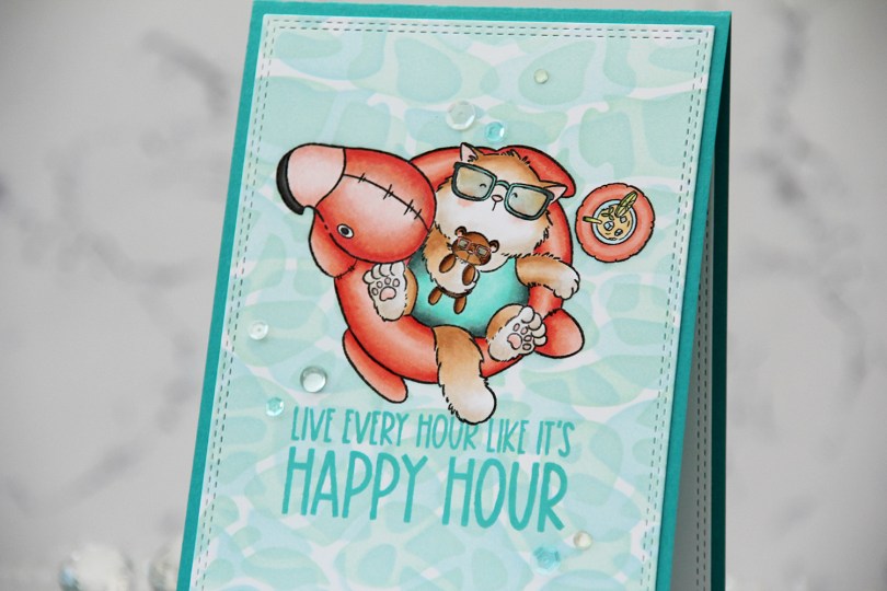
 I stamped and colored my image with Copics on X-Press It blending card, before using a die in the A2 Double Stitched Rectangle STAX die set from My Favorite Things to create faux stitching around the perimeter of my panel.
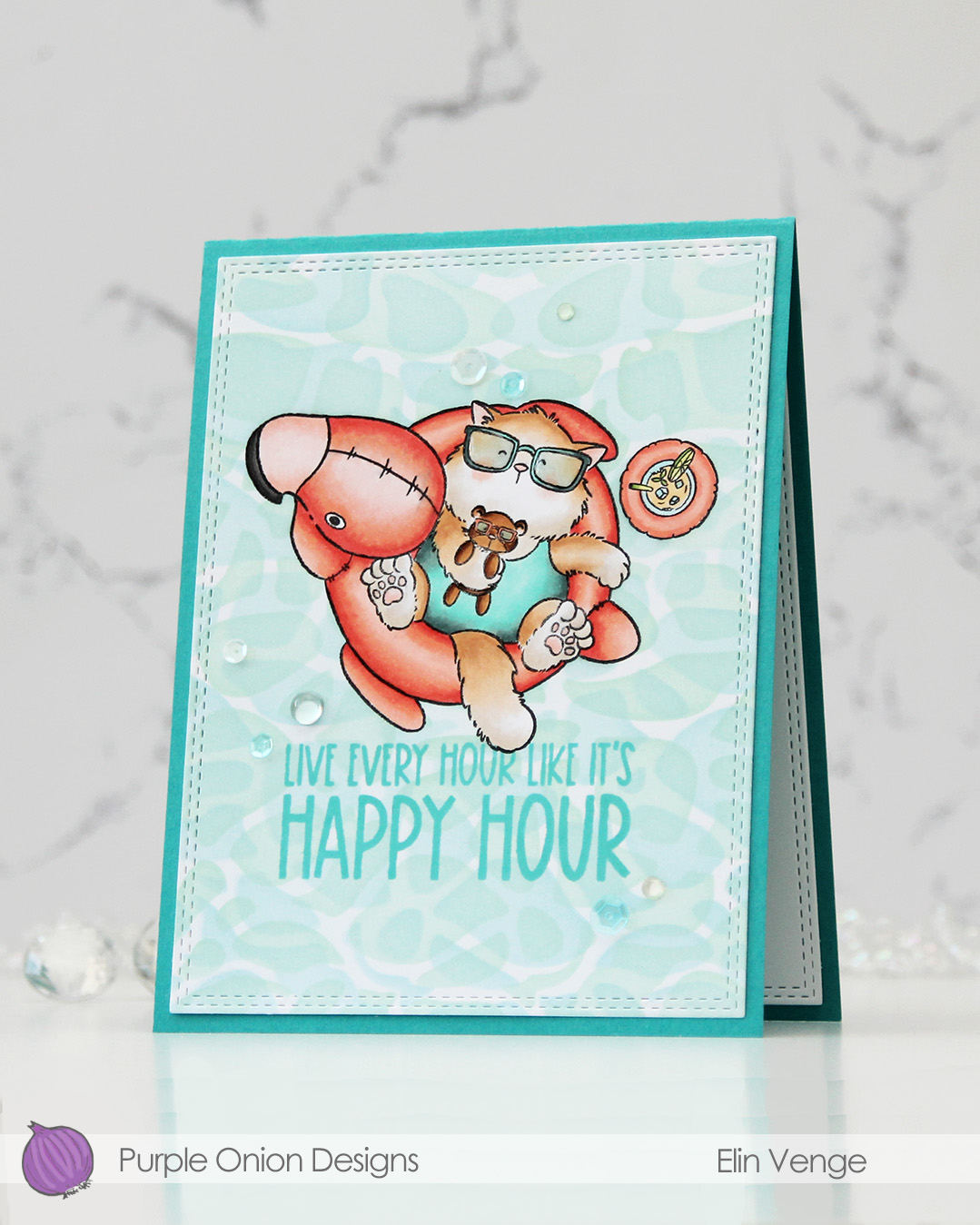 I masked off my image, before using Powder, Harbor and Sea Glass inks from Concord & 9th to ink blend the background through the Perfect Pool Water stencil from My Favorite Things. I flipped and rotated the stencil to create my pool water.
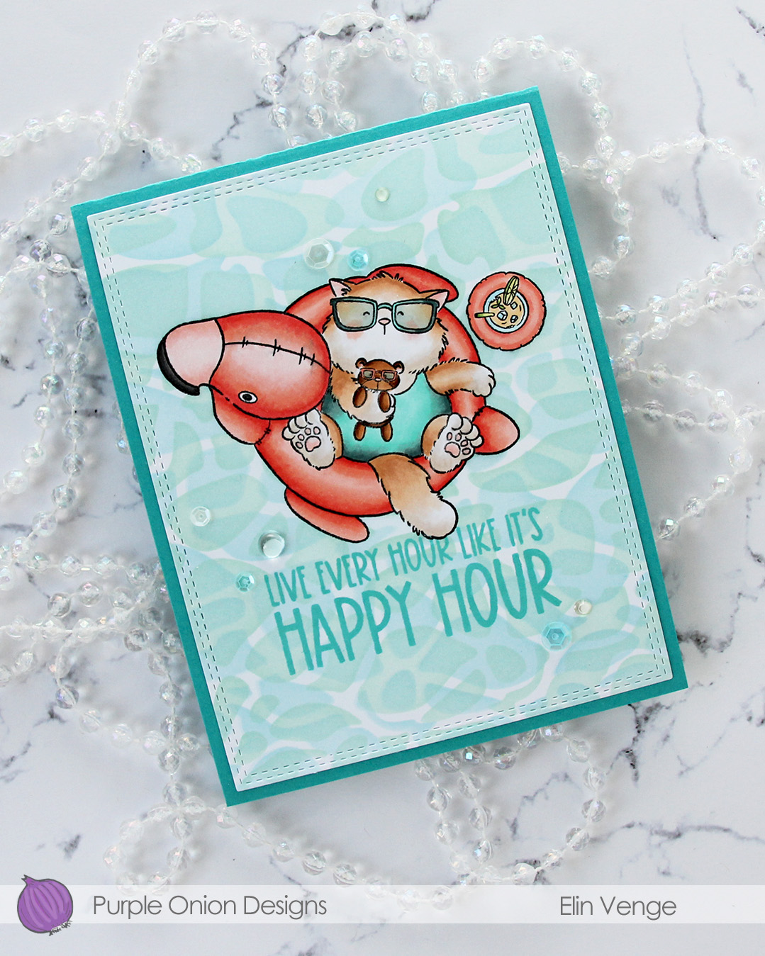 While I still had my mask in place, I stamped a sentiment from the
 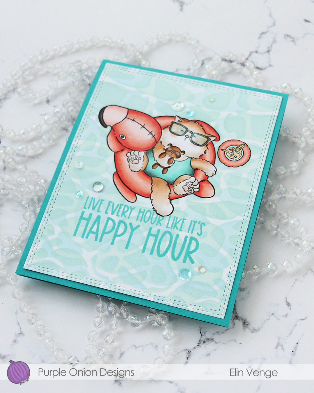 I adhered my panel to a card base I created from Oceanside cardstock from Concord & 9th, added a layer of Glossy Accents to Tofu’s glasses and finished off with a mix of sequins and gems from the Ice Water embellishment mix from Little Things from Lucy’s Cards.
 Very limited color palette for this one.
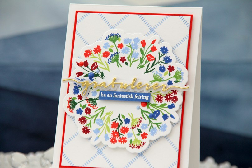
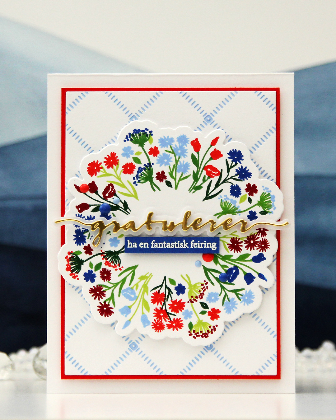 I used the Bouquet turnabout stamp set from Concord & 9th to create my focal point. This turnabout set has two separate images that you turn. The greenery is one stamp, the florals another. I used Sprout, Parsley, Basil and Evergreen inks for the greenery, and Bluebell, Capri, Poppy and Cranberry for the florals, all C9 colors. I’m loving the new 2026 colors from Concord & 9th, Capri is dynamite, it’s so awesome!! I cut my bouquet out using the coordinating die set and put the piece aside while I worked on the rest of the card.
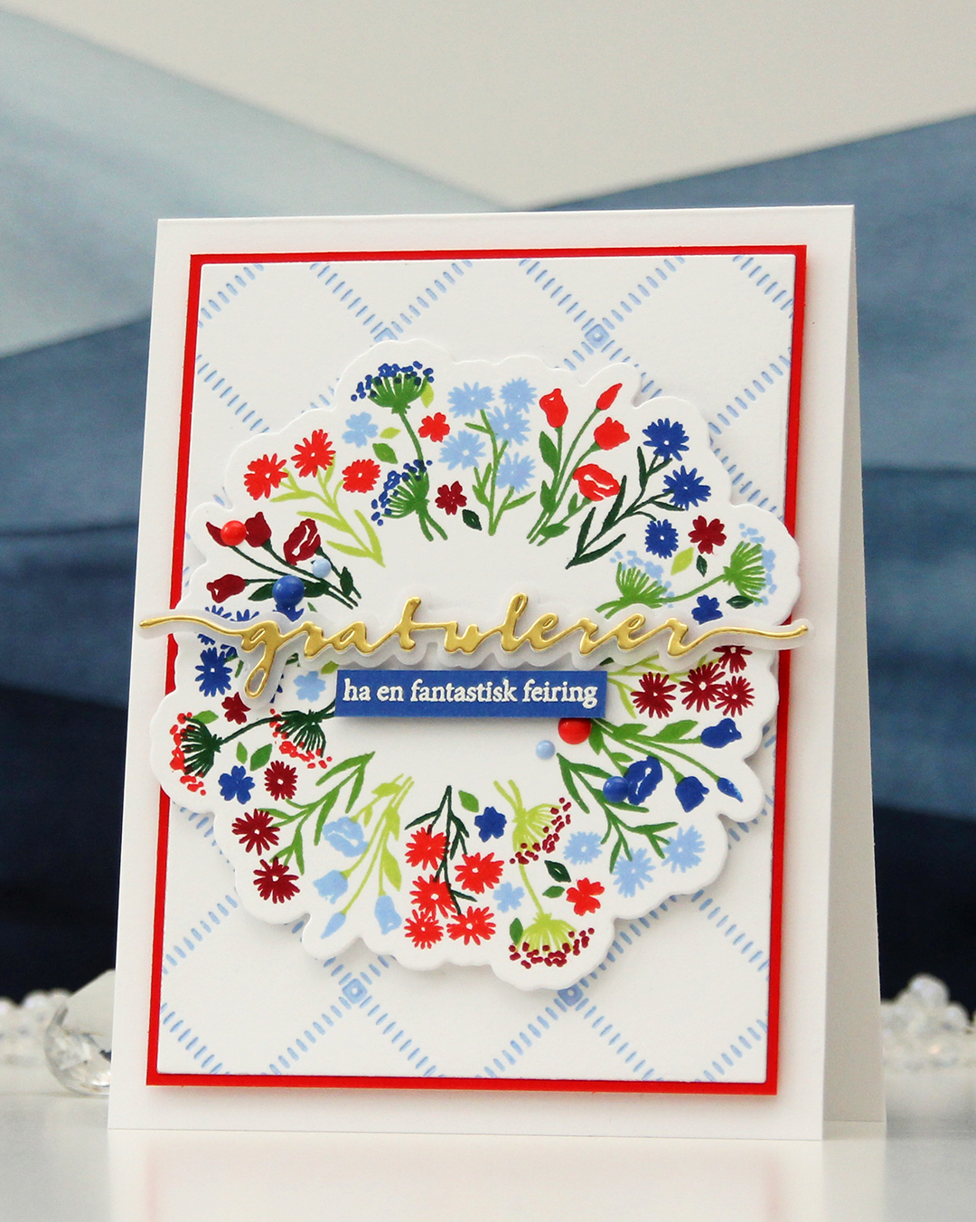 I wanted a subtle background, and opted for the Stippled Plaid press plate from Pinkfresh Studio. I love this press plate, it’s probably the one press plate I use the most. I inked it up very carefully with Bluebell ink and ran it through my system with plain white cardstock to match the white cardstock I used for my floral bouquet stamping. I then cut the panel down significantly, added a mat from Poppy cardstock and mounted it on a top fold card base I created from Stamper’s Select White cardstock from Papertrey Ink, which is the white cardstock I’ve used for everything on this card.
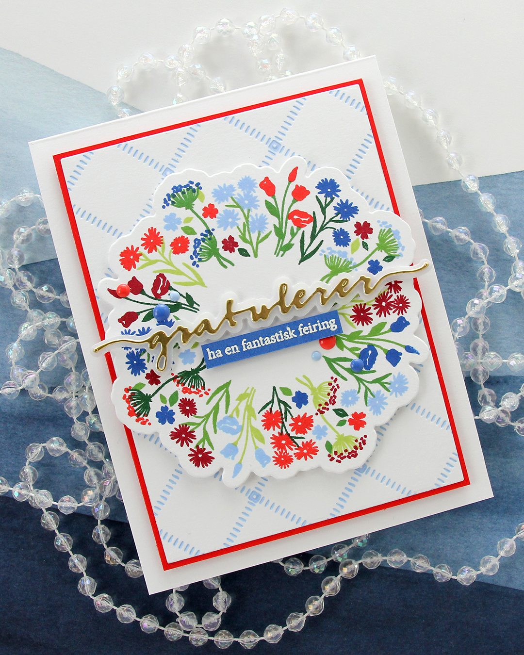 I popped up my bouquet using more foam tape and knew I wanted a die cut sentiment. Gratulerer med dagen is what you say when greeting someone on May 17th, it literally translates to “Congratulations on the day”. It’s the exact same sentiment we use to wish someone a happy birthday. I used the Gratulerer 6 die set from Papirdesign for the main part of my sentiment. I die cut four layers from white cardstock, one layer from Gold Shine cardstock from My Favorite Things and the shadow layer from Heavyweight vellum, also from MFT. I backed the gold one with one white, adhered it to the vellum and put the three remaining white ones behind the vellum, to give it a bit of dimension.
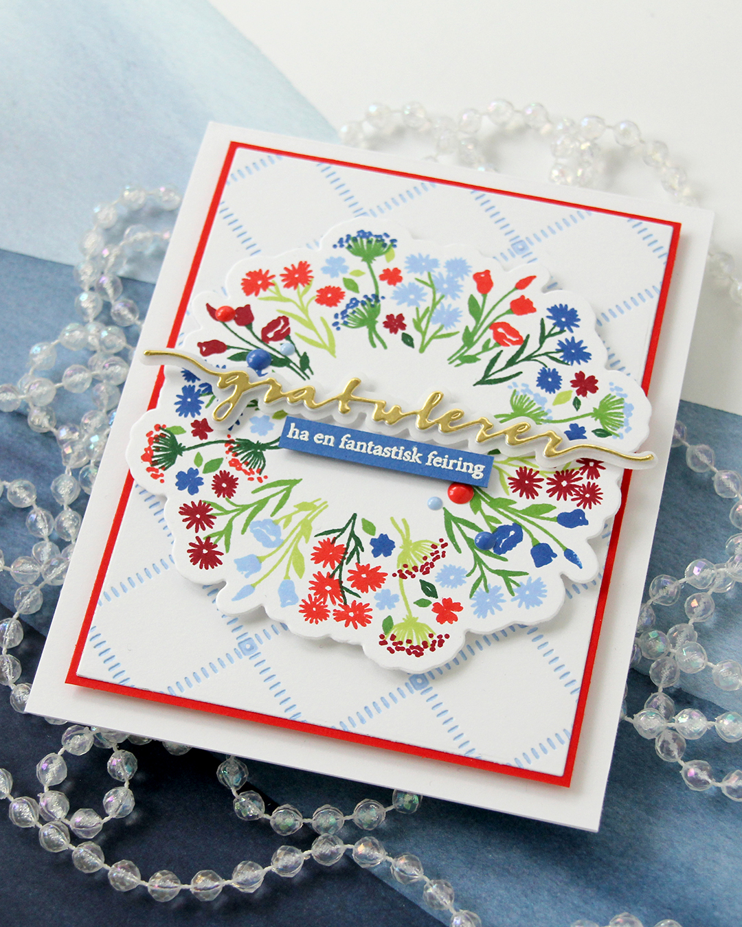 On a piece of Capri cardstock, I stamped a sentiment (have a fantastic celebration) from the A06 stamp set from Norsk Stempelblad AS with VersaMark ink, sprinkled on Super fine detail embossing powder from Ranger and heat set it from the back. I always do my heat embossing from the back, it gives a much smoother result than working from the front. I finished off the card with a few enamel dots from Concord & 9th in Capri, Bluebell and Poppy.
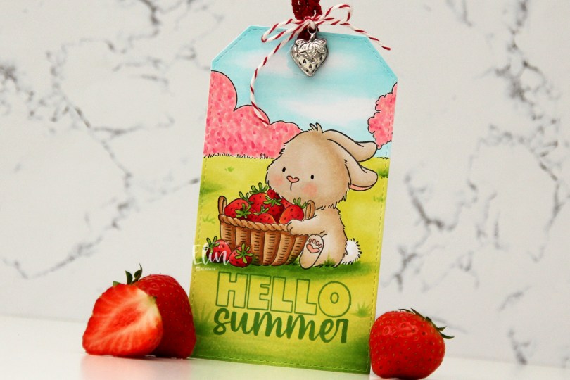
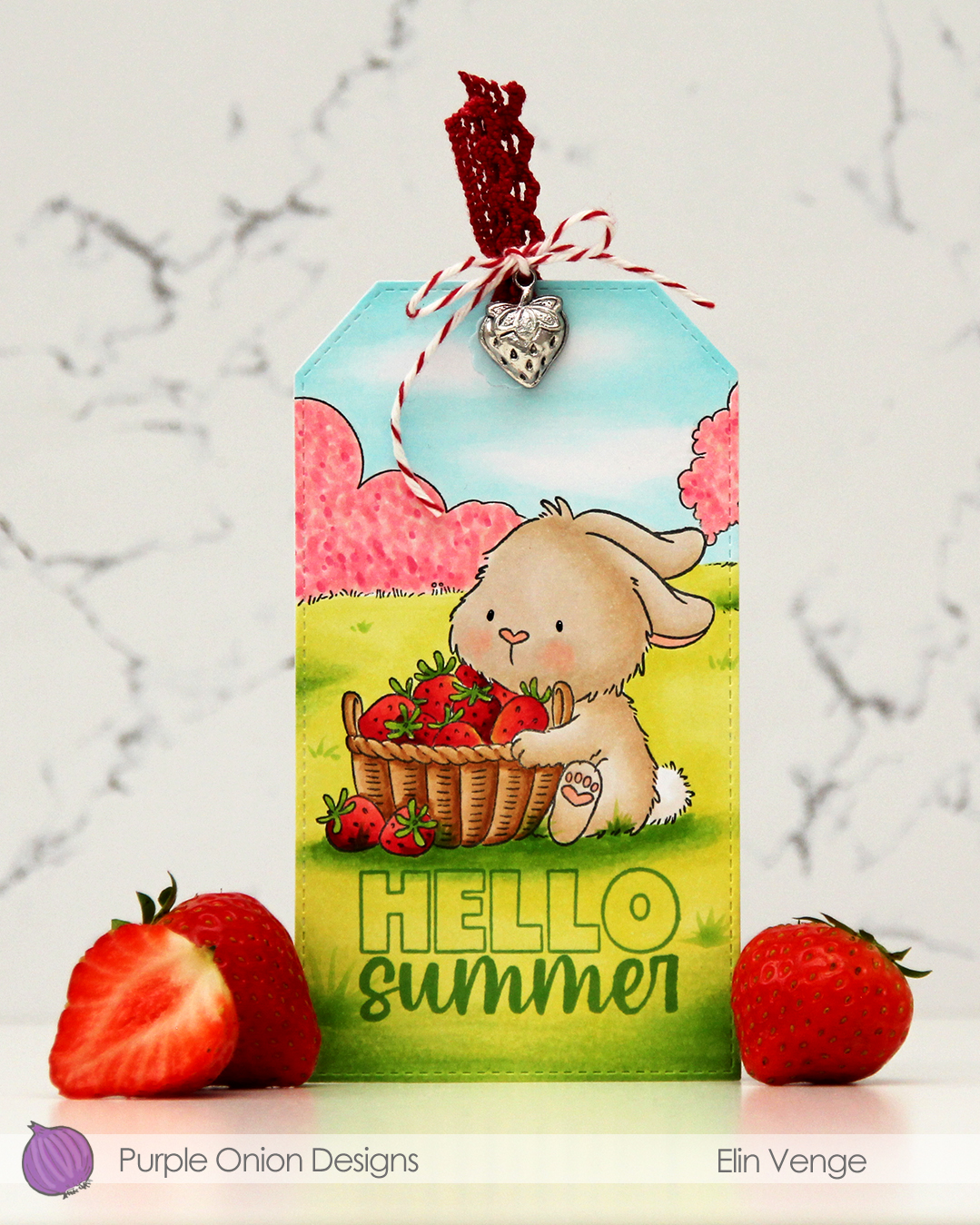 I stamped and masked my bunny, stamped the field background, then colored in my scene with Copics. I didn’t want an “all green” background, so I colored the bush and the tree with pink markers, I’m pretending they’re blooming. The fruit trees are in full bloom at the moment, so it was an easy decision. Once my coloring was complete, I used the largest die in the Stitched Traditional Tag STAX die set from My Favorite Things. This tag set doesn’t create holes in the tags, so I made my own and used a reinforcer from the Fold-up Tags die set, also from My Favorite Things, to give the hole a finished look. I stamped Hello from the
  Very soft color palette for this one.
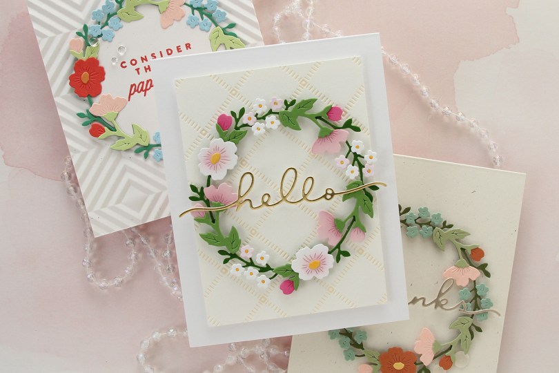
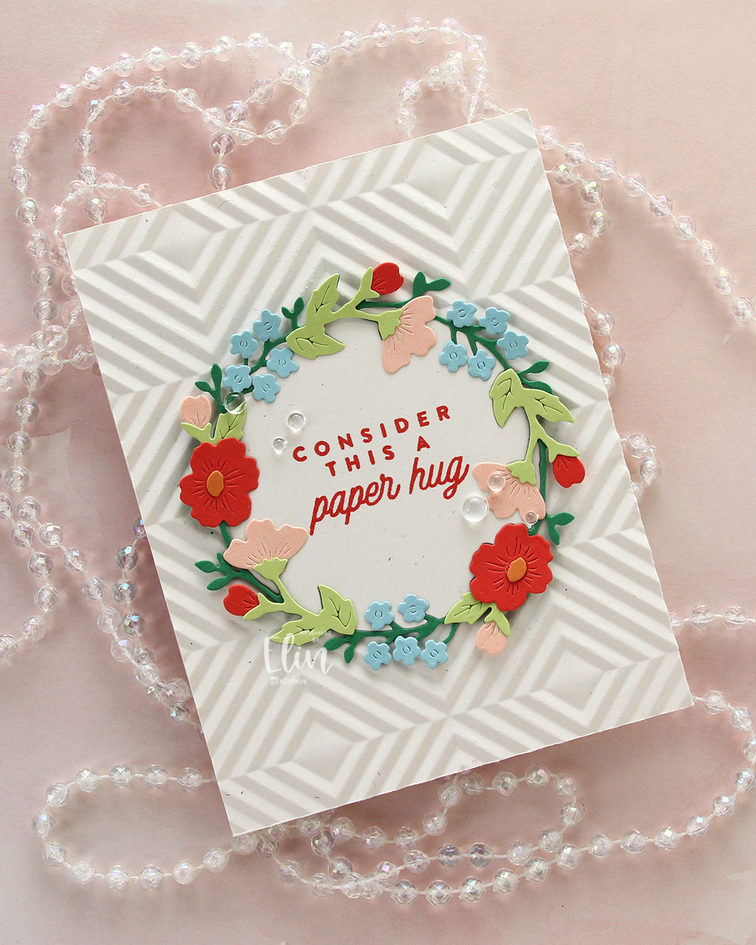 I’m also here for the Briar & Blooms die set from Concord & 9th, which honestly did most of the work on these cards. For this first card, I took my inspiration for the colors from the Summer Breeze color palette on the Concord & 9th website. They’ve got some great color resources, and this particular palette consists of Nectar, Pimento, Clementine, Clover and Harbor. I also threw in Sprout for a second green. I die cut the base of the wreath from Clover, and the remaining pieces from the other colors. I also die cut one base wreath from Rustic White cardstock from Papertrey Ink, but I only needed the inside negative part of that to stamp my sentiment on.
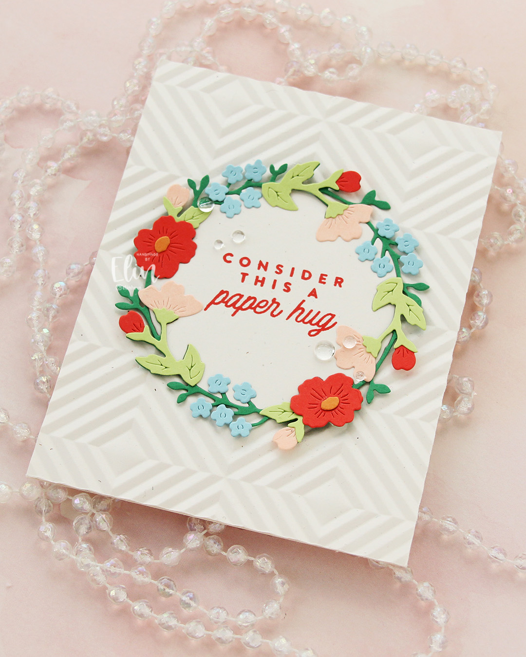 I used the Quilted embossing folder from Concord & 9th to create some texture behind the wreath. This embossing folder is a great one, but it was part of the 2025 Winter Retreat and is not available for purchase. Thankfully, there are other embossing folders out there which will work just as well to create some interest in the background. I adhered the embossed panel to a card base I created from the same Rustic White cardstock. I stamped a sentiment from the Flower Field stamp set from Kristina Werner using Pimento ink on that negative inside piece I’d already die cut. I adhered it in the center of the card and puzzle pieced the actual wreath around it, adding small pieces of foam tape to the outside edges of the wreath only. I finished off the card with a few Concord & 9th dew drops flanking the sentiment.
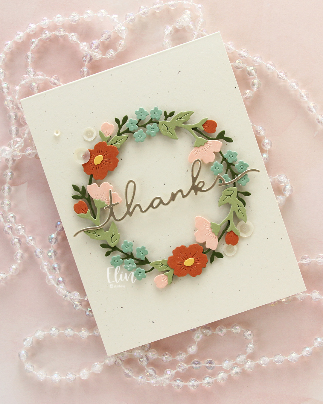 The first card was so much fun to create, I decided to make another. The example picture on the packaging for the die set is beautiful in soft, very muted tones, and I tried to pick colors that were close. Here, I used Artichoke for the base wreath, Pistachio for the remaining greenery, Spiced Cider for the large flowers and a few of the buds, Nectar for the remaining buds and the side facing flowers and finally Eucalyptus for the small flowers. Oh, I also used Buttercup for the flower centers. This is definitely a more muted palette than the first, it has a bit of a fall vibe to me.
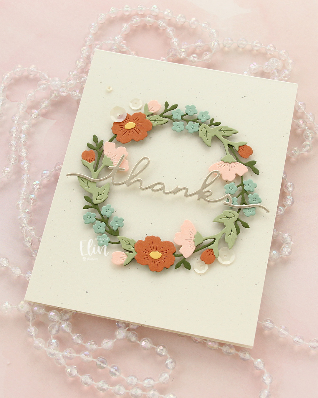 I leaned into the fall vibe and chose to mount my wreath on a card base I created from Rustic Cream cardstock from Papertrey Ink. This is also very muted, and I love the little specks that are in the paper, creating a bit of interest. I die cut the word thanks in the Briar & Blooms die set from Champagne cardstock (also Concord & 9th), backed it with a layer of Rustic Cream and adhered it across the center of the wreath, before finishing off the card with some Satin White sequins from Altenew.
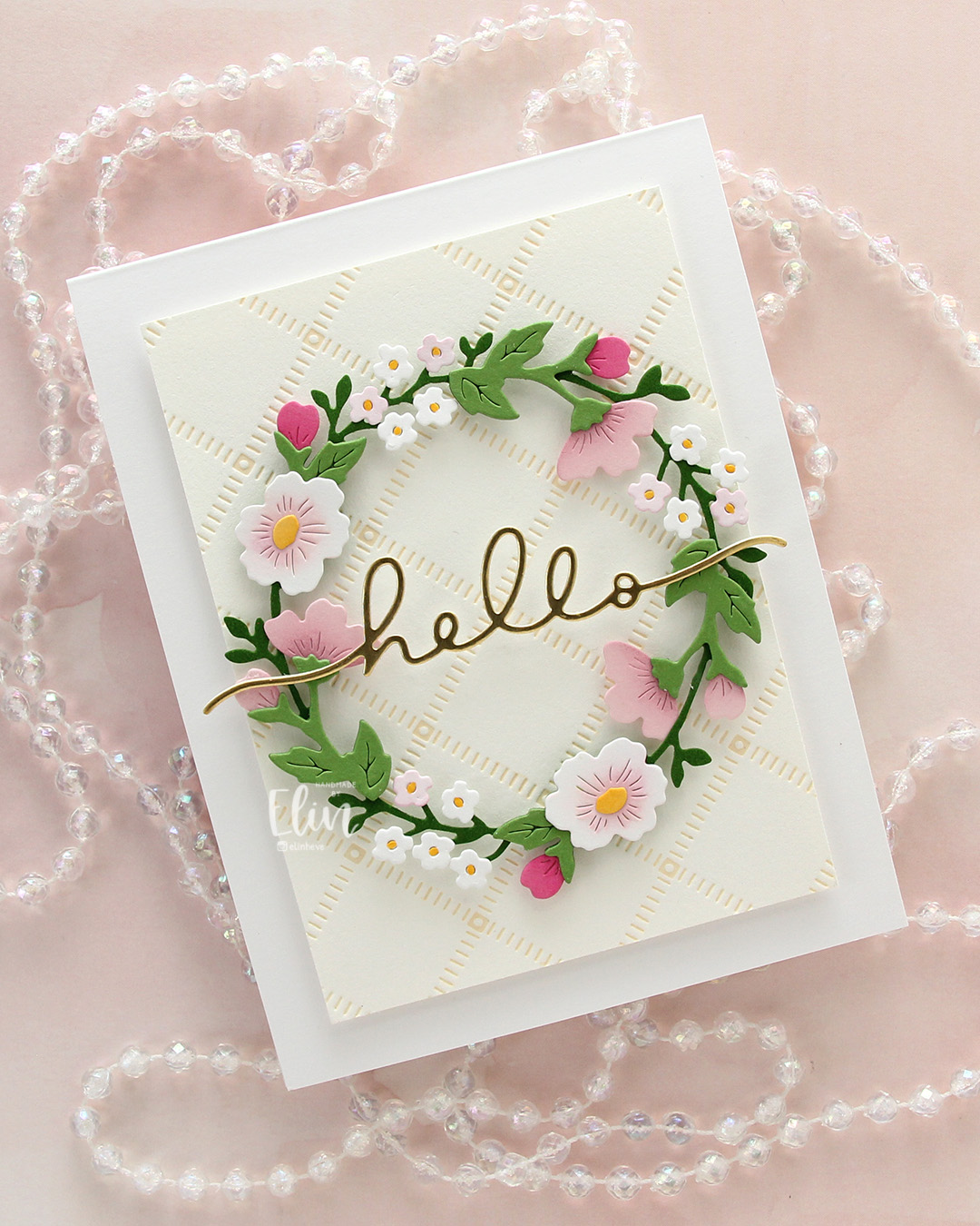 While I was working on card number two, I came up with the idea to create one more wreath in a “blossoming fruit tree” color combination. The fruit trees have just started blooming, and it’s the best thing ever. We have a blood cherry tree outside our front door that started blooming over the weekend. The apple trees (which my color combo is based on) have not started blooming quite yet, but they’re not far behind – I love this time of year! Anyway, back to the card. I don’t have the new Basil green yet from Concord & 9th (other than a small sample that was in this year’s Winter Retreat kit, which I turned into a swatch tag), but when you ink blend Parsley ink on Parsley cardstock, you get a darker color that works well. I did that, then die cut the base wreath from the dark version and die cut the rest of the greenery from plain Parsley. Once again, I used Buttercup for the centers, but I switched out the Nectar I used on the previous two cards for Ballet Slipper, which I thought worked better here. I also slipped in Sweet Pea for a few of the buds for a little more pop of color.
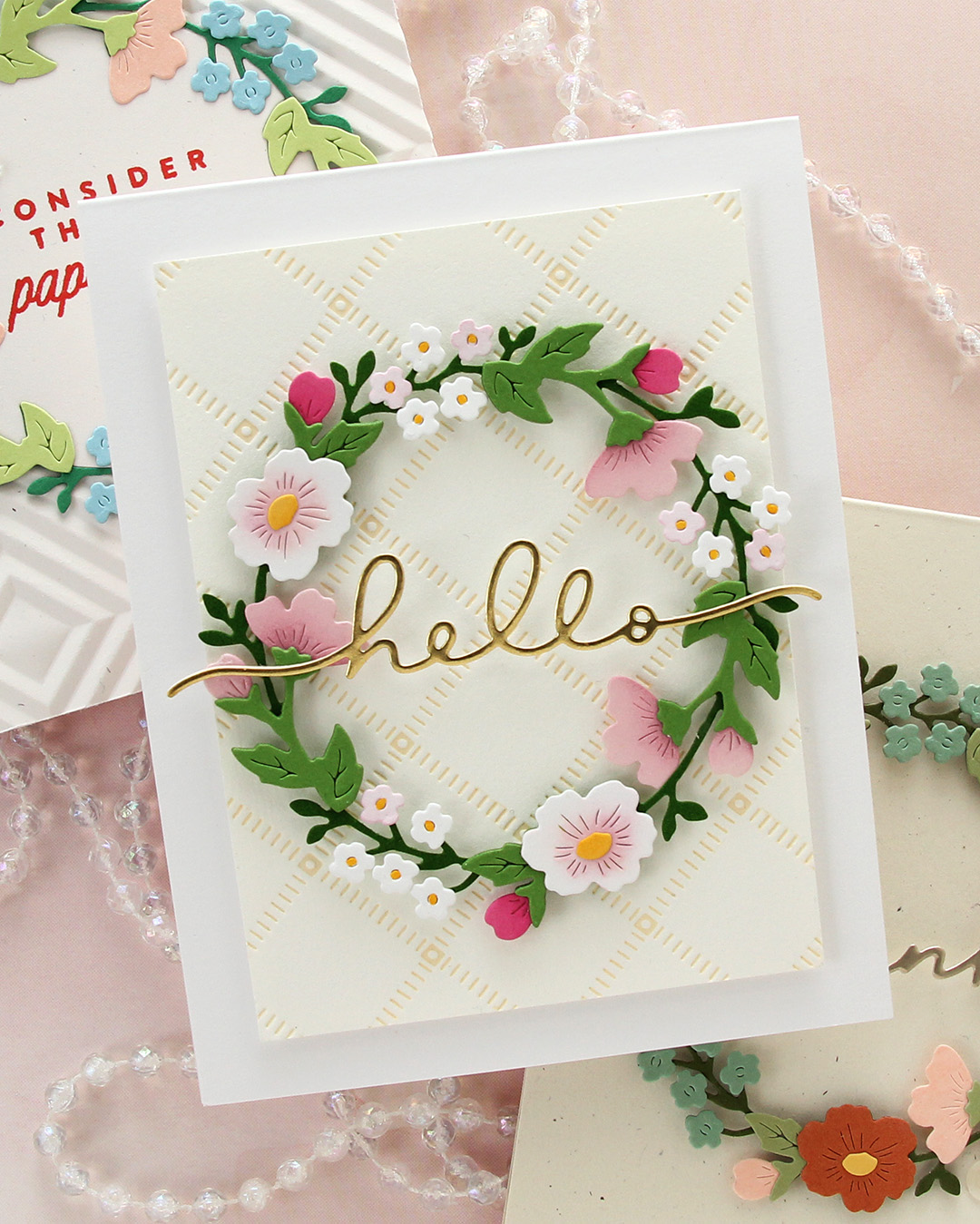
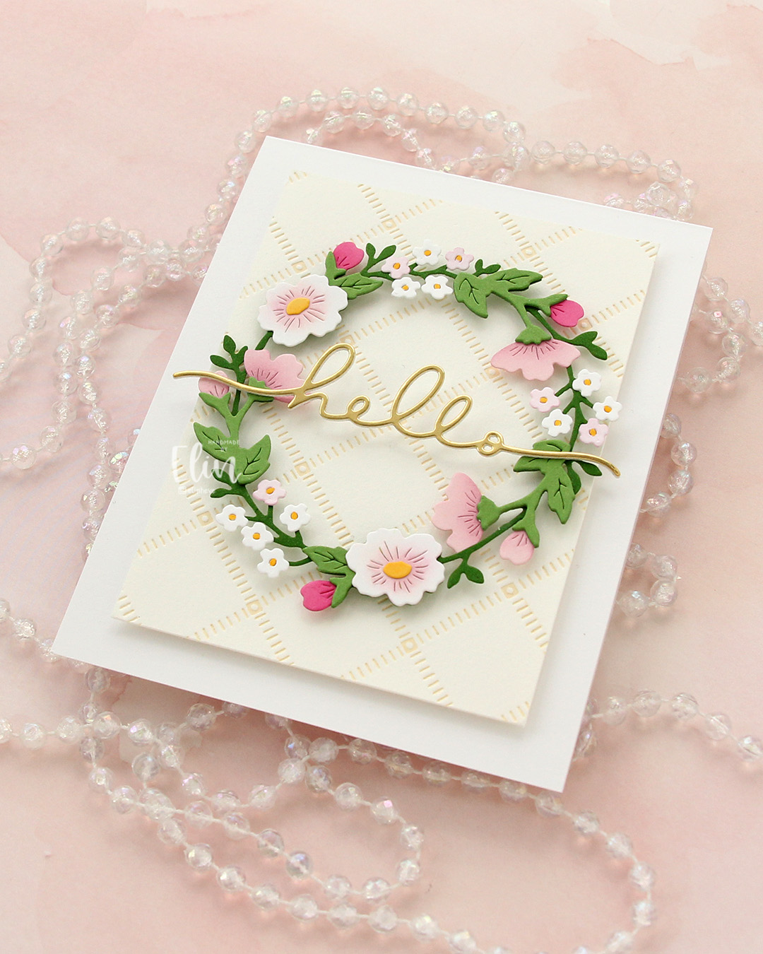 I loved the soft color palette so much that I wanted a soft look in the background, too. I opted for the Stippled Plaid press plate from Pinkfresh Studio and inked that up on a piece of Betterpress Bisque cardstock using Peachy Glow ink from Altenew. The soft yellow ink acts as a neutral on the cream cardstock, which in turn is a neutral on the Stamper’s Select White cardstock from Papertrey Ink that I used for my card base. I popped everything up on foam tape, then die cut the word hello once from white cardstock and once from Gold Shine cardstock from My Favorite Things. I stacked the two and stretched my hello across the center of the wreath. I tried to add a few different embellishments, but in the end, I decided not to use any – and honestly, I think this card looks great without it!