
Hi, crafty friends! We’re halfway through spring, and I’m still really looking forward to summer, as evidenced by my card today. Spring is nice, but summer’s the best, and these images really capture that summer feeling!
 I created a scene with quite a few images from the Lakewood collection from Purple Onion Designs, illustrated by Holly Mabutas. Oliver reading to swim, Sleepy Sampson, Ollie swims, Bruno Jumps In, Boat house and Pier are all used in this one scene. It’s still not a very busy card, and I got away with only masking the guys on the pier.
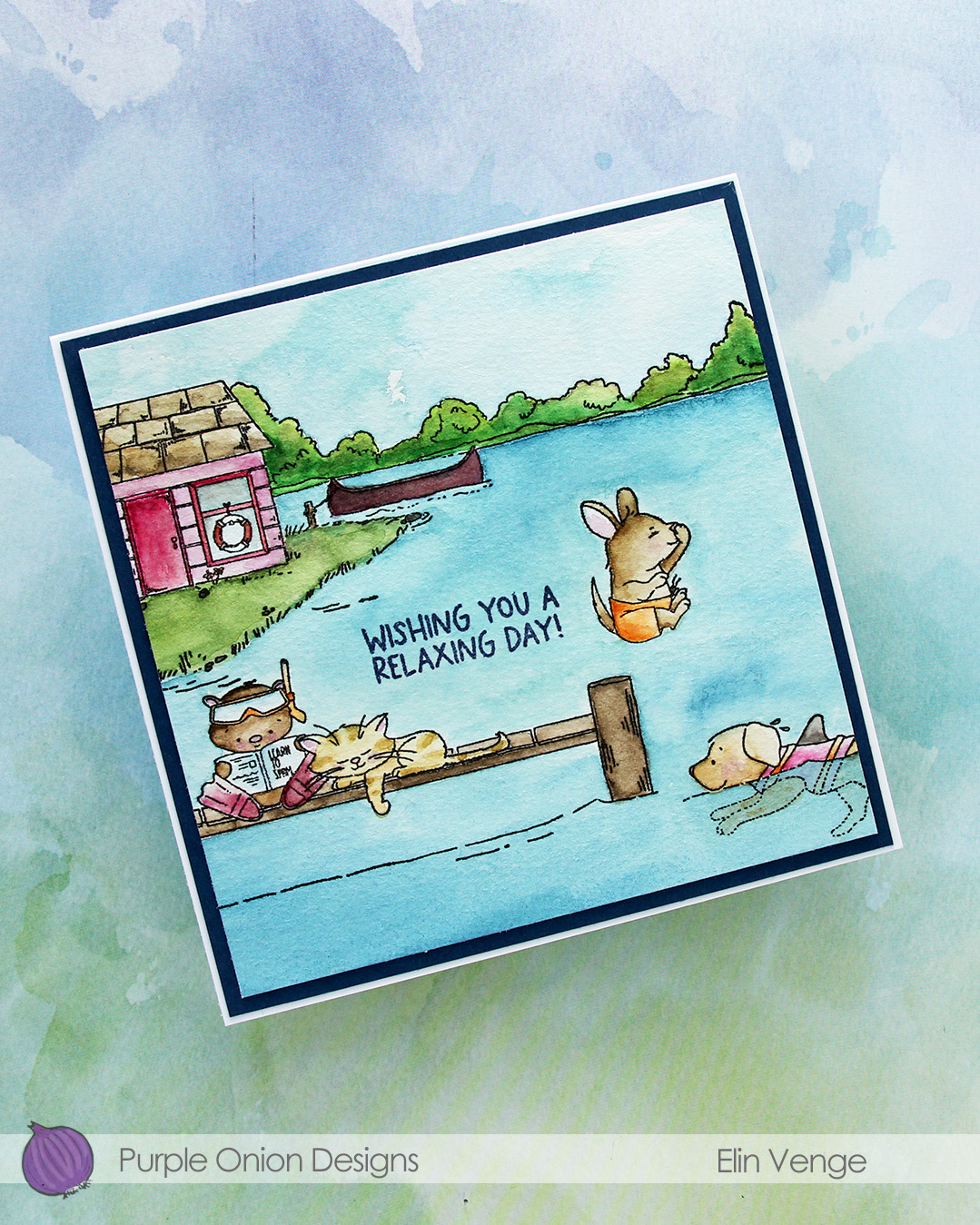
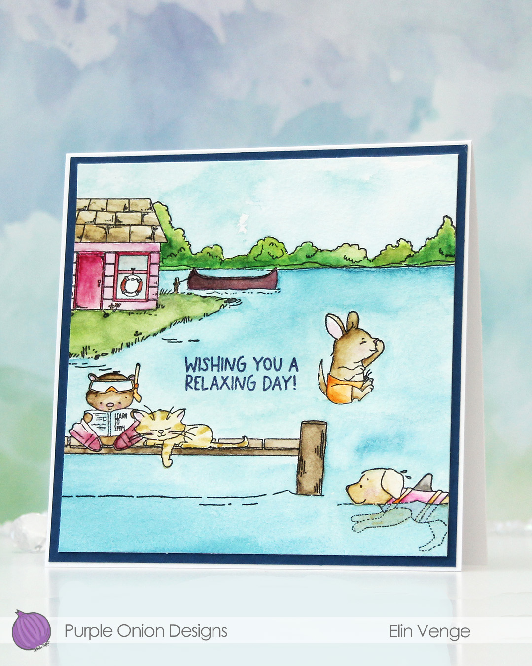 I don’t use watercolor a lot, but a palette with watercolor paint is a lot more travel friendly than 360 Copic markers, and I was on vacation in the mountains when I painted this last summer. Only having access to watercolor forces me to play with them and familiarize myself with them, which is a good thing.
 The images are all stamped using Obsidian ink from Altenew, which is a pigment ink that works well with watercolor. The paper is Fabriano Artístico cold pressed watercolor paper. I used my Mijello Mission Gold watercolor paints and brushes of varying sizes. I’m not an expert watercolorist, so the coloring’s pretty basic.
 I trimmed my panel, stamped a sentiment from the Summer Days Sentiment set using Winter Lake ink from Altenew, matted the panel with a piece of Enchanted Evening cardstock from Papertrey Ink, then adhered that to a square card base (5 5/8″ x 5 5/8″) that I created from Stamper’s Select White cardstock, also from Papertrey Ink.
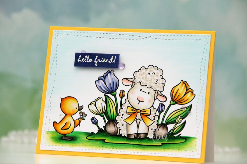
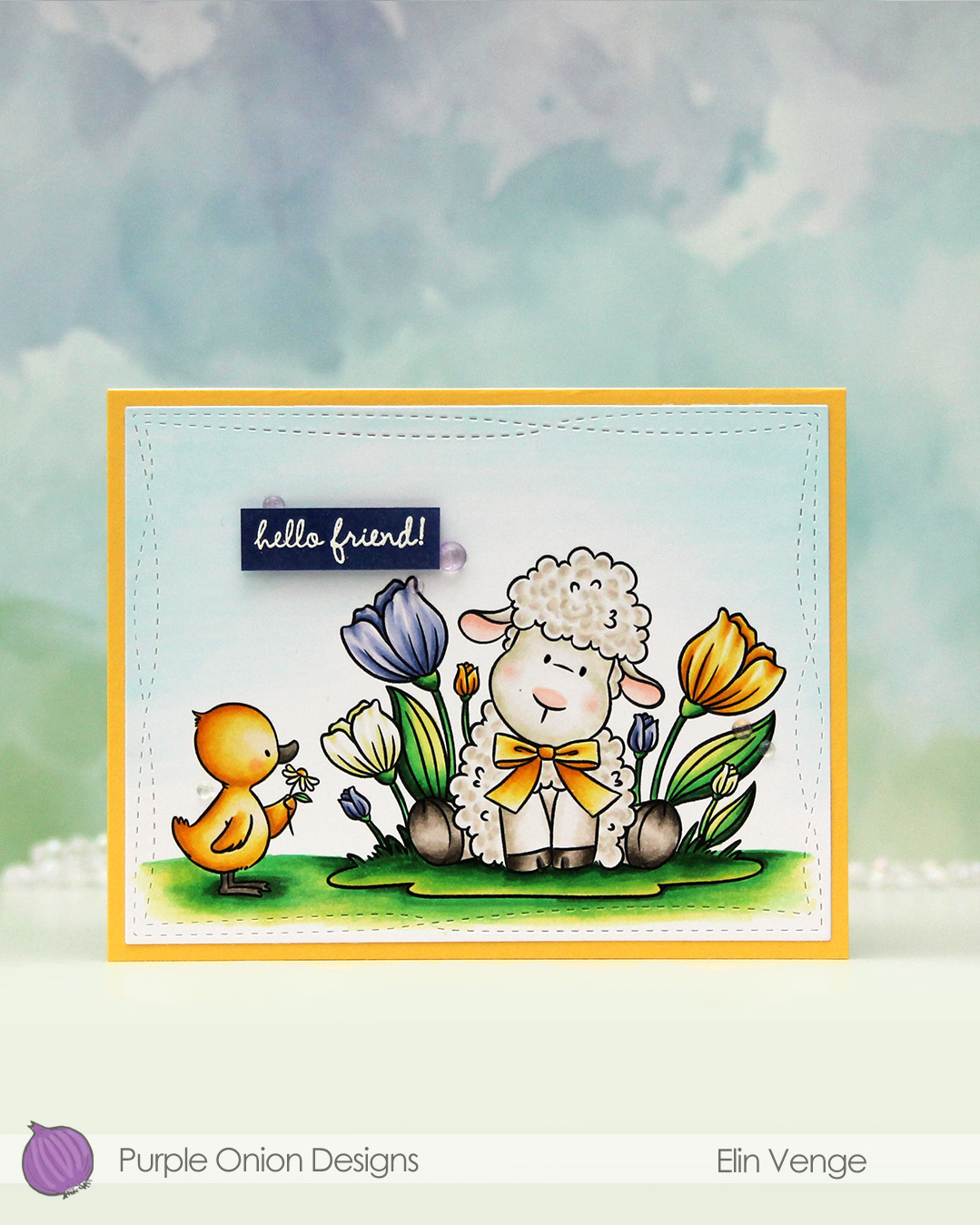 I colored the image with Copics, choosing a very bright green combo for the ground and the leaves. I didn’t want all the flowers to be the same color, so I went for a crocus look. I love all the details you get in a real crocus, but they’ve yet to bloom, I guess it’s still too cold.
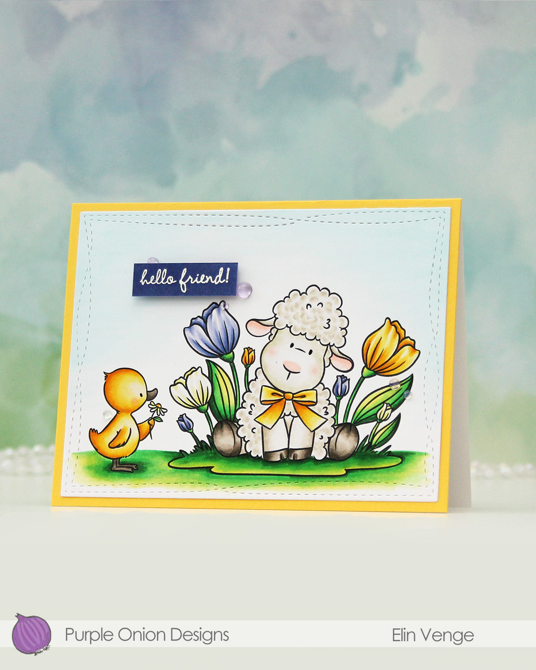 I used the largest die in the Wonky Stitched Rectangles STAX die set from My Favorite Things to turn my colored piece into a panel with a fun detail along the border. then adhered it to a panel of Butterccup cardstock from Concord & 9th, which I in turn adhered to a top fold white card base created from Stamper’s Select White cardstock from Papertrey Ink.
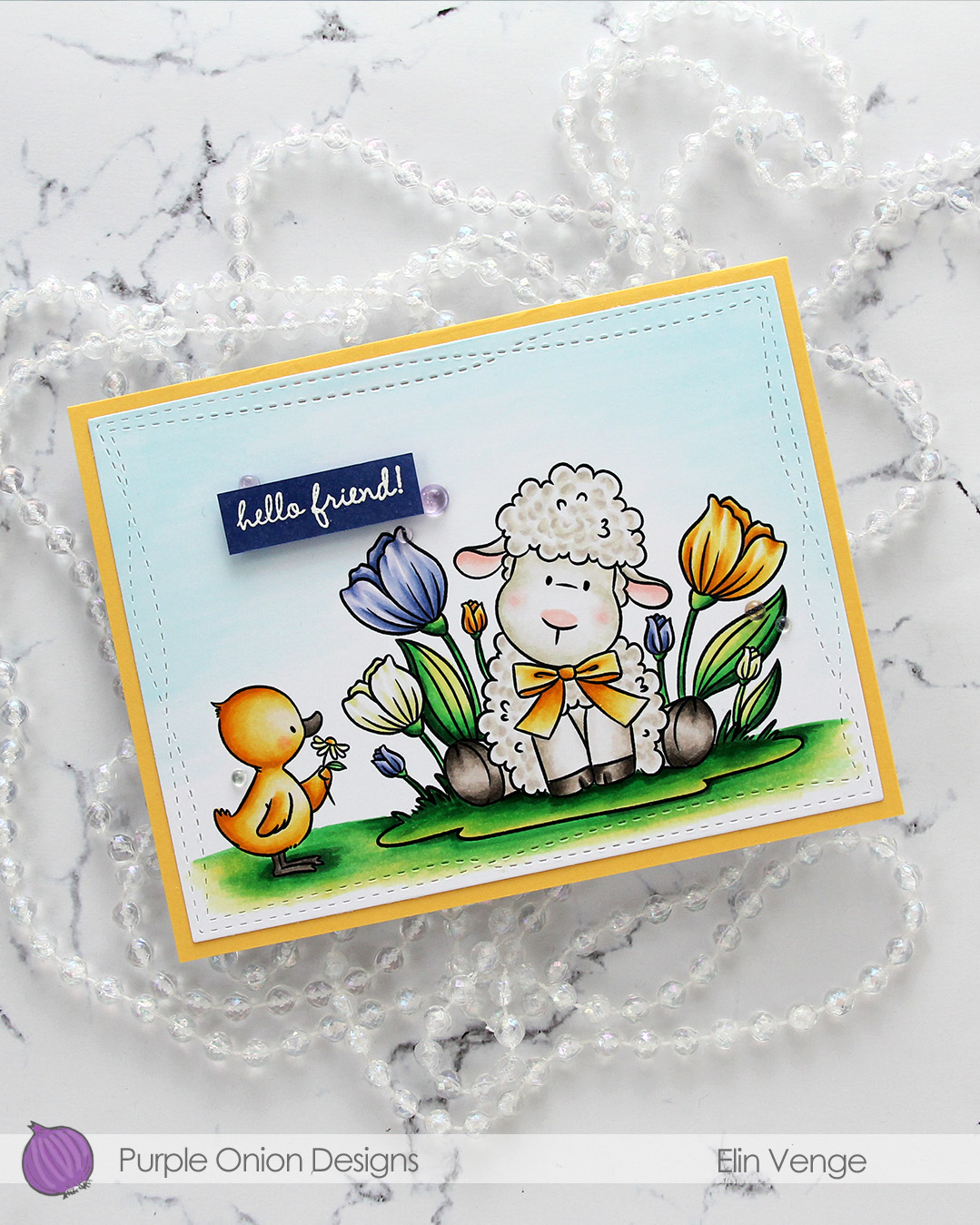 I couldn’t find the right shade of purple in my cardstock collection, so for the sentiment, I colored a scrap piece of X-Press It with one of the colors I used on the florals. I let it dry, then stamped and white heat embossed a sentiment from the
 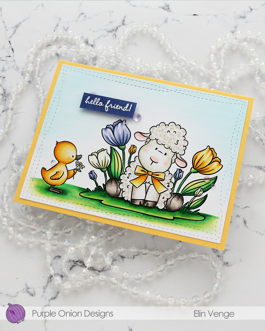 I decided to keep it very simple, only adding a few Iridescent Dew Drops from Pinkfresh Studio to embellish. There are a few different colors in the mix, I chose a few of the purple ones. I did also come in with a black Glaze pen from Sakura to add a touch of dimension and shine to the eyes. It doesn’t really show up in the photos, but you can definitely see it in real life.
