la la la laaaa!
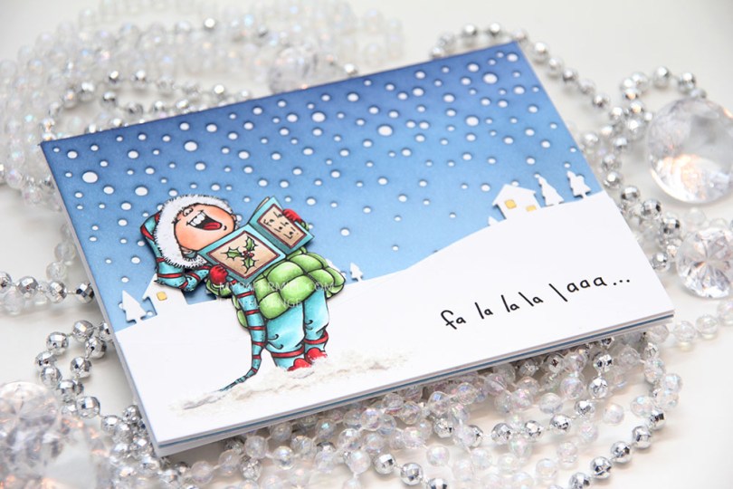
Am I in a Christmas mood? Not really, but it might seem that way. Falalalala was next up on my alphabetic list of Mo Manning images I haven’t yet used, and it needed to go on a Christmas card. Another one done for this year, which admittedly feels pretty good.

I colored my image with Copics as usual. In a split complementary version this time. I’m not a fan of red (not even for Christmas), but when I can use it as an accent color along with blue greens and yellow greens, I feel it works better. I fussy cut my image right up to the black line and glued it to the front of my card.
 I diecut a panel of Spring Rain cardstock from Papertrey Ink using the Snowfall Backdrop die from Lawn Fawn and ink blended over the top. I used Chipped Sapphire Distress ink, Faded Jeans Distress ink, Stormy Sky distress ink and Spring Rain dye ink working my way from top to bottom, dark to light. I glued the piece straight onto my white cardbase.
 I used the Country Landscape die from Memory Box to diecut the background hills from Stamper’s Select White cardstock from Papertrey Ink. I used the same die to diecut the windows using Harvest Gold cardstock, also from PTI, and inlaid them. I popped the entire panel on low foam tape for a little bit of dimension. I then diecut my panel with the sentiment already printed using a die from the Stitched Hillside Borders die set from Lawn Fawn. I’m a huge fan of faux stitch dies, but since the Memory Box die doesn’t have the faux stitching, I didn’t want it on my top panel either, so I used the die upside down and glued this snow bank on with low foam tape. To ground my image I used snow paint just below it as snow, and sprinkled rock candy distress glitter on top while the snow paint was still wet.
 I changed up the sentiment a little. There’s an exclamation mark at the end, but I wanted that to be on the inside, so I added three dots instead and printed the same sentiment on the inside with the three dots in the beginning and the exclamation mark at the end.
 I was a little hesitant about using my blue background at first, because I didn’t think the image stood out enough against the blue. When I created the snow banks, the whole thing transformed, and I’m glad I stuck with the blue.
 Not a lot of markers for this one.
