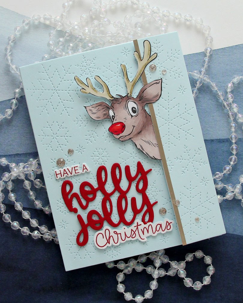
Hi, crafty friends! Is it too early to think about Christmas cards? I know there are lots of people who don’t like creating holiday cards this time of year, and I totally get it. I, myself, am an all year Christmas card maker. My problem for the past couple of years hasn’t been creating the cards, but getting them in the mail. I’ll try to be better this year, we could all use the extra joy that fun mail brings, right? If I want to send cards, I also need to create some, and this Peeking Reindeer from Mo Manning was so cute, I couldn’t resist. It was the November 2025 freebie over on her Patreon.
 I created a tri fold card this time, with the reindeer peeking out from one of the folds. I couldn’t resist a red Rudolph nose, even if that makes my card inaccurate in its reindeer portrayal. Only female reindeer have antlers in the winter, so this is technically a female reindeer. It’s not like a red nosed reindeer is all that believable to begin with, so I guess it doesn’t really matter, it’s just a fun little tidbit.
 For the blue background, I used Powder cardstock from Concord & 9th. I used the Stitched Snowflake Backdrop die from Lawn Fawn to create some interest in the background. I die cut the a sentiment from the Jolly Holiday Greetings die set from Concord & 9th using Cranberry cardstock, also from C9. I stacked three layers, stamped part of a sentiment (have a) from the Christmas Wishes stamp set from My Favorite Things and the word Christmas from the Scripty Xmas stamp set from Mama Elephant, both in Cranberry ink. I die cut the have a with the coordinating die and fussy cut around the Christmas (there’s no coordinating die for this set), and put the three parts together to form a complete sentiment.
 I added a strip of Champagne cardstock from C9 to the edge where Rudolph (not really Rudolph) is peeking out, to emphasize the edge of the panel that opens. I scattered a few Champagne glitter drops from Pinkfresh Studio for a little bit of embellishment.
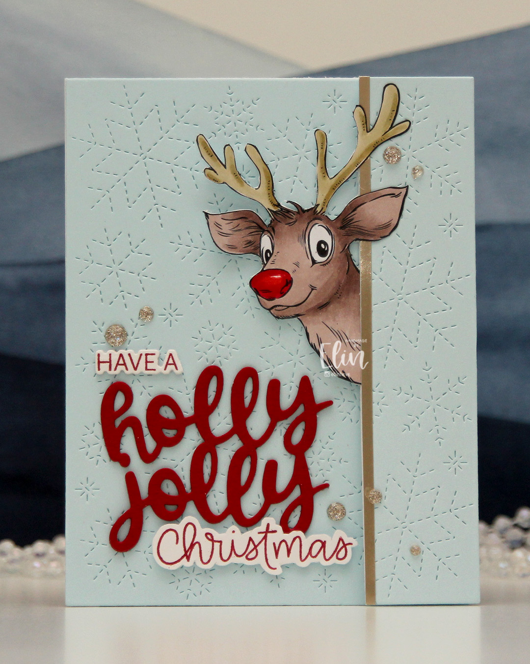
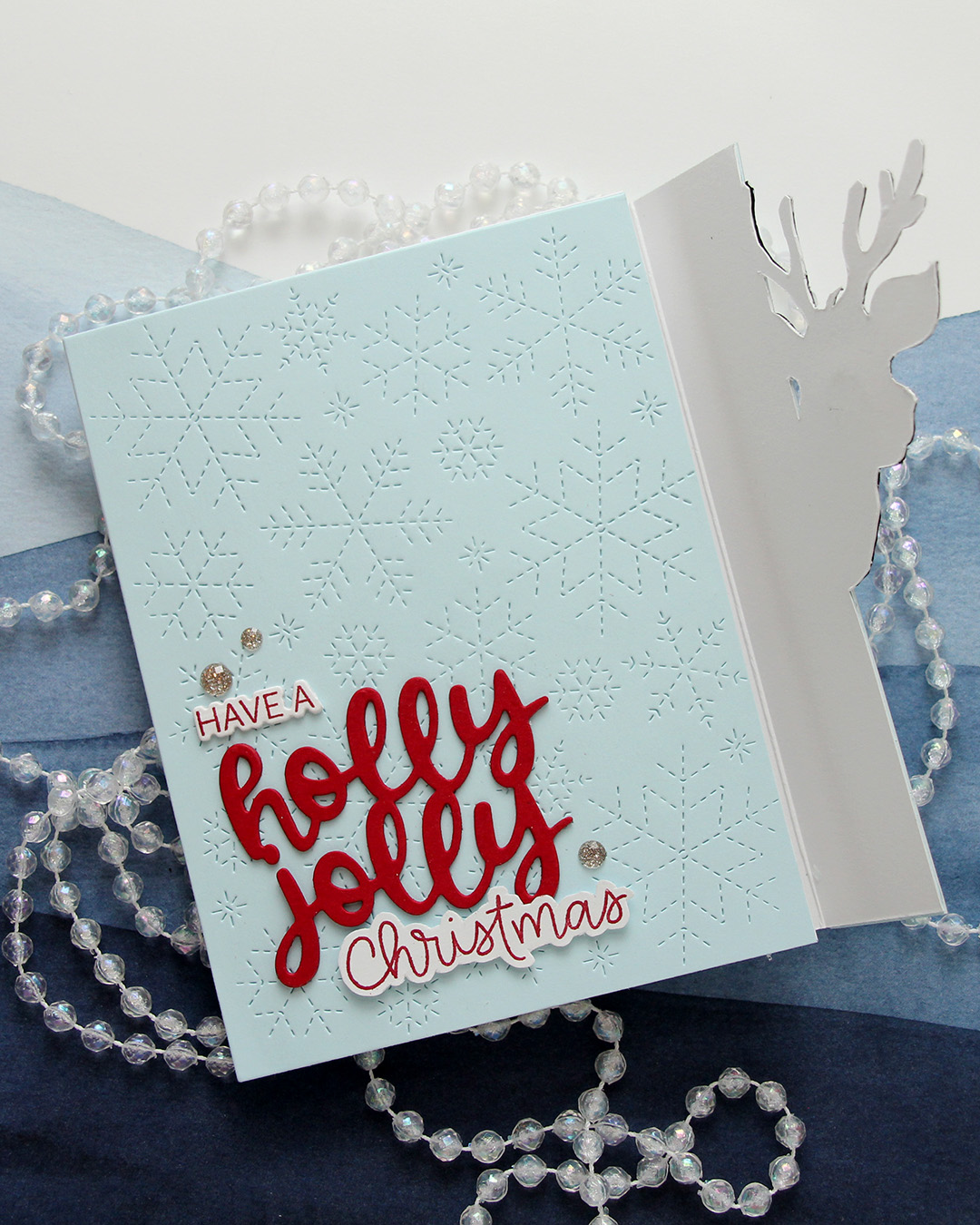 When you lift the flap with Rudolph (not Rudolph), you’re left with a regular side folding card. I’ve hidden magnets so Rudolph (not Rudolph) keeps the flap closed until it’s time to open the card.
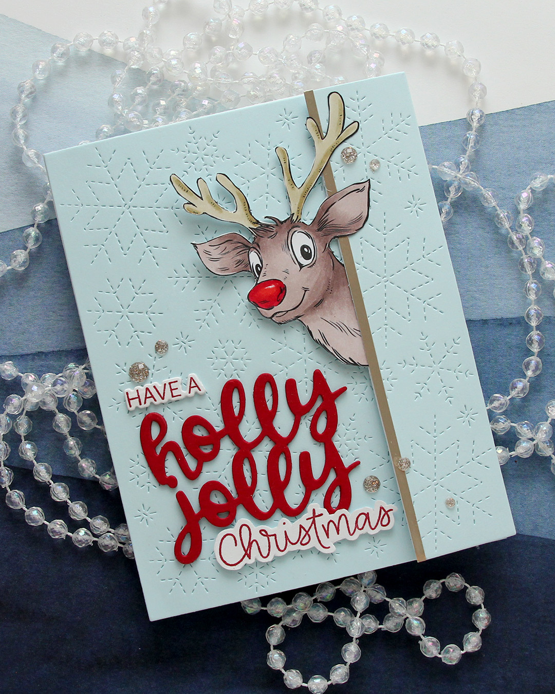
 This one has a super simple color combo, there’s was very little coloring to do on Rudolph (not Rudolph).
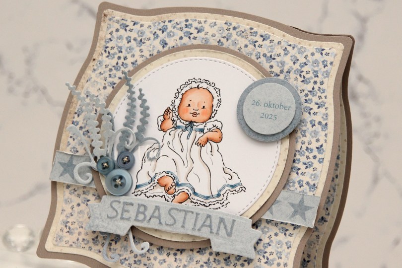
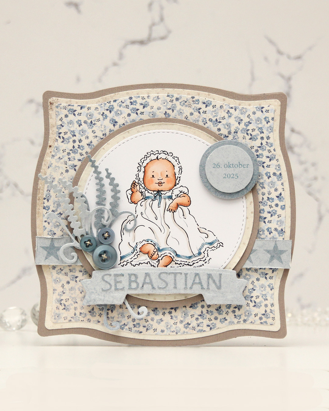 I colored the image and die cut it using one of the circle dies in the Stitched Circle STAX die set from My Favorite Things. I also die cut circles from grey cardstock and patterned paper from the Denim & Friends collection from Maja Design using the Nesting Circles die set from Lifestyle Crafts. The shape of the card is created with the Nesting Frames #8 die set from Lifestyle Crafts.
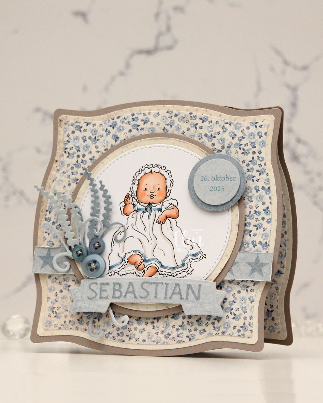 I popped some pieces up using foam tape, die cut the letters for the name using an alphabet die set from Scrapmagasinet and adhered the letters to a banner I die cut with an old die from Spellbinders. I used an old die from Marianne Design for the spriggy things on the left, and used some old Blueberry Sky buttons from Papertrey Ink to embellish.
 Very limited color palette for this one.
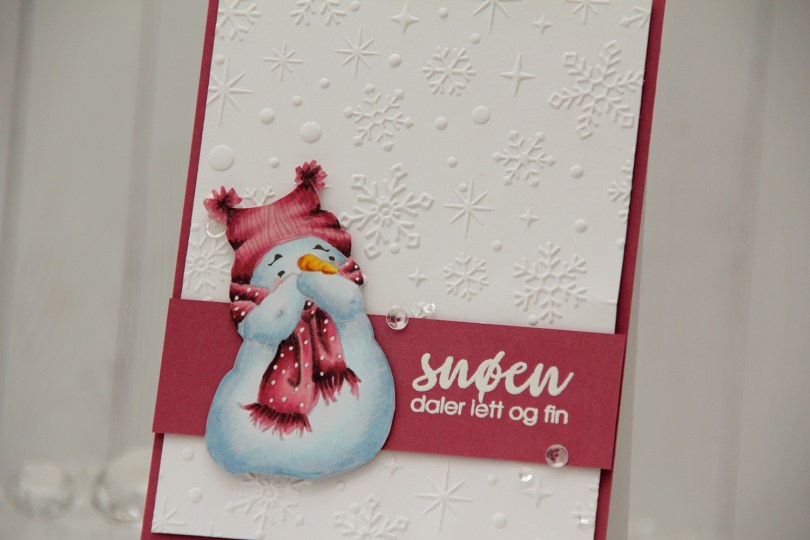
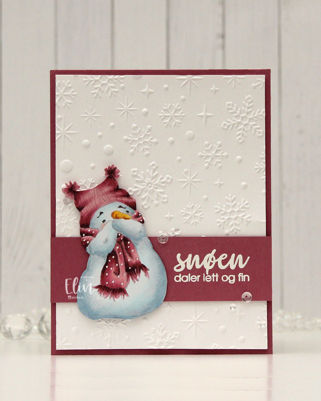 I went for a no line version this time. This is probably my most used image from Mo, and I love how easy he is to color. I chose a pink color combo that I really like, and I think this could work both as a holiday card and as a general winter card. I added the dots back into his scarf using an extra fine white Sharpie, and then fussy cut him. He’s pretty easy to fussy cut, too. I used the Sparkling snow embossing folder from Simon Hurley (Spellbinders) on the background for some texture. I love the detail this embossing folder gives, and they’re proper six pointed snowflakes and not the weird 8 pointed ones that some companies make. Real snowflakes never have eight points, they always come in multiples of six. It has to do with the way water molecules are formed and then bind together. Anyway, it’s a great embossing folder and it adds interest to an otherwise plain background.
 I trimmed my embossed panel slightly, added a couple of layers behind it and adhered it to a card base covered with a panel of Autumn Rose cardstock from Papertrey Ink. On a separate piece of Autumn Rose cardstock, I stamped a sentiment from the Snøstorm stamp set from byCino using VersaMark ink, before sprinkling on super fine detail embossing powder from Ranger and melting it until it was smooth. I cut my sentiment down to a wide strip, added a layer to the back of it for a little bit of dimension, then put a couple of additional layers behind the snowman before gluing him down and finishing the card with a few sequins from the Assorted Moonshine mix from Simon Says Stamp.
 Simple color palette for this one.
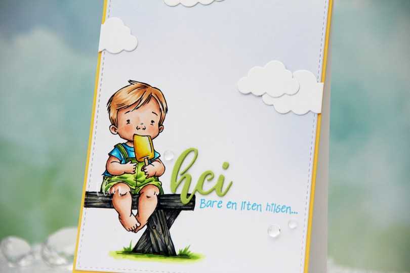
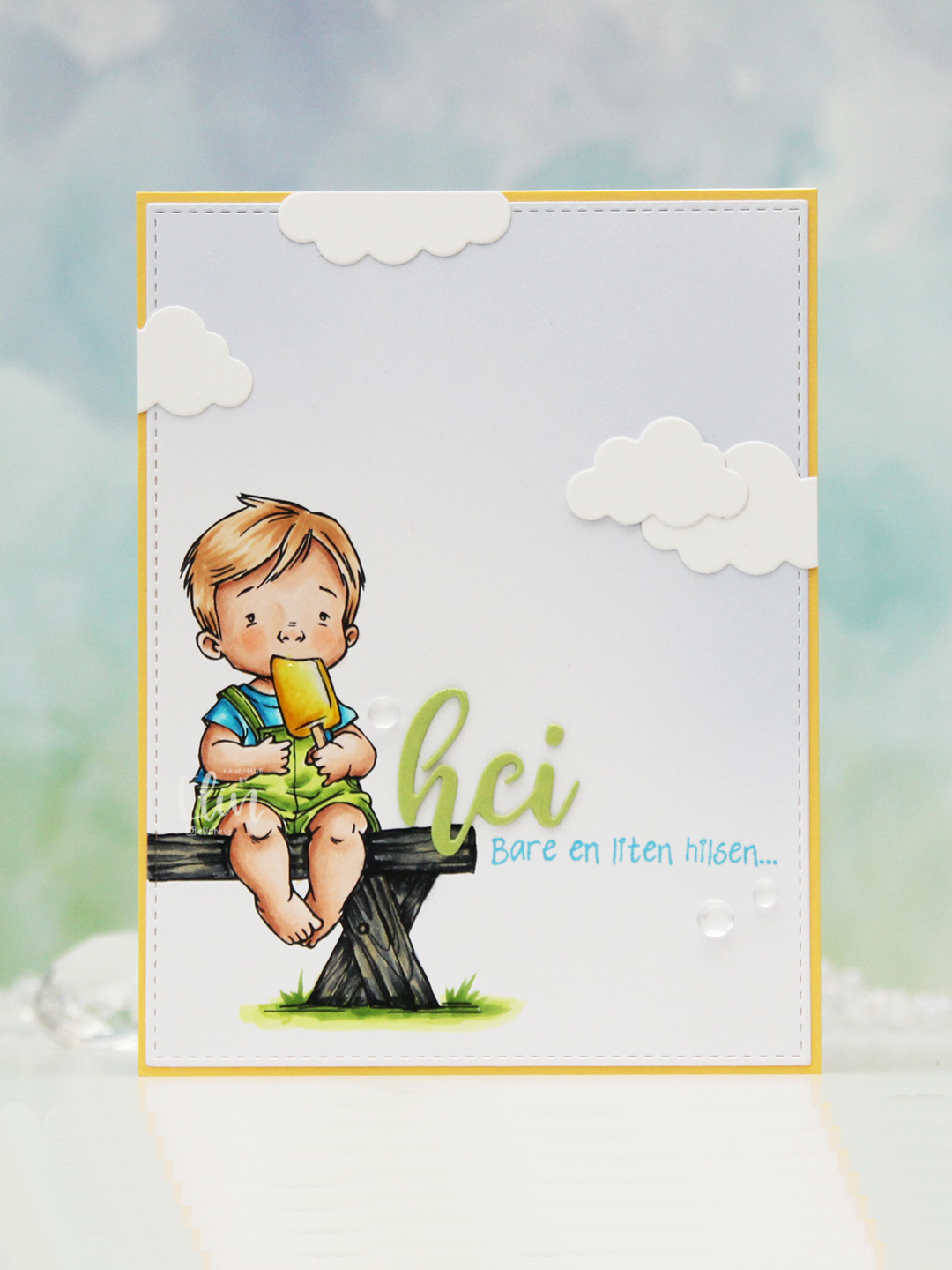 I colored the image with Copics, opting for the cool grays for the bench. I wasn’t planning on making it this dark originally, but when my C9 made a blob, dark was the only way to go. It still works, and I don’t think you can really see where the blob was. I used the largest die in the A2 Stitched Rectangles STAX 1 set from My Favorite Things to trim the panel down a little, then a large blending brush to add some soft blue to the background. I didn’t add any ink to the brush, I simply used whatever was left from a previous project.
 I stamped a sentiment from the Småtekster stamp set from Norsk Stempelblad AS next to the bench using Tide Blue ink from Altenew. I added my colored piece to a panel of Buttercup cardstock from Concord & 9th, which I then adhered to a top fold white card base. I die cut the word hei twice from Green Parakeet cardstock from Papertrey Ink, stacked them and adhered my double die cut next to the boy on the bench before adding a few die cut clouds and some dew drops. Both the cloud dies and dew drops are from Concord & 9th.
 I used quite a few colors for this very simple image.
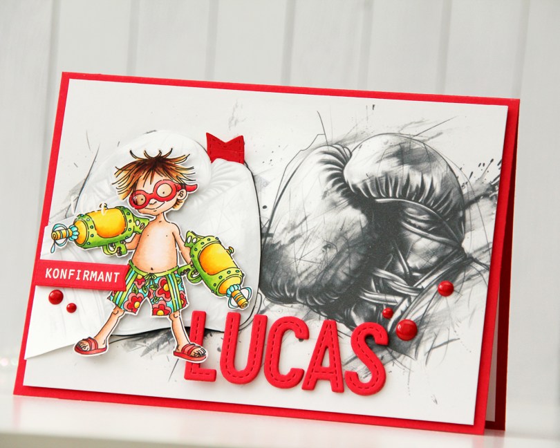
 I looked for a kickboixng image I could color up, as I wanted that to be the main focus on the card – it was his main hobby. I didn’t have one, nor could I find one, but I found this greyscale sketched image with boxing gloves that was perfect.
 The gloves cover the entire front of the card. I still needed something to color, because a black and white image isn’t very interesting on its own. I settled on
  I mounted the colored image on pieces of foam tape, making sure to add a magnet in a strategic spot to keep the flap from opening on its own. I put another magnet behind the image of the gloves to keep both magnets hidden. They’re still plenty strong enough to work through a couple of layers of cardstock.
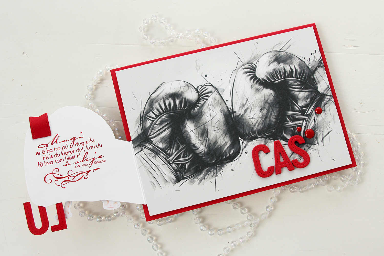 Once you open the glove fully, there’s a sentiment from an old confirmation stamp set from Stempelglede, stamped in Wild Cherry ink from My Favorite Things. I used one of the dies in the Essential Stitched Sentiment Strips die set from My Favorite Things to create a flag end to pull the glove open when the card is closed. The magnets are so strong, it won’t open on its own, and by adding the little flag end, it gives the recipient a little clue to look behind the glove.
 Back to the front of the card when it’s closed. I stamped an white heat embossed the word KONFIRMANT from the A05 stamp set from Norsk Stempelblad AS onto a piece of Red Hot cardstock from My Favorite Things, and then die cut it using a banner die from MFT – they have lots! I popped it up and made sure the end crossed into the image, to tie the two together. I did the same thing with my letters, die cut using the In Stitches Alphabet die set from My Favorite Things, also from Red Hot cardstock. I stacked a few layers for dimension and stability, the L and the U are only barely attached to the glove and the back of his left leg, so they needed a little bit of strength.
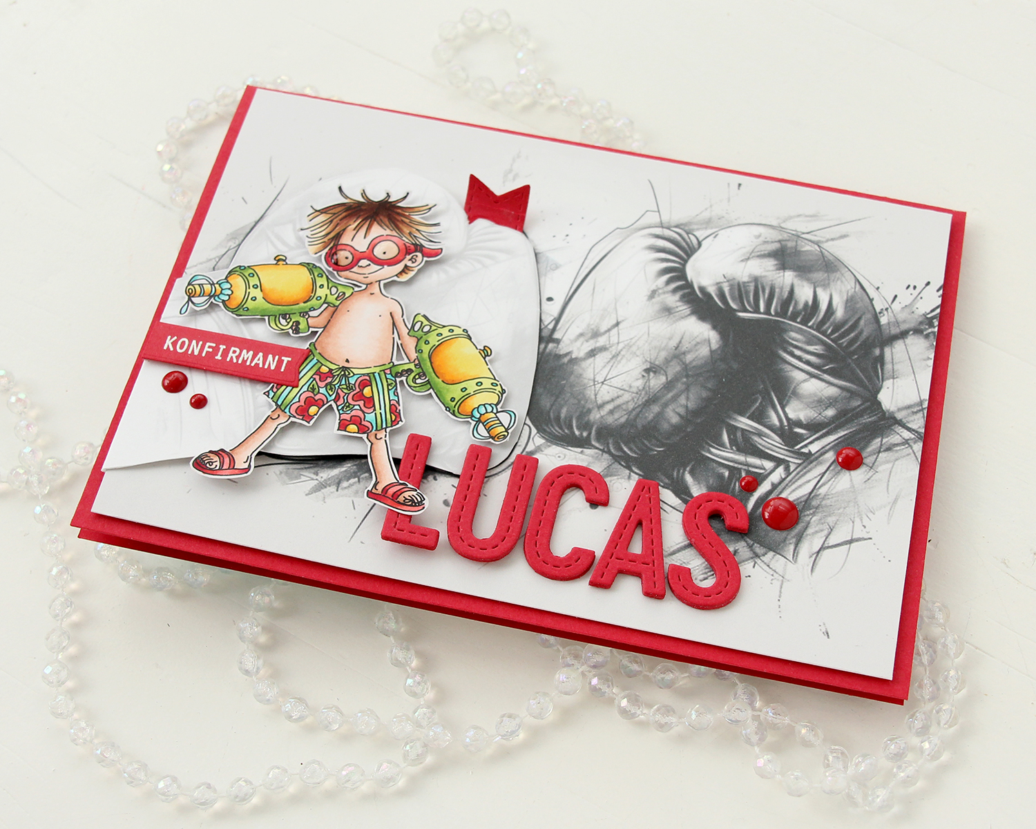 I finished off the front with a few red enamel dots from Papirdesign.
 On the inside, I printed and cut out a checkerboard pattern, which I thought worked well with the car racing theme. There’s still plenty of room to write a personal message. I also used the Wax Seals die set from Waffle Flower to create a rosette badge with a Norsk Stempelblad AS confirmation sentiment heat embossed in the center. I used the Itty Bitty Strips dies from My Favorite Things to create the ribbon ends hanging down from the actual rosette.
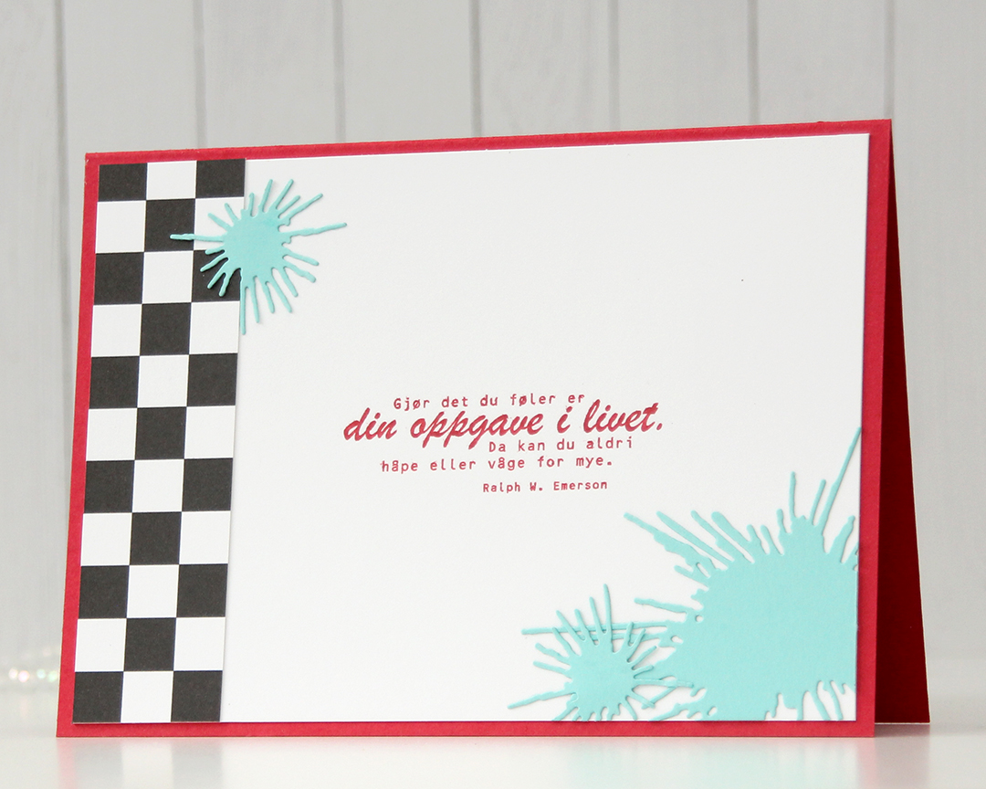 On the back of the card, I used more of that checkerboard pattern, stamped another confirmation sentiment (it’s actually an Emerson quote) and used the Splash die set from Papirdesign to create some water splashes from Summer Splash cardstock from My Favorite Things. I thought they tied in well with the super soakers in the colored image on the front of the card.
 A simple color palette to finish off. This card was a hard nut to crack, but once I got going I had a blast (no pun intended) creating it.
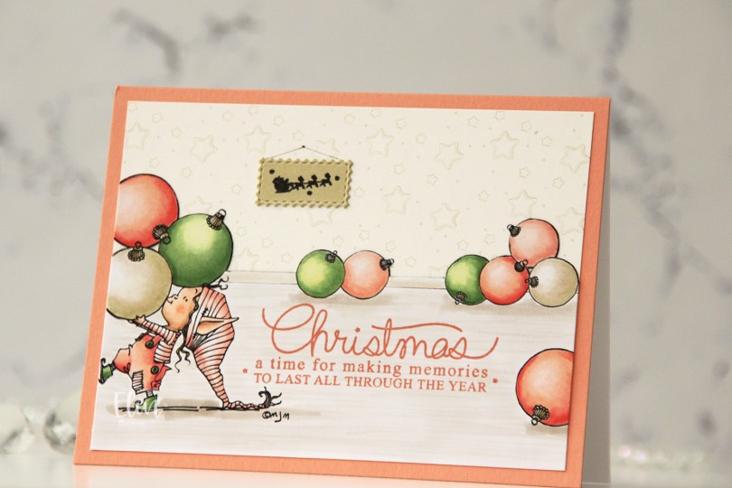
 I separated out the baubles from the image and did some copy paste work to create my scene. It’s one of the advantages of using digital stamps, and it makes them super versatile. I drew in a base board at the back with a black Copic multiliner and colored my scene.
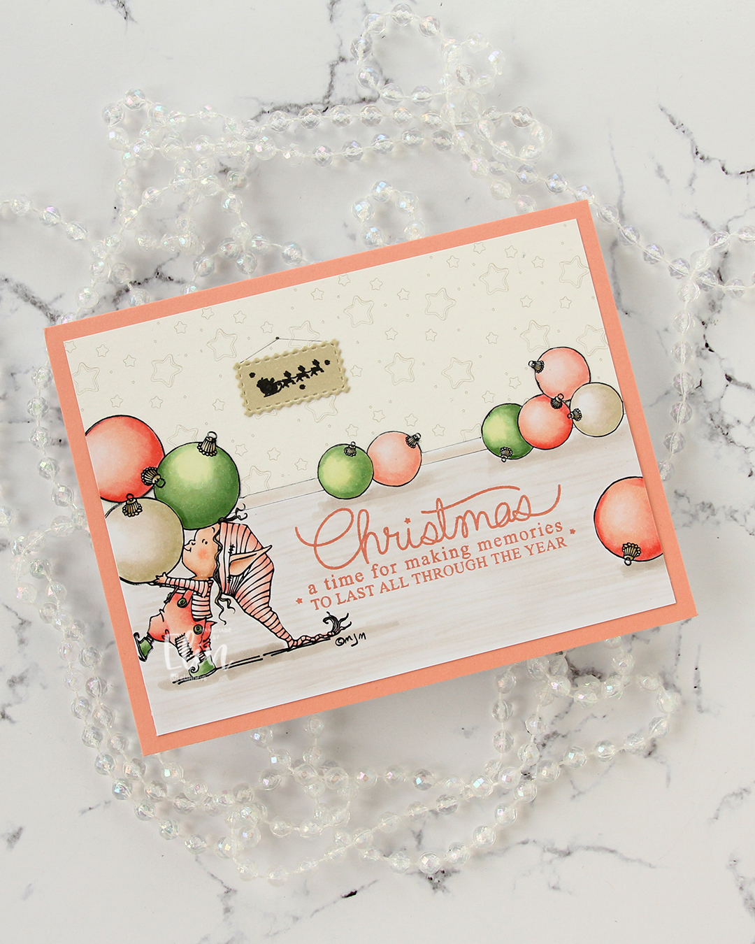 I fussy cut around the back bauble and base board and adhered my colored piece onto a piece of patterned paper from ModaScrap that acts as a wall paper for my background. To make it even more obvious that it’s supposed to be a wall, I stamped part of the Window Signs image from Purple Onion Designs using Altenew Obsidian ink onto a scrap piece of X-Press It blending card that I’d colored with one of the neutral colors (E81) I used for my baubles. I then die cut that using the Postage Collage Die set from Waffle Flower and adhered it to my wall, drawing in strings and a nail on the wall for it to hang from.
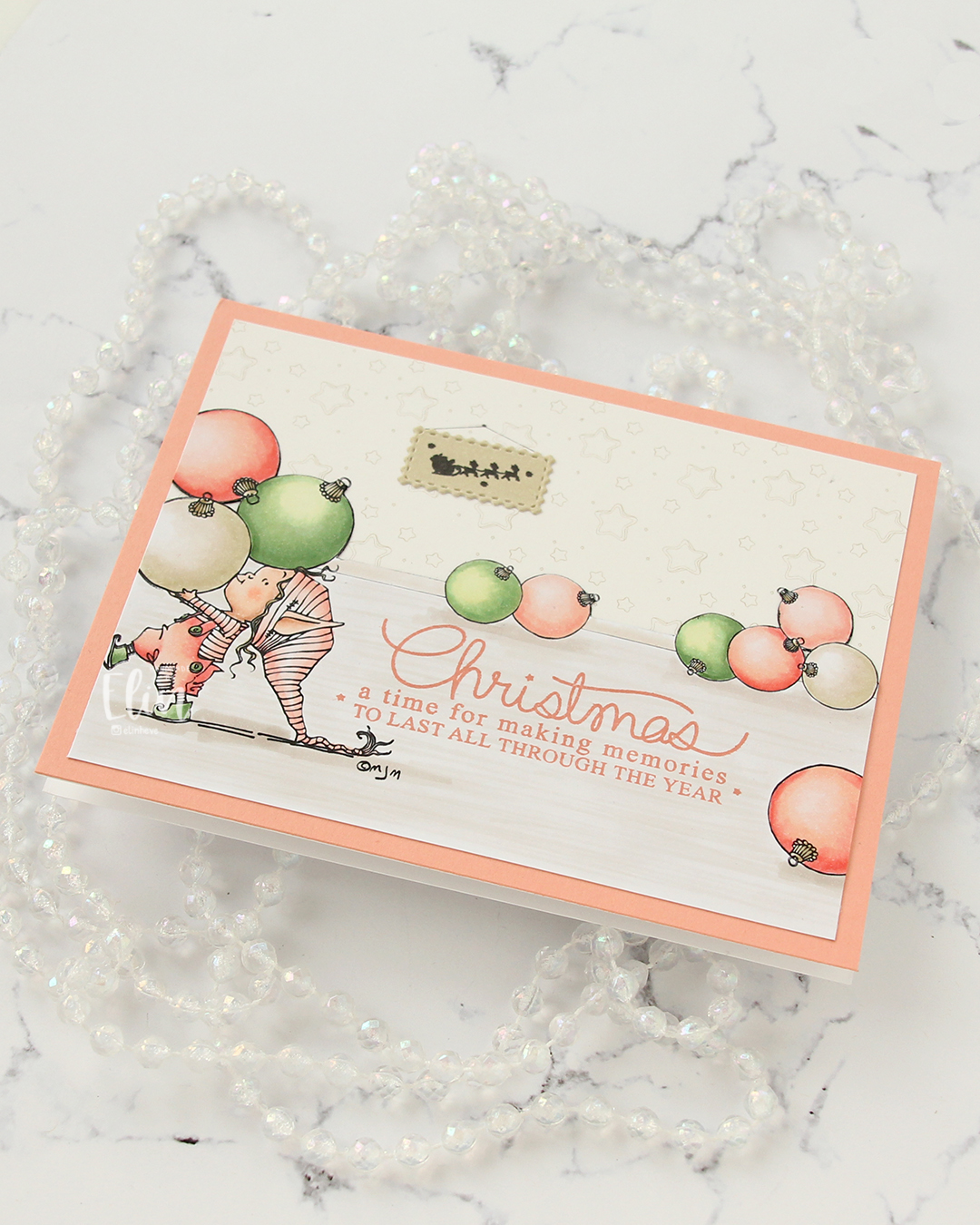 I stamped a sentiment from the Merry Greetings stamp set from Mama Elephant using Melon Berry ink from Papertrey Ink. It matches really well with the coloring. I adhered my scene to a card base covered with a quarter sheet of Grapefruit cardstock from Concord & 9th to create a matching frame and my card was finished.
 Limited Copic color palette for this one. I also used W3, W1 and W0, but I see now that I cut my graphic off too short, so they’re missing here.
 When I printed my image, I printed
  Once my coloring was complete, I used the Notebook Edge die from My Favorite Things to cut from the edge of the panel for a little bit of interest. I mounted my little scene using foam tape onto a card base I created from Cornflower cardstock from My Favorite Things.
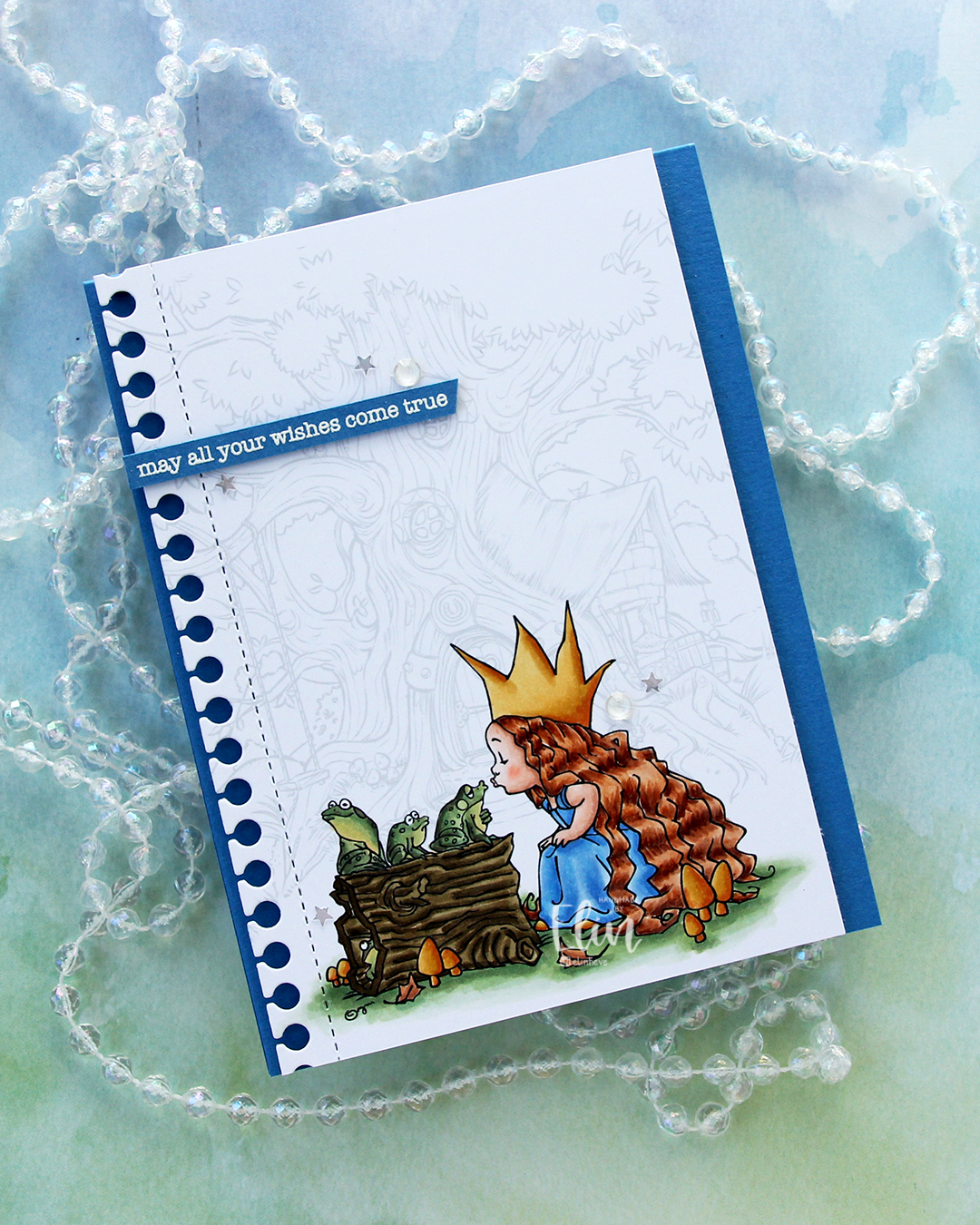 I stamped a sentiment from the Birthday messages stamp set from Mama Elephant using VersaMark ink onto a scrap of Cornflower cardstock, added super fine detail embossing powder from Ranger and heat embossed. I always heat emboss from the back of the back of the cardstock only, it gives a much better result than heat embossing from the front.
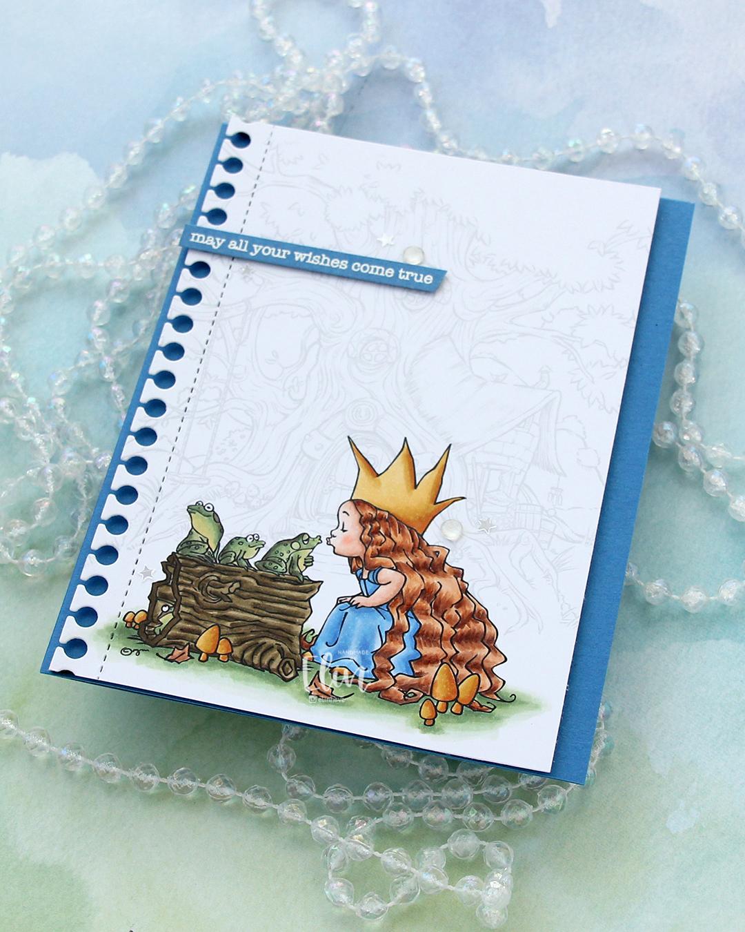 I cut my sentiment down to a strip, added a couple of layers of cardstock behind it for dimension and adhered it near the top left of the card, before finishing off with a few gems and confetti stars from the Starry Night mix from Little Things from Lucy’s Cards. The stars made me think of “When you wish upon a star”, which goes perfectly with the sentiment and the “Once upon a time” theme for the Coloring Club Challenge.
 I used a fairly limited color palette for this one, I feel.
 I made a
  I created a shaped card using the Nesting Frames 8 die set from Lifestyle Crafts, and used a few sizes of this die for the patterned paper panels on my card, which are all created from the Vintage Spring Basics collection from Maja Design. I die cut a white doily using the English Tea Party die from Cheery Lynn, mounted it in the center of the card and added my circles on top. I die cut the letters to spell the boy’s name using Die 304 from Kort & Godt and adhered them to a strip I die cut with the Essential Stitched Sentiment Strips die set from My Favorite Things. I added some Studio Calico veneer stars to embellish and a button from Kort & Godt that I put on top of a bow I created from Chalk White seam binding which I’d colored with Copic B95 and B91. This took me back – I used to color seam binding with Copics to match my card sooo often back in the day, and it honestly made me a little nostalgic doing this.
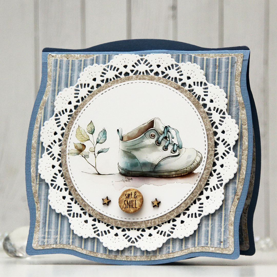 The insides of the card have the same basic layout as the front, just different patterns, and I left the stitched circles plain white for the personal message. On the back of the card, I die cut a pre printed image from Kort & Godt, found another button and added a star on each side of it to finish.
 Very limited color palette for this one, there wasn’t much to color.
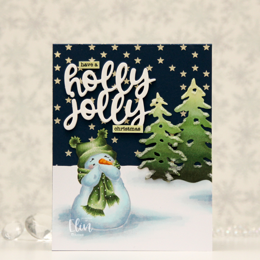 I love coloring this image in noline versions. I usually print with his eyes and eyebrows in a dark brown and the rest of him in a super light grey. I kept the snow on the ground around him this time, and cut away the part of the panel that above my imagined horizon line. I created stars in the sky by using solar paste from Simon Hurley (in the golden hour color) through the Falling stars stencil from Simon Says Stamp onto the front of an A2 card base I created from After midnight cardstock from My Favorite Things.
 Once the stars were dry, I adhered my panel with my snowman, adding die cut trees a little bit below the horizon line. I created the trees by coloring a scrap piece of X-Press It using the same green markers I used for the image, before die cutting them using the Silhouette Snow Trees die set from Mama Elephant. I finished off the trees with some liquid glue and Rock Candy distress glitter for a sparkly, snowy look. For a sentiment I die cut the words holly jolly from the Jolly Holiday greeting die set from Concord & 9th five times from white cardstock and adhered them all together for a stacked, dimensional look and completed the greetings with some small words from the Holiday messages stamp set from Mama Elephant that I stamped in Obsidian ink from Altenew onto pieces of cardstock I colored with the lightest of the green markers I used for the snowman and the trees.
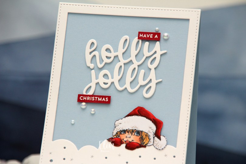
 I colored the image with Copics and fussy cut it. It’s an easy one to fussy cut, so that helps. I die cut a frame from the Mega Snowflake Cover die set from Mama Elephant three times from white cardstock, stacked them and adhered the stack to a card base I created from Blue Breeze cardstock from My Favorite Things, before mounting the image with foam squares.
 I used one of the dies in the Jolly Holiday Greetings die set from Concord & 9th to die cut a few times from white cardstock and stacked those as well. I adhered the stacked die cut to my card base. I stamped and white heat embossed a sentiment from the Itty Bitty Holiday stamp set from My Favorite Things onto Amarena Cherry cardstock from My Favorite Things, cut the sentiment apart and used part of it to complete the sentiment on the card, before finishing off with a few pearls from the Glossy Porcelain mix from Little Things from Lucy’s Cards.