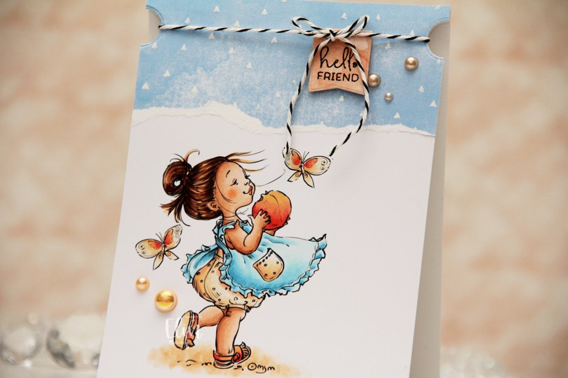
Hi, crafty friends. I haven’t shared many cards recently, and I apologize for that – there have just been too many things lately needing my attention, and it means less time in the craft room. I do have a new card today, though (yay), featuring this cute Peaches image from Mo Manning. I’ve used this one before, and it’s very summery. I’m holding onto summer (or at least the idea of summer, we didn’t really have much of a summer this year) for dear life, even though the leaves are changing colors and falling like it’s all they know how to do.
 I colored her up with my Copics and kept the panel intact this time. No die cutting, no nothing. I adhered it directly to a top fold A2 card base and put a torn piece of patterned paper at the top. The paper is from the Watercolor Wishes pad from Lawn Fawn, and I white heat embossed triangles onto it to create a little more interest, using the Scattered Triangles Background stamp from My Favorite Things.
 I used a small circle die to create notches near the top of the card. I stamped a sentiment from the Mini messages stamp set from Mama Elephant using Obsidian ink from Altenew onto a piece of patterned paper from the Watercolor Wash Brights paper pad from My Favorite Things, and die cut it with one of the dies in the Blueprints 27 die set from My Favorite Things. I put foam tape on the back and adhered it to my card, before adding some black twine to the card, tying it in a bow at the top of the die cut. The notches help keep the twine in place. I finished off with a few pearls from the Meadow mix from Little Things from Lucy’s Cards.
![]() I love using Rs and YRs to create peach colors.
I love using Rs and YRs to create peach colors.

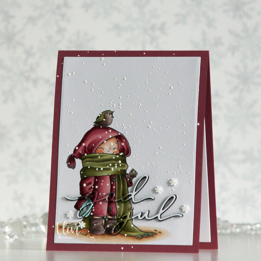 I printed the image on a piece of X-Press It blending card, colored it with my Copics and used a die in the Additional A2 Layers die set from Waffle Flower to trim the rectangle down a bit. You could also use a trimmer for this. Into the panel, I die cut the words god jul using dies from Kort & Godt. The two words are actually from separate die sets, but work perfectly together like this.
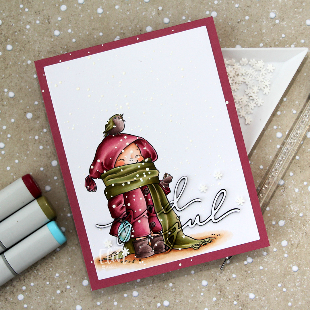 I adhered my panel to a top fold card base I created from Autumn Rose cardstock from Papertrey Ink, paper pieced the counters back into place, sprinkled on Chunky White embossing enamel from Stampendous and heated the granules from the back. I should have done this before adhering my panel to the card base to spend less time with the heat gun (melting the powder through two layers of cardstock takes significantly longer than doing it through just the one layer), but I honestly forgot about it. It does work through two layers, it’s just a matter of patience.
 Once my snow was in place, I die cut four layers of each of the words from black cardstock. I stacked them, added the colored one on top and puzzle pieced them in where they belonged, before adding a few Snowdrift sprinkles from Little Things from Lucy’s Cards to finish the card.
 Pink and dirty green. This is about as close as I (willingly) get to using red and green together on a card.
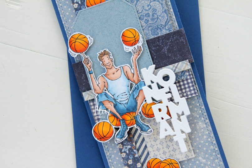
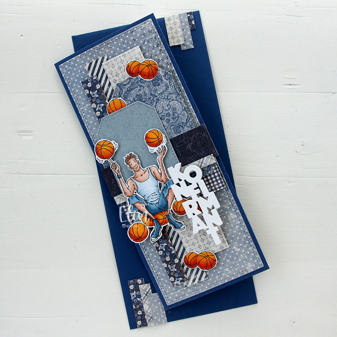 I made a slimline card this time. I created a background from blue scraps from several collections from Maja Design – Denim & Friends, Denim & Girls, Fika and Vintage Autumn Basics are all represented. One of the things I like about the Maja Design patterned paper is that papers match across collections. They’re also made from really good heavyweight paper, which is another tick in the pro column for me. I used the Slimline Double Stitched Rectangle STAX die set from My Favorite Things to create the panel in the back and also the Stitched Traditional Tag STAX die set, also from MFT, to create the tags.
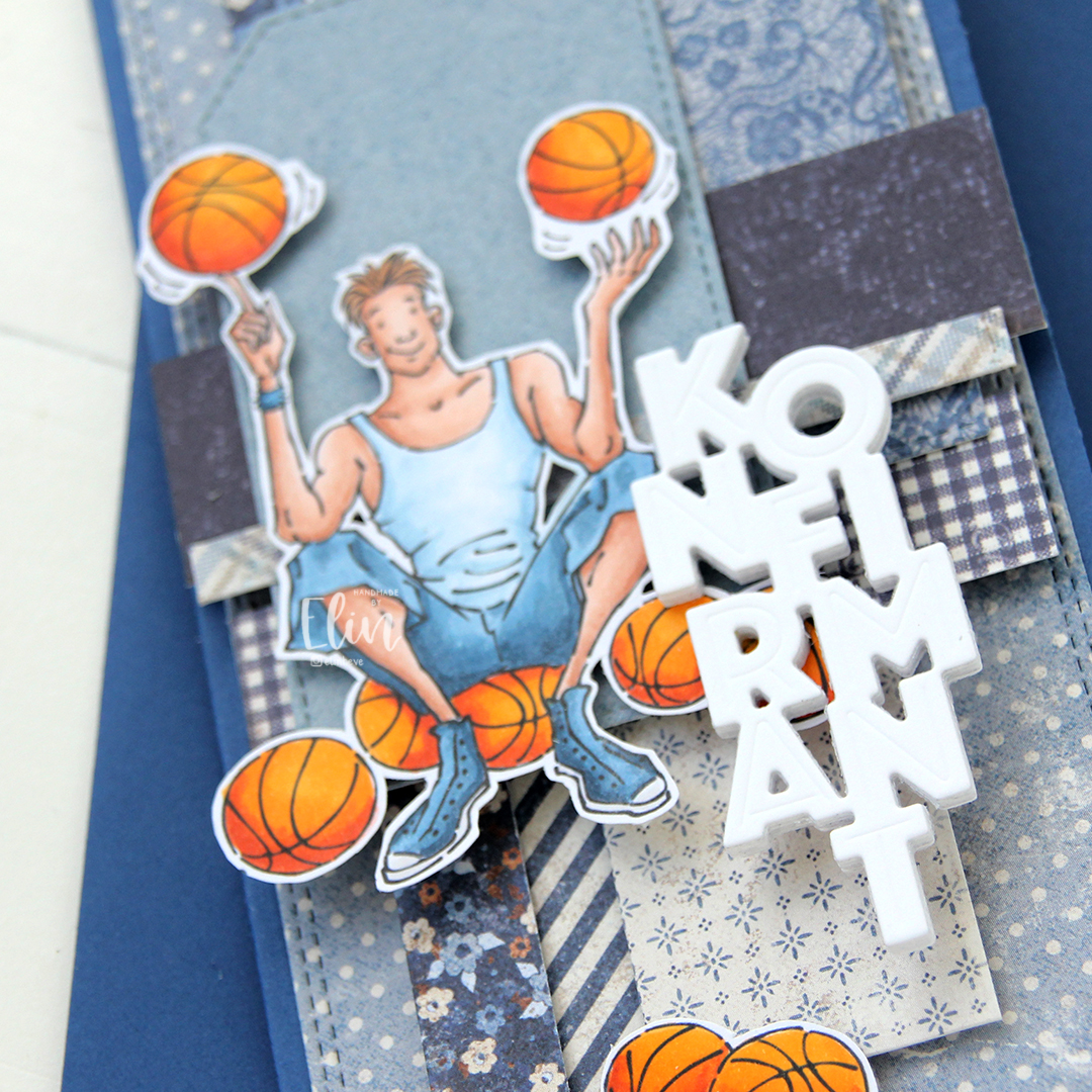 I added the image on top of one of the tags and scattered a few more basketballs around to work as embellishments. The orange really stands out against the blue background. To finish off I die cut the Konfirmant 5 die from Papirdesign six times from white cardstock and stacked them for a dimensional look. I adhered it on top of the image, and it floats above the card further down.
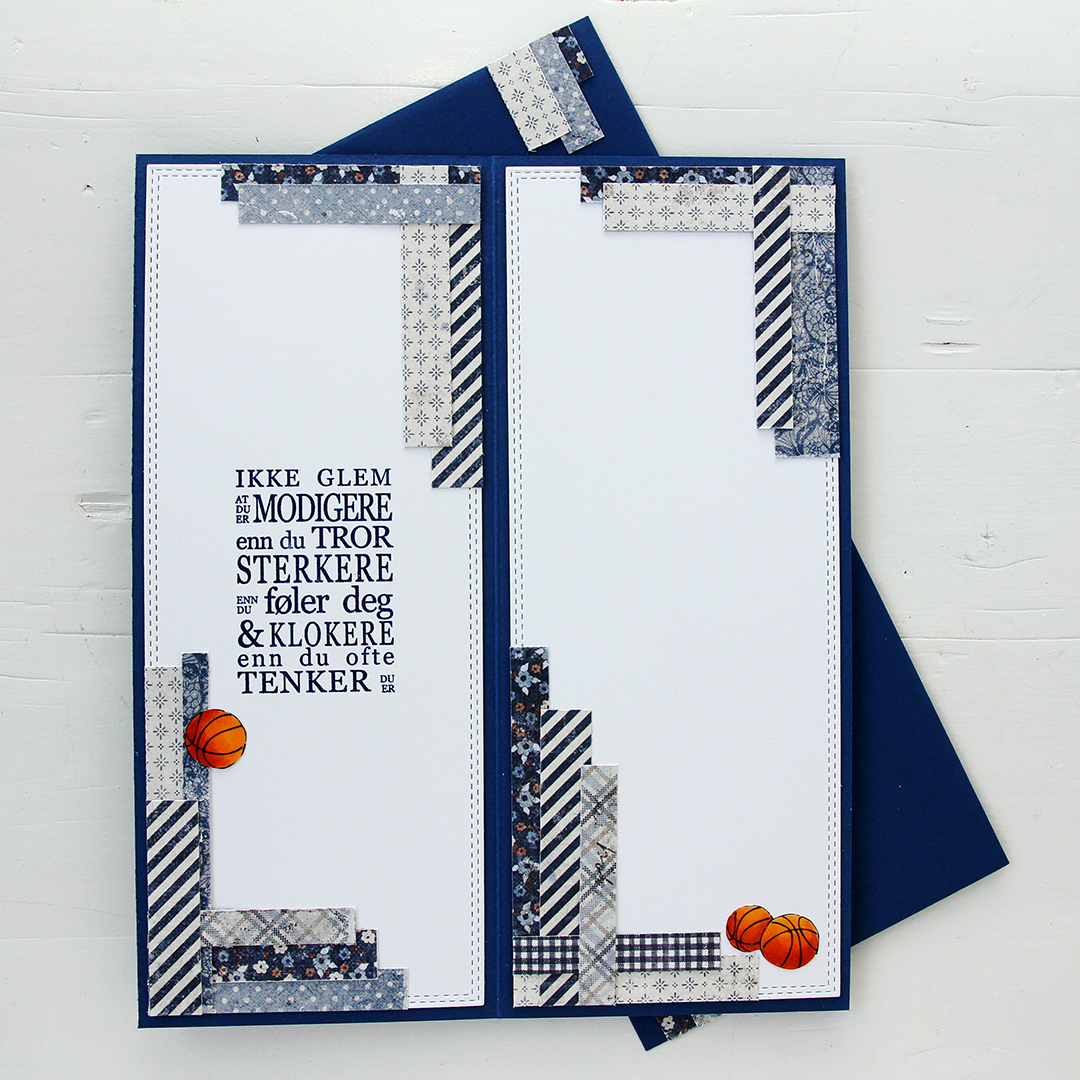 Whenever I make cards to order, I always decorate the inside too. I used the largest slimline double stitched rectangle die to create the white panels on the inside, adding more strips of patterned paper to continue the look from the front of the card and also fill the pages a little. Slimline cards are large, and the added elements make it less daunting to have to come up with a message for the recipient. On one side, I stamped a sentiment from the Konf. 01 stamp set from Norsk Stempelblad using Blue Beyond ink from My Favorite Things, the right side still has plenty of room for a personal message. I also included more basketballs.
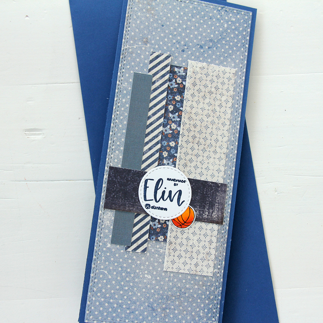 For the back of the card, I used a few strips of patterned paper I had left, die cut a white cardstock circle using the Stitched Circle STAX die set from My Favorite Things and stamped my personal stamp in the center of it using Blue Beyond ink from MFT. The card base is also from My Favorite Things, it’s made from Blueberry cardstock, and the envelope is also in that same Blueberry color.
 Limited color palette for this one.
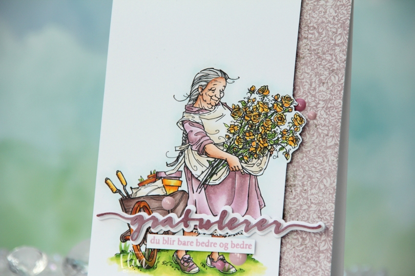
 I printed the image on X-Press It blending card and colored it with my Copics. I pulled out my RV90 series, which I used to use a lot ages ago, but haven’t really used much in recent years.
 Once my coloring was complete, I decided to cut off quite a bit on the right hand side of the panel, which meant doing some fussy cutting around the flowers. I don’t mind fussy cutting, and cutting on the border like this makes for a more dynamic design. Along the right hand side of a top fold card base, I adhered a scrap strip of patterned paper from the Vintage Romance collection from Maja Design, then popped my colored panel on the left.
 I die cut the Gratulerer 6 die from Papirdesign a few times. I die cut the shadow layer in white, then a few stacked of the word, before finishing off with a colored one. I actually colored this one with Copics on the scrap I cut off the panel. This is a neat trick if you want your colors to match, but don’t have the right cardstock color. I stamped a sentiment from the A06 stamp set from Norsk Stempelblad AS using Briar Rose ink from Concord & 9th, cut it down to a strip and adhered it below the die cut, adding a few strips of cardstock behind it for dimension. I finished off the card with a few enamel does from the Shades of Purple pack from Altenew.
 Using patterned paper from Craft Consortium along with a stamp, die and a few sentiment sticker strips from Kort & Godt, I created an envelope to match.
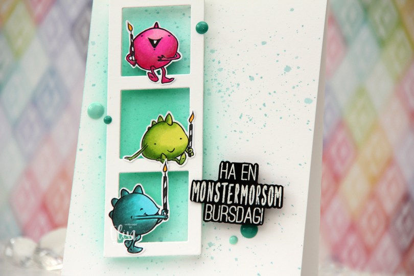
 I colored the monsters on X-Press It blending card using my Copics, then fussy cut them all, before putting them aside while I worked on the rest of my card.
 Onto a top fold card base I created from Stamper’s Select White cardstock from Papertrey Ink, I ink blended a section left of center using Volcano Lake ink from Altenew, then added splatter with some watered down Caribbean Sea ink from My Favorite Things. It adds a little bit of interest to what is a pretty plain background.
 I used the Photo Booth Strip die from My Favorite Things to create my little frame. The die leaves a thicker border at the bottom, but I snipped off the bottom bit to make the border even on all sides. I die cut it twice for strength, then decided to add Crystal Clear Double Thick foam tape from The Rabbit Hole Designs on the back. This creates a lot of dimension, and it also gives an airy effect that you don’t achieve by stacking die cuts (which was my original plan). I added my frame at an angle on top of the ink blending, then put the monsters on the frame.
 I white heat embossed a sentiment from Huldra Designstudio onto a piece of True Black cardstock from Papertrey Ink. I fussy cut around it and used the same foam tape on the back of this to pop it up, before finishing off the card with a few enamel dots from the Sea Shore mix from Altenew, which matches my blended background perfectly. So does the envelope I used, which is also Volcano Lake from Altenew.
 Fun color palette for this one.
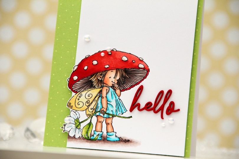
 I colored the image with my Copics, cut my panel way down and even cut a little bit around the image for a fun effect.
 I decided to cover the card base with patterned paper. This one is from Waffle Flower, it’s from their dot pattern in the Christmas color scheme. It’s not too distracting, the colors work well with the colors I’ve used and the dots work well with this amanita mushroom hat.
 I mounted the panel with my image using foam tape and adhered it left of center on the card, so a little bit of the patterned paper would peek out on the right, and a lot of it would peek out on the left.
 I die cut the word hello from the Sweet Sentiments die set from Altenew using Pure Poppy cardstock from Papertrey Ink. I die cut four layers and stacked them together for dimension. This is a very fine lined die cut, and I’ve found that using microdot adhesive is a good way to go. Even liquid glue in a fine tip bottle will ooze out the sides on this one, it’s so fine.
 I finished off with a few pearls from the Glossy Porcelain mix from Little Things from Lucy’s Cards.
 This is such a bright, happy color palette.
 I colored the image with Copics, added some simple ground and flowers next to her and die cut my panel using the largest die in the Additional A2 Layers die set from Waffle Flower, before adhering it to a card base I created from Lazy Day cardstock from My Favorite Things. It’s been a really long time since I’ve made one of my signature “cluster cards”, so I decided it was time for a new one. I keep little die cut scraps in storage pockets sorted by color, which makes it easy to find pieces that will fit any color combination I’ve chosen for my image. I play around with the composition, and when I’m happy, I adhere it all to my card. Some directly, some using foam tape. This gets very thick very fast, but I love this process.
 I stamped a sentiment from the Pristine Peonies stamp set from Altenew using Picked Raspberry Distress Oxide ink, then die cut it into a banner using one of the dies in the Essential Stitched Sentiment Strips die set from My Favorite Things. This goes really well with the other fishtail banners I already had going in my cluster, and the color matches nicely with the pink striped patterned paper from Sunny Studio that I used. I finished off with a few enamel dots from the Pocketful of Sunshine pack from Altenew.
 Very springy color palette. I’m here for it!!
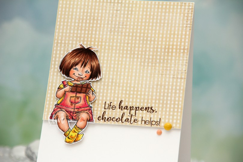
 I colored the image with Copics, fussy cut leaving a white border and created a very simple card for her to sit on. I pulled out a piece of patterned paper from the Coffee in the Arbour 6×6″ paper stack from Maja Design and cut it down to fill about 2/3 of the front of an A2 card.
 I stamped a sentiment from the Coffee and Chocolate stamp set from hÄnglar & Wings onto the bottom of the pattern using Dark Chocolate ink from Papertrey Ink. I added a few layers of cardstock behind the patterned paper for a bit of dimension, and did the same with the little girl, making sure to add a couple of extra layers behind her legs so they wouldn’t sag. I adhered her so she’s sitting right on the edge of the patterned paper and finished off the card with a couple of enamel dots from My Mind’s Eye. The yellow one is from the “Oxford Lane” pack, the peach from the “Sky’s the Limit” pack.
 I colored the image with Copics, then used a die from the Blueprints 27 die set from My Favorite Things to give the panel a nice border around the edge. I added a few layers of cardstock scraps behind the panel for strength and dimension. I created a top fold card base from Lavender Moon cardstock from Papertrey Ink and ink blended from the bottom using Autumn Rose ink, also from Papertrey Ink. This gave my card base a nice ombre effect.
 I used the Big Happy Holidays die from Mama Elephant to die cut four layers from Lavender Moon cardstock. I used the same ink blending trick for the top layer that I used for the card base, ink blending it before I die cut and stacked all four together for a nice, dimensional sentiment. To finish off the card I added a few die cut snowflakes. I used the Snowflake Confetti Fancy die from Hero Arts and CR1335 from Marianne Design to create my snowflakes, and my card was complete.
 I always go overboard when I color snow, even though there was very little of it this time.
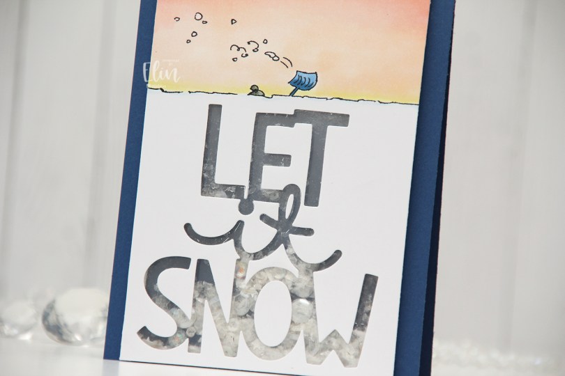
 I really don’t want the sentiment to come true right now, I don’t remember there ever coming this much snow in the city in such a short time, and I’d very much like to not have to walk to work tomorrow. I saw plenty of people out with their shovels today when I walked home, their cars were snowed in, their driveways were full of snow and they could barely open their front doors. It’s winter, we get it, but it’s enough now, we don’t need more snow.
 I’m done venting. I think. I was originally planning on adding a stacked die cut where all the snow is, but then I came up with the idea of a shaker card instead. It’s kind of like the little person under the beanie is trapped inside the shaker with all the shaker bits, which I thought was a fun concept.
 I used the Giant Let It Snow die from Lawn Fawn, covered my window with acetate and filled my shaker well with Distress Mica Flakes, a little bit of Rock Candy Distress Glitter and a small pile of embellishments from the Starry Night mix from Little Things from Lucy’s Cards.
 I added my shaker panel to a top fold card base I created from Blueberry cardstock from My Favorite Things and decided not to add anything else.
 Very simple color palette for this one.