Hi, crafty friends! It’s a well known fact that I love to color. However, after having been on a couple of design team where coloring has not been my focus (thank you Kort & Godt and Papiria), I’ve grown very fond of cards with loads of die cutting. Today I’m sharing three same, but different cards featuring lots of die cut pieces. I have a stamped sentiment on one of the cards and have done a tiny bit of ink blending on another, but it’s mostly die cutting, and I’m here for it.
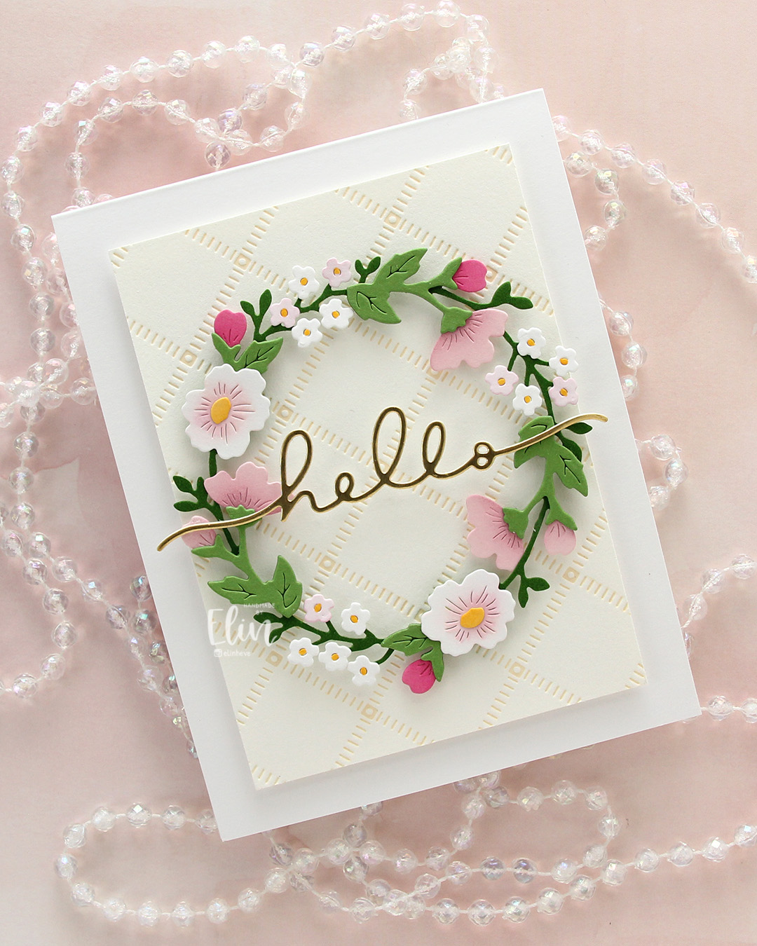
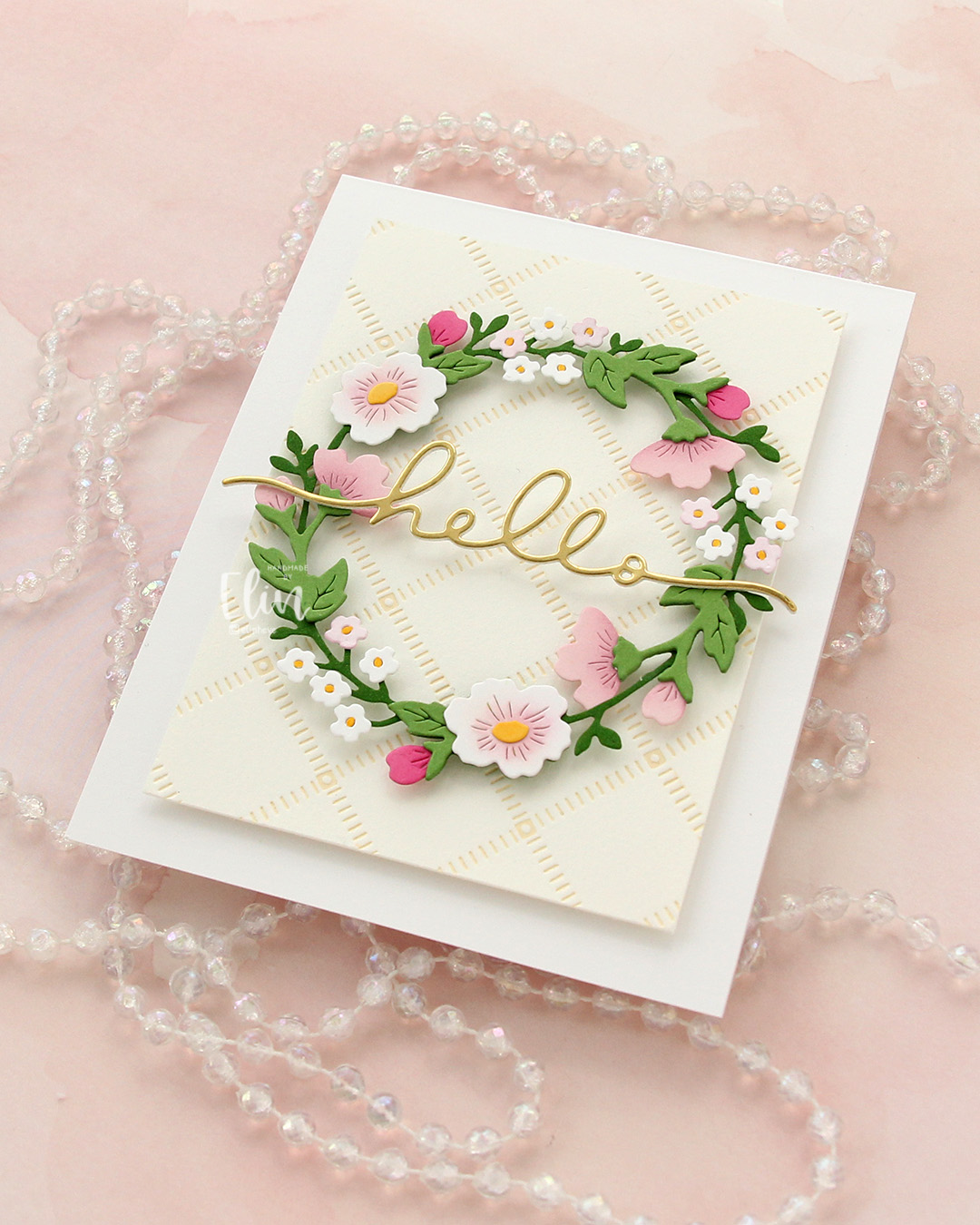
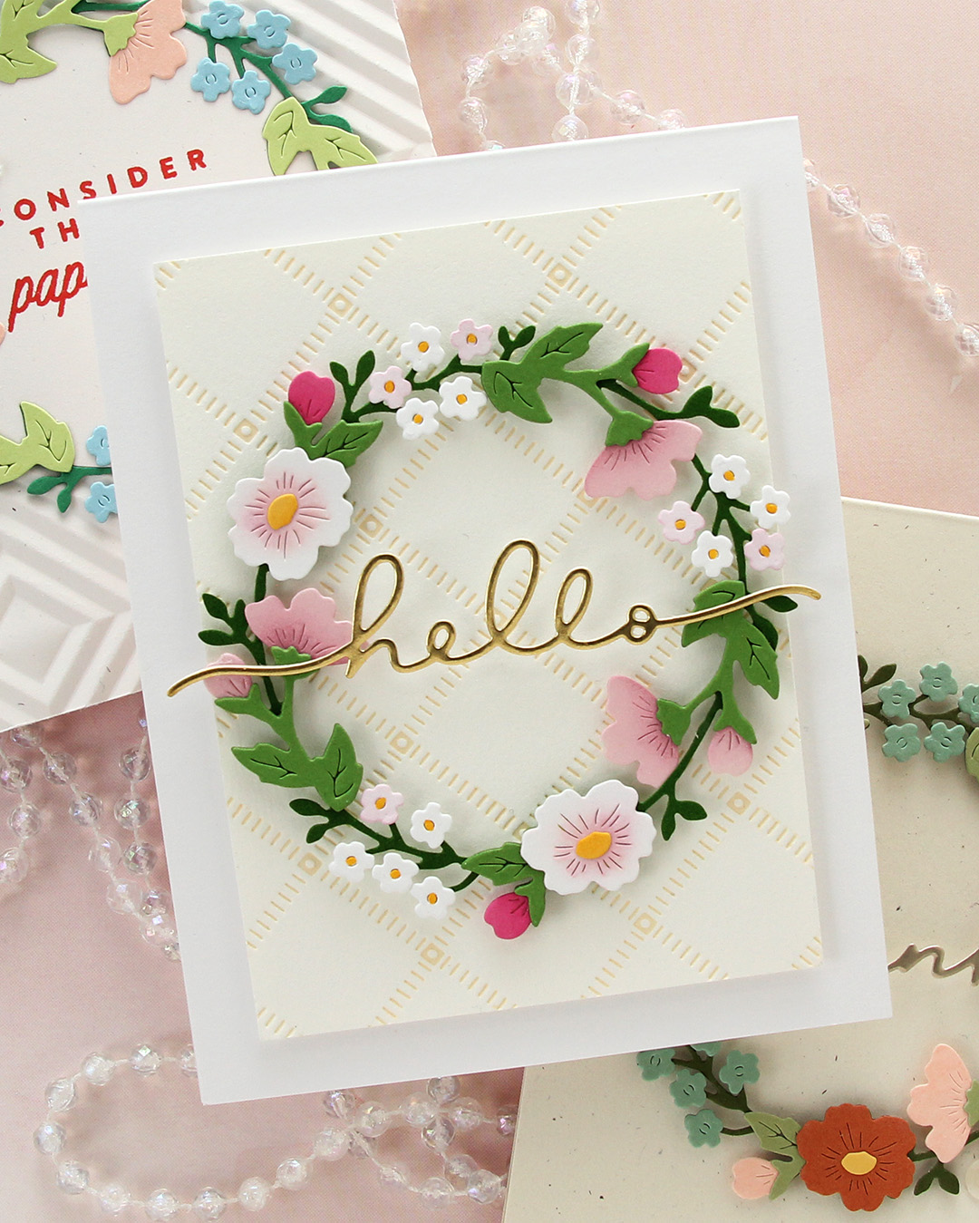
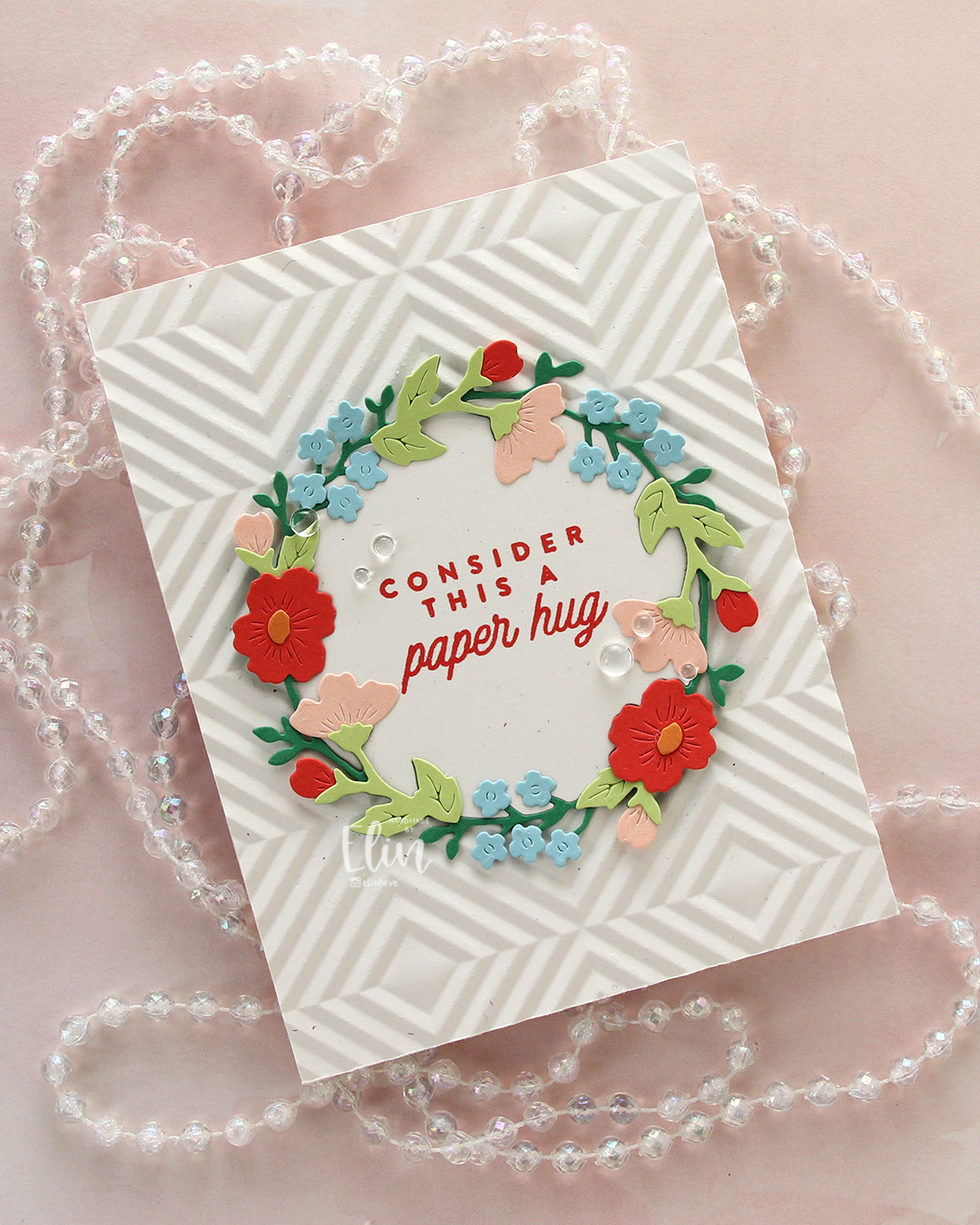 I’m also here for the Briar & Blooms die set from Concord & 9th, which honestly did most of the work on these cards. For this first card, I took my inspiration for the colors from the Summer Breeze color palette on the Concord & 9th website. They’ve got some great color resources, and this particular palette consists of Nectar, Pimento, Clementine, Clover and Harbor. I also threw in Sprout for a second green. I die cut the base of the wreath from Clover, and the remaining pieces from the other colors. I also die cut one base wreath from Rustic White cardstock from Papertrey Ink, but I only needed the inside negative part of that to stamp my sentiment on.
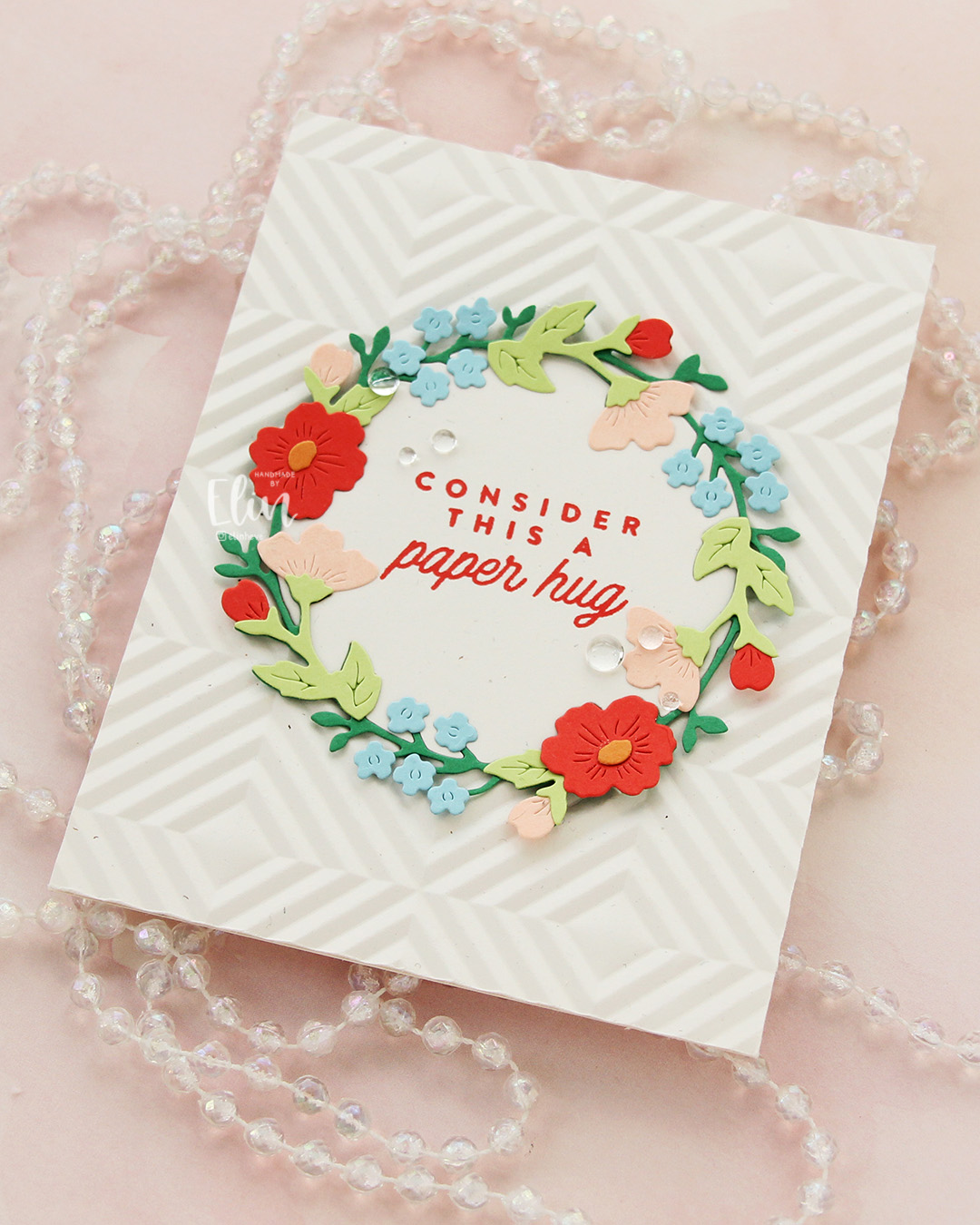 I used the Quilted embossing folder from Concord & 9th to create some texture behind the wreath. This embossing folder is a great one, but it was part of the 2025 Winter Retreat and is not available for purchase. Thankfully, there are other embossing folders out there which will work just as well to create some interest in the background. I adhered the embossed panel to a card base I created from the same Rustic White cardstock. I stamped a sentiment from the Flower Field stamp set from Kristina Werner using Pimento ink on that negative inside piece I’d already die cut. I adhered it in the center of the card and puzzle pieced the actual wreath around it, adding small pieces of foam tape to the outside edges of the wreath only. I finished off the card with a few Concord & 9th dew drops flanking the sentiment.
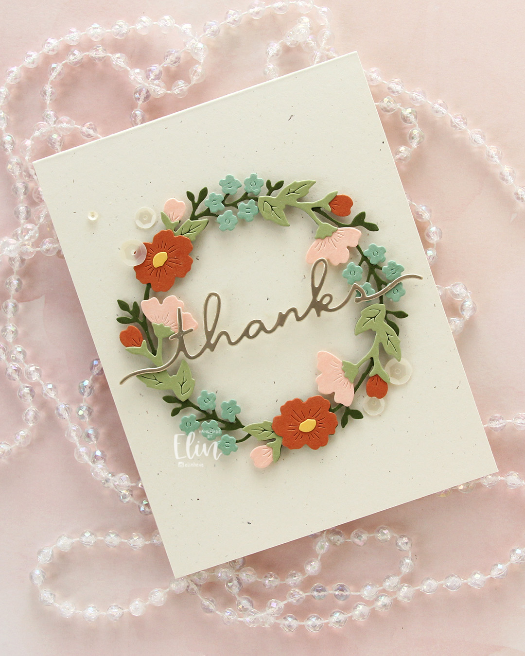 The first card was so much fun to create, I decided to make another. The example picture on the packaging for the die set is beautiful in soft, very muted tones, and I tried to pick colors that were close. Here, I used Artichoke for the base wreath, Pistachio for the remaining greenery, Spiced Cider for the large flowers and a few of the buds, Nectar for the remaining buds and the side facing flowers and finally Eucalyptus for the small flowers. Oh, I also used Buttercup for the flower centers. This is definitely a more muted palette than the first, it has a bit of a fall vibe to me.
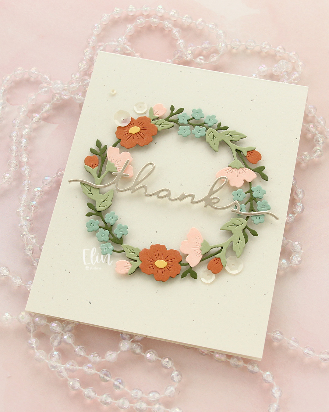 I leaned into the fall vibe and chose to mount my wreath on a card base I created from Rustic Cream cardstock from Papertrey Ink. This is also very muted, and I love the little specks that are in the paper, creating a bit of interest. I die cut the word thanks in the Briar & Blooms die set from Champagne cardstock (also Concord & 9th), backed it with a layer of Rustic Cream and adhered it across the center of the wreath, before finishing off the card with some Satin White sequins from Altenew.
 While I was working on card number two, I came up with the idea to create one more wreath in a “blossoming fruit tree” color combination. The fruit trees have just started blooming, and it’s the best thing ever. We have a blood cherry tree outside our front door that started blooming over the weekend. The apple trees (which my color combo is based on) have not started blooming quite yet, but they’re not far behind – I love this time of year! Anyway, back to the card. I don’t have the new Basil green yet from Concord & 9th (other than a small sample that was in this year’s Winter Retreat kit, which I turned into a swatch tag), but when you ink blend Parsley ink on Parsley cardstock, you get a darker color that works well. I did that, then die cut the base wreath from the dark version and die cut the rest of the greenery from plain Parsley. Once again, I used Buttercup for the centers, but I switched out the Nectar I used on the previous two cards for Ballet Slipper, which I thought worked better here. I also slipped in Sweet Pea for a few of the buds for a little more pop of color.
On the base of the Sweet Pea buds, I ink blended with Sweet Pea ink. On the large open white flowers, I ink blended with Ballet Slipper, adding a touch of Carnation (RIP – I’m sad to see this color leave the C9 color spectrum) in the very center. I also used Carnation for the Ballet Slipper buds and side facing flowers, and I used whatever pink ink was left on my brush on a few of the tiny white die cut flowers. For those I used a Y19 Copic marker in the center. It’s a good match for the Buttercup cardstock, and those centers are too small to ink blend. I used the very tip of the marker, no more was needed.
 I loved the soft color palette so much that I wanted a soft look in the background, too. I opted for the Stippled Plaid press plate from Pinkfresh Studio and inked that up on a piece of Betterpress Bisque cardstock using Peachy Glow ink from Altenew. The soft yellow ink acts as a neutral on the cream cardstock, which in turn is a neutral on the Stamper’s Select White cardstock from Papertrey Ink that I used for my card base. I popped everything up on foam tape, then die cut the word hello once from white cardstock and once from Gold Shine cardstock from My Favorite Things. I stacked the two and stretched my hello across the center of the wreath. I tried to add a few different embellishments, but in the end, I decided not to use any – and honestly, I think this card looks great without it!
In the end, the apple tree color combo version wound up being my favorite of the three. What do you think? Maybe you have another favorite?
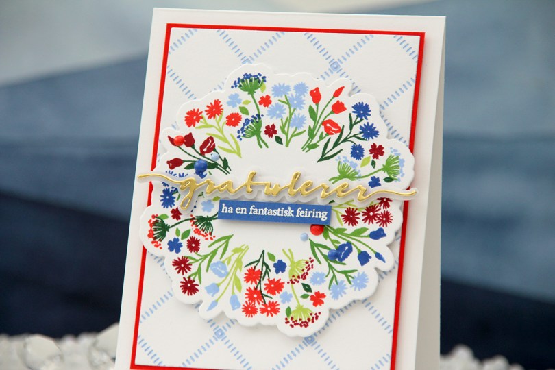
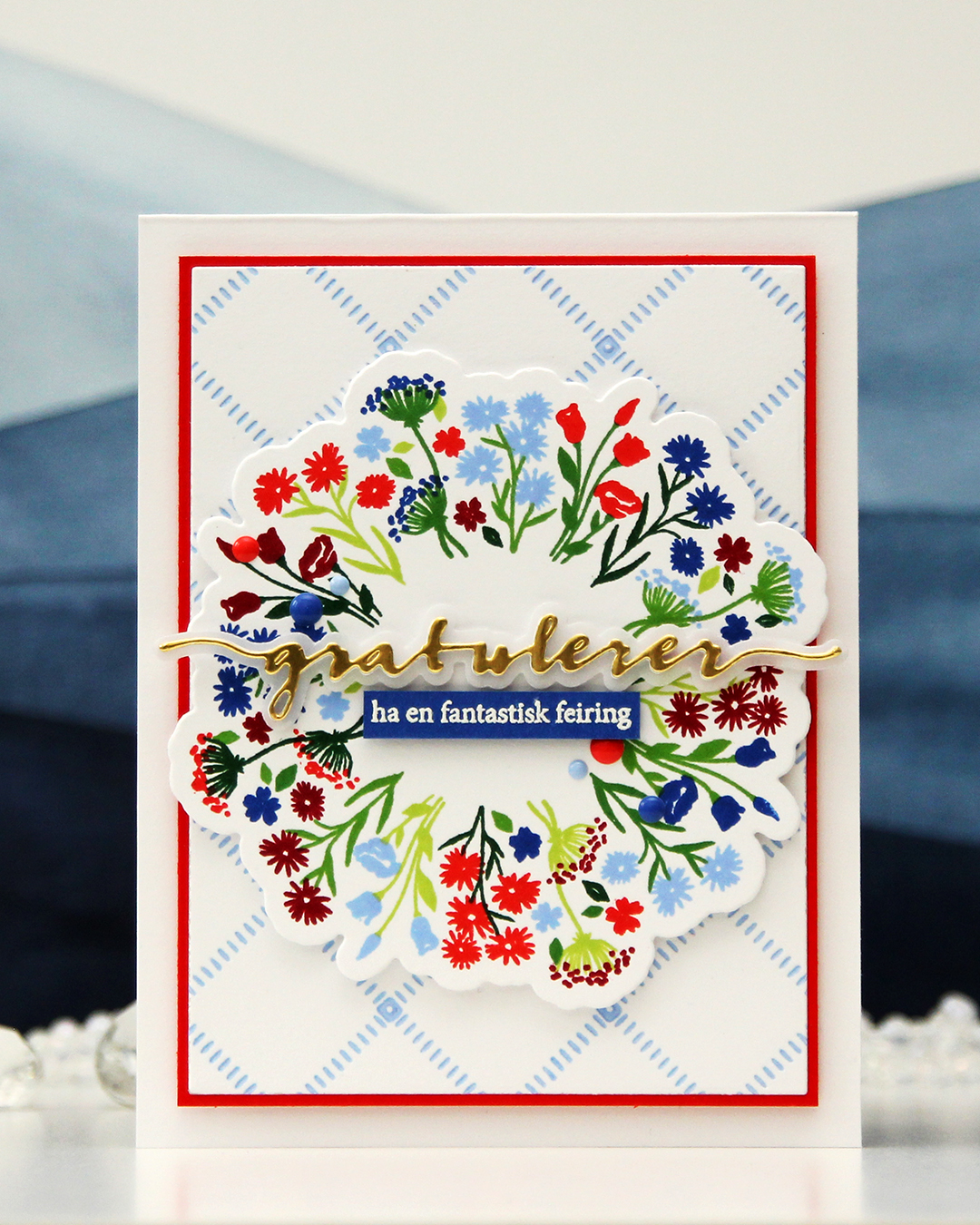 I used the Bouquet turnabout stamp set from Concord & 9th to create my focal point. This turnabout set has two separate images that you turn. The greenery is one stamp, the florals another. I used Sprout, Parsley, Basil and Evergreen inks for the greenery, and Bluebell, Capri, Poppy and Cranberry for the florals, all C9 colors. I’m loving the new 2026 colors from Concord & 9th, Capri is dynamite, it’s so awesome!! I cut my bouquet out using the coordinating die set and put the piece aside while I worked on the rest of the card.
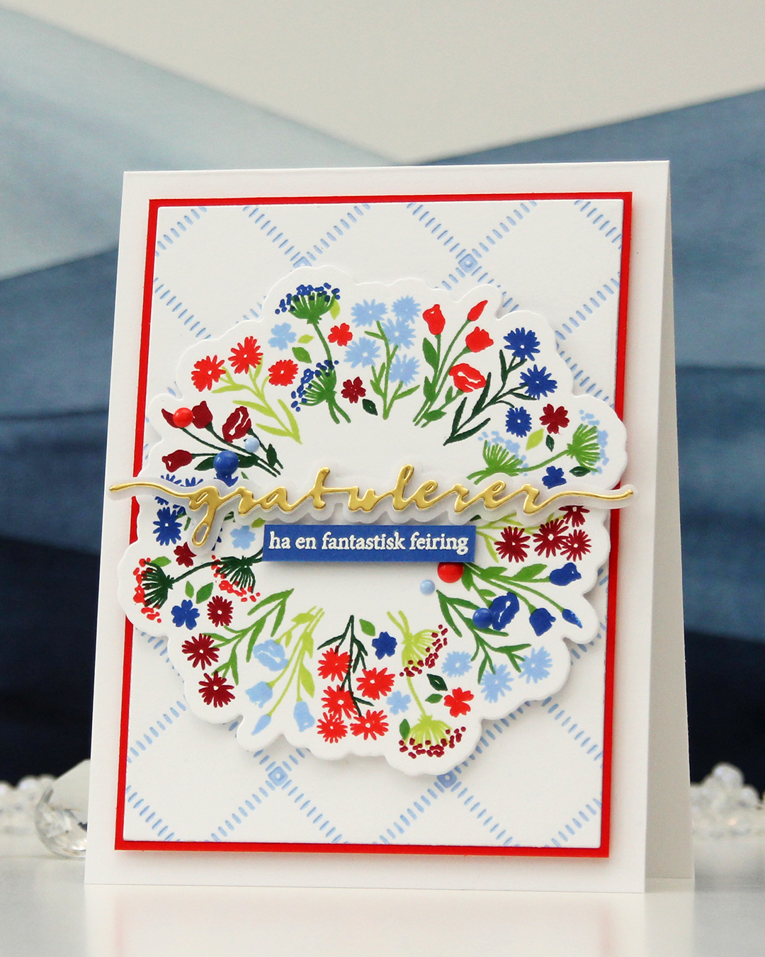 I wanted a subtle background, and opted for the Stippled Plaid press plate from Pinkfresh Studio. I love this press plate, it’s probably the one press plate I use the most. I inked it up very carefully with Bluebell ink and ran it through my system with plain white cardstock to match the white cardstock I used for my floral bouquet stamping. I then cut the panel down significantly, added a mat from Poppy cardstock and mounted it on a top fold card base I created from Stamper’s Select White cardstock from Papertrey Ink, which is the white cardstock I’ve used for everything on this card.
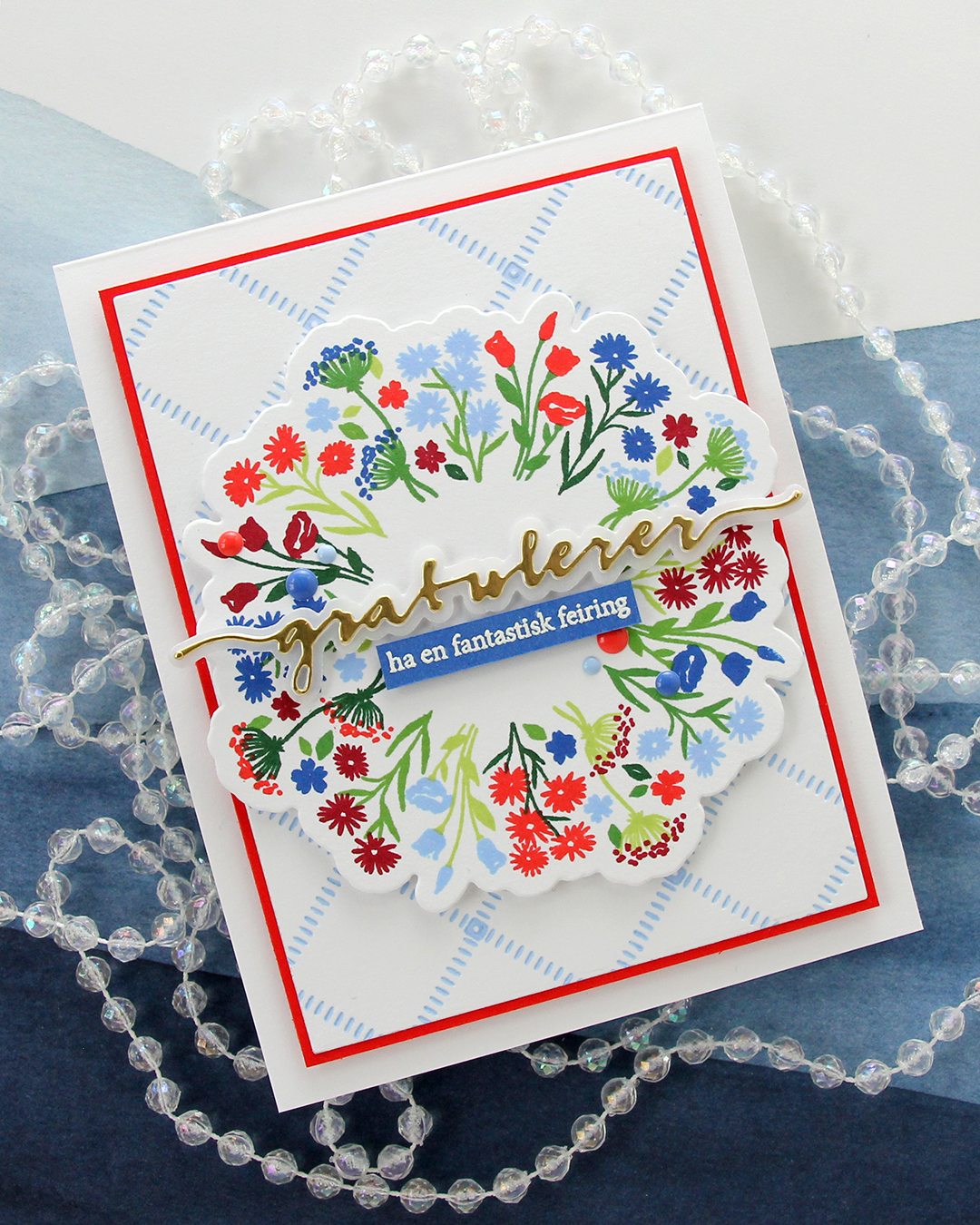 I popped up my bouquet using more foam tape and knew I wanted a die cut sentiment. Gratulerer med dagen is what you say when greeting someone on May 17th, it literally translates to “Congratulations on the day”. It’s the exact same sentiment we use to wish someone a happy birthday. I used the Gratulerer 6 die set from Papirdesign for the main part of my sentiment. I die cut four layers from white cardstock, one layer from Gold Shine cardstock from My Favorite Things and the shadow layer from Heavyweight vellum, also from MFT. I backed the gold one with one white, adhered it to the vellum and put the three remaining white ones behind the vellum, to give it a bit of dimension.
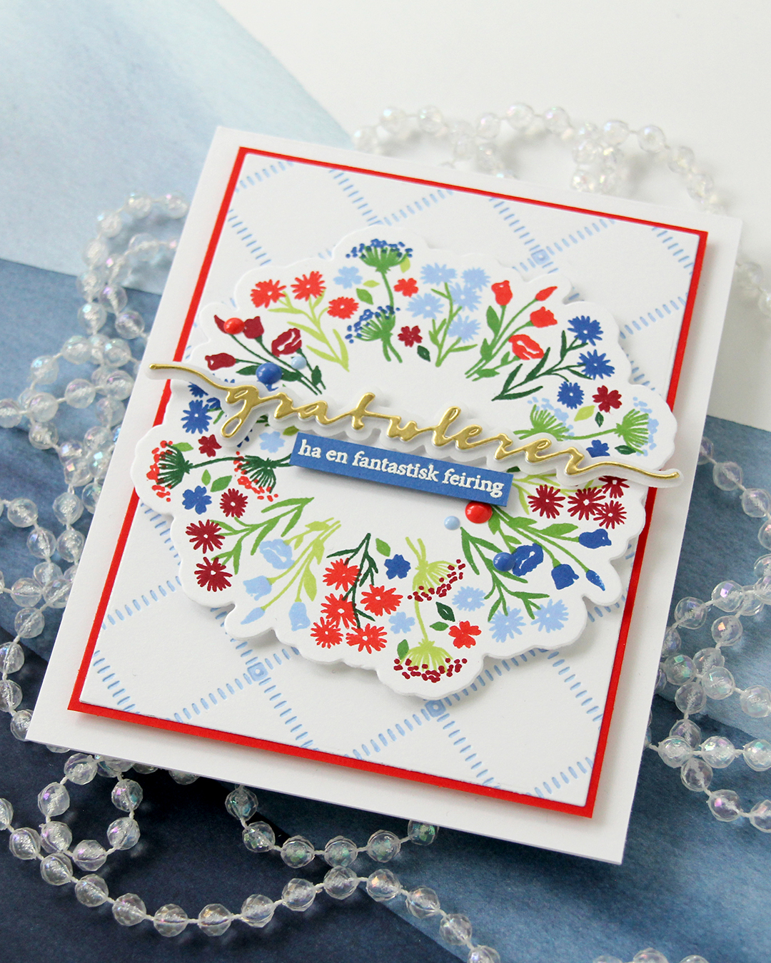 On a piece of Capri cardstock, I stamped a sentiment (have a fantastic celebration) from the A06 stamp set from Norsk Stempelblad AS with VersaMark ink, sprinkled on Super fine detail embossing powder from Ranger and heat set it from the back. I always do my heat embossing from the back, it gives a much smoother result than working from the front. I finished off the card with a few enamel dots from Concord & 9th in Capri, Bluebell and Poppy.
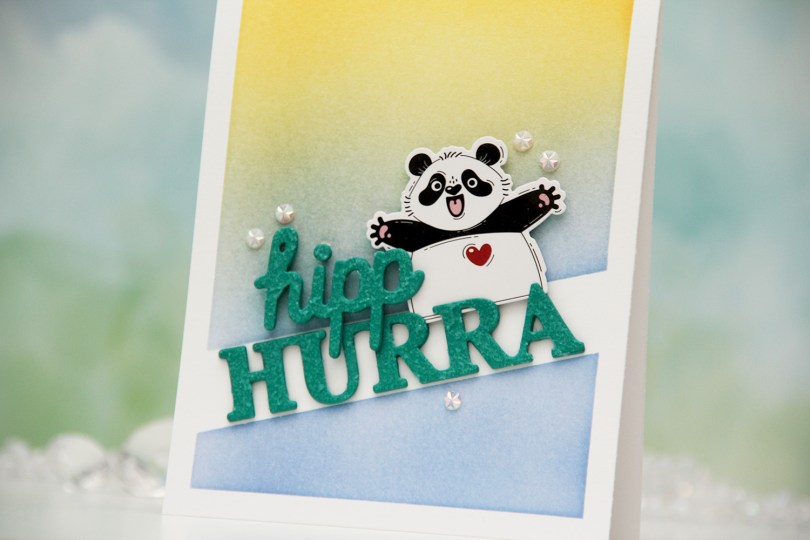
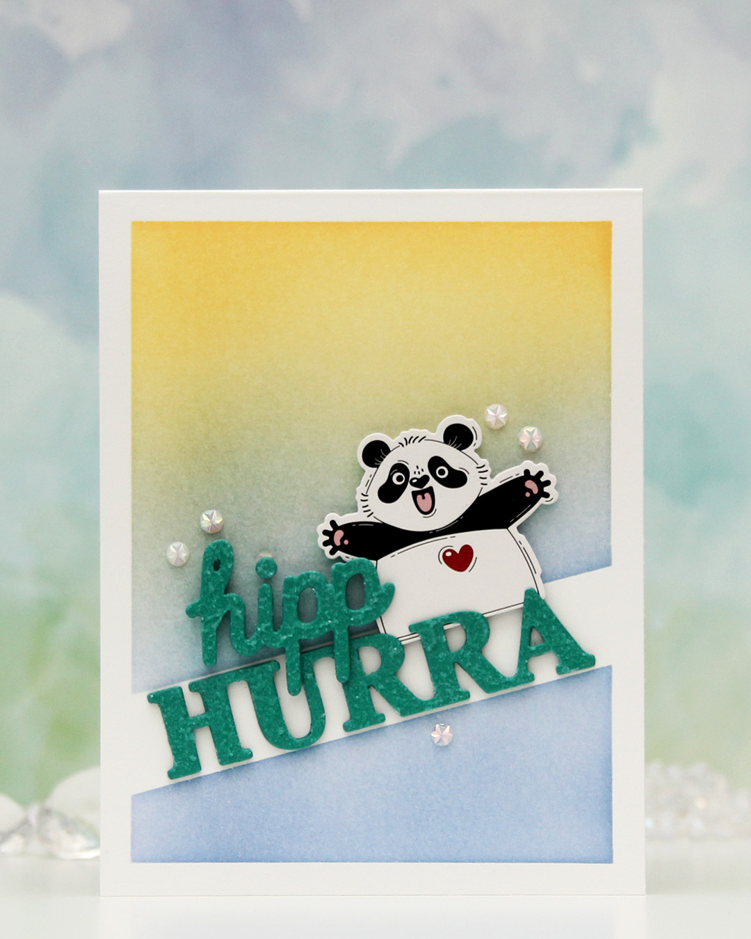 This one is sooo simple. Directly on the card base, I ink blended Blueberry Sky and Harvest Gold inks from Papertrey Ink over the Smart Mask Diagonal High Low stencil from My Favorite Things. This created the perfect spot for a sentiment, and the hurra part of the Hipp hurra die from Kort & Godt was the perfect size for the opening.
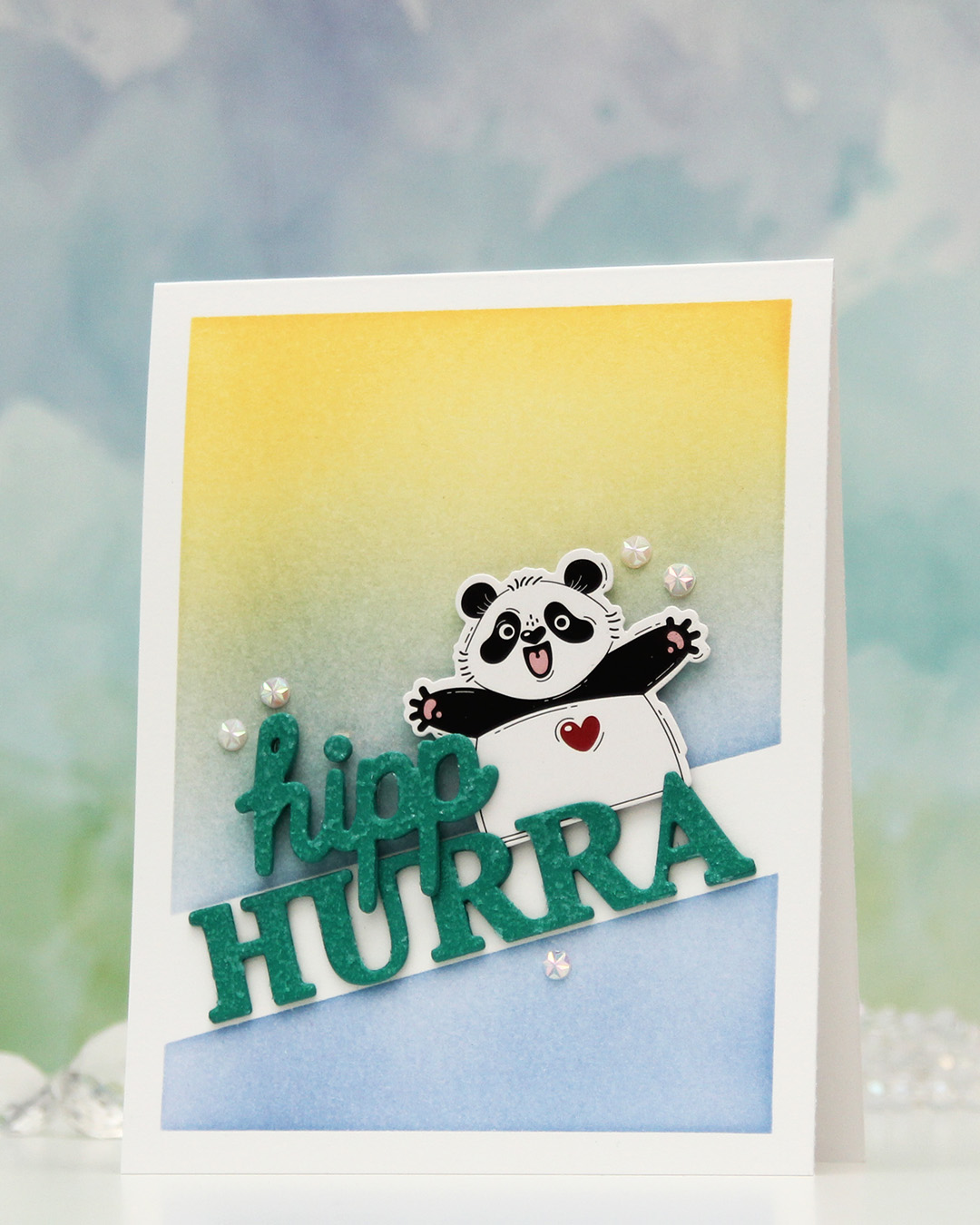 I die cut four layers from Tropical Teal cardstock from Papertrey Ink for both words, stacked them and added Frostbite Astro Paste from Simon Hurley on top for a fun, textured effect.
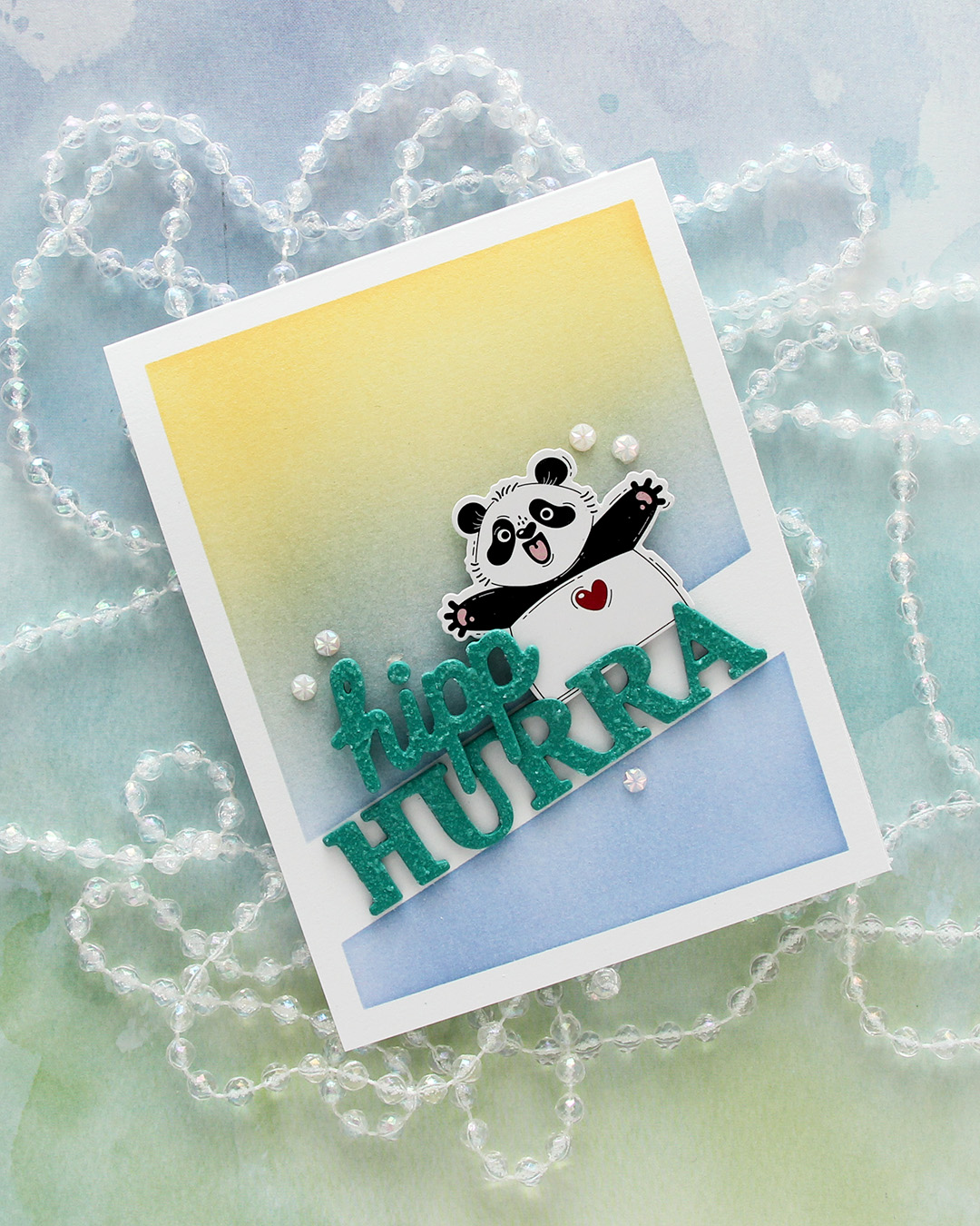 I mounted the panda from Kort & Godt with foam tape, adhered the hurra word in the opening and the hipp on top of both the panda and the other word.
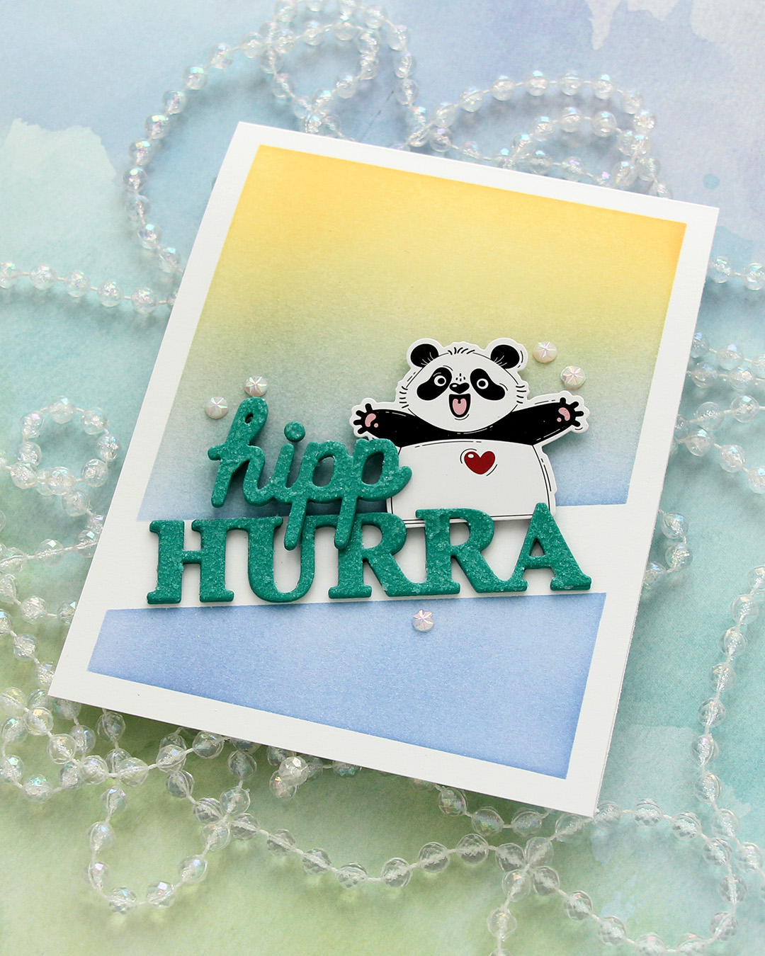
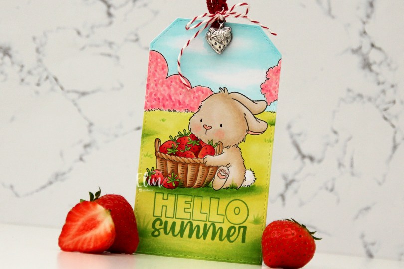
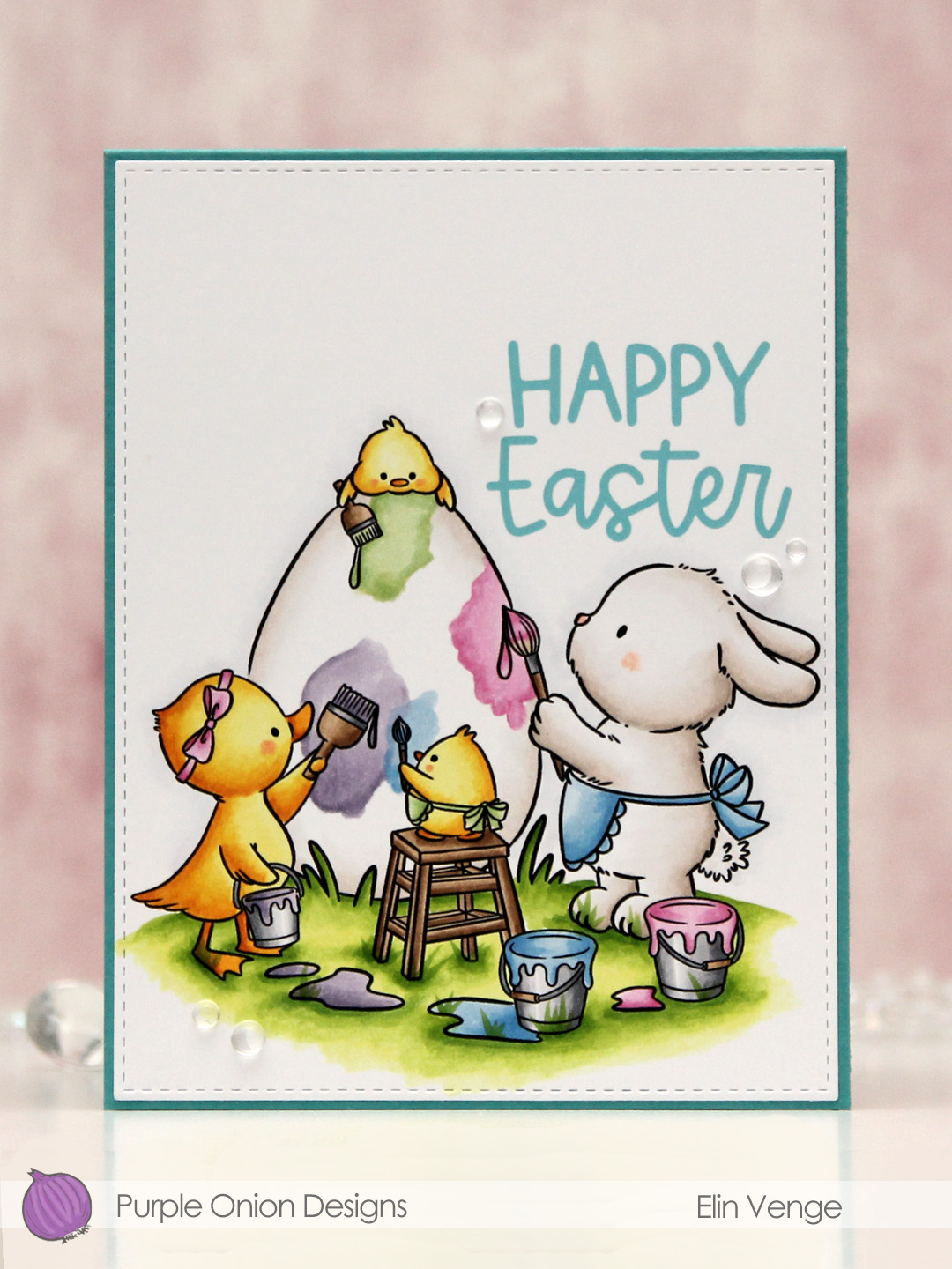
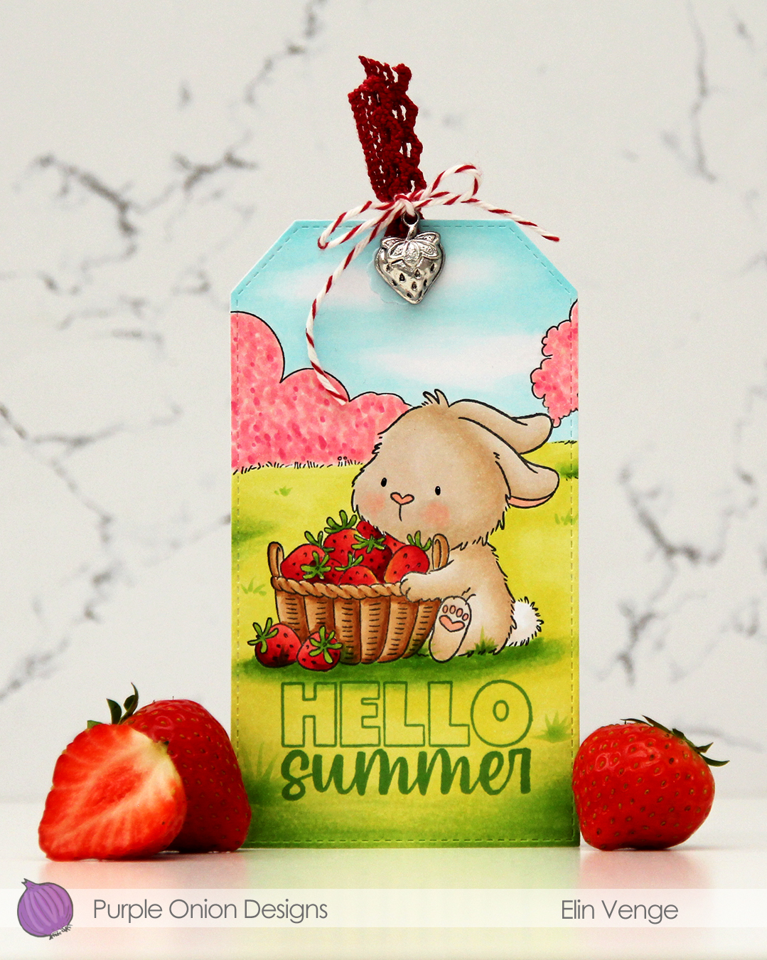 I stamped and masked my bunny, stamped the field background, then colored in my scene with Copics. I didn’t want an “all green” background, so I colored the bush and the tree with pink markers, I’m pretending they’re blooming. The fruit trees are in full bloom at the moment, so it was an easy decision. Once my coloring was complete, I used the largest die in the Stitched Traditional Tag STAX die set from My Favorite Things. This tag set doesn’t create holes in the tags, so I made my own and used a reinforcer from the Fold-up Tags die set, also from My Favorite Things, to give the hole a finished look. I stamped Hello from the
  Very soft color palette for this one.
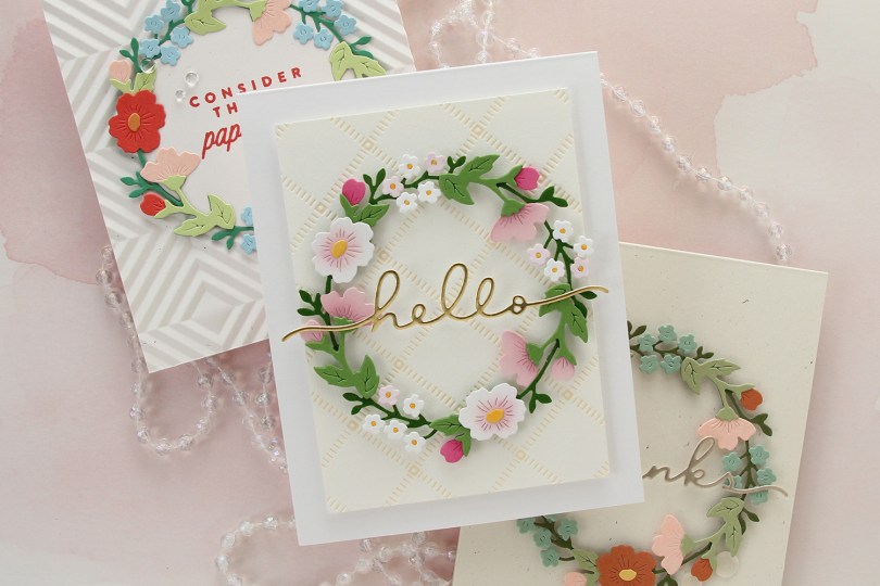

 I created a scene with quite a few images from the Lakewood collection from Purple Onion Designs, illustrated by Holly Mabutas.
 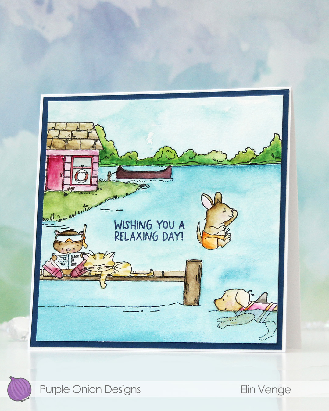 I don’t use watercolor a lot, but a palette with watercolor paint is a lot more travel friendly than 360 Copic markers, and I was on vacation in the mountains when I painted this last summer. Only having access to watercolor forces me to play with them and familiarize myself with them, which is a good thing.
 The images are all stamped using Obsidian ink from Altenew, which is a pigment ink that works well with watercolor. The paper is Fabriano Artístico cold pressed watercolor paper. I used my Mijello Mission Gold watercolor paints and brushes of varying sizes. I’m not an expert watercolorist, so the coloring’s pretty basic.
 I trimmed my panel, stamped a sentiment from the
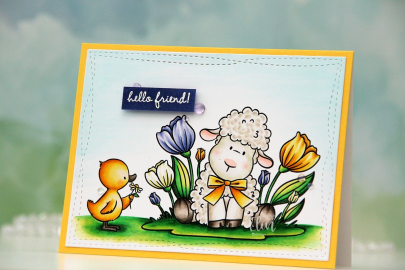
 I colored the image with Copics, choosing a very bright green combo for the ground and the leaves. I didn’t want all the flowers to be the same color, so I went for a crocus look. I love all the details you get in a real crocus, but they’ve yet to bloom, I guess it’s still too cold.
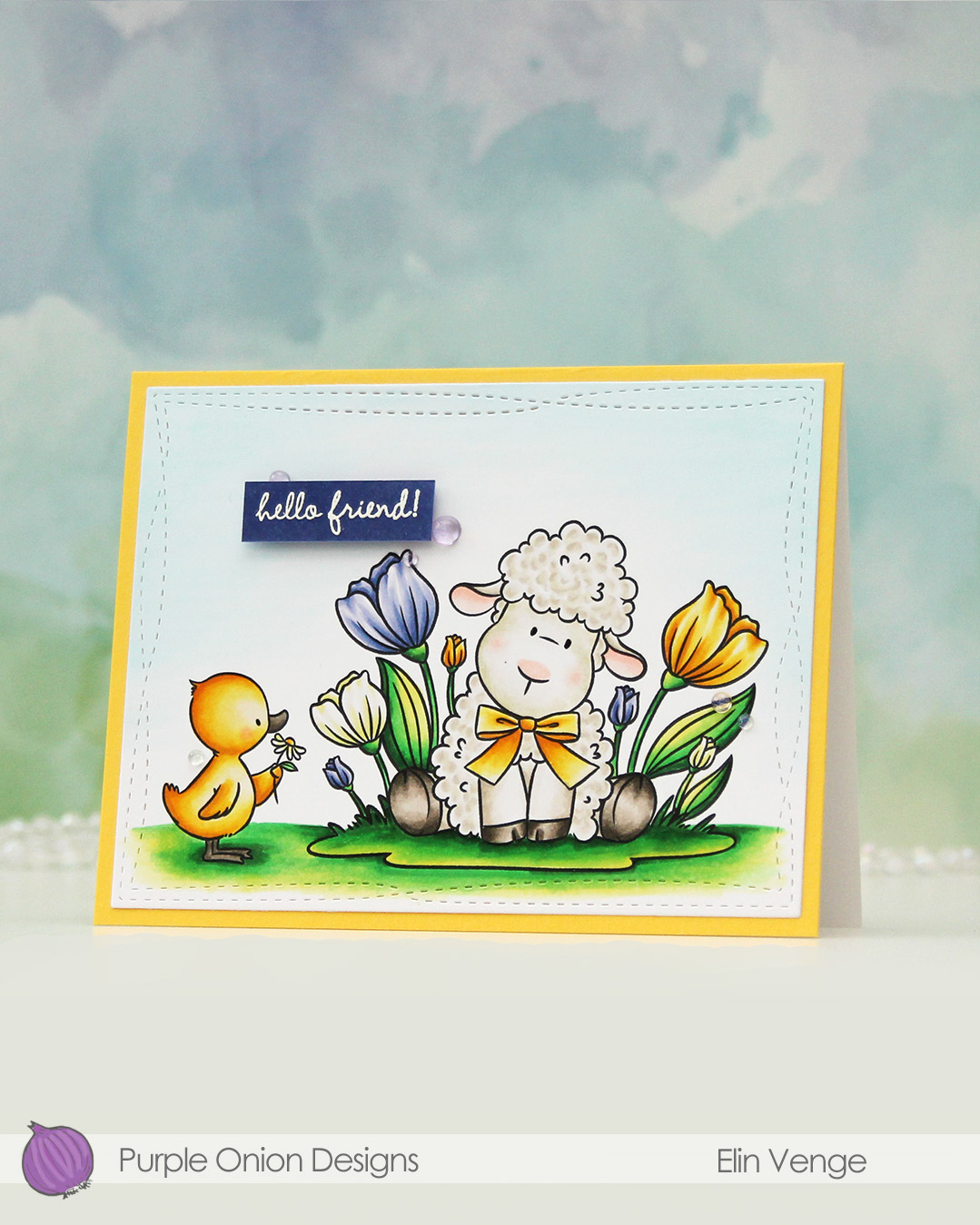 I used the largest die in the Wonky Stitched Rectangles STAX die set from My Favorite Things to turn my colored piece into a panel with a fun detail along the border. then adhered it to a panel of Butterccup cardstock from Concord & 9th, which I in turn adhered to a top fold white card base created from Stamper’s Select White cardstock from Papertrey Ink.
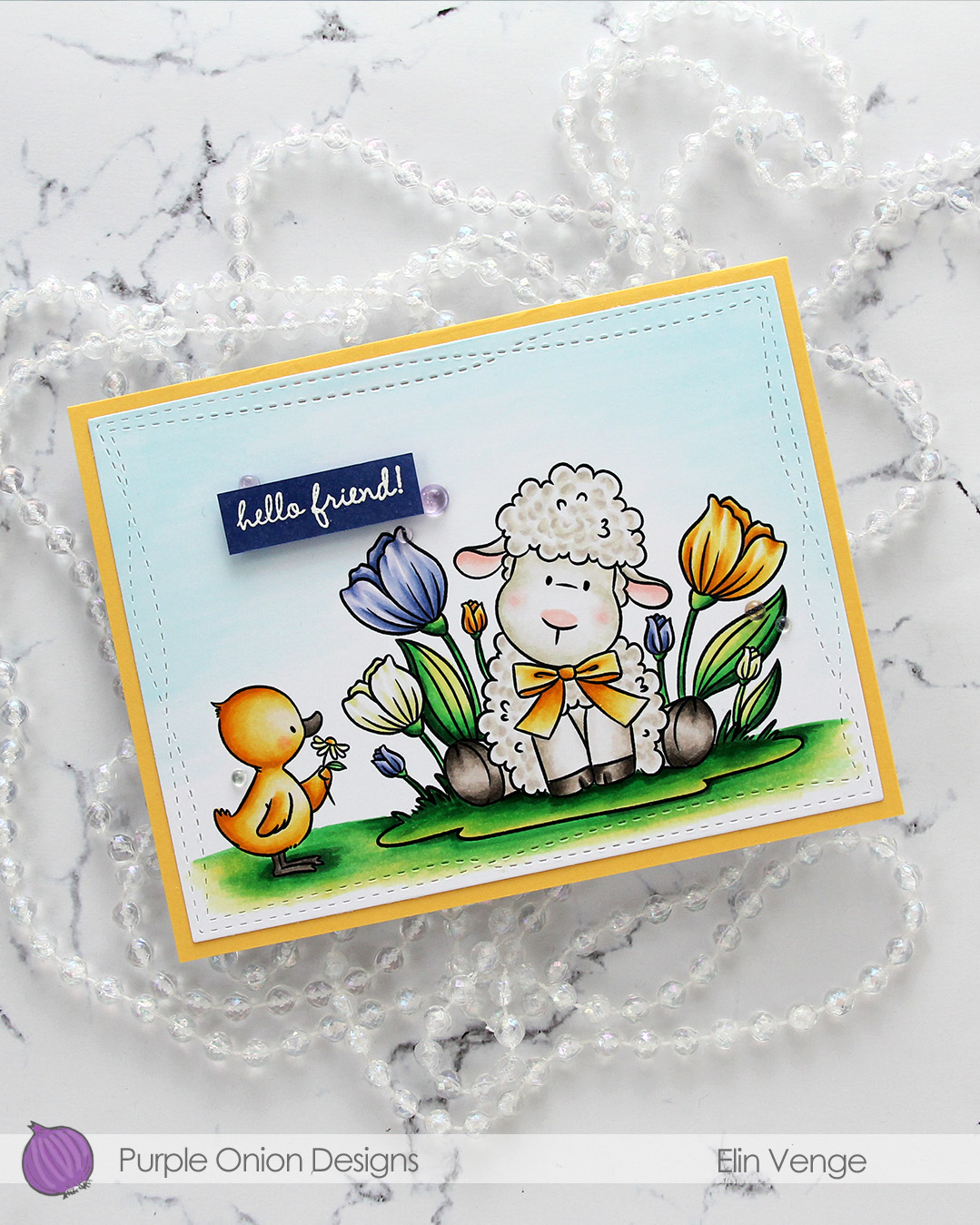 I couldn’t find the right shade of purple in my cardstock collection, so for the sentiment, I colored a scrap piece of X-Press It with one of the colors I used on the florals. I let it dry, then stamped and white heat embossed a sentiment from the
 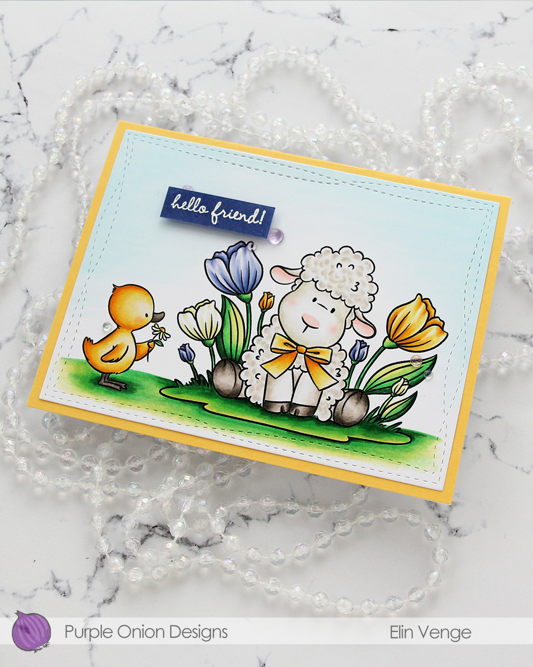 I decided to keep it very simple, only adding a few Iridescent Dew Drops from Pinkfresh Studio to embellish. There are a few different colors in the mix, I chose a few of the purple ones. I did also come in with a black Glaze pen from Sakura to add a touch of dimension and shine to the eyes. It doesn’t really show up in the photos, but you can definitely see it in real life.
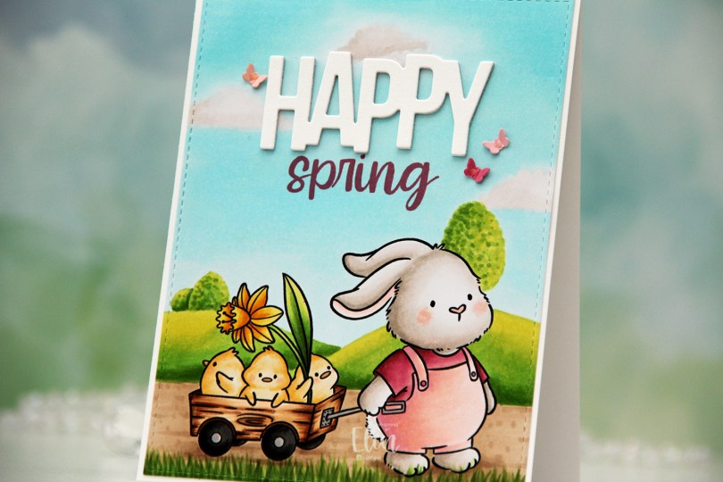
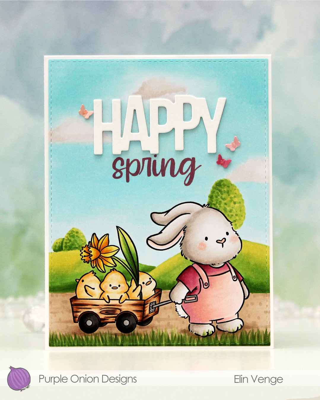 I colored the image with Copics, adding a simple free hand background of a couple of hills with a few trees, a path for the bunny to walk on and some blades of grass in front. My original plan wasn’t a scene at all, I had planned to add a big Happy Easter die cut, but changed my mind and added the hills and sky instead. I think this looks better than what I had planned.
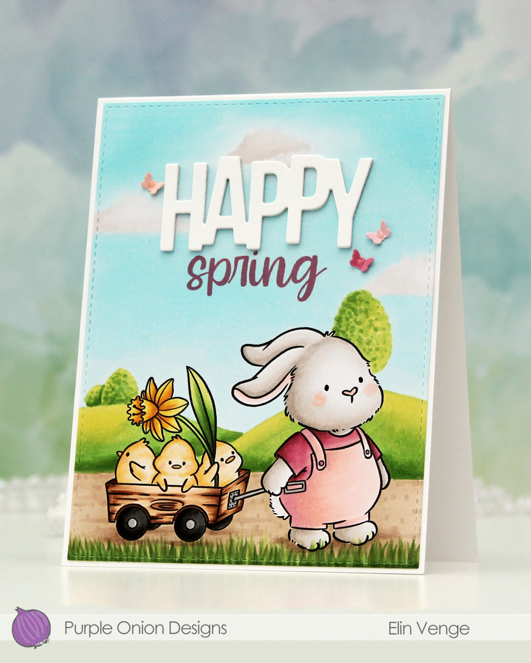 I used the largest die in the A2 Stitched Rectangles STAX 1 set from My Favorite Things to create a little bit of interest along the perimeter of my panel. I stamped the word spring from the
 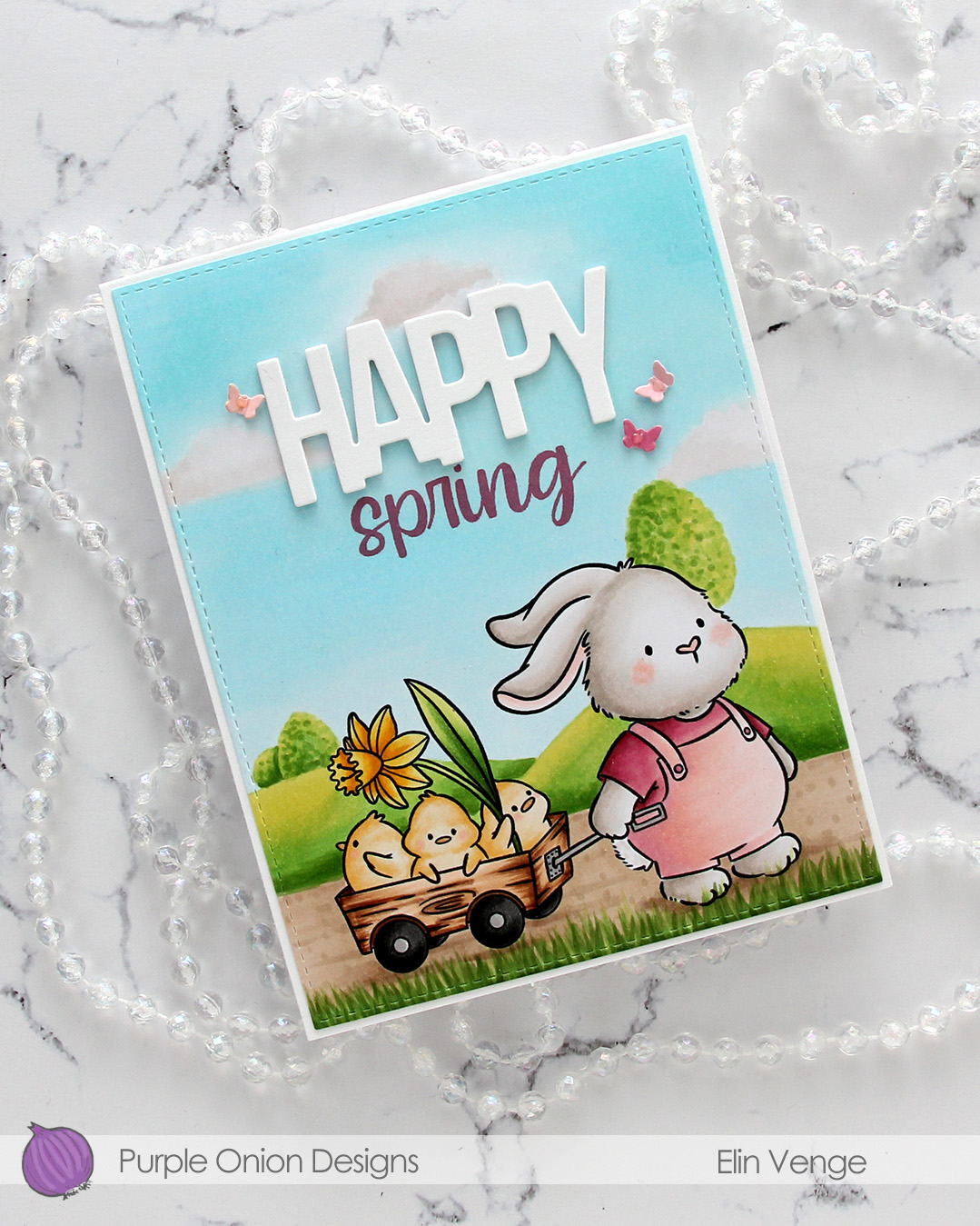 I die cut the word HAPPY from the Birthday Script die set from Kristina Werner three times from Stamper’s Select White cardstock from Papertrey Ink (the same cardstock that I used for my card base, I love this cardstock) and stacked them. I adhered my stacked word above the stamped spring to complete my sentiment.
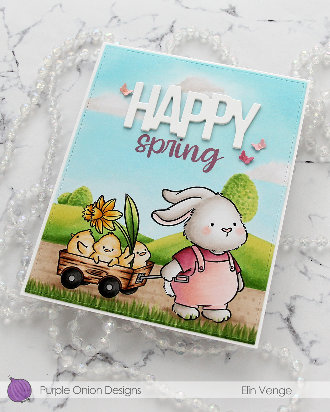 I decided to die cut tiny butterflies to use for embellishment. I didn’t have any cardstock in the color I wanted, so I colored scraps of X-Press It blending card with the same colors I used for the bunny’s outfit, before using the butterflies die from the Greenhouse Greetings die set from Concord & 9th (it’s a die set from the 2024 C9 summer camp). I scored my tiny butterflies down the body, adhered each of them with a tiny bit of glue and added Rosewater Jewel Drops from Tonic on the bodies of the butterflies to finish.
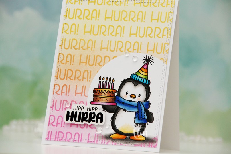
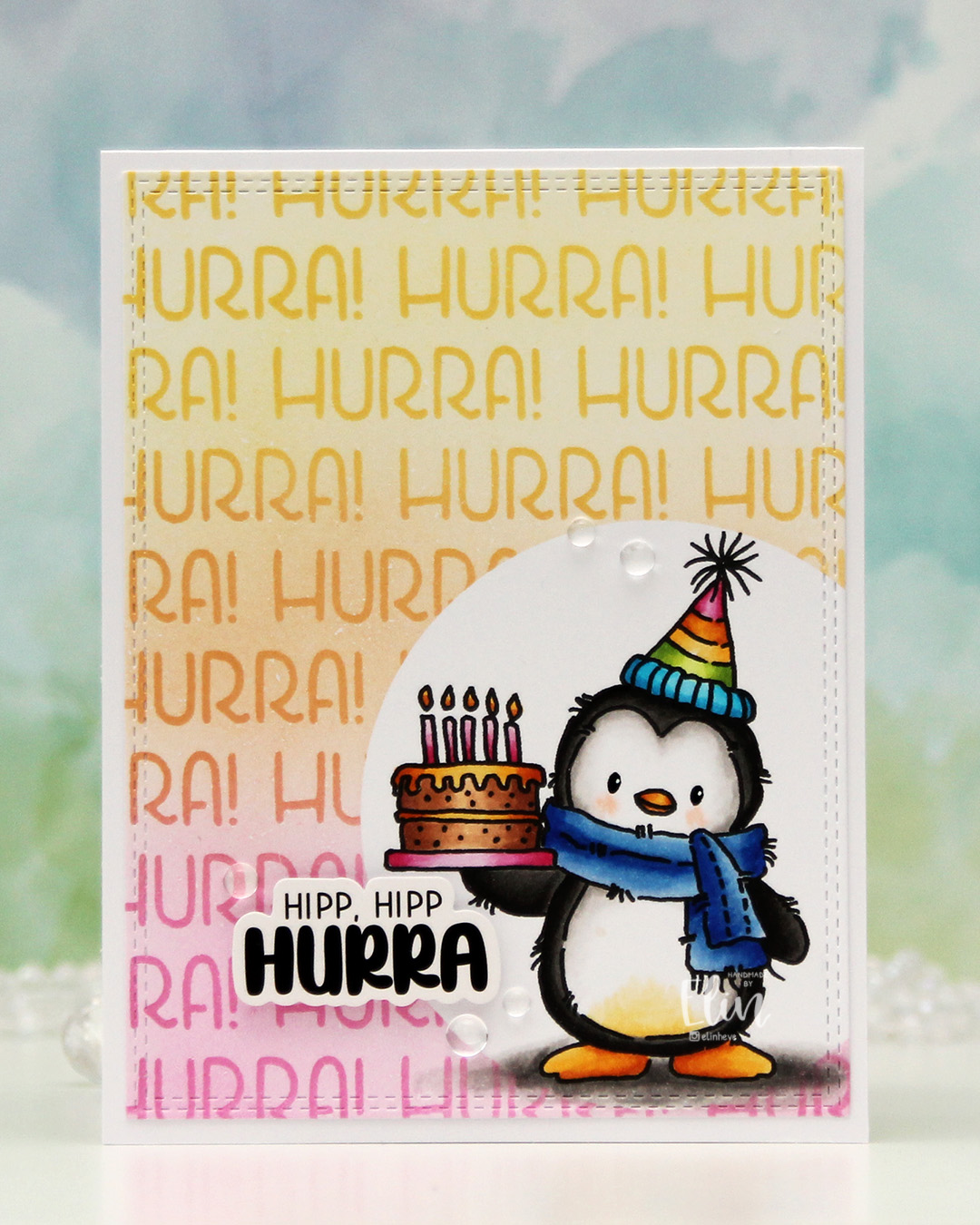 I actually didn’t start with the coloring on this one. I printed the image on a quarter sheet of X-Press It blending card, which is what I always use for Copic coloring. I put a circle mask on top of the penguin, then used the Hurra stencil from Create a smile and some inks from Concord & 9th to create my background. I used Sweet Pea, Clementine and Buttercup, creating a gradient between the three colors. Once I took the stencil off, the white of the background felt a bit stark, so I went in with the 1″ blender brushes from Pinkfresh Studio and did a soft blend of the background using the same three colors.
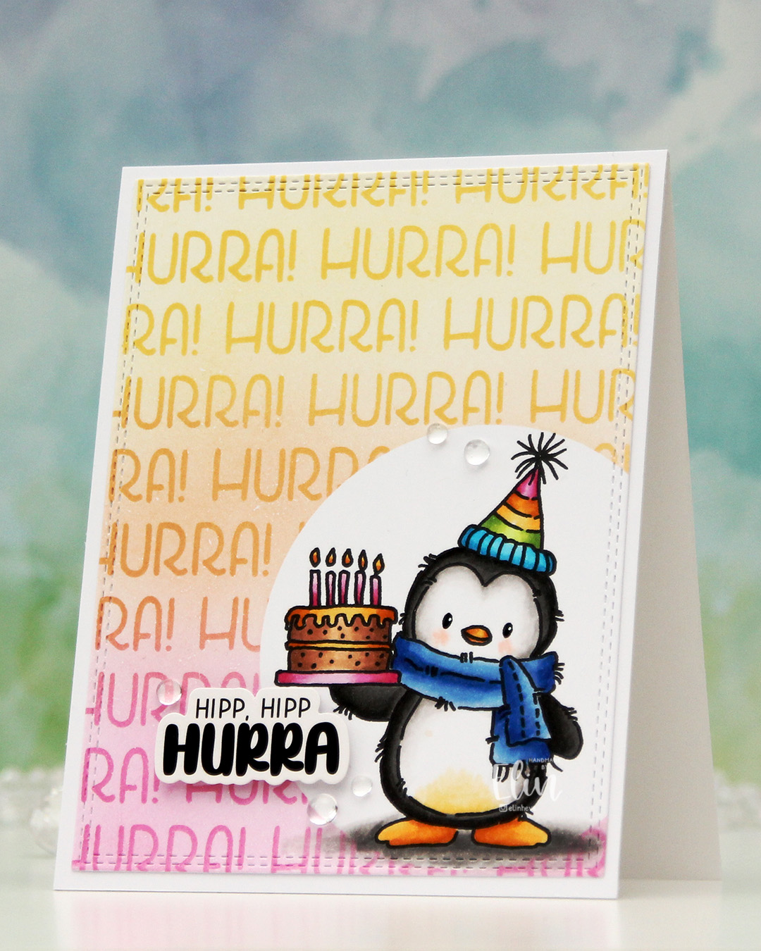 Once I removed the mask, it was time to color the penguin. I used Copics, went for a pretty bright palette and added a bit of black glaze pen to the eyes, then a dot with a white Sharpie on top once the black was dry. This gives the eyes a bit of shine.
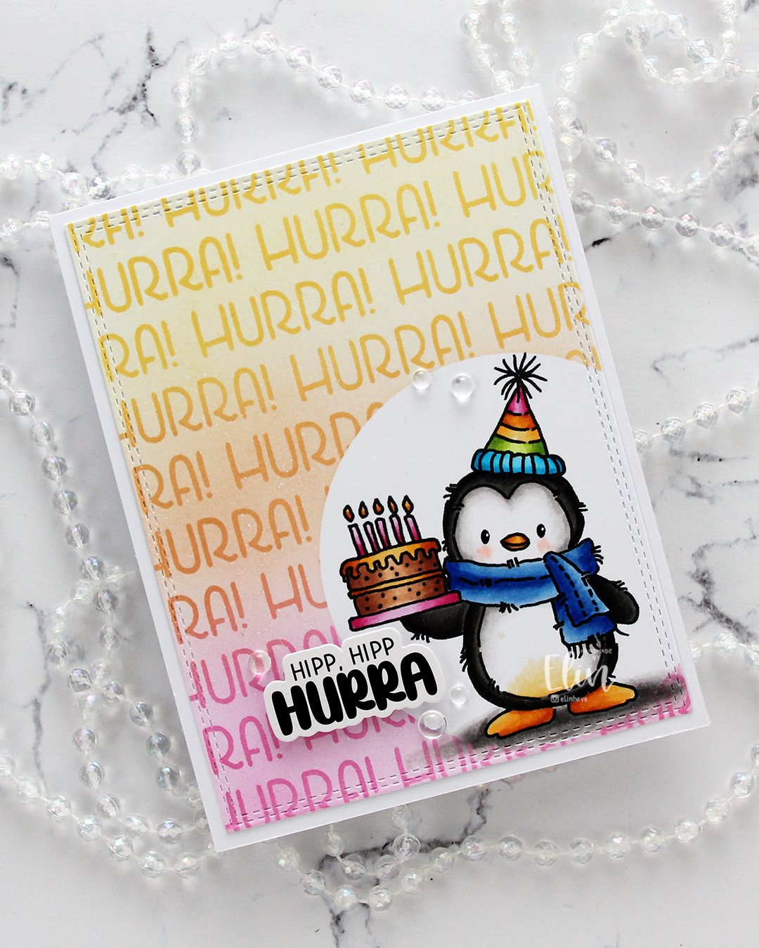 I used the largest die in the Double Stitched Rectangles die set from My Favorite Things to cut my panel down slightly. It also adds a fun stitching detail to the edge. I then adhered my panel to a top fold card base I created from Stamper’s Select White cardstock from Papertrey Ink.
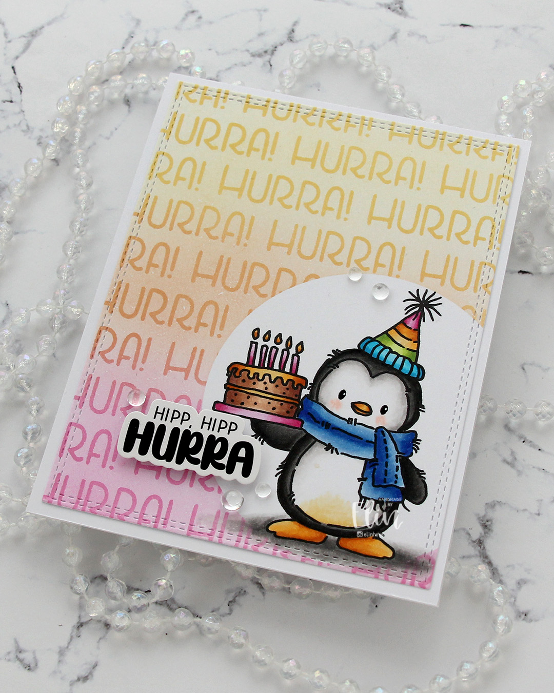 I used a sticker from Kort & Godt for my sentiment. I like my sentiments with some dimension, and to get dimension with stickers, I first use antistatic powder on the back to remove the stickyness, then add foam tape. I finished off the card very simply with some clear dew drops from Concord & 9th. There was so much color going on, I thought clear was the best option.
 I used quite a few Copics for this, but that hat alone needed quite a few.
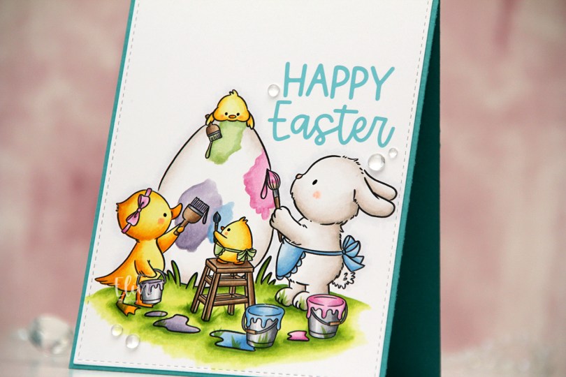
 I colored the image with Copics on a piece of X-Press It blending card and nestled one of the sentiments in the little nook between the bunny and the egg. I die cut the panel using the largest die in the Stitched Rectangles STAX 1 set from My Favorite Things.
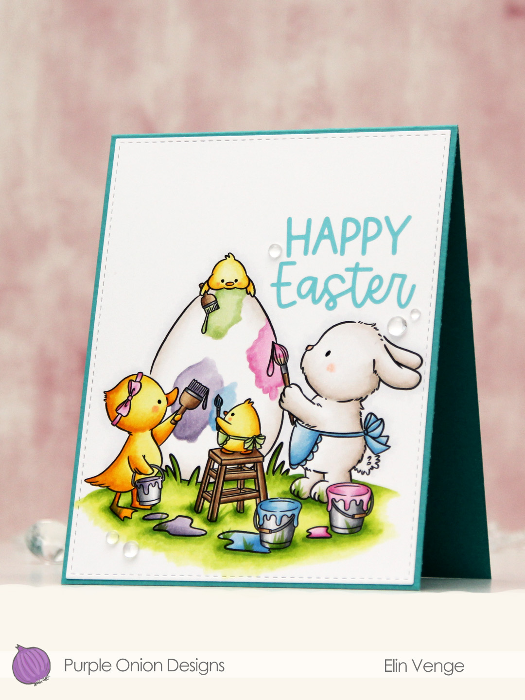 I adhered the panel directly onto a card base I created from Caribbean Sea prestige cardstock from My Favorite Things and finished off the card with a few dew drops from Concord & 9th. Simple, yet sweet, right?
 Lots of pastels for this one.
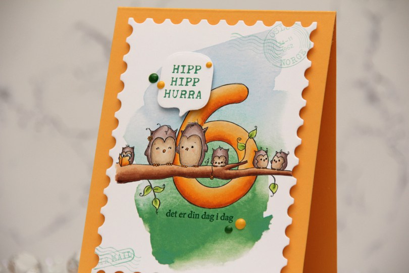
 I printed the image onto a piece of X-Press It blending card, adding a digital watercolor background behind the image before printing. I colored the image with Copics and opted for a warm yellow for the actual number and the book, an analogous color palette always works well.
 I die cut the panel using the Postage Stamps infinity die set from Hero Arts, then stamped the sentiments from the Bursdagsbillett stamp set from by.cino (hipp hipp hurra) and the A06 stamp set from Norsk Stempelblad AS (det er din dag i dag) using Clover ink from Concord & 9th. I also used second generation stamping of a couple of the images from the CS0879 stamp set from Marianne Design in the corners of my large postage stamp. I mounted my postage panel onto a card base I created from Summer Sunrise cardstock from Papertrey Ink, then die cut and mounted the Hipp hipp hurra sentiment using the MSTN Say Anything die set from My Favorite Things, before finishing off the card with Clover and Honeycomb enamel dots from Concord & 9th, as well as a dot of a black Sakura Glaze pen to each eye for a little bit of shine and dimension.