
Hi, everyone! Another Wednesday already. Man, the weeks fly by so quickly. I’ve got another Mo Manning cutie to share today.
 This is one of Mo’s birthday fairies. Her name is Dee, and you can find it in the store here. I actually have a red rubber version from Penny Black of this image that I actually used for this card. I stamped it in fadeout ink from Inkon3 and went to town with no line coloring. When doing no line coloring I usually stamp (or print) the facial features in a darker ink than the rest of the image, but I forgot on this one, and had to draw everything back in once my coloring was done. I used a Prismacolor pencil and held my breath as I added those details back in.
 I diecut my panel using the largest of the faux stitch rectangle dies from My Favorite Things. I think it’s the perfect size as it creates a 1/16″ border when I add it to my cardbase. The color scheme might not be typical of me, but the layout definitely is. I added half a mini paper doily from Doodlebug Design, diecut some scraps of pink patterned paper to go with my image using another favorite MFT die set (Fishtail Flag Frames) and stamped a Norsk Stempelblad AS birthday sentiment using Papertrey Ink Hibiscus Burst ink. The ink matches the cardstock, which is also Hibiscus Burst from Papertrey Ink.
 I added my banners using foam tape and embellished very simply with some sequins from Pretty Pink Posh. I even used my scissors on one to cut a little bit off and tucked it underneath that sentiment banner. Laura Bassen would be proud, haha.

 Det er ingen tvil om at jeg liker å lage enkle kort, men mine enkle kort er ofte ikke så enkle som man skulle tro ved første øyekast. Dette er et sånt kort. Jeg startet med å stemple monstrene fra
  Jeg lagde bakgrunnen ved å maskere alle fire kantene, før jeg gikk inn med forskjellige farger Distress Ink med
  Mer pirkearbeid. Jeg stanset ut en
  Til slutt gjensto kun å lime fast monstrene med 3D-puter og å få på en hilsen. Jeg stemplet og embosset en
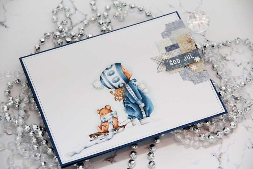
 I had to use my favorite color combination for Christmas on this one. Blue, grey and brown. I made my greys very light, so they look more white than grey, and I have to admit I kind of love the look! I printed the image with 15 % opacity and did no line coloring. I love no line coloring!
 This card is very “me”. The cardbase is made from Papertrey Ink Enchanted Evening cardstock, I used a die from My Favorite Things to add the faux stitching detail on the main panel, and I added a little cluster of diecut patterned paper scraps. I stamped and heat embossed a Norsk Stempelblad AS sentiment on one of the patterned paper pieces and added three snowdrift sprinkles from Little Things from Lucy’s Card as my finishing touch.
 Clean and simple with cluster, these cards come together so easily once the image is colored.
 I used quite a few colors for this simple image. Lots of different earth tones for different parts of the image, and two grey families.
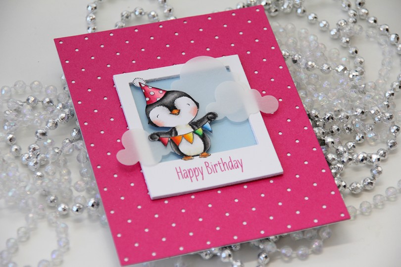
 I love every image Stacey Yacula designs. This little penguin, from the
  I created a polaroid frame by diecutting the
  I wanted a little bit of interest to my background and diecut a piece of Raspberry Fizz cardstock from Papertrey Ink with the
  I glued my polaroid frame in the center of the card and added a few strategically placed vellum clouds. Because they hang off the edge of the frame, they break up the rigid rectangular look a little bit.
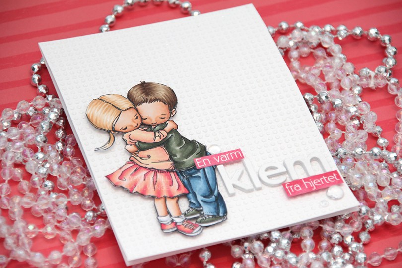
 I colored up
  This card is somewhat different for me. It has a lot of white space, which is fairly common for me, but I used a stencil and texture paste on the card base to change it up a bit, which definitely isn’t normal for me. I even sprinkled distress glitter all over the texture paste while it was still wet, so the card sparkles when you tilt it in the light. Glitter is a nightmare to photograph, though, so it doesn’t show up in the photos very well.
 I used the Parker alpha set from Memory box to diecut the word klem, which means hug in Norwegian. I diecut each letter five times and glued them together for a stacked, dimensional look. I created a couple of pink cardstock pieces by using one of the Copic markers I used on the skirt, stamped the remainder of my sentiment and heat embossed in white before glueing them on with clear foam tape.
 By adding part of my sentiment on top of the image, I get a more cohesive design than I would have if I had put my little sentiment strip above the word only. Just a little design tip. I finished off the card by adding a few raindrops from Little Things from Lucy’s Cards.
 These are all the Copics I used, and I must admit that I really love the pink and peach combos I came up with for this one.
 I colored up
  I used a Docrafts die to create those tickets from scraps of patterned paper from Maja Design, popping them up on foam squares from Gina K designs to give them a little bit of dimension. I white heat embossed a sentiment from Ladybug & Friends on one of the tickets and tucked a diecut pine branch behind it. I finished by adding a few red enamel dots from Papirdesign, tying in the red details from the colored image.
 As usual, I finish with the Copic colors I used to color my image.
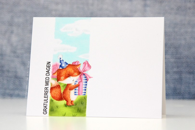
 Jeg startet med å stemple den søte reven fra
  Jeg stemplet en