Hi, everyone! This is my second post of the day. If you came here to see my Mo Manning post, you will find that here. This one’s a bit of a twofer, focusing on the big birthday wishes die from My Favorite Things, along with the Big Balloon stencil, also from MFT.
 I have a great crafty friend who suggested I play along with the current color challenge over at MFT. The color palette for the challenge was Blueberry, Berrylicious, Grout Gray and Sweet Tooth, and it’s a palette I find very appealing! I’ve done a raised diecut inlay using the big birthday wishes die and big balloon stencil once before, but it was with warmer tones (it’s this card) and some birthday monsters.
 Starting with the raised die cut inlay card, I did some serious ink blending. I love the look of ink blending, but I have a shoulder that protests every time I do it, meaning it doesn’t happen every day. I don’t have colored inks from MFT, so I used the brands I have and made it work. I used Hero Arts Wet Cement and Papertrey Ink Soft Stone inks for the gray balloon, Papertrey Ink Hawaiian Shores and Distress Ink Speckled Egg for the teal balloon, and Altenew Dark Night, Azurite, Ultramarine and Eastern Sky for the blue balloon.
 Once the panel was inked, I used the Big Birthday Wishes die to die cut the panel, making sure to keep all the little pieces for the stacked inlay technique. I die cut five more pieces from white card stock and stacked all the individual letters, putting the inked piece on top, giving me a total of six layers for each letter. I no line colored a few of the bears from the Bitty Bears stamp set to look like polar bears, and added them to the big letters at the top.
 For the second card I used the same color inks to ink blend the balloons, cut off the edges to make it a smaller panel and used the negative of a die cut for the shaker window. I built up the walls of the shaker using thin strips of white card stock. I’m not a fan of foam tape for shaker windows, I prefer to take the extra time and effort to build dimension with cardstock. It’s fiddly and time consuming, but I love it!
 I glued the negative die cut onto a piece of acetate, and filled the shaker with the Starry Sky Mix of jewels from Pretty Pink Posh before adding the piece of acetate and negative die cut on top, sealing in the jewels. The colors of the jewels are perfect for the color palette I was going for. I glued the finished shaker piece onto a top fold card base I made from Berrylicious card stock, and my card was finished.
 I had so much fun creating these two cards, but will admit that I struggled with which bears to use, I’d colored all but one bear from the stamp set. Indecisive is my middle name. So is procrastinator, perfectionist and a whole bunch of other descriptors.
 All the bears (except for the one that couldn’t fit on this panel) all colored up like polar bears. While the stamps were still in my Misti, I used a Memento Rich Cocoa dual marker on the eyes, noses and mouths and stamped them on top of the fadeout ink from Inkon3 I’d already used. This is a trick I like to use, and it saves me from having to draw eyes and mouths in after my coloring and risk ruining my images.
 Last, but not least, the colors I used. Not a lot, but enough to make these cute bears look like polar bears and for them to match the color palette for the MFT color challenge.

 I had trouble deciding whether to make a card for a baby girl or for a baby boy, so I decided to go somewhat neutral with a combo of yellow and green. I colored the image with my Copics, added a clear coat of glitter on the green areas using a Wink of Stella glitter brush.
 I stamped a sentiment from Norsk Stempelblad AS using Fresh Leaf ink from Altenew, and decided to even add some clear crystals of various sizes from the Crystal Collection from Little Things from Lucy’s Cards.
 I used a frame die from Mama Elephant and die cut 3 frames; two from white card stock and one from Lemon Tart card stock from Papertrey Ink, which is a very nice soft yellow. I glued all three frames together for a stacked look and spritzed the frame with a sheer shimmer spray from Imagine, before adhering the frame onto the colored piece, and then onto a white card base. I paired it with a Lemon Chiffon envelope from My Favorite Things. It’s not a perfect match, but it’s close enough.
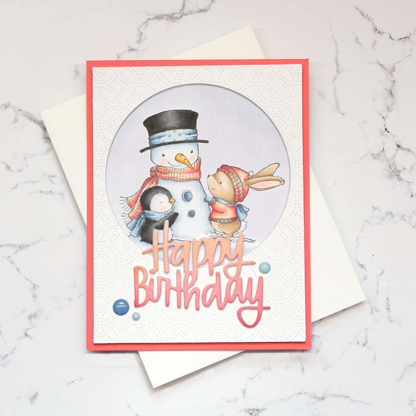
 I started by coloring my image. I had a rough idea of what I wanted to do when I started, so I lightly traced a circle and colored everything inside. Using a peachy pink combo with the fairly light blue helps sell the idea of this not being a holiday card.
 Once the image was all colored up, I took the same die that I’d used to trace my coloring area to die cut circle windows in four panels of white card stock, before adhering them together for a dimensional look, making sure the window was in the same spot on each of them. I used the Detail Ringlet Plate from Simon Says Stamp to die cut from another piece of white card stock. Lining up the circle once more, I die cut a window from this layer, trimmed 1/8″ off from each side and added it to the stack of die cuts I already had. I glued the colored piece behind the window, and adhered everything onto a card base made out of Berry Sorbet card stock from Papertrey Ink.
 Using the Happy Birthday Brush Script die from Simon Says Stamp, I die cut three pieces from white card stock and one from a piece of X-Press It that I’d colored with the same peachy pink Copic combo that I used on my image. I glued all four pieces together for a dimensional look, and used a shimmer spray on top for some sparkle, before adhering the stacked die cut to the front of the card, before adding a few blue enamel dots from Papirdesign as a finishing touch. I didn’t have a colored envelope to match, so I used a white one from My Favorite Things instead.
 Not a whole lot of colors for this one. I have, however, used quite a few colors to color in the snow. B41 was used for the sky, but the rest of those light blues, the BV20 and the BG0000 were all used for the snow, as well as the blender. For the sky I also used B40, which is a color I’ve made myself.
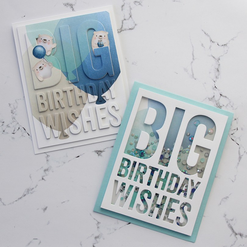

 As usual, I colored my image with Copics. I usually also create a panel with my colored images, but this time I did some serious fussy cutting, that stem is super thin. Ginger, one of the talented crafty people I follow on Instagram (you can find her
  I used the Detail Ringlet Plate cover die from Simon Says Stamp on a piece of Berrylicious card stock from My Favorite Things. I chopped off 1/4″ on each side, added a few layers of card stock behind for dimension and adhered it to a top fold card base I made out of Stamper’s Select White card stock from Papertrey Ink. I die cut two tags from the same white card stock and glued them to the panel that was already there.
 I glued the girl onto the tag, making sure to put a couple of extra pieces of card stock for stability behind the part of her head that hangs over the edge of the tag. I also added used my clear Wink of Stella glitter brush on her wings, which you can sort of see in the photo if you look closely. I die cut the word hei (hi) four times from Summer Sunrise card stock from Papertrey Ink and glued them together for a stacked look. The sub sentiment is a stamp from Norsk Stempelblad AS, stamped in VersaMark and white heat embossed on New Leaf card stock from Papertrey Ink. I also built that up with a few additional layers of cardstock behind it for stability and dimension, and finished the card by adding a couple of enamel dots from Papirdesign.
 Here you can see that there’s a lot of dimension in this fairly simple card.
 No post complete without a list of Copic colors used.