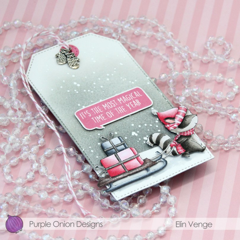
Hi, everyone! Hope you’ve had a great weekend. I thought I’d share with you a gift tag before we get to a new week and a new month tomorrow. I sat down to color Flannel the racoon from Purple Onion Designs, and a friend of mine suggested pink and silver for a color combo. Not my go tos for Christmas (well, silver kind of is), but I had so much fun with this. I always do when she suggests colors for me.
 I went with a really bright pink, colored in the image with my Copics and did some serious fussy cutting, before adding 1 mm foam squares to the back. I also stamped one of the sentiments from the Holiday Blurbs II set using Hibiscus Burst ink from Papertrey Ink, fussy cut it leaving a thin white border and added 1 mm foam squares to the back. I even added some sparkly sheer shimmer spray to the raccoon. He’s very sparkly and shimmery in real life, even though the camera couldn’t quite capture it.
 From a piece of Bristol Smooth card stock, I used the largest of the dies in the Stitched Traditional Tag STAX die set from My Favorite Things, masked off a curved line towards the bottom and ink blended a gray sky using Charcoal, Soft Granite and Wet Cement ink from Hero Arts, as well as Soft Stone ink from Papertrey Ink. The Charcoal is fairly dark, but the Soft Stone super soft, giving a nice gradient feel. I sprinked on chunky white embossing enamel from Stampendous and heated the tag from behind to melt the granules for a snowy effect on my background.
 Going direct to paper, I colored a scrap of Bristol Smooth with the Hibiscus Burst ink pad that I used for the sentiment, before using one of the tiny dies in the Tag Builder Blueprints 6 die set from My Favorite Things to create my reinforcement piece. I think the faux stitching on the circle matches the stitching on the tag perfectly, one of many reasons why I love my MFT dies, they’re so awesome to mix and match. I added a bit of Cotton Candy twine from Whisker Graphics and a charm from my stash near the top to complete the tag.
 Not a lot of colors for this one, but I did my best to make the pink really pop against the other colors.
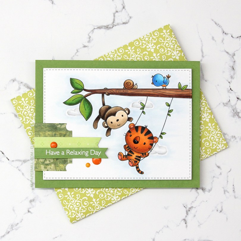
 I colored the image with Copics and die cut it using the second largest die in the A2 Stitched Rectangles STAX 2 set from My Favorite Things, before adding it to a card base made from Gumdrop Green Heavyweight card stock, also from MFT, using lots and lots of foam tape. I used a black Glaze pen to add some dimension and shine to their eyes and noses.
 I’m one of those people that use patterned paper on my cards. I don’t use lots, and I pretty much always use them for small clusters, but my ancient stash of patterned paper is shrinking ever so slightly with each card. I have a tub of die cut patterned paper scraps on my desk, and rummage through it to find the perfect pieces for my clusters. The dark green patterned paper I used here is actually from 2005, which was years before I started making cards. I stamped one of the sentiments from the Always Bring a Smile stamp set from My Favorite Things onto a separate piece of Gumdrop Green card stock and die cut it using one of the dies in the Slimline Starter die set. I finished off my card with a few enamel dots from Papirdesign to match the tiger and the details on the bird.
 Another great use of patterned paper is envelopes. I’ve nearly run out of colored envelopes for A2 cards, and I’m definitely out of white ones, but larger scraps of patterned paper are perfect for creating one of a kind envelopes. I used the A2 V flap envelope dies from Simon Says Stamp on this piece of patterned paper from 3ndypapir. Another old one, this paper’s from 2010.
 Lots of bright colors used for this one. I also used B40, which is a color I’ve created myself.
 I thought
  Using Memento Bamboo Leaves ink, I stamped a sentiment from Norsk Stempelblad AS inside one of the balloons, stamped again in VersaMark ink and clear heat embossed it. It makes it stand out a little more from the balloon. I die cut the panel using a die from the A2 Stitched Rectangles STAX 1 set from My Favorite Things and adhered it to a card base made from Sour Apple card stock from MFT using lots of foam tape for dimension.
 I added Sparkling Clear sequins from Pretty Pink Posh to three of the balloons, and my card was finished. All that was missing was an envelope. The only colored envelopes for A2 sized cards I have left are in warm tones, so I decided to make my own using the A2 V flap envelope dies from Simon Says Stamp with a scrap piece of patterned paper from Papirdesign.
 I thought the color of the patterned paper matched the blue balloons on the card so well, and it made the pile in my scrap drawer shrink ever so slightly, gotta love that!
 I kind of went overboard with the number of Copics used for each balloon, but I think it turned out pretty good in the end.
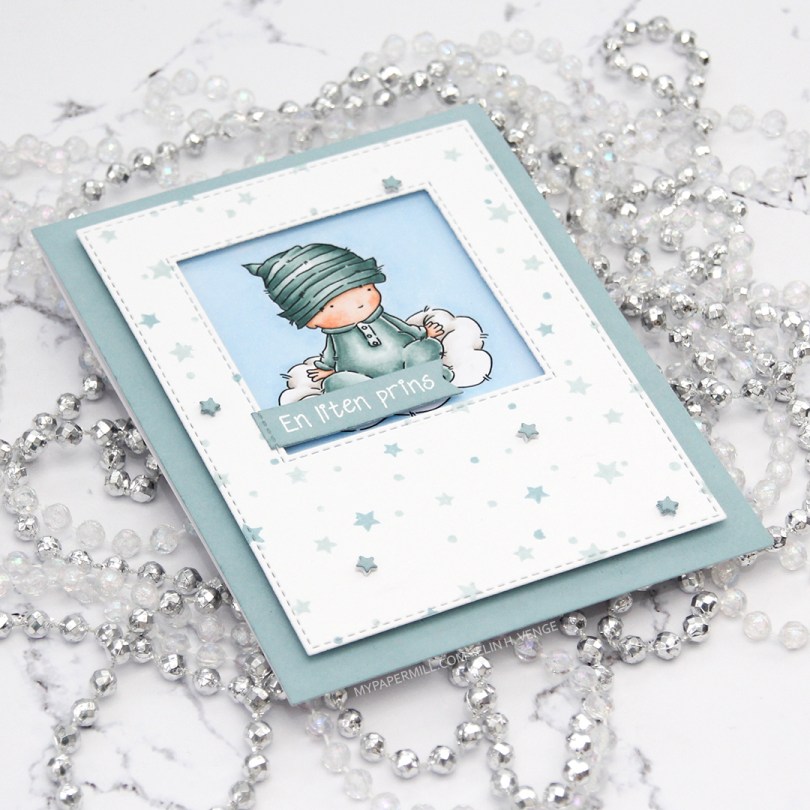
 I had the beginnings of a plan before I started coloring this cutie, and knew that I wanted a window of sorts for the image to be sitting in. I traced a square die onto my panel before I started coloring, so I knew how large of an area I needed to fill in beyond the baby and the cloud.
 Using the Star turnabout stamp from Concord & 9th along with Misty Morning and Cloudy Sky Ink from Altenew, I was able to create a quick panel of scattered stars in colors that matched my colored image. Using dies from two die sets from My Favorite Things, I turned my panel into one with a window and nice faux stitching along the edges. I really like the look of the faux stitch lines that many of the MFT dies have. Other companies have faux stitching dies too, but there’s something about the length of the stitches, the distance between them and the adjacency to the edge of the MFT ones that make them a favorite of mine. I put foam tape on the back of my stamped star panel, making sure to center my image in the window.
 I didn’t have any card stock colors that fit my stamping and coloring perfectly, so I went direct to paper using the Cloudy Sky ink from Altenew onto a quarter piece of white lettersize card stock. I adhered that to a white top folding card base made out of Stamper’s Select White card stock from Papertrey Ink, which is the same card stock that I use throughout (except for the colored image, which is on X-Press It blending card, the only paper I use for Copic coloring). Using another die set from MFT, I die cut tiny little stars and stacked some scattered around on the stamped star panel. I stamped and white heat embossed a Norsk Stempelblad AS sentiment onto a scrap piece of my dyed card stock, before using a couple of additional dies from MFT to turn it into a banner. I love my MFT dies!
 Limited color palette. For the sky, in addition to B21, I used B20, which is a color I’ve made myself. I also used BG71, another color I’ve made, for the clothing on the baby.
 For today’s card I really wanted to include both
  I stamped the bear using fadeout ink from Inkon3 and masked him, before stamping the fox in the same ink. While I still had the stamps in my MISTI, I stamped their eyes, mouths and noses using Memento Espresso Truffle ink. This saved me from having to draw the details back in after my coloring, which could have potentially ruined the entire scene. I used my Copics to color everything, and trimmed the panel down slightly. I used one of the greens from the image on the edges of a 5×7″ piece of X-Press It blending card to make the card front match the image, as I didn’t have any card stock in the right shade of green. For the die cut HURRA (die from Kort & Godt), I scribbled one of the green Copics onto a scrap piece of X-Press It before die cutting. I added another three white die cuts behind it for dimension, and used foam tape on the back of the colored panel to give it a little lift up from the card base.
 As usual, I used lots of colors for the snow (everything in this graphic before E44), but that’s just how I roll.
 I really enjoyed playing with the mini slimline format last week, so I wanted to create another mini slimline. Last time, I slightly miscalculated the measurements I needed to create the matching envelope, so I made this one a little bit smaller, so it fits inside the envelope from last week that was just a tad too small for that particular card. This one measures 3 3/8 x 5 7/8″. I didn’t want to mess with the scene too much, so I die cut a few clouds from vellum using dies from Papertrey Ink and white heat embossed a Norsk Stempelblad AS sentiment onto one of the clouds. I mounted the clouds onto tiny pieces of foam, and added enamel dots from Papirdesign on top in very strategic spots.
 I used a bright color palette for this one.
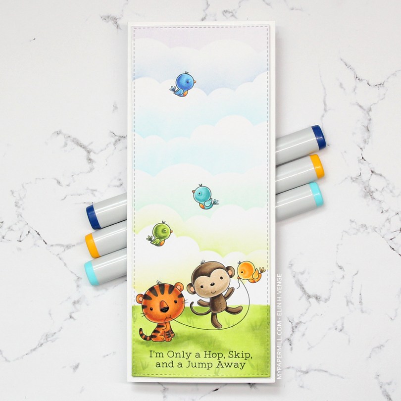
 I colored in all the critters using Copics, before masking them off and creating clouds behind them using a
 I don’t often purchase coordinating dies for stamp sets, but boy, they make it easy to add dimension. Once I’d colored up the little girl with the balloon, I die cut her and four additional pieces from white card stock to add dimension behind her. Way more sturdy than foam tape.
 I wanted to use lots of other goodies from MFT on this card, so I used the cloud stencil with a very light blue ink (Iceberg from Altenew) to create a barely there puffy cloudy sky behind her. It’s really soft, but shows up better in real life than in photos. I used a couple of elements from the Scene Builder stamp set and stamped those near the bottom using Fadeout ink from Inkon3 for a little bit of no line coloring. I die cut the largest of the Stitched Rectangle Scallop Edge Frames four times from Peach Bellini card stock and glued them together for dimension.
 I added clear Wink of Stella glitter and a thick layer of Glossy Accents on the balloon, before stamping and white heat embossing one of the sentiments in the Birthday Cutie stamp set onto Berry Sorbet card stock from Papertrey Ink. I die cut the sentiment using one of the Fishtail Flag Frames dies from MFT, and found some scraps in my stash that I’d already die cut using dies from the same set. I use that die set a lot. I added three green enamel dots from the Tropical Forest set from Altenew and my card was finished. I paired the card with a Persimmon envelope, also from MFT. I love their envelopes!
 Lots of colors for this one! I was going for a peachy pink jacket and leggings, but it was too close to the pink I’d used for the rest of her, so I added some yellows on top. I also decided to go for a brighter green on the grass than her little stuffie.
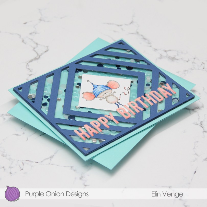
 My sister’s birthday’s in a few weeks, and I thought this was the perfect card for her. She used to have the nickname “musa” (the mouse) when we were kids. Our cousin, a few months younger, was also quite a bit bigger, earning her the nickname “rotta” (the rat). Of the two, I think my sister got the better nickname.
 I die cut the frame five more times, cutting away the interior pieces and stacking the frames to form the walls of my shaker. The frame is quite thin, so I didn’t trust myself enough with a ruler and a craft knife to create five identical frames. Die cutting seemed safer and quicker. I’ve kept all the pieces and am planning on using them in the future for a card or two.
 There’s quite a bit of dimension in this. Card base, five layers of walls for the shaker, a piece of acetate, die cut cover frame on top, then three layers of letters. Dimension is life!
 Limited color palette with such a small image.
 I colored up the image with my Copics. Nothing unusual about that, but these blues are brighter than the ones I normally use. The colored panel was too narrow to fill the width of a regular card, so I decided to put a frame around it. I used one of the wood frame nested dies from Hero Arts to create my frame from Classic Kraft card stock from Papertrey Ink, and built up layers by adding a few more frames behind the top one. I created a card bas from Lush Lagoon card stock from Papertrey Ink, and used the By the numbers impression, also from PTI, to create a debossed look to the card base. There’s quite a bit of blue showing outside the frame, so I wanted a little bit of texture there.
 Using Limelight card stock from My Favorite Things, I die cut the number (from the By the numbers die set from Papertrey Ink) four times and stacked them for a dimensional look. I adhered the number to the frame using liquid glue, and glued a white heat embossed black sentiment strip on top, with two more layers of black card stock behind that, for even more dimension.
 I added a bunch of green enamel dots from Papirdesign, and rummaged through my old patterned paper for one I could make an envelope from. I struck gold with this green one from Pion Design from 2010. I don’t use a lot of patterned paper anymore (at least not big pieces), but I can’t exactly throw it away, either, so I figure it’s perfect to create envelopes from. This way, they get used!
 Super bright colors. Well, except for all the browns. I actually used five colors for his sheriff’s badge before I ended up with a color I liked.