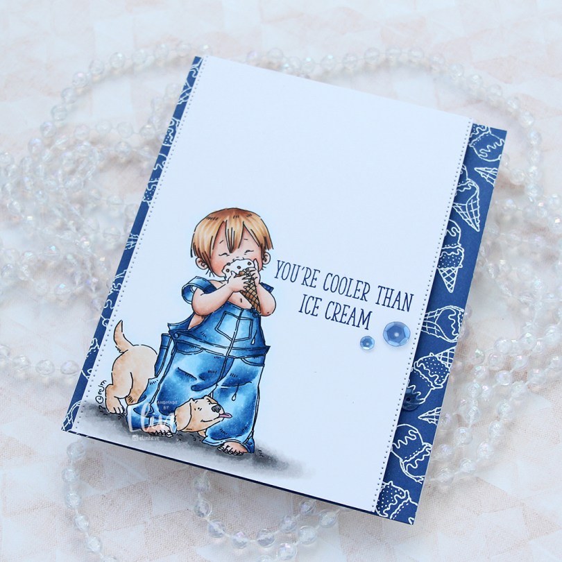
Hi, crafty friends. I’m back today, featuring Justin’s Ice Cream from Mo Manning on a very clean and simple card. I love this image, he looks so happy with his ice cream, and the puppy is equally happy, it’s adorable.
 I’ve colored this image before, but never using blue for his overalls. That feels crazy, but it’s also true. I obviously used blue this time, and gave him blond hair too. I stamped a sentiment from the Double Scoop of Cute stamp set from My Favorite Things, using Blue Beyond ink, also from My Favorite Things.
 On the sides of the panel, I used a die from the Stitched Borders die set from Lawn Fawn to create a tiny bit of interest.
 On a quarter piece of Blueberry cardstock from My Favorite Things, I repeatedly stamped the ice cream cones in the Double Scoop of Cute stamp set and white heat embossed them all. I adhered the blue panel to a card base and mounted my colored panel on top using foam tape.
 To finish off the card I added three sequins from the Denim mix of sequins from Little Things from Lucy’s Cards. I tend to put my embellishments near the sentiment, it’s a good way to draw the eye to the sentiment.
 It doesn’t get much cuter than a boy with a puppy. And I wish the temps were good enough for ice cream outdoors. We still have snow on the ground, it’s cold and there’s more snow in the forecast. I want summer, when’s it coming?
 Lots of Copics despite a very limited color palette. It happens.

 Meet
Meet  I stamped and masked both Parker and Walter before using the
  I didn’t want to mess up the card too much with my sentiment, so I decided to add a subtle one from the
  I cut the panel down to 6×4″ and mounted it in the center of an A7 card base using foam tape. And that’s it. Super simple.
 Not so simple; the coloring. A lot of Copics went into creating this card. It’s become the norm for me when creating these full scene cards using Purple Onion images.
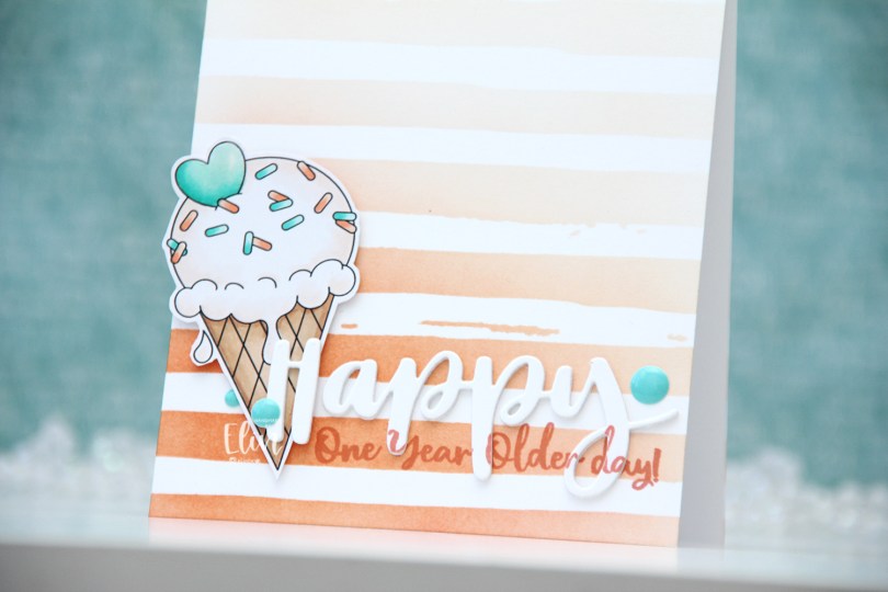
 I colored the ice cream with my Copics, fussy cut it leaving a thin white border and put it aside while I worked on the rest of the card. Using the Watercolor Stripes stencil from Altenew, I ink blended stripes using Melon Berry ink from Papertrey Ink, going heavy handed at the bottom with a soft gradient toward the top of my A2 card base.
 I used the Hand-Lettered Happy Birthday die from My Favorite Things to die cut the word happy from white cardstock from Papertrey Ink. I then did a little stamp surgery, by combining two sentiments in the Anything-but-Basic Birthday Wishes stamp set from My Favorite Things to stamp a sub sentiment to the lower part of the die cut word. I then stamped the same sentiment directly on my card base, still using Melon Berry Ink. I die cut two more of the happy to glue behind the stamped one, stacked all three together and adhered it to the card front, lining up the stamping on the die cut with the stamping on the card base. I then mounted the ice cream on foam squares, added a bit of Glossy Accents to the heart and some enamel dots from the Cool Summer Night pack from Altenew for a little bit of added interest and color.
 Very limited color palette.
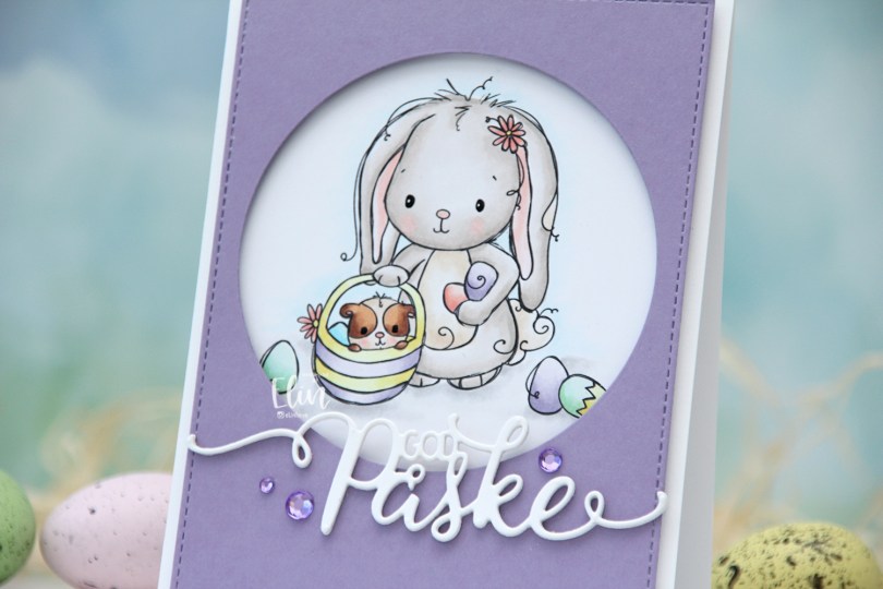
 I used the
  I wanted a pastel look for my card, and this is probably the lightest wash of color I’ve ever done with my Copics. Except for E25 on the guinea pig, I’ve only used markers ending in numbers that are 3 or lower. That’s super light for someone who doesn’t shy away from using markers ending with 9. Once the coloring was complete, I used a black glaze pen to create shine in their eyes, and I went over it with a dot of white Gelly Roll 05 on the bunny.
 From a piece of Winter Wisteria cardstock from Papertrey Ink, I die cut a circle opening and also used a faux stitch rectangle die from My Favorite Things to create a little bit of extra interest around the edge of the panel, before mounting it on foam tape.
 I used a die from Papirdesign to make my God påske (Happy Easter in Norwegian) sentiment, and made it dimensional by stacking four white die cuts on top of each other, before finishing off the card with a few crystals from Papirdesign that match the Winter Wisteria cardstock nicely.
 Here it is, the softest color palette ever.