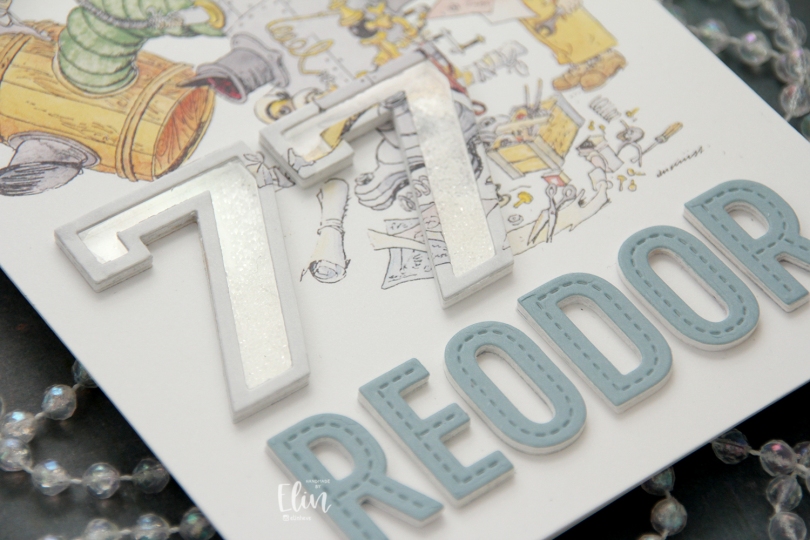
Hi, crafty friends. I’m sharing a very simple shaker card that I made for my dad’s birthday. He turned 77 in March, and threw a big party. He did the same thing for his 55th and 66th, which is kind of fun. He’s a retired structural engineer, and we lovingly call him Reodor, which is a character from the movie Pinchcliffe Grand Prix (Flåklypa Grand Prix in the original Norwegian). The character is a bicycle repair man by trade, but he’s known for his quirky inventions, and that’s why we’ve nicknamed my dad after him, as he comes up with these quirky solutions too. He’s installed a smoke detector that you can lower at our cabin in the mountains. The ceiling is so high that it’s very impractical when the smoke detector goes off or the battery needs to be changed. His quirky little invention keeps us from having to get a ladder whenever that happens. He used the elastic from old underwear as a fan belt for his car back in the 90s, and he’s added a base and tires to a generator to make it easier to lug around (also at our cabin). There are lots of other things too, let’s just say he’s earned the nickname.
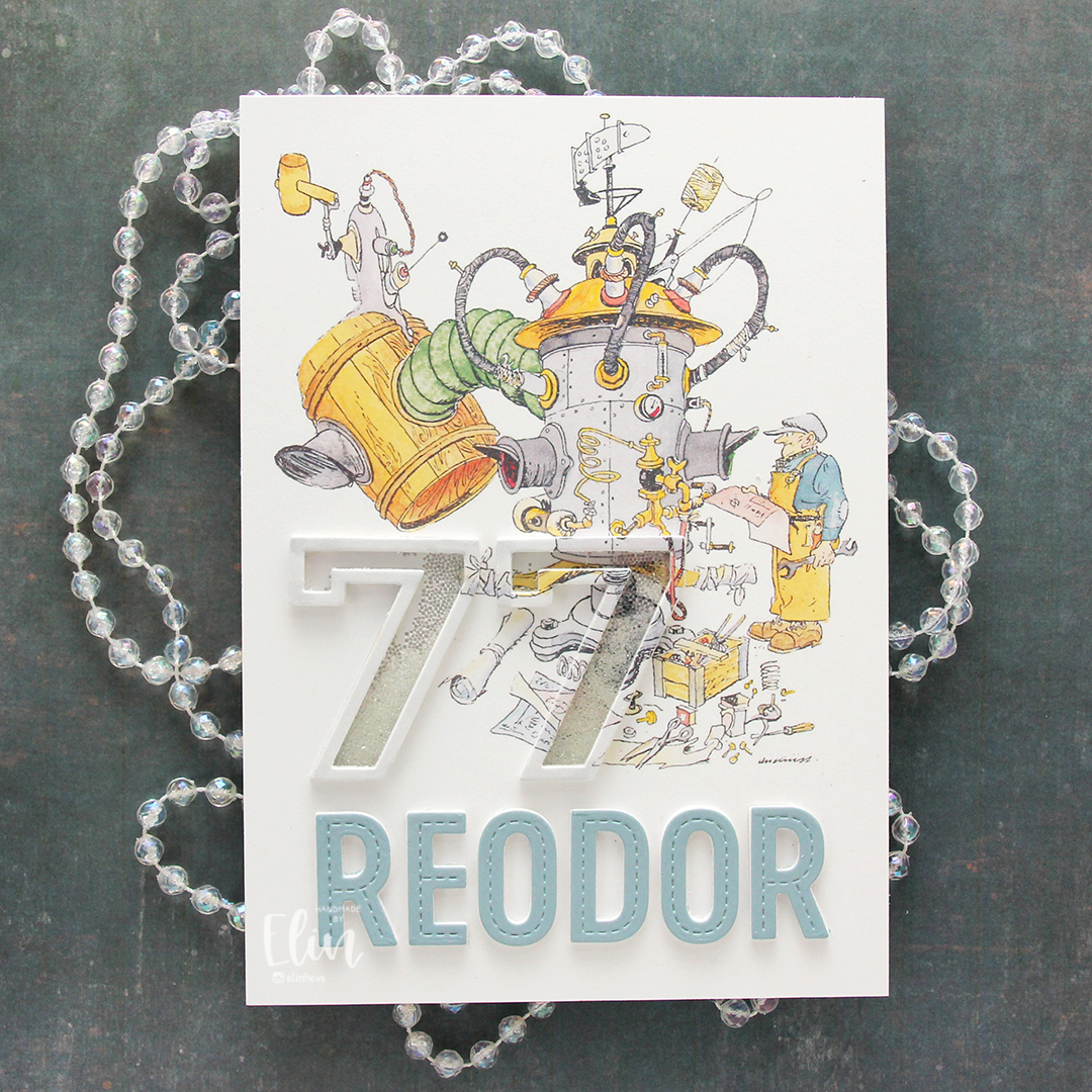 The Flåklypa universe has had a big resurgence in the past 10-15 years or so. Additional movies have come out based on the original and there’s a bit of merchandise available. I have a few calendars, and for this card, I used a calendar page with Reodor looking at his latest machine, wrench and technical drawing in hand. I sampled the color on his shirt to create a colored cardstock to match, and die cut the letters for the name Reodor using the In Stitches Alphabet die set from My Favorite Things. I die cut a few layers from white and the top layer from my custom colored cardstock and added them below the image.
 For the shaker portion of the card, I used the Outline Numbers and Solid Numbers die sets from My Favorite Things. I die cut the outline from the image as well as a few from white cardstock, and used the solid number die for the acetate. I used microbeads for shaker filler and colored the top layer with a layer of a very pale grey Copic marker to make it stand out a little against the background. The card was very well received, and my parents have actually framed it and put it on display in their dining room.
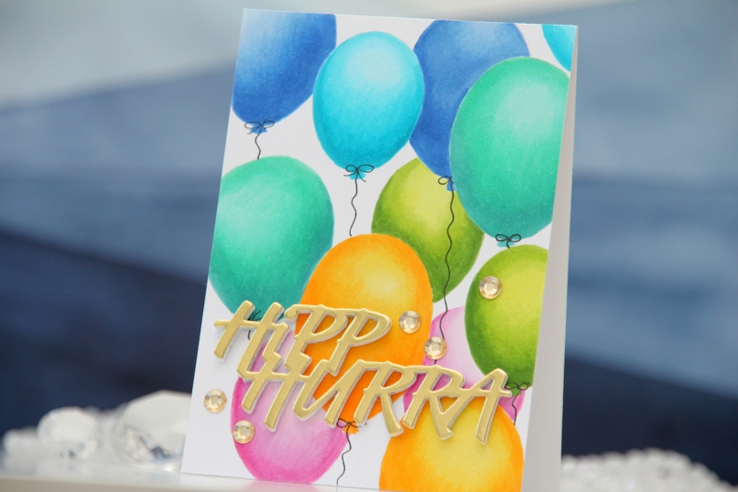
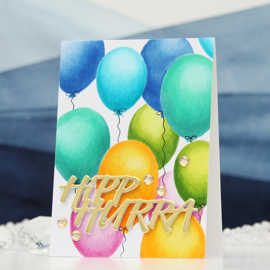 I started by drawing the balloons for my background with a 0.3 mm mechanical pencil. I erased most of the pencil lines before coloring, as Copic will trap pencil, making it impossible to erase after coloring. I wanted a no line look for these, and the half erased lines were enough for me to see where to add my Copics. Balloons are actually pretty easy to draw, it’s basically an upside down egg. If you don’t want to draw yourself, there are lots of balloon stencils on the market that you can use as a guide, or even a die cut balloon that you trace. I colored in my balloons, two of each color, added the panel to a top fold 4 bar card base I created from white cardstock and drew in balloon strings using a 0.35 Copic multiliner.
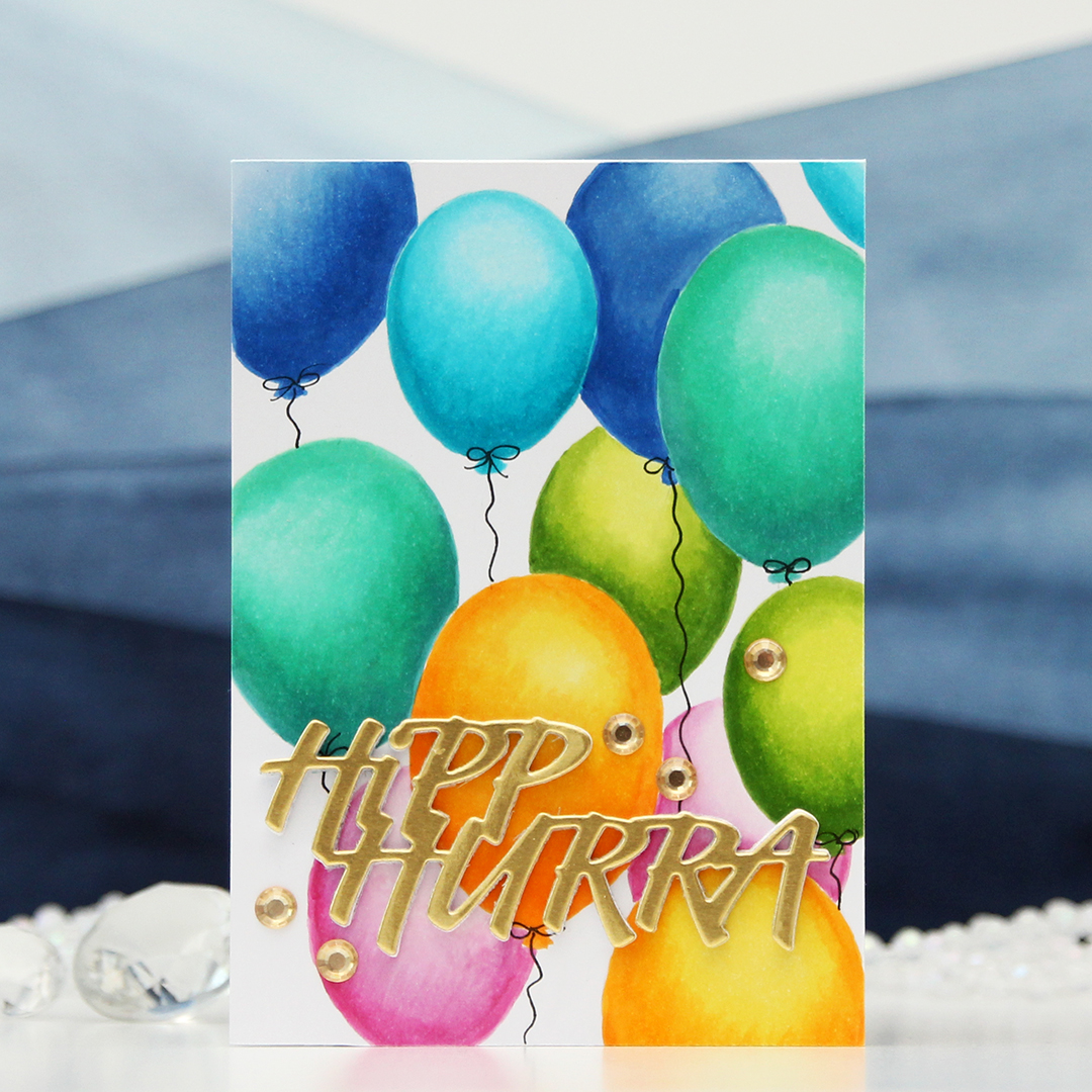 For a sentiment, I die cut the Hipp hurra die from Kort & Godt five times and stacked them for a dimensional look. I cut four from white cardstock and one from gold shine cardstock and topped the stack with that. I added some gems from the ST210 pack of gems to finish.
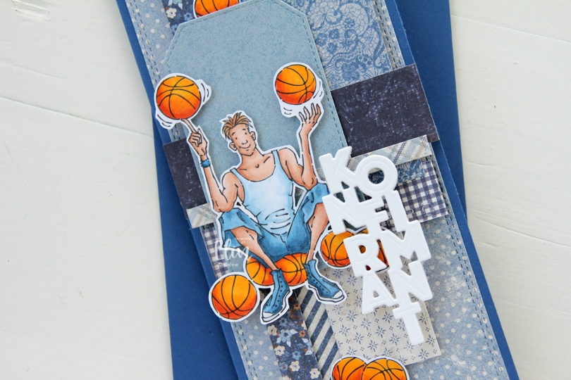
 I made a slimline card this time. I created a background from blue scraps from several collections from Maja Design – Denim & Friends, Denim & Girls, Fika and Vintage Autumn Basics are all represented. One of the things I like about the Maja Design patterned paper is that papers match across collections. They’re also made from really good heavyweight paper, which is another tick in the pro column for me. I used the Slimline Double Stitched Rectangle STAX die set from My Favorite Things to create the panel in the back and also the Stitched Traditional Tag STAX die set, also from MFT, to create the tags.
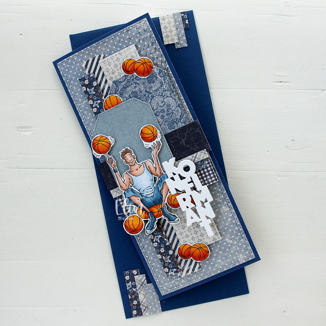
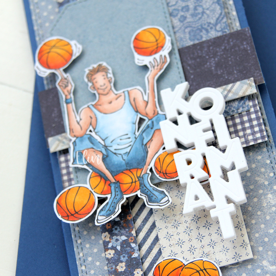 I added the image on top of one of the tags and scattered a few more basketballs around to work as embellishments. The orange really stands out against the blue background. To finish off I die cut the Konfirmant 5 die from Papirdesign six times from white cardstock and stacked them for a dimensional look. I adhered it on top of the image, and it floats above the card further down.
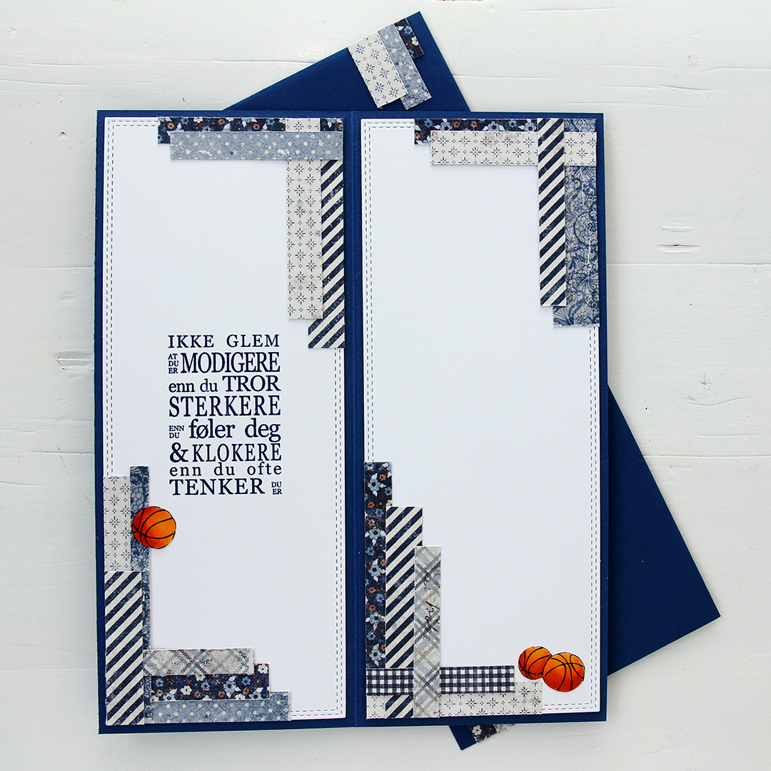 Whenever I make cards to order, I always decorate the inside too. I used the largest slimline double stitched rectangle die to create the white panels on the inside, adding more strips of patterned paper to continue the look from the front of the card and also fill the pages a little. Slimline cards are large, and the added elements make it less daunting to have to come up with a message for the recipient. On one side, I stamped a sentiment from the Konf. 01 stamp set from Norsk Stempelblad using Blue Beyond ink from My Favorite Things, the right side still has plenty of room for a personal message. I also included more basketballs.
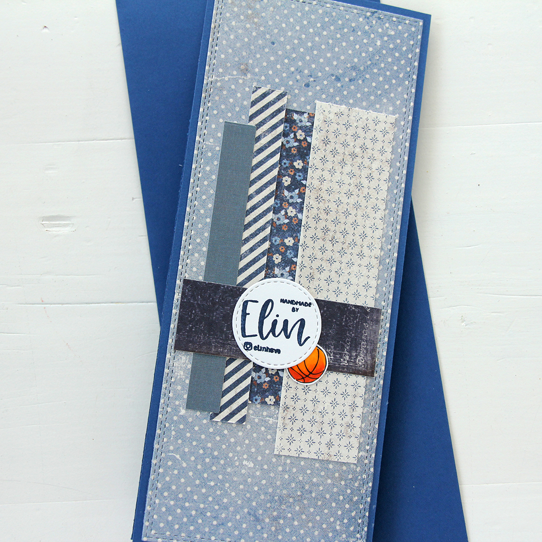 For the back of the card, I used a few strips of patterned paper I had left, die cut a white cardstock circle using the Stitched Circle STAX die set from My Favorite Things and stamped my personal stamp in the center of it using Blue Beyond ink from MFT. The card base is also from My Favorite Things, it’s made from Blueberry cardstock, and the envelope is also in that same Blueberry color.
 Limited color palette for this one.
 The RAM Stamps digital images always come in sets of two, where one has black lines and the other has grey lines to make it easier to print images for no line coloring. I wanted to change things up for this card and decided to pair the two versions. I layered them in Photoshop (the black lined one on top) and erased the background in the black lined version, only keeping the lines for the duck, the fairy and the large flower. I kept the no line version intact and printed my image. This way, I had dark lines for the focal point and soft grey for the remaining scene. I love the look of this.
 I colored the part of the image that had the black lines using Copics, keeping the rest uncolored. I stamped a sentiment from the Itty Bitty Gifting stamp set from My Favorite Things directly on the panel using Obsidian ink from Altenew, then added a hugs word above, created using the Sweet Sentiments die set, also from Altenew. I die cut a few from white and one from a piece I’d colored with one of the Copics I used for the image. I still had the sentiment stamp mounted in my Misti, so I could stamp on top of the die cut for a continuous sentiment. I cut my panel down slightly and adhered it to a panel of Wildberry cardstock from Concord and 9th, adhered it all to a white card base and finished off the card with a few sequins from the Starry Night mix from Little Things from Lucy’s Cards.
 The image is simple, but I still went overboard with the coloring for this. It happens.
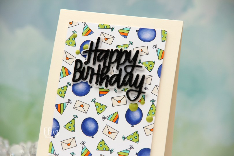
 Once I had enough images to cover a background, I printed it onto X-Press It blending card and chose a few Copics to color in the images. I went with flat color for most of these, only adding dimension in the coloring of the balloons.
 I cut my panel down and mounted it onto a top fold card base I created from Vintage Cream cardstock from Papertrey Ink. I die cut the sentiment using the Happy Birthday Brush Script die set from Simon Says Stamp, using Heavyweight Translucent Vellum from My Favorite Things for the shadow layer and black glitter cardstock from Kort & Godt for the words themselves, backed with a few layers of plain black cardstock (True Black from Papertrey Ink) for dimension. Behind the vellum, I die cut the word dies from a few layers of white cardstock to make the vellum “float” above the images.
 I adhered the greeting in the top center of the card and added enamel dots from the Forest Trail pack of enamel dots from Altenew to finish. I paired the card with a Sour Apple envelope from My Favorite Things.
 Just a few Copics for this one.
 The weather’s finally improving, and things grow greener and greener with every passing day, so I thought a floral background would be perfect for this card. I die cut masking paper using the Lenten Rose mini slimline die from Crafty Meraki. I had to do quite a bit of puzzle piecing of the masking paper to ink up the different sections in different colors, but I think the end result is worth it. The colors I used are all from Concord & 9th, they are Wildberry, Sweet Pea, Sunflower and Harbor.
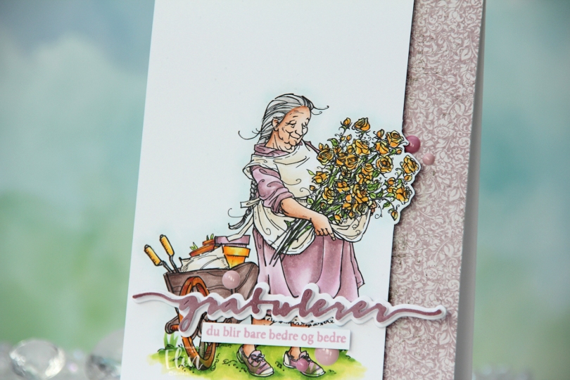
 I printed the image on X-Press It blending card and colored it with my Copics. I pulled out my RV90 series, which I used to use a lot ages ago, but haven’t really used much in recent years.
 Once my coloring was complete, I decided to cut off quite a bit on the right hand side of the panel, which meant doing some fussy cutting around the flowers. I don’t mind fussy cutting, and cutting on the border like this makes for a more dynamic design. Along the right hand side of a top fold card base, I adhered a scrap strip of patterned paper from the Vintage Romance collection from Maja Design, then popped my colored panel on the left.
 I die cut the Gratulerer 6 die from Papirdesign a few times. I die cut the shadow layer in white, then a few stacked of the word, before finishing off with a colored one. I actually colored this one with Copics on the scrap I cut off the panel. This is a neat trick if you want your colors to match, but don’t have the right cardstock color. I stamped a sentiment from the A06 stamp set from Norsk Stempelblad AS using Briar Rose ink from Concord & 9th, cut it down to a strip and adhered it below the die cut, adding a few strips of cardstock behind it for dimension. I finished off the card with a few enamel does from the Shades of Purple pack from Altenew.
 Using patterned paper from Craft Consortium along with a stamp, die and a few sentiment sticker strips from Kort & Godt, I created an envelope to match.