
Hi, crafty friends! I have a fun card to share today with some cuties from Purple Onion Designs. I colored this up for the rainbow theme for last month’s Coloring Club Challenge over on Instagram. Polly the hedgehog is so cute with her buckets of paint, and I had her paint a stone wall this time.
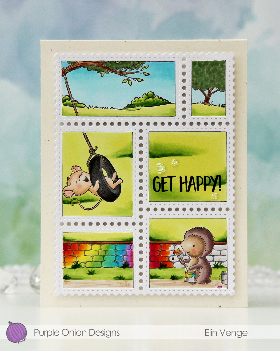 In addition to Polly and the stone wall, I also used Hazel and the countryside horizon background. I die cut a panel of X-Press It blending card using the Postage Collage die set from Waffle Flower. I then used the coordinating coloring stencil to mask off the edges, so I could stamp in the “windows” only and keep the outside white. I used a 0.03 Copic multiliner to add a very thin frame around each part of the scene to contain my coloring inside.
 Once my coloring was complete I stamped a sentiment from the Journey sentiment set from Purple Onion Designs using Altenew Obsidian ink.
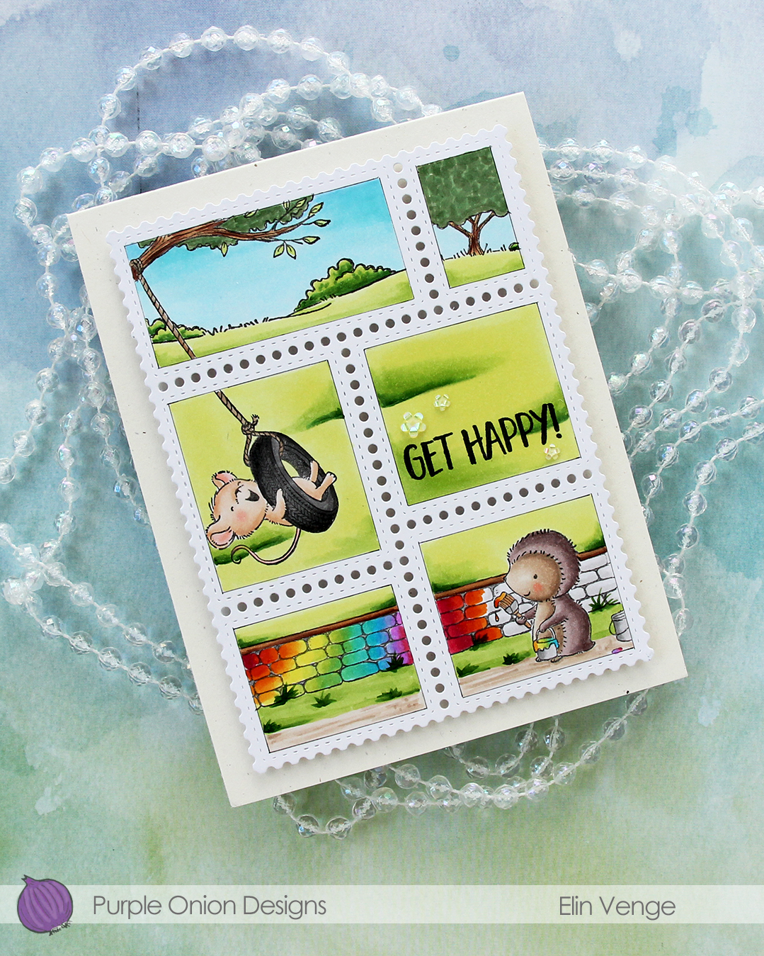 I stacked cardstock scraps behind each of the postage stamps for dimension and adhered everything to a card base I created from Rustic Cream cardstock from Papertrey Ink. I love this cardstock, I need to break it out more!!
 To finish off the card I embellished with iridescent flowers from the Spring Leaves mix from Little Things from Lucy’s Cards.
 Lots of Copics for this one.

 I used a couple of the brand new cardstock colors from Concord & 9th (Brickyard and Pimento), along with a bunch of older ones (Sorbet, Grapefruit, Nectar, Eucalyptus, Rainforest) for the rest of the florals. I also used a little bit of vellum and some gold shine cardstock for the flower centers.
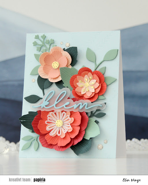 Once you’ve die cut the florals and greenery, you can use the embossing folder that coordinates to create texture on the petals and large leaves. They come out looking like crepe paper, and I love the look. There are many ways to assemble these flowers, and I created a bunch more that I wasn’t able to fit on this card. For the circular centers, I stacked some white die cuts behind the gold ones for dimension, and I curled all the petals and “crepe paper” leaves before assembly.
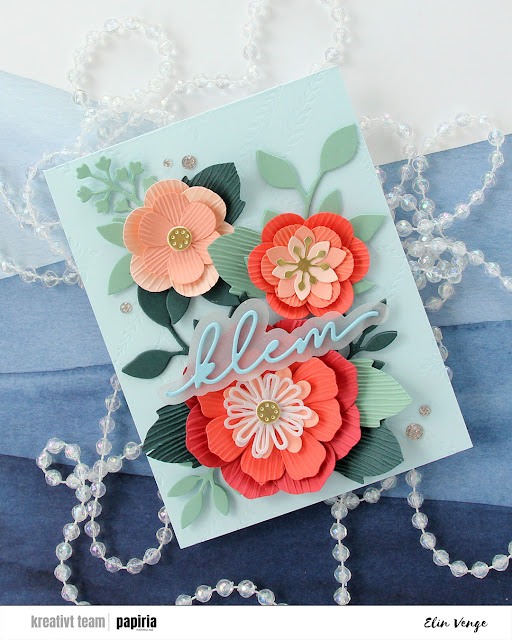 On the Powder panel that covers the card base, I wanted a little bit of texture. I used the Leafy Lattice press plate from Pinkfresh Studio with Polar Bear ink from Altenew for a subtle background – it’s so subtle it barely shows in the photos, it’s definitely more noticeable in real life. I probably could have gone a little bit darker with the ink, or ink up the press plate a second time and run it through again if I wanted it darker.
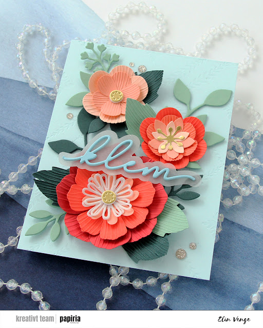 I adhered all my flowers and leaves with liquid glue, stacking the pieces in the background for strength and dimension. They’re only attached at the base of the sprigs, so they have som lift at the tips. I die cut a sentiment die from Kort & Godt four times from Harbor cardstock, stacked them, added a vellum shadow layer behind and glued my sentiment on top of the larger flower, before finishing off with a few champagne glitter drops from Pinkfresh Studio.