
Hi, crafty friends! It’s the first Sunday of Advent, and I have a fun gift tag to share today featuring the adorable Baking Fun image from Purple Onion Designs, illustrated by Pei – I’m such a big fan of her illustrations!! I did a lot of baking last year for Christmas – SO many different types of Christmas cookies and sweets. This year, I haven’t even started yet. I have a few favorites I might end up making, I haven’t decided yet. Anyway, back to the gift tag.
 I colored up the cute little mouse with Copics, adding a plaid pattern to the apron using a Zig watercolor brush marker (No. 98 Pale Dawn Gray), before fussy cutting the image leaving a white border. I used the Gift Pocket Tag die set from Mama Elephant to die cut from patterned paper from the Christmas Nostalgia collection from Maja Design to create my tag. I mounted the smaller piece with foam squares and did the same with the cute little mouse.
 I stamped a sentiment from the Holiday Blurbs I stamp set from Purple Onion Designs using Amarena Cherry ink from My Favorite Things, fussy cut leaving a white border and mounted it on top of my image, doubling up on the foam squares on the left half. I tucked a few felt snowflakes from Kort & Godt under my element, added a bit of black glaze pen to the eyes and tied ribbon and twine at the top of the tag to finish.
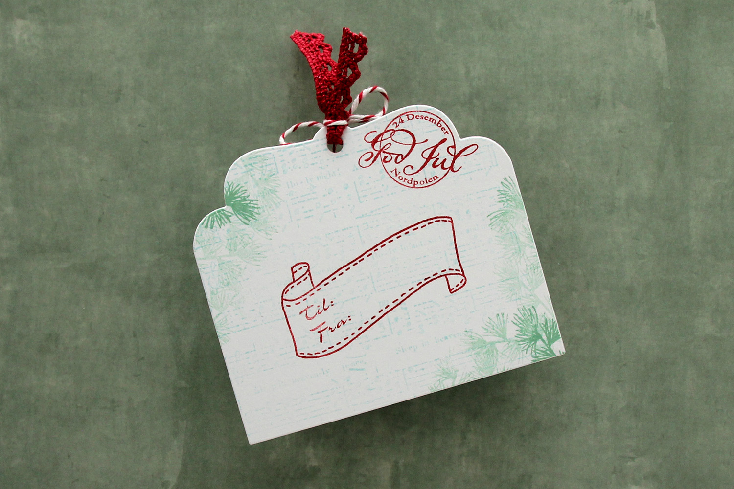 I die cut the tag a second time from white cardstock and did quite a bit of stamping on it. I used second generation stamping of an old sheet music stamp from Magnolia using Powder ink from Concord & 9th – I wanted it to be very soft. The sheet music is actually for Silent Night, making it extra Christmas-y – not that you can really tell. I used first and second generation stamping of a branch from a Mathia Design stamp set using Eucalyptus ink from Concord & 9th to add a little something to the corners. I stamped a postmark stamp from Ladybug & Friends, as well as a to/from stamp from Norsk Stempelblad AS using Amarena Cherry ink from My Favorite Things. I don’t think Ladybug & Friends is in business anymore. Neither is Norsk Stempelblad, but I love their stamps and can’t bring myself to stop using them.
![]() I didn’t use too many colors on this one.
I didn’t use too many colors on this one.
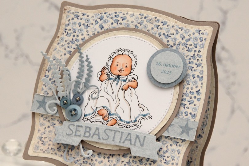
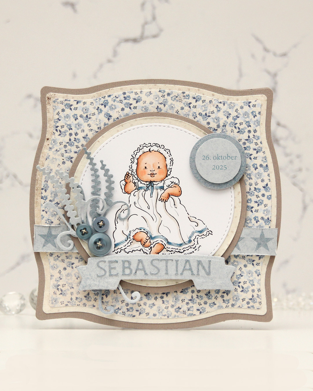 I colored the image and die cut it using one of the circle dies in the Stitched Circle STAX die set from My Favorite Things. I also die cut circles from grey cardstock and patterned paper from the Denim & Friends collection from Maja Design using the Nesting Circles die set from Lifestyle Crafts. The shape of the card is created with the Nesting Frames #8 die set from Lifestyle Crafts.
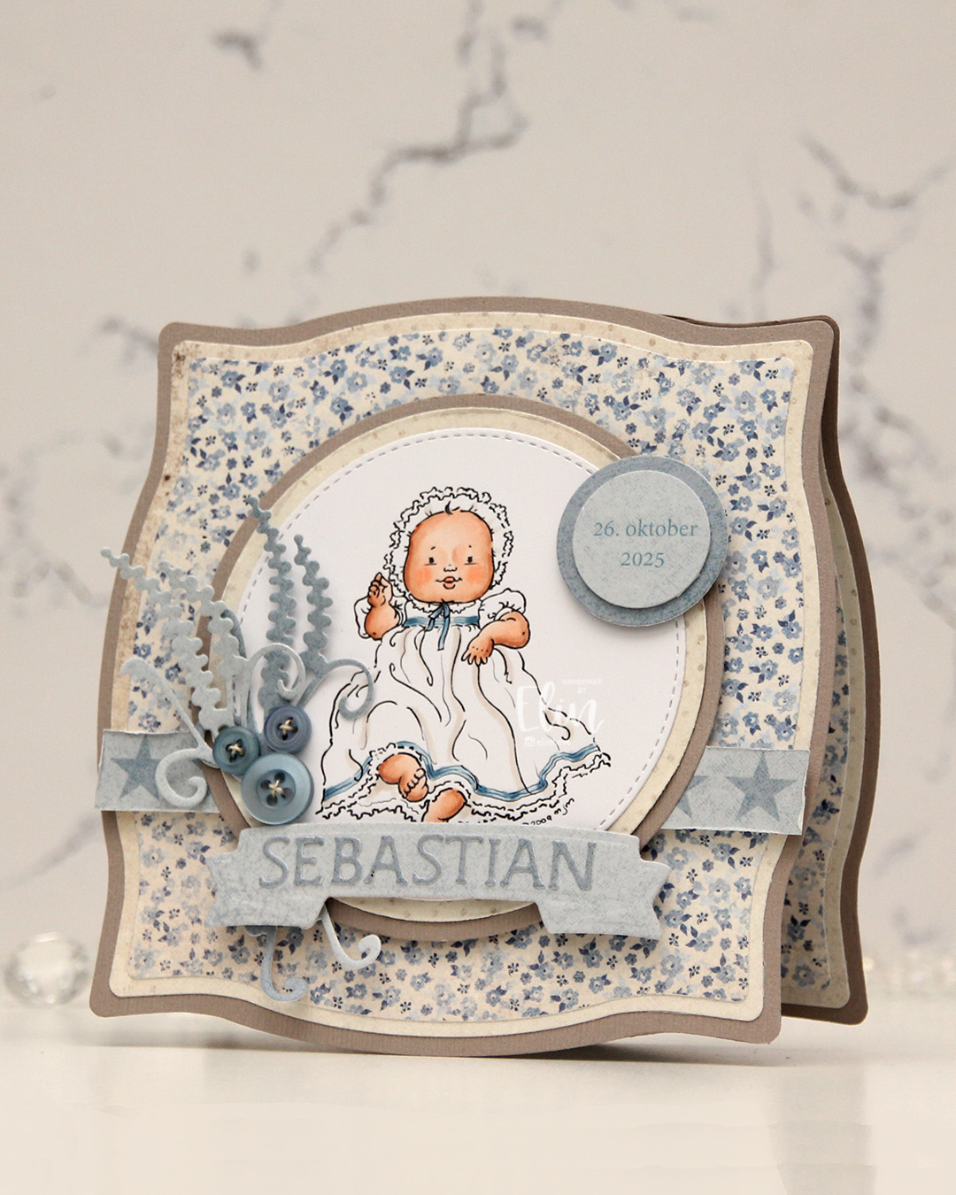 I popped some pieces up using foam tape, die cut the letters for the name using an alphabet die set from Scrapmagasinet and adhered the letters to a banner I die cut with an old die from Spellbinders. I used an old die from Marianne Design for the spriggy things on the left, and used some old Blueberry Sky buttons from Papertrey Ink to embellish.
 Very limited color palette for this one.
 This all started with patterned paper from Maja Design and the Sleigh full of cheer dies from Concord & 9th. Die cutting presents like this is a great way to use scraps. I used the Christmas Nostalgia collection for this. I’m a sucker for anything blue, so I wanted a dark-ish blue at the bottom, a lighter blue at the top and a contrast in the center. You could do this with any color, even plain cardstock. There are actually some images in the coordinating stamp set that will allow you to add patterns to your die cuts using just ink, but I opted for the patterned paper version here. I die cut the bow, the ribbon for the presents and the sleigh using champagne foil cardstock from Concord & 9th and added those for a touch of shine. The sleigh itself is a few layers thick to make it stand out against the background, and I did some ink blending on the seat using Wheat ink to make it stand out even more, as I have the same cardstock color for the seat as my background.
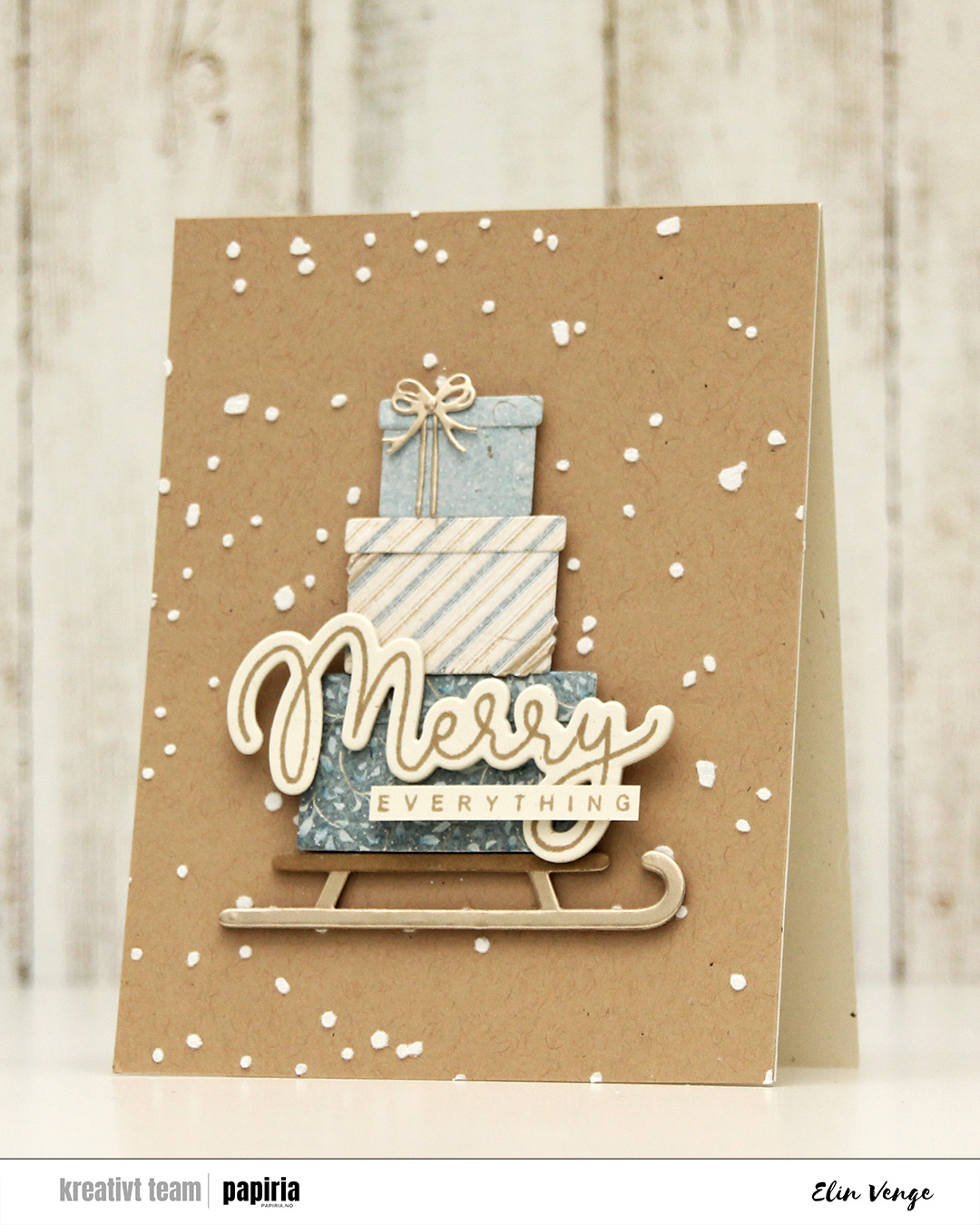 Speaking of backgrounds – I used one of the stencils in the Splatter Textures stencil set from Kristina Werner on a panel of Wheat cardstock from Concord & 9th. I added Altenew embossing paste through the openings and sprinkled on rock candy distress glitter while the paste was still wet. It’s important to clean your stencils quickly when using paste, or you’ll have a really hard time making it come off. Nobody wants to clean, but when dealing with pastes, you need to. I stamped my sentiment from the Joyful and merry stamp set from Kristina Werner using Wheat ink on Rustic Cream cardstock from Papertrey Ink. I used the coordinating die set to cut out my merry, and added another three die cuts on the back for dimension. I cut down everything to a nice strip, added another strip on the back for strength and adhered the sentiment to the largest present to finish the card.
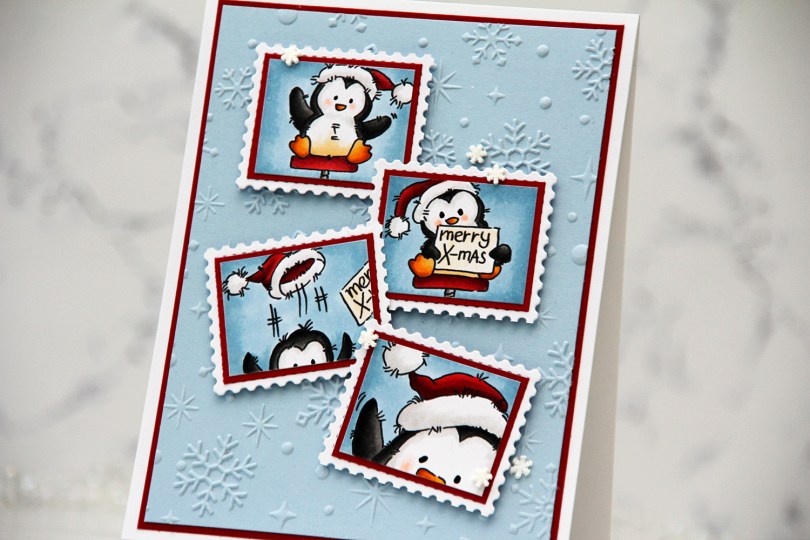
 I started by coloring the images with Copics. They each come with a frame, but I wanted this postage stamp look, so I cut my images on the inside of the frames.
 I wanted some interest in the background, and the Sparkling Snow embossing folder from Simon Hurley/Spellbinders is amazing! It creates proper six pointed snowflakes and gives such a cool texture, I want to use it on everything. I used it with a panel of Blue Breeze cardstock from My Favorite Things. It’s one of my favorite light blue colors, I may need to hoard it since MFT went out of business. I trimmed my panel down, matted it with a panel of Cranberry cardstock from Concord & 9th and adhered both to a top fold white card base I covered with an A2 panel of X-Press It blending card, just so that my whites would match.
 I adhered each of my colored images onto Cranberry cardstock for a nice framed look, then adhered my matted images to postage stamps I die cut with the Postage Collage die from Waffle Flower.
 I mounted each of my postage stamps using foam squares, adding the first two straight before making sure the last two were wonky. I like that both the images and their placement tell a story about what happened in that photo booth, everything going perfectly at the start, followed by slight chaos. To finish off the card, I added black glaze to the eyes for some shine and a tiny bit of dimension, as well as snowdrift sprinkles from Little Things from Lucy’s Cards.
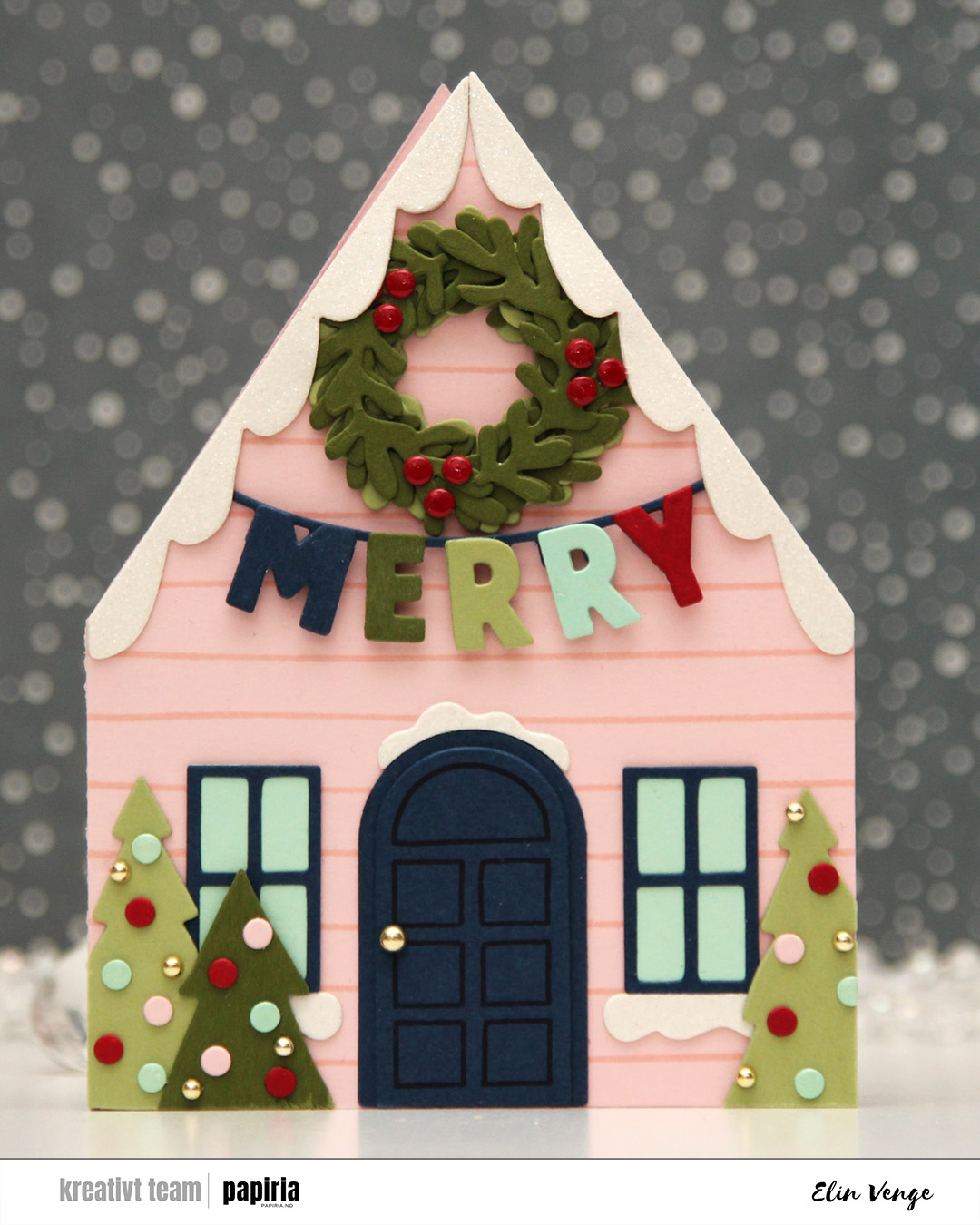 The Yuletide Lane bundle caught my eyes as soon as I saw it. It’s easy to create a big row of houses with the die set, but I opted for a simple shaped card for this one. If you love putting together die cuts, this is the set for you. I cut two houses from Ballet Slipper cardstock. Onto one of them, I stamped one of the stamps in the coordinating stamp set using Ballet Slipper ink for a tone on tone look. this particular stamp is very forgiving. It’s just two lines spaced about half an inch apart, but they’re not completely parallel or straight, which means you don’t need to be too precise when stamping. I glued the two houses together on one flap and cut the other flap off, leaving a standard side fold card base.
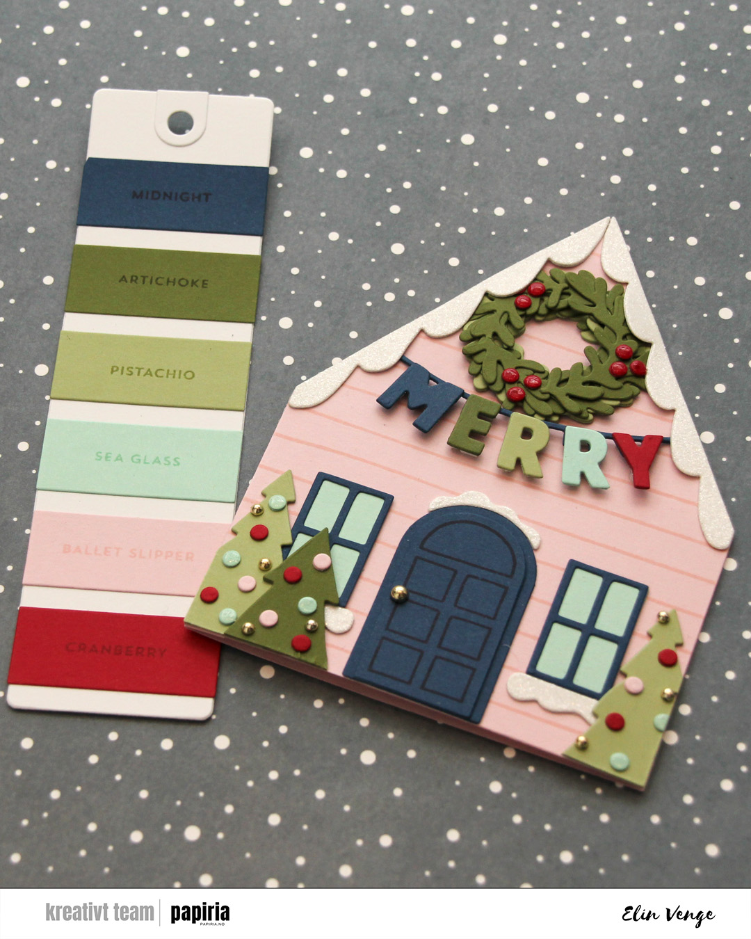 Time for the bells and whistles. This die set is packed full of so much stuff you can add, there’s really no limit to what you can do. I chose a fun color combo of Cranberry, Midnight, Artichoke, Pistachio and Sea Glass to match the Ballet Slipper nicely. I doubled up the die cuts on nearly everything, even adding white glitter cardstock from Kort & Godt for the snow. On the door, I stamped the coordinating door stamp in Midnight ink, I popped up the letters, added a thick layer of Glossy Accents to the berries on the wreath, a somewhat thinner layer on the Sea Glass ornaments and some gold enamel dots to finish. I even used a gold enamel dot for the doorknob.
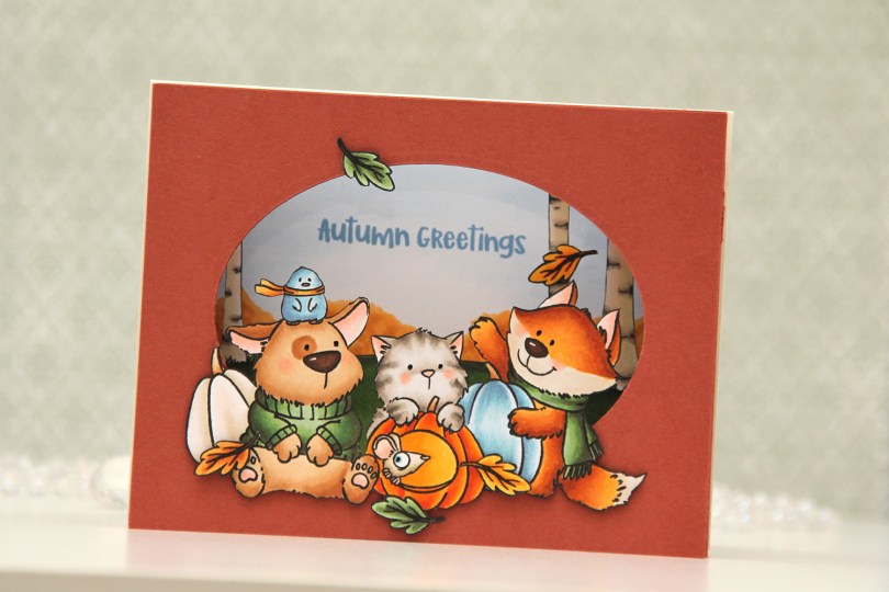
 I stamped my images (both the critters and birch tree background) on separate panels of X-Press It blending card with Copic friendly ink, colored them in and fussy cut them. Before fussy cutting the critters, I actually stamped over my initial stamping with Obsidian ink from Altenew, which gives super black lines that are extra crisp. It’s a pigment ink, though, so it needs to be stamped after the coloring. I also colored a sky and some bushes on a separate panel, where I stamped my sentiment in Blueberry Sky ink from Papertrey Ink. I cut an oval into a panel of Americana cardstock from Papertrey Ink using an old oval die from Spellbinders (Petite Ovals Large) and then created two pieces of accordion folds in the same color cardstock. I glued my background with bushes and sky to the back of the accordion pieces, the birch trees in the center, and the panel with the oval window in front. I mounted my critters using foam tape and used black glaze pen for the eyes. I then adhered my accordion to a top fold card base I created from Rustic Cream cardstock from Papertrey Ink.
 I used a lot of Copics for this one. I even used B20, which is a color I’ve created myself using an empty marker, B21 reinker and blender reinker.
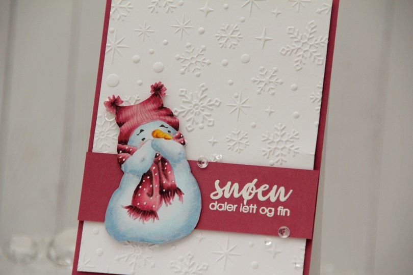
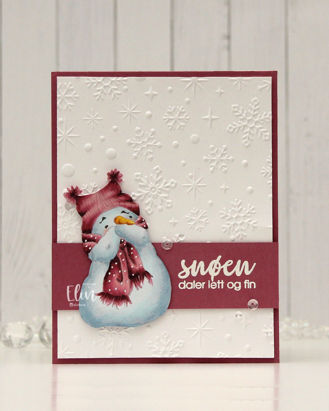 I went for a no line version this time. This is probably my most used image from Mo, and I love how easy he is to color. I chose a pink color combo that I really like, and I think this could work both as a holiday card and as a general winter card. I added the dots back into his scarf using an extra fine white Sharpie, and then fussy cut him. He’s pretty easy to fussy cut, too. I used the Sparkling snow embossing folder from Simon Hurley (Spellbinders) on the background for some texture. I love the detail this embossing folder gives, and they’re proper six pointed snowflakes and not the weird 8 pointed ones that some companies make. Real snowflakes never have eight points, they always come in multiples of six. It has to do with the way water molecules are formed and then bind together. Anyway, it’s a great embossing folder and it adds interest to an otherwise plain background.
 I trimmed my embossed panel slightly, added a couple of layers behind it and adhered it to a card base covered with a panel of Autumn Rose cardstock from Papertrey Ink. On a separate piece of Autumn Rose cardstock, I stamped a sentiment from the Snøstorm stamp set from byCino using VersaMark ink, before sprinkling on super fine detail embossing powder from Ranger and melting it until it was smooth. I cut my sentiment down to a wide strip, added a layer to the back of it for a little bit of dimension, then put a couple of additional layers behind the snowman before gluing him down and finishing the card with a few sequins from the Assorted Moonshine mix from Simon Says Stamp.
 Simple color palette for this one.
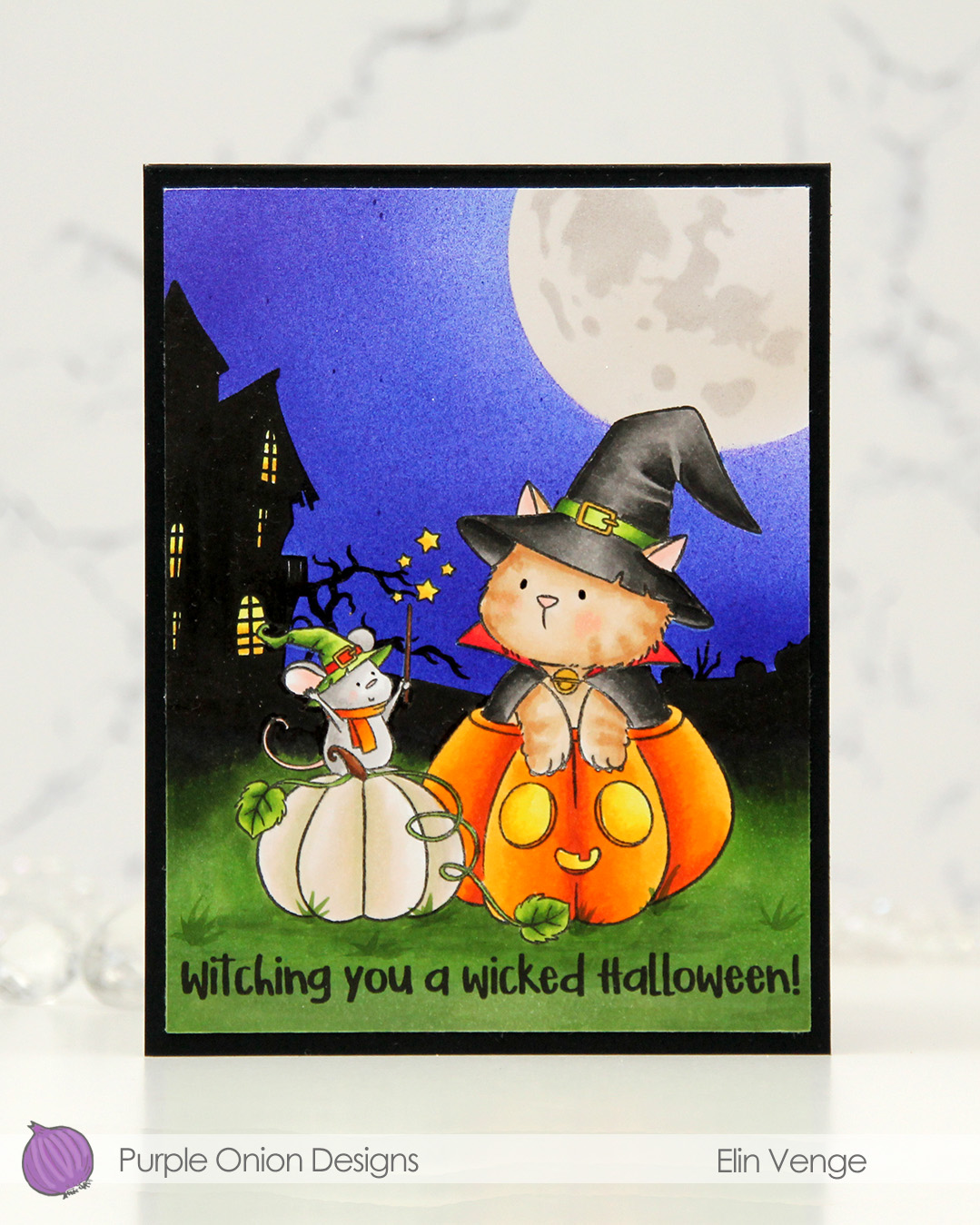 I stamped the image near the bottom center of a panel of X-Press It blending card using Extreme Black ink from MFT, which is a Copic safe hybrid ink. I colored the image and created a spooky silhouette background which fades from black in the distance to green as you get closer to the front of the image.
 I masked off the scene and put a moon mask from an old Simon Says Stamp Stamptember collaboration with Tim Holtz into the top right corner, before I went in with Copics and an airbrush to create the sky. I used three colors of blue, trying to make it a bit lighter near the moon and darker further away. I took off the moon mask, masked the sky and airbrushed into the circle opening using E40 for a very pale moon. I then added the detail mask for the moon and airbrushed the openings with T1, which is a very light grey that I also used for the mouse. Once all the coloring was complete, I removed all the masks, added a bit of black glaze pen to their eyes and stamped a sentiment at the bottom using Obsidian ink from Altenew, before trimming the panel down a little and adhering it to a card base I created from Black cardstock from Concord & 9th to finish.
 I used quite a few markers for this. The ones after the gap are the ones I used for the airbrushing of the moon and sky.
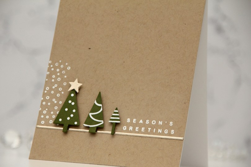
 I started by stamping the little decorations on the trees with VersaMark ink onto Artichoke cardstock from Concord & 9th, before heat embossing with white embossing powder from Ranger. I then used the coordinating tree die to cut out my trees. I added foam tape to the back and put the trees aside while I worked on the rest of the card.
 Onto a panel of Wheat cardstock from C9, I stamped and white heat embossed the snow flurries from the Sleigh full of cheer stamp set from C9, as well as a sentiment from the Joyful and merry stamp set from Kristina Werner. I used one of the dies in her Gift bows die set to cut a thin strip of Champagne cardstock from C9, which I adhered below the snow flurries and sentiment. I also die cut a star from the same cardstock using a die in the Yuletide Lane die set from Concord & 9th. I mounted my trees to the card and added the champagne star on top of the tallest tree to finish.
 This was my inspiration for my card. Very clean and simple with lots of white space and the snow flurries in the background to ground the trees. It’s an awesome card!
 I die cut the “map” from the Joyful Wreath die set into a panel of Nectar cardstock. This die doesn’t actually cut anything, but is a great placement guide when gluing all the leaves on top. I die cut the leaves from Eucalyptus, Rainforest, Grasshopper and Champagne cardstock and put a drop of liquid glue at the base of each, which made it possible to lift the leaves off the panel for an airy feel.
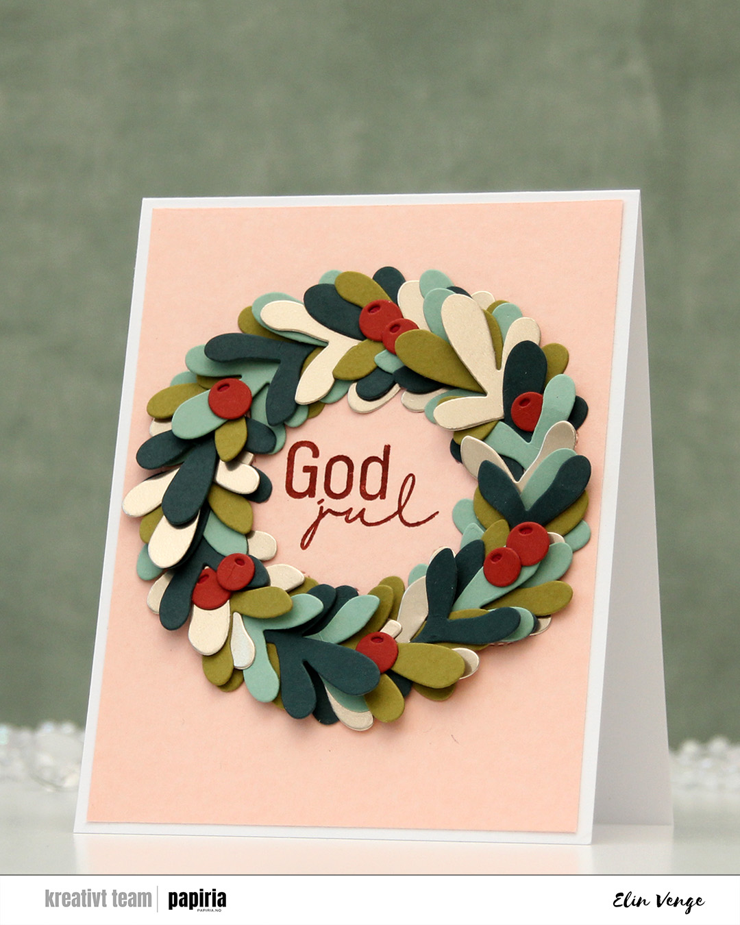 I die cut the top layer of the berries from Cayenne cardstock, opting for the darker Cranberry for the base. I glued them directly to the leaves, tucking parts behind some of the leaves. I went back and forth on the sentiment, trying a few different things before choosing this simple Kort & Godt sentiment to stamp in the center using Cayenne ink. I trimmed the Nectar panel slightly and adhered it all to a top fold white card base I created from Stamper’s Select White cardstock from Papertrey Ink.