Hi, everyone! Two weeks ago, I received an invitation to join the Kort & Godt design team. If you’re Norwegian, you’ve no doubt heard of this company, they’ve been around forever and make stamps, dies and embellishments that add just the perfect touch to any card. They also make buttons, stitch markers and other knitting/sewing accessories, which is perfect for me! I couldn’t say no, as I love their products. And as if that weren’t enough, I’ve been on a previous design team with several of the ladies on this particular design team. They’re just good people, and that really sealed the deal for me!
My first Kort & Godt card is a fairly typical card for me (except for the fact I haven’t done any coloring). It’s one of those clean and time consuming ones that I often make.
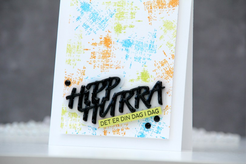
 I started by creating a colorful background. Using one of the stamps in the M479 stamp set, I stamped repeatedly across the background using Distress Oxide inks in the colors Salty Ocean and Twisted Citron, as well as regular Distress ink in Spiced Marmalade. I cut the panel down to be 3 1/2 x 4 7/8″ and mounted it to a white top fold card base using foam tape.
 Using the DIE294 die set, I die cut 8 layers of the words from True Black cardstock from Papertrey Ink and one shadow layer using heavyweight translucent vellum from My Favorite Things. I stacked three of the black layers, added the vellum layer on top and then the last five black layers. I even added a coat of Nuvo Crystal Drops in the Ebony Black color to the top layer for extra dimension and shine. On a piece of Limeade Ice cardstock from Papertrey Ink, I stamped a sentiment from the M458 stamp set using Obsidian ink from Altenew, before adhering both the stacked die cut and my stamped sentiment strip at an angle, before finishing off the card with a couple of crystals (BE107). And that’s a wrap for my first DT card for Kort & Godt – I can’t wait to play more, and hope this inspired you.

 I colored and fussy cut the sloth, colored in the party hat and fussy cut that, before putting both pieces aside while I worked on the rest of my card. I created a card base from Blue Breeze cardstock from My Favorite Things and created a wall for the sloth to hang onto using Stamper’s Select White cardstock from Papertrey Ink. To create a bit of texture to the wall, I stamped the Touch of Texture background stamp from My Favorite Things using Soft Stone ink from Papertrey Ink. It’s subtle, but still adds a little bit of interest.
 I stamped a sentiment from the Anything-but-Basic Birthday Wishes stamp set from My Favorite Things using Obsidian ink from Altenew, before adding the wall to the card base with 1 mm foam squares. I added the sloth using foam tape and finished off the card with a few Starry Sky Ombré Glitter Drops from Pinkfresh Studio. I also added a dot of Black Glaze pen to his eyes for a bit of shine and dimension, which is easy to see in real life, but tricky to photograph.
 This was initially a very muted, very simple color palette. Let’s just say things changed when I decided to add the party hat 🙂
 I stamped and colored my images, before fussy cutting them, leaving a bit of a white border around them all. I put my colored pieces aside and started working on the rest of the card. I decided to do a bit of ink blending with the Paint Strokes stencil from My Favorite Things. I thought the brush strokes would be good for a background for my colored images.
 I started out with Coral Bliss and Pink Pearl inks from Altenew for the pink, but wanted a little more oomph and went over them with Picked Raspberry and Worn Lipstick distress inks, which gave it the pink I wanted. On the orange paint stroke, I only used Spiced Marmalade distress ink, and for the yellow, I chose Mustard Seed and Squeezed Lemonade distress inks. I then stamped a sentiment from the
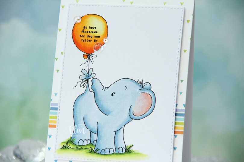
 I colored the elephant with Copics, stamped a Norsk Stempelblad AS sentiment inside the balloon using Altenew Obsidian ink, then used a die from the A2 Stitched Rectangle STAX 1 set from My Favorite Things to turn it into a panel with that nice faux stitch line that I use a lot on my cards. In my stash I had a white card base with a stamped background (the Scattered Triangles Background stamp from My Favorite Things, stamped with Sour Apple and Blue Yonder inks, also from My Favorite Things) on the front that I decided to also make use of. The colors match my elephant nicely. I was actually planning on using this card base for my
  On top of my scattered triangle background, I adhered a strip of a patterned paper from the Party Patterns paper pad from My Favorite Things, mounted my colored panel using foam tape and embellished near the sentiment using the White Orchid Sequin mix from Little Things from Lucy’s Cards.
 Simple card means simple color palette.
 As you might be able to tell from the front, this isn’t a regular card. It’s a slider card. At first I wasn’t sure how to turn this particular stamp into a card, but then I had a lightbulb moment and realized it was perfect for a slider card.
 I colored the images with Copics, did some fussy cutting leaving a think white border and put my pieces aside while I worked on the rest of the card.
 When you pull on the string at the top, these mice from the Be Kind stamp are revealed. Nice little surprise there, huh? The slider mechanism itself is made using the Slider Surprise die set from My Favorite Things, but you could easily do this on your own, it’s not difficult. They’re straight cut lines and just a few score lines.
 I wanted a little texture to my white cardstock, and used the Stitched Ripple Backdrop die from Lawn Fawn, which creates these faux stitch lines across the panel. In hindsight, I realize I probably should have dry embossed it only and not die cut it, because where the stitched lines intersect with the die cut edge of the part that folds up, it kind of snags a little. It’s not a huge deal, but it’s enough to make me think simply dry embossing would have been enough.
 In the opening, I added a piece of Gold Foil Pinstripe washi tape from Altenew for the mice to have a little bit of a grounding element, then adhered the mice using liquid glue. The top die cut panel is mounted on foam tape, and everything adhered to a top fold card base I created from Melon Berry cardstock from Papertrey Ink.
 Probably the simplest color palette I’ve ever used on a card.
 I decided to cut off about half of the bench. Since I’m only using one of the kids, I didn’t need the whole thing. If you want, there’s also a
  I adhered my panel directly to a card base I created from Green Parakeet cardstock from Papertrey Ink. I stamped a sentiment from Norsk Stempelblad AS onto a strip of the same color cardstock using Green Apple ink from Simon Says Stamp and put the sentiment aside while I worked on the rest of my card.
 I die cut the word hipp 8 times from Tropical Teal cardstock from Papertrey Ink using a die from Kort og Godt, and created two stacks of four each for a dimensional look. I adhered my stacked die cuts to the card and put the green cardstock strip on top of the bottom hipp.
 To finish off the card I added a few enamel dots from Papirdesign. I decided to go for orange ones to pick up the color from the little boy’s ice cream.
 It’s a fairly simple card, but the clouds add a little something to the white space, and the die cuts and dots add dimension.
 For such a small image, I used a lot of colors.
 Isn’t this the cutest elephant image you ever did see? Saying hello to his little ladybug, I just couldn’t resist. I colored in the image with my Copics and used a stitched border die from Lawn Fawn to create a little interest to the top and bottom of my panel.
 I put foam tape on the back and was initially planning on a big die cut word, but it didn’t really work for the card, so I stamped a small sentiment in the grass instead, using Sour Apple ink from My Favorite Things. The sentiment itself is from InkyWings.
 Onto a quarter piece of white cardstock from Papertrey Ink, I stamped the Scattered Triangles Background stamp from My Favorite Things using Sour Apple ink near the bottom and Blue Yonder ink, also from My Favorite Things, near the top. I adhered my stamped background onto a top fold card base I created from Stamper’s Select White cardstock from Papertrey Ink and mounted my colored panel on top.
 This cute elephant might be even cuter because I colored him blue. There’s a reason blue’s my favorite color, everything just looks better when it’s blue.
 I decided not to add any embellishments to the card, I really wanted the elephant to be the star.
 Simple color palette for this one. I also used B90 for the elephant, which is a color I’ve created myself.
 My last holiday card was blue, so I needed a new color. Green to the rescue, with a little bit of “gold” and a touch of pink. Somehow, I think it works.
 I printed the image twice: once onto X-Press It blending card, which is what I use for all my Copic coloring, and once onto Stamper’s Select White cardstock from Papertrey Ink. I wanted to fussy cut my colored image right up against the lines, but Rachelle’s images come with these great squiggly lines that I didn’t want to lose, they add such a unique look. By printing twice, I could mount my colored piece onto the other one and maintain the wonderful linework.
 For the background, I ran my printed white cardstock through my die cutting machine using the Magic Snow Cover die from Mama Elephant, which adds a nice faux stitch snow flurry look. I used an embossing mat to make the details stand out even more, then adhered my white panel to a white cardbase and mounted the colored image using 1 mm foam squares – I wanted a little bit of lift, but not too much dimension.
 I then used the sentiment from the Let It Snow die set from Mama Elephant to die cut 5 times from Meadow cardstock from Hero Arts. Before die cutting, I colored one of the pieces with my G46 Copic marker to better match my coloring, stacked the five layers together with the colored one on top and added the stacked die cut sentiment to the card.
 I finished off the card with a few sequins. These are a mix of Sparkling Clear sequins from Pretty Pink Posh and select sequins from the Sea Glass mix from Simon Says Stamp.
 I used my favorite green combo AND my favorite “holiday pink” combo for this card. I hope they inspire you.
 I colored the image in a very pastel color palette, before trimming the panel down to 3 7/8 x 5 1/2″, added foam tape on the back and mounted it on an A6 (4 5/8 x 6 1/4″) top fold white card base that I covered with a piece of Aqua Sky cardstock from Concord & 9th.
 This card was a bit of an evolution. I originally wanted to use a bigger kite and a different sentiment, but the larger kite was too big for my image (AND for my card) and the sentiment I initially wanted to use was too big for this smaller kite, so I had to improvise. I used a die from the kite builder die set from Concord & 9th, and stamped a sentiment from the Kite Strings stamp set, also from Concord & 9th, using VersaFine Onyx Black ink. I then die cut the word hello twice from white cardstock using the Sweet Sentiments die set from Altenew, stacked the two together and added the word above the stamped sentiment and popped the kite on some 1 mm foam squares for a tiny bit of dimension.
 My card felt kind of empty at this point, I had even more white space than I wanted, and I needed a fix. My color buddy and general crafty assistant Liz suggested adding clouds. Using the Cloud 1 & 2 die set from Papertrey Ink, I die cut three clouds from vellum. I tucked one behind the kite and added tiny slivers of 1 mm foam squares behind the other two for a little bit of dimension, before strategically placing sequins from the Ice Water mix from Little Things from Lucy’s Cards to hide the foam squares and finish the card.
 This card didn’t turn out the way I planned, but sometimes, that’s actually a good thing. I like the clouds, the sequins and my other revisions to my original idea. And I will never cease to be amazed at how good clouds always look die cut from vellum. It’s the best!
 I didn’t use a lot of markers for this one.
 I stamped and masked Birch before stamping the
  I used a gradient of purples for the sky, starting with BV17 at the top and working my way down to B60 at the very bottom. B60 is technically a blue color, but the entire B60 family has a purple tinge, making B60 the perfect choice for the lightest color in the sky. I then used the Big Happy Holidays die from Mama Elephant to die cut 6 layers from white cardstock that I stacked for a super dimensional sentiment that I placed in the sky. I decided to keep the card very clean and simple and didn’t add any embellishments at all.
 Lots of cool tones for this one (the markers after the gap are the ones I used for the air brushing).