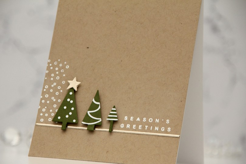
Hi, crafty friends! I’m sharing a super simple, graphic holiday card today, featuring the Merry Trees bundle from Kristina Werner that came out last year. It’s so good, I want to use it more!
 I started by stamping the little decorations on the trees with VersaMark ink onto Artichoke cardstock from Concord & 9th, before heat embossing with white embossing powder from Ranger. I then used the coordinating tree die to cut out my trees. I added foam tape to the back and put the trees aside while I worked on the rest of the card.
 Onto a panel of Wheat cardstock from C9, I stamped and white heat embossed the snow flurries from the Sleigh full of cheer stamp set from C9, as well as a sentiment from the Joyful and merry stamp set from Kristina Werner. I used one of the dies in her Gift bows die set to cut a thin strip of Champagne cardstock from C9, which I adhered below the snow flurries and sentiment. I also die cut a star from the same cardstock using a die in the Yuletide Lane die set from Concord & 9th. I mounted my trees to the card and added the champagne star on top of the tallest tree to finish.
 This was my inspiration for my card. Very clean and simple with lots of white space and the snow flurries in the background to ground the trees. It’s an awesome card!

 I die cut the “map” from the Joyful Wreath die set into a panel of Nectar cardstock. This die doesn’t actually cut anything, but is a great placement guide when gluing all the leaves on top. I die cut the leaves from Eucalyptus, Rainforest, Grasshopper and Champagne cardstock and put a drop of liquid glue at the base of each, which made it possible to lift the leaves off the panel for an airy feel.
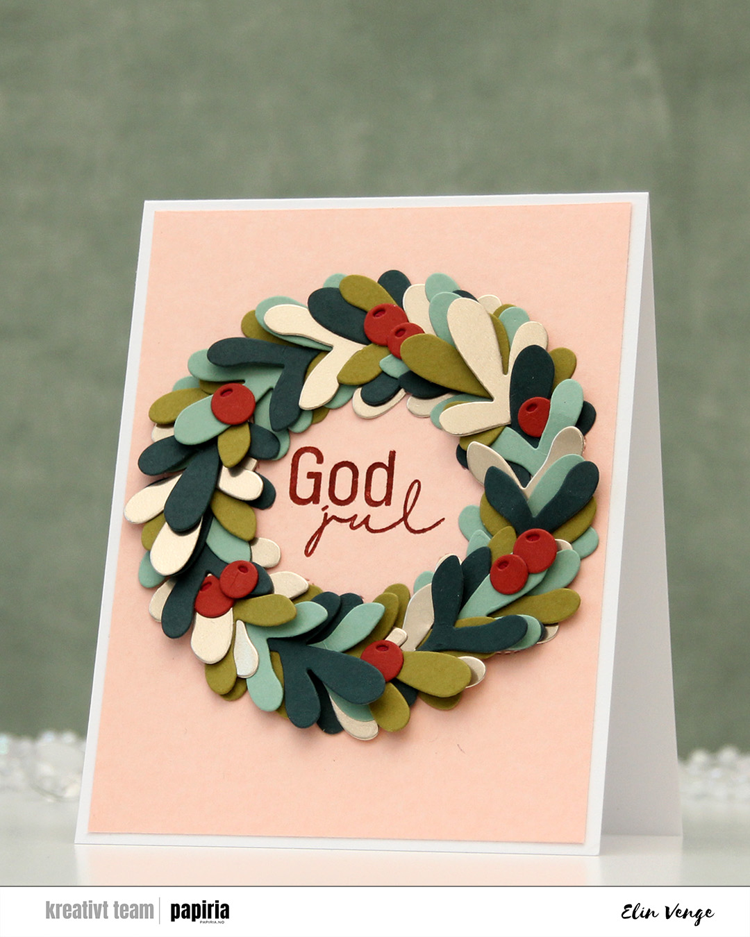 I die cut the top layer of the berries from Cayenne cardstock, opting for the darker Cranberry for the base. I glued them directly to the leaves, tucking parts behind some of the leaves. I went back and forth on the sentiment, trying a few different things before choosing this simple Kort & Godt sentiment to stamp in the center using Cayenne ink. I trimmed the Nectar panel slightly and adhered it all to a top fold white card base I created from Stamper’s Select White cardstock from Papertrey Ink.
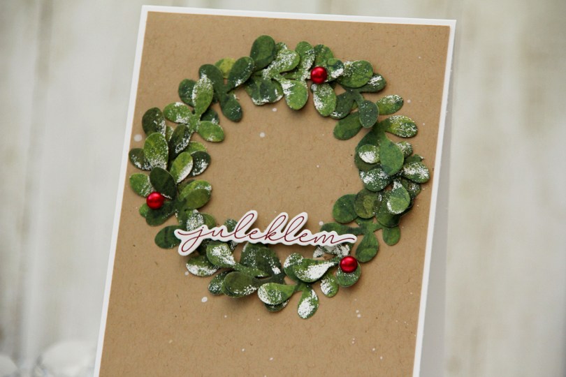
 I started by die cutting the branch four times from a piece of green patterned paper from the Key to my Heart Collection from Kaisercraft. I then painted unevenly with a VersaMarker and added White puff embossing powder from Wow! for a snowy effect on parts of the leaves. I then cut each of the branches up into little mini branches to create my wreath.
 I splattered white reinker onto a panel of Wheat cardstock from Concord & 9th and adhered it to a top fold white card base. I added my mini sprigs of leaves in a wreath formation, popped up a sticker sentiment near the base of the wreath and added three red pearls to embellish. I also put little pieces of foam squares behind some of the leaves to make it more dimensional.
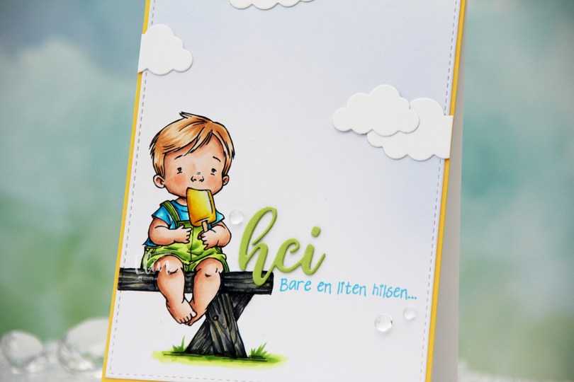
 I colored the image with Copics, opting for the cool grays for the bench. I wasn’t planning on making it this dark originally, but when my C9 made a blob, dark was the only way to go. It still works, and I don’t think you can really see where the blob was. I used the largest die in the A2 Stitched Rectangles STAX 1 set from My Favorite Things to trim the panel down a little, then a large blending brush to add some soft blue to the background. I didn’t add any ink to the brush, I simply used whatever was left from a previous project.
 I stamped a sentiment from the Småtekster stamp set from Norsk Stempelblad AS next to the bench using Tide Blue ink from Altenew. I added my colored piece to a panel of Buttercup cardstock from Concord & 9th, which I then adhered to a top fold white card base. I die cut the word hei twice from Green Parakeet cardstock from Papertrey Ink, stacked them and adhered my double die cut next to the boy on the bench before adding a few die cut clouds and some dew drops. Both the cloud dies and dew drops are from Concord & 9th.
 I used quite a few colors for this very simple image.
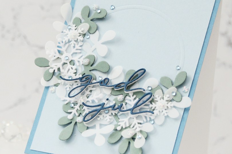
 This card was a bit of an evolution. I originally wanted to make a snowflake wreath, but quickly decided that that was too simple. I then had an idea of half a very layered wreath, and this stems from that.
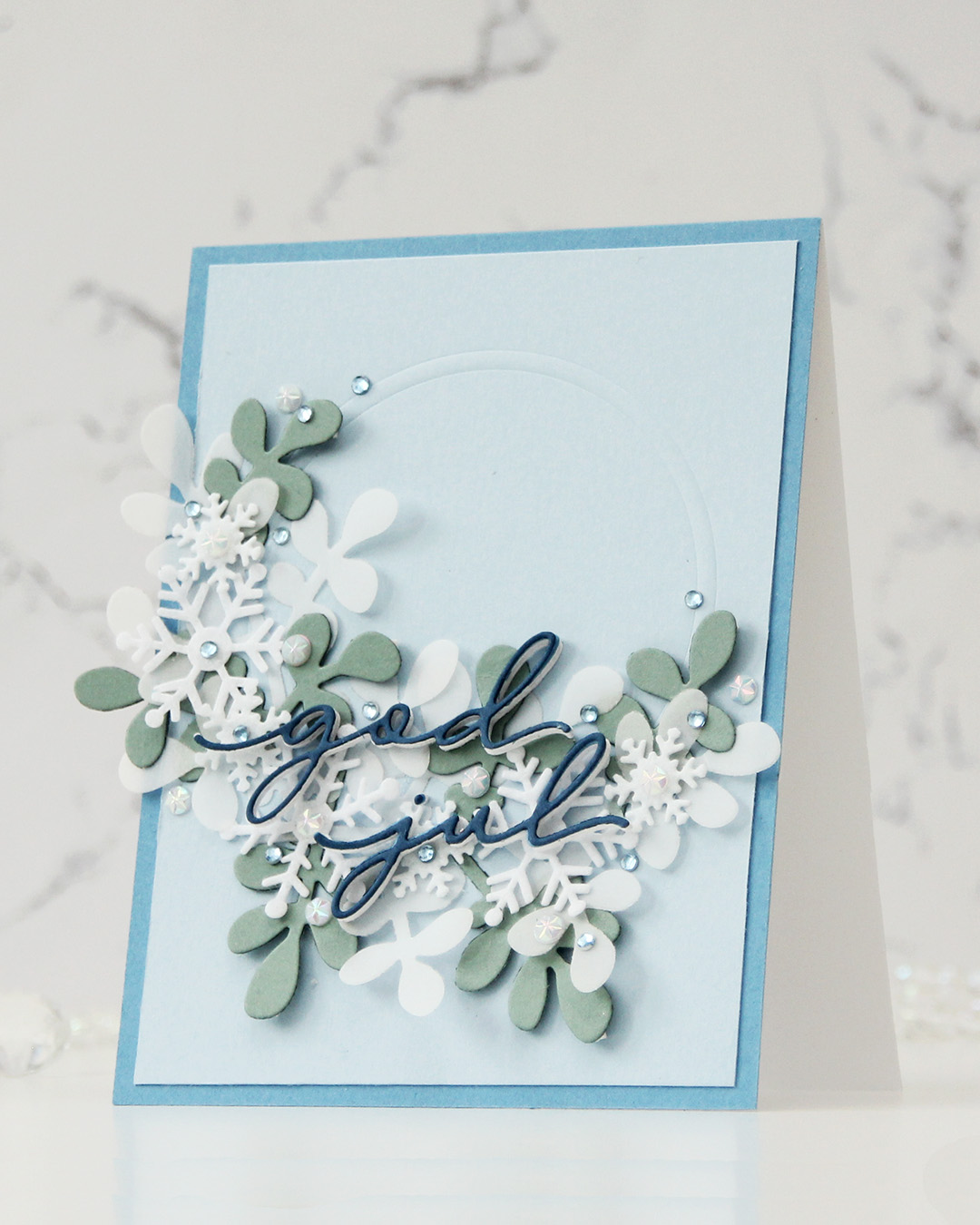 I die cut a sprig of leaves a few times – two from 40 lb vellum from Bazzill and a couple from Ocean Tides cardstock from Papertrey Ink. I dry embossed a couple of circle dies into a panel of Blue Breeze cardstock from My Favorite Things and adhered the two vellum pieces in the bottom left of my impressed circle. I cut the green leaves apart and added them here and there, before topping with felt snowflakes, alternating between large and small.
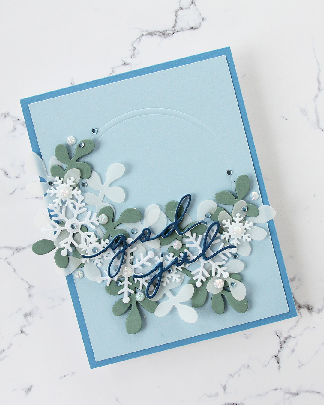 I wanted a white sentiment, and started with white glitter cardstock. The white didn’t match the snowflakes, so I went to regular white cardstock and die cut four of each word and stacked them. The sentiment got lost, there was too much going on in the background. I then die cut the words from Blueberry Sky cardstock from Papertrey Ink and added that on top. I also cut down the panel slightly and added a 4 1/4 x 5 1/2″ panel of Blueberrry Sky cardstock behind the lighter one to pick up the color from the sentiment. Guess what? The sentiment was still lost in the busy background. Plan D: die cut one more layer from Enchanted Evening cardstock from Papertrey Ink and add that on top. This is one of my most used blue cardstocks, I love it. The sentiment was finally legible.
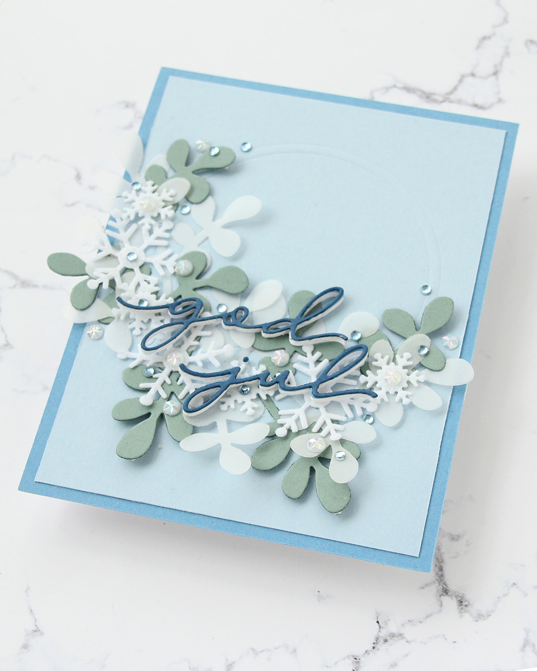 I embellished with a mix of faceted white pearls and some blue diamonds, and the card was finished. I kind of wish I’d made my half wreath tighter, it’s very wide, but I’ll revisit the snowflake wreath idea, I might have a plan for a new card using these products.
 I stamped the image with black ink onto X-Press It blending card and colored it with Copics.
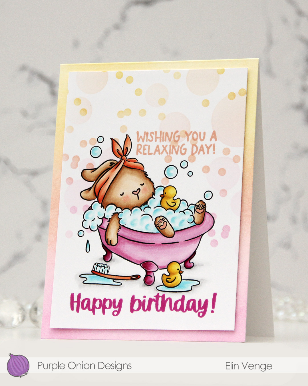 I added a mask to my image, then used the Bokeh Elements stencil duo from Waffle Flower to softly ink blend additional bubbles in an ombré effect in the background. I used Sweet Pea, Grapefruit and Buttercup inks, all colors from Concord & 9th, making sure to add slightly more color on the smaller circles than the large ones, while still keeping it fairly light.
 I stamped a sentiment from the
  I trimmed my panel down slightly and added it with of dimension to a top fold white card base that I ombré ink blended using the same three colors I used with the stencils. I did also add a dot of black Glaze pen to the eyes of the ducks for a finishing touch.
 Simple color palette for this one.
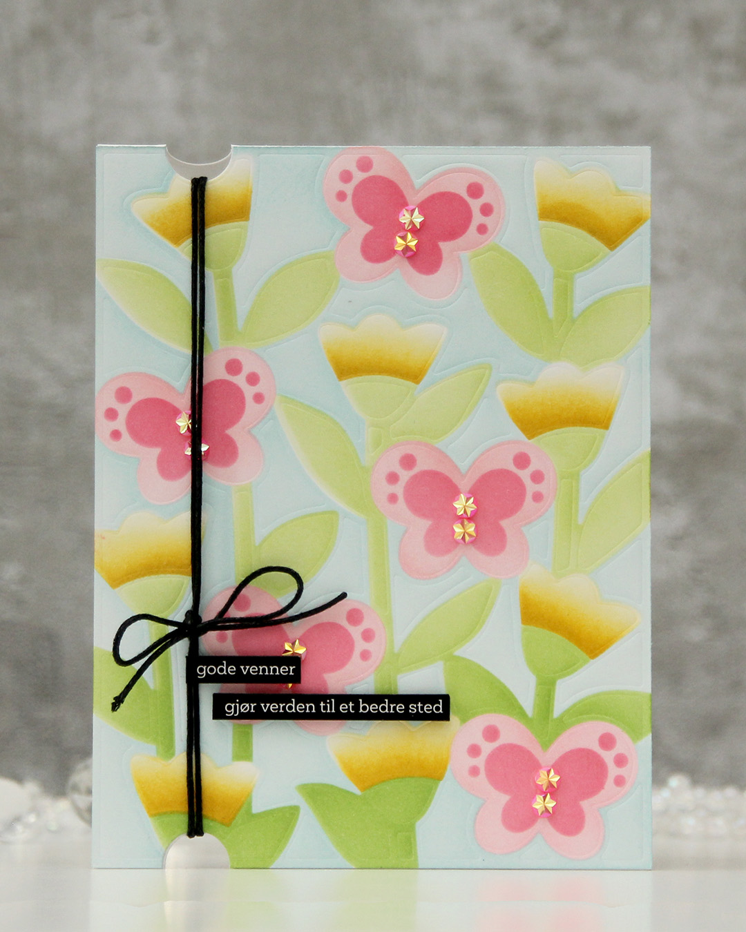 I started with a panel of Stamper’s Select White cardstock from Papertrey Ink that I dry embossed. I then used a stencil set (the Butterfly Blooms set from Concord & 9th) to add the color. I used all inks from Concord & 9th: Powder for the background, Sprout and Parsley for the greens, Sunshine and Buttercup for the florals and Pink Lemonade and Honeysuckle for the pinks.
 Once the panel was all inked, I adhered it to a white card base, created half circle notches at the top and bottom with a small circle die and thread some cotton thread through, which I tied off in a bow. I added pink sparkly gems to act as the bodies of the butterflies and finished off with a couple of black sentiment sticker strips that I mounted on foam tape. I love the softness of the background against the bold of the black. The black really draws your eye.
 I knew I had to color up this image as soon as I saw it. This is so adorable with the corgi hanging off the top of the glass. And so funny, and very typical of Pei’s illustration style. I love it!
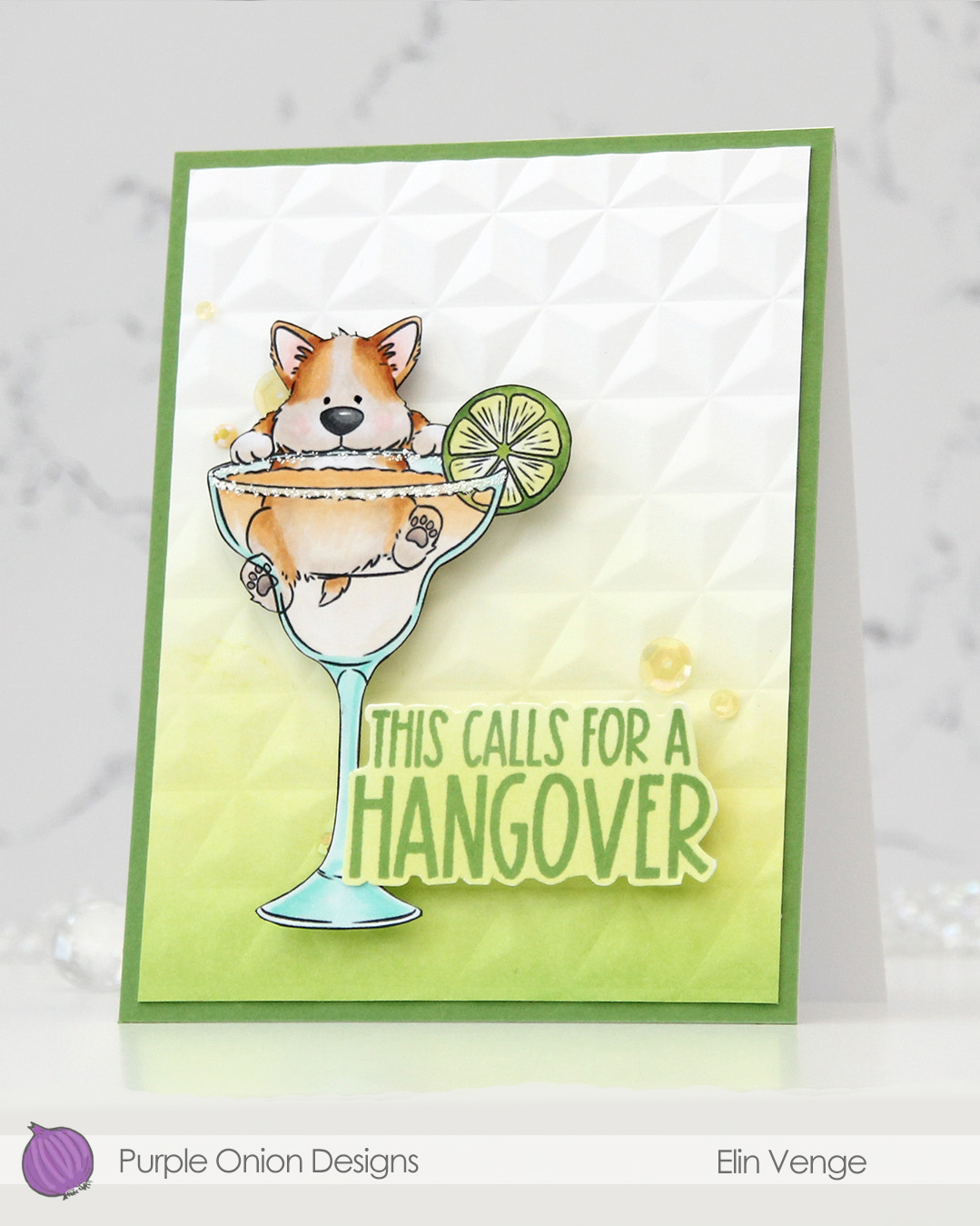 I colored the image with Copics, fussy cut him, then added VersaMarker pen to the rim of the glass and used white puff embossing powder from Wow! to mimic a salt rim. The embossing also adds some fun texture to the glass. I also used a black glaze pen to add a little bit of shine and dimension to his eyes.
 I ink blended Parsley and Starfruit inks from Concord & 9th onto a white cardstock panel for an ombré effect, then used the Geometric embossing folder from WRMK to create some subtle dimension. I added the panel to a card base I’d covered with Parsley cardstock from Concord & 9th, before mounting the image using foam tape.
 In this release there are also a few sentiment sets, and this one from the
  Simple color palette for this one. This was so fun to color!!!
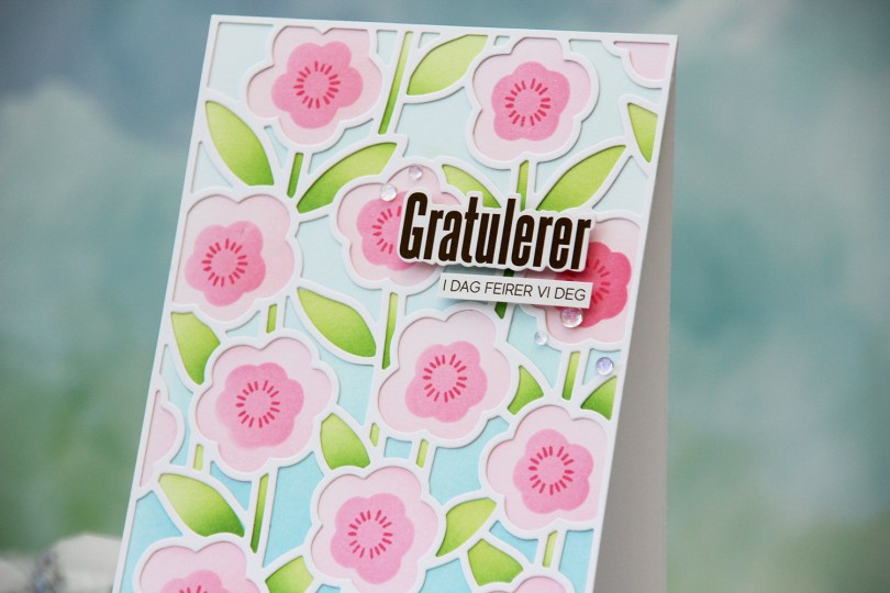
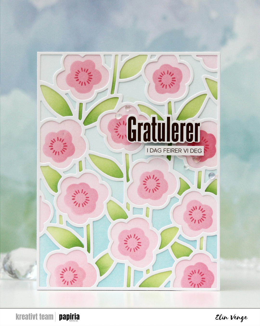 I started with a panel of white cardstock. I put down the first stencil, which is for the background, and used Harbor and Powder inks. The second stencil does the stems and leaves, and I used Sprout with a bit of Parsley at the base for those. For the large part of the flowers, I used Ballet Slipper and for the fourth and final stencil, which is for the smaller part of the flower, I used Honeysuckle. I also used the small circle burst stamp in the stamp set to add a little more detail. I stuck to Honeysuckle ink, and I just love the way these flowers turned out.
 I used the cover die to create a frame from white cardstock that I glued on top of my ink blending. I mounted sentiment sticker strips from Kort & Godt using foam tape and adhered the sentiment in the top third of the card. I rarely add my sentiments to the top right, but I think it works. I finished off very simple with a few iridescent dew drops from Pinkfresh Studio.
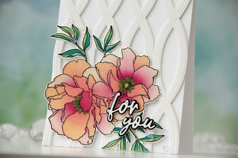
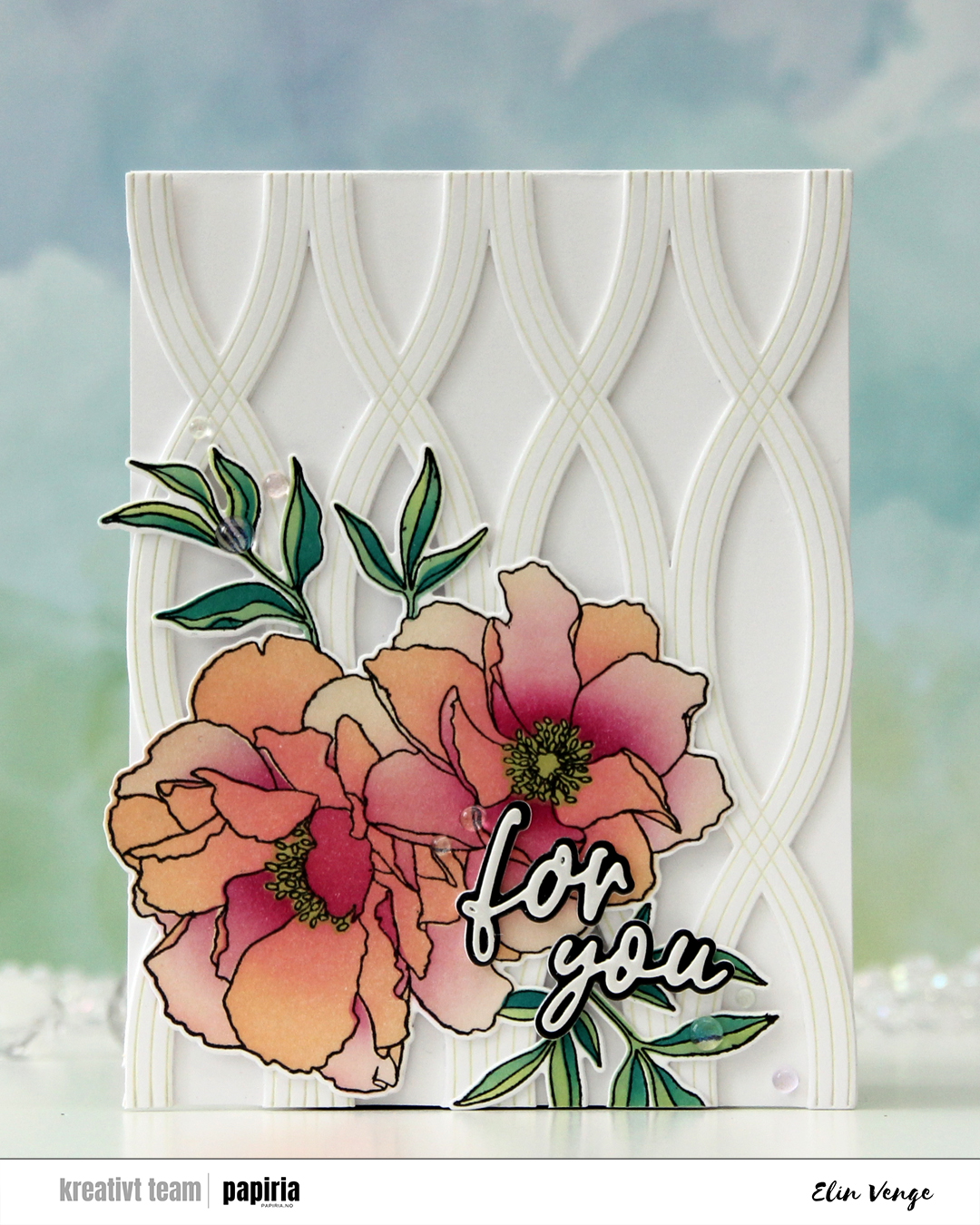 The Blended petals set from Concord & 9th is a very versatile one with a large flower image that you can color up any way you’d like. There are even coordinating stencils that let you add color very easily, which is what I used for my card. As much as I love coloring, stencils make everything go so much faster!
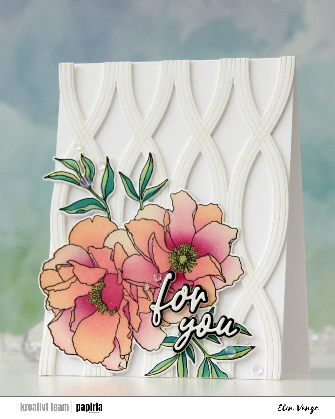 I stamped the image in black ink, let it dry and used the coordinating stencils to color it in using Creamsicle, Sweet Pea, Wildberry, Sprout, Tidepool and Peacock inks, all Concord & 9th colors. I then used the coordinating die to cut out the image, adding a couple of blank die cuts behind it for dimension.
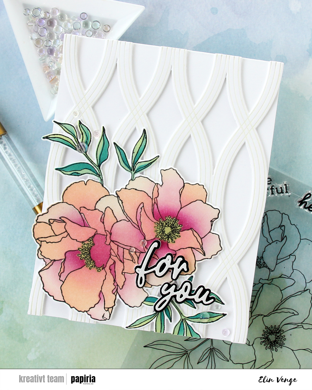 I used the Twist Pattern press plate from Pinkfresh Studio along with some Pistachio Fresh Dye ink from Altenew to create a subtle pattern in the background. I die cut it using the coordinating die and added two more die cuts behind it before adhering it to the front of a top fold card I created from Stamper’s Select White cardstock from Papertrey Ink, which is the same white cardstock I used for everything except the sentiment.
 Speaking of the sentiment – I used the Sweet Sentiments die set from Altenew. The top layer is from white mirror cardstock from Kort & Godt, the black is black mirror cardstock from Kort & Godt, and then I put three additional die cuts of the shadow die behind for dimension. I finished off the card very simply with Iridescent Dew Drops from Pinkfresh Studio.