Hi, crafty friends. I’m sharing a simple card today with some goodies from Kort & Godt.
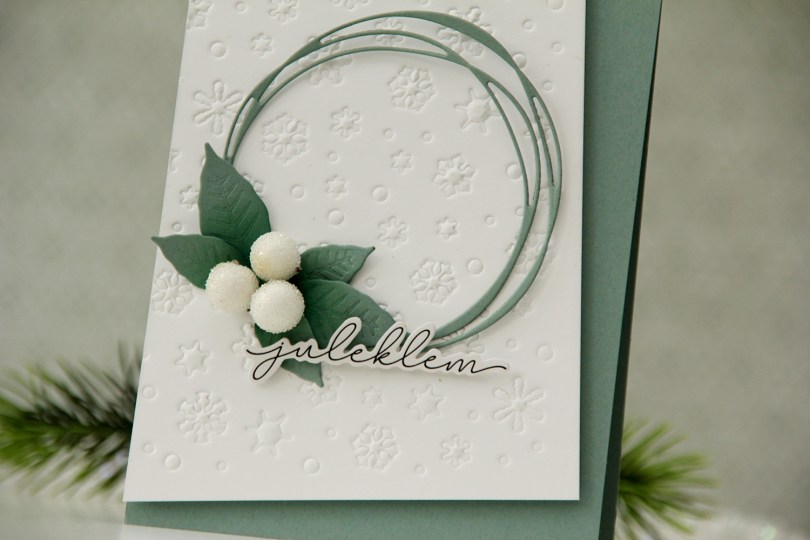
 I had a dry embossed white panel in my stash I thought I’d put to good use (I used the Snowflake Confetti fancy die from Hero Arts with an embossing mat to create this texture).
 I die cut a scribbled circle and a couple of layers of a poinsettia from Ocean Tides cardstock from Papertrey Ink. I used the same color cardstock to create my card base and mounted my white panel at an angle to create a dynamic design.
 I adhered the circle with a tiny bit of glue where my leaves would cover it, making the rest of the circle float above the rest.
 I cut apart the poinsettia petals to use as leaves and inked over them with Eucalyptus and Rainforest inks from Concord & 9th. I adhered the large ones with a bit of foam behind each leaf for dimension, but glued the smaller ones straight down at the base of the leaves.
 Using liquid glue, I added three large berries to the center of my leaf arrangement before finishing off with a sticker, which I put slivers of foam on the back of for even more lift. I like that it kind of floats above the rest.
Kort & Godt products used:
Die 355 (scribbled circle)
Die 302 (poinsettia)
ST1020 (sticker sentiment)
PB201 (berries)


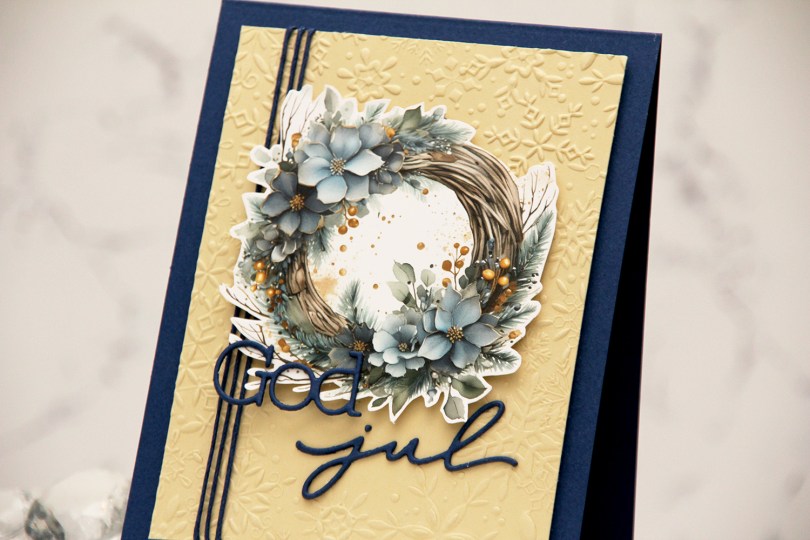
 I love the new image sheets from Kort & Godt, and the Christmas ones they just released are AWESOME! I used one of the blue ones for this card and decided to fussy cut the wreath. This is pretty easy to fussy cut leaving a white border. I used the Snowflake Oval Frame embossing folder from Simon Says Stamp on a piece of Fine Linen cardstock from Papertrey Ink to create some texture to my background. I cropped off quite a bit on the edges and used a blue cotton thread from Kort & Godt to add a little something to the design.
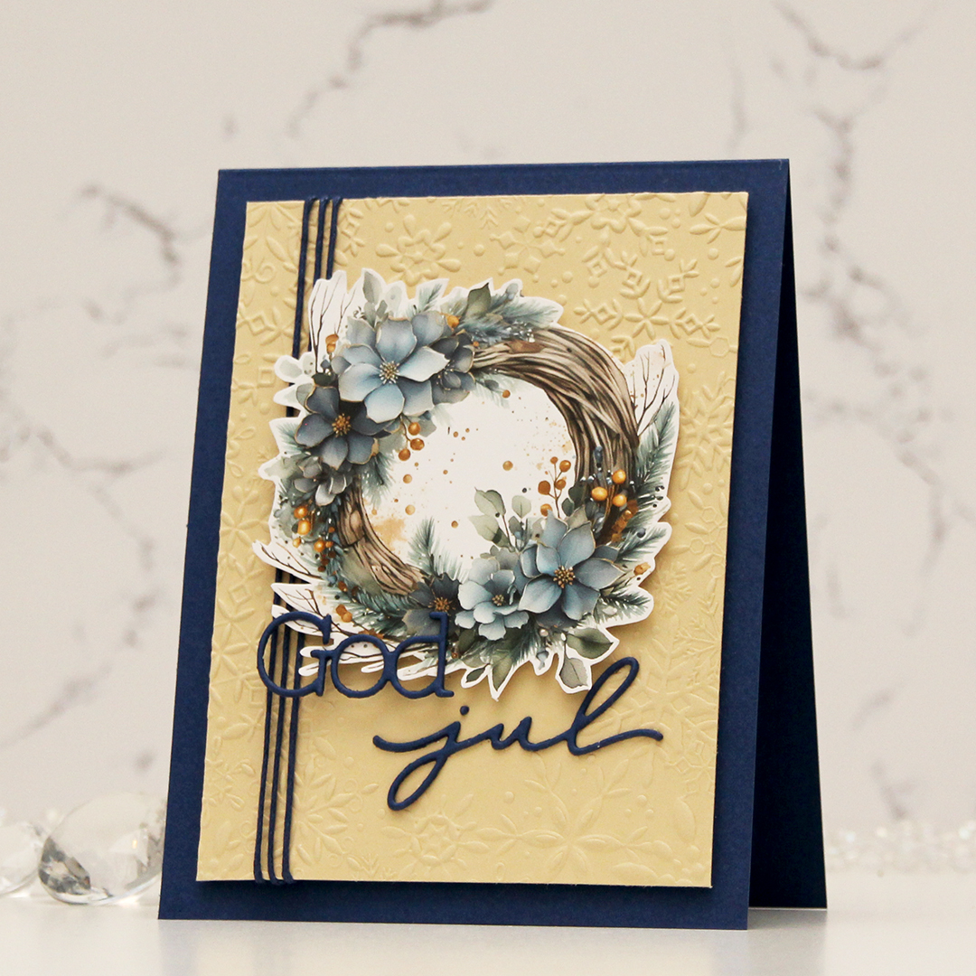 I mounted my embossed panel onto a card base I created from Blue Beyond cardstock from My Favorite Things. I used the same color cardstock to die cut my sentiment. I stacked two, so they would be a little sturdier, mounted the wreath in the top center, adhered God directly to the wreath and jul onto the embossed piece. And that’s it, I didn’t add any embellishments to this.


 I stamped this cute gang onto X-Press It blending card and colored them with Copics, then used the largest die in the A2 Rectangle STAX Set 2 from My Favorite Things to create my standard faux stitch edge. I stamped a sentiment from the
  I covered the critters with a mask, then used the Bokeh Elements Stencil Duo set from Waffle Flower to create some interest to the rest of the panel. I used Pistachio and Misty Sage fresh dye inks from Altenew for the green and started with Peachy Glow, also fresh ink from Altenew, for the smaller yellow dots. I suspect my stencil wasn’t clean from the last project, because the yellow seemed a bit too muddy for the look I was going for, so I went over with Scattered Straw Distress Ink, which helped. I then rotated the stencil 180 degrees and went in with Simon Hurley Solar Paste in the Golden Hour color. This paste goes on so easily and has a lot of shine. Once the paste was dry, I adhered my panel to a top fold card base I created from Sour Apple cardstock from My Favorite Things, and the card was complete.
 The solar paste adds so much shine that I decided not to add any embellishments to this card, making it very mail friendly.
 I didn’t use a ton of colors for this one.
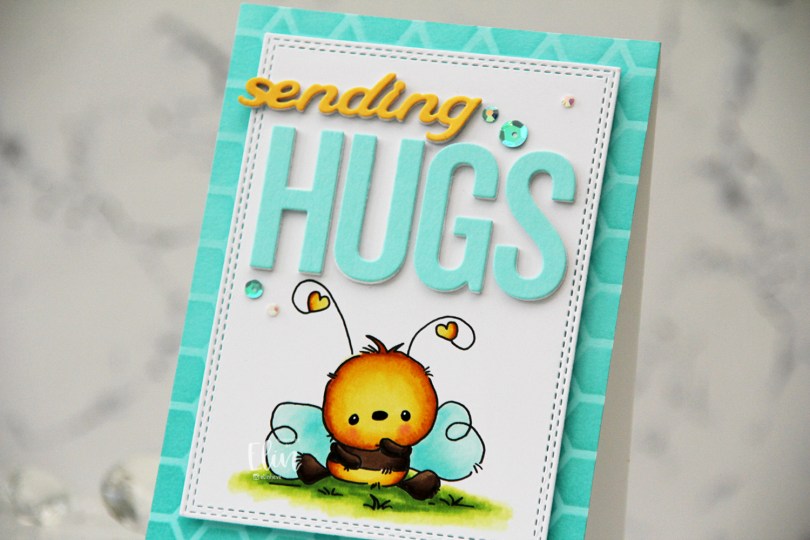
 I stamped the bee on X-Press It blending card and colored it with Copics, before I used a die in the A2 Double Stitched Rectangle STAX die set from My Favorite Things to create a faux stitch border.
 Onto a panel of Aqua Sky cardstock from Concord & 9th, I ink blended Aqua Sky ink through the Geometric Mosaic stencil from My Favorite Things and adhered the panel to a white card base I created from Stamper’s Select White cardstock from Papertrey Ink, then mounted the panel with the bee in the center using foam tape.
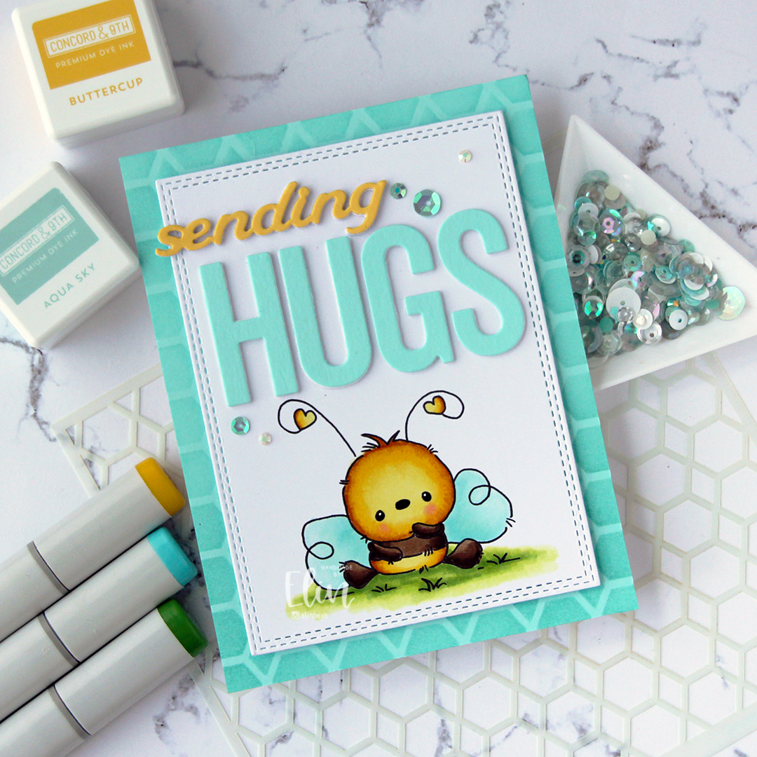 I used the Sending You Hugs die from My Favorite Things to die cut the word HUGS four times. I die cut three white, one from Aqua Sky cardstock and stacked them for dimension. I used the same technique on the sending die from the Blooming Delight die set from Altenew, but switching out the color for the top die cut to Buttercup cardstock from Concord & 9th. I adhered the letters for HUGS above the bee, and the stacked sending above that, letting the s hang from the edge of the panel to break the line in the design.
 I used sequins and gems from the Urban Chic mix from Little Things from Lucy’s Cards to embellish, and I also used my trusted black glaze pen/white Gelly Roll 05 combo for the eyes to give them a little dimension and shine.
 Simple color palette for this one.
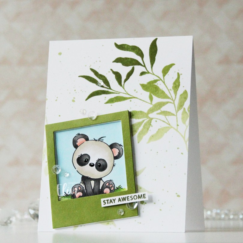
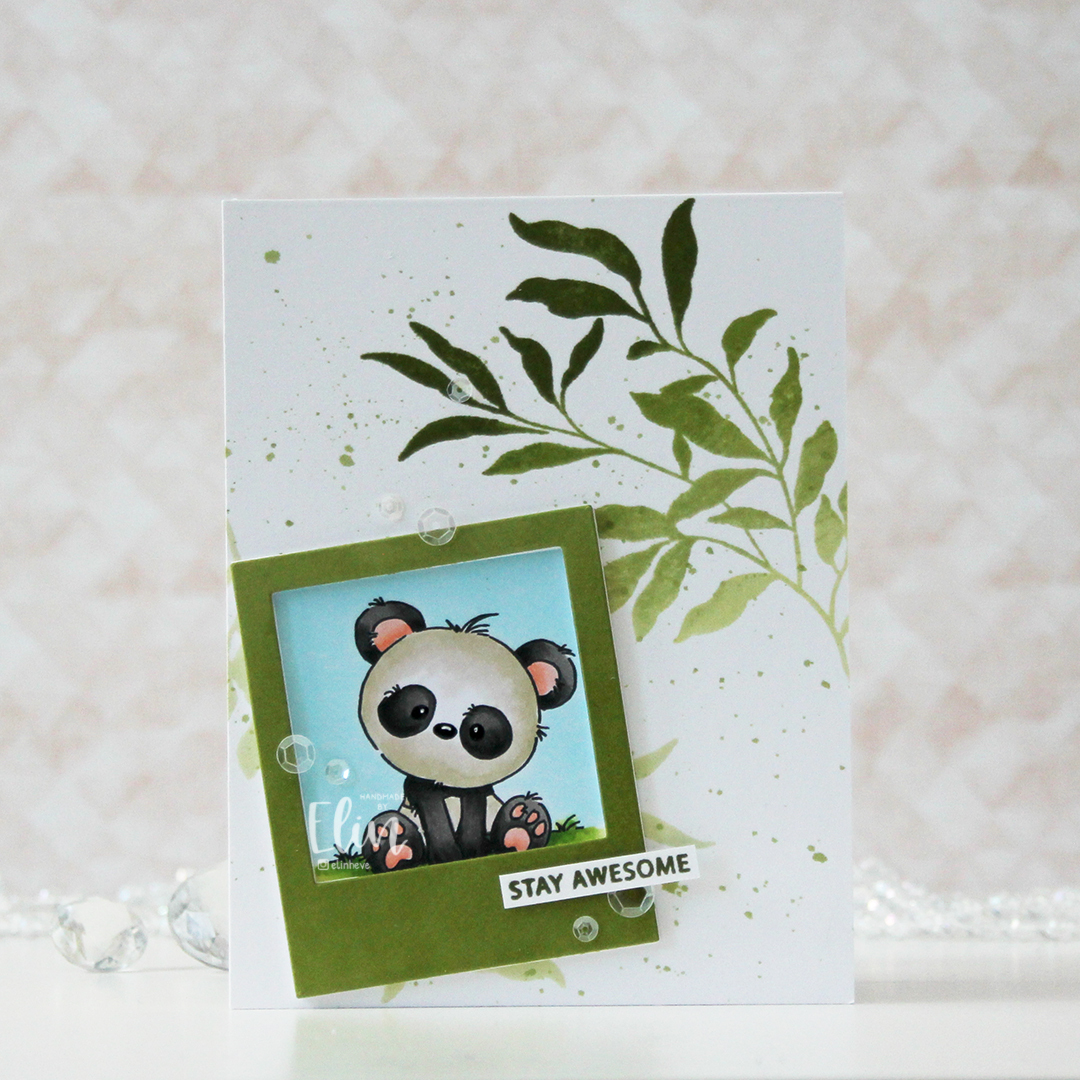 I printed my panda onto X-Press It blending card, colored him with Copics and used a black glaze pen, then a white Gelly Roll 05 to create shine and a little bit of dimension in his eyes and nose. I then used the Polaroid Shaker Frame die from My Favorite Things to create the perfect spot for him by die cutting a few layers from white cardstock and one layer from cardstock that I colored green with one of the inks in the Jade Greens family of fresh dye inks from Altenew.
 Using the Leaf Clusters stamp set from Altenew, I stamped one of the leaf clusters onto my white card base with various greens to create an ombre look. I used Pistachio, Misty Sage, Mossy Meadow and Green Opal inks, all from that same Jade Greens family of Fresh dye inks. I actually stamped it twice, but the polaroid covers most of the one I stamped in the bottom left corner. I also used the inks to create a little ink splatter on the background.
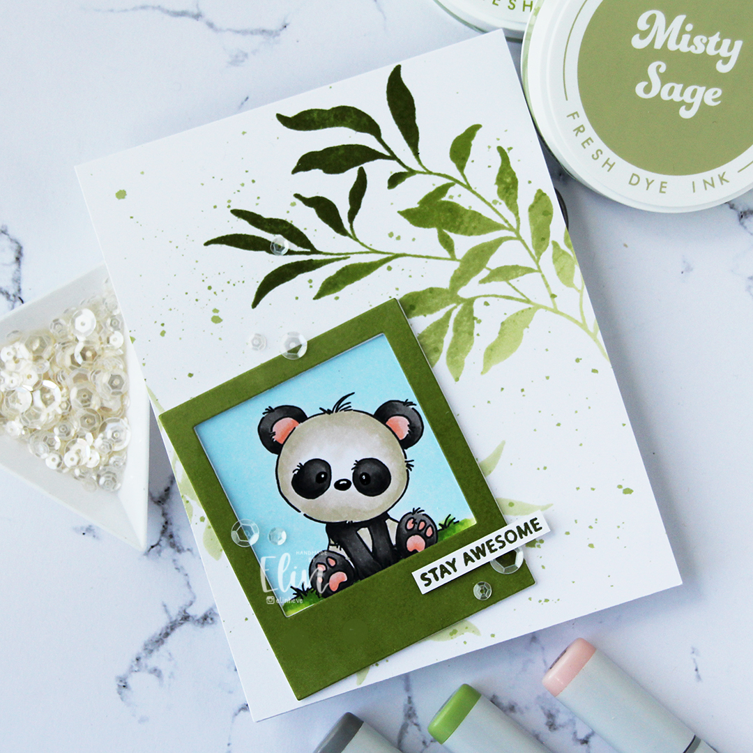 I stamped a sentiment from the Leaf Clusters stamp set in Green Opal ink, cut it down to a strip and added a couple of strips behind it for strength and dimension, before finishing off the card with a visual triangle of sequins from the White Orchid Sequin mix from Little Things from Lucy’s Cards.
 It’s no secret that I love dimension on my cards, and my three layer sentiment on top of the four layer polaroid frame add enough weight for this to require extra postage, but that’s true of most of my cards.
 These pandas tend to make for some pretty simple color combos.
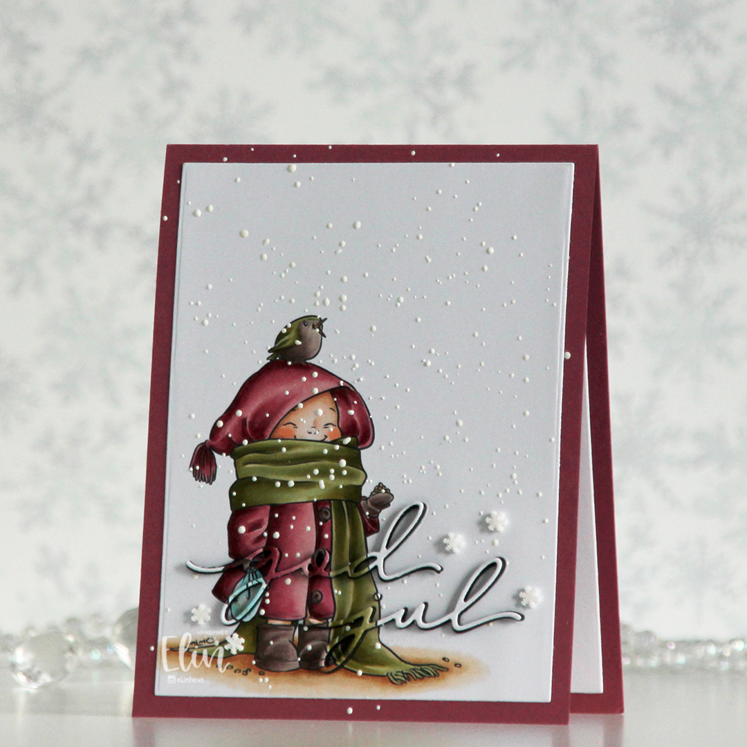 I printed the image on a piece of X-Press It blending card, colored it with my Copics and used a die in the Additional A2 Layers die set from Waffle Flower to trim the rectangle down a bit. You could also use a trimmer for this. Into the panel, I die cut the words god jul using dies from Kort & Godt. The two words are actually from separate die sets, but work perfectly together like this.
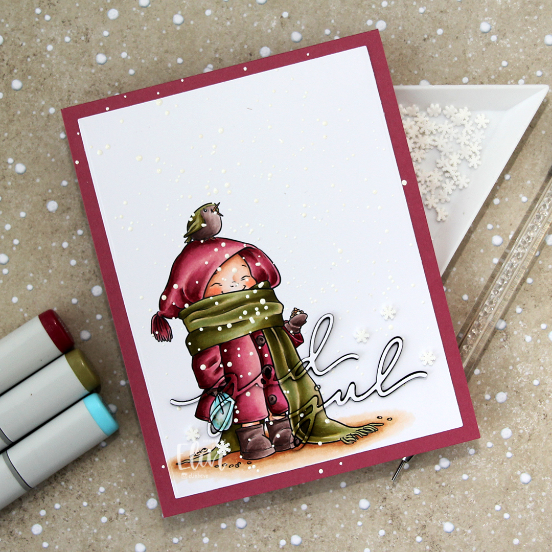 I adhered my panel to a top fold card base I created from Autumn Rose cardstock from Papertrey Ink, paper pieced the counters back into place, sprinkled on Chunky White embossing enamel from Stampendous and heated the granules from the back. I should have done this before adhering my panel to the card base to spend less time with the heat gun (melting the powder through two layers of cardstock takes significantly longer than doing it through just the one layer), but I honestly forgot about it. It does work through two layers, it’s just a matter of patience.
 Once my snow was in place, I die cut four layers of each of the words from black cardstock. I stacked them, added the colored one on top and puzzle pieced them in where they belonged, before adding a few Snowdrift sprinkles from Little Things from Lucy’s Cards to finish the card.
 Pink and dirty green. This is about as close as I (willingly) get to using red and green together on a card.
 Enough housekeeping. I colored this cute panda and the bamboo in the background onto X-Press It blending card using Copics, before stamping a small sentiment from the Mini Messages stamp set from Mama Elephant using Obsidian ink from Altenew.
 I adhered my colored piece to a top fold white card base and used the Leafy Cover die from Mama Elephant to die cut a frame from Green Parakeet cardstock from Papertrey Ink. I strategically cut off a few leaves that did too good of a job of hiding my panda, before adhering the frame on top of the image.
 I added a black glaze pen to his eyes and nose, before going in with a Gelly Roll 05 once the black was dry. I love the extra shine and dimension it adds to the image, even if it doesn’t show up in the photos. What does show up, however, is the embellishment mix. This is the Spring Leaves mix from Little Things from Lucy’s Cards. I purposefully underexposed my photo as I was taking the picture to avoid blowing out the light areas during editing. It’s a trick I learned today from Mona Tóth (@mona.toth on Instagram), and it blows my mind that willingly making the photos look dark as you shoot makes them that much better in the end – but it totally works!
 I didn’t use too many Copics for this one.