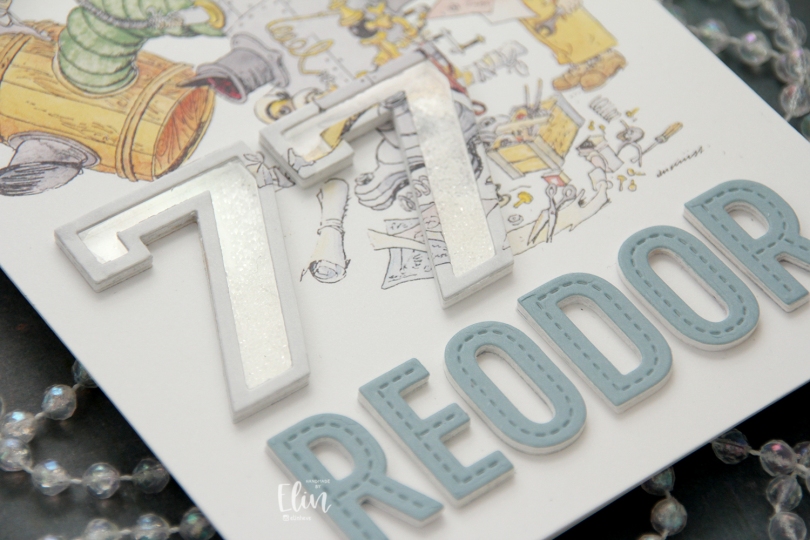
Hi, crafty friends. I’m sharing a very simple shaker card that I made for my dad’s birthday. He turned 77 in March, and threw a big party. He did the same thing for his 55th and 66th, which is kind of fun. He’s a retired structural engineer, and we lovingly call him Reodor, which is a character from the movie Pinchcliffe Grand Prix (Flåklypa Grand Prix in the original Norwegian). The character is a bicycle repair man by trade, but he’s known for his quirky inventions, and that’s why we’ve nicknamed my dad after him, as he comes up with these quirky solutions too. He’s installed a smoke detector that you can lower at our cabin in the mountains. The ceiling is so high that it’s very impractical when the smoke detector goes off or the battery needs to be changed. His quirky little invention keeps us from having to get a ladder whenever that happens. He used the elastic from old underwear as a fan belt for his car back in the 90s, and he’s added a base and tires to a generator to make it easier to lug around (also at our cabin). There are lots of other things too, let’s just say he’s earned the nickname.
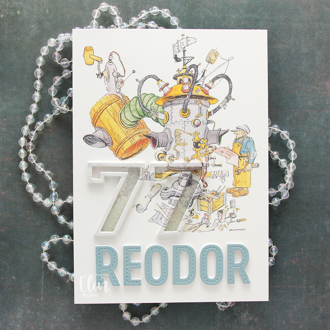 The Flåklypa universe has had a big resurgence in the past 10-15 years or so. Additional movies have come out based on the original and there’s a bit of merchandise available. I have a few calendars, and for this card, I used a calendar page with Reodor looking at his latest machine, wrench and technical drawing in hand. I sampled the color on his shirt to create a colored cardstock to match, and die cut the letters for the name Reodor using the In Stitches Alphabet die set from My Favorite Things. I die cut a few layers from white and the top layer from my custom colored cardstock and added them below the image.
 For the shaker portion of the card, I used the Outline Numbers and Solid Numbers die sets from My Favorite Things. I die cut the outline from the image as well as a few from white cardstock, and used the solid number die for the acetate. I used microbeads for shaker filler and colored the top layer with a layer of a very pale grey Copic marker to make it stand out a little against the background. The card was very well received, and my parents have actually framed it and put it on display in their dining room.
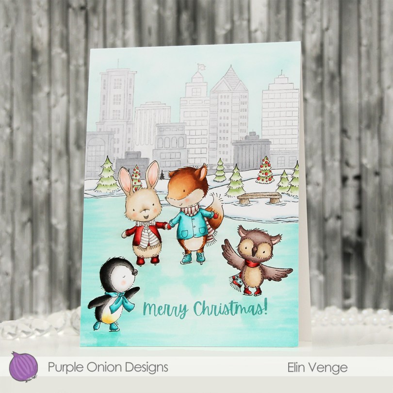
 I always say that you can’t go wrong with a penguin, and with so many images to choose from in this release, I knew I could color another penguin and the rest of the card would fall into place.
  I colored the ice first, and added a hint of reflection underneath their feet. I probably could have used a darker marker, but it’s more noticeable in real life than in the photos. Initially, I’d planned on keeping the buildings and sky uncolored, but once I’d colored the snow and the trees, it kind of all looked white, so I decided to add color to the background anyway. I colored the buildings in various shades of cool greys, before masking off the buildings and airbrushing a blue sky behind them.
 I colored my critters (here you can see the reflection in the ice a bit better) before finishing up with a sentiment from the
  There’s an ice rink stamp in this release, I just really loved the large area I was able to create with this older horizon stamp.
 Lots of Copics used for this card. B000 was only for airbrushing the sky.
 I did a lot of masking for this card, using two stamp sets from the recent release. I’ve got the
  I colored them all with Copics, added black glaze to their eyes for shine, then a dot of white Gelly Roll 05 once the black was dry. I fussy cut my “tree”, added foam tape to the back and mounted it on a card base I created from Blue Breeze cardstock from My Favorite Things.
 I used the Stitched Snowflake Backdrop die from Lawn Fawn to create some texture on the card base. This card measures 5 x 7 1/4″, so I had to get creative with the die, because it’s a standard A2 size die. I love the subtle texture in the background.
 I used a die from Kort & Godt to create my sentiment (Christmas hug in Norwegian). I stacked four die cuts from white cardstock and adhered the top of the word to the bottom of my critter tree. I used Starry Sky ombré glitter drops from Pinkfresh Studio to finish off. I love the sparkle and shine to these.
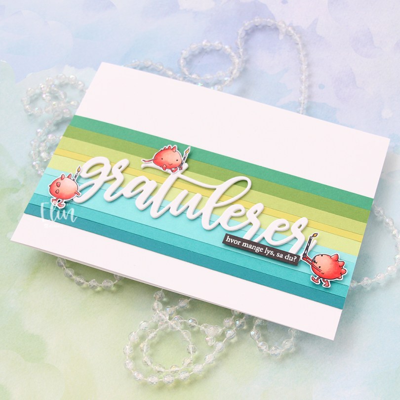
 I colored my monsters with Copics and fussy cut them leaving a thin white border. I covered my A7 card base with a band of solid colored cardstock strips. From top to bottom they are Concord & 9th Clover, Concord & 9th Parsley, Papertrey Ink Green Parakeet, Papertrey Ink Limeade Ice, Concord & 9th Sprout, My Favorite Things Summer Splash, Papertrey Ink Hawaiian Shores, Concord & 9th Oceanside and My Favorite Things Tropical Teal.
 I die cut the word gratulerer three times from white cardstock using the Flasketag, gratulerer die set from Papirdesign. The cardstock I used is Stamper’s Select White cardstock from Papertrey Ink, which is the same cardstock I used for my card base. I want my whites to match, and this is the perfect white cardstock, I love it.
 I added my stacked white die cut to the center of the striped background, mounted the monsters on foam tape and white heat embossed a sentiment from the A06 stamp set from Norsk Stempelblad AS onto Smokey Shadow cardstock from Papertrey Ink and adhered it to the stacked die cut word to finish the card. I decided against adding embellishments, I wanted the monsters to really steal the show.
 Very limited Copic selection for this one.
 Meet
Meet  I stamped and masked both Parker and Walter before using the
  I didn’t want to mess up the card too much with my sentiment, so I decided to add a subtle one from the
  I cut the panel down to 6×4″ and mounted it in the center of an A7 card base using foam tape. And that’s it. Super simple.
 Not so simple; the coloring. A lot of Copics went into creating this card. It’s become the norm for me when creating these full scene cards using Purple Onion images.
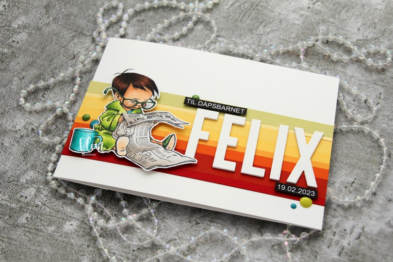
 I colored the image with My Copics and decided to fussy cut around it this time. I tend to turn my colored pieces into panels for my card and work from there, but I wanted to do something a little different today.
 I left a white border around the image to make it easier on myself. You tend to lose some of the details in the hair if you cut up close to the line, and I wanted to keep the hair intact. I also added Glossy Accents to his glasses for shine and a touch of dimension.
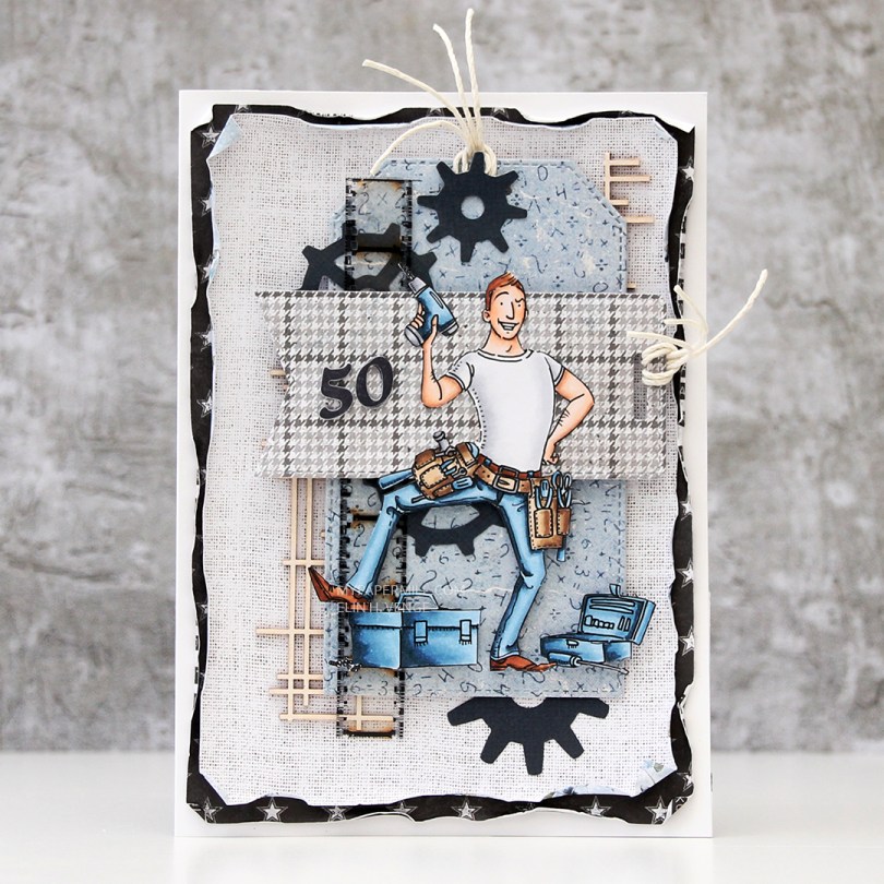
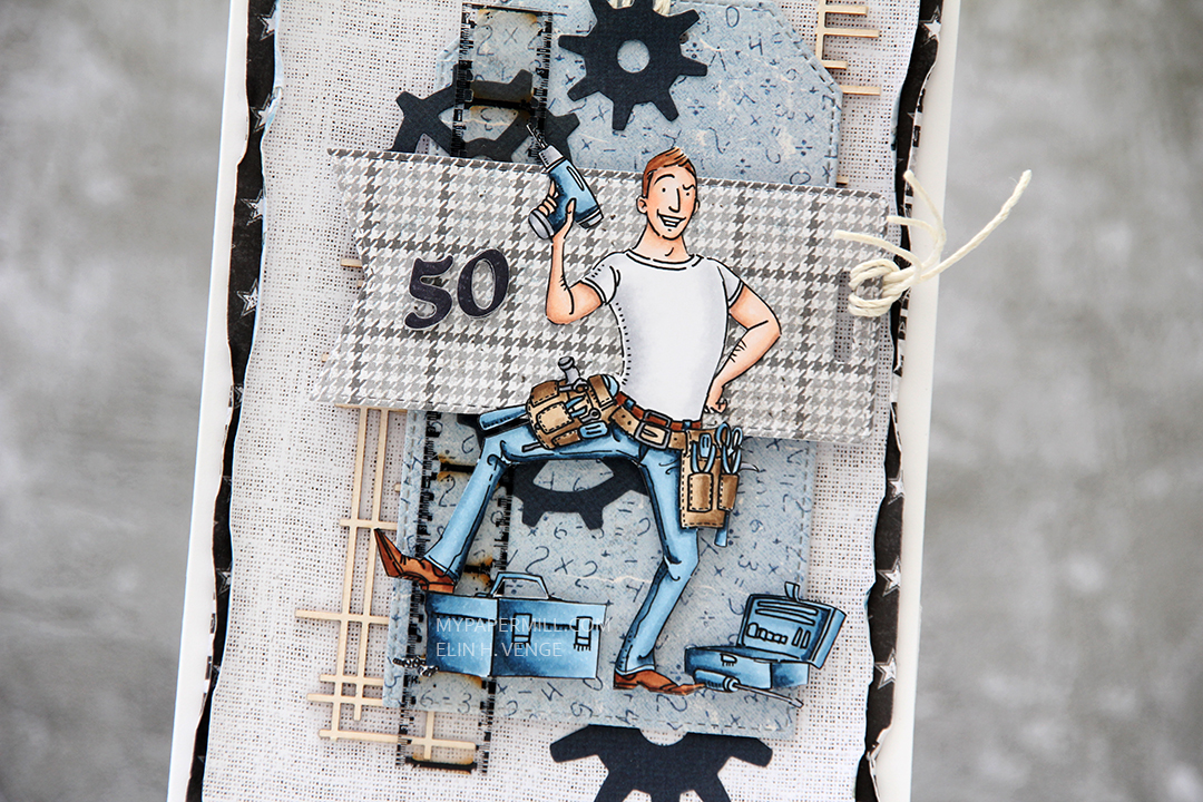
 I wanted to include his name on the card, but had printed my image fairly large. My solution was to make a landscape A7 card (7×5″). I rarely make landscape cards (trickier to photograph) and the same goes for A7, but it’s fun to shake things up. I also shook things up by adding cardstock strips going across the card. I tried with cool colors first, but the image got lost, so I went through my solid colors of cardstock again and made a version with warm tones. From top to bottom they are:
 I used the Impact Alphabet die set from My Favorite Things to spell the name. I die cut four of each letter and stacked them for a dimensional look, gluing them right onto the stripped background, before adding the sentiment and date in white on black.
 I mounted the image on foam tape and added a few enamel dots from Altenew (teal dots from the Cool Summer Night pack) and Papirdesign to finish the card.
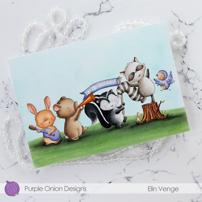
 I stamped and masked all these critters. From left to right we have
  There are two sentiments that come with Petunia that you can stamp in the banner. One is the hip hip hooray!, which I white heat embossed, the other says Happy birthday! This card is a bit of an odd size. I needed it big to fit all my images, and it measures 7 1/4 x 5 1/16″. I probably could have trimmed off a little bit on the sides and on the bottom (or top) to make it an even A7 size, but this is what I wound up with. I’ll probably make my own envelope to fit anyway.
 Lots of Copics used for this one. I tried to make the colors of the critters different even though I have two brown ones and two gray ones. I love the Copic range of earth tones and gray tones, it really does allow you the option to create different colors within the same color family.
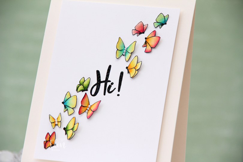
 I used the
  I fussy cut each of the butterflies right up against the stamped lines, going over the cut edge with a black pen so no white core would show from the sides. I then took a thin Copic multiliner to make the bodies of the butterflies more solid black (I suspect I might need a new black ink pad because my current one is starting to get dry).
 I added the butterflies to a 3 1/2 x 4 3/4″ panel of Stamper’s Select White cardstock from Papertrey Ink, lifting the wings and adding tiny pieces of 1 mm foam squares to the back of them for dimension. I didn’t want these to be flat. On some of the butterlies, I added 2 mm white pearls from Kort & Godt to the bodies.
 The sentiment is from the
  The sparkle of the embossing powder is visible in this photo, as is the wonderful lift the wings of the butterflies get by using tiny pieces of foam tape. I colored one more butterfly, but there was no more room on the front of the card, so I adhered it to the back of the card above my “Handmade by Elin” stamp.
 Not a lot of colors for this one, though I did use the yellow ones for all the two toned butterflies.
 I bought a 36 tube set of Mijello Mission Gold watercolors last September, and they’ve been sitting in their palette scaring me, but I’ve recently started dabbling a little bit. Images like this with big open areas are great for practice, and this is my third proper watercolor piece. Yes, I’m keeping track, haha. The previous two attempts were both noline. One was a background, and the other a digital stamp. My printer ink doesn’t play well (or at all, really) with water, so I had to opt for the noline look to prevent visible bleeding. I dove right into the deep end, hoping I could pull it off.
 I stamped the image onto Fabriano Artistico Extra White watercolor paper using VersaFine Onyx Black ink. I’ve created a birthday card with these two once before (blog post
  For my last card with this image, I used my Copic BV20 series for a purply gray elephant. This time, I went for a bluer version to get a nice contrast. I actually decided to mute my pink a little before painting with it. The Bright Opera color from Mijello is a super bright pink, and I added a tiny bit of Hooker’s Green to dull it a little, it was just too bright a pink straight from the palette for what I wanted.
 Once I’d painted my scene, I went back over with a black pen to trace the lines of the image. I would have restamped if I could, but I stamped the image weeks before I painted it and removed the stamp from my MISTI in the meantime. Black pen to the rescue. I just wanted crisp black lines. I stamped a sentiment from the stamp set using VersaFine Onyx Black ink and heat embossed that using clear embossing powder.
 I cut down my colored panel slightly and adhered it to an A7 top fold card base I created from two pieces of Poppin’ Pink cardstock from Papertrey Ink. To finish the card I adhered sequins, beads, confetti and other various little bits from the Sweet Shop mix from Little Things from Lucy’s Cards. I don’t usually put this many sequins on my cards and scatter them like this, but I wanted to really keep the party vibe from these two going across the entire card front.