Hi, crafty friends. There’s a new release at Lili of the Valley. There are a few different girls, quite a few florals and a quartet of party animals. If you know me, it’s no secret that I started with the party animals. The Party animal penguin, to be exact. There’s also a cute highland cow, a bunny and a chimp.
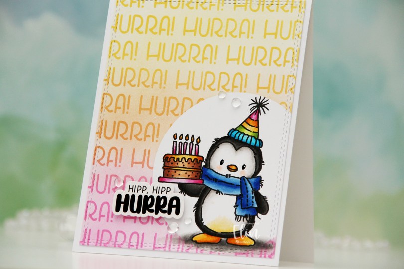
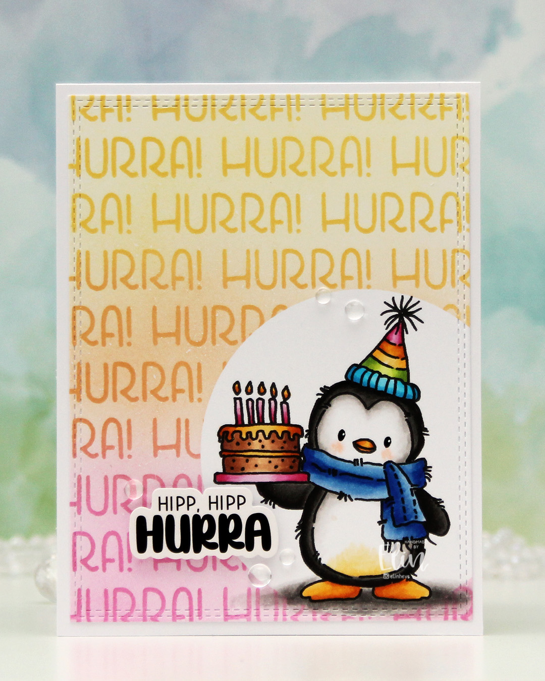 I actually didn’t start with the coloring on this one. I printed the image on a quarter sheet of X-Press It blending card, which is what I always use for Copic coloring. I put a circle mask on top of the penguin, then used the Hurra stencil from Create a smile and some inks from Concord & 9th to create my background. I used Sweet Pea, Clementine and Buttercup, creating a gradient between the three colors. Once I took the stencil off, the white of the background felt a bit stark, so I went in with the 1″ blender brushes from Pinkfresh Studio and did a soft blend of the background using the same three colors.
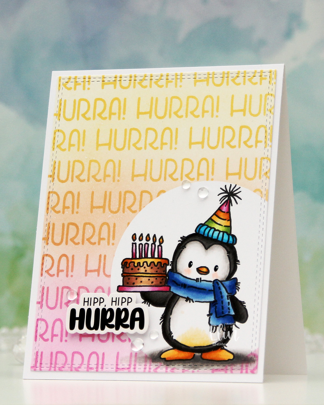 Once I removed the mask, it was time to color the penguin. I used Copics, went for a pretty bright palette and added a bit of black glaze pen to the eyes, then a dot with a white Sharpie on top once the black was dry. This gives the eyes a bit of shine.
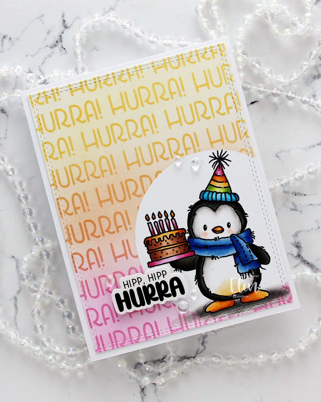 I used the largest die in the Double Stitched Rectangles die set from My Favorite Things to cut my panel down slightly. It also adds a fun stitching detail to the edge. I then adhered my panel to a top fold card base I created from Stamper’s Select White cardstock from Papertrey Ink.
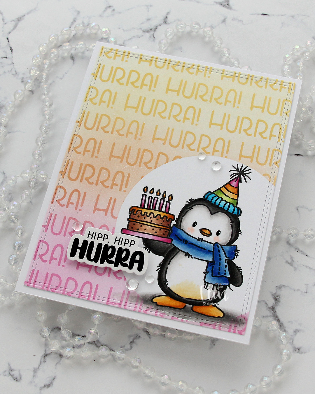 I used a sticker from Kort & Godt for my sentiment. I like my sentiments with some dimension, and to get dimension with stickers, I first use antistatic powder on the back to remove the stickyness, then add foam tape. I finished off the card very simply with some clear dew drops from Concord & 9th. There was so much color going on, I thought clear was the best option.
 I used quite a few Copics for this, but that hat alone needed quite a few.
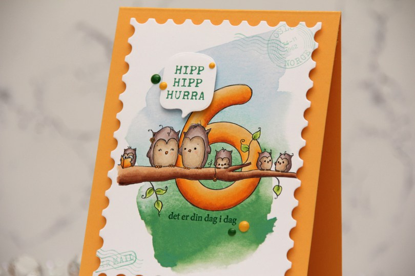
 I printed the image onto a piece of X-Press It blending card, adding a digital watercolor background behind the image before printing. I colored the image with Copics and opted for a warm yellow for the actual number and the book, an analogous color palette always works well.
 I die cut the panel using the Postage Stamps infinity die set from Hero Arts, then stamped the sentiments from the Bursdagsbillett stamp set from by.cino (hipp hipp hurra) and the A06 stamp set from Norsk Stempelblad AS (det er din dag i dag) using Clover ink from Concord & 9th. I also used second generation stamping of a couple of the images from the CS0879 stamp set from Marianne Design in the corners of my large postage stamp. I mounted my postage panel onto a card base I created from Summer Sunrise cardstock from Papertrey Ink, then die cut and mounted the Hipp hipp hurra sentiment using the MSTN Say Anything die set from My Favorite Things, before finishing off the card with Clover and Honeycomb enamel dots from Concord & 9th, as well as a dot of a black Sakura Glaze pen to each eye for a little bit of shine and dimension.
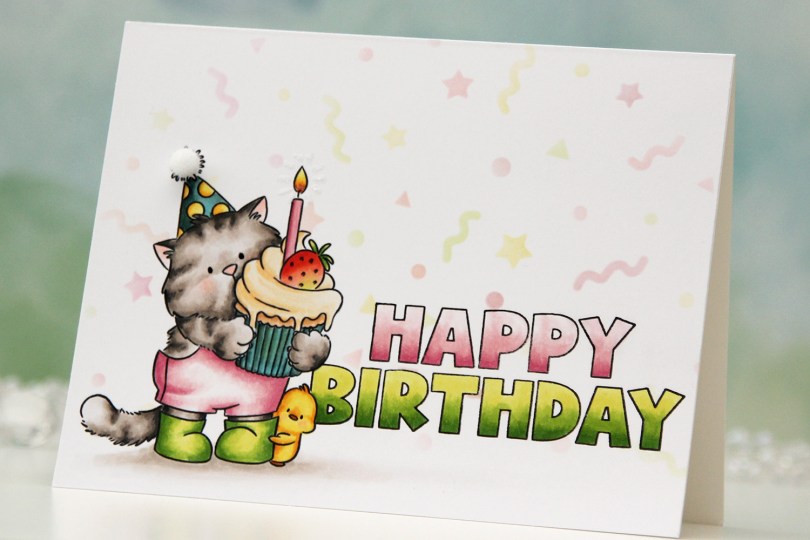
 I stamped
 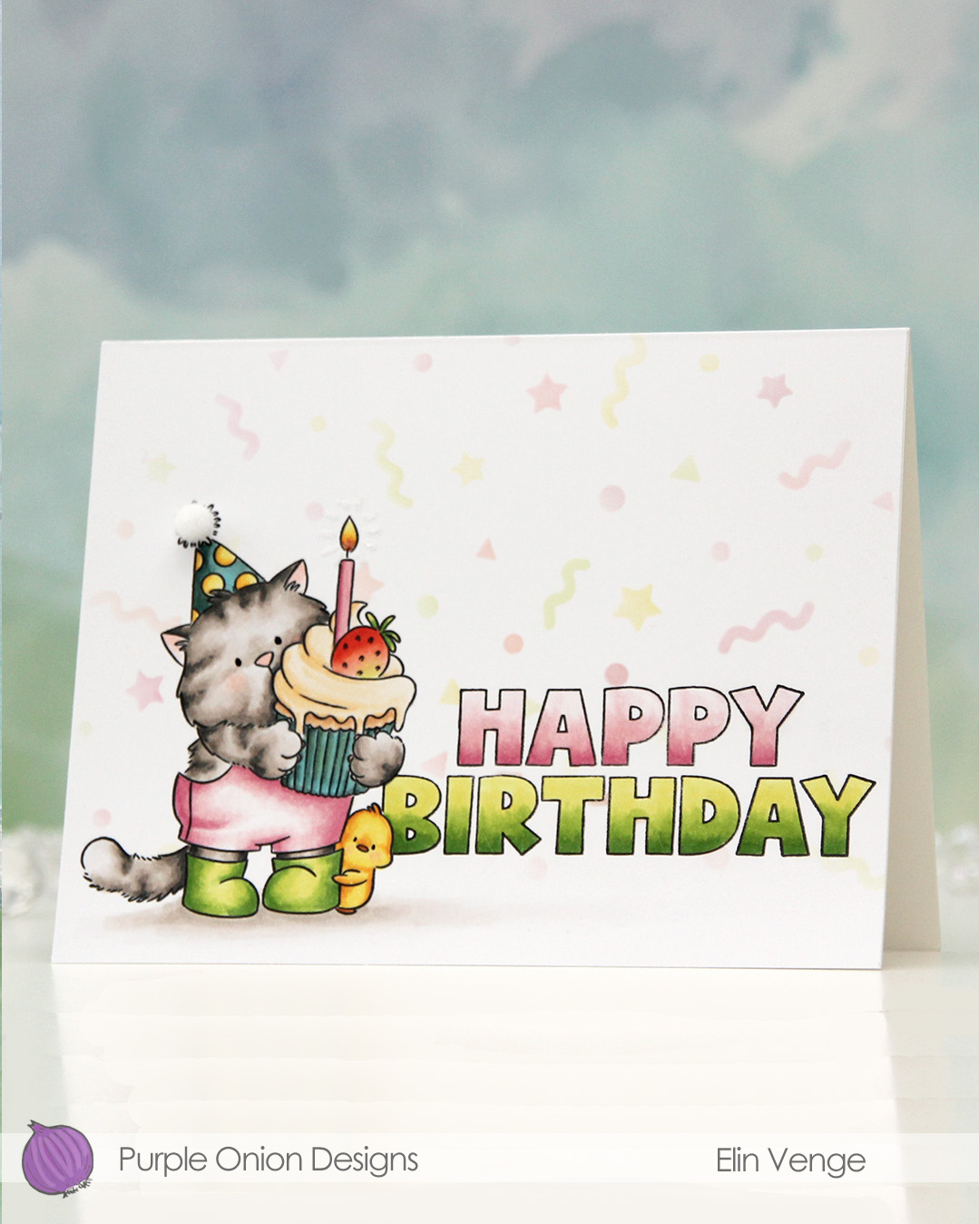 I colored Tofu and the sentiment with Copics, adding a black dot of Sakura Glaze pen to the eyes once the coloring was complete. This creates a tiny bit of dimension, as well as a bit of shine.
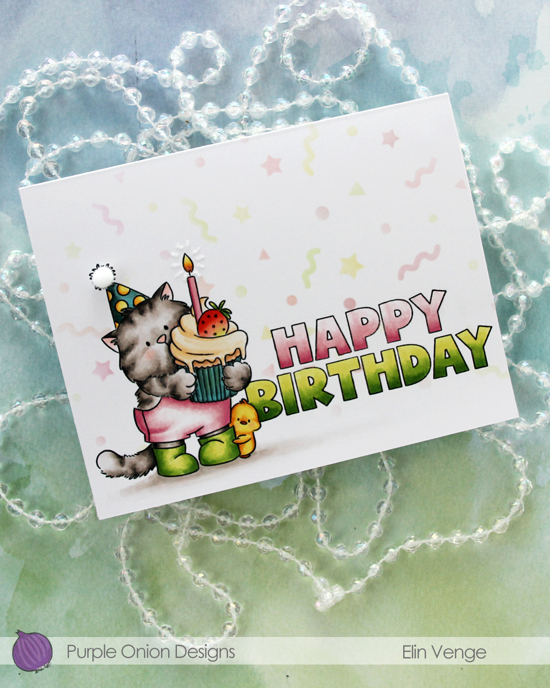 I used a Quickie glue pen to create a burst from the flame, then sprinkled on Rock Candy distress glitter. This adds a tiny bit of sparkle and some subtle texture.
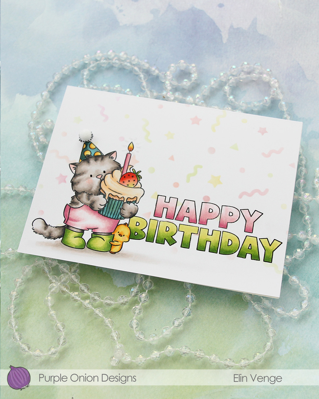 To finish off, I added a 5 mm pom pom from Cousin DIY to the top of the party hat.
 I used lots of Copics for this one. I wasn’t quite happy with the color of the cupcake liner or the party hat, but it is what it is. The card is still cute!
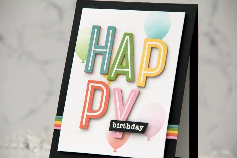
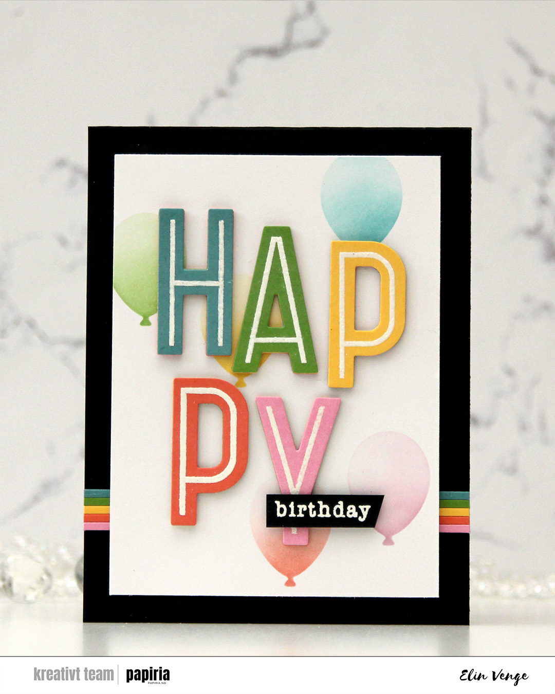 I started by stamping the word happy from the Happy Birthday Words stamp set from Kristina Werner onto five different colors of cardstock from Concord & 9th. I used Lakefront, Parsley, Buttercup, Sorbet and Carnation. I heat embossed them all with white embossing powder from Ranger and stacked the letters for dimension, choosing a different color on top for each. This gives a bit of a rainbow look from the side.
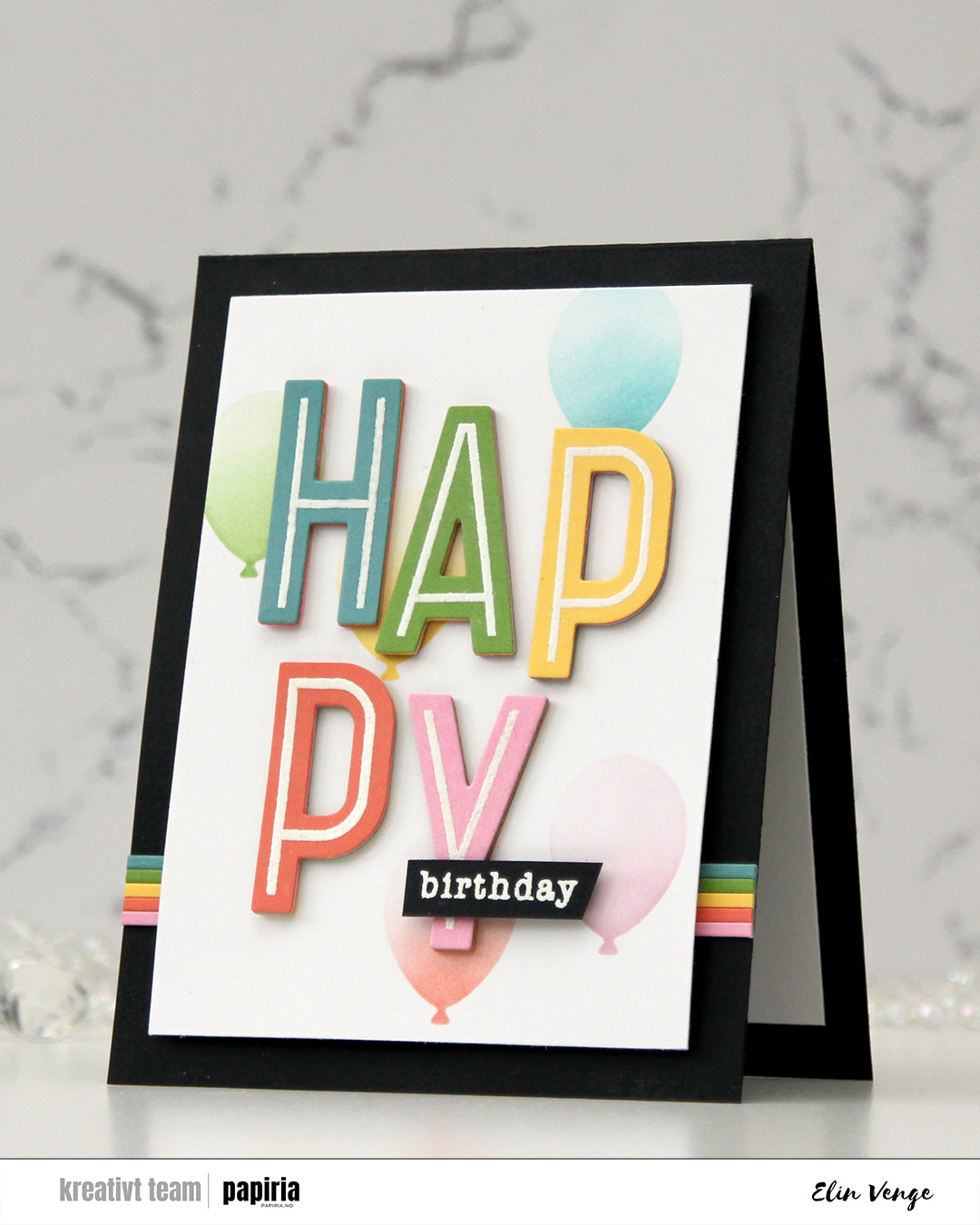 I cut a white panel to 3 1/2 x 4 7/8″ and used the Balloon Party stencil from My Favorite Things to add ink blended balloons in the background. I used the same ink colors as my cardstock colors for the letters, and added a gradient on each of the balloons, concentrating the color on the base of the balloon, then fading as you go up the balloon. I adhered my letters staggered onto the stenciled background.
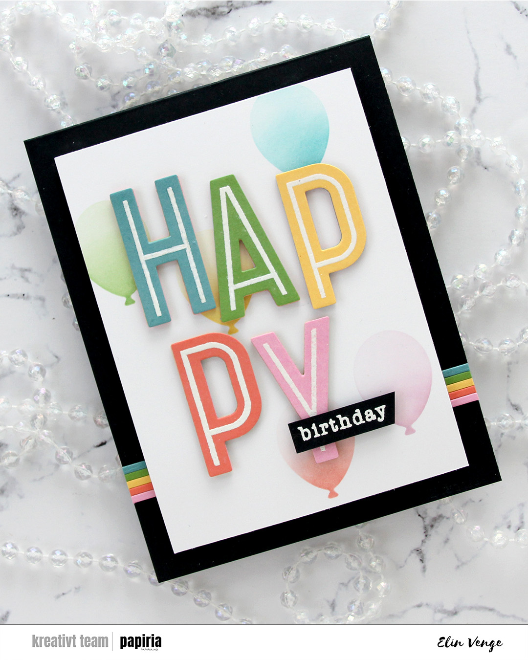 I stamped and white heat embossed the word birthday from the All the birthdays stamp set from Concord & 9th onto a scrap of Black cardstock. I added a few extra layers of cardstock behind it, before adhering it near the bottom of the pink Y.
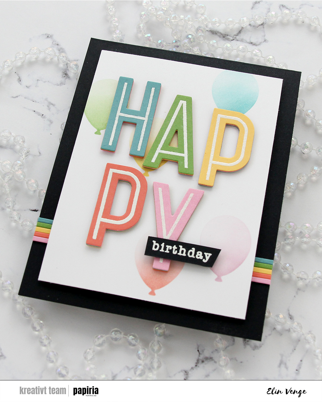 I cut slivers of the same colors of cardstock to create some interest on the card base. I like the beveled edge you get from die cutting as apposed to using a trimmer, which is why I used one of the frames in the A2 Thin Frames die set from Kristina Werner for this. I put a scrap of each color cardstock along the sides of the die for a bit of selective die cutting. It was then super easy to butt the strips up against each other. I adhered the strips horizontally across the card base, added foam tape to my panel and adhered it in the center of the card.
 I stamped the image with black ink onto X-Press It blending card and colored it with Copics.
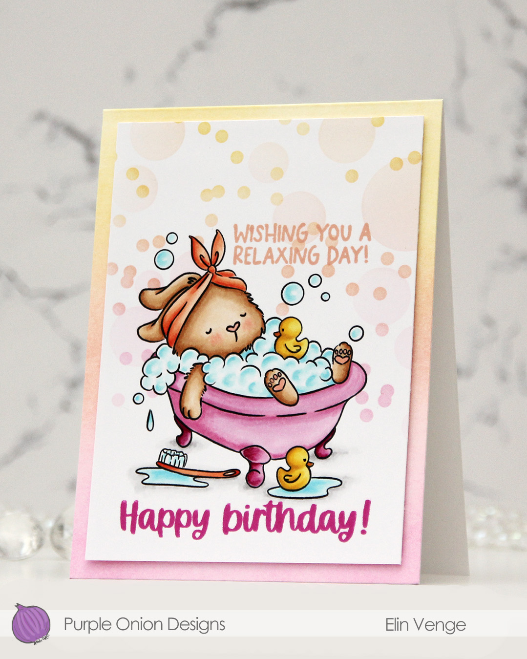 I added a mask to my image, then used the Bokeh Elements stencil duo from Waffle Flower to softly ink blend additional bubbles in an ombré effect in the background. I used Sweet Pea, Grapefruit and Buttercup inks, all colors from Concord & 9th, making sure to add slightly more color on the smaller circles than the large ones, while still keeping it fairly light.
 I stamped a sentiment from the
  I trimmed my panel down slightly and added it with of dimension to a top fold white card base that I ombré ink blended using the same three colors I used with the stencils. I did also add a dot of black Glaze pen to the eyes of the ducks for a finishing touch.
 Simple color palette for this one.
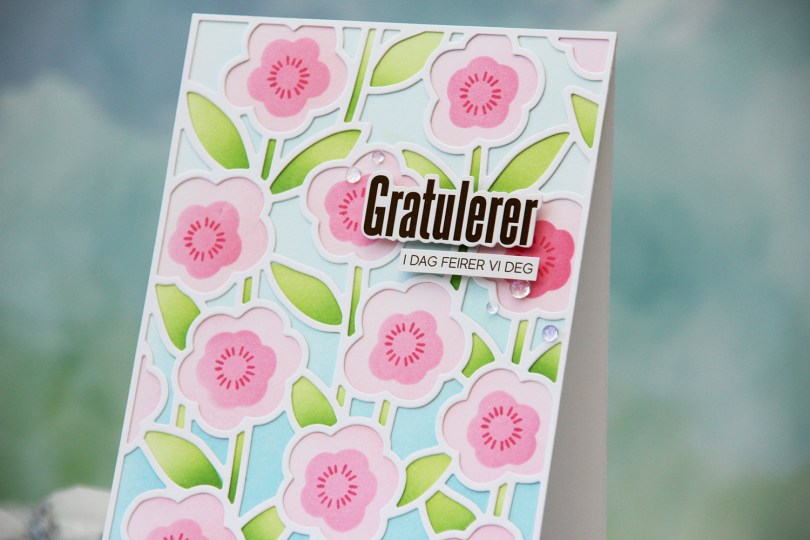
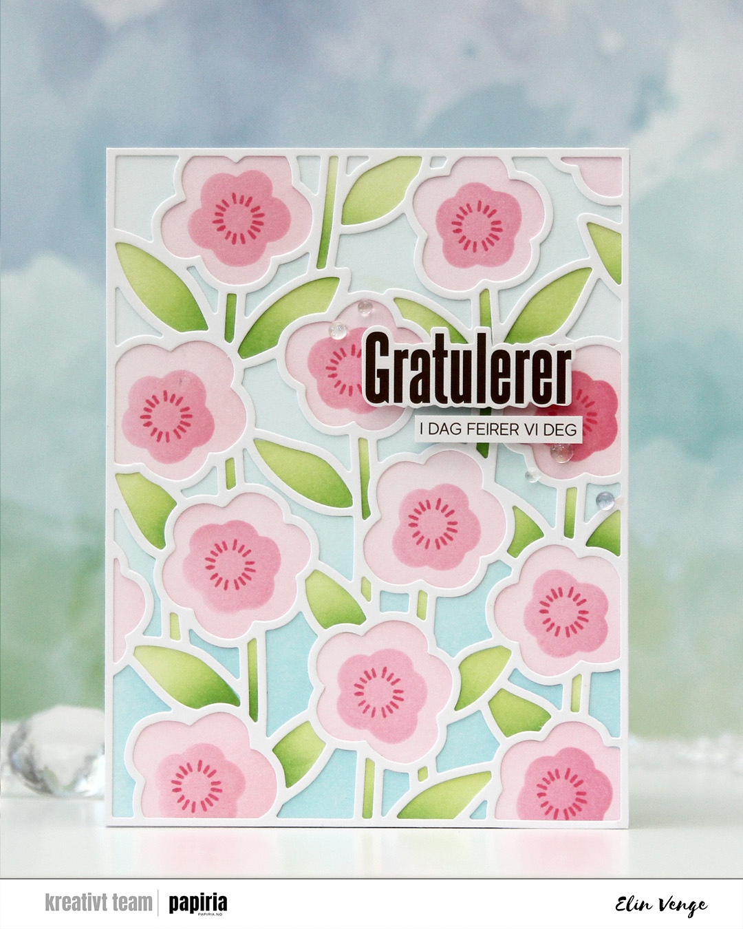 I started with a panel of white cardstock. I put down the first stencil, which is for the background, and used Harbor and Powder inks. The second stencil does the stems and leaves, and I used Sprout with a bit of Parsley at the base for those. For the large part of the flowers, I used Ballet Slipper and for the fourth and final stencil, which is for the smaller part of the flower, I used Honeysuckle. I also used the small circle burst stamp in the stamp set to add a little more detail. I stuck to Honeysuckle ink, and I just love the way these flowers turned out.
 I used the cover die to create a frame from white cardstock that I glued on top of my ink blending. I mounted sentiment sticker strips from Kort & Godt using foam tape and adhered the sentiment in the top third of the card. I rarely add my sentiments to the top right, but I think it works. I finished off very simple with a few iridescent dew drops from Pinkfresh Studio.
 I started by running a panel of white cardstock through my die cut machine with an embossing folder. I chose the Crystal Distortion embossing folder from Simon Says Stamp, which leaves some fun texture in the background without being too distracting.
 I added the tigers to the panel with some foam squares. The texture on the dry embossed panel makes it uneven, and the foam squares help – I also love the dimension it adds. I cut off the parts of the tigers hanging off the edge, trimmed the panel down and mounted it on foam tape to a card base I created from Canyon Clay cardstock from Papertrey Ink.
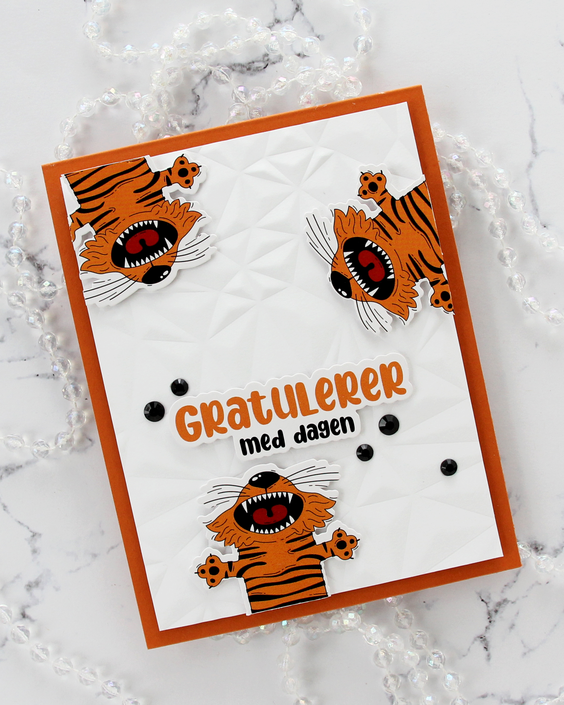 The large sentiment is from the same sheet of stickers as the tigers, which means the colors fit perfectly. I added some foam squares to the back and adhered it above the bottom tiger.
 I added some black bling in a couple of different sizes to finish the card. This is actually the third card I’ve shared in a row without any stamping. I’m sure I’ll use some stamping soon, but it’s fun to use other products and techniques.
 It’s kind of weird that I, as an avid colorist, really enjoy using images like this, where all the work is done for you and you just have to cut it apart from the other images on the same sheet. I created a 4 bar card this time, so even though the image itself isn’t THAT big, it still takes center stage on this smaller card. I added a thin strip of copper glitter cardstock above and below the image. It gives more definition and it also works really well with the orange balloons in the image.
 I used the Terrazzo press plate from Altenew to create some fun texture in the background. I inked up the press plate with Caribbean Sea ink from My Favorite Things and pressed it onto Caribbean Sea cardstock, also from MFT. I mounted my image on foam tape, added a sticker sentiment that I also popped up and finished off the card with a few faceted pearls. I love these!!
 When I printed my image, I printed
  Once my coloring was complete, I used the Notebook Edge die from My Favorite Things to cut from the edge of the panel for a little bit of interest. I mounted my little scene using foam tape onto a card base I created from Cornflower cardstock from My Favorite Things.
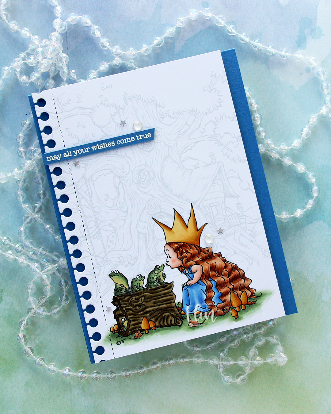 I stamped a sentiment from the Birthday messages stamp set from Mama Elephant using VersaMark ink onto a scrap of Cornflower cardstock, added super fine detail embossing powder from Ranger and heat embossed. I always heat emboss from the back of the back of the cardstock only, it gives a much better result than heat embossing from the front.
 I cut my sentiment down to a strip, added a couple of layers of cardstock behind it for dimension and adhered it near the top left of the card, before finishing off with a few gems and confetti stars from the Starry Night mix from Little Things from Lucy’s Cards. The stars made me think of “When you wish upon a star”, which goes perfectly with the sentiment and the “Once upon a time” theme for the Coloring Club Challenge.
 I used a fairly limited color palette for this one, I feel.
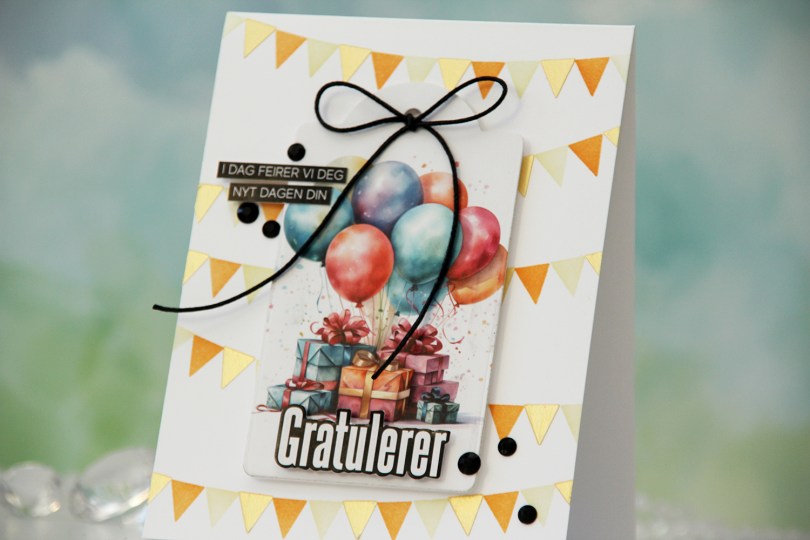
 To start, I die cut this focal image with a tag die. I die cut another in white to put on the back for a little strength and put my tag aside while I worked on my card base.
 I used the Wimpelkette stencil set from Create a smile to create the pennants in the background. The set consists of 3 stencils that layer and create an easy pennant background. I used Peachy Glow and Amber Blaze inks from Altenew with two of the stencils, and through the third one, I added a layer of Solar Paste in the Golden Hour color. It creates a little bit of shine and some texture.
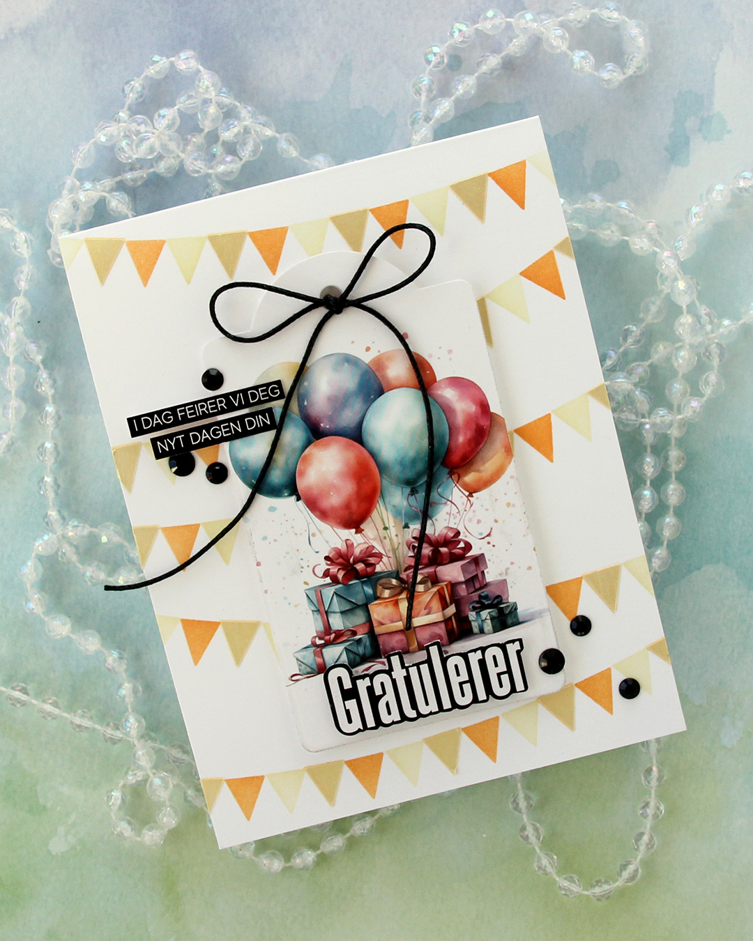 I mounted the tag with foam tape in the center of the card, used 1/16″ foam squares on the back of the Gratulerer word sticker to make it stand out a little, then trimmed down the sentiment strips slightly and adhered them to the tag.
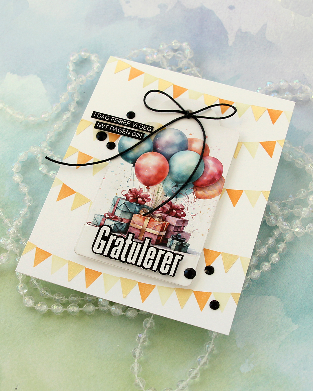 To finish off the card I added a few black gems and tied a bow using black cotton thread from Kort & Godt.