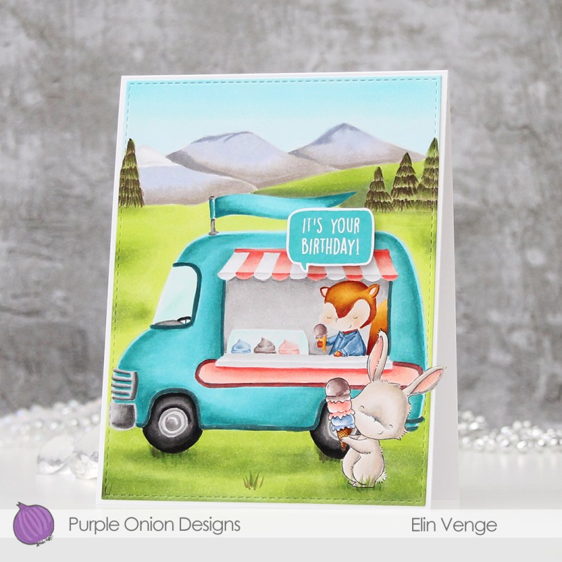
Hi, there! I’m back with a birthday card for an ice cream loving friend today.
I stamped Marigold from Purple Onion Designs in Extreme Black ink from My Favorite Things, before masking and stamping the Ice Cream Truck and the Mountains using fadeout ink from Inkon3.

I’ll admit, this took a while to color. I always start with my background elements and finish with the main image in the scene. Believe it or not, but I actually added quite a bit of brown to those trees. I added darker greens under the wheels of the ice cream truck and under the bunny, and a little bit here and there in the rest of the scene as well, for a little bit of interest. Once the entire scene was colored in, I went in and added a few blades of grass in the foreground.

I knew even before I started that I wanted the ice cream truck to be teal. Originally, I was going for a very light color, but it was looking a bit too blue, so I went in with some darker colors and made the whole truck darker, that did the trick. I went for a corally, peachy type color for the awning and the side panel, I really like peach tones with teal. Kind of weird, since I’m not generally a fan of complementary colors, but these work.
Once everything was colored, I did some fussy cutting around the bunny’s ear and used the largest of the A2 Stitched Rectangles STAX 2 dies to die cut the entire panel. Except for the ear, of course. I adhered my panel onto an A2 card base, and I admit I love the little detail of the ear sticking out past the edge of the card. Of course it meant that I needed to make my own envelope, the ear would have gotten crumpled inside the envelope had I used an A2 envelope.

I stamped one of the sentiments in the Everyday Blurbs stamp set using Distress Oxide ink in the color Peacock Feathers, before fussy cutting the speech bubble and mounting it on foam tape onto the card.
Lots and lots of Copics used for this one!


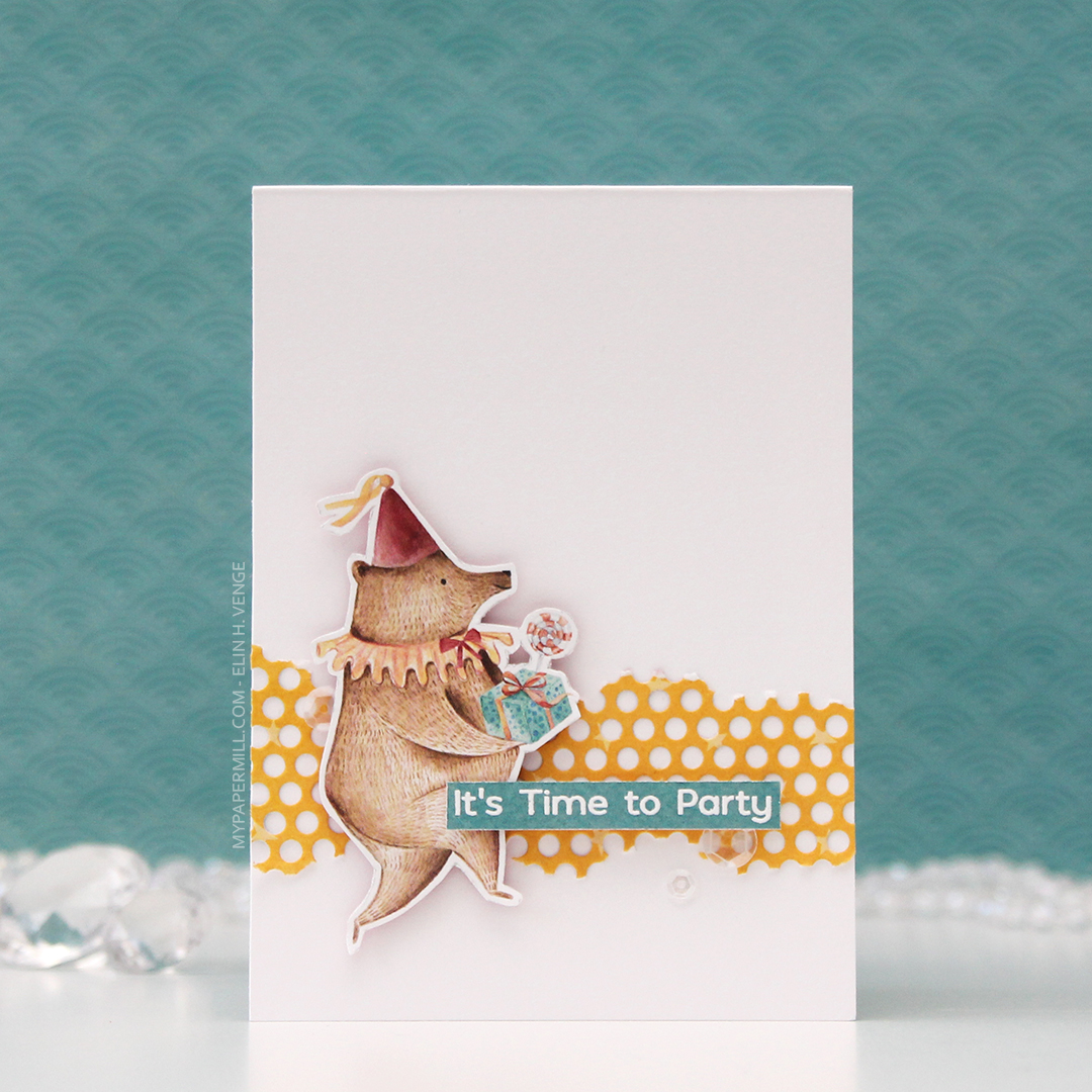 I’m starting with this bear, ready for a party! The papers in the P13 collections don’t have individual names, they just have numbers, and I fussy cut this bear from 05. I die cut a piece of 01 using a die from Papirdesign, tearing the edges for an uneven look and glued it straight onto my 4 bar top fold card base, before adding the bear with foam tape for dimension.
 03 in this collection from P13 has wide, diagonal stripes in different colors. I cut it down to strips, and used them to emboss my sentiments to get the perfect color matches. The sentiment on this card is from the Bitty Bears stamp set from My Favorite Things. I added the sentiment strip using foam tape, and finished off the card with some sequins from the White Orchid Sequin mix from Little Things from Lucy’s Cards.
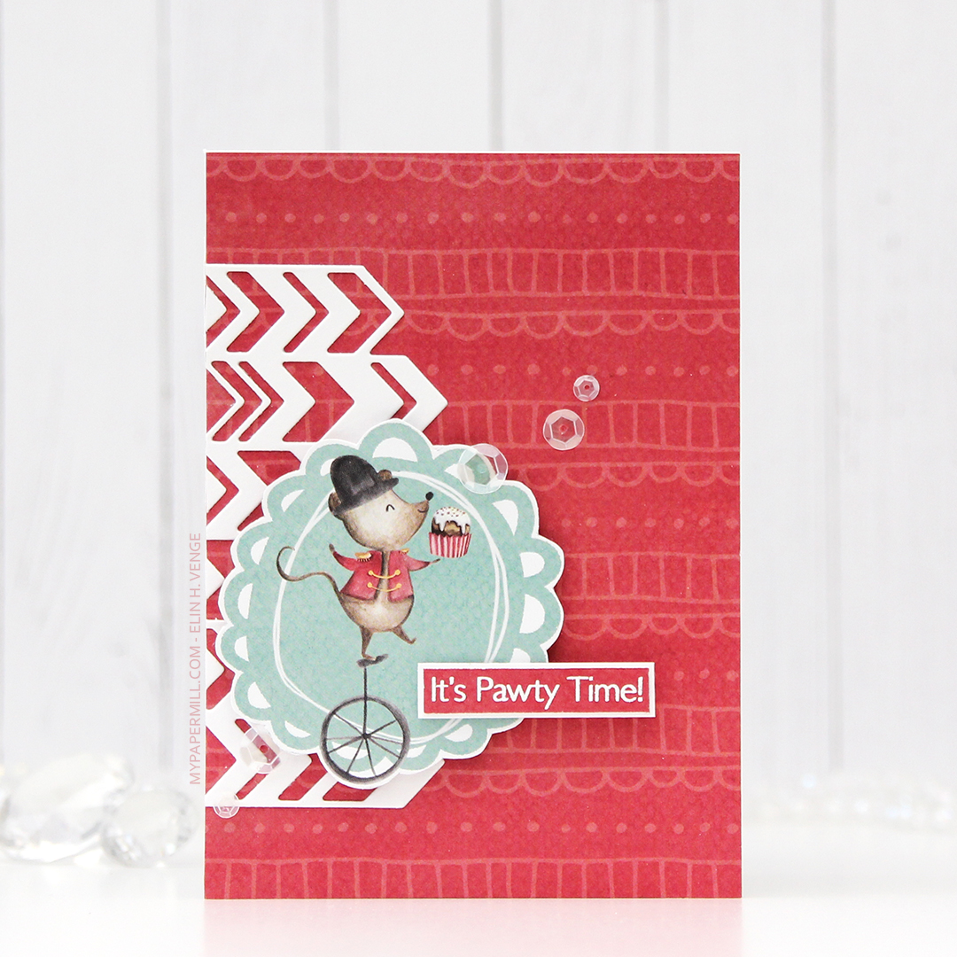 For my second card I covered the entire card front with the back of the 05 sheet. Most of the papers in this collection have lots of images on the front, and are more plain on the back, of course with colors that coordinate. The little mouse on a unicycle is from the 02 sheet, and again I used 03 to stamp my sentiment on. This sentiment is also from My Favorite Things, it’s from the Pawty Time stamp set.
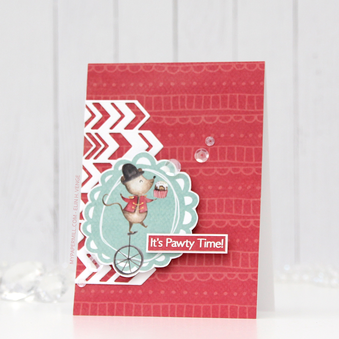 I die cut a chevron pattern from white card stock using a die from Papirdesign and adhered it directly to my patterned paper card front, before popping up the image on foam tape, and the sentiment on even more foam tape. Again I added sequins from the White Orchid Sequin mix to finish the card.
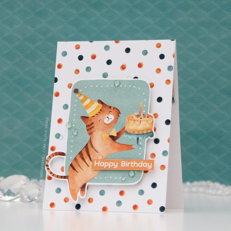
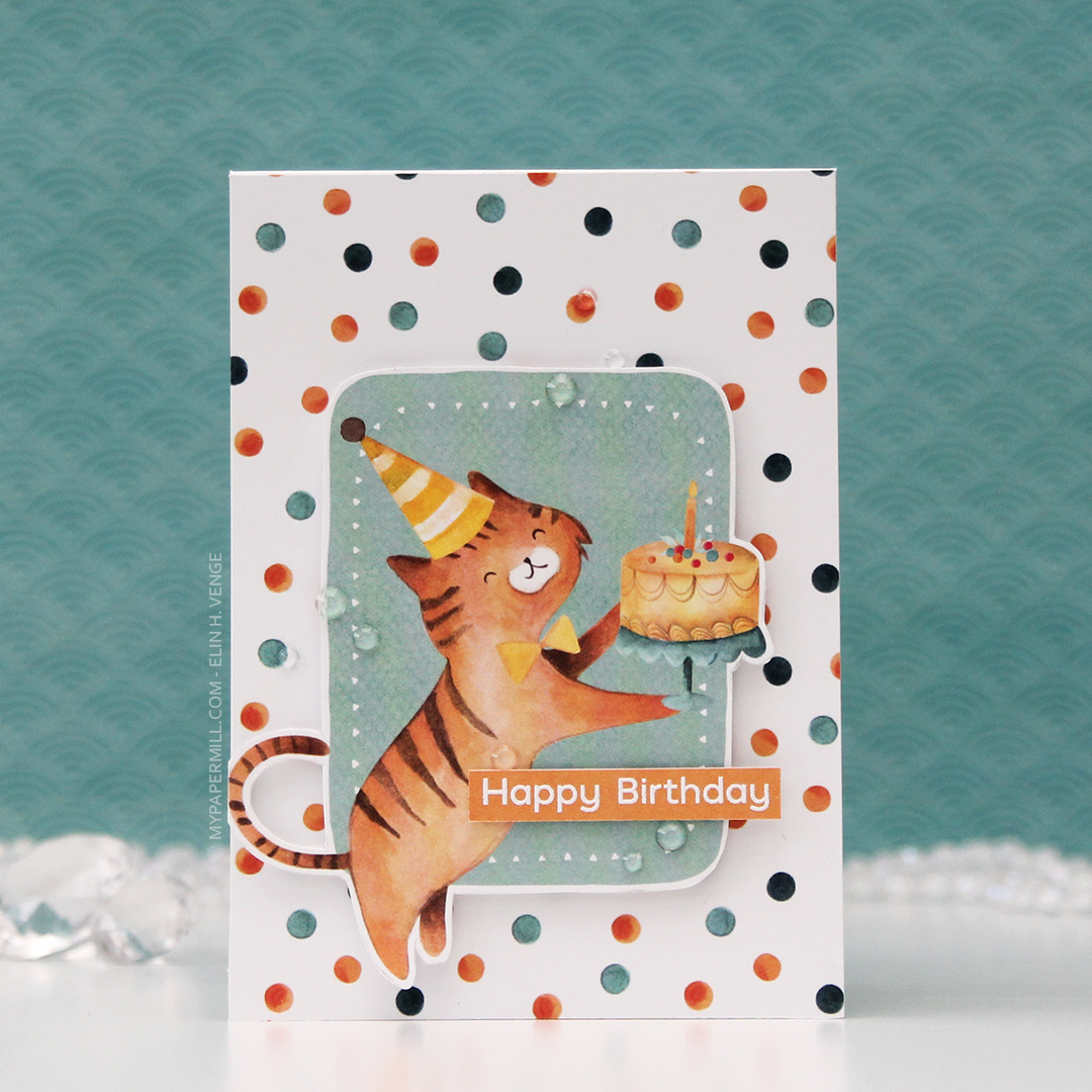 Card number 3. Now, I’m not sure whether this is a cat or a tiger, but whatever he is, he’s definitely ready to party. I fussy cut him from the 02 sheet, and I used the back of the same sheet to cover the card front. Once again, I popped the image on foam tape for dimension.
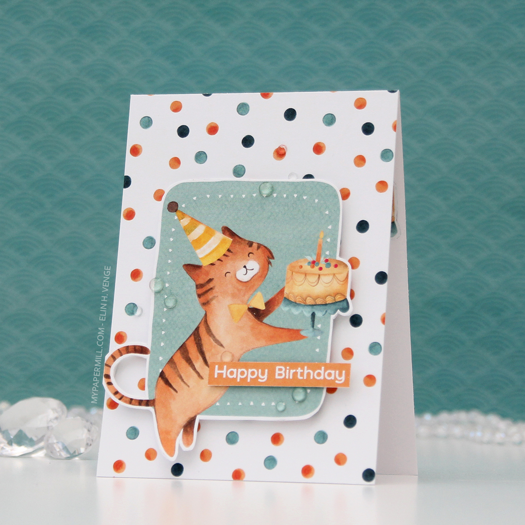 I used the Happy Birthday sentiment from the Bitty Bears stamp set again, and this time I used some clear gems from the Crystal Glass collection from Little Things from Lucy’s Cards to embellish.
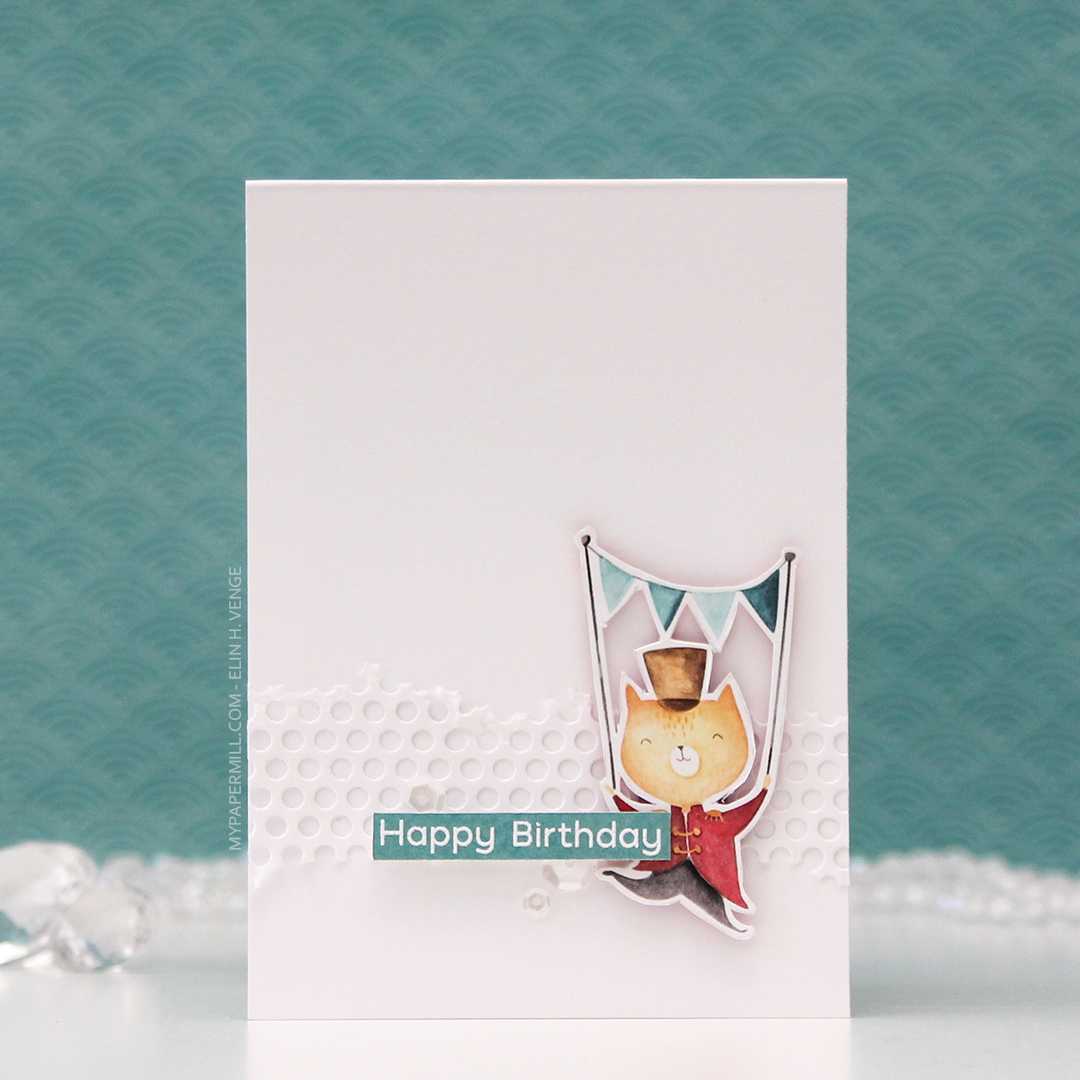 I made the last card for today very simple. I die cut the same hole pattern as I used for the first card, only this time in white card stock for a bit of textured interest in the background. The cat is from the 05 sheet, which I used a lot of for these cards.
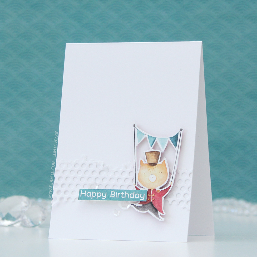 I added the cat using foam tape, the sentiment using more foam tape and those white sequins once again. These cards were so much fun to create, and I’ve got more in upcoming posts.
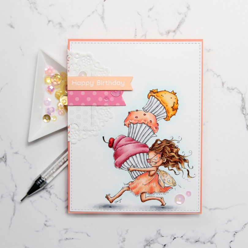
 I colored my image onto X-Press It blending card using my Copics, before using the largest of the A2 Stitched Rectangles STAX dies from My Favorite Things to turn it into a nice panel with faux stitching around the edge. I adhered it onto a card base I made from Coral Crush card stock from My Favorite Things. Sadly, the color’s discontinued, but they have loads of other gorgeous card stock colors at My Favorite Things.
 I added a small cluster of scraps to the top left of my card. About half a mini doily from Doodlebug Design is at the bottom, followed by die cut pieces of patterned paper from Sunny Studio and a sentiment banner on top. I white heat embossed a sentiment from the Bitty Bears stamp set from My Favorite Things onto a banner of Peach Bellini card stock, also a discontinued MFT color.
 My embellishments tend to be sequins or enamel dots centered around the sentiment on my cards. For this one, I added another two sequins in the bottom right corner, just to do something different than my standard three sequins. These sequins are from the Heaven Sent mix from Little Things from Lucy’s Cards.
 I used quite a few colors for this one. For the frosting on the pink cupcake, I also used R87, which is a color I’ve created myself.
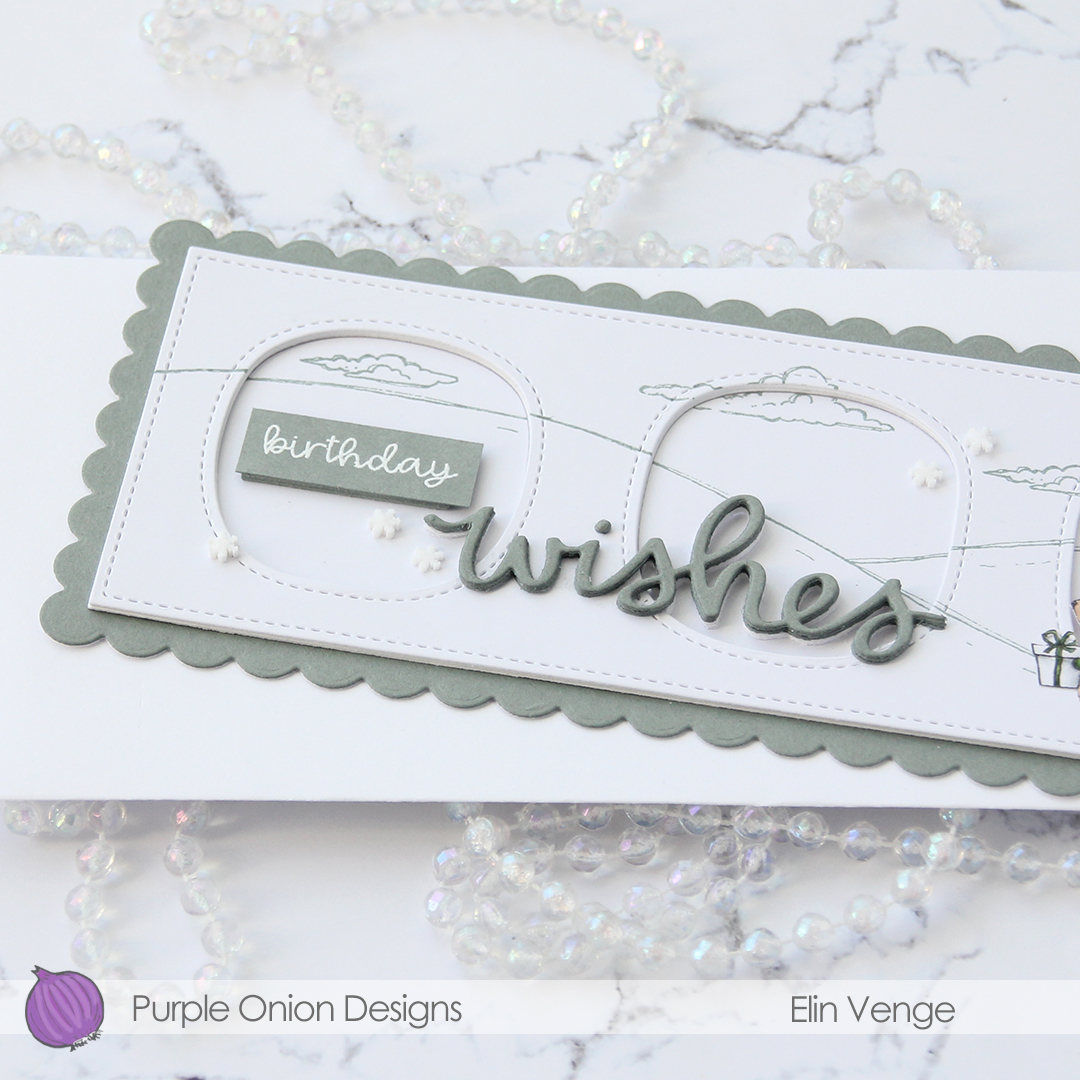
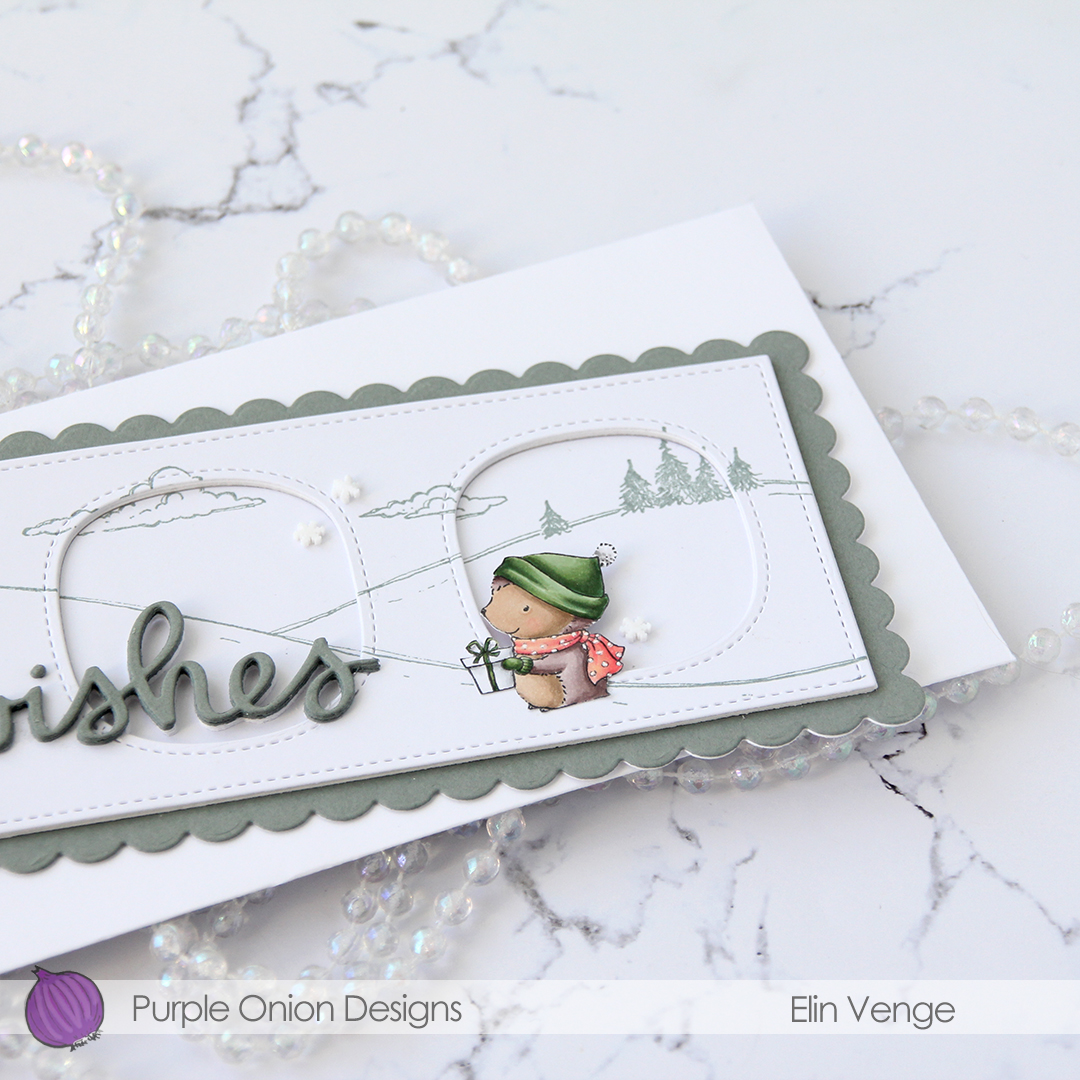
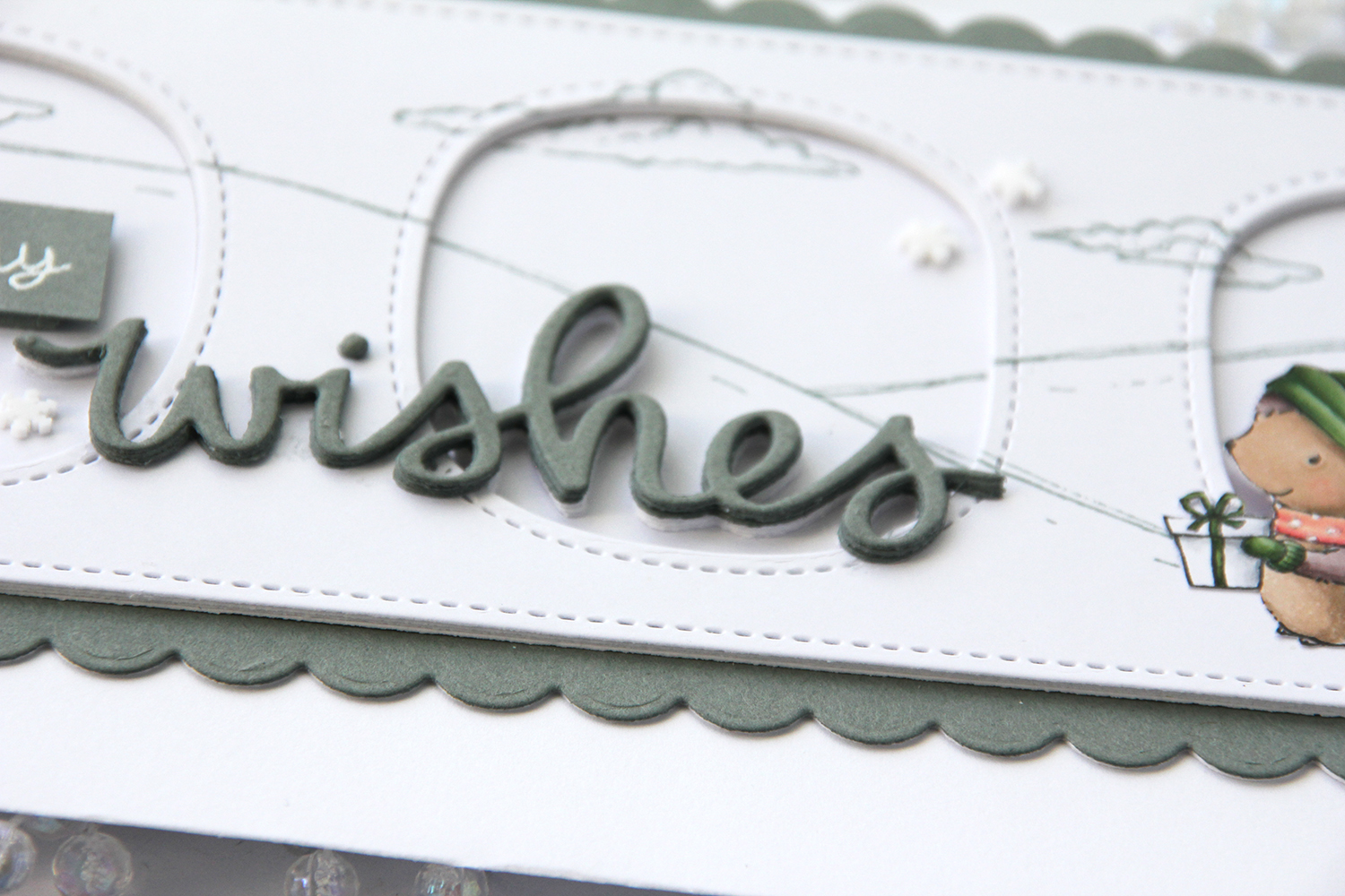
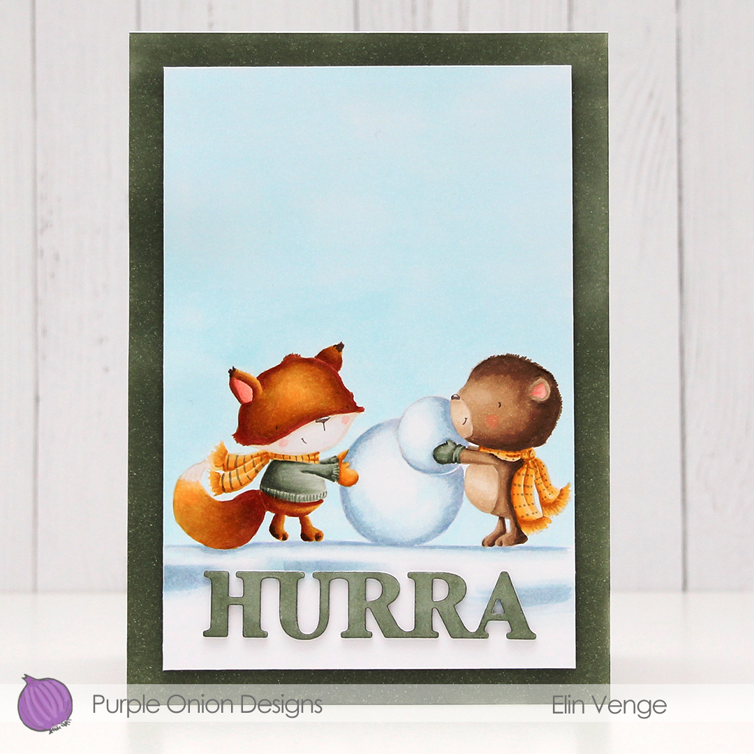 For today’s card I really wanted to include both
  I stamped the bear using fadeout ink from Inkon3 and masked him, before stamping the fox in the same ink. While I still had the stamps in my MISTI, I stamped their eyes, mouths and noses using Memento Espresso Truffle ink. This saved me from having to draw the details back in after my coloring, which could have potentially ruined the entire scene. I used my Copics to color everything, and trimmed the panel down slightly. I used one of the greens from the image on the edges of a 5×7″ piece of X-Press It blending card to make the card front match the image, as I didn’t have any card stock in the right shade of green. For the die cut HURRA (die from Kort & Godt), I scribbled one of the green Copics onto a scrap piece of X-Press It before die cutting. I added another three white die cuts behind it for dimension, and used foam tape on the back of the colored panel to give it a little lift up from the card base.
 As usual, I used lots of colors for the snow (everything in this graphic before E44), but that’s just how I roll.
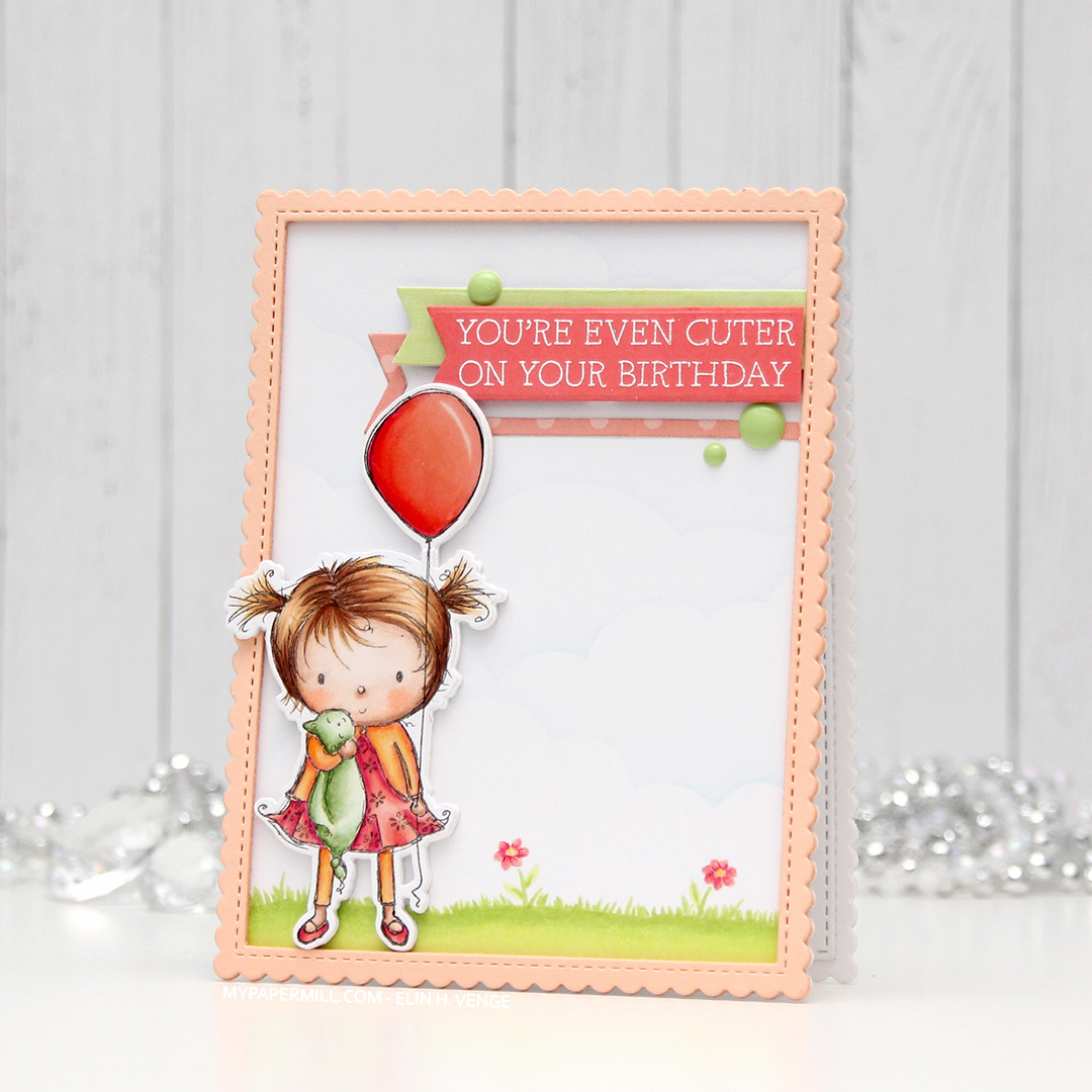 I don’t often purchase coordinating dies for stamp sets, but boy, they make it easy to add dimension. Once I’d colored up the little girl with the balloon, I die cut her and four additional pieces from white card stock to add dimension behind her. Way more sturdy than foam tape.
 I wanted to use lots of other goodies from MFT on this card, so I used the cloud stencil with a very light blue ink (Iceberg from Altenew) to create a barely there puffy cloudy sky behind her. It’s really soft, but shows up better in real life than in photos. I used a couple of elements from the Scene Builder stamp set and stamped those near the bottom using Fadeout ink from Inkon3 for a little bit of no line coloring. I die cut the largest of the Stitched Rectangle Scallop Edge Frames four times from Peach Bellini card stock and glued them together for dimension.
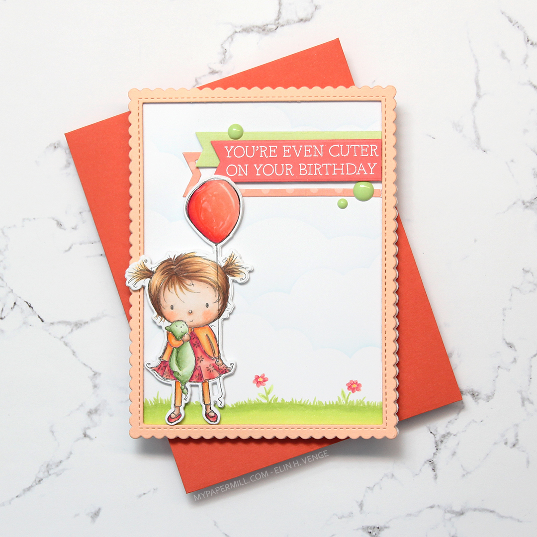 I added clear Wink of Stella glitter and a thick layer of Glossy Accents on the balloon, before stamping and white heat embossing one of the sentiments in the Birthday Cutie stamp set onto Berry Sorbet card stock from Papertrey Ink. I die cut the sentiment using one of the Fishtail Flag Frames dies from MFT, and found some scraps in my stash that I’d already die cut using dies from the same set. I use that die set a lot. I added three green enamel dots from the Tropical Forest set from Altenew and my card was finished. I paired the card with a Persimmon envelope, also from MFT. I love their envelopes!
 Lots of colors for this one! I was going for a peachy pink jacket and leggings, but it was too close to the pink I’d used for the rest of her, so I added some yellows on top. I also decided to go for a brighter green on the grass than her little stuffie.
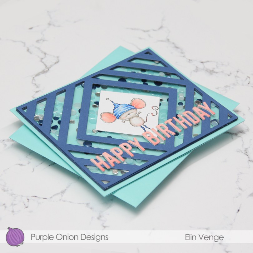
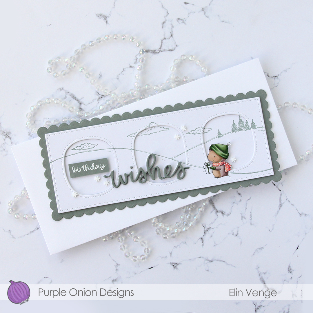
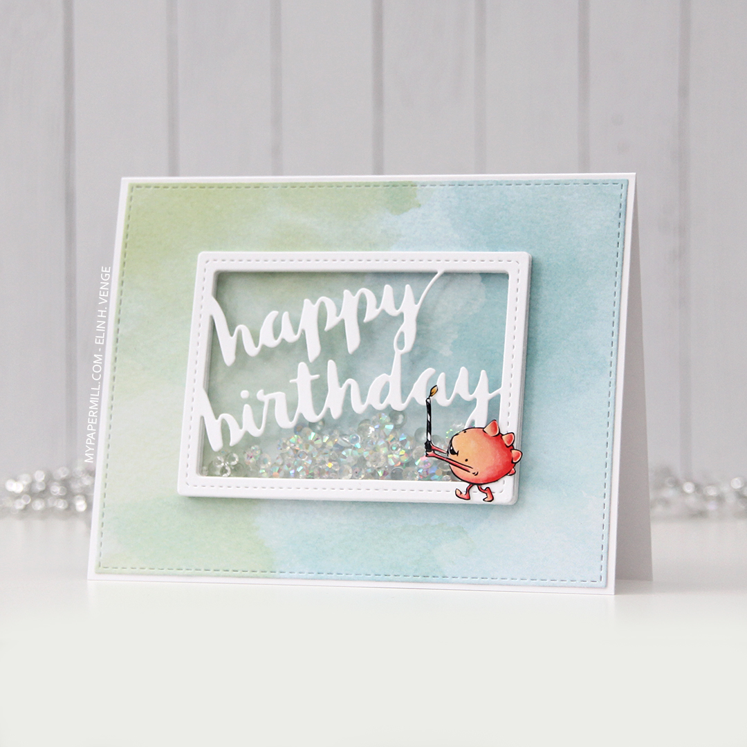
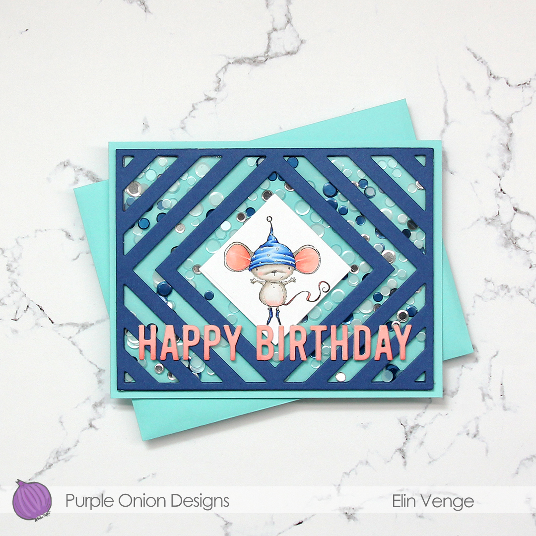 My sister’s birthday’s in a few weeks, and I thought this was the perfect card for her. She used to have the nickname “musa” (the mouse) when we were kids. Our cousin, a few months younger, was also quite a bit bigger, earning her the nickname “rotta” (the rat). Of the two, I think my sister got the better nickname.
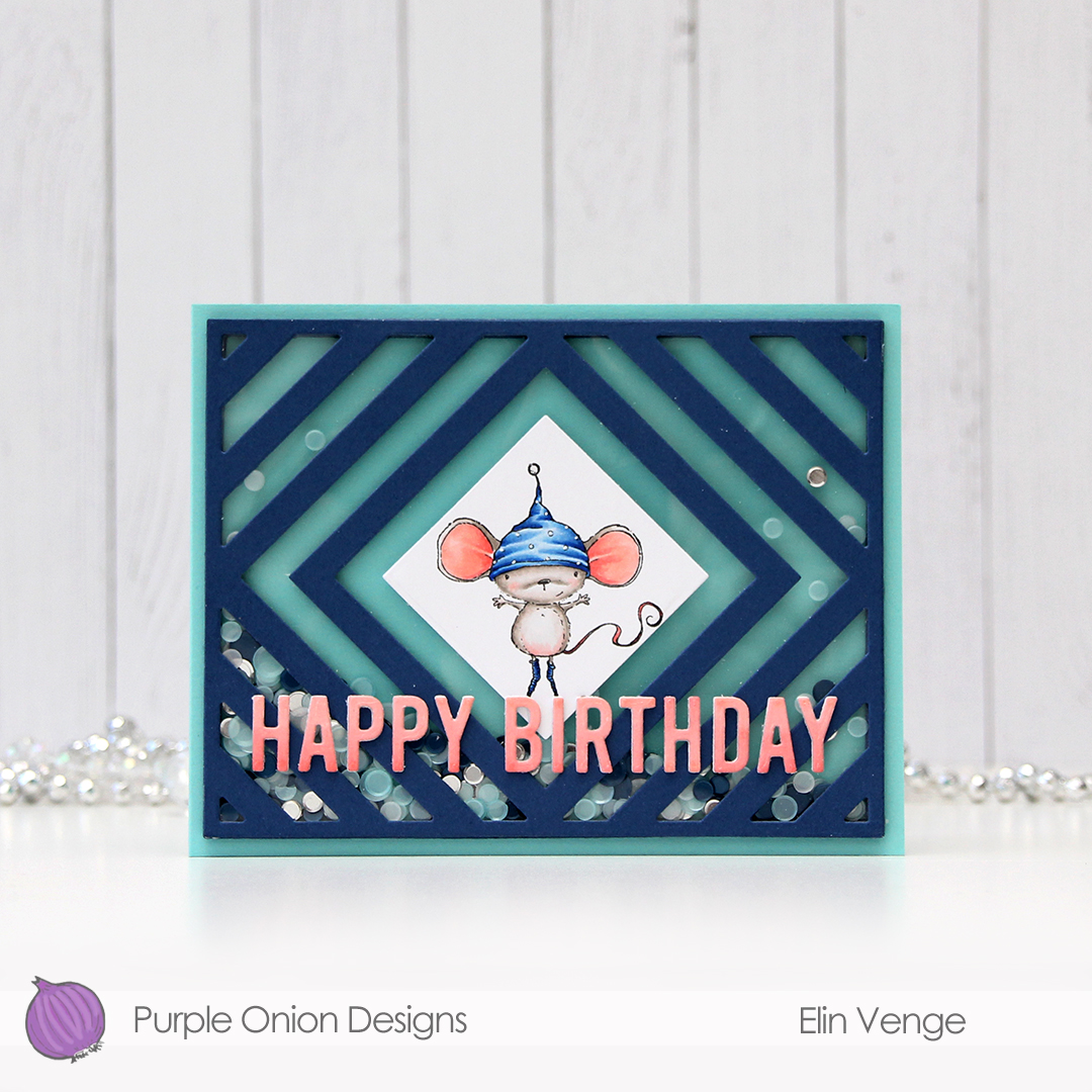 I die cut the frame five more times, cutting away the interior pieces and stacking the frames to form the walls of my shaker. The frame is quite thin, so I didn’t trust myself enough with a ruler and a craft knife to create five identical frames. Die cutting seemed safer and quicker. I’ve kept all the pieces and am planning on using them in the future for a card or two.
 There’s quite a bit of dimension in this. Card base, five layers of walls for the shaker, a piece of acetate, die cut cover frame on top, then three layers of letters. Dimension is life!
 Limited color palette with such a small image.
 I colored up the image with my Copics. Nothing unusual about that, but these blues are brighter than the ones I normally use. The colored panel was too narrow to fill the width of a regular card, so I decided to put a frame around it. I used one of the wood frame nested dies from Hero Arts to create my frame from Classic Kraft card stock from Papertrey Ink, and built up layers by adding a few more frames behind the top one. I created a card bas from Lush Lagoon card stock from Papertrey Ink, and used the By the numbers impression, also from PTI, to create a debossed look to the card base. There’s quite a bit of blue showing outside the frame, so I wanted a little bit of texture there.
 Using Limelight card stock from My Favorite Things, I die cut the number (from the By the numbers die set from Papertrey Ink) four times and stacked them for a dimensional look. I adhered the number to the frame using liquid glue, and glued a white heat embossed black sentiment strip on top, with two more layers of black card stock behind that, for even more dimension.
 I added a bunch of green enamel dots from Papirdesign, and rummaged through my old patterned paper for one I could make an envelope from. I struck gold with this green one from Pion Design from 2010. I don’t use a lot of patterned paper anymore (at least not big pieces), but I can’t exactly throw it away, either, so I figure it’s perfect to create envelopes from. This way, they get used!
 Super bright colors. Well, except for all the browns. I actually used five colors for his sheriff’s badge before I ended up with a color I liked.