Hi, crafty friends. I’m sharing a simple birthday card today, with a cutie pie bee from Amanda Jayne Designs. This is bee with balloon. I wanted to have this card ready for world bee day, but we’re way past that now. It’s still a cute birthday card, though, right?
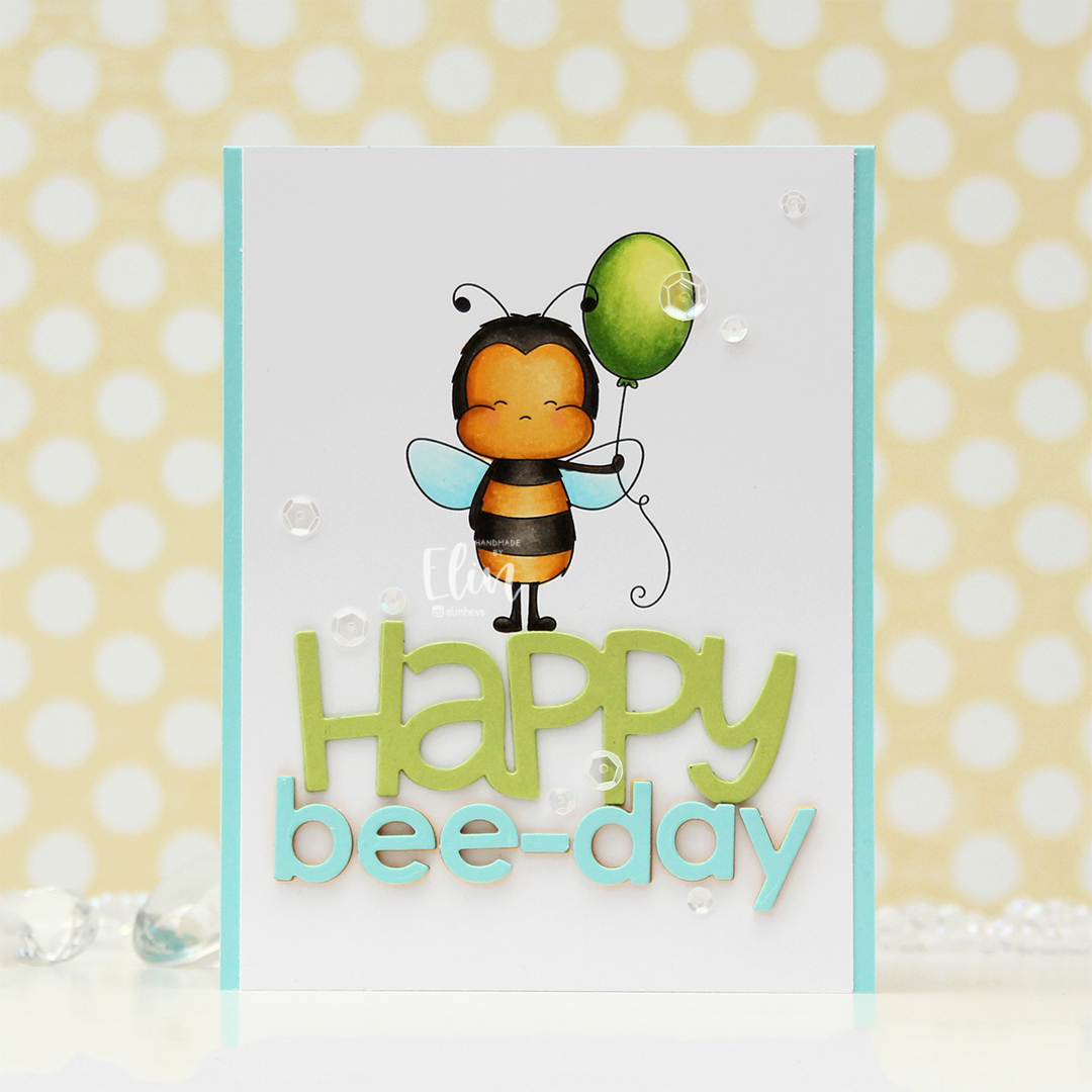 I knew I wanted a large sentiment for this card, so I printed the bee pretty much top center of a quarter sheet of X-Press It blending card, which is my preferred cardstock for Copic coloring. I’ve been using it since 2012, and in my mind, there’s no better cardstock for Copics, so it’s pretty much all I use. I colored the image with my Copics and cut off a little bit on each side of the panel before adhering it to a top fold card base I created from Summer Splash cardstock from My Favorite Things.
 I die cut HAPPY from the Big Happy Holidays die from Mama Elephant three times from Sour Apple cardstock from My Favorite Things, stacked them for a dimensional look and adhered the stacked die cut right beneath the bee’s feet. Using the Parker alphabet die set from Memory Box, I die cut the letters to spell bee-day, using an exclamation point that I trimmed down a little to create a hyphen. This word is actually multi-colored. That was not my intention, but I wasn’t happy with the color I chose initially, which was Bright Buttercup from Papertrey Ink. It’s a great color, but it wasn’t the right yellow to match my colored bee. On top of three die cuts of that, I added a layer of Honey Nut cardstock, also from Papertrey Ink. It matched my bee, but it was a little too brown for my taste, and my card felt sad. I didn’t want a sad birthday card, so I topped it with a layer of Summer Splash cardstock from My Favorite Things, which is what I used for the card base. I was much happier with this, and it matches the wings nicely.
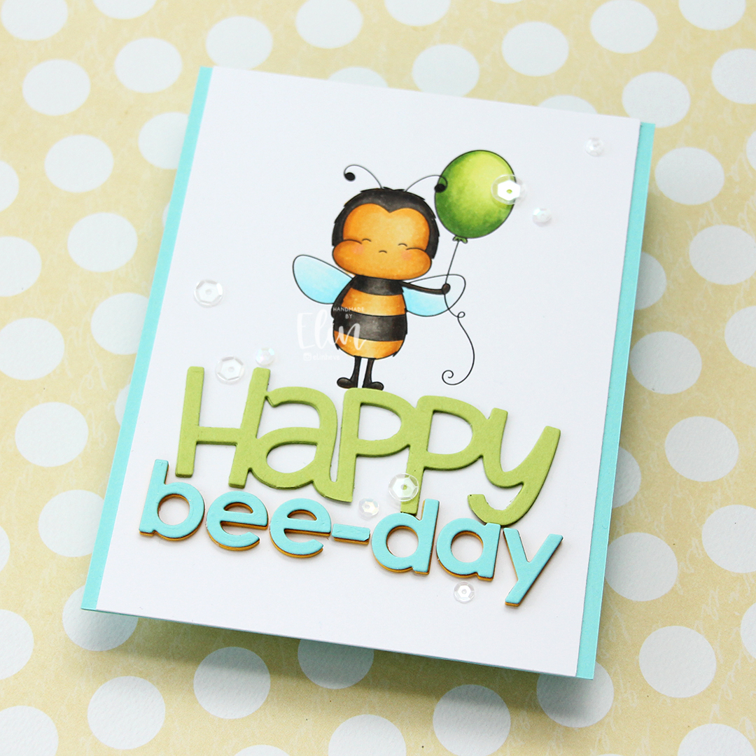 To finish off the card I added a few sequins from the Starry Night mix from Little Things from Lucy’s Cards. Here you can also see the multi-colored letters in the word bee-day, which adds another layer of interest to this fairly simple card.
 Simple color palette for this one.


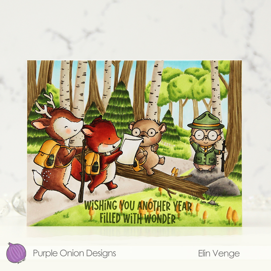
 I stamped this cute gang onto X-Press It blending card and colored them with Copics, then used the largest die in the A2 Rectangle STAX Set 2 from My Favorite Things to create my standard faux stitch edge. I stamped a sentiment from the
  I covered the critters with a mask, then used the Bokeh Elements Stencil Duo set from Waffle Flower to create some interest to the rest of the panel. I used Pistachio and Misty Sage fresh dye inks from Altenew for the green and started with Peachy Glow, also fresh ink from Altenew, for the smaller yellow dots. I suspect my stencil wasn’t clean from the last project, because the yellow seemed a bit too muddy for the look I was going for, so I went over with Scattered Straw Distress Ink, which helped. I then rotated the stencil 180 degrees and went in with Simon Hurley Solar Paste in the Golden Hour color. This paste goes on so easily and has a lot of shine. Once the paste was dry, I adhered my panel to a top fold card base I created from Sour Apple cardstock from My Favorite Things, and the card was complete.
 The solar paste adds so much shine that I decided not to add any embellishments to this card, making it very mail friendly.
 I didn’t use a ton of colors for this one.
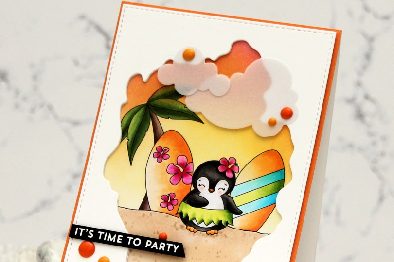
 I created my little scene with the palm tree, a couple of surfboards and a penguin. I can never resist a penguin, and this one has a hula skirt – I was sold! I colored my scene with Copics, and the plan I had initially went out the window. I was going to color the base of the surfboards in a light yellow, almost white, but then I came up with this soft orange combo and totally changed everything else to fit. Instead of a soft blue sky, I ink blended a sunset using Honeysuckle, Clementine and Buttercup inks from Concord and 9th. I then used the largest die in the A2 Stitched Rectangle STAX 1 set from My Favorite Things, along with the Watercolor Wash Free Form die, also from MFT, to create a rectangular panel with a fun window. I die cut a couple more to stack behind the front panel to create a little bit of dimension, before adhering it all to my colored image.
 I adhered a quarter sheet of Clementine cardstock from Concord & 9th directly to a top fold card base and glued my scene in the center. This created a bit of an orange border around the image. I then die cut Cloud 1 & 2 from Papertrey Ink out of Heavyweight Translucent vellum from My Favorite Things. I love die cut vellum clouds. This vellum is super thick, so the glue I put behind it doesn’t even show through, but I still placed enamel dots strategically on top. Old habit, I guess. These enamel dots are actually from a Halloween pack from Papirdesign. Onto a piece of True Black cardstock from Papertrey Ink, I stamped and white heat embossed a sentiment from the Bitty Birthday Wishes stamp set from My Favorite Things. I cut it down to a strip, added a couple of extra layers of cardstock behind it and adhered it to my card.
 I used quite a few Copics for this one.
 I’ve had this duck colored for quite a while, but sometimes, life just gets busy. I fussy cut him, leaving a white border around the edge and did the same with the butterflies and the balloon from the same stamp set. I ink blended clouds on a piece of Stamper’s Select White cardstock from Papertrey Ink using Harbor ink from Concord & 9th and the Rolling Clouds stencil from My Favorite Things. I die cut my panel using the largest die in the Blueprints 27 die set, also from MFT.
 I covered my white card base with a piece of light pink glitter cardstock from Kort & Godt. I added a few layers of cardstock behind my die cut panel to give it a little lift and adhered it in the center, before placing stacked die cut words on top. I used the Hipp hurra die set from Kort & Godt to create these, cutting four of each words from white cardstock and the top from the same pink glitter cardstock I used to cover the front of the card. I threaded black sewing thread through the balloon and the wing of the duck. I added a bow to the balloon using the same thread and mounted both the duck and the balloon onto the card using foam tape. I adhered the butterflies above the balloon, before heat embossing a sentiment from the A06 stamp set from Norsk Stempelblad AS. I cut it down to a strip, put a few additional layers of cardstock on the back of it and adhered it below my die cut sentiment, before finishing off with a few gems from the
 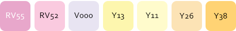 Yellows and pink and nothing else for this one.
 I stamped and masked
  Once all my coloring was complete, I stamped on top of my critters, this time using Obsidian ink from Altenew. This is a very crisp pigment ink, and it makes the critters really stand out, but it’s not Copic friendly, so all the coloring needs to be complete when doing this. To finish off, I stamped a sentiment from
  Lots of Copics for this one.
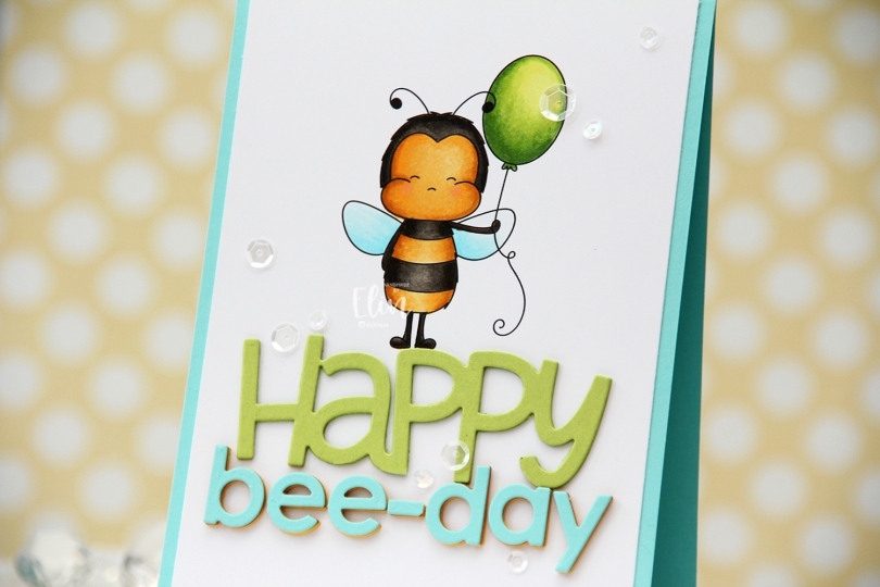
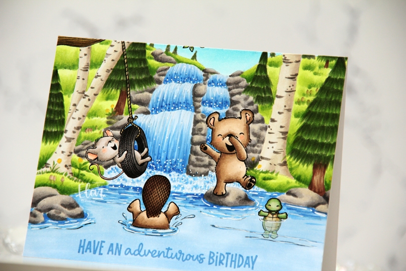
 I created a fun water scene with
  I stamped a sentiment from the coordinating
  Considering I colored the entire card front on this card, I don’t think I used too many markers.
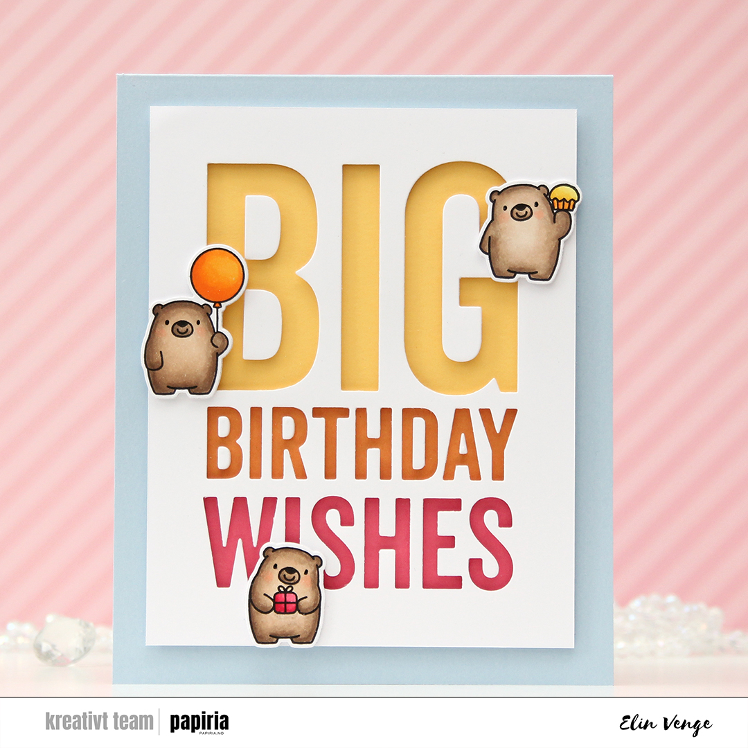 I love the super sized sentiment dies from My Favorite Things. They have several in this style, and they’re great for all sorts of techniques. Today I used the negative of the Big Birthday Wishes die, cut into X-Press It blending card. I normally use this paper for coloring only, but I wanted the white background to match the white trim on my die cut bears, which are colored on the same paper. I added foam tape to the back of my negative die cut for dimension, making sure to keep the counters so I could put them back in. I added a strip of solid colored cardstock from Concord & 9th behind each of the lines in the die cut. I used Honeysuckle at the bottom, Clementine in the center and Buttercup for the top. I then adhered everything to a card base I created from Blue Breeze cardstock from My Favorite Things.
 I stamped the bears from the Bitty Bears stamp set from My Favorite Things and colored them in with Copics and used the coordinating dies to cut them out. I added three white die cuts behind each of the bears for dimension and placed them on the card. I didn’t want to cover up too much of the letters, so I made sure to create a wide border around the die cut words. I also wanted a chunky border around the white, so this card is quite large and measures about 5 1/4 x 6 1/2″.
 At first, I wasn’t sure how to add dimension behind the small counters, especially on the triangle in the A, because it’s very very small, but I wound up putting foam tape behind some X-Press It, then die cut the letters I needed once more to get counters with dimension. It worked really well, so I’ll remember this trick in case I need to do something similar in the future.
 Yellows, oranges and pinks, just like the strips of cardstock behind the letters.
 I stamped one of the images in the stamp set using black ink and used the coordinating layering stencils to color it in. It’s no secret I’m a fan of Copic coloring, but this was soooo much faster, and maybe it’s okay to cheat a little once in a while. I used the Dried Petals set of inks for the pink in the flowers and the Forest Trail set for the green. For the yellow I used Sunflower and Buttercup inks from Concord & 9th, as I don’t have yellow inks from Altenew.
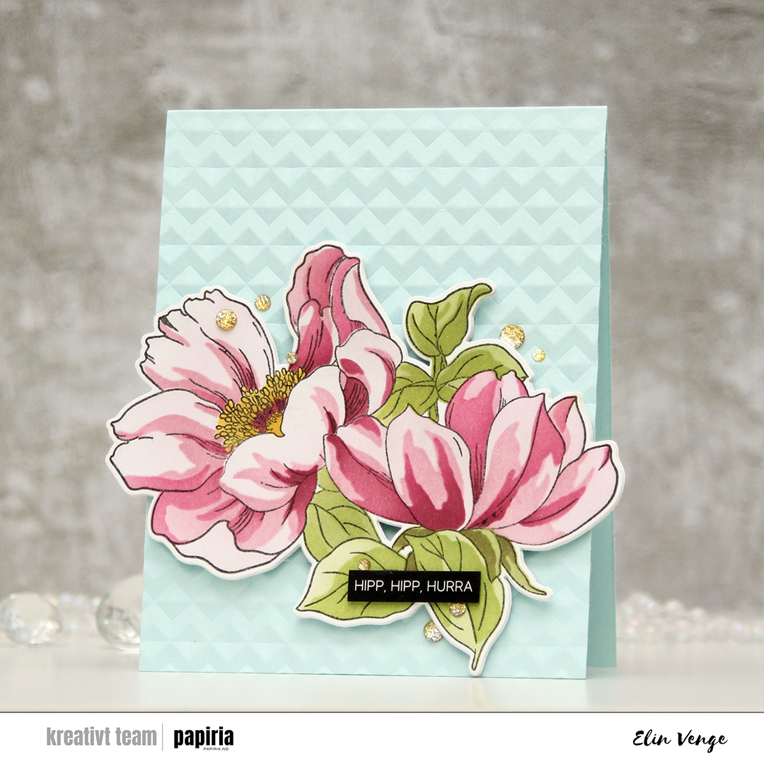 I created a card base from Sno Cone cardstock from My Favorite Things and used the Angled Mosaic 3D embossing folder from Altenew to add some texture and interest. I mounted my flowers in the bottom center using foam tape, then added a black sentiment sticker strip from Kort & Godt with a couple of layers of cardstock behind it for a little bit of lift, before finishing off the card with Sparkle & Shine ombré glitter drops from Pinkfresh Studio.
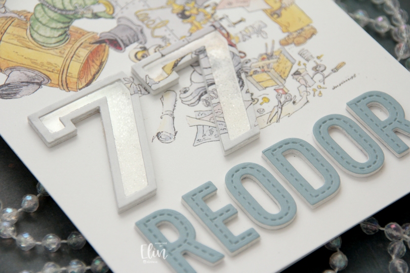
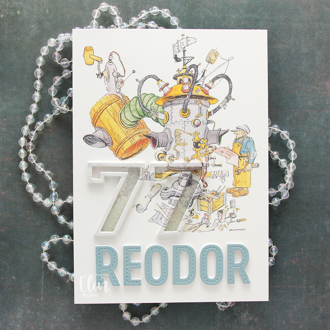 The Flåklypa universe has had a big resurgence in the past 10-15 years or so. Additional movies have come out based on the original and there’s a bit of merchandise available. I have a few calendars, and for this card, I used a calendar page with Reodor looking at his latest machine, wrench and technical drawing in hand. I sampled the color on his shirt to create a colored cardstock to match, and die cut the letters for the name Reodor using the In Stitches Alphabet die set from My Favorite Things. I die cut a few layers from white and the top layer from my custom colored cardstock and added them below the image.
 For the shaker portion of the card, I used the Outline Numbers and Solid Numbers die sets from My Favorite Things. I die cut the outline from the image as well as a few from white cardstock, and used the solid number die for the acetate. I used microbeads for shaker filler and colored the top layer with a layer of a very pale grey Copic marker to make it stand out a little against the background. The card was very well received, and my parents have actually framed it and put it on display in their dining room.