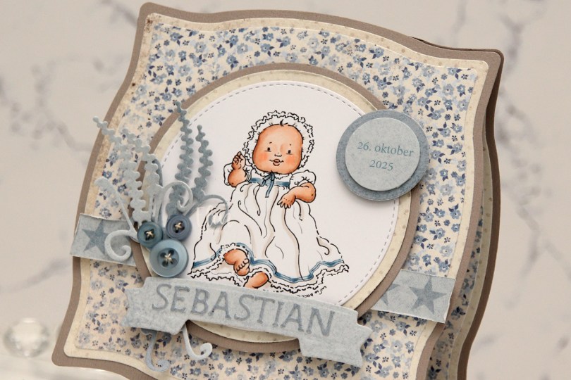
Hi, crafty friends. Today, I’m sharing a quick Christening card with Mo Manning’s Christening image. I’ve lost track of how many times I’ve used this particular image, but it’s so versatile! This image is only available in her old shop until the end of the year, so if you want it, don’t wait too long to get it.
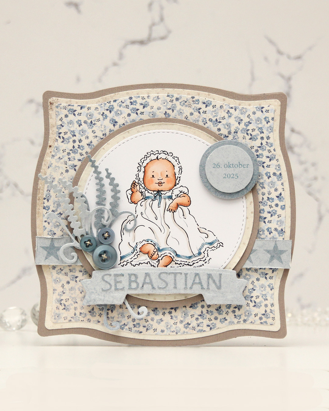 I colored the image and die cut it using one of the circle dies in the Stitched Circle STAX die set from My Favorite Things. I also die cut circles from grey cardstock and patterned paper from the Denim & Friends collection from Maja Design using the Nesting Circles die set from Lifestyle Crafts. The shape of the card is created with the Nesting Frames #8 die set from Lifestyle Crafts.
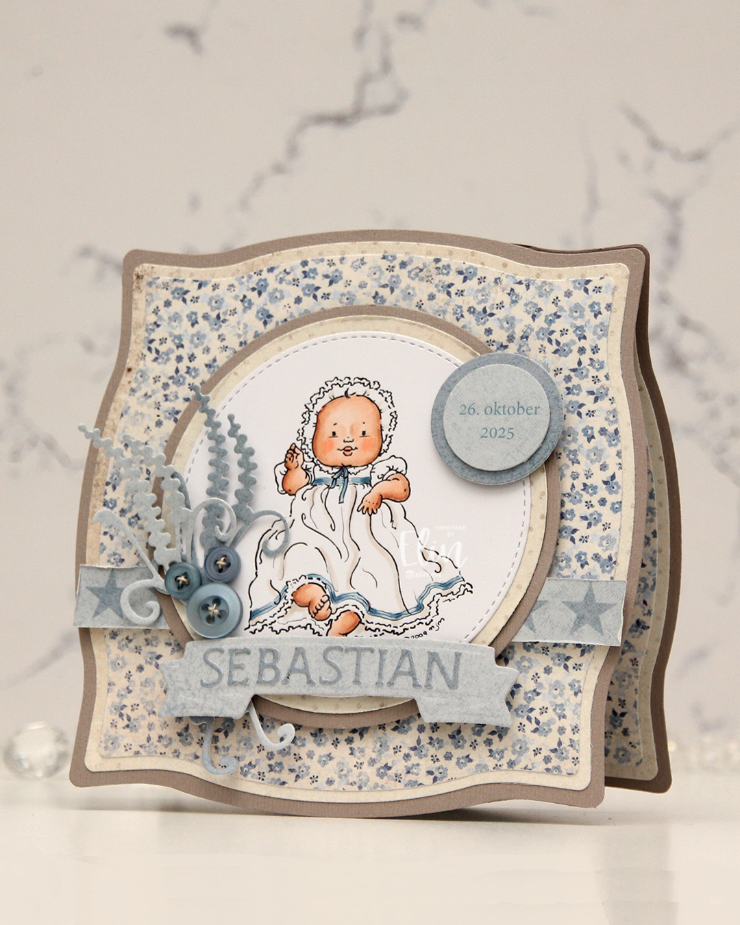 I popped some pieces up using foam tape, die cut the letters for the name using an alphabet die set from Scrapmagasinet and adhered the letters to a banner I die cut with an old die from Spellbinders. I used an old die from Marianne Design for the spriggy things on the left, and used some old Blueberry Sky buttons from Papertrey Ink to embellish.
 Very limited color palette for this one.

 I made a
  I created a shaped card using the Nesting Frames 8 die set from Lifestyle Crafts, and used a few sizes of this die for the patterned paper panels on my card, which are all created from the Vintage Spring Basics collection from Maja Design. I die cut a white doily using the English Tea Party die from Cheery Lynn, mounted it in the center of the card and added my circles on top. I die cut the letters to spell the boy’s name using Die 304 from Kort & Godt and adhered them to a strip I die cut with the Essential Stitched Sentiment Strips die set from My Favorite Things. I added some Studio Calico veneer stars to embellish and a button from Kort & Godt that I put on top of a bow I created from Chalk White seam binding which I’d colored with Copic B95 and B91. This took me back – I used to color seam binding with Copics to match my card sooo often back in the day, and it honestly made me a little nostalgic doing this.
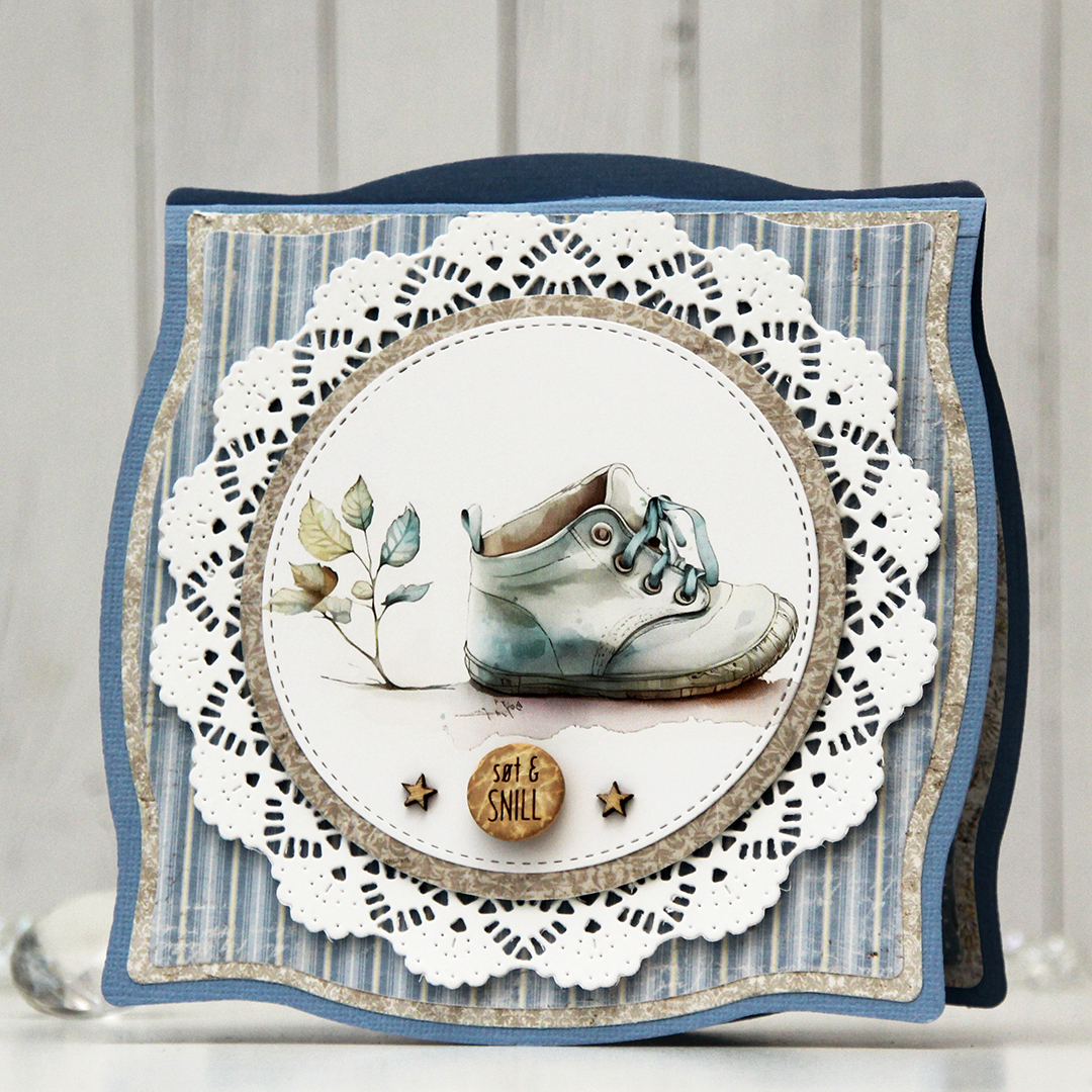 The insides of the card have the same basic layout as the front, just different patterns, and I left the stitched circles plain white for the personal message. On the back of the card, I die cut a pre printed image from Kort & Godt, found another button and added a star on each side of it to finish.
 Very limited color palette for this one, there wasn’t much to color.
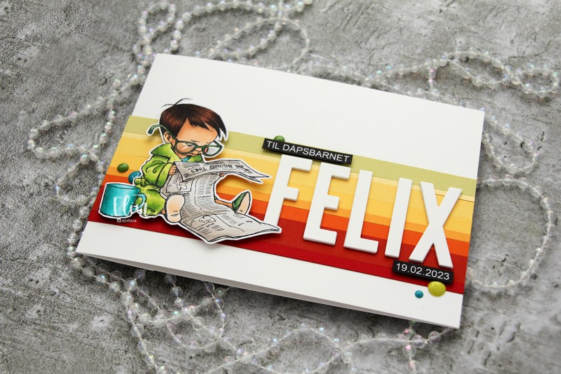
 I colored the image with My Copics and decided to fussy cut around it this time. I tend to turn my colored pieces into panels for my card and work from there, but I wanted to do something a little different today.
 I left a white border around the image to make it easier on myself. You tend to lose some of the details in the hair if you cut up close to the line, and I wanted to keep the hair intact. I also added Glossy Accents to his glasses for shine and a touch of dimension.
 I wanted to include his name on the card, but had printed my image fairly large. My solution was to make a landscape A7 card (7×5″). I rarely make landscape cards (trickier to photograph) and the same goes for A7, but it’s fun to shake things up. I also shook things up by adding cardstock strips going across the card. I tried with cool colors first, but the image got lost, so I went through my solid colors of cardstock again and made a version with warm tones. From top to bottom they are:
 I used the Impact Alphabet die set from My Favorite Things to spell the name. I die cut four of each letter and stacked them for a dimensional look, gluing them right onto the stripped background, before adding the sentiment and date in white on black.
 I mounted the image on foam tape and added a few enamel dots from Altenew (teal dots from the Cool Summer Night pack) and Papirdesign to finish the card.


 I used flowers from different companies (I honestly don’t know where these are from, I’ve had them for 10+ years, but I’m thinking most of these are from Wild Orchid Crafts. The ruffled roses are really old ones from Kort & Godt, and I think the teal ones might be from I am roses, though I’m not entirely sure), removed the yellow centers from the teal ones and replaced them with white pearls from Papirdesign.
 Both insides share the same layout, and so does the back. I printed a sentiment to go on the back, as well as the date, and a few more flowers. These cards that I make with decorations on all four sides are thick, flowers add a ton of dimension. I used old patterned paper from Maja Design for this card. The Vintage Spring Basics collection and the Vintage Summer Basics collection are both collections that Maja Design released over 10 years ago. Back then, I used plenty of patterned paper, and especially Maja Design. Their paper is such good quality, and I love their use of pattern and color. My style has changed considerably, and I rarely use large pieces of patterned paper anymore, but I still have a lot, and Maja Design is still a favorite.
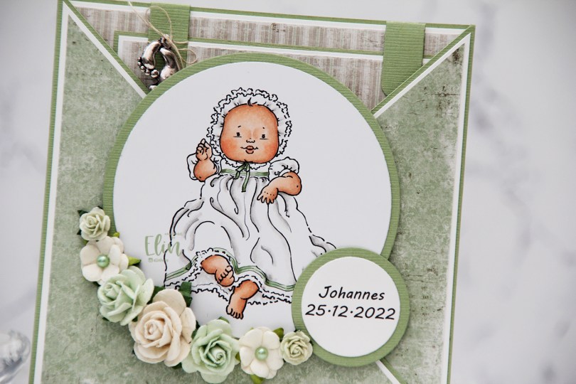
 This
This  I colored the image with Copics and used patterned paper from Maja Design to create this criss cross card. I added some flowers, a few pearls and also a charm to the large square tag I put inside, which has plenty of room for a personal message.
 On the back I put an additional sentiment, and the card was complete. Easy peasy.
 Simple color palette, not a whole lot of Copics.
 This
This  I used 3 different collections of patterned paper from Maja Design for this card. One of the benefits of using their papers is that their collections usually match pretty well. Vintage Basics Summer, Vintage Baby and Sofiero are the collections I used for this card, and they all match. I used older dies from Lifestyle Crafts, Cottage Cutz, Scrapmagasinet, Marianne Design and Spellbinders, as well as flowers from Wild Orchid Crafts and Papirdesign.
 The insides of the card have a very similar layout, and so does the back. Onto a white circular panel, I stamped a christening stamp from North Star Design using Soft Granite ink from Hero Arts.
 The card was too thick to fit inside a regular envelope, so I created a box envelope using a punch board from We R Memory Keepers. Onto a diecut eyelet circle I stamped a Norsk Stempelblad AS sentiment and adhered it to the box envelope.
 This image is so quick to color and doesn’t require a ton of markers. Easy peasy!
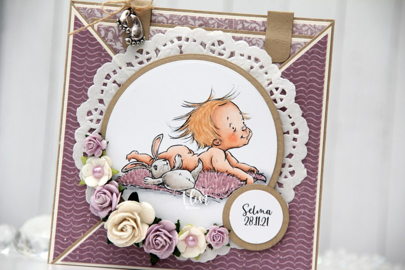
 This card was created for a little girl whose christening was this past Sunday. I think the
  I die cut the image using a circle die from Lifestyle Crafts and matted it with kraft cardstock. I also printed the name and date on a piece of white cardstock that I also matted with kraft. I put a doily from Helz Cuppelditch behind my image and added flowers using a hot glue gun. I took out the yellow centers of two of the flowers and replaced them with Lavender pearls from Kaisercraft.
 On the inside tag I added a circle diecut made from white cardstock for a space to write a personal message. I used the Labels Trio die set from Spellbinders to create two “handles” from kraft cardstock. I tied a bow and attached a charm to one of them for a little added interest.
 On the back of the card I stamped a sentiment from North Star Design using Amethyst ink from Altenew.
 The card isn’t very big, it only measures 5×5″, but it’s quite dimensional and doesn’t fit in a regular envelope, so I decided it was best to create a box envelope.
 I rummaged through my 12×12″ cardstock and found a color that matched pretty well, and used my Envelope Punch Board from We R Memory Keepers to create the box. I added another Helz Cuppelditch doily for cohesion, as well as more of the patterned paper that I die cut using the Impact alphabet die set from My Favorite Things.
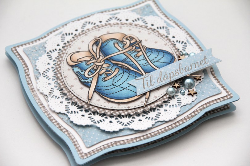
 Jeg har stemplet et motiv med barnesko fra North Star Design og fargelagt. Jeg syns barnesko gjør seg så bra på dåpskort. Jeg har klippet rundt motivet og limt det med lave 3D-puterer på et av mønsterarkene mine fra Maja Design. Jeg har brukt ark fra flere forskjellige kolleksjoner på dette kortet. Noe av det som er så bra med arkene til Maja Design er at de kan brukes på tvers av kolleksjoner, men likevel harmonerer de.
 Selv om kortet er lag på lag er det ganske enkelt, alt er bare stanset ut og limt oppå hverandre, noe med dimensjon. Teksten fra North Star Design har jeg stemplet på et utstanset banner i en farge som matcher det brune i arkene. Jeg har pyntet meget enkelt med finérstjerner fra Studio Calico og perler fra FabScraps.
 Her kommer dimensjonen bedre frem. Lave og høye 3D-puter er brukt om hverandre for å gi ulike høyder opp fra lagene under.
 Innsidene har det samme oppsettet. Her har jeg brukt en die fra Papirdesign til å stanse ut en dekorativ slisse i den hvite kartongen for å lage plass til penger. Jeg har stemplet et bakgrunnsstempel fra NSD på den hvite sirkelen, og limt navnet på dåpsbarnet over med utstansede bokstaver av mønsterark. Den andre innsiden er lik, men der er den hvite kartongsirkelen beregnet til å skrive personlig hilsen på.
 På baksiden av kortet har jeg stemplet en tekst på det hvite panelet og brukt den lille varianten av skoene som pynt.
 Kortet er såpass tykt at det ikke får plass i en vanlig konvolutt. Jeg har derfor laget min egen. Jeg har brukt minivarianten av skoene også her, og rammet dem inn ved hjelp av en polaroidramme stanset ut med en die fra My Favorite Things.

 Jeg stanset ut motivet mitt med en die fra Spellbinders og satte på en perlebord fra Wild Orchid Crafts på innsiden av kanten. Pyntet med blomster fra WOC og Kort & Godt, i tillegg til knapper fra Papertrey Ink malt med bittelitt gesso. I midten av de hvite sweetheartblomstene har jeg satt blå diamanter fra Kort & Godt, og i midten av den blå har jeg limt på en liten hvit perle.
 Bak motivet har jeg gjemt en tag stanset ut med en die fra Magnolia. Jeg har satt en sløyfe med knapp i enden, og stemplet en tekst fra North Star Design på tagen med blekk fra Papertrey Ink. Bokstavene i navnet til dåpsbarnet er stanset ut i Maja Design papir med en Sizzix-die.
 Kantdieen jeg har brukt for å lage stjerneborden som går på tvers av kortet kommer også fra Magnolia, det samme gjør hjerteswirlen jeg har lagt under blomstene mine.
 På innsidene har jeg to identiske skrivefelt laget med den samme dieen som jeg brukte på forsiden til motivet mitt. Det gir en fin helhet til kortet. Den andre innsiden er lik denne. Veldig greit med ekstra god skriveplass på dåpskort, dåpsbarnet har jo hele livet foran seg.
 Baksiden har det samme oppsettet, en tekst fra NSD og enda flere blomster.
 Her syns relativt godt at det er en god del dimensjon på kortet. Spesielt postgangvennlig er det ikke, men dåpskort blir gjerne håndlevert, så jeg syns likevel det er innafor med såpass dimensjon.
 Siden kortet ikke fikk plass i en vanlig konvolutt lagde jeg en eske til å ha det i. En liten diecut med stemplet tekst får pryde utsiden av esken.
 I’ve gone with a tried and true layout on my card. I didn’t have a whole lot of time to make this, so I needed to not reinvent the wheel. I colored up my image with Copics and used patterned papers from the Vintage Baby collection by Maja Design.
 I embellished with blue and white flowers and rose buds, along with a few Kort & Godt diamonds scattered around my flower clusters. I diecut the letters in the little boy’s name twice and stacked them for a little bit of dimension. I added the letters to a fishtail banner in the perfect size.
 I stamped a North Star Design sentiment on the back of the card using Papertrey Ink Blueberry Sky ink.