Hi, crafty friends! I’m sharing a sweet holiday card today, made with images from the Whispering Pines collection from Purple Onion Designs, illustrated beautifully by Stacey Yacula.

I started by stamping Murphy (squirrel), put a mask on top, then Frosty & Sweet Pea, put another mask on top, then the little deer from the Doe & Hart set, placed a third mask and stamped the Little Pines at the very back. I did all the stamping with Extreme Black in from My Favorite Things onto X-Press It blending card, which is what I pretty much always use for Copic coloring.
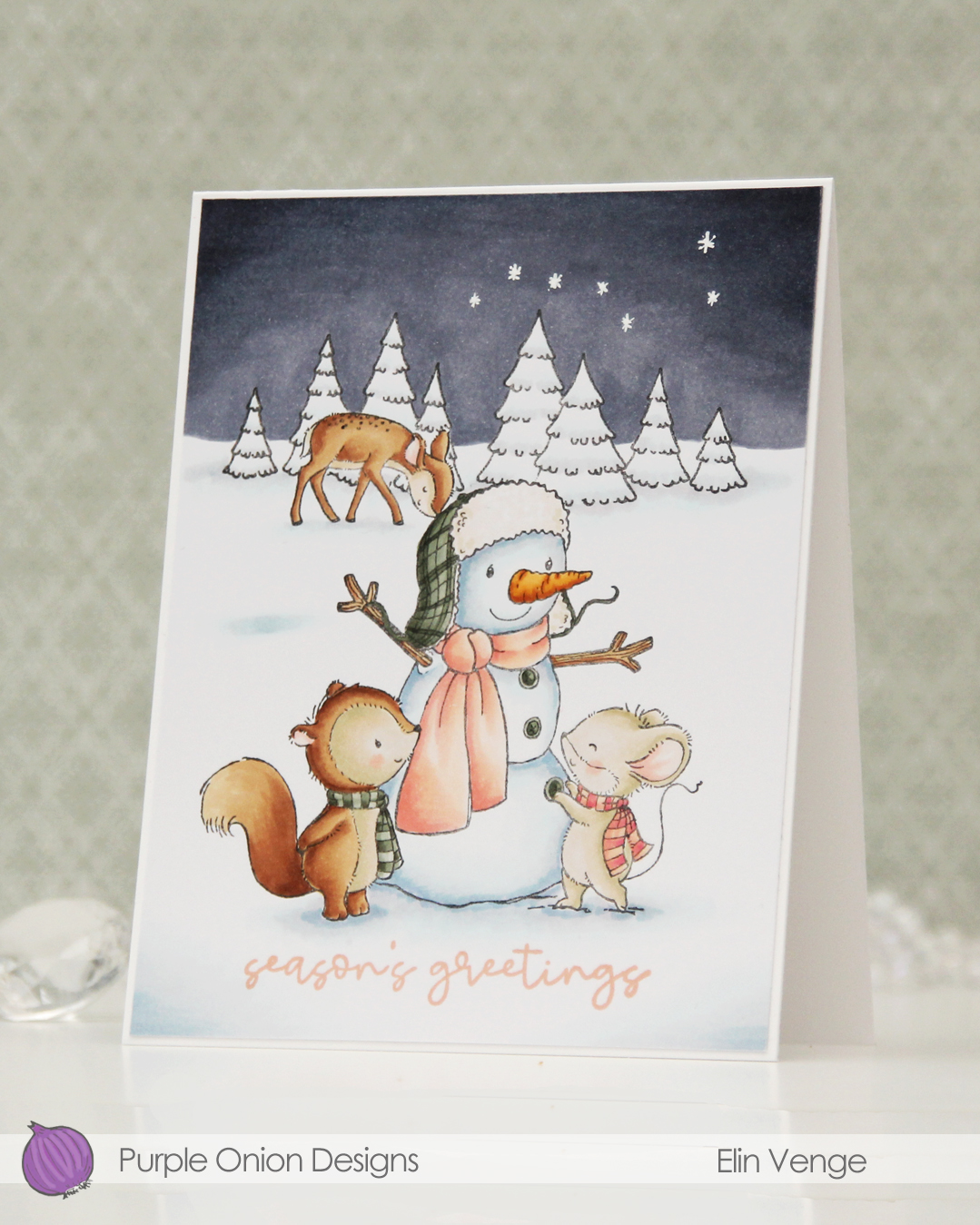 Once I removed the masks, I could color in my scene. I always start with the background elements before coloring in the focal point. I wanted a very wintery card, so I kept the trees pretty much white, only adding a little bit of the blues I used for the rest of the snow to make them look less flat.
 I stamped a sentiment from the Classic Holiday Trio stamp set using Grapefruit ink from Concord & 9th, which perfectly matches the peach tones in my coloring.
 I cut my panel down to 4 1/2 x 5 3/8″, which gave me an even 1/16″ border around the edge when I adhered it to my A2 card base. I love a think border like this. I also love a very chunky border, usually when I mount my panels with foam tape. To me, it seems silly to add foam tape to a panel that goes close to the edge of the card, but with a wide border, it really makes an impact. I finished off the card by drawing in the Big Dipper stars using an extra fine point Sharpie paint marker.
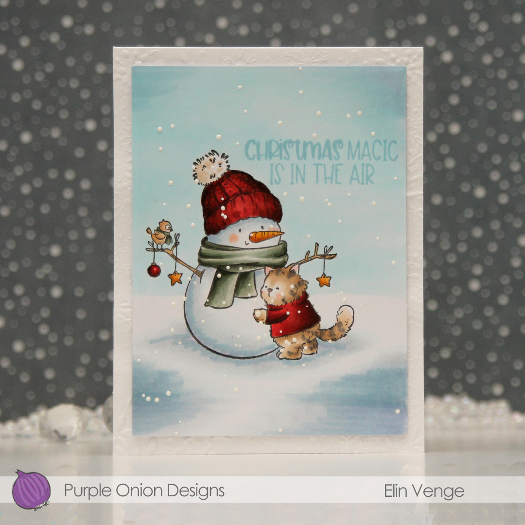
 Not a whole lot of markers used for this one, actually. Although I see that I missed the colors I used (BV29, 25, 23) for the sky in this graphic.

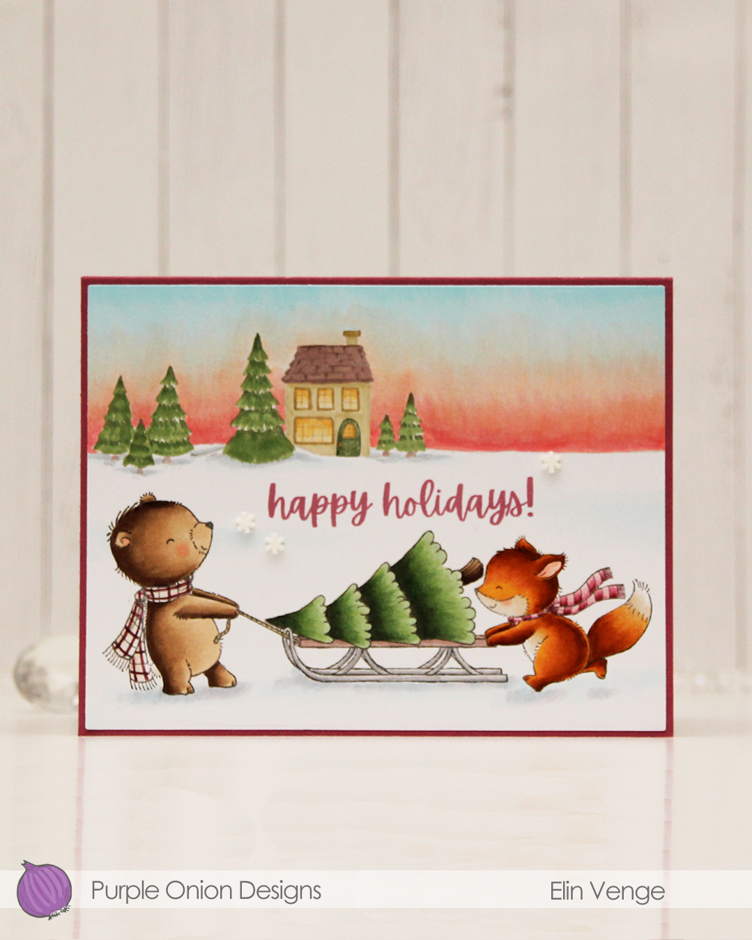 I colored these cuties with my Copics and did the same with Home Sweet Home that I used in the background. I stamped a sentiment from the Merriest City sentiment set using Autumn Rose ink from Papertrey ink. It fits well nestled into the scene.
 I used the Additional A2 Layers die set from Waffle Flower to cut my panel down slightly, then adhered it to a card base I created from Autumn Rose cardstock from Papertrey Ink, before I added a few snowdrift sprinkles from Little Things from Lucy’s Cards.
 Lots of Copics for this one. I even created a new combo for the fox which requires less markers than the one I used to use.
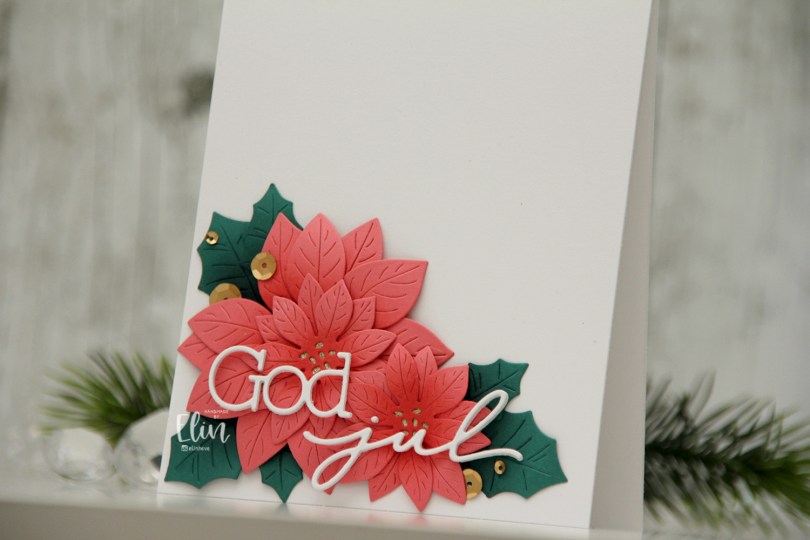
 I actually shared this one on the Papiria blog back in December, but I thought I’d share here, as well. I die cut the parts for the florals from Watermelon cardstock and the leaves from Juniper cardstock, both are C9 colors. I ink blended the petals with Watermelon ink and the leaves with Rainforest ink, which is a darker green than the Juniper color. I curled all the petals and leaves back before assembly, and adhered them all to a white card base. I used gold glitter cardstock from Kort & Godt for the centers of the flowers.
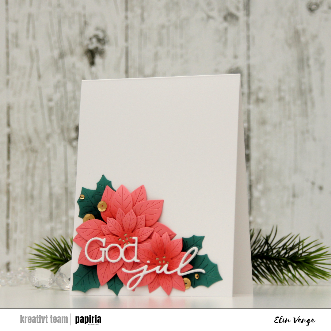 I used a die set from Kort & Godt to create my sentiment. I stacked three of each die cut and used liquid glue to adhere the sentiment to the florals, before finishing off the card with Satin Gold sequins from Altenew. Super simple, and I love all the white space!!
 I colored the bear with Copics and used the Snowflakes and Ornament die set from Hero Arts to turn him into a Christmas ornament. Isn’t he adorable with his head tilted to the side? I covered the card base with a piece of Cranberry cardstock from Concord & 9th. This is the perfect Christmas red, and it goes really well with the colors on his hat, as well as the color I chose for the
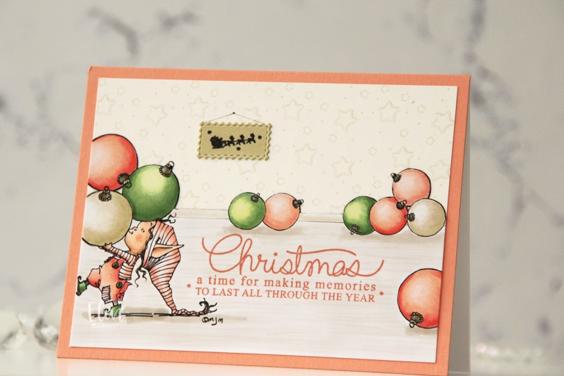
 I separated out the baubles from the image and did some copy paste work to create my scene. It’s one of the advantages of using digital stamps, and it makes them super versatile. I drew in a base board at the back with a black Copic multiliner and colored my scene.
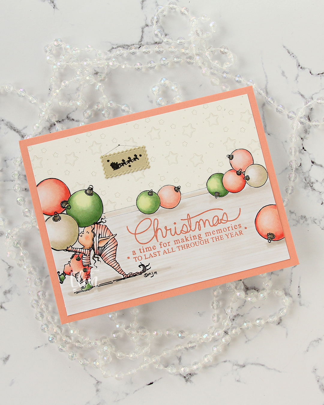 I fussy cut around the back bauble and base board and adhered my colored piece onto a piece of patterned paper from ModaScrap that acts as a wall paper for my background. To make it even more obvious that it’s supposed to be a wall, I stamped part of the Window Signs image from Purple Onion Designs using Altenew Obsidian ink onto a scrap piece of X-Press It blending card that I’d colored with one of the neutral colors (E81) I used for my baubles. I then die cut that using the Postage Collage Die set from Waffle Flower and adhered it to my wall, drawing in strings and a nail on the wall for it to hang from.
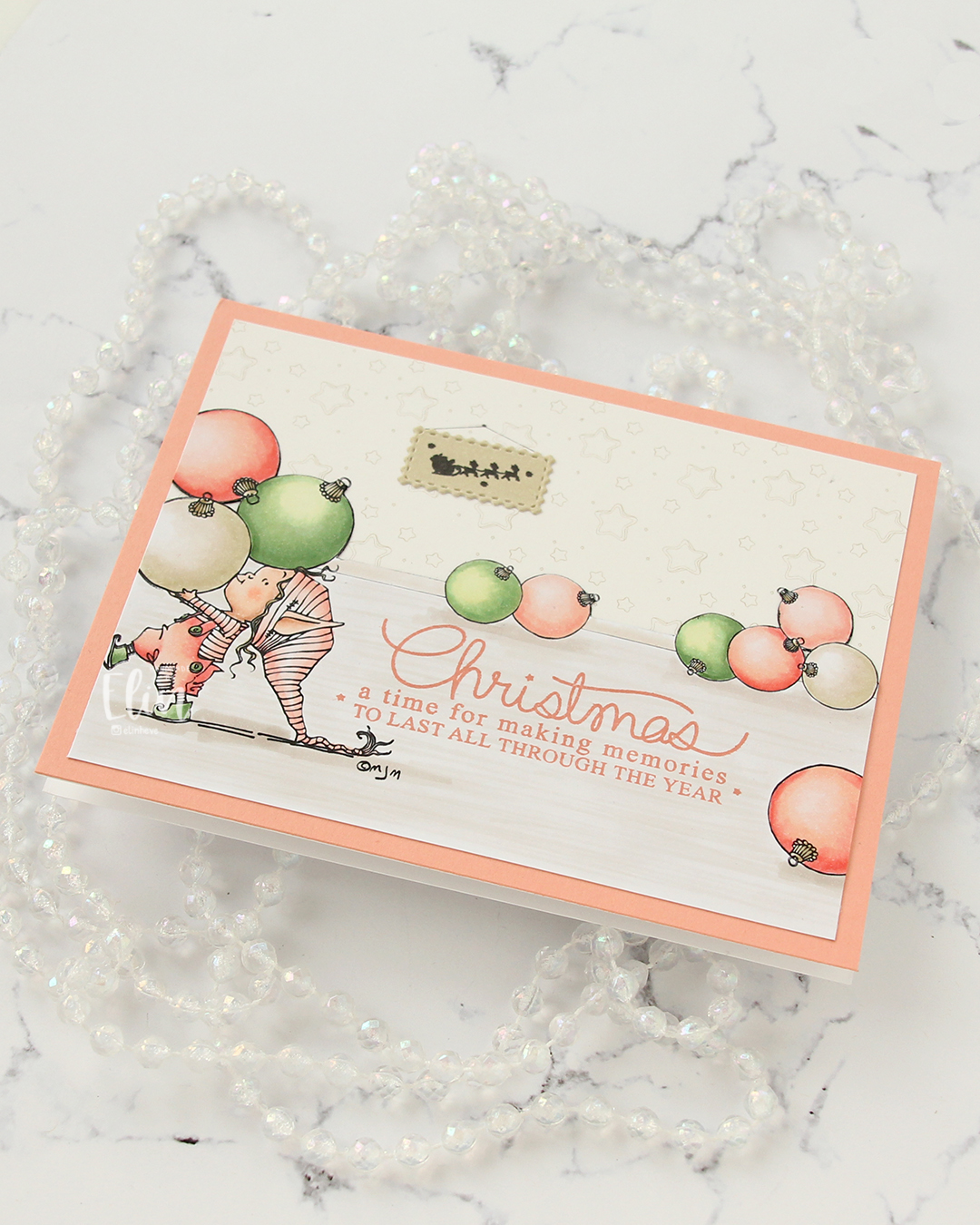 I stamped a sentiment from the Merry Greetings stamp set from Mama Elephant using Melon Berry ink from Papertrey Ink. It matches really well with the coloring. I adhered my scene to a card base covered with a quarter sheet of Grapefruit cardstock from Concord & 9th to create a matching frame and my card was finished.
 Limited Copic color palette for this one. I also used W3, W1 and W0, but I see now that I cut my graphic off too short, so they’re missing here.
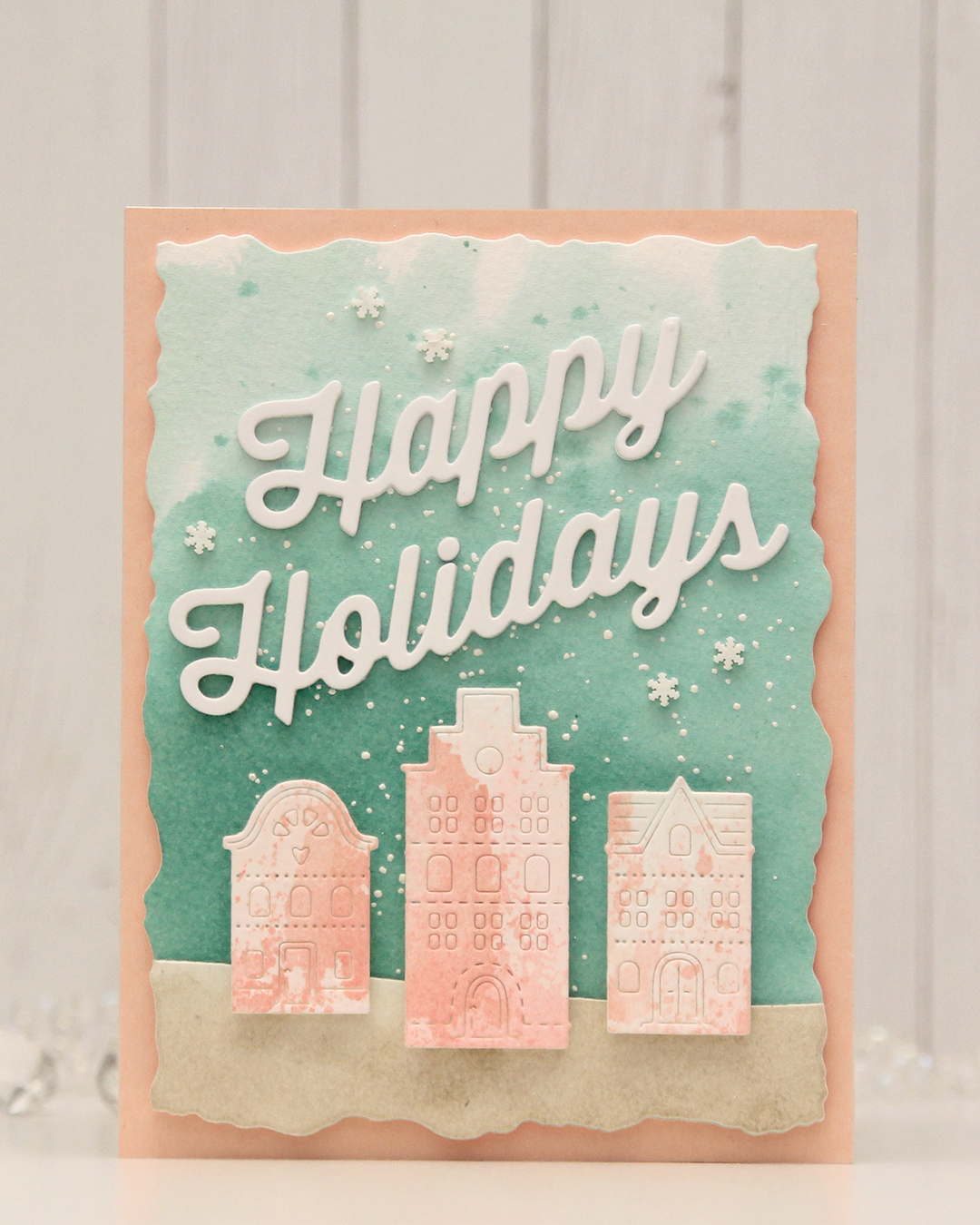 For this card, I really tried. I chose a color combo of Pebble, Ballet Slipper, Brickyard, Cranberry, Cobblestone and Tidepool from C9. I wanted to focus on Ballet Slipper, Cranberry and Tidepool for the Gummiapan diecut houses, but Tidepool and Ballet Slipper created mud when they mixed, while ink smooshed Cranberry looked like an episode of Dexter. I switched gears and ink smooshed Ballet Slipper on its own on watercolor paper. When it dried it looked like Grapefruit. So much for not using peach tones. I watercolored a background using Tidepool reinker and did the same with Pebble reinker on a separate piece of watercolor paper. Once dry, I die cut the Pebble piece with a curved landscape die from the Slim Card Basics die set from Mama Elephant, then layered the two pieces together and die cut them using the largest die in the Watercolor Rectangle STAX die set from My Favorite Things.
 I sprinkled on Chunky white embossing enamel from Stampendous onto the background, heat set it so the granules melted to look like snow, adhered the slope with 1 mm foam squares and mounted the entire panel onto a card base that I covered with a piece of Nectar cardstock from Concord & 9th. I tried Grapefruit first, but felt it was too dark against the background. I mounted the houses using foam tape, die cut and stacked four layers of Happy Holidays from the Jolly Holidays Greetings die set from Concord & 9th and adhered the greeting at an angle above the houses, before finishing off with Snowdrift Sprinkles from Little Things from Lucy’s Cards.

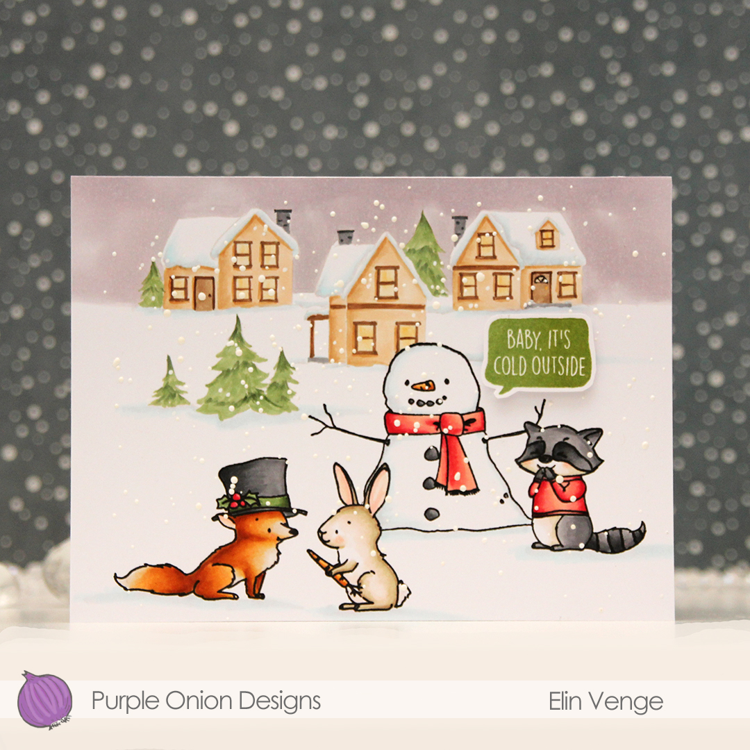 These images in this scene are all from the Winterwood collection from Purple Onion Designs, illustrated by Holly Mabutas. We have
  I colored the scene with Copics, then stamped the critters and the snowman again, this time using Obsidian ink from Altenew to get crisp black lines. This is a pigment ink, which doesn’t play nice with Copics, but as long as the coloring’s already complete, using this ink is totally fine. I sprinkled on Chunky White embossing enamel from Stampendous, melted the granules from the back of the paper and finished off the card with a sentiment from the
  Not a whole lot of colors used given the large scene, but I did use 7 for the fox alone. But he came out so cute, it was totally worth it!
 I love Stacey’s images, they all work so well together to tell stories. I colored my scene with Copics and cut my panel down ever so slightly.
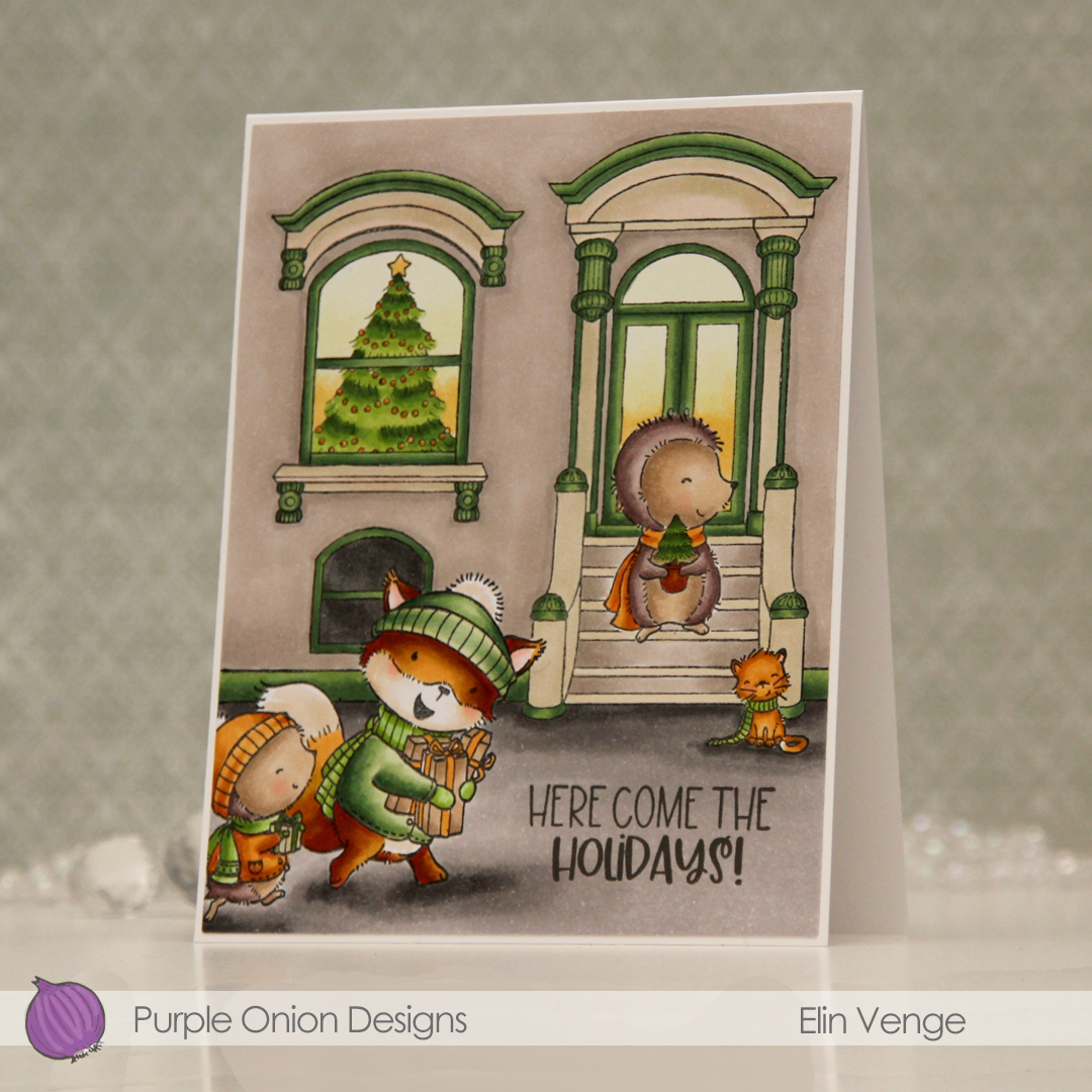 I stamped a sentiment from the
  Even with a fairly limited color palette on the card, I used quite a few Copics.
 i colored the scene with Copics, before using a die in the Additional A2 Layers die set from Waffle Flower to trim down my panel. I stamped a sentiment from the
  I used the Snowflake Oval Frame embossing folder from Simon Says Stamp to create some texture on a panel of white cardstock which I adhered directly to a top fold card base, before mounting the panel on foam tape to finish the card. Super simple, right?
 A lot of Copics for this one.
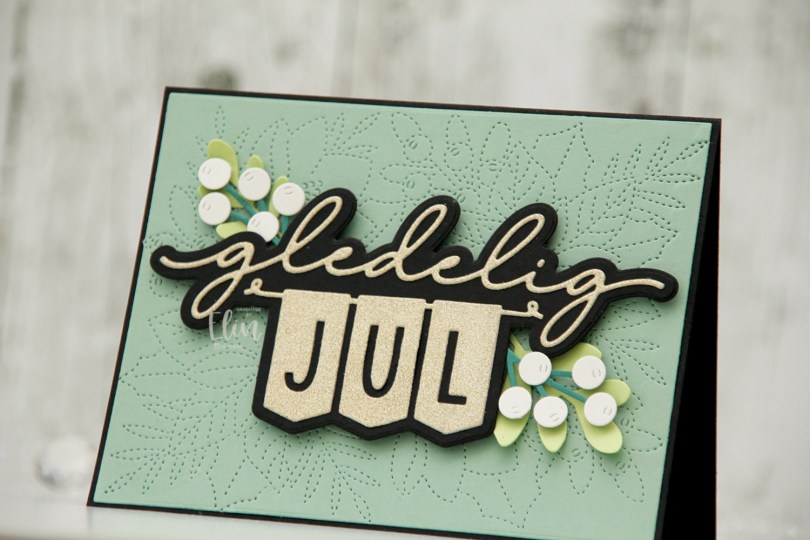
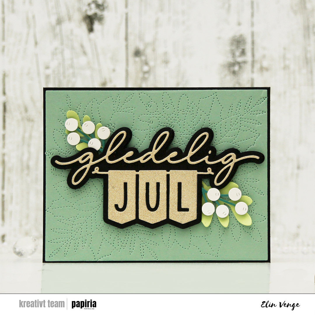 I started by die cutting the sentiment. I cut the shadow layer from True Black cardstock from Papertrey Ink and the top layer from gold glitter cardstock from Kort & Godt. I love their glitter cardstock, it’s so smooth and nothing rubs off. I used the largest die in the Additional A2 Layers die set from Waffle Flower on a piece of Eucalyptus cardstock from Concord & 9th, before using the faux stitch die in the Festive Blooms die set from Concord & 9th to dry emboss the panel, which I then adhered to my black card base. I love that there’s a tiny little black border.
 I die cut leaves and sprigs from the Festive Blooms die set and the Joyful Season die set (also from Concord & 9th) to frame my sentiment. I used Sprout and Juniper cardstocks from Concord & 9th for the leaves and sprigs, and a little bit of Rustic White cardstock from Papertrey Ink for the berries. I curled up the ends of the leaves, added foam tape on the back of the berries and adhered it all to flank my popped up sentiment. There you have it, a Christmas card with what I believe to be a very modern palette.