Hi, crafty friends. I’m back with another holiday card. This cold, wet weather we’ve been having this summer is perfect for creative sessions in the craft room, and I gravitate towards holiday cards for some reason. I shared this card over on Mo’s Dream Team blog yesterday, but thought I’d share here, too.
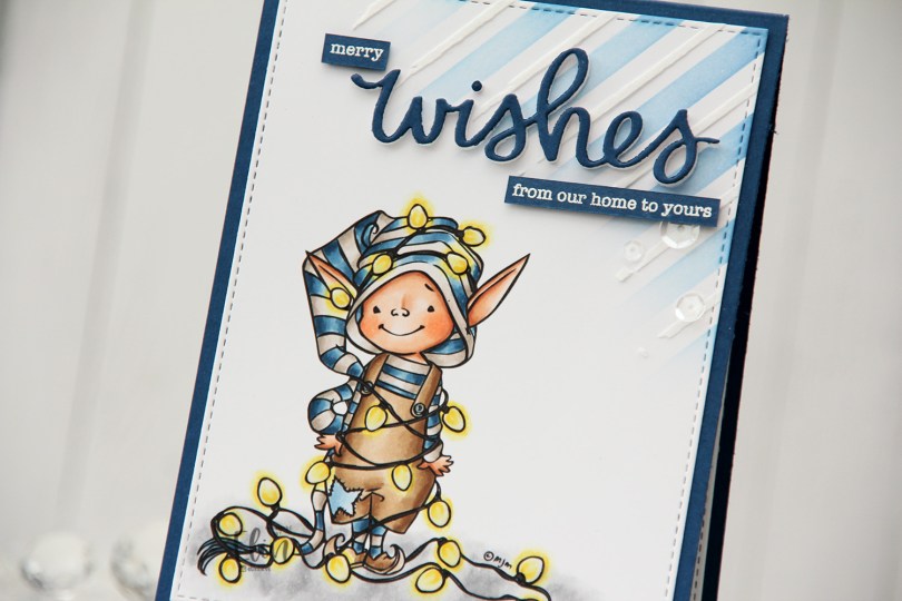
 Little Elf Tippi is one of my favorites from Mo. I have lots of favorites from her images, I love her style so much. This one won me over as soon as I saw it, and I’ve made a card with it (this one) previously.
 I had to go for my traditional Christmas colors for this one with blue, brown and grey, it’s such a good combo. I made all the lights the same color. I know some people prefer the differently colored lights, but as a Scandinavian minimalist, my color palette for Christmas is very toned down, including my Christmas lights, which are all white.
 Once I’d colored my image, I used the largest die in the Stitched Rectangles STAX 2 set from My Favorite Things to create a faux stitch border around my panel. I then took the Plaid builder stencil set from My Favorite Things and ink blended using Blue Yonder ink from My Favorite Things in the top right corner with the stencil with the wide stripes. On top of the stencil with the smaller stripes, I used Light & Fluffy Modeling Paste from The Crafter’s Workshop for a little bit of added dimension and interest to the background.
 I adhered my panel to an A2 top fold card base I created from Enchanted Evening cardstock from Papertrey Ink. Using the scripty wishes die from Mama Elephant, I die cut three layers of white and one blue on top for a stacked look and adhered it on top of my stenciled background. I also stamped and white heat embossed a couple of sentiments from the Holiday messages stamp set from Mama Elephant to add to the wishes to make my sentiment complete. I cut them down to strips and added a few layers of cardstock behind each of them for dimension, before finishing off the card with a few sequins from the Starry Night mix from Little Things from Lucy’s Cards, as well as Glossy Accents for the lightbulbs.
 I love the glow and shine from the lightbulbs.
 Fairly simple color palette for this one.

 I started by stamping this bird on a piece of X-Press It blending card using Extreme Black ink from My Favorite Things. I colored the bird to look like a bullfinch using my Copics. In this little corner of the world, no bird says Christmas like a bullfinch. Once I finished my coloring, I stamped on top of my initial stamping, this time using Obsidian ink from Altenew to get really crisp lines. I love how crisp this ink is. It’s not compatible with Copics, so I need to stamp after my coloring’s complete, but that’s not a problem with a stamp positioning tool.
 Onto a piece of Classic Kraft cardstock from Papertrey Ink, I stamped a few branches using Classic Kraft ink for a soft backdrop for my sentiment, which I stamped in Dark Chocolate ink, also from Papertrey Ink. I popped up the 3 1/2″ wide kraft panel in the center of a top fold white cardbase using foam tape, added foam tape behind my die cut image and placed it near the top center of the card, before finishing off with a gold heart for a little bit of embellishment.
 Simple color palette for this image.
 The cold weather’s been perfect for Christmas in July, though, and this
  I colored both the penguin and the letters with Copics and fussy cut them. I left a white border around the penguin, but cut the letters up to the black lines.
 I created a circular card base from Stamper’s Select White cardstock from Papertrey Ink, and added a circle on top that I created from Sno Cone cardstock from My Favorite Things. I dry embossed the Magic Snow Cover die from Mama Elephant onto the colored cardstock for a little bit of added interest in the background, before mounting the penguin in the center of the card and adding the letters around him.
 To finish off the card I added a few Snowdrift sprinkles from Little Things from Lucy’s Cards to the letters. I tried using pearls first, but these worked better with the card. She’s stopped selling these clay sprinkles, so I kind of hoard the ones I have.
 Hot pink and orange/yellow/gold. It’s not a Christmas color palette you see every day, and when I did the actual coloring, I wasn’t sold on this. I wasn’t sold when the card was done, either, but it’s grown on me, and I’m now in a place where I like it. That might change again, though, ask me tomorrow 😉
 I printed the image on the bottom half of a quarter sheet of X-Press It blending card, did my coloring, then used the Basket Weave stencil from My Favorite Things to add a little bit of interest to the panel. Above the image, I used Puffy Heart and Rose Quartz inks from Altenew, underneath the image I used Scattered Straw Distress Ink. I trimmed off 1/4″ on each side and mounted it with foam tape onto a card base I created from Ripe Raspberry cardstock from My Favorite Things.
 I added black glaze to the eyes for some shine and Glossy Accents to the lightbulbs, before stamping and white heat embossing a sentiment from the Holiday Messages stamp set from Mama Elephant onto a scrap piece of pink cardstock. I cut the sentiment down to a strip, added a few more layers behind it and added it to my card, before finishing off with a few gold jewels from the Fesitivities mix from Little Things from Lucy’s Cards.
 The Glaze, Glossy Accents, sub sentiment and gems all work together to add interest to what is otherwise a very simple card.
 I decided to use the macaron from the stamp set. There’s actually a large and a small one in the set. I used the large one, and I stacked seven on top of one another, so I could add lots of different colors to them. It’s an odd rainbow, but I think it works, and I kept the coloring very simple. I fussy cut my stack of macarons, leaving a thin white border and put it aside while I worked on the rest of my card.
 I cut down a piece of patterned paper from the Ink Drops – Vivid paper pad from Craft Consortium. I chose this particular sheet because the colors I used for the macarons are well represented in the paper. I printed the sentiment directly onto the patterned paper and adhered it to a top fold card base I created from Stamper’s Select White cardstock from Papertrey Ink. I die cut the largest frame in the Classic Rectangle Frames die set from My Favorite Things 9 times from white cardstock. I stacked them and adhered them to the card front, before adding sequins and gems to the well. The sequin mix I used is the Vanilla Kiss mix from Little Things from Lucy’s Cards. I adhered a few around my sentiment to keep them from falling to the bottom, then sealed my shaker well with a piece of acetate from Simon Says Stamp. I added one final white die cut frame on top of the acetate for a clean look and also adhered the stack of macarons to finish the card.
 By creating thick walls for my well, the sequins, gems and pearls really have a lot of space to shake around. I made sure to place the large pearls and gems the right side up before I added the acetate, so they wouldn’t turn around on me. The smaller ones do, but as long as the big ones show their good side, I’m okay with that.
 Very sherbety color palette for this one. Three colors for each macaron.
 I colored Mae with Copics, opting for one of my go to summer color palettes. There’s something about pink, yellow and orange that just screams summer to me. Once colored, I fussy cut her, leaving a white border around the image. The white border makes her stand out against a colorful background, and with that hair, there’s no way I was cutting right up against the black lines in the image.
 I created an A2 top fold card base from Stamper’s Select White cardstock from Papertrey Ink, and did some ink blending directly on the front. I first used the Watercolor Circle stencil from My Favorite Things and ink blended using Squeezed Lemonade and Mustard Seed Distress inks. I removed the circle stencil, added the Geometric mosaic stencil, also from MFT, and used Spiced Marmalade Distress ink for an orange pattern on top, extending out from the circle a bit. I didn’t think the orange was dark enough, so I went over it with Orange Peel ink from Simon Says Stamp and even added a little bit of Abandoned Coral Distress ink on top to amp up the contrast.
 I mounted Mae on foam tape, before adding a couple of Kort & Godt sentiment stickers, which I also put foam tape on the back of.
 I love dimension on my cards, and by popping up the image and the sentiments, they stand out a little against a fairly busy background.
 To finish the card, I added a few pearls, hearts and gems from the Chrysanthemum mix from Little Things from Lucy’s Cards. I love her mixes, and use them on most of my cards, they add the perfect finishing touch.
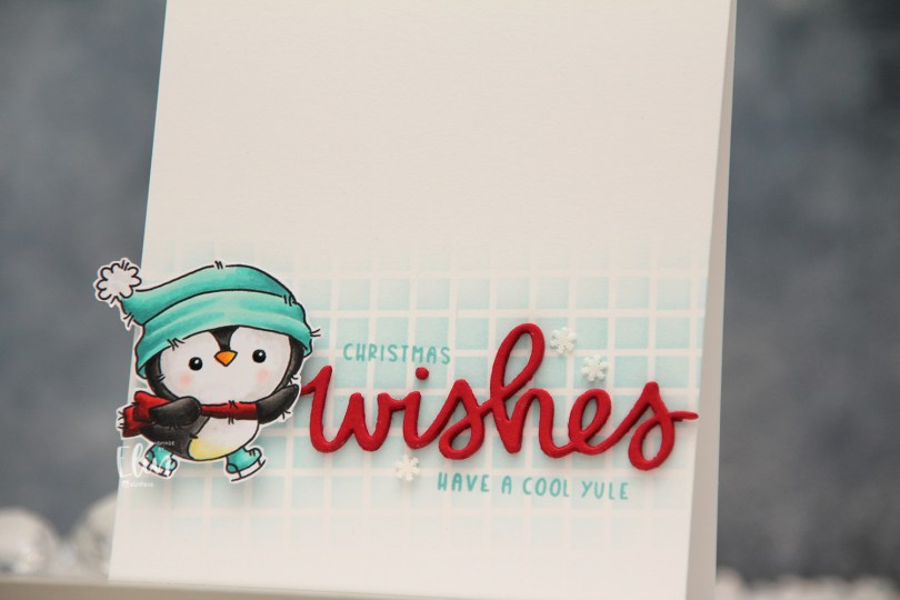
 There are five adorable penguins in this stamp set, and I chose two to color, with a vague idea for a card in the back of my mind as I was coloring. Once I’d colored both penguins and fussy cut them, I realized splitting them up and creating two cards would be better. For this card, I placed the Grid stencil from My Favorite Things at a bit of an angle directly on my top fold card base I created from Stamper’s Select White cardstock from Papertrey Ink. Using Sno Cone ink from My Favorite Things and a blender brush, I created a soft blend near the bottom of the card front, fading to white above and below.
 The wishes die from Mama Elephant is probably my most used word die, I love it so much. I die cut it five times from Wild Cherry cardstock from My Favorite Things and stacked the die cuts for dimension. Onto the background I stamped a sub sentiment and the word Christmas from the
 Meet
Meet  I colored the scene with Copics, cropped down the panel and white heat embossed a sentiment from the coordinating sentiment set using VersaMark ink and Super fine detail embossing powder from Ranger. I added a few white dots to the wave using a Sharpie and put the panel to the side while I worked on the rest of the card.
 I thought the Stitched Ripple Backdrop die from Lawn Fawn would work perfectly for a subtle wave pattern in the background. It’s a landscape oriented die and I wanted a portrait oriented card, so I die cut it twice from Stamper’s Select White cardstock from Papertrey Ink, before adding colored strips along the seam for a little bit of added interest. I colored the strips with a few of the Copics I used for my scene and used a die from the Blueprints 27 die set from My Favorite Things to turn them into strips of the same width.
 I mounted my scene to the center of the card using foam tape, before embellishing with sequins and raindrops from Little Things from Lucy’s Cards. The sequins are from her Ice Water mix.
 The finished card is a simple looking one. I love adding dimension, the sequins and raindrops work perfectly with the colors and Kalei’s making the most of her summer. I hope you are too 🙂 And if you’re in the Southern hemisphere in the middle of winter right now, I feel your pain.
 I tend to go overboard whenever I color skies or water.
 I love hydrangeas, and this image was is one I just HAD to color. Even though I’m more confident with my Copics because I use them so much, I love the soft look and those edges lines you get with watercolor. I stamped the image on a piece of Fabriano Artistico Extra White watercolor paper using Obsidian ink from Altenew. This is a pigment ink, which makes it perfect for embossing. I sprinkled on clear embossing powder from Ranger and melted the powder.
 I grabbed a couple of paint brushes and my Mijello Mission Gold watercolor set and mixed pinks and purples for my flowers, and a bunch of different greens for the stems and leaves. I’m no expert watercolorist (if you want to watch an expert watercolor, head over to Debby Hughes’
  This stamp set actually comes with a couple of additional leaves and petals and dies to cut them out, but there’s no die for this large image. Fussy cutting it was easy enough, though. I stamped and white heat embossed a sentiment from the stamp set onto a piece of True Black cardstock from Papertrey Ink. I dry embossed a piece of patterned paper from the Watercolor Wishes 6×6 inch paper pack from Lawn Fawn using the Geometric Landscape stencil from Altenew. I wanted a little bit of texture to create interest in the background without distracting from the main image, and this did the trick.
 I added a few more layers of cardstock behind my black strip for dimension, popped the flower up on foam tape and finished off the card with a few faceted pearls. Or are they gems? No matter what they are, they’re gorgeous, and I have a feeling I’ll use up the entire pack of these in no time, I love them so much.
 I started with a quarter sheet of Stamper’s Select White cardstock, the Wintry Forest stencil set from Pinkfresh Studio and the Northern Shore color family from Altenew. The stencil set has 6 different stencils that you layer to create a gorgeous wintry forest. I started with stencil number 1 (the Pinkfresh Studio stencils are numbered, which makes it really easy) and Polar Bear ink, which is the lightest of the four colors in the Northern Shore color family. I then moved on to stencil number 2, but didn’t change the color. Since I had to stretch my four colors and use them on five stencils (the last stencil adds snow on the trees), I kept the lightest one for this second layer and ink blended with a heavier hand, which makes the color appear darker. I used stencil number 3 with Icy Water ink, which is the next shade, then stencil number 4 with Winter Lake ink, and finally stencil number 5 with Arctic Mountain ink, which is the darkest color in this set of four gorgeous blues.
 On top of the ink blending, I stamped a snow flurry background stamp from Kort & Godt (M-428) using Fresh Snow hybrid ink from Papertrey Ink, which added lots of white snowy dots to my background. I then used a die in the DIE240 set from Kort & Godt to die cut the banner directly from my background. I put it to the side, placed the last stencil on my background and spread a layer of Light & Fluffy modeling paste from The Crafter’s Workshop through the stencil, before sprinkling on Rock Candy Distress Glitter and let that dry. Onto my banner, I stamped a sentiment from the M-467 stamp set from Kort & Godt using Arctic Mountain ink. I ink blended a little bit of Winter Lake ink to the edges to make it stand out a little bit more, added a stack of white die cuts behind it for dimension and adhered a couple of faceted iridescent pearls (ST178) to finish off the card.