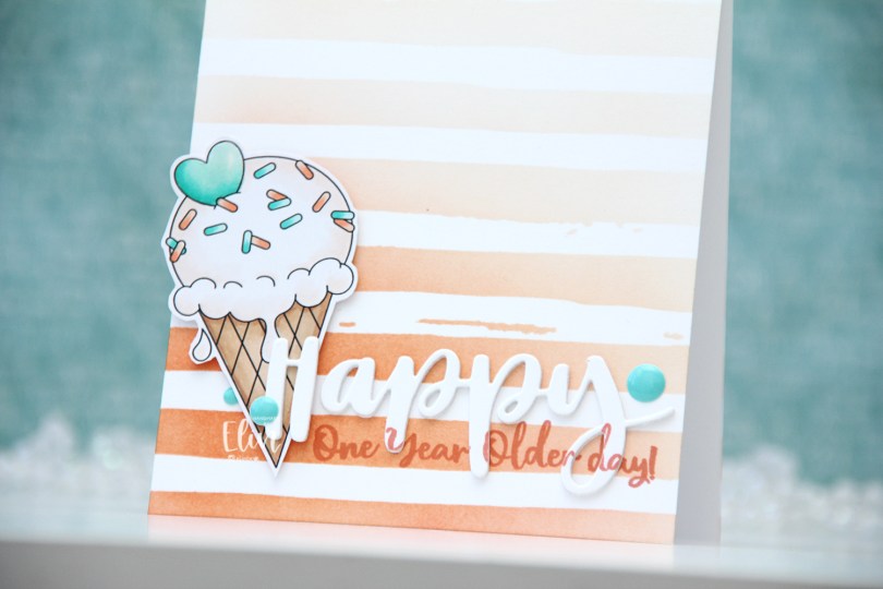
Hi, crafty friends! Today, I’m sharing with you a quick, clean and simple birthday card, featuring the ice cream from the Sloth-some Sloths digi stamp set from Streamside Studios. Today’s my sister’s birthday, so it’s kind of fitting, I think. It also happens to be our dad’s birthday, March is a big birthday month in our family.
 I colored the ice cream with my Copics, fussy cut it leaving a thin white border and put it aside while I worked on the rest of the card. Using the Watercolor Stripes stencil from Altenew, I ink blended stripes using Melon Berry ink from Papertrey Ink, going heavy handed at the bottom with a soft gradient toward the top of my A2 card base.
 I used the Hand-Lettered Happy Birthday die from My Favorite Things to die cut the word happy from white cardstock from Papertrey Ink. I then did a little stamp surgery, by combining two sentiments in the Anything-but-Basic Birthday Wishes stamp set from My Favorite Things to stamp a sub sentiment to the lower part of the die cut word. I then stamped the same sentiment directly on my card base, still using Melon Berry Ink. I die cut two more of the happy to glue behind the stamped one, stacked all three together and adhered it to the card front, lining up the stamping on the die cut with the stamping on the card base. I then mounted the ice cream on foam squares, added a bit of Glossy Accents to the heart and some enamel dots from the Cool Summer Night pack from Altenew for a little bit of added interest and color.
 Very limited color palette.
 I used the
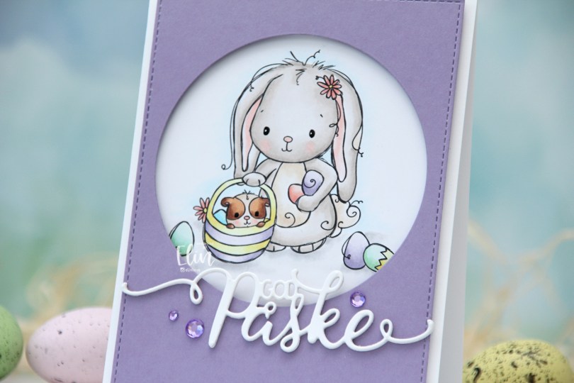
  I wanted a pastel look for my card, and this is probably the lightest wash of color I’ve ever done with my Copics. Except for E25 on the guinea pig, I’ve only used markers ending in numbers that are 3 or lower. That’s super light for someone who doesn’t shy away from using markers ending with 9. Once the coloring was complete, I used a black glaze pen to create shine in their eyes, and I went over it with a dot of white Gelly Roll 05 on the bunny.
 From a piece of Winter Wisteria cardstock from Papertrey Ink, I die cut a circle opening and also used a faux stitch rectangle die from My Favorite Things to create a little bit of extra interest around the edge of the panel, before mounting it on foam tape.
 I used a die from Papirdesign to make my God påske (Happy Easter in Norwegian) sentiment, and made it dimensional by stacking four white die cuts on top of each other, before finishing off the card with a few crystals from Papirdesign that match the Winter Wisteria cardstock nicely.
 Here it is, the softest color palette ever.
 I stamped the wreath on a piece of Rustic Cream cardstock from Papertrey Ink, before coloring with pencils. Yes, you read that right, I broke out my Prismacolors and did pencil coloring. I don’t use my pencils very often. Copics are my “go to” coloring medium, but every now and then, I shake things up.
 I fussy cut around the finished piece, leaving a white border along the edge and cutting the open part at the top right as if my colored panel was a circle. I didn’t want to cut away the interior, and this seemed faster, easier and better. I created a 4 1/4″ square card base and used the Caleidoscope embossing folder from Simon Says Stamp to create a little bit of texture in the background, before mounting the wreath on foam tape.
 I stamped and white heat embossed a sentiment from the Mini Messages stamp set from Mama Elephant onto a piece of Cornflower cardstock from My Favorite Things, before using a nested circle die to turn it into a circle. I put a few foam squares behind it and adhered it to a part of the wreath where it wouldn’t cover up too many of the flowers.
 To finish the card, I added a generous amount of Papirdesign pearls for some shine.
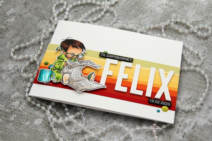
 I colored the image with My Copics and decided to fussy cut around it this time. I tend to turn my colored pieces into panels for my card and work from there, but I wanted to do something a little different today.
 I left a white border around the image to make it easier on myself. You tend to lose some of the details in the hair if you cut up close to the line, and I wanted to keep the hair intact. I also added Glossy Accents to his glasses for shine and a touch of dimension.
 I wanted to include his name on the card, but had printed my image fairly large. My solution was to make a landscape A7 card (7×5″). I rarely make landscape cards (trickier to photograph) and the same goes for A7, but it’s fun to shake things up. I also shook things up by adding cardstock strips going across the card. I tried with cool colors first, but the image got lost, so I went through my solid colors of cardstock again and made a version with warm tones. From top to bottom they are:
 I used the Impact Alphabet die set from My Favorite Things to spell the name. I die cut four of each letter and stacked them for a dimensional look, gluing them right onto the stripped background, before adding the sentiment and date in white on black.
 I mounted the image on foam tape and added a few enamel dots from Altenew (teal dots from the Cool Summer Night pack) and Papirdesign to finish the card.

 This
This  I stamped a sentiment from the Definisjoner stamp set from Norsk Stempelblad AS with Melon Berry ink from Papertrey Ink, chopped off a bit of the panel and adhered it to a card base I created from Melon Berry cardstock, also from Papertrey Ink.
 I added a couple of sequins from Little Things from Lucy’s Cards. The larger sequin is from the Sweet Shop mix, the smaller one from the Iced Sherbet mix.
 Aren’t these bunnies cute? I paired the three bunnies in the Teacup Bunnies stamp set with a digital sentiment. The sentiment will be a freebie digi, along with a few others in the same style and sub sentiments to pair with it.
 I colored the bunnies and letters with Copics and did some fussy cutting, leaving a thin white border to preserve the “fuzzies” that are part of the signature Lili of the Valley style. I used a black glaze pen for their eyes to make them pop and shine, and once dry, added a tiny white dot to each eye using a white Gelly Roll 05 pen.
 I used the Crystal Distortion Embossing folder from Simon Says Stamp on a piece of Lemon Tart cardstock from Papertrey Ink to create a little bit of interest in the background. Below the yellow panel, I added a strip of Sprout cardstock from Concord & 9th for a little bit of extra green.
 I adhered the cardstock pieces to a white top fold card base and mounted the teacup bunnies and sentiment on foam tape for dimension, before finishing off with a few enamel dots from the Tropical Forest set from Altenew.
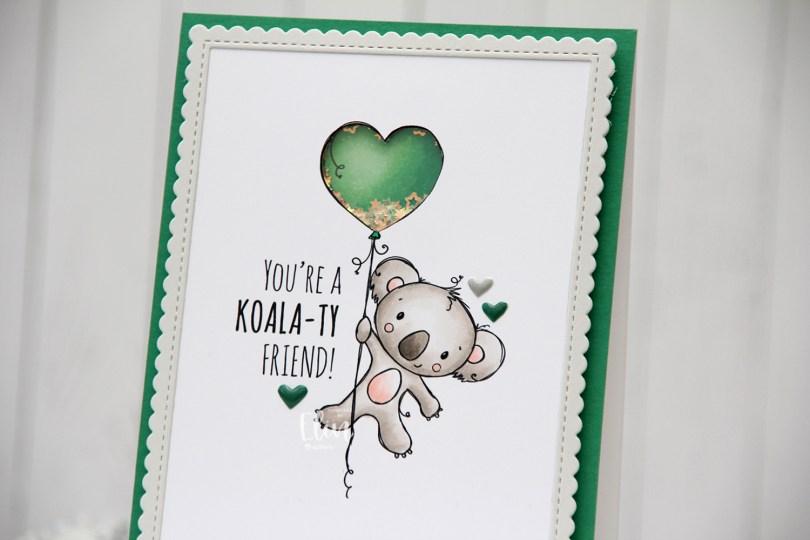
 I’m using the new
  I adopted Laura Bassen’s new coloring motto for 2023 for this card: “no muss no fuss coloring”. This was very simple, a few grays and a little bit of pink for the cheeks, the inner ears and the belly. I used a craft knife to cut out the interior of the balloon and printed another panel with just the balloon in the same size. I colored that balloon in green (thanks for the color suggestion, Liz) and added foam strips along the outer edge of the balloon, before filling it with tiny iridescent stars from the Icicle sequin mix from Hero Arts. I then added a piece of acetate on top to complete my shaker, and adhered the koala panel to the shaker, making sure to line up the window with my shaker heart balloon as best I could.
 I added foam tape on the back of the rest of the panel and adhered it to a top fold card base. The card base is actually Stamper’s Select White cardstock from Papertrey Ink, but I adhered a panel of Clover cardstock from Concord & 9th on top to create the green front. The color matched with my green balloon, but I don’t have unlimited amounts of Concord & 9th cardstock, so I’m trying not to use it all at once. Also, it’s a thinner cardstock, and not sturdy enough on its own to hold the weight of lots of foam tape and a shaker.
 Using the largest of the dies in the Stitched Rectangle Scallop Edge Frames die set from My Favorite Things, I die cut a frame from Soft Stone cardstock from Papertrey Ink. This is such a perfect soft grey, I love it. I finished off the card with a few enamel hearts from Altenew, from the Green Fields pack and the Rock Collection.
 The iridescent stars inside the shaker heart really catch the light nicely.
 Super simple color palette, as I mentioned.
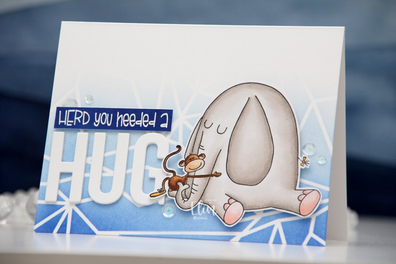
 I chose to color Elliot in a very soft grey, and once fully colored, fussy cut the image leaving a thin white border. I put the image aside and started working on the rest of the card.
 I felt a landscape design would work best for what I had in mind, and used the Geometric Landscape stencil from Altenew to create some interest in the background with blue inks, also from Altenew. I used the entire Lapis Lazuli color palette from Altenew for my blending, (Azurite, Ultramarine, Eastern Sky, Iceberg) which fades to white at the top.
 Using the Sending You Hugs die from My Favorite Things, I die cut the letters to spell out HUG four times from white cardstock from Papertrey Ink, which happens to be the same cardstock I used for my cardbase. I love their white cardstock, it’s the best by far. I stacked the letters for dimension and stamped and white heat embossed a punny sentiment that comes with Elliot & Marcel. There are actually a few more sentiments in the set, and I added another one to the inside of the card. I didn’t have the right color cardstock, though, so I cheated and covered white cardstock with the Azurite color, which is the darkest of the four blues I used for the blending of the background. To create the sentiment strip, I went direct to paper, and used my heat tool to speed up the drying process of the ink so I could stamp and heat emboss on top. I added three additional strips of cardstock behind it to make it flush with the die cut letters, adhered it to the card and finished off with a few sequins from the White Orchid Sequin mix from Little Things from Lucy’s Cards.
 I chimply love punny sentiments and couldn’t resist.
 Very simple color palette for this one. This was fast to color.
 I love these animal number images from Rachelle, and these ducks are sooo cute. Perfect for a birthday card, I think. I colored the image with my Copics, before temporarily adhering the Watercolor Wash Free Form stencil from My Favorite Things and ink blending with Harvest Gold ink from Papertrey Ink. I then stamped a sentiment from the A06 stamp set from Norsk Stempelblad AS using Shadow Creek ink from Altenew.
 I used the largest of the Wonky Stitched Rectangle STAX dies from My Favorite Things to create a quirky faux stitch interest around the edge and adhered my panel to a top fold card base I created from Meadow cardstock from Hero Arts.
 To finish off the card I added a few raindrops from Little Things from Lucy’s Cards, I thought they fit well with the water theme in the image.
 I colored the donut with my Copics and fussy cut it, leaving a thin white border around the edge. I printed a panel of several donuts in light gray for a bit of added interest in the background, popped up my panel onto a card base I created from Rustic Cream cardstock from Papertrey Ink, while I worked on the rest of the card.
 Using the Parker alphabet die set from Memory Box, I die cut the letters to spell sweet from Grapesicle cardstock from My Favorite Things. I stacked six of each for a dimensional look.
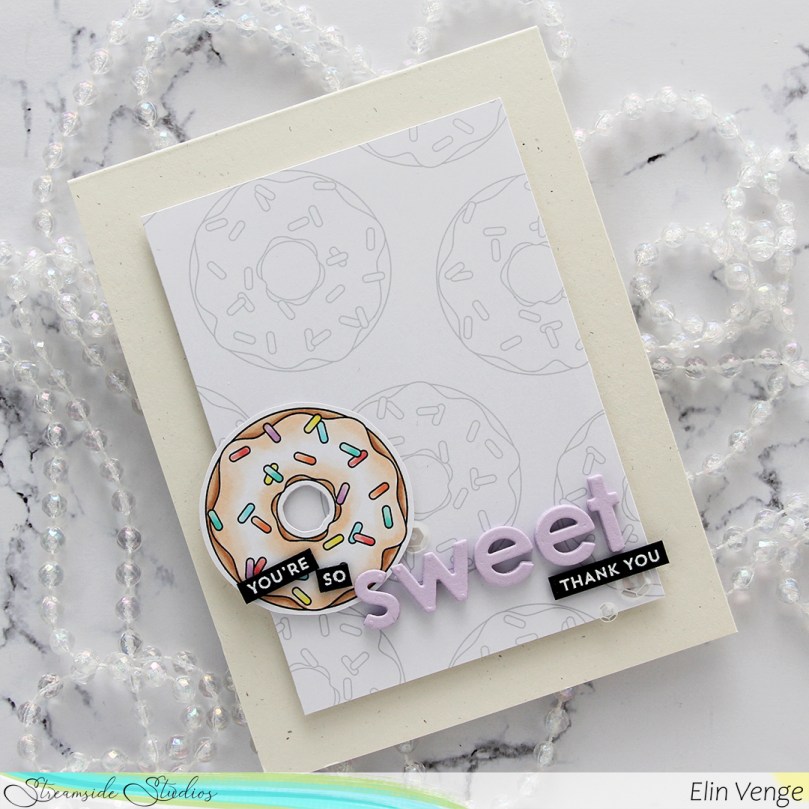 I stamped and white heat embossed partial sentiments from the Itty Bitty Basics and Itty Bitty Gifting stamp sets from My Favorite Things to complete my sentiment, adhered it all to the card and finished with a few sequins from the White Orchid Sequin mix from Little Things From Lucy’s Cards.