Hi, crafty friends! Have you checked out the new release from Purple Onion Designs? There are two new collections from a couple of our favorite illustrators: Pei and Holly Mabutas. Holly’s collection is massive, with 24 stamps, including some really versatile backgrounds that I’ve had a blast playing with (I’ll share more in a future blog post), and Pei’s collection consists of 12 stamps in her sweet and fun signature style. My favorite character of hers, Mousy, makes an appearance, but today, I’m focusing on Mr. Corgi’s Margarita.
 I knew I had to color up this image as soon as I saw it. This is so adorable with the corgi hanging off the top of the glass. And so funny, and very typical of Pei’s illustration style. I love it!
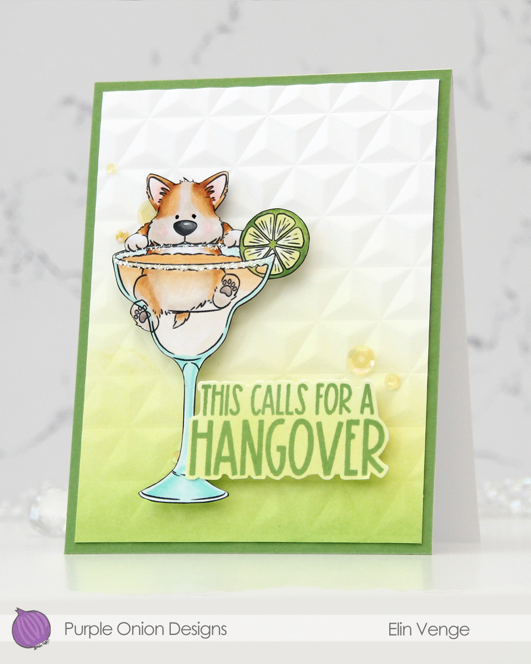 I colored the image with Copics, fussy cut him, then added VersaMarker pen to the rim of the glass and used white puff embossing powder from Wow! to mimic a salt rim. The embossing also adds some fun texture to the glass. I also used a black glaze pen to add a little bit of shine and dimension to his eyes.
 I ink blended Parsley and Starfruit inks from Concord & 9th onto a white cardstock panel for an ombré effect, then used the Geometric embossing folder from WRMK to create some subtle dimension. I added the panel to a card base I’d covered with Parsley cardstock from Concord & 9th, before mounting the image using foam tape.
 In this release there are also a few sentiment sets, and this one from the Good Libations set was the perfect one to pair with the corgi. I stamped it in Parsley ink onto white cardstock, then ink blended with Starfruit ink and fussy cut, before mounting it onto the card with more foam tape. I used a couple of different embellishment mixes from Little Things from Lucy’s Cards to finish off. The sequins are from the Beach Dreams mix, while the gems are from the Seashore mix.
 Simple color palette for this one. This was so fun to color!!!
For a limited time, you can purchase a bundle with all 12 stamps in the Spring is in the air collection. This bundled set is discounted over 30% off the regular prices and is available for a limited time. The bundled promotion ends on Thursday, July 10, 2025 on the Purple Onion designs website.

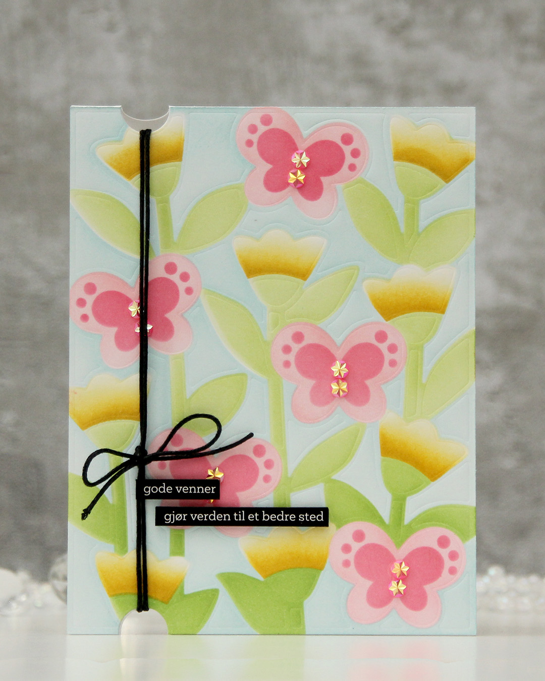 I started with a panel of Stamper’s Select White cardstock from Papertrey Ink that I dry embossed. I then used a stencil set (the Butterfly Blooms set from Concord & 9th) to add the color. I used all inks from Concord & 9th: Powder for the background, Sprout and Parsley for the greens, Sunshine and Buttercup for the florals and Pink Lemonade and Honeysuckle for the pinks.
 Once the panel was all inked, I adhered it to a white card base, created half circle notches at the top and bottom with a small circle die and thread some cotton thread through, which I tied off in a bow. I added pink sparkly gems to act as the bodies of the butterflies and finished off with a couple of black sentiment sticker strips that I mounted on foam tape. I love the softness of the background against the bold of the black. The black really draws your eye.
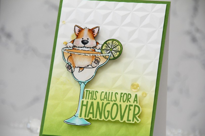
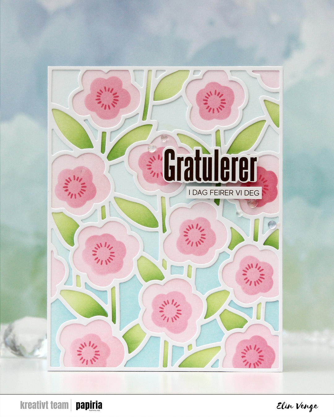 I started with a panel of white cardstock. I put down the first stencil, which is for the background, and used Harbor and Powder inks. The second stencil does the stems and leaves, and I used Sprout with a bit of Parsley at the base for those. For the large part of the flowers, I used Ballet Slipper and for the fourth and final stencil, which is for the smaller part of the flower, I used Honeysuckle. I also used the small circle burst stamp in the stamp set to add a little more detail. I stuck to Honeysuckle ink, and I just love the way these flowers turned out.
 I used the cover die to create a frame from white cardstock that I glued on top of my ink blending. I mounted sentiment sticker strips from Kort & Godt using foam tape and adhered the sentiment in the top third of the card. I rarely add my sentiments to the top right, but I think it works. I finished off very simple with a few iridescent dew drops from Pinkfresh Studio.
 I started by running a panel of white cardstock through my die cut machine with an embossing folder. I chose the Crystal Distortion embossing folder from Simon Says Stamp, which leaves some fun texture in the background without being too distracting.
 I added the tigers to the panel with some foam squares. The texture on the dry embossed panel makes it uneven, and the foam squares help – I also love the dimension it adds. I cut off the parts of the tigers hanging off the edge, trimmed the panel down and mounted it on foam tape to a card base I created from Canyon Clay cardstock from Papertrey Ink.
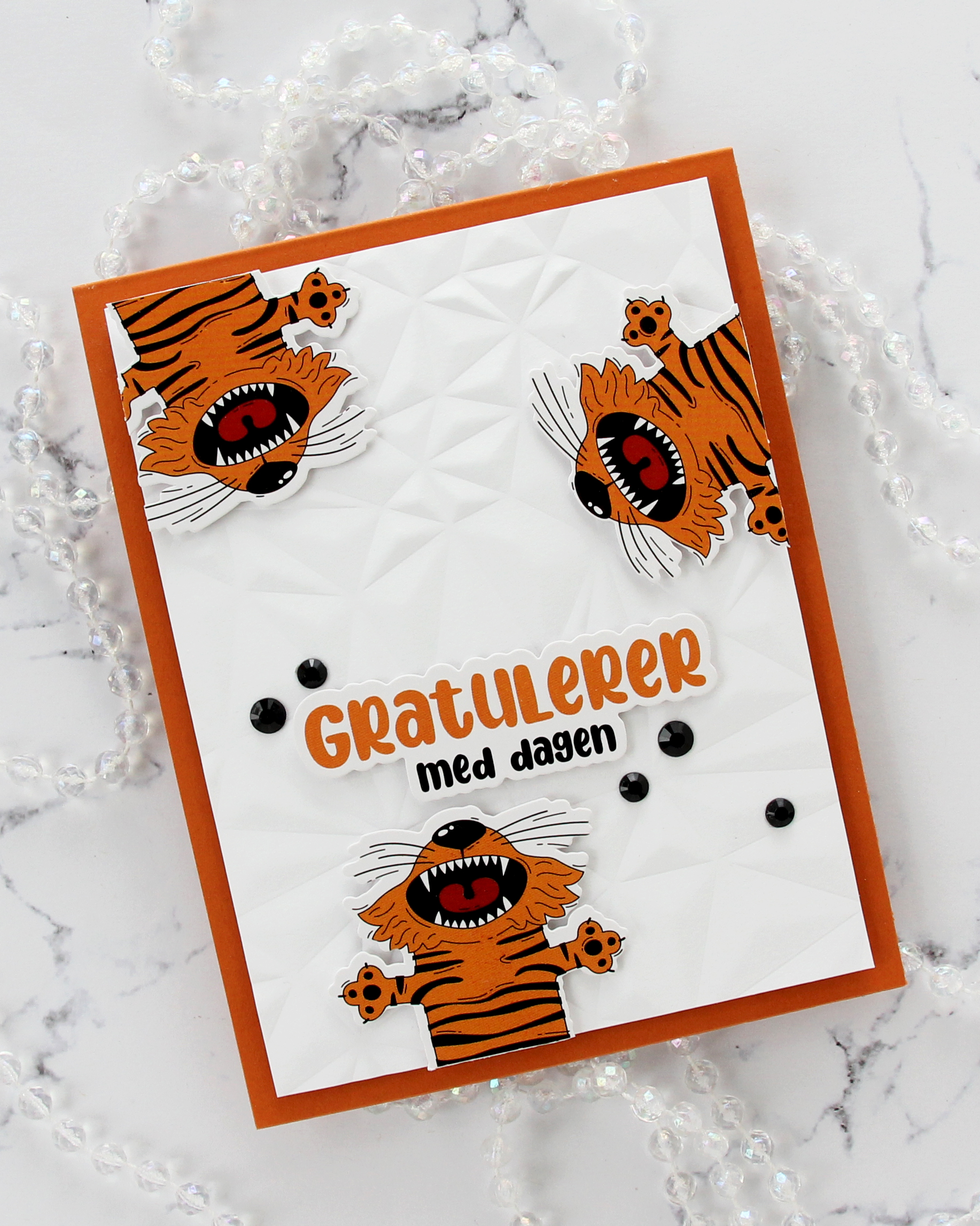 The large sentiment is from the same sheet of stickers as the tigers, which means the colors fit perfectly. I added some foam squares to the back and adhered it above the bottom tiger.
 I added some black bling in a couple of different sizes to finish the card. This is actually the third card I’ve shared in a row without any stamping. I’m sure I’ll use some stamping soon, but it’s fun to use other products and techniques.

 I used the Twist pattern press plate from Pinkfresh Studio with Nectar ink from Concord & 9th on a piece of Nectar cardstock from Concord & 9th to create a subtle background. I adhered the panel to a top fold card base I created from Stamper’s Select White cardstock from Papertrey Ink.
 I mounted the tag in the center using foam tape and added a bow with white cotton thread from Kort & Godt. I adhered a couple of sentiment sticker strips with foam tape.
 To finish off the card I adhered a few faceted pearls. This card is so simple, and the soft colors really are perfect for spring.
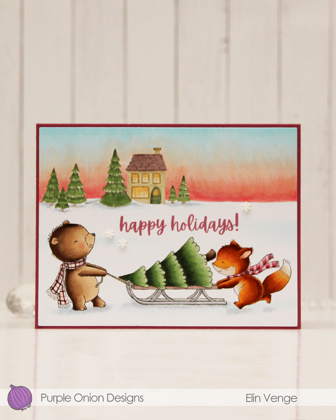 I colored these cuties with my Copics and did the same with
  I used the Additional A2 Layers die set from Waffle Flower to cut my panel down slightly, then adhered it to a card base I created from Autumn Rose cardstock from Papertrey Ink, before I added a few snowdrift sprinkles from Little Things from Lucy’s Cards.
 Lots of Copics for this one. I even created a new combo for the fox which requires less markers than the one I used to use.
 It’s kind of weird that I, as an avid colorist, really enjoy using images like this, where all the work is done for you and you just have to cut it apart from the other images on the same sheet. I created a 4 bar card this time, so even though the image itself isn’t THAT big, it still takes center stage on this smaller card. I added a thin strip of copper glitter cardstock above and below the image. It gives more definition and it also works really well with the orange balloons in the image.
 I used the Terrazzo press plate from Altenew to create some fun texture in the background. I inked up the press plate with Caribbean Sea ink from My Favorite Things and pressed it onto Caribbean Sea cardstock, also from MFT. I mounted my image on foam tape, added a sticker sentiment that I also popped up and finished off the card with a few faceted pearls. I love these!!
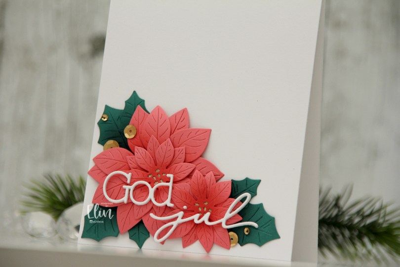
 I actually shared this one on the Papiria blog back in December, but I thought I’d share here, as well. I die cut the parts for the florals from Watermelon cardstock and the leaves from Juniper cardstock, both are C9 colors. I ink blended the petals with Watermelon ink and the leaves with Rainforest ink, which is a darker green than the Juniper color. I curled all the petals and leaves back before assembly, and adhered them all to a white card base. I used gold glitter cardstock from Kort & Godt for the centers of the flowers.
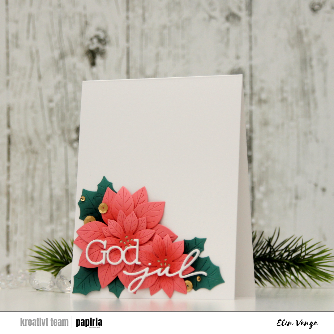 I used a die set from Kort & Godt to create my sentiment. I stacked three of each die cut and used liquid glue to adhere the sentiment to the florals, before finishing off the card with Satin Gold sequins from Altenew. Super simple, and I love all the white space!!
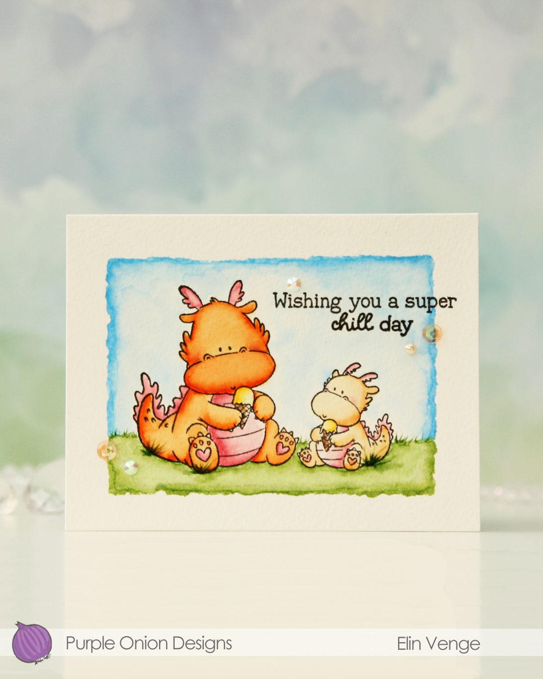
 I added some tufts of grass to my coloring. The markers make it super easy because of their actual brush.
 Once all my coloring was dry, I stamped a sentiment from the

 I started by running a panel of Stamper’s Select White cardstock from Papertrey Ink through my die cutting machine with the Kaleidoscope embossing folder from Simon Says Stamp for a subtle, textured background. I love white space on my cards, but that doesn’t mean it needs to be flat.
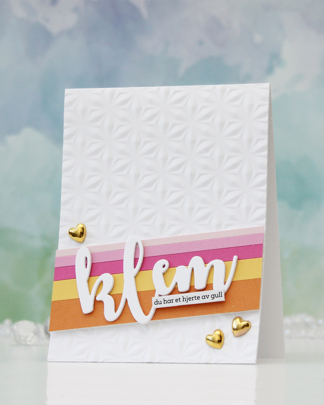 Next, I did some stripping. Cardstock stripping, that is. I cut a few colors of cardstock into different width strips. The colors I used are (top to bottom – all Concord & 9th cardstock): Ballet Slipper, Carnation, Sweet Pea, Buttercup and Clementine. I added the strips to a scrap of cardstock to keep them all together and mounted them at an angle using foam tape.
 I die cut the word klem (hug) three times from white cardstock and stacked them for dimension. I usually stack four, but I was using a scrap to die cut from and there was only room for three with the piece I used. Three layers work too!
 I love how this word die creates a space for a sub sentiment strip. You can put pretty much anything on the bottom of the last part of the die cut and still see the whole word. For this one I used a sentiment sticker strip and adhered a couple of layers of cardstock strips behind it for even more dimension, so it pops off the die cut a little. To finish off the card, I added a few gold heart, I thought they matched the sub sentiment (you have a heart of gold) nicely.