
Hi, crafty friends! I’m back today with another card I created with one of the brand new stamps from Purple Onion Designs. Three collections all in one release has given me plenty to play with, and today’s card features Felicia & Snowcat from the It’s Snowing Cats & Dogs collection illustrated by Shari Bresciani.
 This image is so quirky and playful, and the look of that cat just puts a smile on my face! This card actually came together pretty quickly and easily. I’d colored all my images for this release over a couple of days, and I spent a couple of hours fussy cutting all the images I wanted to have fussy cut, so when it was time for assembly, this one was a cinch.
 Onto a top fold white card base I added a panel of white cardstock that I die cut using the Snowflake Confetti Fancy die from Hero Arts. I love this die, I’ve had it for years, and it’s great for die cutting lots of tiny snowflakes to put on cards, which is what I usually use for. I do, however, keep the bigger die cut pieces in the packaging with the die, and for this card I just pulled one out and adhered it to the card base. Super simple when the die cutting job is done in advance. I like the subtle texture the tone on tone die cut gives. It adds a little bit of interest, but doesn’t steal the show from the focal point of the card.
 Seriously, look at that cat. He’s so funny and quirky and awesome!! As I’m writing this blog post, I’m realizing that I’ve kind of colored him to look like Garfield. Totally unintentional, but I’ll just run with it! Now that I think about it, it’s not a him, it’s a her, her name’s Felicia.

I put foam tape on the back of Felicia and the snowcat and adhered them to the bottom center of my card. I love all the white space above their heads, they have room to breathe.
 I die cut the words god jul (Merry Christmas in Norwegian) twice from Jalapeño Popper cardstock from My Favorite Things using a die from Papirdesign. I glued the two layers together and adhered them on top of my colored image, and my card was complete.
 Very limited amount of colors for this one.
The entire It’s Raining Cats & Dogs collection can be purchased as a bundle at a 30% reduction in price until November 12, 2021 (which happens to be tomorrow). If you’re a cat person and don’t want the dog images, there’s also a cat bundle with 6 different cat images and a Christmas Tree, and if you’re a dog lover, you can get the dog bundle with 8 dogs, a dog house AND the Christmas tree. If you get the bundle of the entire collection, there’s also a sentiment set included. If you purchase either the cat bundle or the dog bundle, you’ll have to purchase the sentiment separately if you want to grab it. All bundles are available at a 30% price reduction over on the Purple Onion Designs store.
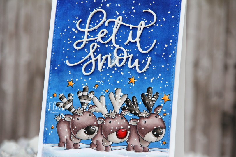
 I often wind up running out of time to create cards from my colored images in a timely manner, but better late than never? I colored most of this image in very neutral tones, I wanted the red nose to really stand out, and it does. It helps that I added Glossy Accents to it, but it’s a very red nose!
 Once I’d colored my image, I used the largest die in the A2 Stitched Rectangles STAX 2 set from My Favorite Things to give it that nice finished edge that I’m so fond of.
 I sprinkled on lots of Chunky White embossing enamel from Stampendous and heated the panel from the back, before adhering it to the front of a top fold white card base I created from Stamper’s Select White cardstock from Papertrey Ink.
 From the same white cardstock I die cut the sentiment three times using a die from Mama Elephant and stacked them for a dimensional look, before gluing them to my sky.
 I added some shimmer to the die cut words using a Wink of Stella brush marker from Kuretake. It doesn’t really show up in photos, but it gives a nice effect in real life.
 Last but not least – lots of Copics. 6 markers for that tiny red nose might have been overkill…
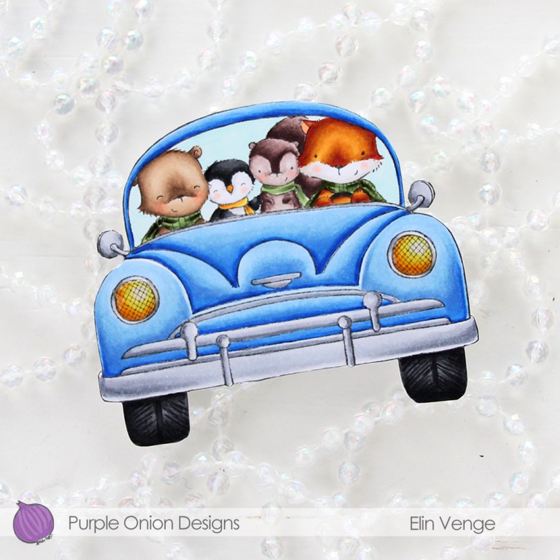
 The shape of the car actually dictated the shape of the card. I love shaped cards, and aside from the side mirrors, this one was pretty easy to fussy cut.
 I colored in the car with the critters using my Copics, fussy cut right up against the black lines and added the car onto a top fold white cardbase. I then fussy cut that, making sure to temporarily glue the card shut for the cutting to be a little bit easier. Those side mirrors are fussy, but the rest was a cinch.
 To create a truly one layer card would have been easier than having to fussy cut the car, adhere it to the card base and then fussy cutting again, but I didn’t think of it when I stamped my image, so I did it the hard way. Simon Says Stamp has a 120 lb cardstock that’s great for one layer cards with Copic coloring. Copics bleed through on most cardstocks, but the 120 lb from Simon doesn’t and would have been perfect for this card if I’d only thought of it before I was finished. Onto the headlights I put a thick layer of Glossy Accents for shine, and my tiny car card was finished.
 Not a whole lot of colors used for this one. I’m loving the green combo I used for this, it’s giving me life. The entire collection can be purchased as a discounted bundle for a limited time, the offer is available until Friday, November 12th, and you can read all about it on the Purple Onion Designs blog
 This is a tall, narrow tree, so it’s perfect for a slimline card. Using the largest die in the Slimline Double Stitched Rectangle STAX die set from My Favorite Things, I quickly turned it into a panel perfect for a slimline card. I adhered it to a cardbase I created from Blue Breeze cardstock from My Favorite Things.
 I used a die from Papirdesign for my sentiment and die cut that in Stamper’s Select White cardstock from Papertrey Ink before matting it with a small piece of that same blue cardstock that I used for the cardbase. I pulled out a matching slimline envelope and white heat embossed an image from the Santa Stationery stamp set from Papertrey Ink on the flap of the envelope. I love this stamp!! No graphic today for the Copics I used. I colored this three years ago, and there were no scribbled notes on the back of it, nor a post-it to tell me what colors I used.
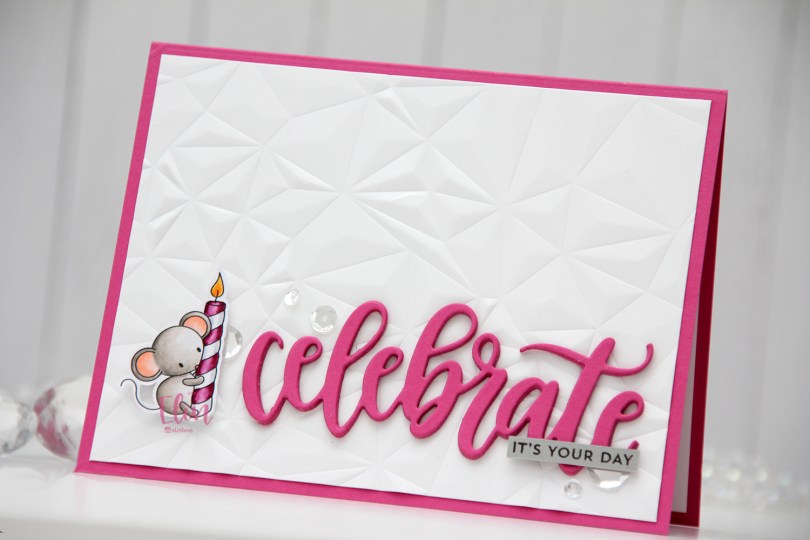
 In this stamp set there are five mice in different poses, there’s a giant piece of cake, a few accessories and some sentiments. I decided to focus on the mouse with the birthday candle for my card today. I usually color larger images, but these small ones from Streamside Studios are perfect for playing with different layouts for my cards.
 I colored the mouse very simply with my Copics, and did some fussy cutting, leaving a white border around the image. I usually prefer cutting right up to the lines, but with the tail and the wick on the candle being thin, single lines, that wasn’t going to happen.
 I created a top fold landscape cardbase from Ripe Raspberry cardstock from My Favorite Things and used the Crystal Distortion embossing folder from Simon Says Stamp on a piece of Stamper’s Select White cardstock from Papertrey Ink to create a textured background for all my elements to sit on.
 I die cut the Celebrate die from My Favorite Things four times from the same Ripe Raspberry cardstock that I used for the cardbase, and stacked them for a dimensional look. I stamped a sentiment from the Itty Bitty Birthday set from My Favorite Things using Smokey Shadow ink from Papertrey Ink onto a piece of Cement Gray cardstock from My Favorite Things and trimmed it down to a strip that I glued to my die cut word.
 I popped up the mouse using foam tape, and added sequins from the Sparkling Clear sequin mix from Pretty Pink Posh to finish my card. Super simple.
 Not a lot of Copics for this tiny image.
 I bought a 36 tube set of Mijello Mission Gold watercolors last September, and they’ve been sitting in their palette scaring me, but I’ve recently started dabbling a little bit. Images like this with big open areas are great for practice, and this is my third proper watercolor piece. Yes, I’m keeping track, haha. The previous two attempts were both noline. One was a background, and the other a digital stamp. My printer ink doesn’t play well (or at all, really) with water, so I had to opt for the noline look to prevent visible bleeding. I dove right into the deep end, hoping I could pull it off.
 I stamped the image onto Fabriano Artistico Extra White watercolor paper using VersaFine Onyx Black ink. I’ve created a birthday card with these two once before (blog post
  For my last card with this image, I used my Copic BV20 series for a purply gray elephant. This time, I went for a bluer version to get a nice contrast. I actually decided to mute my pink a little before painting with it. The Bright Opera color from Mijello is a super bright pink, and I added a tiny bit of Hooker’s Green to dull it a little, it was just too bright a pink straight from the palette for what I wanted.
 Once I’d painted my scene, I went back over with a black pen to trace the lines of the image. I would have restamped if I could, but I stamped the image weeks before I painted it and removed the stamp from my MISTI in the meantime. Black pen to the rescue. I just wanted crisp black lines. I stamped a sentiment from the stamp set using VersaFine Onyx Black ink and heat embossed that using clear embossing powder.
 I cut down my colored panel slightly and adhered it to an A7 top fold card base I created from two pieces of Poppin’ Pink cardstock from Papertrey Ink. To finish the card I adhered sequins, beads, confetti and other various little bits from the Sweet Shop mix from Little Things from Lucy’s Cards. I don’t usually put this many sequins on my cards and scatter them like this, but I wanted to really keep the party vibe from these two going across the entire card front.
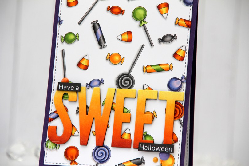
 In the stamp set, there are three fairies, a few ghosts, an adorable bat (yes, it’s adorable) and various accessories. Among them are different candies. I created a panel of these candies, and colored them in with my Copics using very Halloween-y colors. That was last year.
 I wasn’t sure what to do with my colored background, but I didn’t want to cover too much of it, and opted for a very simple design. Using the largest die from the A2 Stitched Rectangles STAX 2 set from My Favorite Things, I turned my colored piece into a panel with a nice faux stitched edge. I love these faux stitch dies from MFT and use them for nearly every card I make. It adds such a wonderful detail. It’s all in the details, to paraphrase a famous German architect.
 I adhered my die cut panel onto a card base I created from Royal Velvet cardstock from Papertrey Ink. It’s a deep purple that goes well with the coloring.
 I created the remainder of my sentiment in Photoshop and printed it, cut it down to two strips and added them on top of the letters with an extra strip of black cardstock behind for a little added dimension and stability. I added three enamel dots from Papirdesign (yellow and orange) and Altenew (purple) to finish my card.
 Not a lot of colors for this one, and yet they’re very Halloween-y.
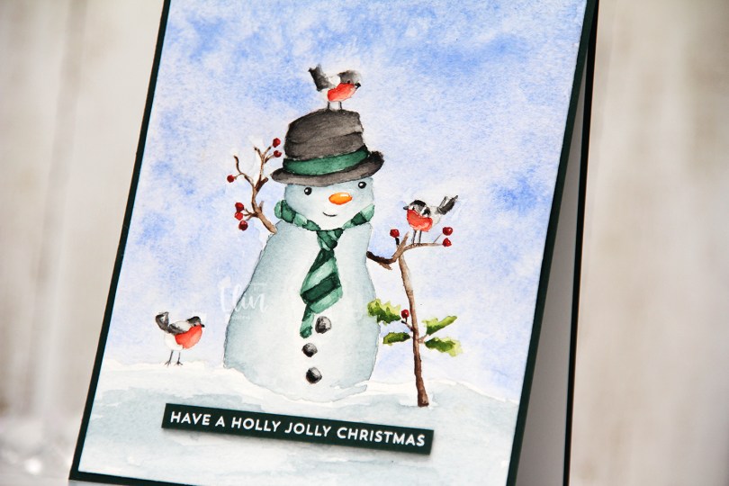


 I wanted a really dark, intense moon to illuminate and cast shadows in my scene. Once I’d placed all the different images where I wanted them in Photoshop, I drew a large circle to create the edges of my moon. I set the opacity very low, so I could use it as a guide when I did the actual coloring to get a perfect circle and not have any black lines around the edges.
 My original plan when I colored this scene (which was actually last year) was to create a shaker card where the tombstone was the actual shaker recessed into the card, while everything else was popped up. Plans change, though, and when I sat down to actually make the card I decided to go for a very simple approach. I glued my colored panel onto a card base made from Sour Apple cardstock from My Favorite Things, and that was it. No embellishments, no nothing. Some people might call this a one layer card, but to me, a one layer card is one where everything is done on the card base. This is adhered to the card base, so I wouldn’t technically call it a one layer card. What do you think? One layer or not? What’s your definition of a one layer card?
 Not a whole lot of Copics, given the fact that the entire front panel is colored in.
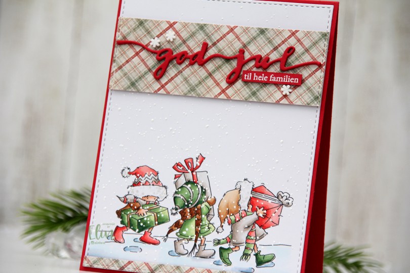
 I colored up these
  I’m usually good at using scraps of patterned paper and rarely use a brand new sheet. Today was the day, though. I thought this patterned paper from the I wish collection from Maja Design went really well with my coloring, and I didn’t have a single scrap of this particular paper. Using the same die that I used on the white panel, I die cut my patterned paper before cutting up my die cut into pieces I could use on my card. I added two layers of cardstock behind both pieces and glued them to my card. I now have a continuous stitched border, even though some of it is my colored panel and some is patterned paper. I love little details like that. I die cut three of the god jul die from Papirdesign from red cardstock and glued them together for a stacked look. I glued my die cut to the center of the wide patterned paper before adding a sub sentiment. The sub sentiment is from Norsk Stempelblad AS, white heat embossed on the same color red cardstock and cut down to a strip, with two additional pieces of cardstock behind it to make it flush with the die cut. I added three snowdrift sprinkles from Little Things from Lucy’s Cards to the patterned paper, and my card was finished.
 Not a whole lot of colors for this one. Soft colors too (except for the darkest green, I wanted a little bit of contrast there), which is rare for me.