
Hi, everyone! I’ve got a simple, yet colorful birthday card to share today, featuring stamps from Mathia design. I was actually inspired by a card I made a couple of years ago for this one. It featured a couple of Papirdesign stamps, and I made the card very similarly to this one. You can find that blog post (written in Norwegian) here.
 This time I used a Gratulerer sentiment and plenty of inks. From top to bottom they are Plum Pudding (Papertrey Ink), Autumn Rose (Papertrey Ink), Picked Raspberry (Distress Oxide), Worn Lipstick (Distress Ink), Spiced Marmalade (Distress Ink), Fossilized Amber (Distress Oxide), Twisted Citron (Distress Oxide), Cracked Pistachio (Distress Oxide), Peacock Feathers (Distress Oxide), Salty Ocean (Distress Oxide) and Blueprint Sketch (Distress Ink). Distress ink and clear stamps aren’t the best of friends, but if you put VersaMark on the stamp first, then distress ink, you’ll get a better result. The distress ink will stick to the VersaMark and won’t bead up as much.
 I stamped and white heat embossed a sentiment from another Mathia design stamp set and popped it up on black foam tape from Gina K.
 Behind the black cardstock piece I put a nest of angel hair. It’s a very very thin thread, and it has actual silver in it. I buy mine at the flower shop, one bag will last a looooong time. I finished off my card with some crystals of unknown origin. I know the brands of most of the stuff in my craft room, but these are a mystery.
 I printed my image onto X-Press It blending card towards the bottom left corner of a quarter sheet. I colored it in with my Copics, before trimming it down to 5 3/8 x 4 1/8″. I wanted the Melon Berry cardbase from Papertrey Ink to show around the edges, and this size panel creates the perfect 1/16″ border on all four sides.
 If you’ve seen a card or two from me previously, you’ll no doubt know that I’m a fan of adding clusters on my cards. They vary in size and some are simpler than others, but they tend to have three things in common: a piece of a paper doily, fishtail banners and enamel dots or sequins. I also usually put my elements on straight, but this time I went for a less rigid look. I went through my patterned paper scraps and found a green piece from the Vintage Garden collection by Pion Design and diecut it using a fishtail flag frame die from My Favorite Things. I thought I’d have to go for just a piece of cardstock for the other banner, but then I remembered that I have a paper pack from Sunny Studio with pastel colors, and one of them fit perfectly.
 I stamped a Norsk Stempelblad AS sentiment onto the green banner using My Favorite Things Extreme Black ink and stapled the two banners together before gluing them onto the card. I added a string of Green Apple divine twine to the top of the card and a few My Mind’s Eye enamel dots to finish it off. In real life, the green dot looks closer to the greens I used in my image. Photos sometimes lie.

 I colored up this image from the Sending Sweet Celebration Wishes for day 8 of the last round of Kathy Racoosin’s 30 day coloring challenge on Instagram. I’m not usually good at turning images from that challenge into cards, but I’m trying to be better. I decided to fussy cut this one and put him on a vellum circle.
 I followed a sketch from MFT and glued a piece of patterned paper from Sunny Studio onto my cardbase, before cutting a white cardstock piece from Papertrey Ink on an angle and adding lots of foam adhesive on the back. I am not shy with my foam adhesive, I tend to cover the entire back, which I did this time as well. I stamped a sentiment from the same stamp set in VersaFine Onyx Black ink. I like the color and the crispness of this ink, but am no fan of that hinged lid, it’s a pain to work with.
 I glued my vellum circle to the white cardstock (I put my liquid glue strategically behind the bunny) and added a couple of Papirdesign enamel dots for a finishing touch.

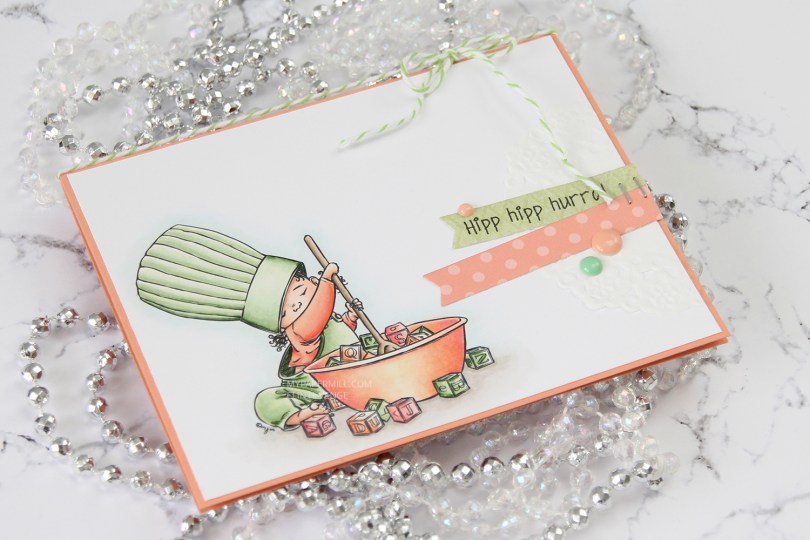
 I did what I usually do by diecutting the panel with the hippo using the largest of the stitched rectangle dies from MFT. This is the one die I use more than any other, and it gives such a nice look with that faux stitching around the edge and the 1/16″ border of the cardbase (in this case Berry Sorbet cardstock from Papertrey Ink) showing.
 I diecut a word die from Kort & Godt four times from Aqua Mist cardstock and glued them all together for a stacked look. There was just enough space above the head of that hippo for the word to fit nicely. I stamped and white heat embossed a Norsk Stempelblad AS sentiment on a piece of that Berry Sorbet cardstock and added three more layers behind that, so it’s flush with the word above.
 The small birds were also colored way back in 2018 for that same challenge as the hippo with the balloons. They didn’t have cheeks colored in, so I just went in with a couple of red markers and then a white pen on top to make them look like the first bird. I fussy cut both and added them to my sentiment to form a visual triangle. A few enamel dots from My Mind’s Eye finishes the card nicely. I usually know exactly where to put my enamel dots (or sequins or other small embellishments), but I was really stuck on this one and couldn’t find a good placement until
  Last, but not least, the Copics I used for this card.
 I printed
  I’m no stranger to adding clusters on my cards, so I pulled out half a paper doily from Doodlebug Design, more scraps of Maja Design patterned paper (the Vintage Summer Basics and Vintage Autumn Basics collections) and diecut a couple of banners using the Fishtail Flag Frames die set from My Favorite Things. I also stamped and white heat embossed a Norsk Stempelblad AS sentiment, before punching it out using my 1″ circle punch from EK Success. I added a pebble on top for an extra bit of dimension.
 I also added some sequins (from the Ice Water mix) and a couple of heart shaped drops (from the Crystal Collection – Glass mix) from Little Things from Lucy’s Cards, and my card was done.
 I printed
  Once I’d finished coloring, I went back in with a 0.03 black Copic multiliner to bring back the original linework that was covered in layers of pencil, before stamping a sentiment (Enjoy every second of your day) from Mathia design in VersaFine Onyx Black ink. And that finishes my card. A one layer card, even, I don’t make many of those, but I really wanted that image to shine.
 This is one of Mo’s birthday fairies. Her name is Dee, and you can find it in the store
  I diecut my panel using the largest of the faux stitch rectangle dies from My Favorite Things. I think it’s the perfect size as it creates a 1/16″ border when I add it to my cardbase. The color scheme might not be typical of me, but the layout definitely is. I added half a mini paper doily from Doodlebug Design, diecut some scraps of pink patterned paper to go with my image using another favorite MFT die set (Fishtail Flag Frames) and stamped a Norsk Stempelblad AS birthday sentiment using Papertrey Ink Hibiscus Burst ink. The ink matches the cardstock, which is also Hibiscus Burst from Papertrey Ink.
 I added my banners using foam tape and embellished very simply with some sequins from Pretty Pink Posh. I even used my scissors on one to cut a little bit off and tucked it underneath that sentiment banner. Laura Bassen would be proud, haha.
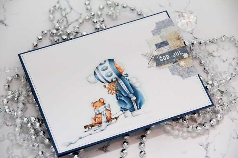
 I had to use my favorite color combination for Christmas on this one. Blue, grey and brown. I made my greys very light, so they look more white than grey, and I have to admit I kind of love the look! I printed the image with 15 % opacity and did no line coloring. I love no line coloring!
 This card is very “me”. The cardbase is made from Papertrey Ink Enchanted Evening cardstock, I used a die from My Favorite Things to add the faux stitching detail on the main panel, and I added a little cluster of diecut patterned paper scraps. I stamped and heat embossed a Norsk Stempelblad AS sentiment on one of the patterned paper pieces and added three snowdrift sprinkles from Little Things from Lucy’s Card as my finishing touch.
 Clean and simple with cluster, these cards come together so easily once the image is colored.
 I used quite a few colors for this simple image. Lots of different earth tones for different parts of the image, and two grey families.
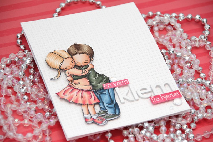
 I colored up
  This card is somewhat different for me. It has a lot of white space, which is fairly common for me, but I used a stencil and texture paste on the card base to change it up a bit, which definitely isn’t normal for me. I even sprinkled distress glitter all over the texture paste while it was still wet, so the card sparkles when you tilt it in the light. Glitter is a nightmare to photograph, though, so it doesn’t show up in the photos very well.
 I used the Parker alpha set from Memory box to diecut the word klem, which means hug in Norwegian. I diecut each letter five times and glued them together for a stacked, dimensional look. I created a couple of pink cardstock pieces by using one of the Copic markers I used on the skirt, stamped the remainder of my sentiment and heat embossed in white before glueing them on with clear foam tape.
 By adding part of my sentiment on top of the image, I get a more cohesive design than I would have if I had put my little sentiment strip above the word only. Just a little design tip. I finished off the card by adding a few raindrops from Little Things from Lucy’s Cards.
 These are all the Copics I used, and I must admit that I really love the pink and peach combos I came up with for this one.
 I colored up
  I used a Docrafts die to create those tickets from scraps of patterned paper from Maja Design, popping them up on foam squares from Gina K designs to give them a little bit of dimension. I white heat embossed a sentiment from Ladybug & Friends on one of the tickets and tucked a diecut pine branch behind it. I finished by adding a few red enamel dots from Papirdesign, tying in the red details from the colored image.
 As usual, I finish with the Copic colors I used to color my image.