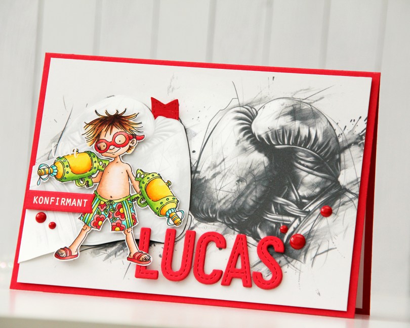
Hi, crafty friends! I’m back today with a confirmation card I made on commission. I was told that the recipient does kickboxing, likes car races, swimming (lake or beach doesn’t matter as long as it’s water) and is a bit of a prankster. Lots of interests that I tried to incorporate into my card. They’re all very different interests, so I had a tough time figuring out what to do, but the card was a huge hit with the recipient, and that’s never a bad thing.
 I looked for a kickboixng image I could color up, as I wanted that to be the main focus on the card – it was his main hobby. I didn’t have one, nor could I find one, but I found this greyscale sketched image with boxing gloves that was perfect.
 The gloves cover the entire front of the card. I still needed something to color, because a black and white image isn’t very interesting on its own. I settled on Blast from Mo Manning, which was the perfect image for a prankster who loves water. I colored it up in very vibrant colors, making sure to include some red, which I thought would work great with the boxing theme AND the car racing theme. I fussy cut him and placed him on top of one of the gloves. He blended in with the background a little too much, so I decided to print the gloves again, this time with a very low opacity. I fussy cut the glove, scored it on one side and made it into a flap that opens. Put the colored image on top of this one, and now it didn’t get lost in the background. I also added a bit of Glossy Accents to the goggles for a bit of shine.
 I mounted the colored image on pieces of foam tape, making sure to add a magnet in a strategic spot to keep the flap from opening on its own. I put another magnet behind the image of the gloves to keep both magnets hidden. They’re still plenty strong enough to work through a couple of layers of cardstock.
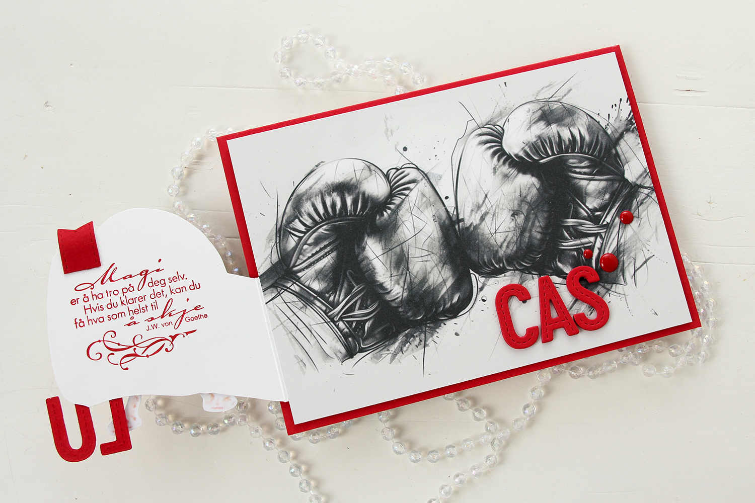 Once you open the glove fully, there’s a sentiment from an old confirmation stamp set from Stempelglede, stamped in Wild Cherry ink from My Favorite Things. I used one of the dies in the Essential Stitched Sentiment Strips die set from My Favorite Things to create a flag end to pull the glove open when the card is closed. The magnets are so strong, it won’t open on its own, and by adding the little flag end, it gives the recipient a little clue to look behind the glove.
 Back to the front of the card when it’s closed. I stamped an white heat embossed the word KONFIRMANT from the A05 stamp set from Norsk Stempelblad AS onto a piece of Red Hot cardstock from My Favorite Things, and then die cut it using a banner die from MFT – they have lots! I popped it up and made sure the end crossed into the image, to tie the two together. I did the same thing with my letters, die cut using the In Stitches Alphabet die set from My Favorite Things, also from Red Hot cardstock. I stacked a few layers for dimension and stability, the L and the U are only barely attached to the glove and the back of his left leg, so they needed a little bit of strength.
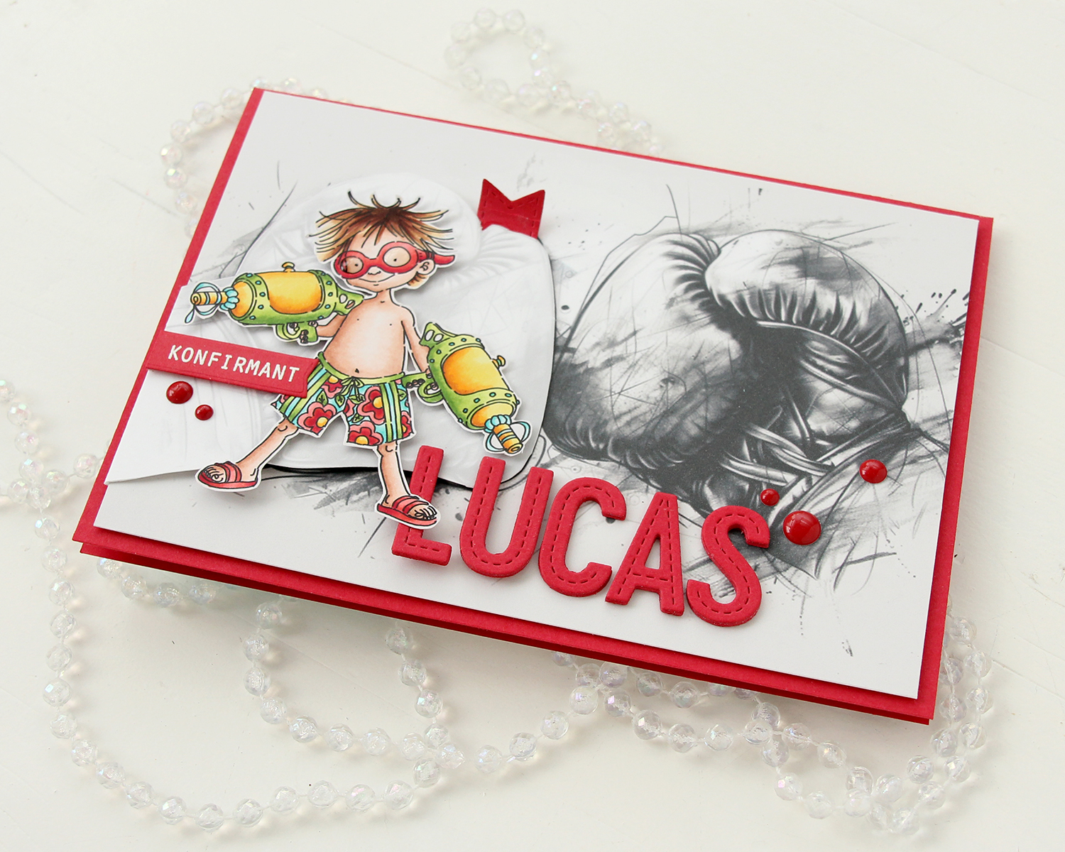 I finished off the front with a few red enamel dots from Papirdesign.
 On the inside, I printed and cut out a checkerboard pattern, which I thought worked well with the car racing theme. There’s still plenty of room to write a personal message. I also used the Wax Seals die set from Waffle Flower to create a rosette badge with a Norsk Stempelblad AS confirmation sentiment heat embossed in the center. I used the Itty Bitty Strips dies from My Favorite Things to create the ribbon ends hanging down from the actual rosette.
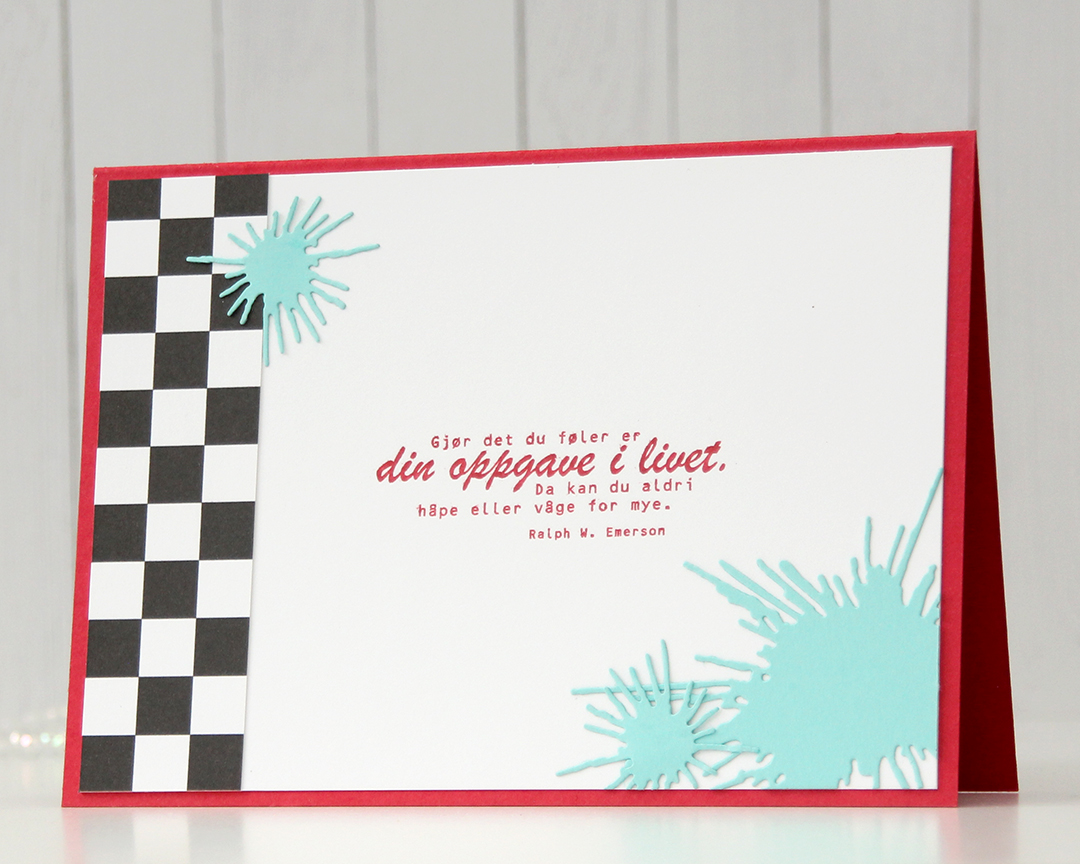 On the back of the card, I used more of that checkerboard pattern, stamped another confirmation sentiment (it’s actually an Emerson quote) and used the Splash die set from Papirdesign to create some water splashes from Summer Splash cardstock from My Favorite Things. I thought they tied in well with the super soakers in the colored image on the front of the card.
 A simple color palette to finish off. This card was a hard nut to crack, but once I got going I had a blast (no pun intended) creating it.
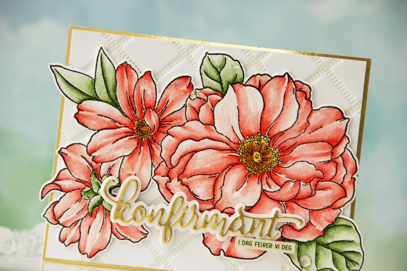
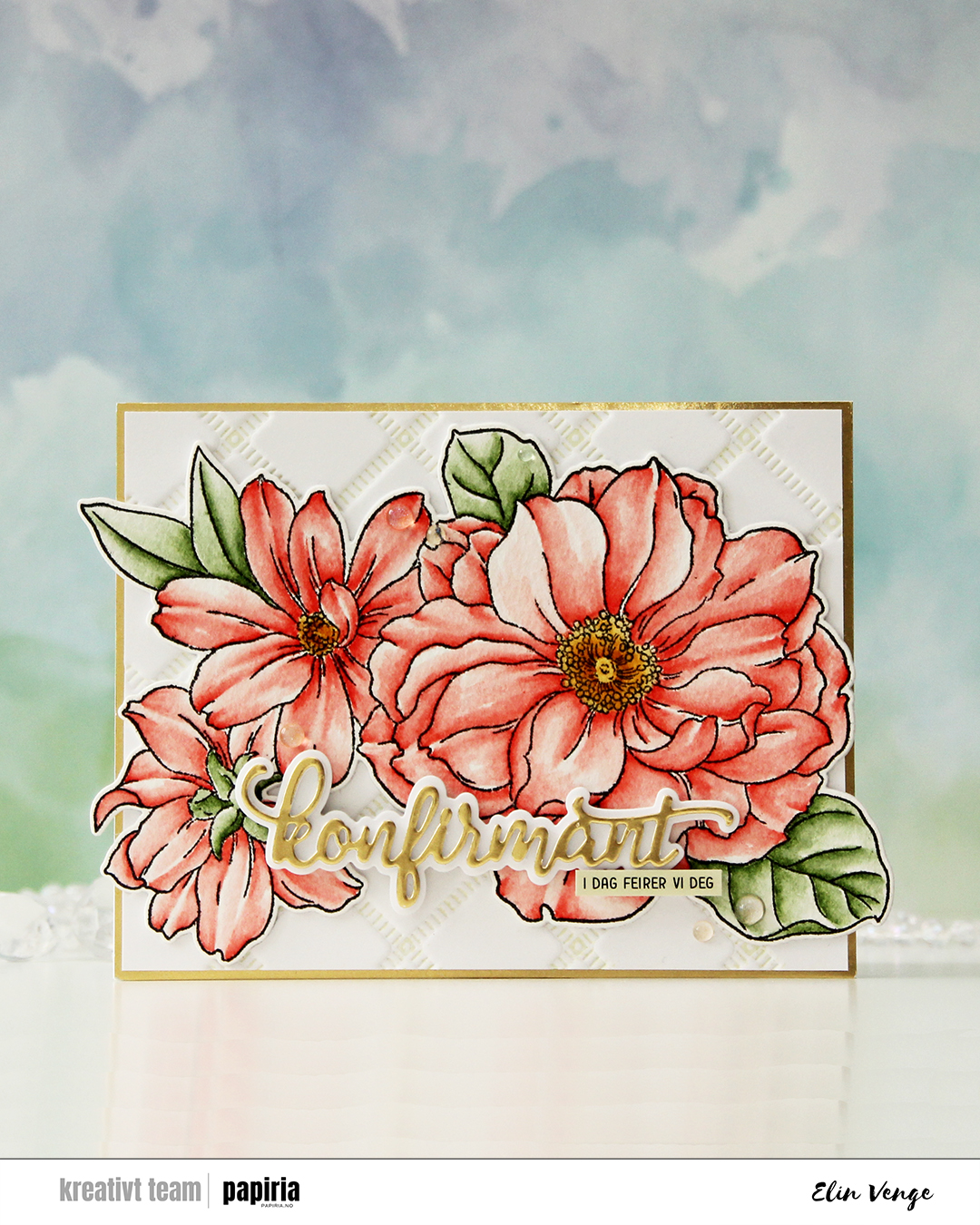 I started by stamping the big floral stamp in the Blooming Delight stamp set from Altewew using Altenew Obsidian ink onto watercolor paper (cold pressed Fabriano Artístico), before coloring with Zig Clean Color Real Brush markers. When my coloring was complete, I die cut the flower with the coordinating die and also cut a few extra from white cardstock to build dimension.
 I used the Stippled Plaid press plate from Pinkfresh Studio with Pistachio ink from Altenew to create a subtle background. I matted it with some gold shine cardstock from My Favorite Things and adhered my florals pretty much in the center. The flowers stick out on both sides, but I just made a larger envelope to accomodate the larger size.
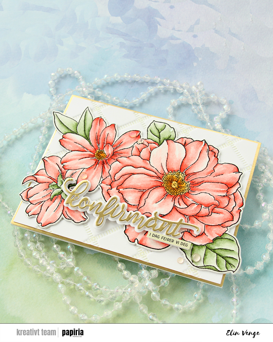 For the sentiment, I used a konfirmant die set from Papirdesign. I die cut the shadow layer from white cardstock and the word itself from the same gold cardstock that I used previously, with a few white die cuts stacked behind it for dimension. I even stacked a few behind the shadow, so it looks like the shadow floats on top of the flowers. For a sub sentiment, I used a sentiment sticker strip from Kort & Godt that I ink blended with Misty Sage ink from Altenew, before finishing off the card with a few Iridescent Dew Drops from Pinkfresh Studio.
 This card started out with me playing with the cotton thread from Kort & Godt. I wanted to something with it besides tying it in bows, and crocheting came to mind. I crocheted three flowers in different colors, and that was my starting point. I created a subtle background using the Watercolor Stripes stencil from Altenew with VersaMark ink, Sticky embossing powder and Distress Glitter in the Rock Candy color. This gives a soft tone on tone sparkle on the white cardstock and doesn’t distract too much from the flowers. I thread the flowers through to the back of the panel, used some tape to hold the thread down on the back and mounted it using foam tape onto a top fold white card base.
 I die cut the leaf circle die twice; once from vellum (I used Heavyweight translucent vellum from My Favorite Things), and once from Sprout cardstock from Concord & 9th. I offset them a bit, and used small amounts of liquid glue to adhere them to the card. I also die cut Konfirmant a few times from pink cardstock and adhered them together for a stacked, dimensional look. Once I added my die cut to the card, however, it got lost, so I die cut a layer from black cardstock from Papertrey Ink and glued that on top. That did the trick. I used a sentiment sticker to complete the sentiment and added some faceted pearls as a finishing touch.
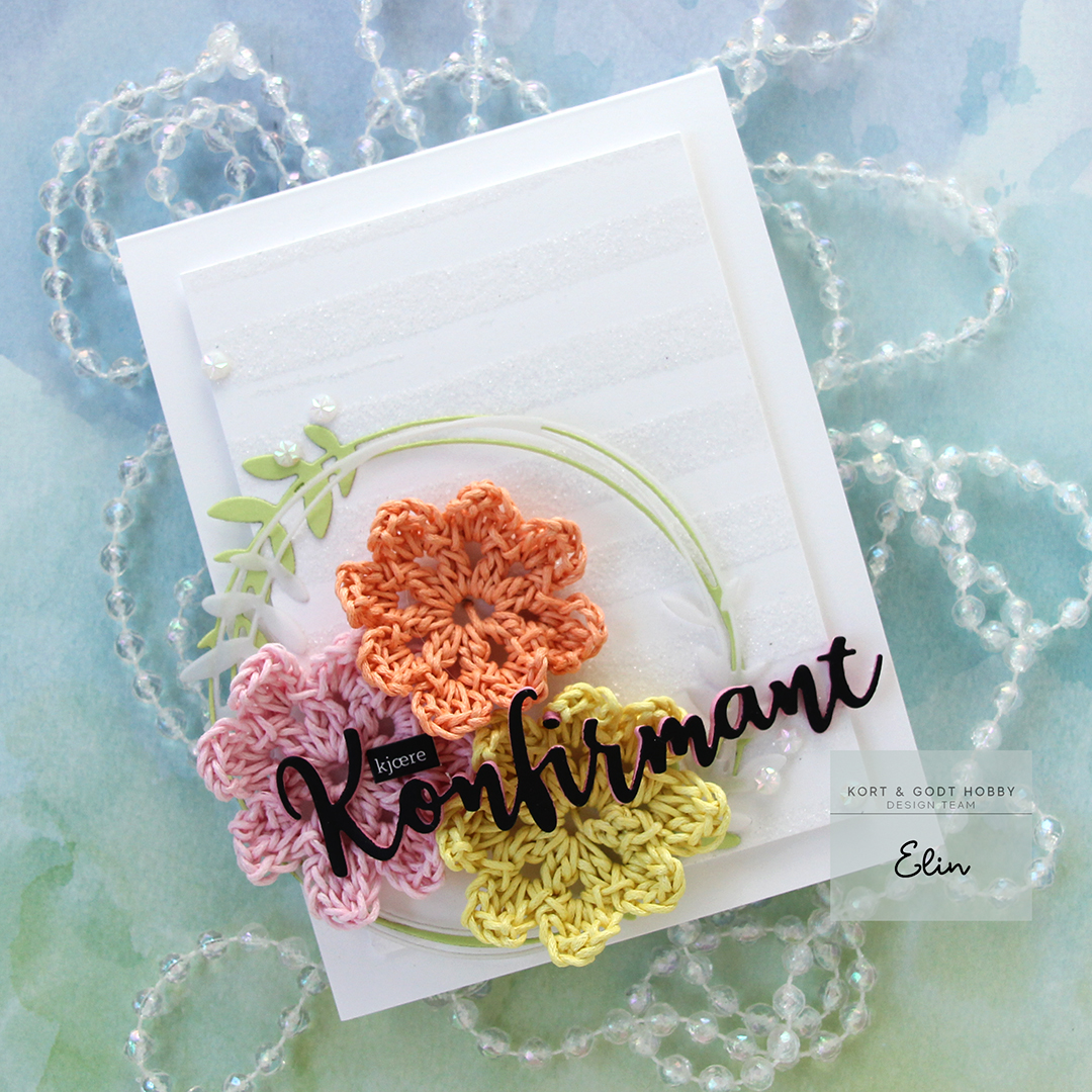 This was a fun way to use the cotton thread, and I still have heaps more!
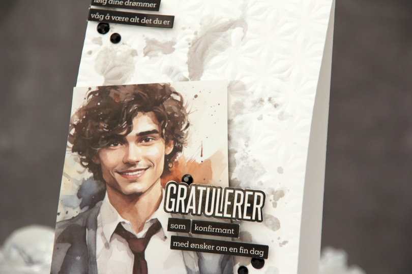
 I started by choosing an image to be the focal point of my card. I ink smooshed Gravel Gray and Eiffel Tower inks from My Favorite Things onto the background to mimic the background in the photo. This adds a little bit of interest to the background without being too distracting. I also used the Kaleidoscope embossing folder from Simon Says Stamp on the card base for added texture.
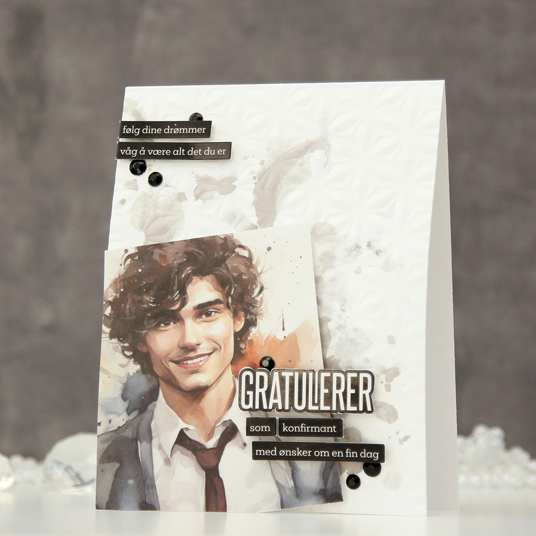 I placed the image at an angle in the bottom left corner of the card and cut off the excess hanging off the side and the bottom. I decided to mount it on foam tape for a little more interest, then used pre printed stickers to add my sentiments. I love these things, they make adding sentiments soooo easy. I put foam squares on the back of these for even more lift off the card base – dimension is life, after all. I used black gems to frame the sentiments as a finishing touch.
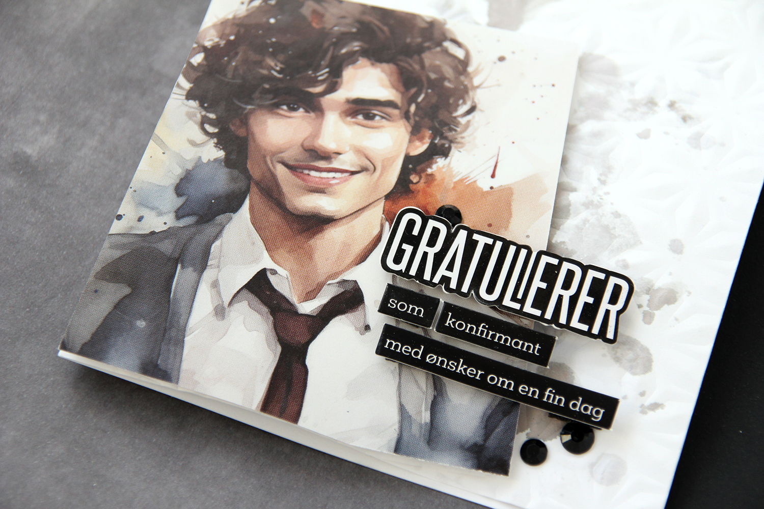 Dimension really is life!
 I die cut the word konfirmant and the individual letters for the recipient’s name in white cardstock and adhered them to a black envelope. The black and white ties in with the card nicely.
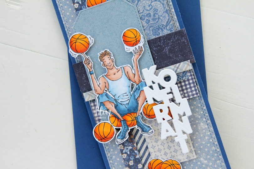
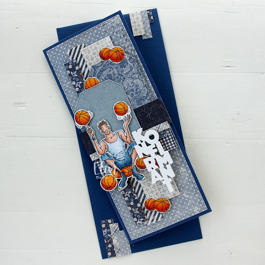 I made a slimline card this time. I created a background from blue scraps from several collections from Maja Design – Denim & Friends, Denim & Girls, Fika and Vintage Autumn Basics are all represented. One of the things I like about the Maja Design patterned paper is that papers match across collections. They’re also made from really good heavyweight paper, which is another tick in the pro column for me. I used the Slimline Double Stitched Rectangle STAX die set from My Favorite Things to create the panel in the back and also the Stitched Traditional Tag STAX die set, also from MFT, to create the tags.
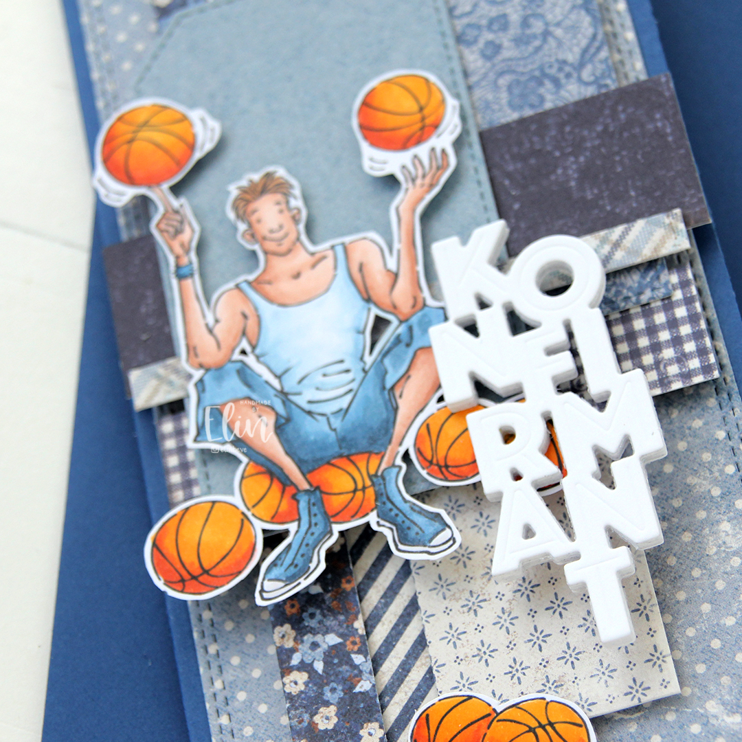 I added the image on top of one of the tags and scattered a few more basketballs around to work as embellishments. The orange really stands out against the blue background. To finish off I die cut the Konfirmant 5 die from Papirdesign six times from white cardstock and stacked them for a dimensional look. I adhered it on top of the image, and it floats above the card further down.
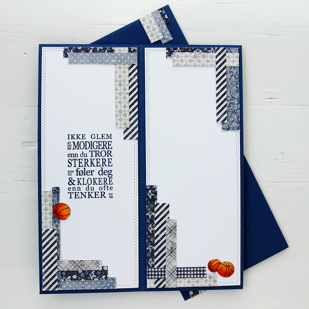 Whenever I make cards to order, I always decorate the inside too. I used the largest slimline double stitched rectangle die to create the white panels on the inside, adding more strips of patterned paper to continue the look from the front of the card and also fill the pages a little. Slimline cards are large, and the added elements make it less daunting to have to come up with a message for the recipient. On one side, I stamped a sentiment from the Konf. 01 stamp set from Norsk Stempelblad using Blue Beyond ink from My Favorite Things, the right side still has plenty of room for a personal message. I also included more basketballs.
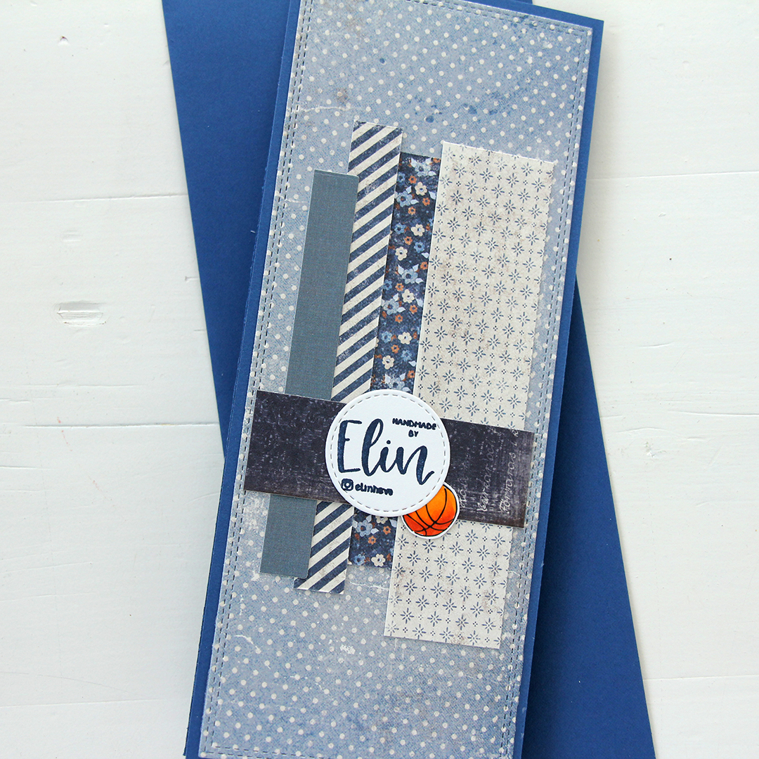 For the back of the card, I used a few strips of patterned paper I had left, die cut a white cardstock circle using the Stitched Circle STAX die set from My Favorite Things and stamped my personal stamp in the center of it using Blue Beyond ink from MFT. The card base is also from My Favorite Things, it’s made from Blueberry cardstock, and the envelope is also in that same Blueberry color.
 Limited color palette for this one.
 It’s confirmation season, and my nephew’s confirmation was September 10th. I made several cards for him, and this is one of them. I thought this image was the perfect one to use, nothing says fifteen year old boy like a guy with his phone in his hand, school books hidden away and a bowl of snacks on the armrest. The controller tucked away is a nice touch too. We don’t wear shoes indoors in Norway, but the rest is pretty spot on.
 I created a background for my colored image using a variety of stamps, inks and even a stencil. I started with the Abstract Triangle Background stamp from My Favorite Things that I stamped in Orange Peel ink from Simon Says Stamp. I didn’t want the stamp to cover the entire background and made sure to stamp it in the lower left corner and have it fade as it went up and to the right. I then took a confirmation stamp from the A05 stamp set from Norsk Stempelblad AS and repeatedly stamped it on top of the stamping I’d already done using VersaMark ink, before sprinkling on super fine detail embossing powder from Ranger and melting the powder with my heat gun. I then used the Watercolor Wash Free Form stencil from My Favorite Things and ink blended using Spiced Marmalade and Mustard Seed distress inks.
 I fussy cut my image leaving a white trim and mounted it on foam tape on top of the stamping and ink blending I’d done. I die cut the Hullmønster die from Papirdesign twice; once from Cornflower cardstock and once from Sour Apple cardstock, both from My Favorite Things. I tore them both up, tucking a couple of pieces behind the image for a little bit of added interest.
 I used the Konfirmant 2 die from Papirdesign to die cut five times from cardstock for a stacked look, placing a layer die cut from True Black cardstock from Papertrey Ink on top of the stack. I adhered it to the card using liquid glue, placing the beginning of the word on top of Noah’s pant leg to make it all fit.
 I added some sentiment stickers from Kort & Godt to fill the space at the bottom of the card a little. They’re originally a bit bigger than this and white with black letters, but I used a Copic marker to color them blue to make them stand out against the white background a little and also cut them down slightly. The banners with the stars are also Kort & Godt stickers.
 In the top right corner, I created a little cluster with die cut pieces and those stickers, before finishing off the card with a few Papirdesign enamel dots. Onto a Limelight envelope from My Favorite Things, I adhered white die cut letters (dies from Papirdesign) to spell his name and stamped Konfirmant from the Konf. 02 stamp set from Norsk Stempelblad AS using Limelight ink from My Favorite Things.
 On the inside, I stamped a sentiment from the Konf. 02 stamp set from Norsk Stempelblad AS using Orange Peel ink from Simon Says Stamp. I also adhered number stickers from Papirdesign to get the date on there. The right hand side has plenty of space for a personal message.
 Fun, bright color palette for this one.
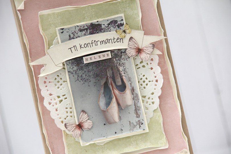
 I was able to scrounge up scraps of paper from three different paper collections from Pion Design: Grandma’s School Book, Till Mor, and Play Time. I wet and curled the edges to soften the look a bit, and also added a paper doily from Bo Bunny.
 Til konfirmanten is a stamp from Norsk Stempelblad AS. I stamped it using Espresso Truffle ink from Memento, I didn’t want it to be stark black, and that ink is a nice mix of grey and brown that I really like. I used some tiny letter stickers from Kaisercraft to add the girl’s name below the banner, and fussy cut a few butterflies from one of the patterned papers and glued them on.
 I kept the insides fairly simple. The sentiment stamp from Stempelglede is a Goethe quote (Magic is believing in yourself. If you can do that, you can make anything happen). The panel on the right side is perfect for a personal message.
 I decided to also keep the back of the card simple. I added another butterfly and stamped “Handmade” below in the same color ink that I used on the front of the card.
 Det ser ikke ut som en typisk norsk bunad, og det er det heller ikke. Konfirmanten har nemlig islandsbunad, og den går i svart, hvitt og gull.
 Jeg brukte ark fra forskjellige Papirdesign-kolleksjoner for å lage denne islandsbunaden, to av arkene jeg har brukt er fra Bryllupsfest-serien, ett ark fra Velkommen lille venn-serien og ett ark fra Gledelig jul-serien. De passet sammen til noe som ligner ganske bra på islandsbunaden.
 Baksiden gjorde jeg ikke noe spesielt med, lagde et belte med det ene arket fra Bryllupsfestserien og har ellers holdt meg til svart kartong fra Papertrey Ink på skjørtet.
 Jeg stanset ut en die fra Papirdesign i fem lag av Berry Sorbet kartong fra Papertrey Ink og limte dem rett på lommen. Jeg pyntet enkelt med blomster og blader fra I am Roses og Wild Orchid Crafts, limte på noen perler fra Papirdesign og et par sommerfugler fra Snip Art.
 Kortet for øvrig er laget som et vanlig dobbelt kort, med paneler til skrivefelt inni. Kantene på selve bukselommen er ikke 100 % rette, så resten av målene måtte tilpasses deretter. Det var også en av grunnene til at jeg valgte å rufse kantene på papirene, da er det ikke så farlig at det ikke er helt perfekt. Av en bit mønsterark fra Summer Crush-kolleksjonen til Maja Design stanset jeg ut en sirkel med pyntekant med en die fra Cottage Cutz og stemplet en tekst fra Stempelglede med Espresso Truffle blekk fra Memento. Følte at jeg måtte ta igjen litt av pynten fra forsiden, så det ble en liten sommerfugl her også.


 Jeg satte en hvit utstanset oval på 3D-puter for dimensjon og limte på en dame stanset ut i flere lag kartong. Jeg er ikke spesielt glad i strukturen på Bazzill, så jeg har stanset ut figuren, så det er baksiden av kartongen som vises. Den er glattere. Ordet konfirmant med skygge stanset jeg ut av de samme mønsterarkene som er i bakgrunnen. Limte på blomster av ymse slag (hortensia med perle, kirsebærblomst, roser og tulipaner), og kortets forside var i boks.
 Kortet skulle ha plass til pengelomme, så i den ene ovalen på innsiden stanset jeg ut bølgekanten med en die fra Gavekort-settet. Ovalen er kun limt i kantene til panelet bak, så det går fint an å putte noen sedler i lommen. Stemplet på en tekst med Memento Espresso Truffle og satte på konfirmantens navn med klistremerkebokstaver. Høyre innside har plass til personlig hilsen.
 Jeg fortsetter med det samme oppsettet også på baksiden av kortet. En fin tekst som passer perfekt både til konfirmanten og til ovalen den er stemplet på. Jeg limte på noen blomster også her, som en liten siste finish.