
Hi, crafty friends. I’m sharing a tri-fold card today, featuring one of the new Little Miss stamps from Streamside Studios.
 I colored my scene with Copics on X-Press It cardstock and fussy cut right up against the black lines. This image has very simple outlines, making fussy cutting a cinch.
 I covered the entire colored panel with sheer sparkle craft spray from Imagine, it adds so much sparkle, which unfortunately is hard to capture in photos. It’s there in real life, though, trust me. I glued my colored piece onto a thicker white cardstock, both for a bit of stability and to hide the back of the colored panel. Copics bleed through to the back (you want that, it’s actually a sign that you’re using a good cardstock for Copic coloring), and I usually add my panels to card bases, but this one was different. I scored the white cardstock at the bottom and glued the back flap to the back bottom of an A2 card base I created from Lovely Lady cardstock from Papertrey Ink. With hidden magnets between the layers of the card, it stays shut and doesn’t fall open.
 You can see some of the shimmer in this photo, a couple of big droplets fell on the mushroom and the rainbow. I added pearls from the Igloo mix from Little Things from Lucy’s Cards for the mushroom, and used a black glaze pen from Sakura to make the eyes stand out.
 Lots of Copics for this one.

 There’s a stamp in the stamp set with a penguin holding a present. I thought it was perfect for a simple birthday card. I colored the penguin with Copics and added a layer of black glaze pen to the eyes for shine. Once the black was dry (this stuff dries fast), I went back in with a 05 Gelly Roll to add the white dots back in. I fussy cut the penguin and started working on the rest of the card.
 Using the Snow Drifts Cover-Up die from My Favorite Things, I decided to create some waves on the front of my card. I die cut four layers from white cardstock and used various shades of aqua tones for the top layer. From bottom to top they are: Tropical Teal from My Favorite Things (bottom two waves), Caribbean Sea from MFT, Hawaiian Shores from Papertrey Ink, Summer Splash from MFT, Sno Cone from MFT and Stamper’s Select White from PTI (top two waves).
 On the Hawaiian Shores wave, I used one of the big words in the
  I used the Sea Glass mix of embellishments from Little Things from Lucy’s Cards for a finishing touch. This mix was the perfect color for my card, and it’s sometimes fun to add something besides JUST sequins. There are a couple of gems and even confetti stars on this card, too, all from the same mix.
 I love the dimension of those waves, it’s very impactful, and the reason I wish I’d added dimension behind my penguin, as well, I feel he’s a little flat compared to the rest. Oh well, next time.
 Simple color palette for this one.
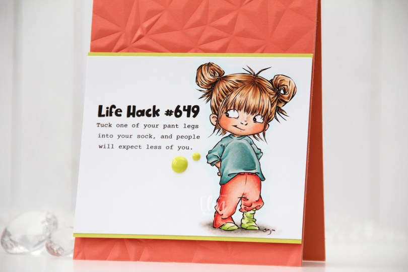
 Meet
Meet  I colored the image with Copics, trimmed my panel down and added a thin strip of Limeade Ice cardstock from Papertrey Ink above and below for a little bit of extra color and definition.


 I used more Copics than I thought I would for this. I even used BG71, which is a color I’ve created myself.
 As usual, I colored the image with Copics. I didn’t use very dark colors for this one, because I wanted the coloring to look soft. I purposely colored the owl in colors that wouldn’t stand out. By using the same colors that I used for the tree, they’re somewhat hidden and go well with the sentiment, which was my plan.
 I created a top fold A2 card base from Jalapeño Popper cardstock from My Favorite Things, cut down my colored panel to 3 5/8 x 4 7/8″ and mounted it on foam tape in the center of my card.
 From the same color cardstock, I used the Connected alphabet die set from My Favorite Things to die cut the letters to spell the word FRIENDS. I die cut each of the letters three times and stacked them for a dimensional look. Using Jalapeño Popper ink from My Favorite Things, I stamped the rest of the sentiment using the Bella Letters stamp set from Mama Elephant onto a strip of white cardstock from Papertrey Ink. I took my time stamping, I wanted this to look pretty straight, and if you’ve ever stamped a sentiment with individual letter stamps, you know that you just can’t rush it.
 I added an additional two layers of white cardstock strips behind my stamped sentiment. I added my dimensional white strip onto a slightly wider green strip, before adhering it directly to the colored image, before finishing up the card with some sparkly sequins from the Seaglass mix from Simon Says Stamp.
 Lots of dimension going on here. Dimension is life, after all 🙂 I added a tiny dot of black to their eyes with a Glaze pen to make them pop.
 Very simple color palette for this one.
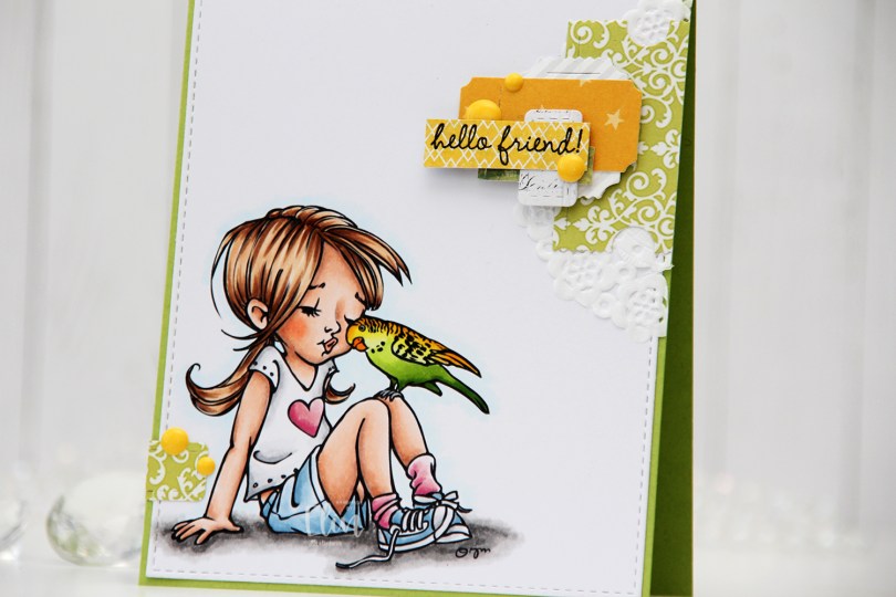
 I colored the image with Copics and die cut the panel using the largest die in the A2 Stitched Rectangles STAX 1 die set from My Favorite Things, before adhering it to a card base I created from Sour Apple cardstock, also from My Favorite Things.
 On my cluster cards, I usually choose two to three colors from the image to create scraps from. This time I chose green and yellow with a little bit of gray. Neutrals are always a good thing to add. I keep die cut scraps in stamp storage pockets on my desk, sorted by color. Whenever I want to create a cluster, I choose the storage pockets with the colors I want, dump the contents on my desk and start PLAYING.
 For this card I wound up using scraps from 3ndypapir, Karen Foster, Sunny Studio, P13, Magnolia and Papirdesign. By limiting the size and colors of my clusters, the design stays harmonious and you can’t tell that I’ve used patterned paper from 6 different companies. I adhere some directly to the layer below, some using foam squares. As a base, I used half a doily from Doodlebug Design that I had in a drawer. I love these tiny paper doilies, they’re perfect for this.
 Using VersaFine Onyx Black ink, I stamped a sentiment from the
  These cluster cards are so fun to make. They make my piles of scraps shrink EVER so slightly, but anything’s better than nothing, and I love the dimension they add to the card.
 I used quite a few colors for this one.
 The stamp is called Coco Loco, the name’s even funny. And also very fitting. I printed it near the bottom left of my panel of X-Press It blending card and printed my sentiment near the top right corner.
 I did some very simple Copic coloring of the palm tree, the beach and also colored a pale blue halo around it to give the illusion of some sort of sky around it. I prefer the look of this light blue on the outside of the actual image instead of the bright white of the paper, I think it looks more finished this way.
 I used the largest die in the A2 Stitched Rectangles STAX 1 die set from My Favorite Things to trim down my panel slightly and add faux stitching around the edge, before I adhered it to a card base I created from New Leaf cardstock from Papertrey Ink.
 I added some brown enamel dots from Papirdesign near the sentiment and also a couple near the image itself to embellish a tiny bit. I love enamel dots!
 To enhance the nuttiness of this image, I colored the cheeks pink and added Glossy Accents to what was already crazy looking eyes for a bit of extra fun.
 Simple image equals simple color palette.
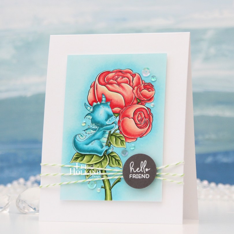
 I printed the image onto X-Press It blending card and colored it with my Copics, before trimming it down. I mounted it on foam tape to a top fold white card base I created from Stamper’s Select White cardstock from Papertrey Ink.
 I felt the need to add a design element that would break the rigidity of the rectangular panels, and decided to add some twine going across. I wrapped Green Apple Divine Twine around the card front three times and tied a knot. The green goes well with the green in the image.
 Onto a piece of Eiffel Tower cardstock from My Favorite Things, I stamped and white heat embossed a sentiment from the Mini messages stamp set from Mama Elephant, before using a 1″ circle punch from EK Success to create a quick circle from it. I added strategically placed pieces of foam tape on the back of it and adhered it directly onto the knot I had tied on the front of the card.
 To finish off the card, I added sequins and gems from the Urban Chic mix from Little Things from Lucy’s Cards. They’re kind of scattered in a trail going from the bottom left to the top right of the image.
 The card is simple, but has lots of dimension, and that dragon hugging his peonies will always steal the show.
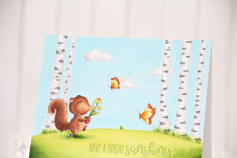
 I stamped
  I colored the entire panel with Copics, deciding to add a few clouds in the sky as well as some visible blades of grass near the trees.
 I adhered my colored panel onto a top fold landscape A2 card base I created from Stamper’s Select White cardstock from Papertrey Ink. I stamped a sentiment from the
  To finish off the card I added a few pearls from Kort & Godt in three different sizes (2 mm, 2.5 mm, 3 mm). Adding the pearls was actually my niece’s idea. I tend to go for sequins myself, but I love pearls too and hadn’t used these in a while, so it was good to break them out.
 The lack of dimension makes this a very thin, lightweight card compared to my normal cards, which means this won’t have any problems going through the mail.
 Not a lot of colors given that the entire card front is colored.
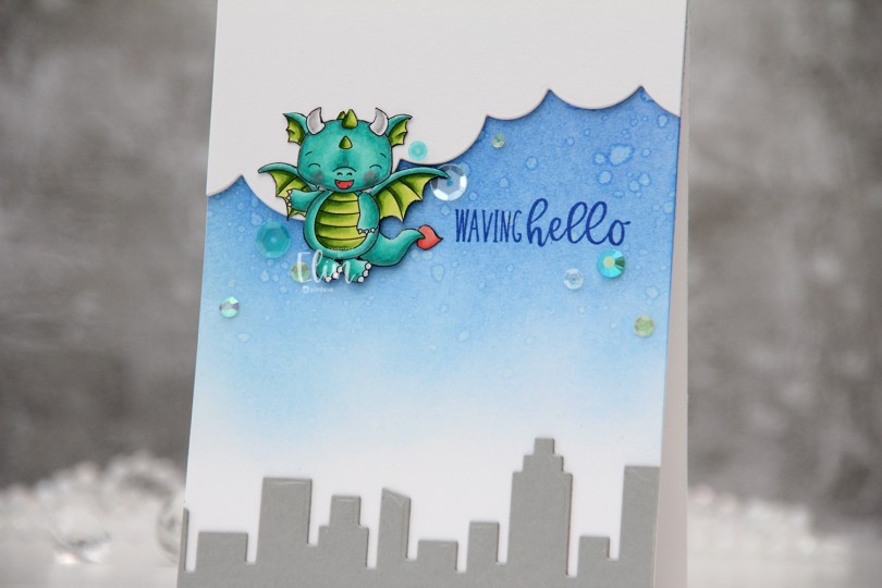
 I colored the dragon with my Copics and fussy cut him right up against the black lines of the image. I put him aside while I worked on the rest of the card.
 Onto a top fold white A2 card base I created from Stamper’s Select White cardstock from Papertrey Ink, I ink blended Azurite, Ultramarine and Eastern Sky inks (all from Altenew) towards the top of the card, fading to white near the bottom. I splashed some water droplets on top for a cool effect. Dye inks are water based and react with water, so this works with most inks you probably have. The darker the color, the bigger the impact.
 From Cement Gray cardstock from My Favorite Things, I die cut two layers of the skyscraper skyline in the Slim Film City die set from Mama Elephant and adhered them at the bottom of my card. Using the cloud die in the Slim Basics die set, also from Mama Elephant, I die cut the cloud shape three times from Stamper’s Select White cardstock, stacked them and adhered them to the top of the card.
 Onto the card base, I stamped a sentiment from the
  I adhered the dragon partially on top of the clouds, using foam squares behind the parts hanging off the clouds for even dimension, and sprinkled a few gems and sequins from the Seashore mix from Little Things from Lucy’s Cards around the dragon and sentiment to finish the card.
 Suuuuper simple color palette for this dragon.

 I wanted to add a little bit of interest to my flowers and did some simple ink blending. I used Mustard Seed and Spiced Marmalade Distress inks for the yellow, Fresh Leaf ink from Altenew for the green and Vintage Timber from My Favorite Things for the brown. I also added additional diecuts to build dimension and interest to these flowers.
 Onto a white card base I created from Stamper’s Select White cardstock from Papertrey Ink, I stamped a sentiment from the
  This is a very simple card, and in hindsight I kind of wish I’d used a different color for my card base, or even ink blended a gradient blue with on the card base, but the white makes the yellow pop and is very clean, which is usually my preference on simple cards.
 Here you can see a little bit of the dimension on the card. I used white diecuts behind the the yellow ones (I don’t have a lot of that Buttercup cardstock and wanted to use as little of it as possible), which worked out great. The white almost disappears against the white of the background, making it look like the flowers are floating on the card, it’s such a cool effect!