
Hi, crafty friends. Have you checked out Alberto Gava’s Coloring Club challenge over on Instagram yet? There is a total of 10 challenges running in April, each one with a different theme lasting 3 days. I’m kind of late with this “Water” themed one, but better late than never?
 I combined Sapphire, Steel & Cobalt with Skip and the Rainbow Falls background. They’re all from last year’s summer’s Amongst the Pines collection from Purple Onion Designs. I stamped the images in Altenew Obsidian ink onto Fabriano Artístico Extra White Cold pressed watercolor paper.
 I didn’t want color on the entire piece and decided on coloring a strip that includes the largest part of the waterfall, the beaver and part of the mama swan. I used Zig clean color real brush markers to color, using the blender for some of it, but a size 4 round watercolor brush from Princeton, along with water, for most of it. The Zig colors I used are the following: 068 Deep Brown, 816 Soft Violet, 028 Pale Pink, 705 Peach Orange, 505 Yellow Ochre, 407 Grass Green, 406 Sage Green, 411 Cactus Green, 307 Aqua Blue, 315 Ultramarine and 910 Warm Gray 6.
 Once my coloring was complete, I cut the colored section apart from the rest. I adhered the uncolored sections onto a black mat I created from Black cardstock from Concord & 9th. Behind the colored panel, I stacked a few layers of cardstock for dimension and adhered it in between the other two pieces. I adhered my finished piece onto a card base that I created from Blue Beyond cardstock from My Favorite Things.
 I stamped and white heat embossed a sentiment from the Sweet Summer sentiment set from Purple Onion Designs onto a scrap piece of black cardstock. I added a few cardstock layers behind it and adhered it to the card, before finishing off with a few blue enamel dots from Papirdesign.
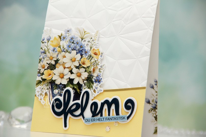
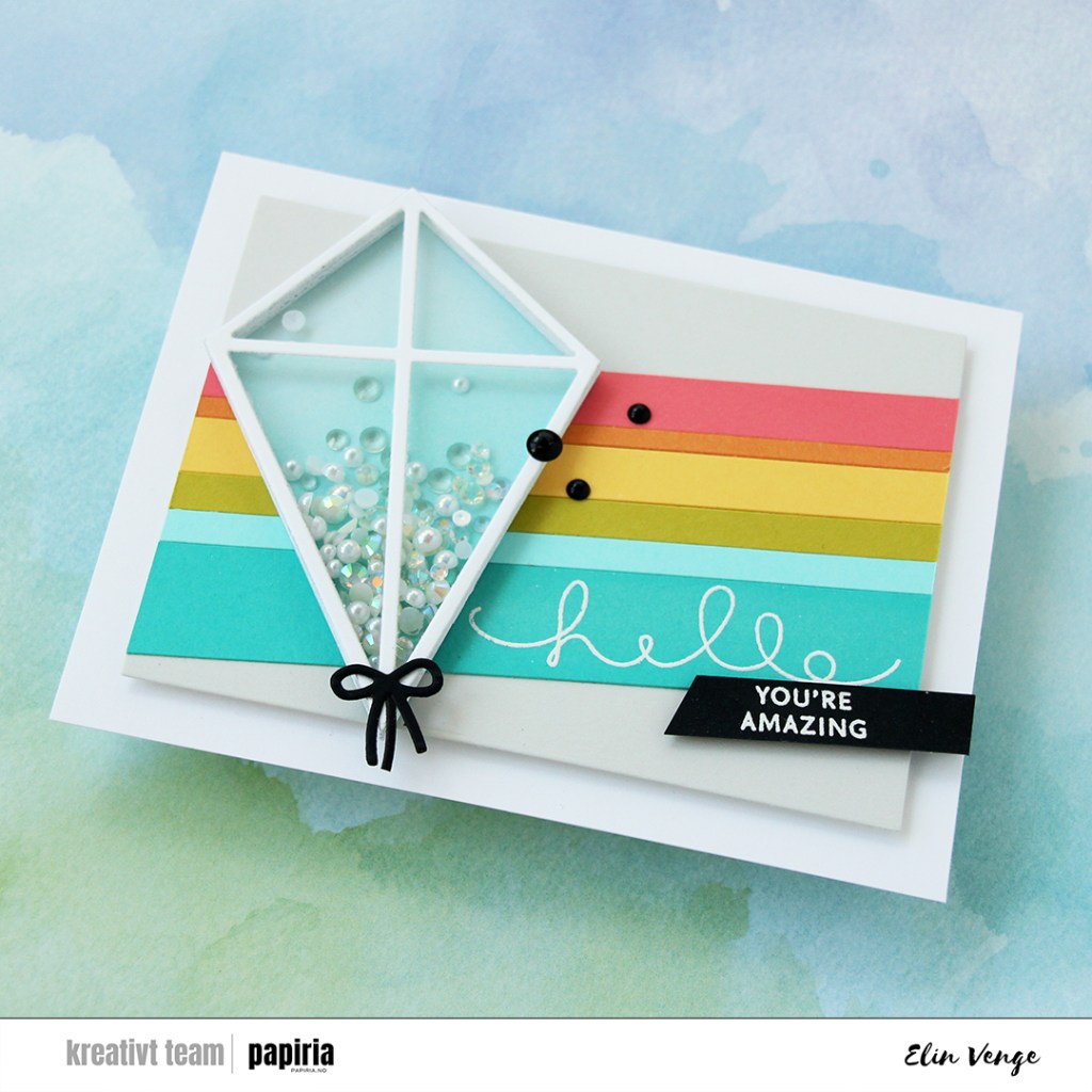
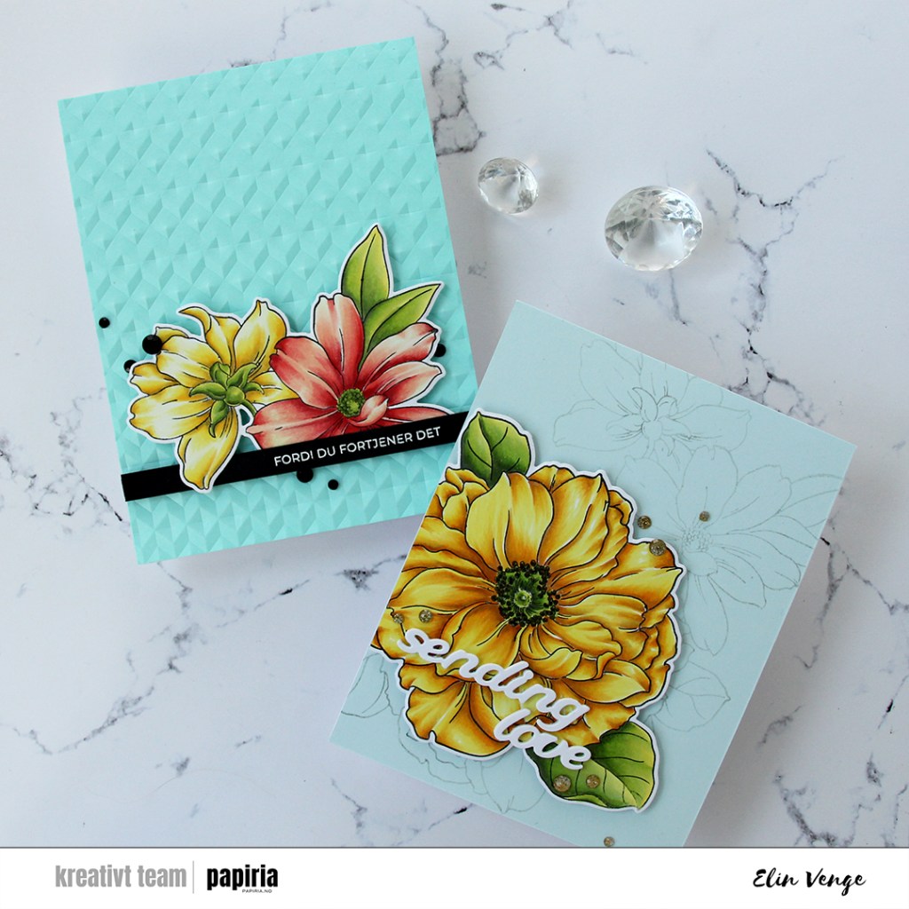
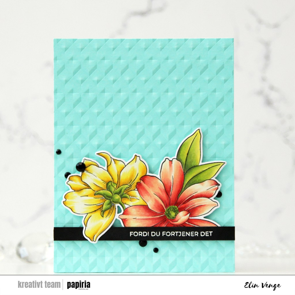
 I started by fussy cutting this floral image, leaving a white border around it. I then used the Crystal Distortion embossing folder from Simon Says Stamp on my card base to create some interest to it.
 I added a piece of Lemon Tart cardstock from Papertrey Ink at a bit of an angle at the bottom of my card front, and glued a small strip of Gold Shine cardstock from My Favorite Things at the top for a defined edge between the white and yellow. I put foam squares on the back of my flowers and adhered the image on the left hand side of the front, chopping off the overhanging bit and adhering it to the inside so it didn’t go to waste.
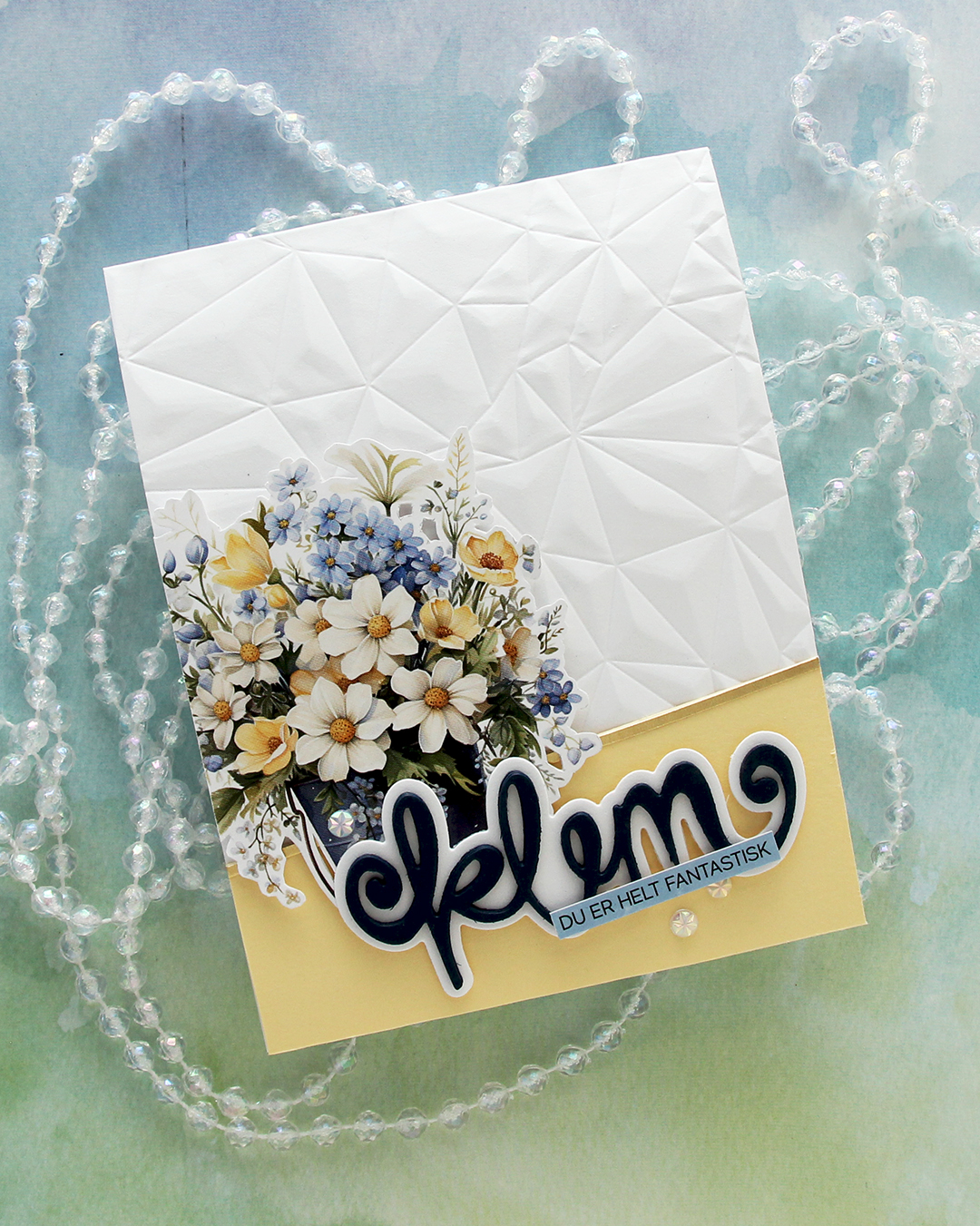 Using Die360 from Kort & Godt, I die cut klem four times from Nautical cardstock from Hero Arts and stacked them for a dimensional look. I die cut the shadow from Stamper’s Select White cardstock from Papertrey Ink (the same cardstock that I used for the card base) and adhered the stacked word to it, before putting foam squares on the back of the right half, adhering it directly to the image on the left.
 I used one of the sentiment sticker strips from Kort & Godt to finish my sentiment. I trimmed it down slightly to make it more narrow and ink blended it with Winter Lake fresh dye ink from Altenew to make it match the blue in the flowers. I adhered the strip on top of the die cut and finished off the card with a few faceted pearls.
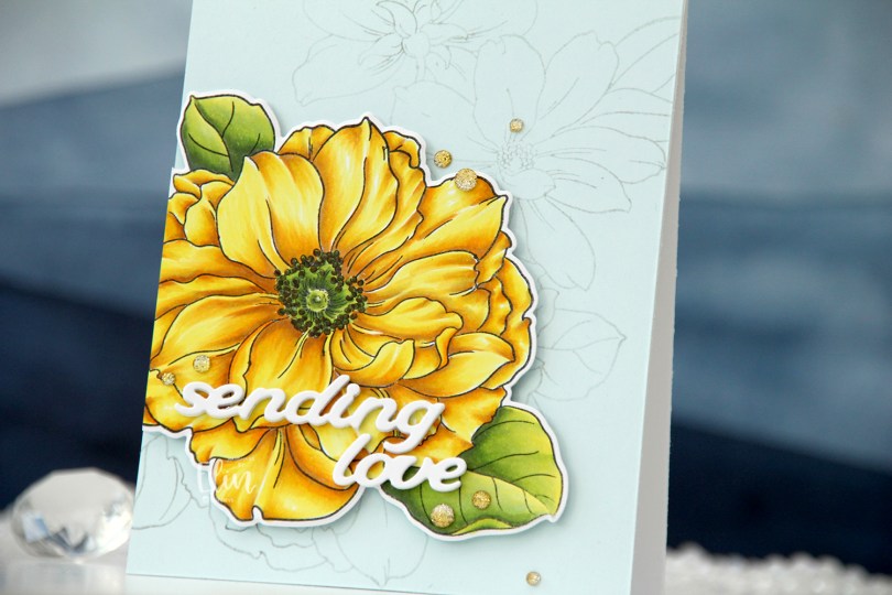
 I started by stamping the large flower in the Pristine Peonies stamp set from Altenew using VersaMark ink. I added Gilded embossing powder from Brutus Monroe and melted the powder before die cutting the flower and then using the coordinating stencils to quickly color in the flower and leaves. I used Nectar, Grapefruit, Sorbet and Cayenne inks from Concord & 9th for the florals, and Pistachio, Misty Sage, Mossy Meadow and Green Opal Fresh dye inks from Altenew for the leaves and buds.
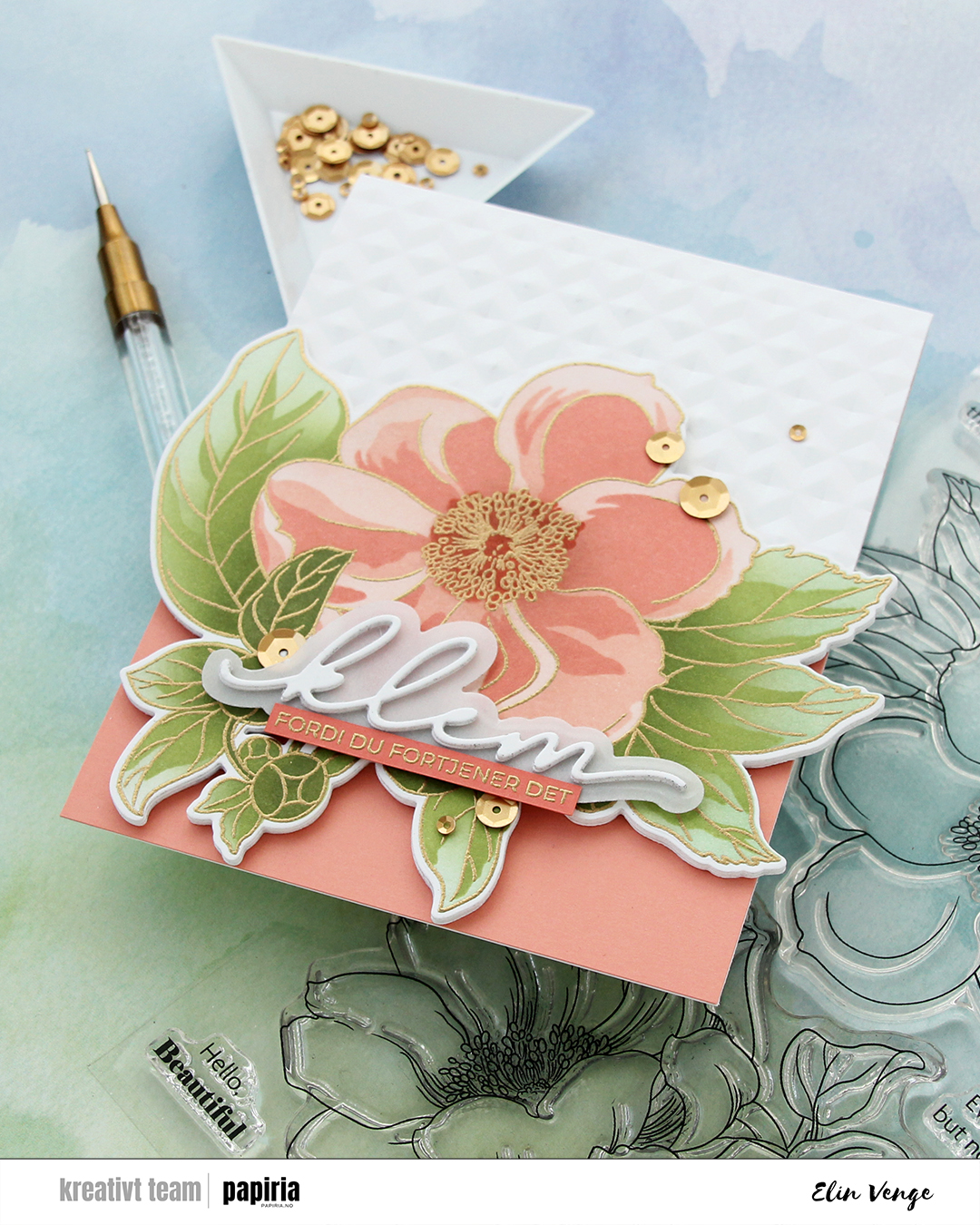 I die cut an additional three layers of the floral from white cardstock to glue behind my colored one, did partial die cutting on the card base using the same die and then ran the base through my Gemini Jr. with the Angled Mosaic embossing folder from Altenew to create some texture to the card front.
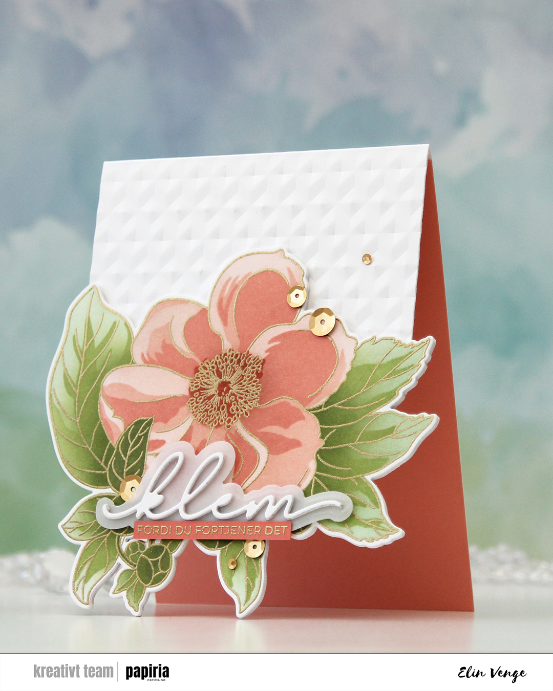 I adhered a panel of Grapefruit cardstock from Concord & 9th to the inside to accentuate the look of the open front, and added my stacked die cuts to the front of the card base. Even though the tips of the leaves touching the table when the card is on display are pointy, all the layers make for a very sturdy front, so they won’t bend.
 I actually used a Christmas die for the sentiment. The die cuts out the word juleklem (Christmas hug), but by omitting the first four letters, I was left with klem (hug). I die cut two stacks of three layers each and die cut the shadow layer from Heavyweight Translucent vellum from My Favorite Things. I sandwiched the vellum between the two stacks and adhered my stacked die cut on top of the flower. I stamped and gold heat embossed a coordinating sentiment (translation: because you deserve it) onto a strip of Sorbet cardstock from Concord & 9th, adhered it to the vellum and added a few more layers on the back for strength and dimension, before finishing off the card with satin gold sequins from Altenew.
 I haven’t done any coloring since December, so I felt rusty. Thankfully, these images from Lili of the Valley are easy ones for jumping back in! Once my coloring was complete, I fussy cut him, leaving a thin white border around the edge. I didn’t want to cut away the “fuzzies” that are so typical of LOTV images, so by leaving a white border, I could preserve the look. I used an embossing folder (Quilted embossing folder from Concord & 9th) to create some interest in the background without being too distracting.
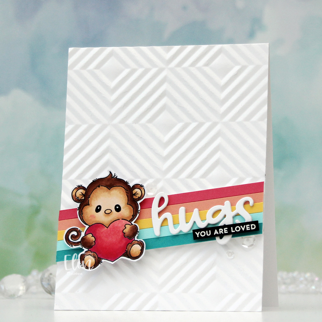 I cut down a few colors of cardstock from Concord & 9th to 3/16″ wide strips and glued them together on a scrap piece of white cardstock. The colors I used are Oceanside, Aqua Sky, Buttercup, Grapefruit and Honeysuckle. I mounted my stripped up panel at an angle, put a few foam squares behind the monkey and added him on top. I die cut hugs (Quilted die set from C9) three times from white cardstock, stacked them and adhered them on top of my strips next to the monkey. I then stamped and white heat embossed a sentiment from the Itty Bitty Gifting stamp set from My Favorite Things onto a black piece of cardstock from Concord & 9th. I added a couple of layers of black cardstock behind for strength and dimension and adhered it on top of the die cut word, before finishing off with a few sequins from the Starry Night mix from Little Things from Lucy’s Cards.
 Simple color combo this time.
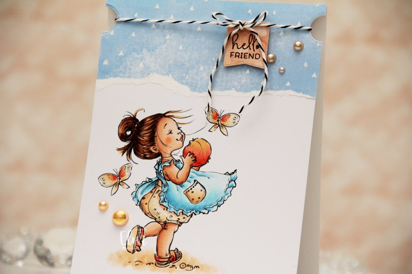
 I colored her up with my Copics and kept the panel intact this time. No die cutting, no nothing. I adhered it directly to a top fold A2 card base and put a torn piece of patterned paper at the top. The paper is from the Watercolor Wishes pad from Lawn Fawn, and I white heat embossed triangles onto it to create a little more interest, using the Scattered Triangles Background stamp from My Favorite Things.
 I used a small circle die to create notches near the top of the card. I stamped a sentiment from the Mini messages stamp set from Mama Elephant using Obsidian ink from Altenew onto a piece of patterned paper from the Watercolor Wash Brights paper pad from My Favorite Things, and die cut it with one of the dies in the Blueprints 27 die set from My Favorite Things. I put foam tape on the back and adhered it to my card, before adding some black twine to the card, tying it in a bow at the top of the die cut. The notches help keep the twine in place. I finished off with a few pearls from the Meadow mix from Little Things from Lucy’s Cards.


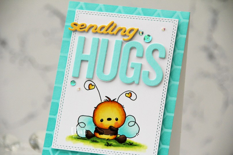
 I stamped the bee on X-Press It blending card and colored it with Copics, before I used a die in the A2 Double Stitched Rectangle STAX die set from My Favorite Things to create a faux stitch border.
 Onto a panel of Aqua Sky cardstock from Concord & 9th, I ink blended Aqua Sky ink through the Geometric Mosaic stencil from My Favorite Things and adhered the panel to a white card base I created from Stamper’s Select White cardstock from Papertrey Ink, then mounted the panel with the bee in the center using foam tape.
 I used the Sending You Hugs die from My Favorite Things to die cut the word HUGS four times. I die cut three white, one from Aqua Sky cardstock and stacked them for dimension. I used the same technique on the sending die from the Blooming Delight die set from Altenew, but switching out the color for the top die cut to Buttercup cardstock from Concord & 9th. I adhered the letters for HUGS above the bee, and the stacked sending above that, letting the s hang from the edge of the panel to break the line in the design.
 I used sequins and gems from the Urban Chic mix from Little Things from Lucy’s Cards to embellish, and I also used my trusted black glaze pen/white Gelly Roll 05 combo for the eyes to give them a little dimension and shine.
 Simple color palette for this one.
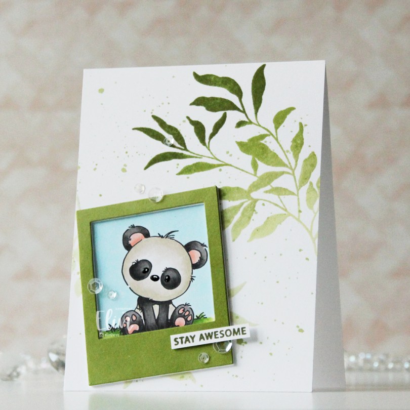
 I printed my panda onto X-Press It blending card, colored him with Copics and used a black glaze pen, then a white Gelly Roll 05 to create shine and a little bit of dimension in his eyes and nose. I then used the Polaroid Shaker Frame die from My Favorite Things to create the perfect spot for him by die cutting a few layers from white cardstock and one layer from cardstock that I colored green with one of the inks in the Jade Greens family of fresh dye inks from Altenew.
 Using the Leaf Clusters stamp set from Altenew, I stamped one of the leaf clusters onto my white card base with various greens to create an ombre look. I used Pistachio, Misty Sage, Mossy Meadow and Green Opal inks, all from that same Jade Greens family of Fresh dye inks. I actually stamped it twice, but the polaroid covers most of the one I stamped in the bottom left corner. I also used the inks to create a little ink splatter on the background.
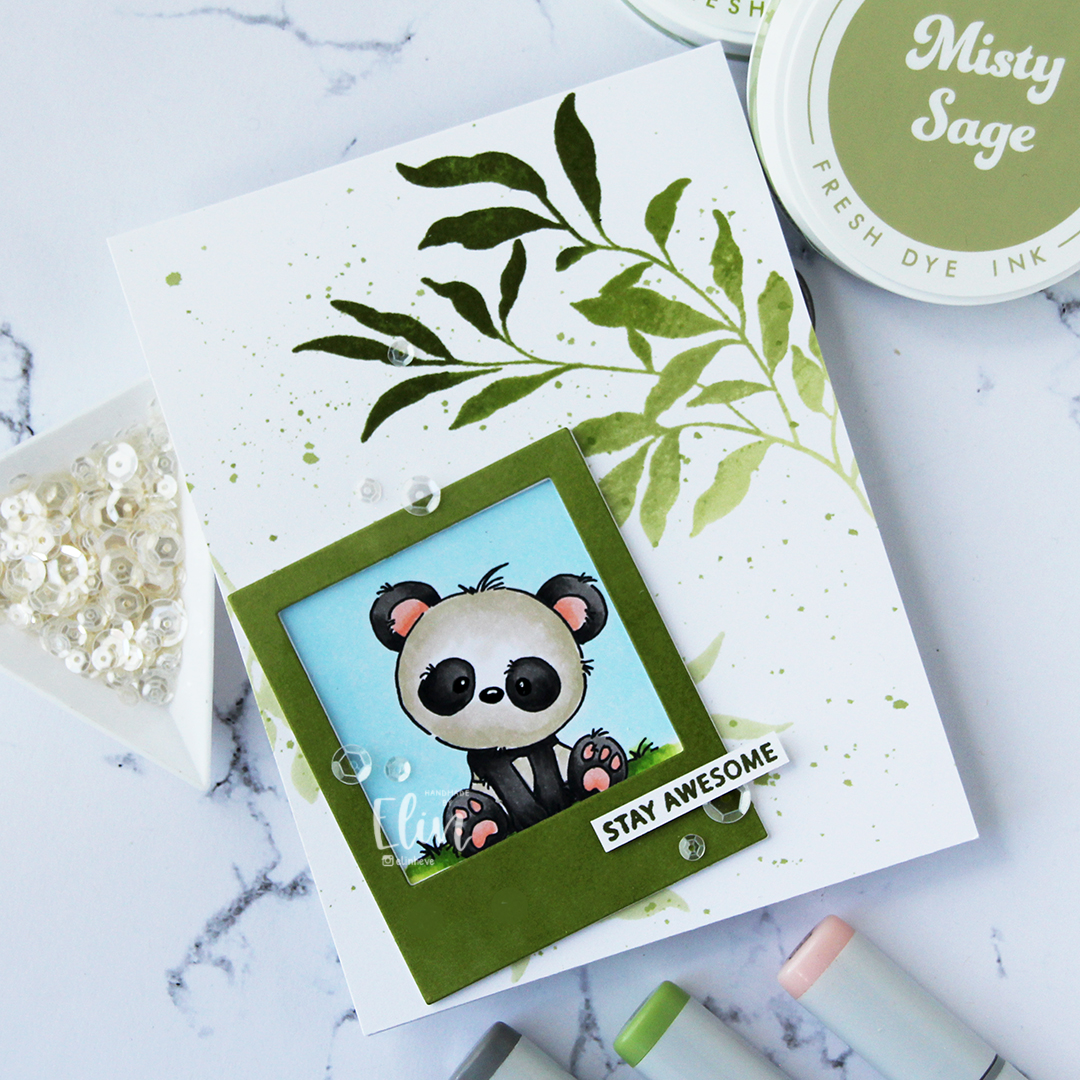 I stamped a sentiment from the Leaf Clusters stamp set in Green Opal ink, cut it down to a strip and added a couple of strips behind it for strength and dimension, before finishing off the card with a visual triangle of sequins from the White Orchid Sequin mix from Little Things from Lucy’s Cards.
 It’s no secret that I love dimension on my cards, and my three layer sentiment on top of the four layer polaroid frame add enough weight for this to require extra postage, but that’s true of most of my cards.
 These pandas tend to make for some pretty simple color combos.
 I colored the image with my Copics, before using the Notebook Edge die from My Favorite Things to create a fun border at the bottom. I used a black glaze pen to add shine and dimension to their eyes, then went in with a Gelly Roll 05 once the black was dry. I fussy cut around the image, and the stems of the sunflowers actually dictated the width of this card, which only measures about 3 1/4 x 4 3/4″. If you include the flowers hanging off the edge, it’s a little wider than 4 1/4″, so I might need to put it in a larger envelope.
 I used the Raised Sentiments 3D embossing folder from Altenew on a piece of Harbor cardstock from Concord & 9th to create a little interest in the background, cut it down and adhered it to a top fold white card base. I mounted my colored piece on top using foam tape, I’m a big fan of dimension on cards.
 I die cut one of the dies from the Blooming Delight die set from Altenew from True Black cardstock from Papertrey Ink. I cut five, put two together, and stacked the remaining three, so I had two somewhat dimensional die cuts. I die cut the shadow layer from Heavyweight Translucent Vellum from My Favorite Things, adhered the stack with 3 behind it and the stack with the 2 on top. This creates a nice shadow around the shadow die without the use of foam tape.
 I white heat embossed a sentiment from the Pristine Peonies stamp set from Altenew, cut it down to a strip, added a few more strips behind it for dimension and adhered it below my die cut to complete the sentiment (the stamp actually says
  Fairly soft color palette for this one.