
Hi, crafty friends! I’m sharing a birthday card today. If you’ve followed Purple Onion Designs the last couple of years, you’re undoubtedly familiar with Tofu, the fluffy cat often central in Pei’s illustrations. This card features Tofu, along with a cute little friend for a celebration.
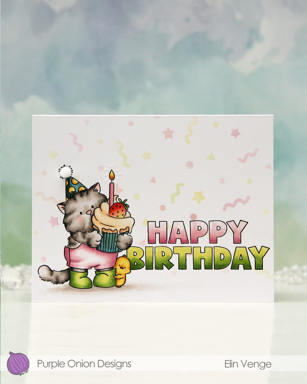 I stamped Tofu birthday wishes, masked off Tofu and the cute little chick and stamped HAPPY BIRTHDAY from the Outliners sentiment set. I even masked off the letters and did some inking over the Bursting backgrounds stencil from Concord & 9th for a subtle background.
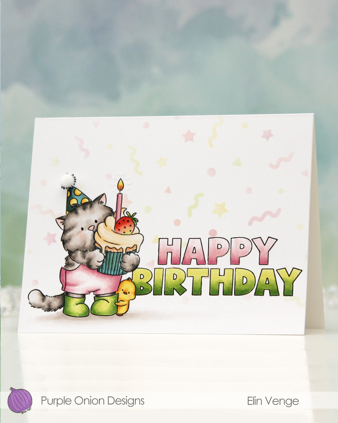 I colored Tofu and the sentiment with Copics, adding a black dot of Sakura Glaze pen to the eyes once the coloring was complete. This creates a tiny bit of dimension, as well as a bit of shine.
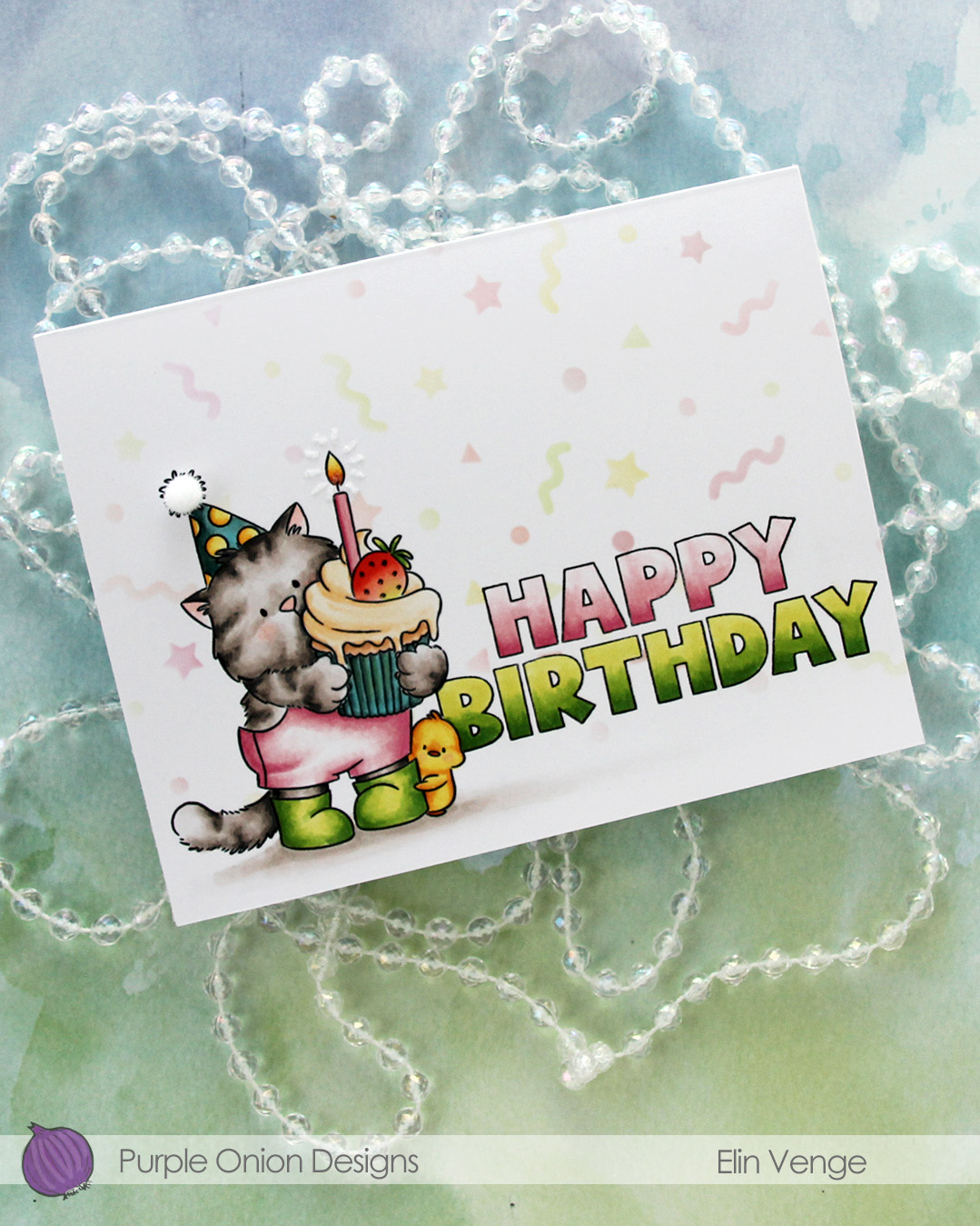 I used a Quickie glue pen to create a burst from the flame, then sprinkled on Rock Candy distress glitter. This adds a tiny bit of sparkle and some subtle texture.
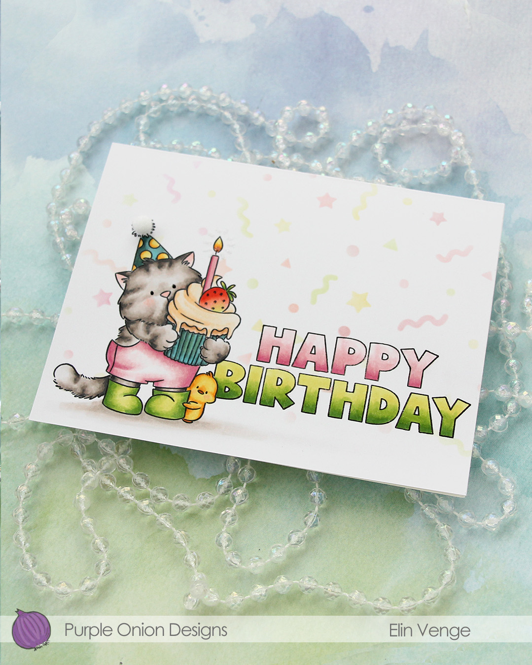 To finish off, I added a 5 mm pom pom from Cousin DIY to the top of the party hat.
 I used lots of Copics for this one. I wasn’t quite happy with the color of the cupcake liner or the party hat, but it is what it is. The card is still cute!

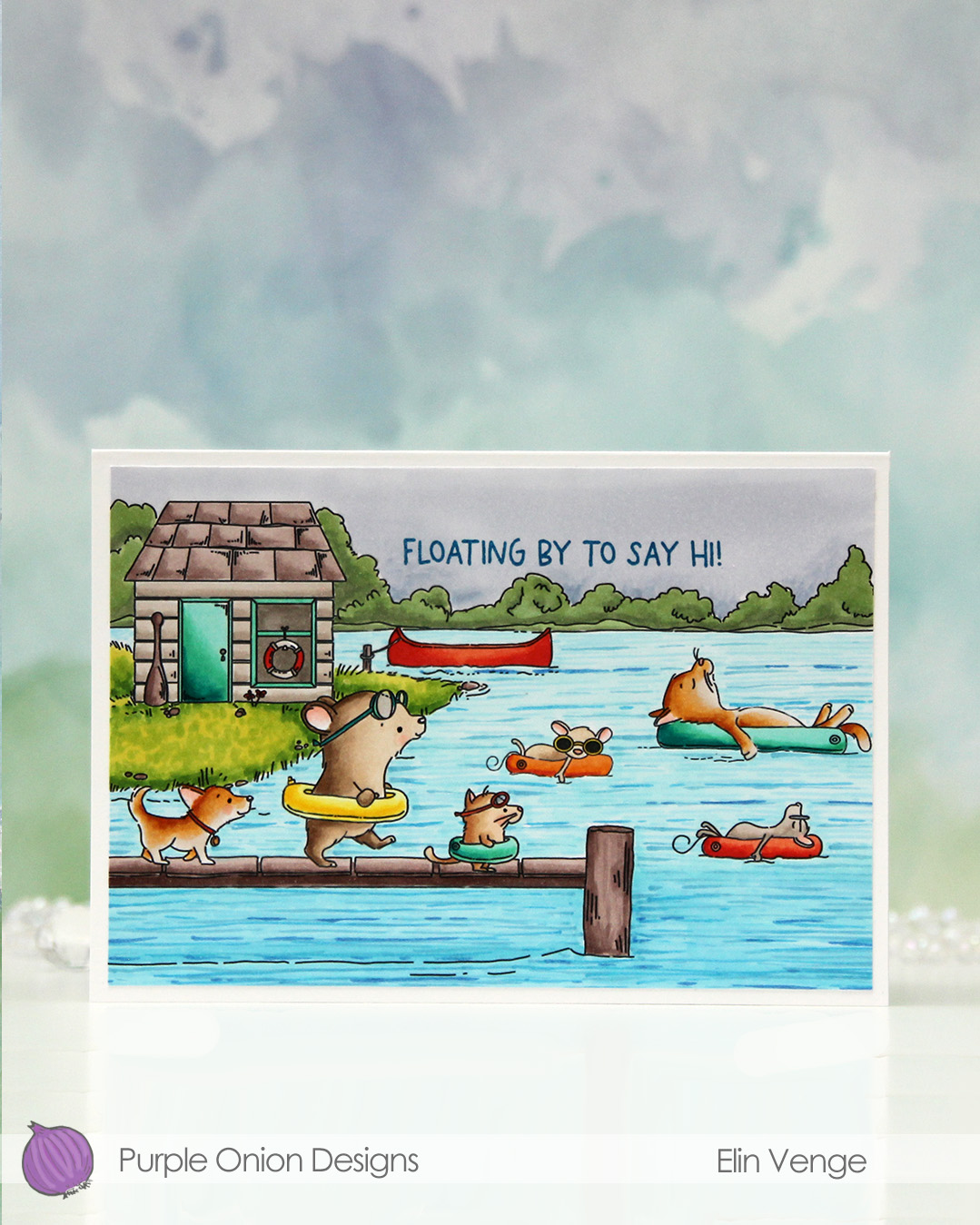 I fit a lot of images into this scene.
  I colored in my scene with Copics, opting for very vibrant colors for all the floating elements and the details on the boat house, while keeping the rest fairly muted. The lake is lighter the further back you get, and the sky is a bit moody off in the distance. I added a bit of black glaze pen to the eyes of the gang on the pier for a little bit of dimension and shine.
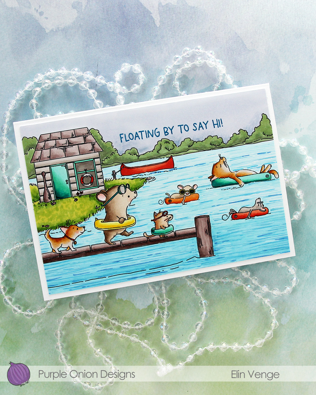 I stamped a sentiment from the
 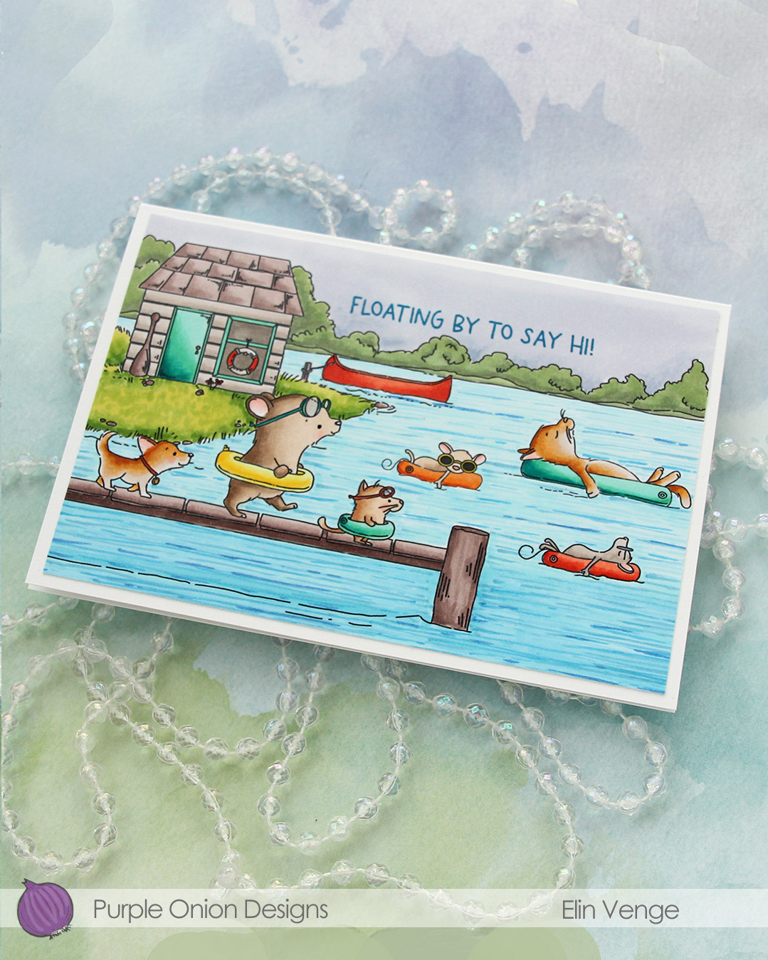 I adhered the panel to a card base that measures 6 1/8″ x 4 1/4″. This is an irregular size for a card, but when I create scenes like this, I let the scene dictate the size of the card. I can always make a custom envelope to fit.
 I used lots of Copics for this one.
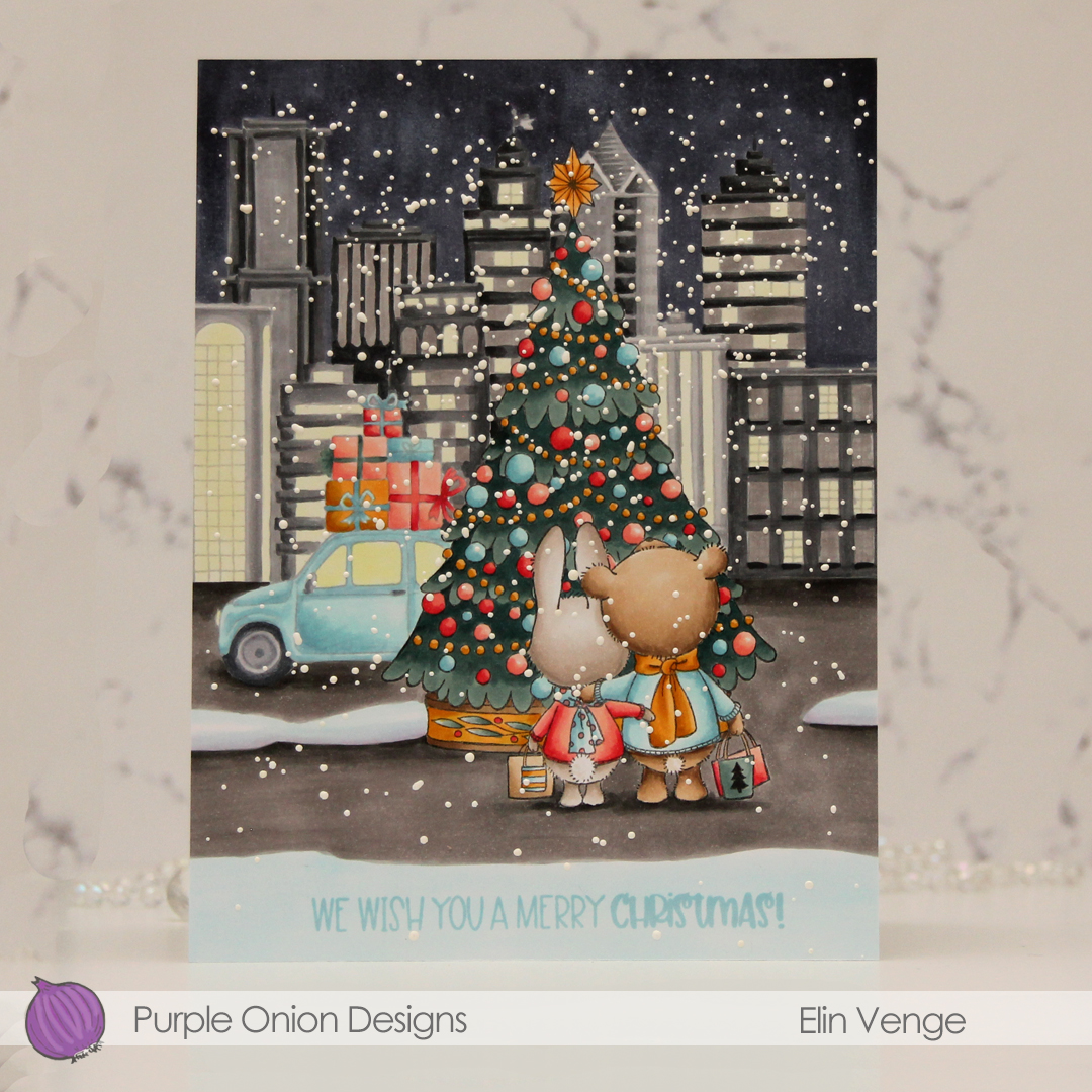 This scene is created entirely with images from last years holiday collection from Stacey Yacula.
  I colored the entire scene with Copics, stamped the sentiment from the
  I used lots of Copics for this, and all the different gray families, actually.
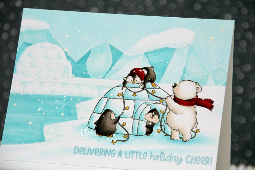
 I originally planned on creating a regular portrait oriented A2 card with this image, but I had this idea of another igloo in the distance, and it kind of evolved from there. I don’t usually create my own backgrounds for cards (I like background stamps that do all the work for me), but I had a blast with this one. Keeping the colors to a minimum certainly helped. I only used five Copics for the entire background.
 Once the background and the actual stamped image were both colored in, I stamped a sentiment from the
  Limited color palette for such a large card.
 Meet
Meet  Once everything was colored in, I stamped Santa’s Silhouette using Obsidian ink from Altenew. This is a pigment ink, which doesn’t really play well with Copics, so it’s best to use it once the coloring’s complete. I then stamped a sentiment from the Home for the Holidays sentiment set using Jalapeño Popper ink from My Favorite Things, before I sprinkled on chunky white embossing enamel from Stampendous, which I melted from the back for a textured snow look. I adhered my panel to a top fold card base and my card was complete.
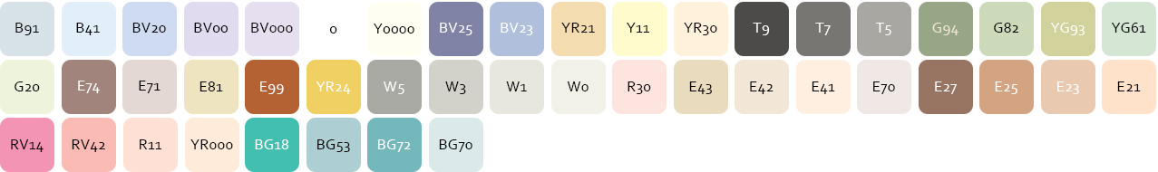 I used a lot of Copics for this scene. A lot.
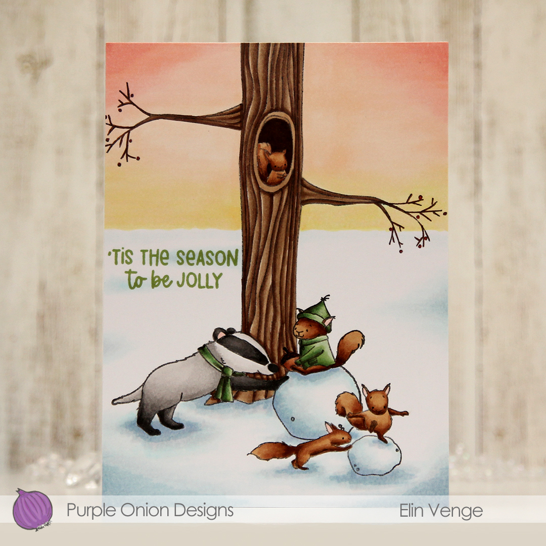 I stamped and colored my critters (
 I stamped a sentiment from the older
  I used a lot of colors for this scene.
 I stamped and masked
  Once all my coloring was complete, I stamped on top of my critters, this time using Obsidian ink from Altenew. This is a very crisp pigment ink, and it makes the critters really stand out, but it’s not Copic friendly, so all the coloring needs to be complete when doing this. To finish off, I stamped a sentiment from
  Lots of Copics for this one.
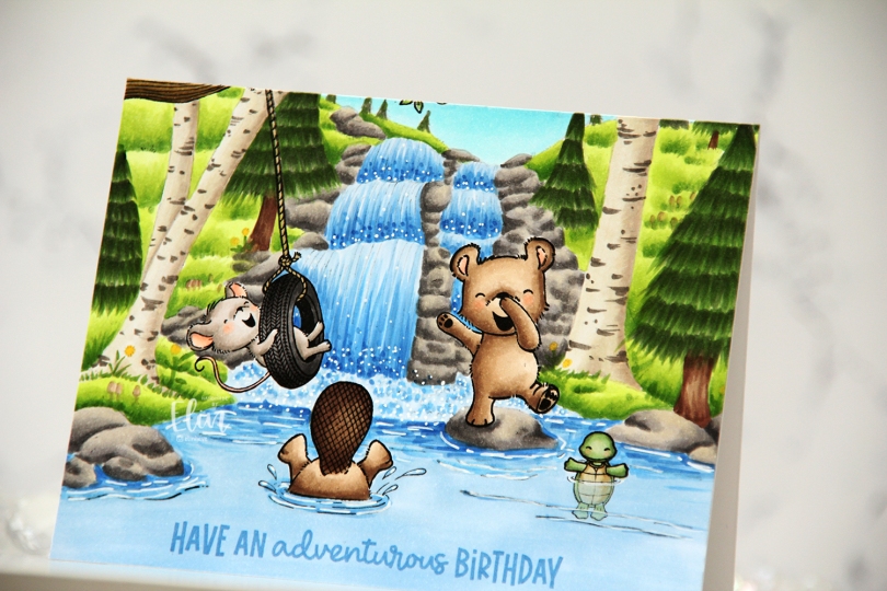
 I created a fun water scene with
 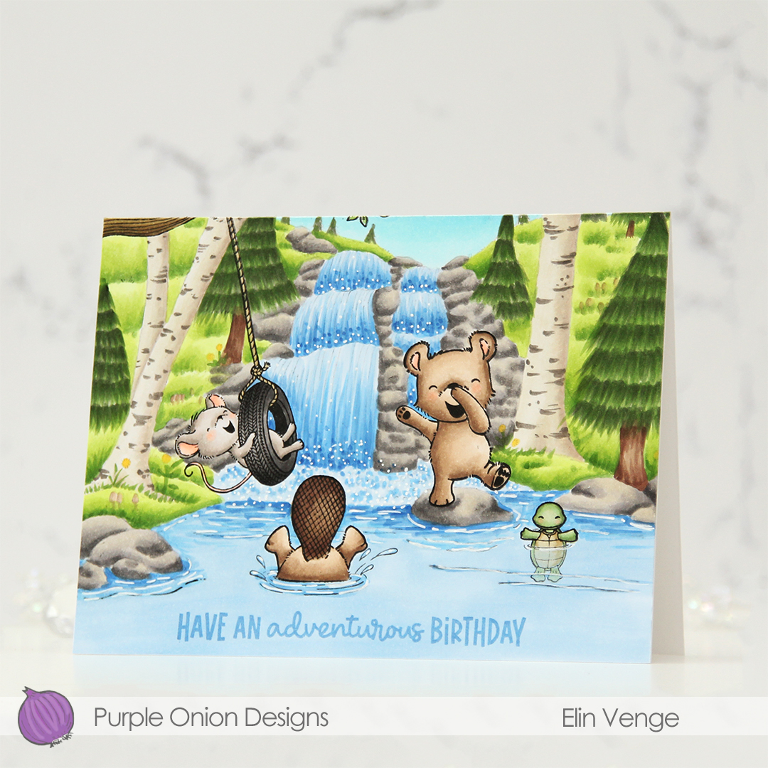 I stamped a sentiment from the coordinating
  Considering I colored the entire card front on this card, I don’t think I used too many markers.
 I started by ink blending directly on the card base. I used the Window Panes stencil from My Favorite Things, and Scattered Straw and Mustard Seed Distress inks.
 I stamped the image and sentiment using Obsidian ink from Altenew and did some very light pencil coloring using my Prismacolor Premier pencils. I used Goldenrod (1034), Yellow Ochre (942) and Cream (914) for the yellow, and Olivegreen (911) and Limepeel (1005) for the green. I decided not to add embellishments, so this is truly a one layer card, as everything is done on the card base itself.
 I almost gave up on this background. One of my markers went sticky. It had recently been refilled, so I knew it wasn’t because of lack of ink (which is usually the culprit when my markers go sticky). I had to investigate, and as soon as I cleaned the marker cap, I knew why. It had a big crack. I keep spare marker caps on hand, so I replaced the cap, changed the brush nib (the chisel nib was fine) and added a few more drops of ink to the marker. It’s an old marker, so I’m hoping I was able to salvage it. I don’t want to have to get a new one, I know the new ones aren’t as good.
 I wanted a very light background to make Lavender & Thyme stand out, and while I’m happy with the window display, I think I would have liked it better if the exterior wasn’t this dark. Lesson learned for next time, I guess.
 I’m happy with how Lavender & Thyme turned out, though. I wanted a bit of a vintage vibe with the colors and may have gone overboard with Thyme’s jacket. I wasn’t happy with the red I used initially, there just wasn’t enough contrast between the jacket and her mitten. I went back over the jacket with a couple of other colors and I’m much happier with this.
 I stamped a sentiment from the
  I used ink from Papertrey Ink for the department store, as well. I used Classic Kraft ink, which I knew would work well with the sepia coloring I had planned. I even used a Sepia colored Copic multiliner to darken the letters in the sign. The Copic multiliner pens have very fine tips, and it was the perfect tool for the job.
 I only used seven colors for the entire background, but way more colors for the critters in front for this card.