Hi, crafty friends. Today’s the last day to take advantage of the 30% bundled discount offer for the new Charmed by the Sea release from Purple Onion Designs. The design team and guest designers have shared lots of amazing cards over the last two weeks featuring stamps from this release, and if you haven’t purchased this collection yet, I have another card for you today that I’m hoping will inspire you that little bit more.
 Meet Slumber. This little mouse taking a nap in a hammock tied to palm trees won me over as soon as I saw it. Can you imagine relaxing by the ocean, listening to the sound of the waves rushing to shore? Heaven! I stamped and masked the surf board from the beach accessories set, the crab and the bottle from the seaside accessories set, then stamped Slumber, did more masking, then added the shoreline background, all using Extreme Black ink from My Favorite Things. With the masks still in place, I stamped the sunrise sunset background using Fadeout ink from Inkon3 for a soft, no line look.
 Whenever I color scenes like this, I always start with the background elements. For this card, I started with the sky and sun, then colored the ocean, the sand and the palm trees, leaving the accessories and the mouse for last. These are the most colorful elements. I even opted to color the crab blue. I didn’t want it to be brown and not show up in the sand, so I decided a blue swimmer crab was a good fit for this scene. It stands out against the other elements in the foreground, but still works with the overall design, because there’s already lots of blue on the card with the ocean and sky. Three completely different blue combos, but they work together still. Also, the blue swimmer crab makes me want to move back to Australia, even though it’s winter in Australia at the moment, and soooo cold (at least winter’s cold in Adelaide, where I used to live)!
 I’ve used the sunrise sunset background on more than half the cards I’ve made with this release, and I’ve tried to color it differently for each card. I love love love the versatility of this stamp, and never in a million years did I guess in advance that this would wind up being my favorite stamp of them all, but there you go. It’s just THAT good.
 To finish off the card, I stamped a sentiment from the coordinating Seaside sentiment set using Classic Kraft ink from Papertrey Ink, and I also used a white Sharpie to add dots to the sand to mimic foam.
 Lots of colors used for this one, and I realize I’ve even left out a few in my graphic. I used W3, W1 and W00 for the mouse, in addition to R21 and R000 for his cheek and ears.
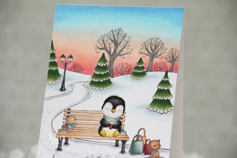
 Meet Lark & Parker. Oh, and Boots, too! A nice hot beverage on a park bench to wind down from the hustle and bustle of the season seems perfect to me. I stamped the park background behind them and colored a very bright winter sunset.
 Once my scene was all colored in, I used a stamp from the Merriest City Sentiment set for a sentiment at the bottom, using Hawaiian Shores and Stormy Sea inks from Papertrey Ink to perfectly match the sentiment with the coloring of the scarves and the bag.
 Lots and lots and lots of Copics for this one. The first eight in this graphic are for the sky alone.
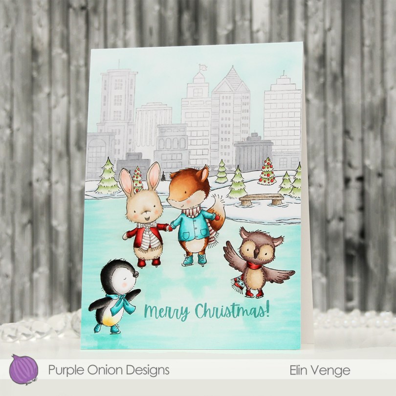
 I always say that you can’t go wrong with a penguin, and with so many images to choose from in this release, I knew I could color another penguin and the rest of the card would fall into place.
  I colored the ice first, and added a hint of reflection underneath their feet. I probably could have used a darker marker, but it’s more noticeable in real life than in the photos. Initially, I’d planned on keeping the buildings and sky uncolored, but once I’d colored the snow and the trees, it kind of all looked white, so I decided to add color to the background anyway. I colored the buildings in various shades of cool greys, before masking off the buildings and airbrushing a blue sky behind them.
 I colored my critters (here you can see the reflection in the ice a bit better) before finishing up with a sentiment from the
  There’s an ice rink stamp in this release, I just really loved the large area I was able to create with this older horizon stamp.
 Lots of Copics used for this card. B000 was only for airbrushing the sky.
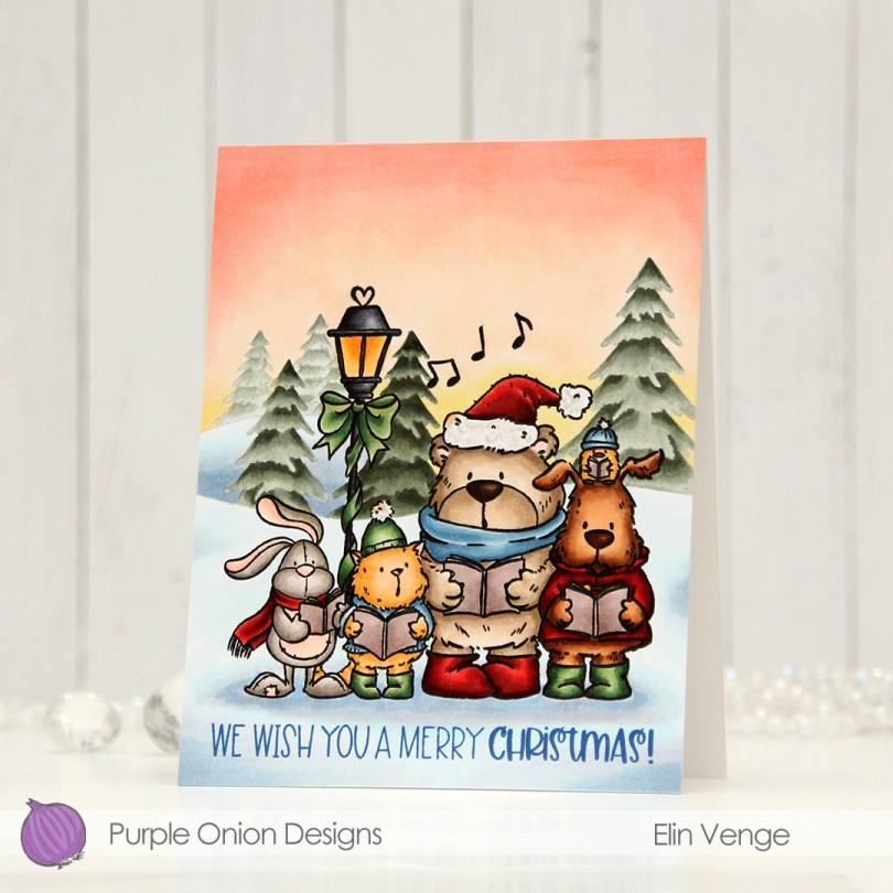
 I stamped my critters using Extreme Black ink from My Favorite Things, added a mask and stamped the trees in the background using Stormy Sky ink from Papertrey Ink. It’s a nice grayish green that goes really well with the colors I used for the coloring of the trees. I created my signature winter sunset behind it all, and did my best to create depth in the background by varying the intensity of the coloring of the trees. Once everything was colored, I stamped the critters again, this time using Obsidian ink from Altenew for a crisp, black outline.
 At the bottom, I stamped a sentiment from the
  I used lots of Copics for this one. Lots!!
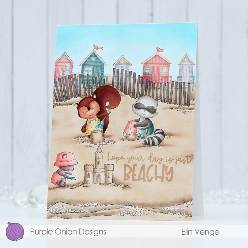

 I packed a lot of stamps into this one card, which is actually an A6 size card (4 5/8 x 6 1/4″). Whenever I create cards with new releases from Purple Onion Designs, I let the design of the card dictate the size of the card, whatever that turns out to be.
 I colored the scene with my Copics. I’d managed to overfill a marker when I refilled it, creating a big drop of blue ink on my peach colored cabana when I went to color in the window. At that point the sky, fences and beach were all colored, I only had the critters left and didn’t want to start over, so I made the fences darker and made the cabana darker too. It’s still visible, but I wanted the focus to be on the critters enjoying their time at the beach. If it had happened on a main element of my card, I probably would have started over.
 I used a white Sharpie to create foam from the waves coming in, and stamped a sentiment from the coordinating
  Fairly muted color palette for this one.
 Meet
Meet  I colored in the scene with Copics, stamped the sentiment using VersaMark ink and sprinkled on Super fine detail embossing powder from Ranger, before melting in it from the back for a smooth look. Did you know that you get smoother embossed results if you use the heat gun from the back of the paper instead of the front? It makes quite a bit of difference, actually. I urge you to try it if you haven’t already.
 It looks like I wrote down the Copics I used for this card in a bit of a haste, because I see I’ve left out the blues, both for the water and the jetski. I made this card at the end of May, so I don’t really remember which ones I did use, but I believe it’s the B10 family (B18, 16, 14 and 12) for the water, and the B30 family (B39, 37 and 34) for the jetski.
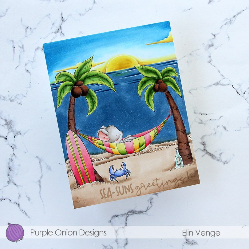
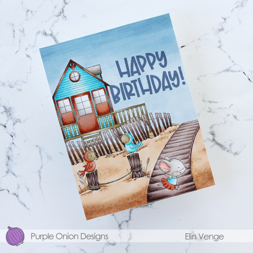
 This time, I made a birthday card. I stamped and masked
  I had the scene all figured out, but struggled with the colors for this one. I’m usually confident in my color choices, but had a hard time with this card. I didn’t want to repeat the color combinations I’d used for the cards I’d already made using stamps from this release, and the combo I tried just didn’t work with the bright aqua. The door, windows and the trim of the beach house all have so many layers of different colors, and the end result is a mottled, rusty look. The rusty look, while not what I was going for, is cool, and I leaned into it by coloring one of the birds in the same color, as well as Iris’ skirt.
 The end result is more of a fall vibe than a summer feel, but some people still go to the beach late in the season, and little Iris looks like she’s running away, so that part at least feels appropriate.
 To finish off the card I stamped a sentiment from the coordinating
  Fairly limited color palette, actually, considering how many colors I tried for the beach house trim.
 I wanted a bit of a dramatic sunset for this card, and also for the critters (
 I adhered my colored panel to a card base I created from Stamper’s Select White cardstock from Papertrey Ink, stamped a sentiment from the
  Lots of colors for this one.
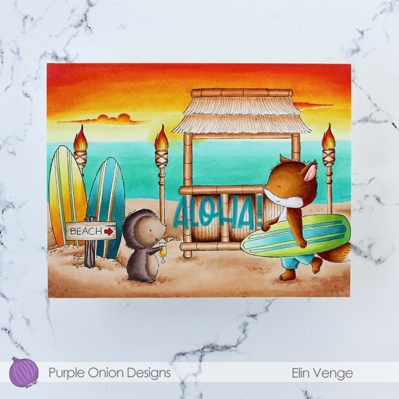
 I did a ton of masking for this card. I love creating stories in my head with these images, then stamping them and making them come to life.
  I colored in my scene using Copics, then stamped the
  I used a lot of colors for this card.
 I actually made a 4 Bar card this time, which is a smaller size than my regular A2 cards. It’s 3 1/2 x 4 7/8″ and it’s basically a one layer card. I admit I added my panel to a card base, but I don’t like working directly on my card base, and Copics bleed through most cardstocks. I don’t want my coloring to be visible from the inside of the card, and adhering the full size panel to the card keeps that from happening.
 I colored the image with Copics and added a watercolor circle around it to fill in some of the white space on the card. There’s still plenty of white space left. I added a sentiment from the stamp set and finished off with a couple of sequins from the Seaglass mix of sequins from Simon Says Stamp.
 Super simple color palette to go with this super simple card.